

Designing for Function: What Google’s Apps Get Right
Google’s products aren’t flashy. But they dominate because they are ruthlessly practical, intuitive, and consistent. For SaaS designers, the specific visual choices matter less than the underlying principles that make these tools frictionless to use day after day. Here are four functional patterns worth borrowing.
1. Show the User’s Top Priority Immediately
When a user lands on a dashboard, the interface should confirm they are in the right place, not bombard them with options. For apps with a clear utilitarian purpose, like Google Translate, that means placing the core tool front and center without any competing clutter.
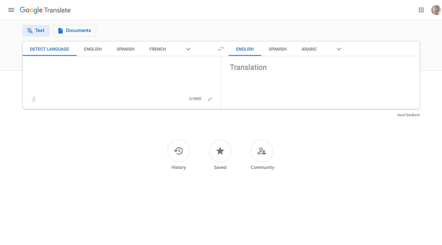
Google also uses its data to reduce user effort by setting sensible defaults. Translate defaults to English, and on mobile, it automatically pairs the default language with the most recently used language. This anticipatory configuration reduces the number of steps needed to complete a task.
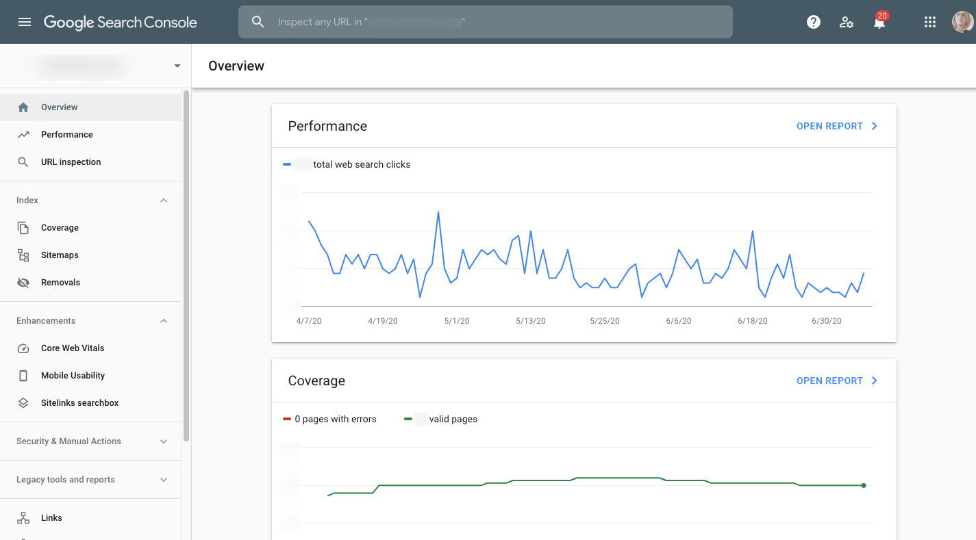
For more complex applications, where the main goal is monitoring performance rather than a direct action, the principle remains the same. In Google Search Console, the first screen focuses on performance and coverage metrics — the two most critical indicators of search health. Less critical recommendations for enhancements live below the fold. The key is to present a high-level overview first, allowing users to drill down only when necessary.
2. Replace Website Navigation with App Navigation
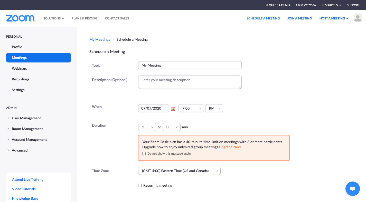
Once a user is logged into an app, the surrounding website navigation is often just distraction. For an application like Zoom, scheduling a meeting in the browser pulls in the site’s main navigation, which competes with the app’s own interface for the user’s attention.
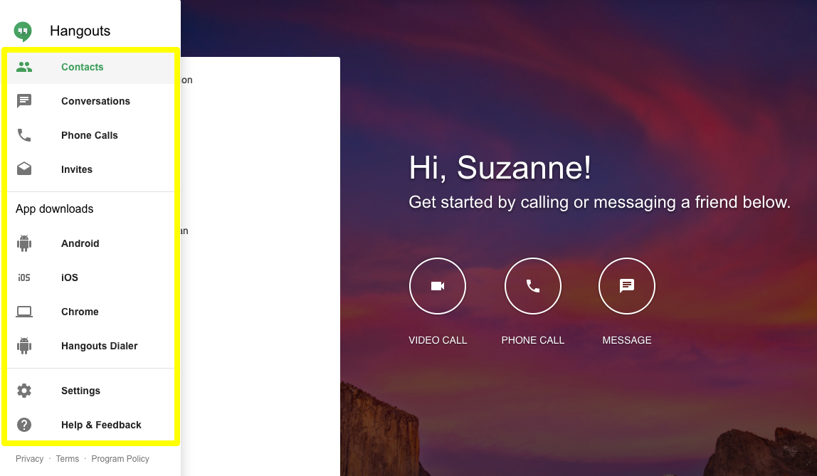
Apps should feel like dedicated environments. Google Hangouts uses a clean layout, placing primary navigation along the left side, reserving secondary actions for menu buttons, and leaving the main area wide open for the core task.
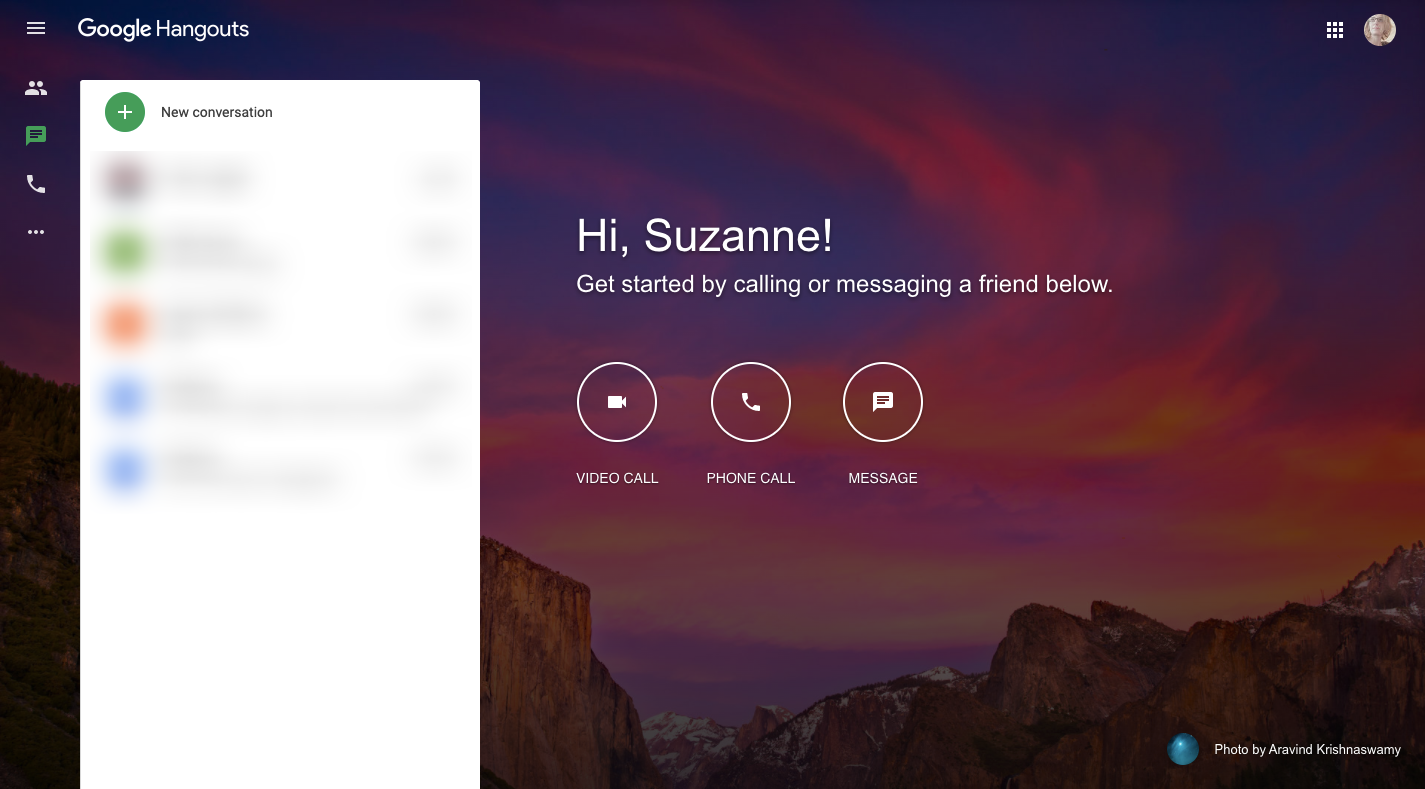
Only if users need to move between related products should the app offer a subtle route back to the broader ecosystem, as Google does with its app grid in the top-right corner. In the app’s internal navigation, simplicity is critical. While Hangouts uses icons for its primary menu, it is risky to follow suit unless the symbols are universally understood. For any custom actions, adding clarifying labels is safer. And grouping navigation items with logical dividers, as seen in the settings menu, makes scanning easier than presenting one long, undifferentiated list.
3. Make Internal Search Predictive
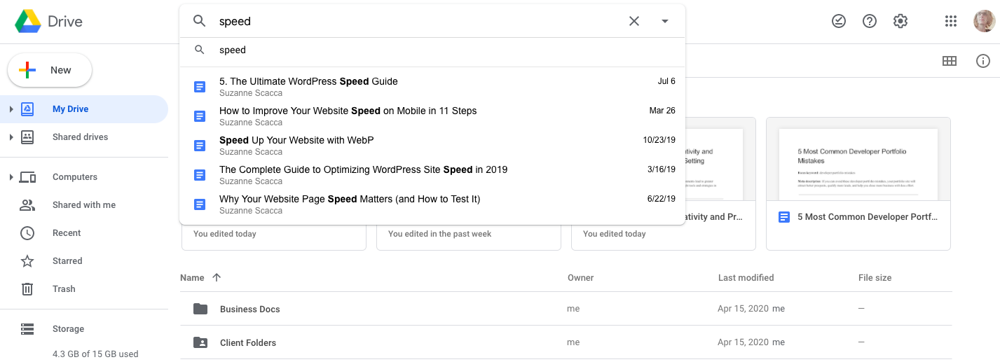
Search is a necessity in any reasonably complex app, but it becomes a genuine asset when it anticipates what the user needs. Google’s products showcase how predictive search can connect users with the right file, person, or action without requiring a perfectly articulated query.
Google Drive has search that filters both documents and collaborators based on the initial input, pulling up relevant, recent content before the user even finishes typing.
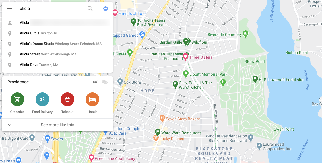
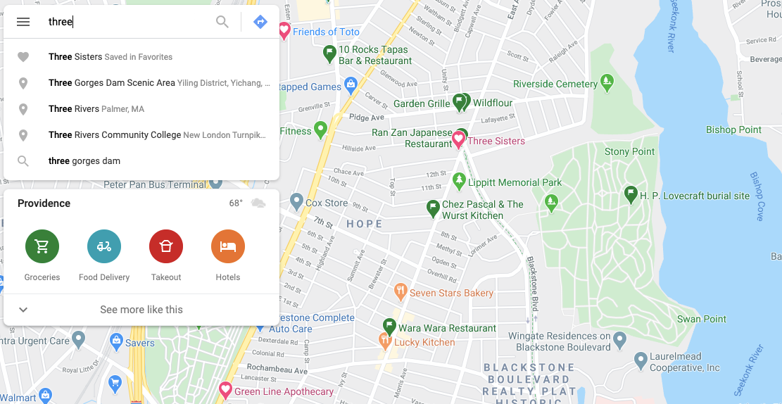
Google Maps takes this a step further by leveraging a user’s broader ecosystem data. Searching for a contact name surfaces saved addresses, while a search for a place name like “Three” can bring up a saved favourite restaurant directly in the results, with a heart marker on the map confirming the connection. Using the personalized information a user has already given you to refine search results is a powerful way to improve the experience.
4. Hand Over Design and Layout Controls
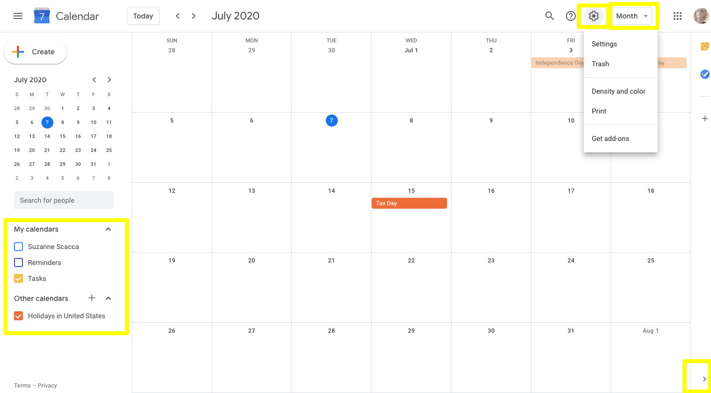
A designer cannot anticipate every user’s preference, but a good SaaS app lets users adjust the interface to fit their own workflow and visual needs. Customization tools not only improve usability but can also address accessibility requirements.
Google Calendar provides many different levers for this. Users can show or hide specific sub-calendars, hide the side panel to maximize focus on the schedule, and adjust color density or the time-frame view directly from the toolbar.
Gmail has also refined its customization experience. Instead of forcing users to leave the app for a separate settings page, Gmail now presents the most common design preferences — line spacing, theme, inbox sorting, reading pane, and conversation view — in a quick panel within the app. Deeper, less common options are still available behind a link to the full settings screen.
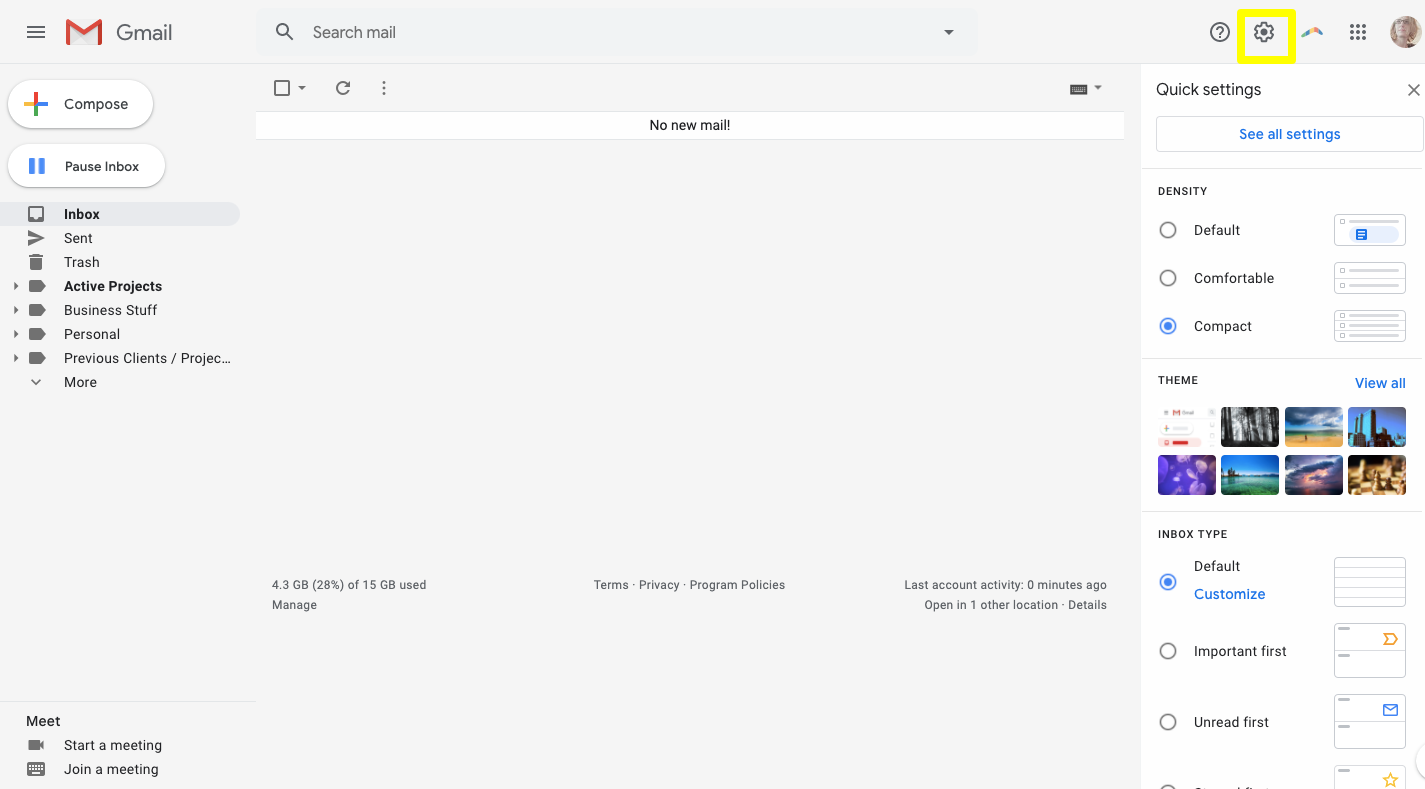
Consider which design controls you can expose directly to users. Options like theme selection, list versus grid views, and toggles for interface density can all give users the ability to craft an interface that feels most comfortable and effective for their own work habits.
Why Google’s Patterns Are a Solid Baseline
Google’s dominance across product categories isn’t accidental. The company’s access to vast amounts of user data gives it an uncommon ability to observe what truly works in interface design. While your audience will always have specific needs that demand tailored solutions, the recurring patterns across Google’s platforms offer a reliable foundation that can serve nearly any user base.
The key is to look past the visual style and focus on the underlying behavioral trends. Those trends—clarity, speed, and predictability—are what make Google’s products feel intuitive to such a wide range of people.

(ra, yk, il, mrn)


