
A Roman Architect’s Checklist for the Web
Architecture has always borrowed heavily from the language of the web, and vice versa. We speak of site architecture, frameworks, and foundations as though a website were a physical structure. That framing is not incidental. Marcus Vitruvius Pollio, a Roman architect writing in the first century BC, laid out criteria for good building that map surprisingly well onto modern web development.
Vitruvius is best remembered for De architectura, the only surviving architectural treatise from antiquity. In it, he defined three qualities essential to any structure: firmitas (durability), utilitas (usefulness), and venustas (beauty). Known as the Vitruvian triad, the framework was intended for temples and public buildings, yet its three pillars translate naturally to digital products. Treating them as a checklist for your website can improve both its engineering and its user experience.
The Three Pillars, Applied to Pixels
Firmitas: Durability
In physical architecture, firmitas means a building stands up to weather, time, and use. On the web, structural integrity looks different but serves the same purpose. A site that breaks under traffic spikes, fails on older browsers, or loses data because of weak error handling lacks durability. The digital equivalent of crumbling masonry is a codebase that cannot sustain growth or change. Solid foundations — sensible architecture, tested code, and reliable hosting — are the web’s concrete and steel.
Utilitas: Usefulness
A building that looks grand but cannot be lived in has failed its purpose. Similarly, a website must do what users need it to do, without friction. Navigation should be predictable, actions should be obvious, and content should answer the questions visitors came with. Usefulness is not about packing in features; it is about clarity and purpose. If a user cannot complete a task efficiently, the design — no matter how polished — is not functional.
Venustas: Beauty
The aesthetic dimension ought not be an afterthought. Vitruvius insisted beauty was integral to good architecture, not decorative garnish. On the web, visual design shapes perception of trustworthiness and ease of use. Consistent spacing, legible typography, and harmonious color palettes are what make a site feel well-crafted. That visual polish has a practical effect: it directs attention and improves usability, bridging utility and elegance.
Why an Ancient Triad Still Fits
The endurance of Vitruvius’s framework comes from its reduction of design to essentials. Modern development complicates matters with frameworks, performance budgets, and accessibility requirements, yet the underlying questions remain the same: Does it hold up? Is it useful? Is it pleasing? None of these can be ignored without compromising the whole.
Da Vinci’s Vitruvian Man, inspired by the architect’s writings on proportion, is proof of the ideas’ longevity. A thousand design systems have come and gone, but the balance between strength, utility, and beauty is as relevant for interface design as it was for Roman aqueducts. For anyone building on the web, Vitruvius is a reminder that the loop between architecture and digital design runs both ways — and that the old masters still have lessons worth heeding.
Utilitas, Firmitas, Venustas: Web Design’s Ancient Blueprint
Vitruvius, the Roman architect whose De architectura survives as the only major architectural treatise from antiquity, laid out three qualities he believed essential to any well-made structure. These became his golden rules. A piece of work should be useful (utilitas), durable (firmitas), and beautiful (venustas). Possessing one of these qualities is fine; having two is better; but nailing all three together elevates a project from mere construction to something transcendent. Each principle has its own meaning in the classical world, and each translates in surprisingly direct ways to the discipline of web design.
Useful (Utilitas)
Buildings are designed and erected for a reason. Whatever that purpose is, it should always be at the forefront of an architect’s mind. If a structure fails to meet its intended function—a theatre with no stage, for example—it has dropped the ball. Vitruvius wrote that usefulness is assured “when the arrangement of the apartments is faultless and presents no hindrance to use, and when each class of building is assigned to its suitable and appropriate exposure.”
You have heard this concept before, albeit with different wording. Vitruvius is the original source of the idea that form should follow function. Louis Sullivan, the father of skyscrapers, coined that exact phrase in 1896 and allegedly attributed it back to Vitruvius, though documentation of that lineage is shaky. Whatever its provenance, that is the essence of utilitas.
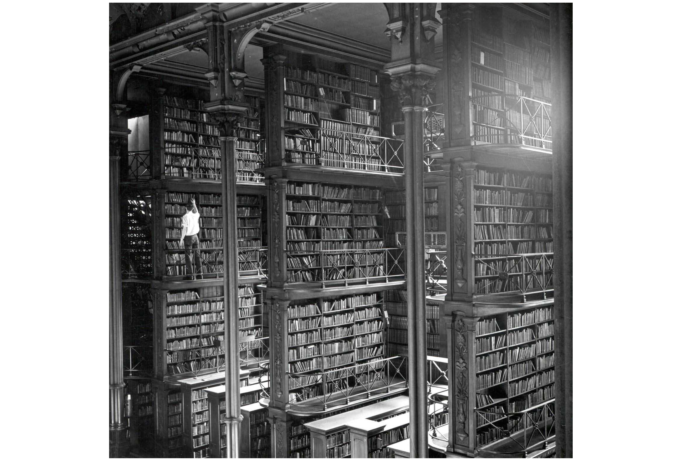
Different building types impose different requirements, and structures designed with those requirements as an afterthought often disappoint. It sounds obvious, but the architectural record is littered with white elephants. Labyrinthine shopping centres and dangerously conductive metal domes in playgrounds may look compelling in investor presentations, but they don’t turn out to be terribly useful. For a building to serve its occupants well, its individual parts should be logically connected, simple to access, and easy to navigate.

Utilitas lands on the web the same way. Every website exists for a purpose, whether practical—search, weather, e-commerce—or artistic, like an interactive narrative or a portfolio. A site designed around that reason is far more likely to be useful to its visitors. Consider an encyclopedia: you would expect it to be easily searchable, cleanly presented, and properly cited. Wikipedia, for instance, ticks all of those boxes, functioning as the web equivalent of an enormous library, staff bickering and all. Its core design has stayed largely consistent since its founding because usefulness was the central priority from day one.
A publication, by contrast, lives or dies on the original content it produces. To be truly useful, it must present that content in a vibrant, direct way and pay particular attention to the reading experience across devices. A website with wonderful articles but a poor design undermines its own usefulness. Clear purpose leads to clear design; a purpose pulling in several directions yields a site that does the same. You cannot be all things to all people, and usefulness leans toward specific needs rather than broad ones.
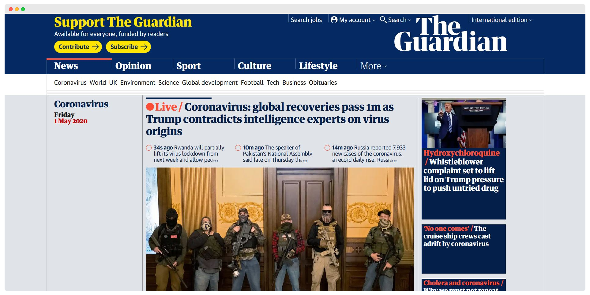
Websites are places people visit, not abstract artefacts, and they should be designed with visitors above all others in mind. When advertisers or investors get a seat at the table too early, usefulness suffers. Articles split across multiple pages purely to inflate traffic numbers are less useful for it, as are e-commerce platforms more concerned with conversion funnels than with honest product information. In those cases, secondary goals outweigh the core purpose and the design degrades accordingly.
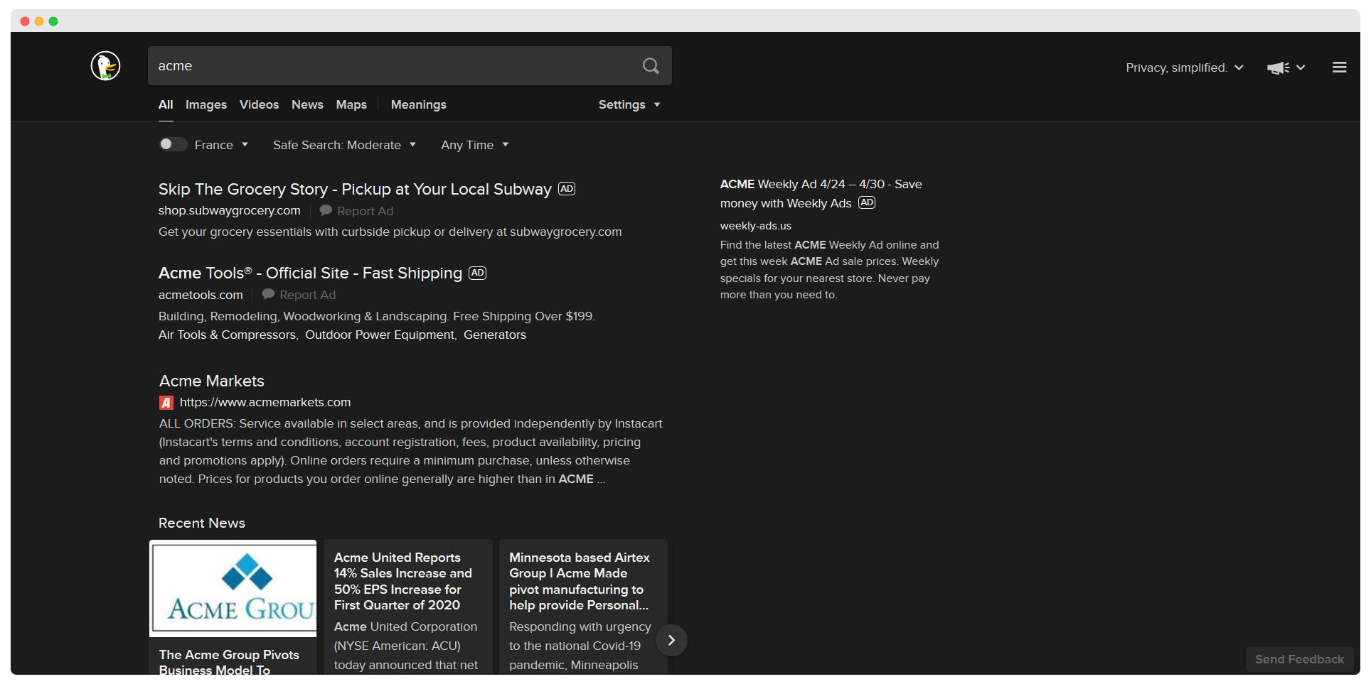
Websites should also be easy to navigate, and that requires planning up front. Where an architect has floor plans, a web designer has sitemaps and wireframes to identify layout problems before they become reality. Looking at the work through different lenses is essential: does the palette account for colour blindness and for the fact that colours mean different things across cultures? Is a site easy to browse with a keyboard or a screen reader? Not everyone experiences the web the same way, and there is no good reason for a site not to be both accessible and inclusive.
Durable (Firmitas)
Firmitas is the principle that things should be built to last. A fantastically useful structure that collapses after a couple of years is widely regarded as a failure, while a well-made building can endure for centuries, even millennia. Ironically, none of Vitruvius’s own buildings survive; the point stands anyway. He wrote that “durability will be assured when foundations are carried down to the solid ground and materials wisely and liberally selected.” The destination must be chosen carefully, the foundations laid deep, and the materials chosen appropriately.
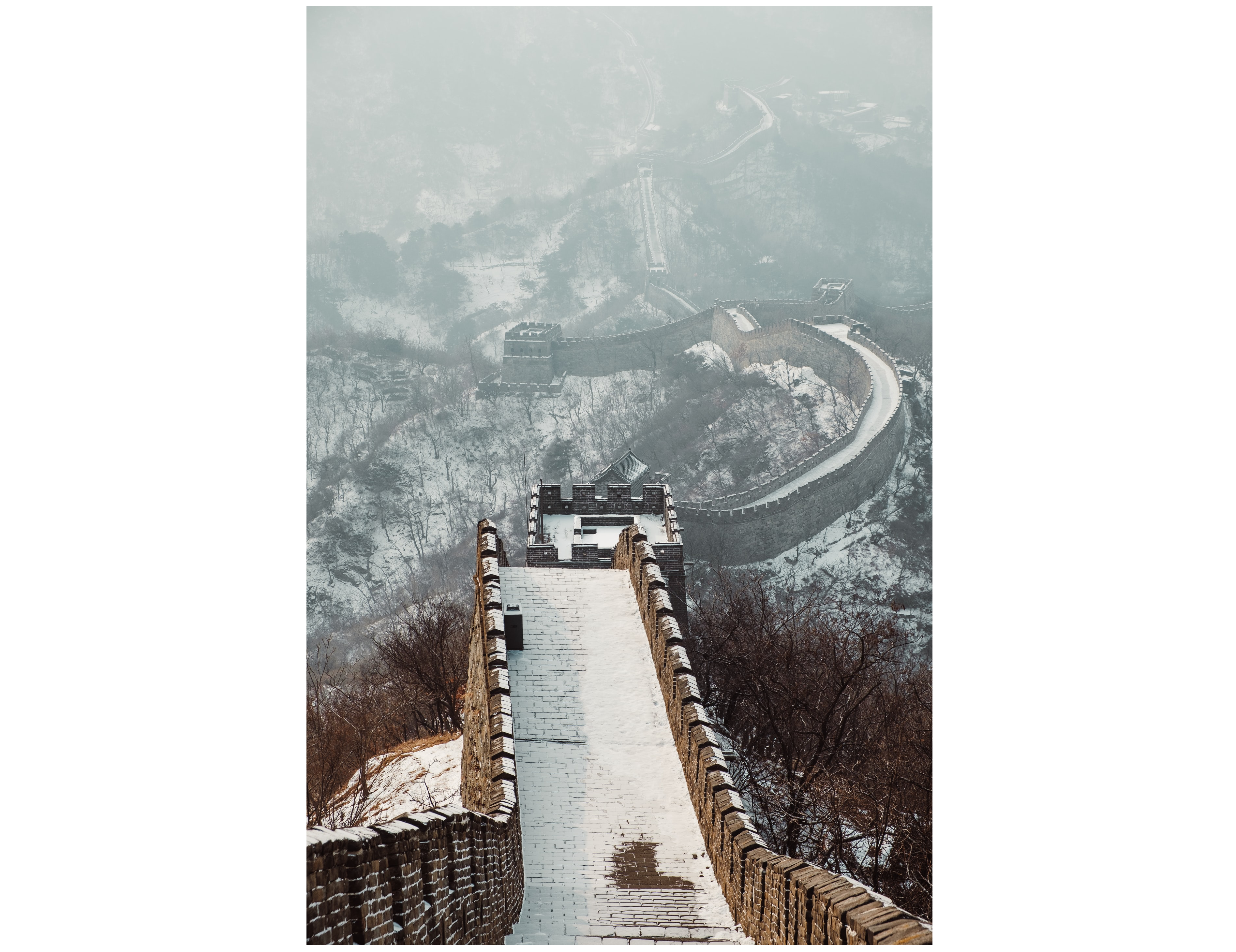
Longevity is instinctively understood as a mark of good design. The Pantheon and the Great Wall of China are testaments to it, renowned as much for their age as for their majesty. That durability also means reckoning with environment: weather, earthquakes, and erosion all take their toll. A structure that doesn’t account for them may not remain a structure for long. Buildings that survive are reassuring and, over time, cheaper to maintain. Ones built without longevity in mind are glorified film sets; before long they become rubble.
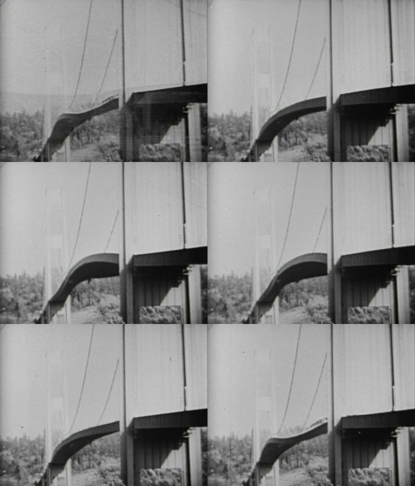
Time accelerates on the web, but firmitas still applies. Given the endless turbulence of online life, it makes sense to anchor a site in something sturdy. Durability online is the least visible of the three qualities to end users, yet without it everything else falls apart. That begins under the hood. Where will the site live? Is the content management system a good fit? Can the host carry the expected traffic—and more—while continuing to run smoothly? Anyone who has migrated between CMSes knows it pays to get this right the first time.

The staying power of the technologies themselves matters too. A trendy new framework might seem like a good idea in the moment, but a site meant to last for years may be better served by fundamental technologies like HTML, CSS, and JavaScript, along with broadly supported SEO markup such as structured data. As in architecture, durable building often means leaning on established materials rather than novel ones.
Durability also reaches into the visual layer. Web pages must bend, stretch, and warp in ways that would make an architect weep, and a responsive site is a durable one. As new formats like foldables arrive, websites have to absorb them gracefully. An architect can’t sulk about earthquakes; no more should a web designer shy away from the changing conditions of the medium. The best design faces environmental challenges directly rather than avoiding them. As a site matures, its users become familiar with its design, and wholesale changes become more disruptive. Careful design from the outset means renovations rather than rebuilds, preserving familiarity when updates do come. Done well, longevity is also environmental in the commercial sense: paywalls, advertising, and membership systems may not define a site’s purpose, but they do help keep it durable.
Beautiful (Venustas)
“The eye is always in search of beauty,” Vitruvius observed, and beauty is a perfectly legitimate design ambition. He defined it as occurring “when the appearance of the work is pleasing and in good taste, and when its members are in due proportion according to correct principles of symmetry.” A building should do its job and last a long while, but it should also lift the spirits. Some structures even touch the heart.
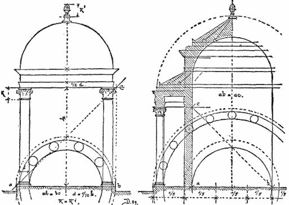
Symmetry and proportion were of particular interest to Vitruvius—hence Leonardo da Vinci’s Vitruvian Man—and the compulsion to impose shape on design predates graphic design by millennia. Every element must be considered in relation to the others around it and to the environment into which it is set. Vitruvius captured that interplay with the Greek term eurythmy, or harmonious rhythm. (British pop duo Eurythmics drew their name from the same word.) He defined it architecturally as “beauty and fitness in the adjustments of the members... when the members of a work are of a height suited to their breadth, of a breadth suited to their length, and when they all correspond symmetrically.” Buildings, like music, have rhythm: their component pieces form a kind of harmony, some as pleasant as a Beach Boys chorus, others as grating as nails on a blackboard.
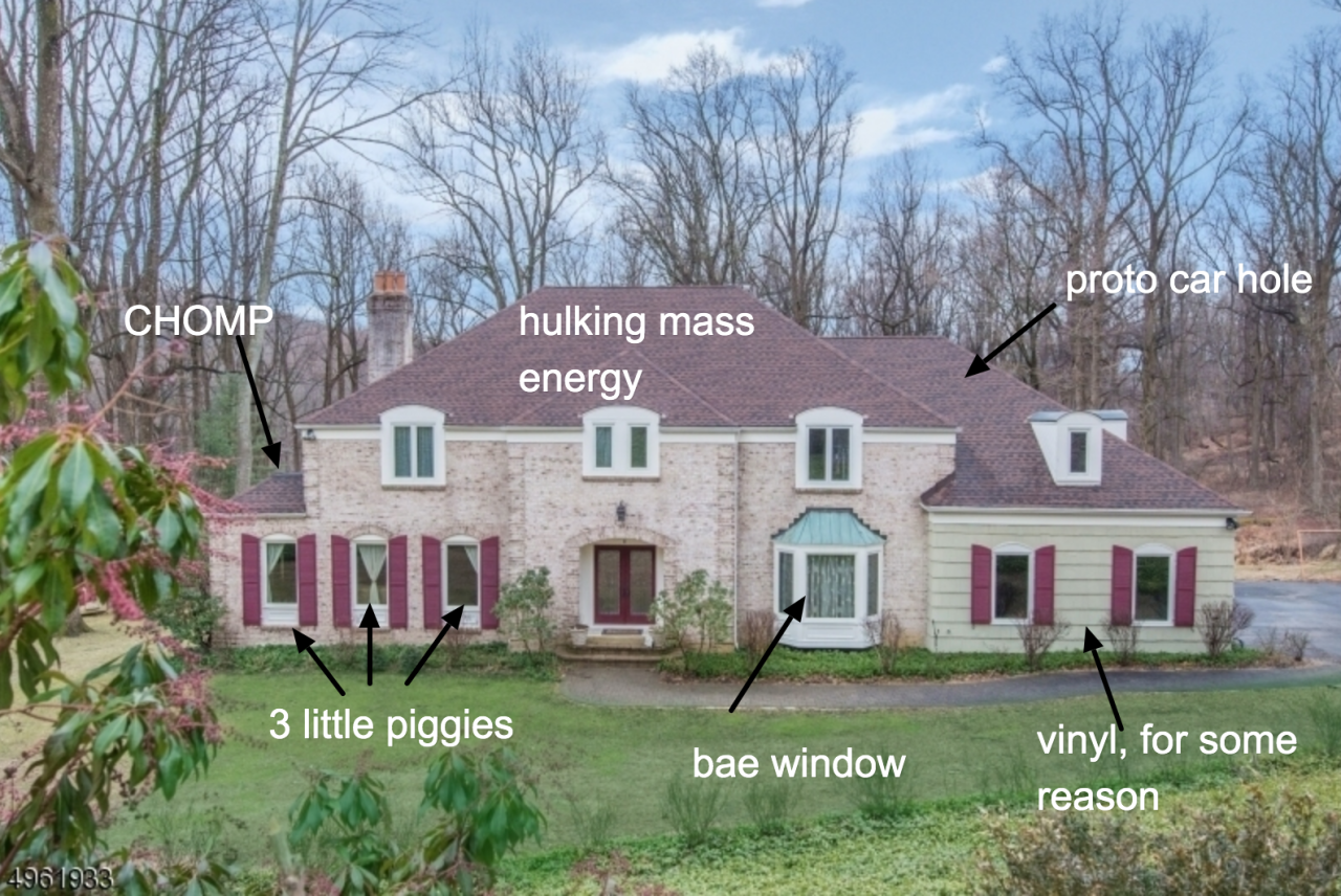
Proportion and symmetry are only part of the picture. Fine craftsmanship is beautiful, as is attention to detail. Materials appropriate to the structure carry their own appeal, signalling the sound judgment of the designer. Ornamentation is acceptable when it complements the core design—think column engravings or paving patterns—rather than fighting it. Accumulated together, these details make a structure.
Beautiful websites operate under much the same rules. Grid systems organize content with proportion and clarity; colour, typography, and imagery all feed into a site’s aesthetic effect. A particularly web-native dimension of venustas is interactivity. A website can be more than something to simply look at; it can be playful, even surprising. It is one thing to be admired from a distance and quite another to invite visitors to take part in the aesthetic itself. Google’s interactive doodles are a good example: they let users play, learn, and be entertained while aligning with the company’s role as a source of information.
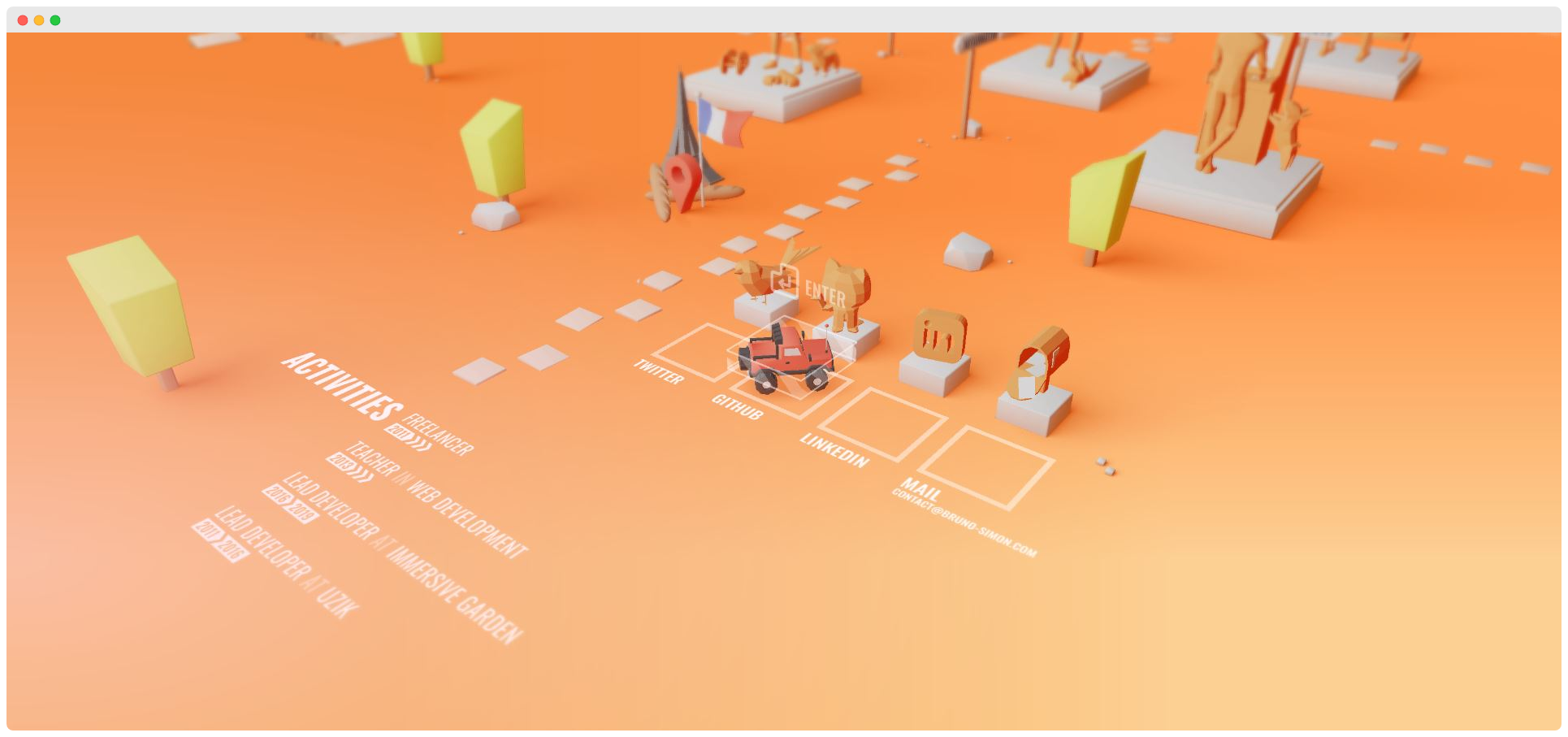
As the web shifts further toward mobile experience, where users literally touch the sites they visit, beauty ceases to be purely visual. It belongs to all the senses. For a website, the “environment” is the device it’s shown on, and unlike a building, a site has no single permanent shape. To be beautiful it must be responsive, altering its size and proportion to suit the screen. Done well, that shapeshifting quality becomes beautiful in its own right.
A Balancing Act
These three rules have endured because they work singly and best together. But attaining all three at once is a balancing act. When they pull in different directions, the whole suffers: beautiful but unusable is poor design, just as utilitarian and butt-ugly would be. When they reinforce one another, the result exceeds the sum of its parts. That requires seeing the whole before the details—the architect, as Vitruvius put it, “as soon as he has formed the conception, and before he begins the work, has a definite idea of the beauty, the convenience, and the propriety that will distinguish it.” Details will change, but the harmony shouldn’t.
The balancing act extends past the product to the people building it. As with architecture, websites have to reconcile the wishes of clients, builders, investors, and users. A harmonious site requires a harmonious team. This is not an argument that the three qualities matter equally in every project; only that each deserves thought in relation to the others. The usefulness of the Eiffel Tower is fairly trivial, as is the beauty of the Hoover Dam, and that’s entirely fine. A site built to be ornamental or temporary doesn’t have to be more. The natures of utilitas, firmitas, and venustas themselves shift with the project. Like most rules worth following, don’t be afraid to bend—even break—them when the occasion calls for it.
Architects of the Internet
If websites are our buildings, then web developers are their architects. Vitruvius insisted that architects are not — and cannot be — experts in every field. Instead, they are jacks of all trades. To achieve firmness, commodity, and delight, it is better to have a broad grasp of many subjects than deep expertise in a single one:
"Let him be educated, skillful with the pencil, instructed in geometry, know much history, have followed the philosophers with attention, understand music, have some knowledge of medicine, know the opinions of the jurists, and be acquainted with astronomy and the theory of the heavens."
Some of these disciplines map to web design directly; others require a little interpretation. Geometry informs proportion and layout. History puts designs in context. Philosophy helps us approach projects honestly and ethically. Music draws attention to the role of sound. Medicine gives thought to accessibility, accounting for the strain on the eye, ear, or thumb. And law looms larger for web developers now than it ever has. Astronomy may be a stretch, but the point stands.
Useful resources to explore these threads further:
- 'Building Better UI Designs With Layout Grids' by Nick Babich
- 'History of the design grid' by Alex Bigman
- 'What Newspapers Can Teach Us About Web Design'
- 'Best Practices With CSS Grid Layouts' by Rachel Andrew
- 'Designing With Audio: What Is Sound Good For?' by Karen Kaushansky
- 'The Beauty Of Imperfection In Interface Design' by Javier Cuello
- 'The Road To Resilient Web Design' by Jeremy Keith
Theory alone will not get you there, though. There is no substitute for learning through doing. As the Stanford Encyclopedia of Philosophy notes, the Vitruvian picture of architecture is rooted in experiential knowledge of making, doing, and crafting. Vitruvius himself puts it more succinctly: "Knowledge is the child of practice and theory."
The Vitruvian triad is a worthy standard whether you are building a coliseum or a portfolio website. Not everyone has the budget for a team of specialists, and even if we did, why deny ourselves the breadth of knowledge that strong design requires? We can build Levittown or we can build Rome, and everything in between. A useful, durable, beautiful Internet sounds like a good deal.