
Why Chart Accessibility Is a Design Problem, Not Just a Compliance One
Accessibility in data visualization goes far beyond meeting web standards. For the past three years, a working group at Google led by Kent has examined how to build visualizations that are genuinely useful for everyone, not just technically compliant. Speaking with designers across the industry, two requirements surfaced repeatedly: accessible chart colors and dual encodings, or conveying meaning without relying on color alone. The techniques discussed here focus on WCAG 2.1, but the same principles apply to WCAG 2.2.
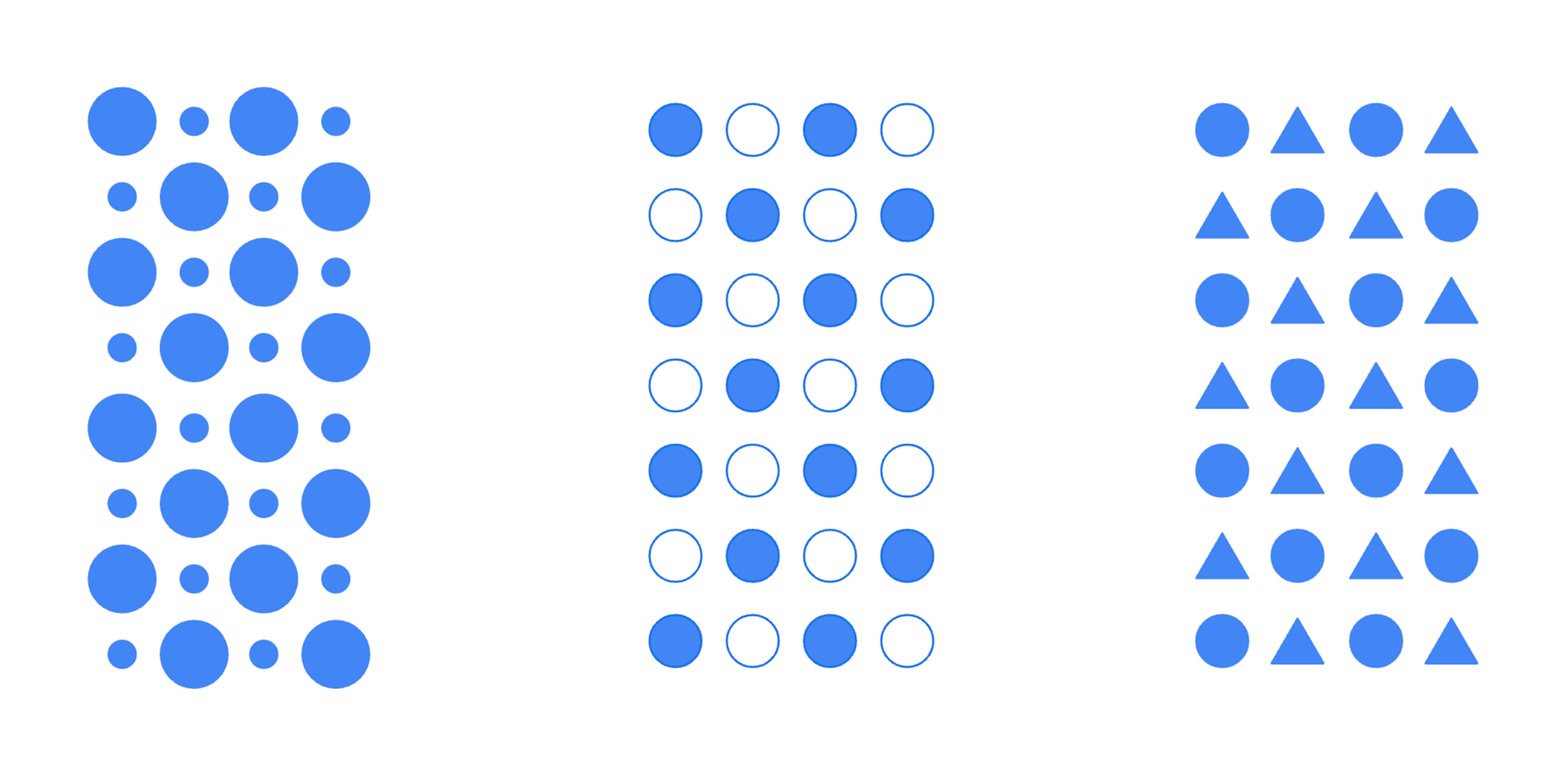
Data visualizations tap into the human visual system's ability to quickly gather and process environmental information. This lets people spot trends, patterns, and outliers at a glance. Visual encodings shape how charts communicate. These include the size of shapes, the presence of fills versus borders, and the use of distinct shape types. Strong visualizations offer a glanceable view of a dataset so large it would otherwise be incomprehensible.
Where Visualization Design Often Fails
Visualizations serve many complex use cases, and choosing the right encodings for each data point takes real care. Designers routinely use color to emphasize key metrics or flag outliers. In that process, the needs of people with vision disabilities are frequently overlooked.
An estimated 300 million people worldwide have color-deficient vision, and the condition affects about 1 in 12 men. Crucially, most people with these conditions do not rely on assistive technology when reading charts. That means the chart itself must be legible without help.
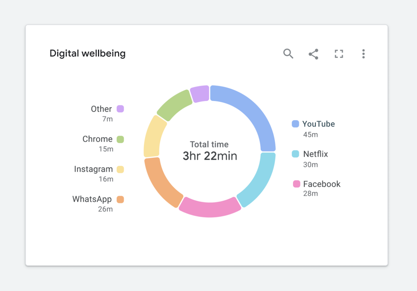
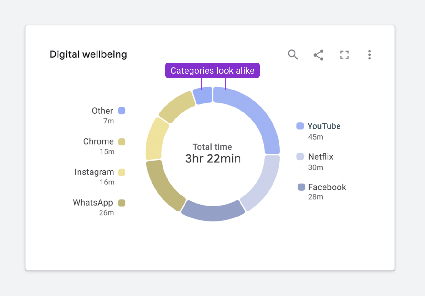
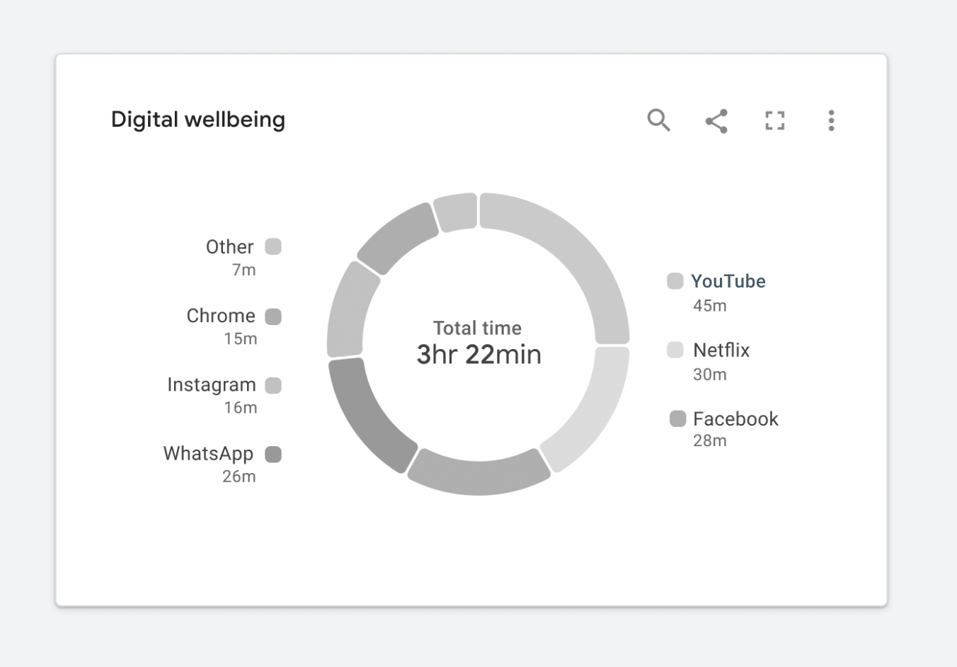
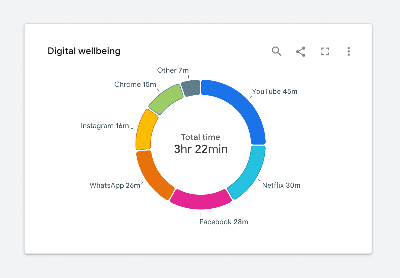
Simulating how that same chart renders for someone with protanopia shows how quickly clarity degrades. The categories for Other and YouTube, positioned at the top of the donut, become nearly indistinguishable. For someone with achromatopsia, the result is more severe: the chart conveys almost nothing. At that point, a simple data table would be more informative than the visual.
Using WCAG as a Design Starting Point
Web standards offer a concrete framework for improving chart design. The Web Content Accessibility Guidelines (WCAG) provide the most comprehensive baseline. Two guidelines matter most for visualization. First, every color must achieve the proper contrast ratio against neighboring elements. Second, visualizations must rely on more than color to carry meaning, typically through a second encoding such as text, icons, images, or patterns.
Contrast Is Harder Than It Looks
WCAG 2.1 level AA requires that graphical elements like lines, bars, areas, nodes, and links hit a minimum 3:1 contrast ratio against their background or adjacent elements. Text needs a stronger 4.5:1 ratio. A palette that satisfies these rules often turns out surprisingly bold.

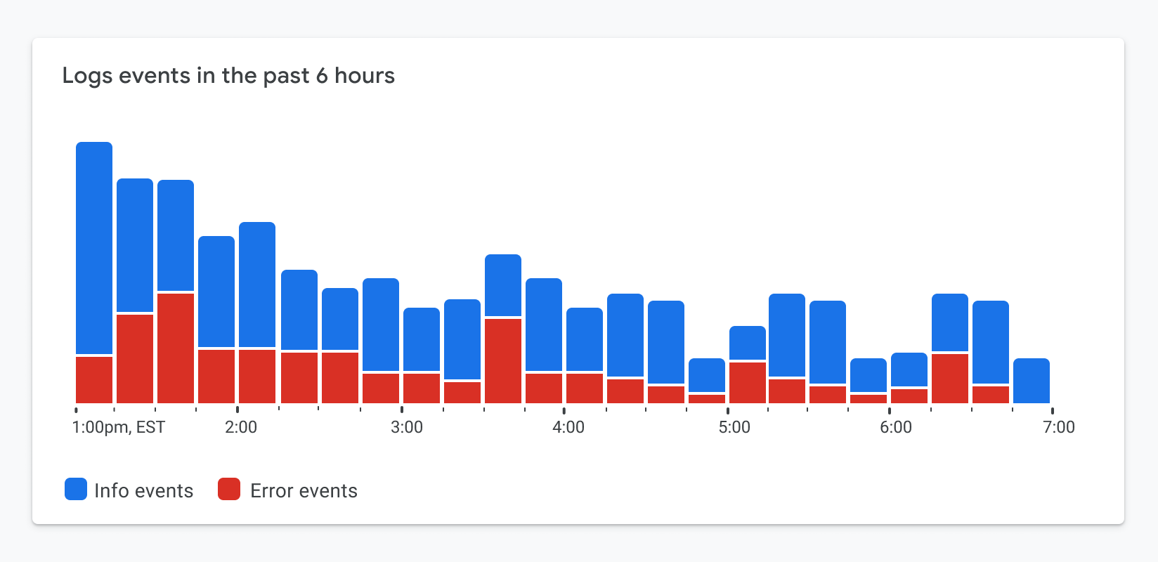
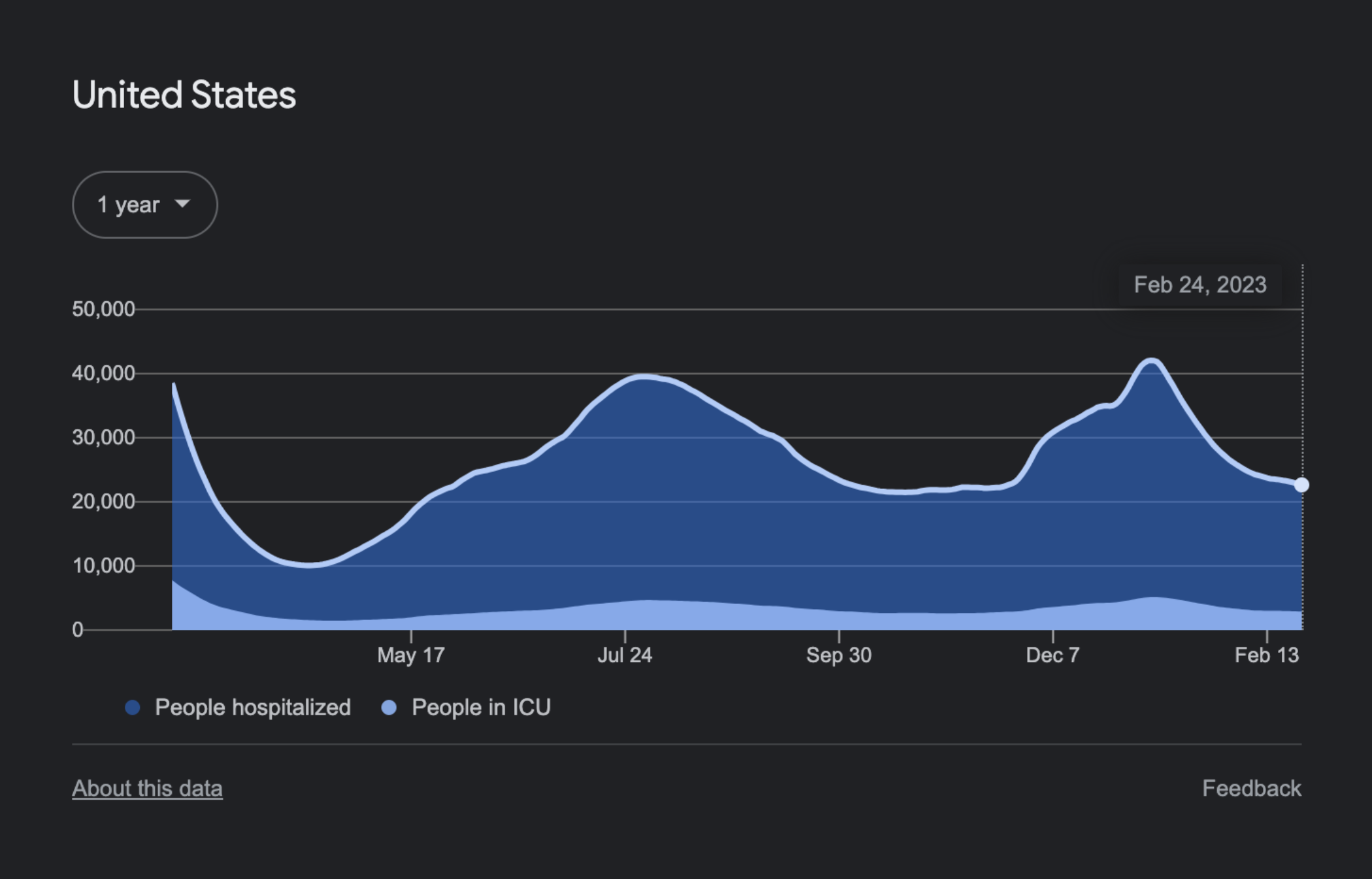
Applying a compliant palette to a stacked bar chart renders it legible, but introduces a new problem. The red segments at the bottom of each bar represent errors that need attention, the chart's core message. With every color competing equally for attention, the visual focal point is lost. The data that matters most no longer stands out.
Patterns Aren't a Shortcut
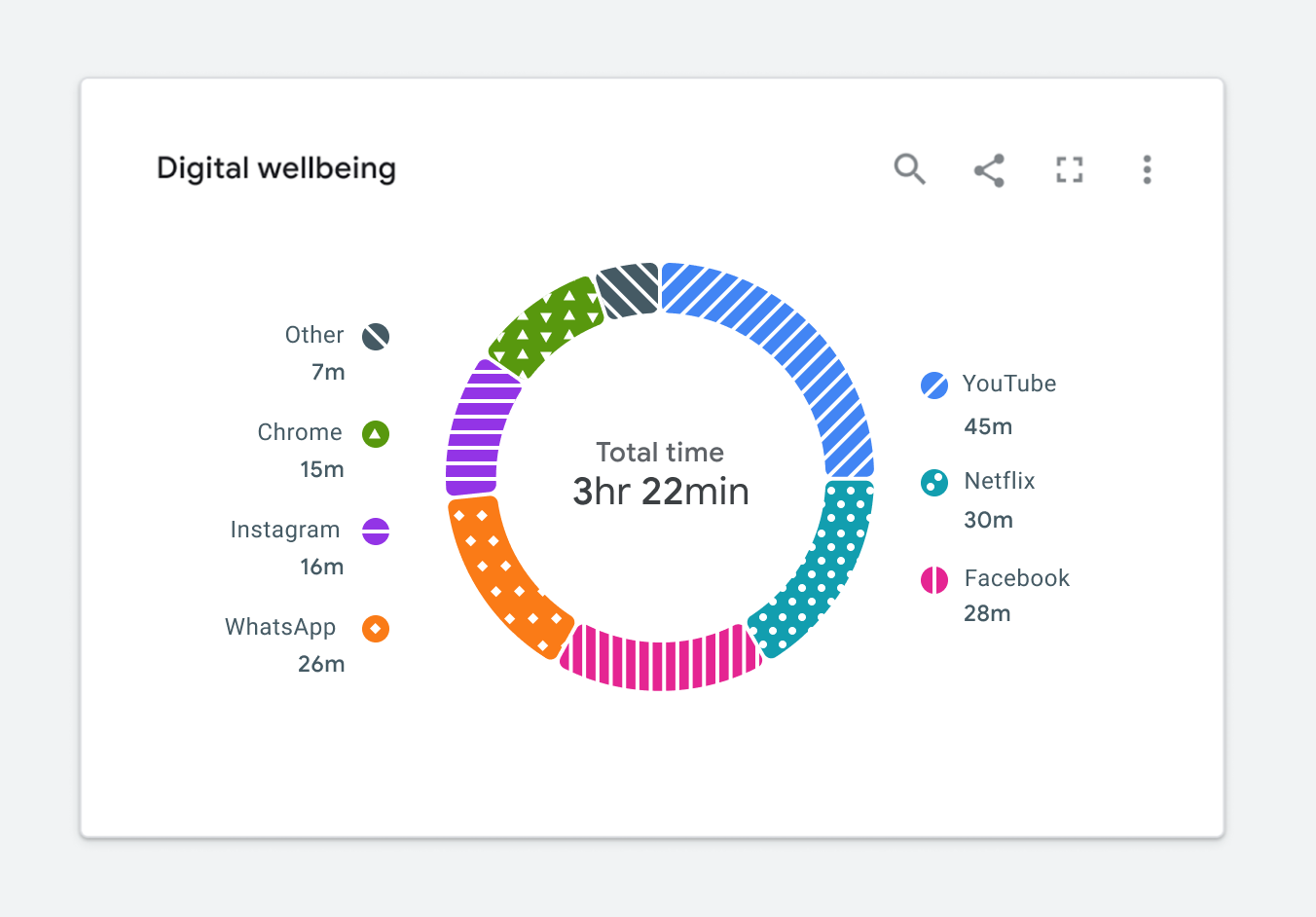
WCAG 2.1 level A also requires conveying meaning through something other than color, such as texture, icons, or text labels. Layering a pattern over a categorical fill seems like the fastest fix. But it often degrades readability further. Tufte's warning about chartjunk applies directly here: patterns layered carelessly can make categories run together, limiting the chart's usefulness rather than enhancing it. The result is a visualization that meets the letter of the standard while failing its true intent.
Accessibility as a Design Driver, Not a Constraint
Google’s Data Accessibility Working Group has found that retrofitting existing charts to meet WCAG requirements tends to produce clutter and reduce usability. A better route is to apply accessibility requirements at the start of the design process. This approach filters out unnecessary decoration before it appears and yields charts that are both compliant and genuinely useful.
Contrast: Knowing Where to Apply the Rules
Color contrast requirements can conflict with glanceability when every element in a chart competes for attention. If a series uses two strong colors, the eye has trouble isolating the metric that matters — for instance, red segments at the bottom of bars that represent failing items.
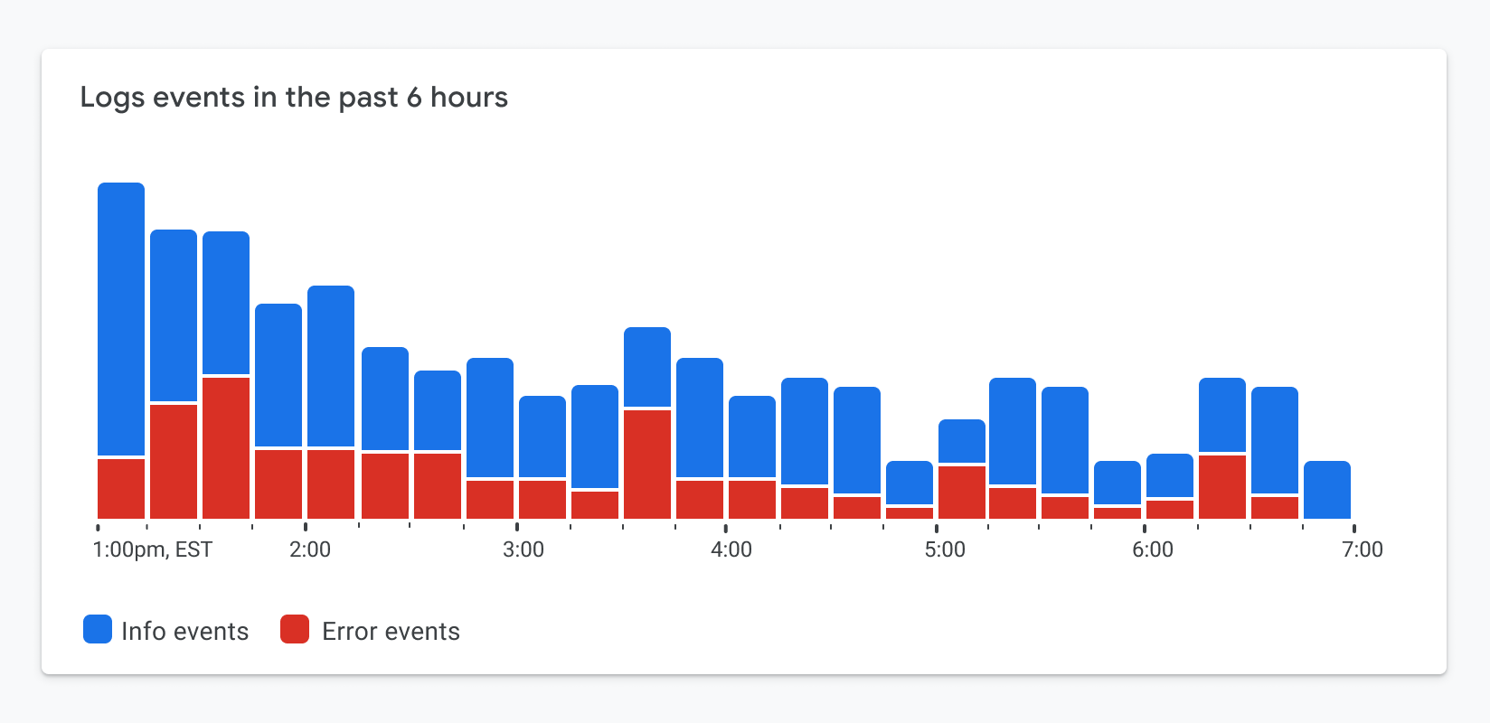
Only the elements essential to interpreting the chart need to meet the contrast requirement. By applying high-contrast borders to the critical portions while keeping other fills lighter, you can pull the viewer’s focus to the important data points without sacrificing legibility.

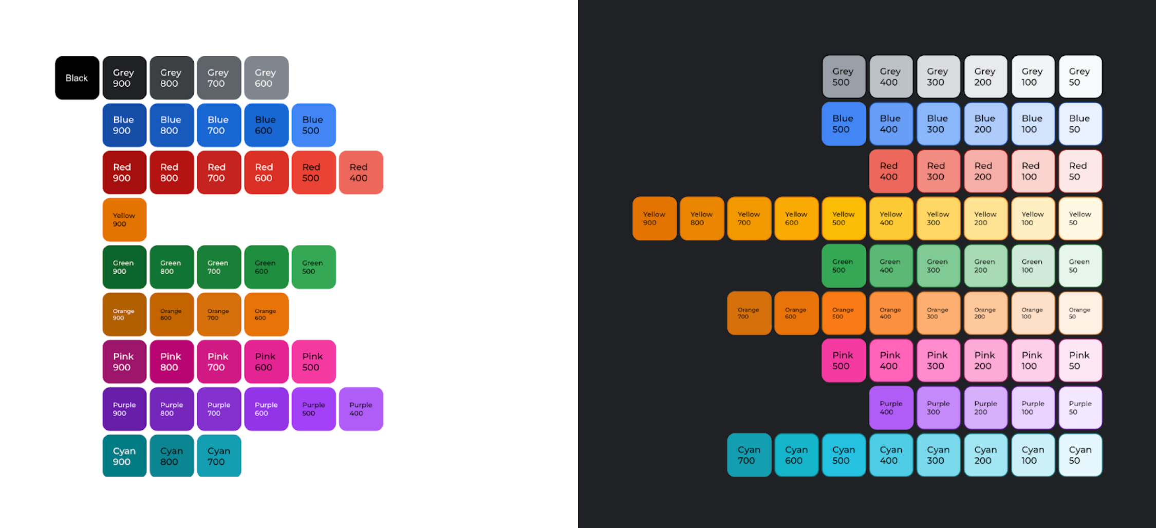
Dark themes are not just visually appealing; they meaningfully expand the range of usable colors. An audit from Google’s working group showed that 61 shades of the 2018 Google Material palette meet the minimum 3:1 contrast ratio on dark backgrounds, versus only 40 shades on white. That 50% increase in available shades gives designers more freedom to emphasize key elements.
Moving Beyond Color: Dual Encodings
Even with proper contrast, a chart that relies solely on color to link segments to a legend remains difficult for many people with vision disabilities. Adding a second encoding — something other than color — is necessary.
Integrating labels directly into the chart is one effective approach. Placing text next to the corresponding segments removes the need for a legend entirely, and the labels themselves serve as the second encoding.
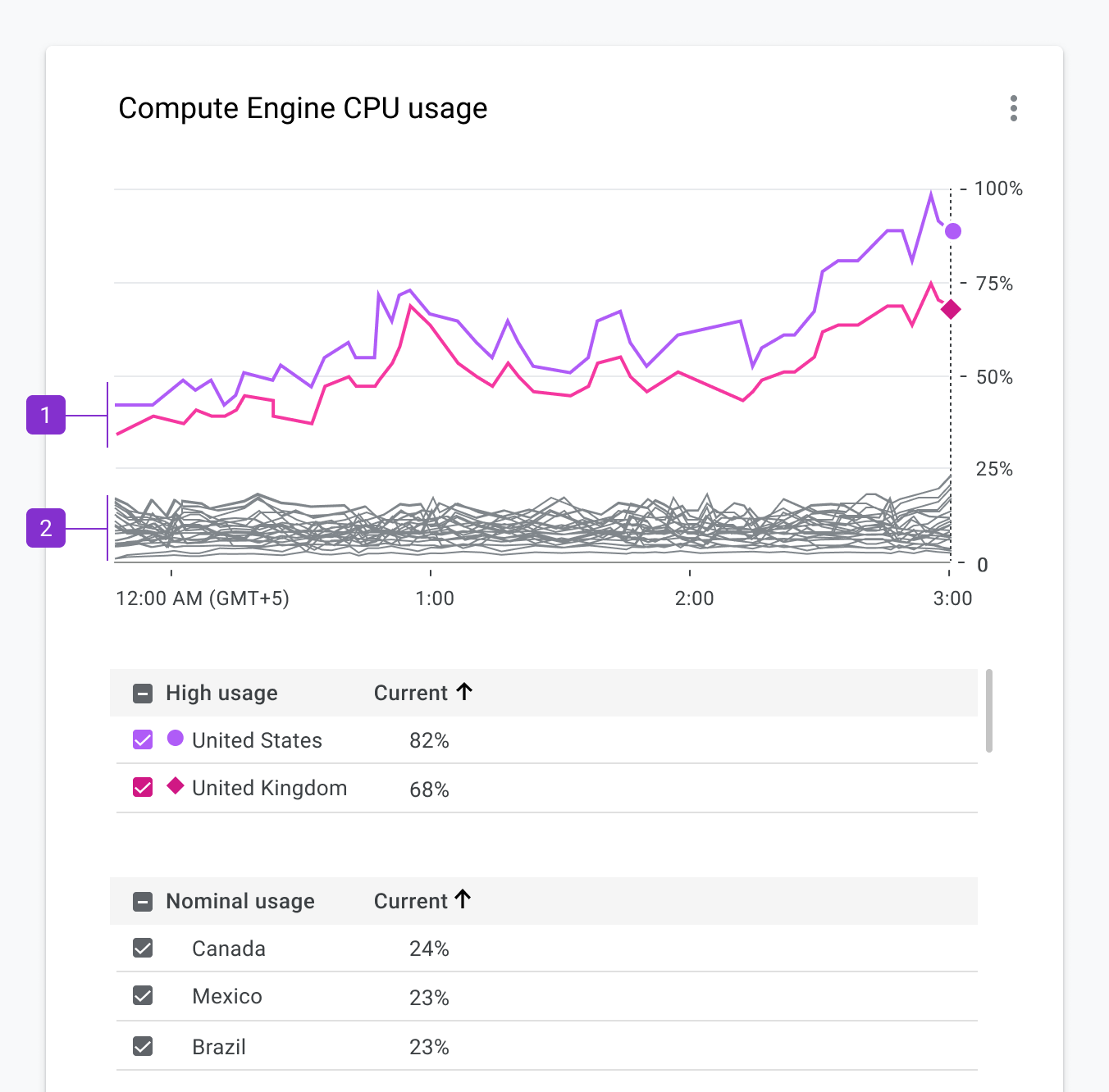
When space is limited, icons can serve the same purpose, provided the number of categories is small. For charts with many hundreds of categories, differentiating every one may not be feasible or necessary. In a multi-series line chart, for example, bright colors can highlight outliers while a neutral gray denotes the nominal categories; a small, distinct set of shapes can then mark the specific series of interest.
Simpler Structures: Small Multiples and Sparklines
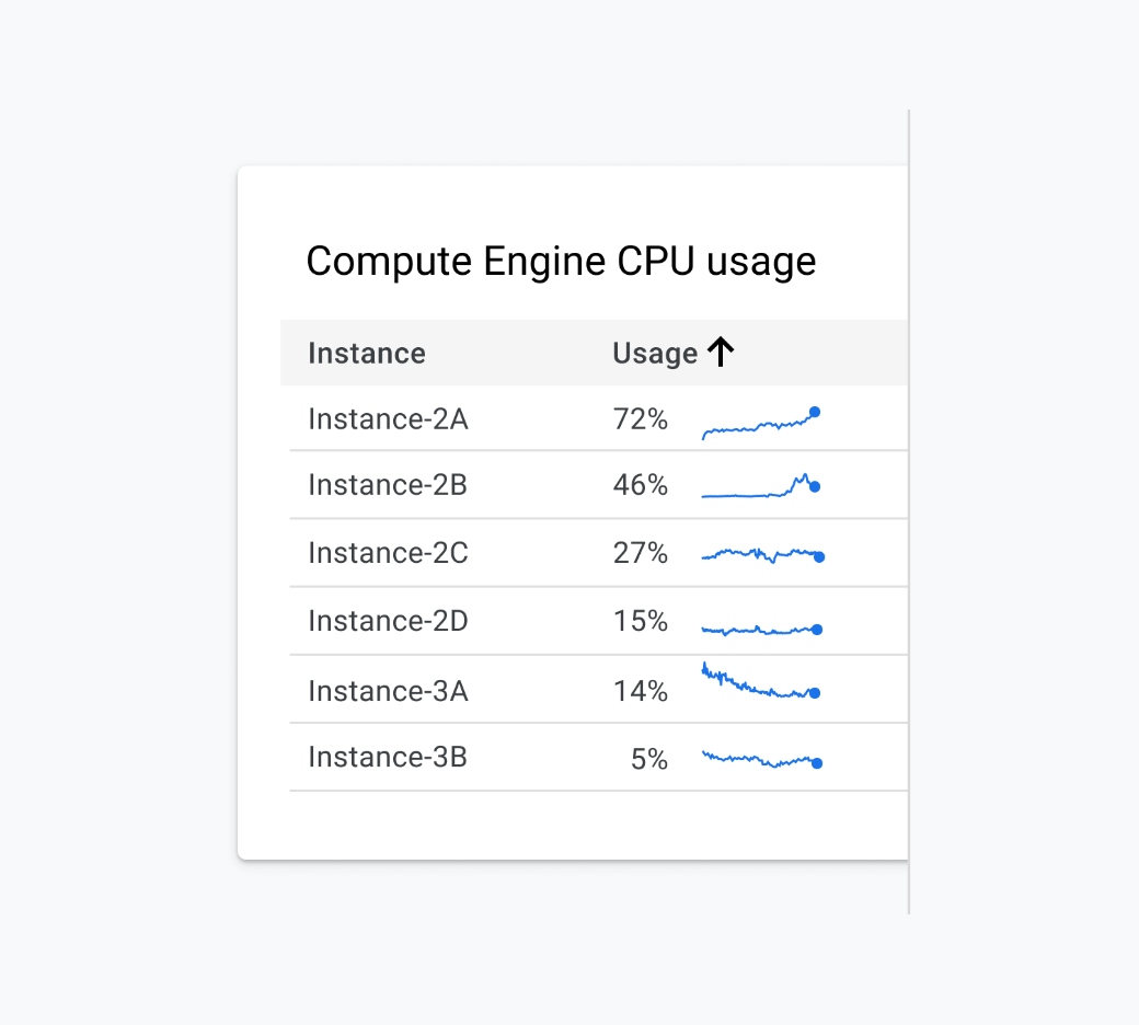
When every category matters and must be distinguishable, a single dense chart becomes a liability. Breaking it into small multiples or sparklines removes the dependence on color entirely. Each sub-chart gets its own label and trend line, making the data legible to more people and, arguably, to everyone.
Status, Focus, and Interaction
- Reserve fills for what needs attention. Using filled shapes only for items that are in a particular state — like errors — helps those items stand out without relying on red/green distinctions. This pattern is more scannable for sighted users and was co-designed with colorblind customers.
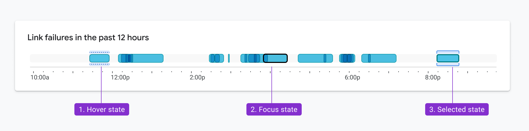
- Interaction states count too. Hover, selection, and keyboard focus need the same contrast considerations. In one bar chart pattern, states were indicated with elements placed above and below each bar, so those indicators only needed to meet contrast ratios with the background, not the bar fill. This also allowed hover and selection states to display simultaneously without violating requirements.
Finding Inspiration Where You Least Expect It
The most challenging design problems sometimes benefit from outside influences. The working group points to examples drawn from nature, halftone printing, and architecture for rethinking how to show complex data relationships — such as cloud moisture effects on network performance or the grouping and flow of categories into a donut chart.


Animation can be a powerful tool in these patterns, but it introduces its own accessibility concerns and requires timeouts or stop controls.
Bringing Teams Along
A design that meets accessibility requirements does not always look as polished as a non-compliant alternative, which can invite criticism. Evangelism is essential: sharing examples, like those above, is a direct way to build empathy for people with vision disabilities.
But communication is a one-way street. Momentum builds faster when colleagues are invited to participate — in brainstorming, design reviews, or co-design sessions. Participating in the process helps them understand the challenge and often yields champions who will voluntarily invest time in building demos, prototypes, and research repositories.
There is also a business case. Pointing to regulations such as Section 508 in the U.S. or the European Accessibility Act is a practical way to secure funding and keep accessibility on your product roadmap. Once you have leadership support and internal advocates, you are positioned to start building.
Accessibility-First Chart Design Pays Off for Everyone
Treating accessibility as a compliance checkbox — something to bolt on at the end or bury in a settings menu — misses the point. When accessibility is considered from the start of a chart’s design, WCAG requirements stop feeling like constraints. They become useful guardrails that clarify decisions about color, contrast, and visual hierarchy, making the end result better for all viewers, not just those with disabilities.
The designs discussed in this piece were refined over a three-year period, informed by real-world testing and iteration. The resulting patterns have been validated for common chart types and can be adopted directly to save design and development time. An accessibility-first workflow tends to produce visualizations that account for the varied ways people perceive, process, and retain information — leading to clearer communication overall.
Recommended Reading and Tools
For those looking to deepen their understanding of accessible data visualization, the following references are a practical starting point.
Getting started
- Google’s Top Tips for Data Accessibility
- Color and contrast: A guide to the theory, science, and perception of color and contrast.
- Introduction to accessible contrast and color for data visualization: A series of notebooks covering the use of contrast and patterns to distinguish marks.
ACM
Contrast checking tool
WCAG requirements
Material design best practices and specs
- Accessibility with Material 3
- “Google’s Six Principles for Designing Any Chart,” Manuel Lima
- Data Visualization in Material Design
The research and examples in this article are the result of collaborative work by Andrew Carter, Ben Wong, Chris Calo, Gerard Rocha, Ian Hill, Jenifer Kozenski Devins, Jennifer Reilly, Kai Chang, Lisa Kaggen, Mags Sosa, Nicholas Cottrell, Rebecca Plotnick, Roshini Kumar, Sierra Seeborn, and Tyler Williamson, whose contributions advanced the field’s understanding of accessible chart design.


