

A Designer Who Looked Twice at Ordinary Things
Saul Bass occupies a singular spot in design history. His title sequences for films like North by Northwest and Anatomy of a Murder, along with his posters and corporate logos, shaped how visual media introduces a story. Martin Scorsese said Bass’s work “distilled the poetry of the modern, industrialized world.” That poetry has shifted from celluloid to screens, but the thinking behind it transfers cleanly to the web.

The web is a faster, louder medium than film credits ever were, yet Bass’s core habit — taking objects so familiar we stop seeing them, then presenting them so we understand them freshly — is exactly what good interface work asks for. His method was about making the ordinary extraordinary. On the web, that means looking at the components we take for granted. Homepage splashes get the attention, but buttons, signup forms, and legal disclaimers carry just as much potential for craft.
Bass’s reputation rests partly on transforming what had been a dull obligation into an art form. Before him, film titles were a static hurdle between audience and movie. He made them set the tone for everything that followed, based on a simple conviction:
“Design is thinking made visual.”
— Saul Bass
Color as a First Impression
Bass said audience involvement with a film should begin with its first frame. A website is no different: visitors register its palette and arrangement before processing a single word of content. Strong content needs a worthy canvas.
His palettes are instructive in their restraint — typically no more than three or four colors, chosen for maximum impact. Red, white, and black was a go-to combination for good reason: it is striking without being loud, vivid without being noisy. Bright color doesn’t have to mean shouting; often it simply means presence.
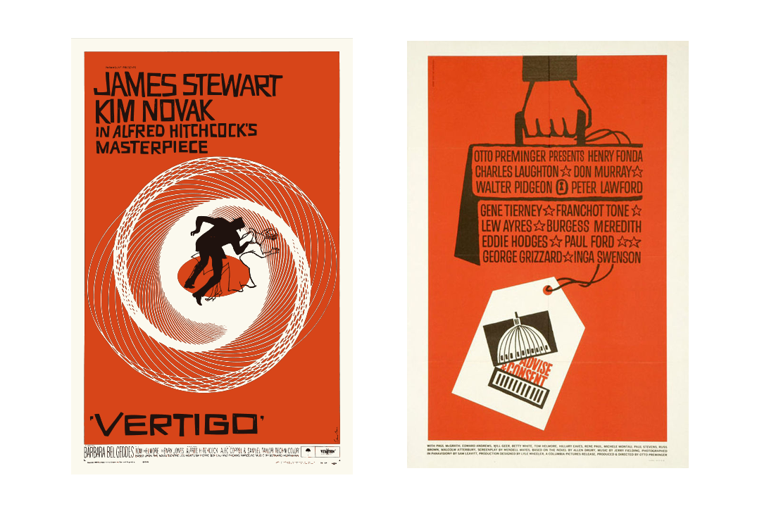
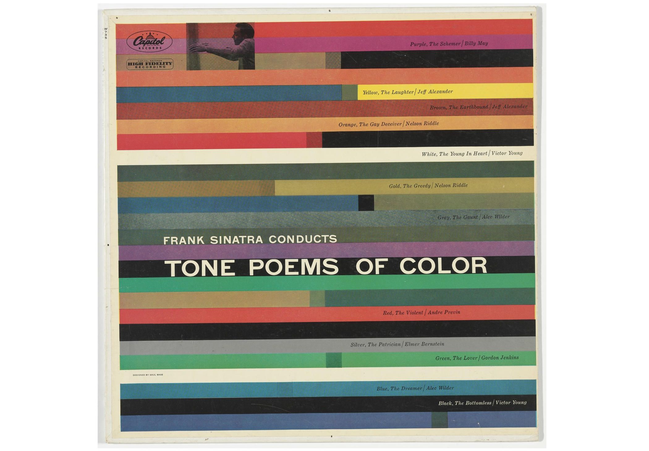
For the web, the lesson is not merely “use bright colors.” It is to study color theory, then apply it deliberately and boldly. A well-chosen palette sets a tone before visitors consciously register what they are looking at. The Holiday Center for Working Youth’s website offers a contemporary example of the Bass approach: bold shapes and saturated blocks in service of a simple functional message, like a mid-century film poster rendered as an interface.
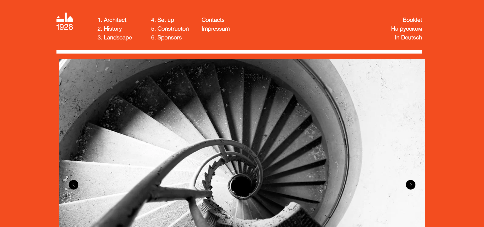
Red, white, and black isn’t always the answer, even if it is an exceptionally sharp one. The right combination depends on the story being told. Color is a powerful tool that often goes underused in today’s white-space-heavy web.
Words That Move
Typography, like color, carried a distinctive Bass signature. Rough, hand-drawn, almost always all-caps, his lettering made words forceful without being domineering. That philosophy translated to what Art of the Title calls his “kinetic typography” — type that has motion and energy on screen.

Fonts carry meaning beyond their literal content: they communicate tone, structure, and personality. Paired with a strong color scheme, lively typography can give copy room to breathe and move.

Copywriter Jon Ryder’s personal website is a fine modern parallel. Through bold type and color, clicking through prompts causes the copy to rearrange and revise itself — a genuinely kinetic reading experience that feels like a natural heir to Bass’s experiments. When selecting fonts it’s worth keeping his spirit in mind. Arial and Times New Roman do a job, but with the current range of free fonts and CSS techniques, giving words more life is easier than ever.
Drawing Before Building
Bass was adamant about hands-on drawing as part of the design process. “Learn to draw,” he advised aspiring designers. “If you don’t, you’re going to live your life getting around that and trying to compensate for that.” It mattered to him as a way of thinking — a fast path from idea to tangible form.
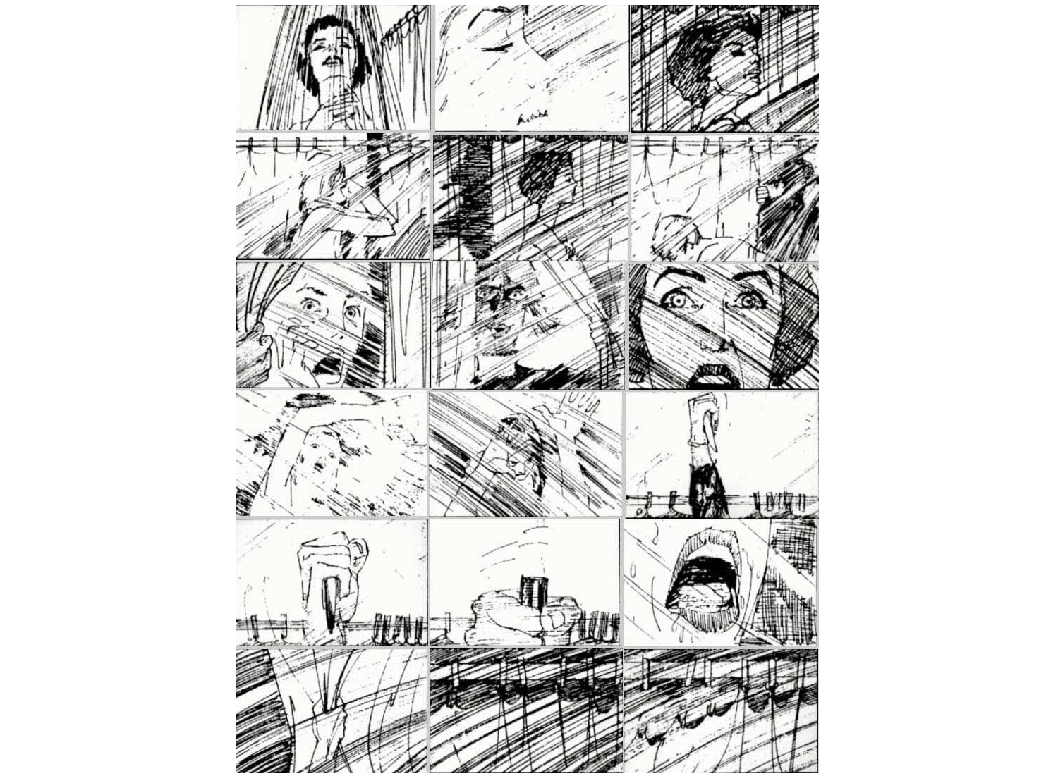
For a web designer, this principle holds beyond the medium. Sketching a page layout, wireframe, or icon by hand bypasses presets and tools; there’s only the idea. The New York Times still begins each front page with a hand-drawn pencil sketch before any software gets involved. Designers of every stripe — whether the artifact is an interface or a newspaper — think with their hands first.
Borrowing from Everywhere
Labels never stuck to Saul Bass. He moved between graphic design, film, photography, and architecture as if they were one continuous practice. That was temperament as much as circumstance. Many web designers discover the field demands the same kind of synthesis by default.
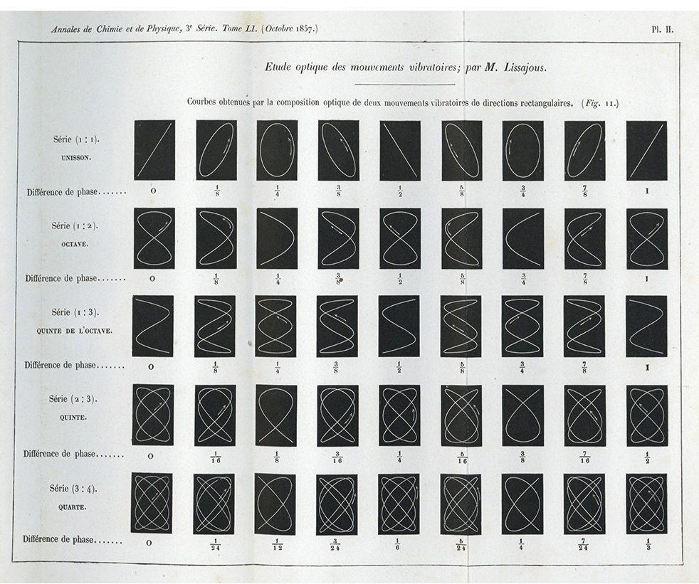
That cross-pollination led directly to iconic results. Bass’s spiral for Vertigo originated years earlier, when he encountered diagrams by 19th-century French mathematician Jules-Antoine Lissajous. When Hitchcock asked him for title work, the idea clicked. Mathematical theory became cinematic iconography.
Specialization matters, but so does leaving it behind now and then. Web work already overlaps with engineering, UX, data, copywriting, ethics, and law. Cultivating that broad curiosity is not just allowed; it is how the next Vertigo poster — or whatever the web equivalent turns out to be — gets made.
When the Client Pushes Back
Bass was a master of his craft, but he was not infallible — nor did he pretend to be. His work on The Shining with Stanley Kubrick is a case study in productive collaboration. The pair cycled through hundreds of poster drafts, with Kubrick offering notes that were often as polite as they were pointed: “beautifully done but I don’t think any of them are right.”
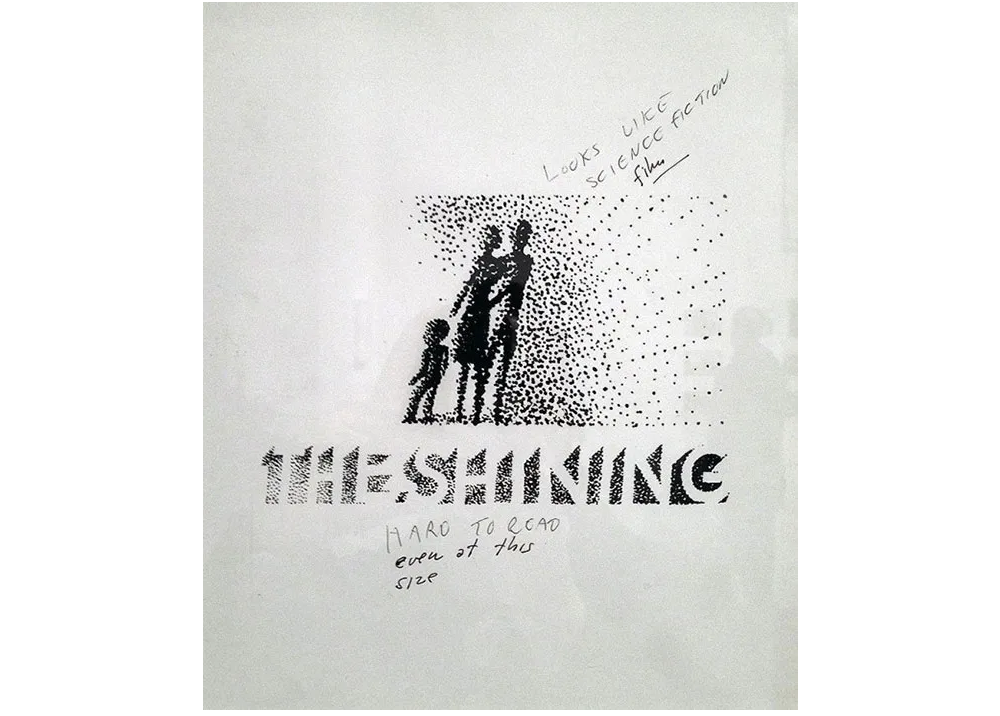
Bass’s willingness to persist through those iterations speaks to a larger truth about design work. You can hold strong convictions and still remain open to input. In the corporate world, that balance is hard to strike, but it is essential. The client is not always right, but they are also not always wrong. The magic happens when ego steps aside and the mutual goal — a better piece of work — takes priority.

Trusted feedback is one of the few reliable accelerants for creative quality. When insecurities are set aside, iteration becomes a dialogue rather than a negotiation.
Beauty Is Its Own Justification
Bass’s career is proof that corporate constraints do not preclude beautiful work. Decades later, his film posters and logos still feel vivid, precise and, above all, deliberate. He argued for craft in everything — from a title sequence to a home page — because he refused to let commercial context dilute the standard.
His own words capture the philosophy best:
“I want everything we do to be beautiful. I don’t give a damn whether the client understands that that’s worth anything, or that the client thinks it’s worth anything, or whether it is worth anything. It’s worth it to me. It’s the way I want to live my life. I want to make beautiful things, even if nobody cares.”
That ethos extends directly to web design today. Color choices, typography, motion, micro-interactions — none of these have to be purely utilitarian. There is room for audacity, curiosity, and a little delight for its own sake.
Further Reading
- Interview With Björn Ottosson, Creator Of The Oklab Color Space
- Mastering Typography In Logo Design
- The Principles Of Visual Communication
- Learning JavaScript With Imagination



