

Design Lessons From a Master of Process Color
Bradbury Thompson wasn’t the most famous designer of the twentieth century, but his influence on print and, by extension, modern web design is hard to overstate. Born in Kansas in 1911, Thompson studied at Washburn College in Topeka, where he designed the college yearbooks. After graduating, he spent five years at Capper Publications, a local printing company. That first job as a printshop junior wasn’t glamorous, but it gave him a working knowledge of design and printing techniques that would shape his entire career.
Kansas in the 1930s wasn’t a creative hub, so in 1938 Thompson traveled the 1,200 miles east to New York City. Remarkably, one of his first projects was designing the 1939 World’s Fair catalogue for Rogers-Kellogg-Stillson, the printing firm that produced it.
Thompson was then assigned to Westvaco Inspirations for Printers, a series of promotional booklets published to showcase Westvaco Corporation’s line of printing papers. Each issue was just sixteen pages, but it offered Thompson a rare opportunity for experimentation. The publication had been around since the 1920s and reached an audience of 35,000 agencies, museums, printers, schools, and universities.
There was no budget for original artwork or photography, but Thompson treated that constraint as a creative challenge rather than a limitation. He described himself as “one of the best scroungers in my profession,” borrowing printed plates and separations from agencies, magazines, and even museums. He combined historical photographs and illustrations with contemporary typography and modern process colors. For Victory, a 1953 spread, he integrated arrow illustrations into targets made from solid colors. He ultimately designed over 60 editions of Inspirations.
During World War II, Thompson designed the final issues of two wartime magazines, Victory and USA, published by the Office of War Information. In 1945, he became art director of Mademoiselle magazine, a role he held for fifteen years. With a budget for the first time, he commissioned up-and-coming artists including Andy Warhol, Joan Miró, Willem de Kooning, and Jasper Johns to illustrate fiction pieces. His career also spanned more than thirty other magazines, including Business Week, the Harvard Business Review, and Smithsonian.
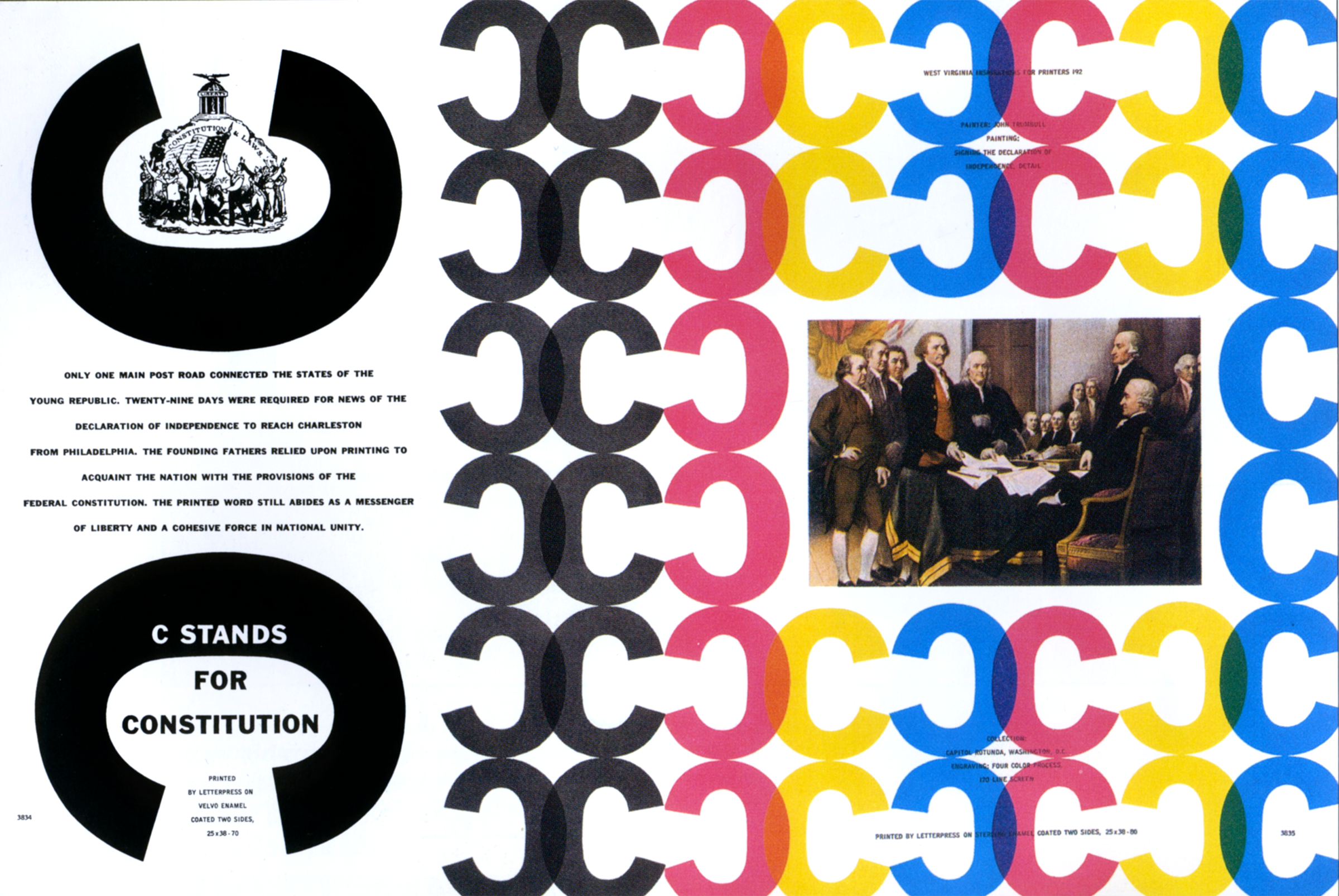
Thompson’s industry recognition included the National Society of Art Directors of the Year Award in 1950, the AIGA Medal in 1975, induction into the Art Directors Club Hall of Fame in 1977, and the Frederic W. Goudy Award and Type Director’s Club Medal during the 1980s.
Type as Tool, Toy, and Teacher
From his earliest work in Topeka, Thompson was a meticulous designer who paid close attention to typographic detail and to the precise cropping and placement of images. His use of simple palettes of process colors alongside black-and-white historical illustrations and geometric forms made his work feel both classic and contemporary.
“Type is a thing of constant interest to me. In short, type can be a tool, a toy, and a teacher. It can provide a means of livelihood, a hobby for relaxation, an intellectual stimulant—and a spiritual satisfaction. I believe an avid interest in type necessarily includes a zest for everyday life.”
— Bradbury Thompson
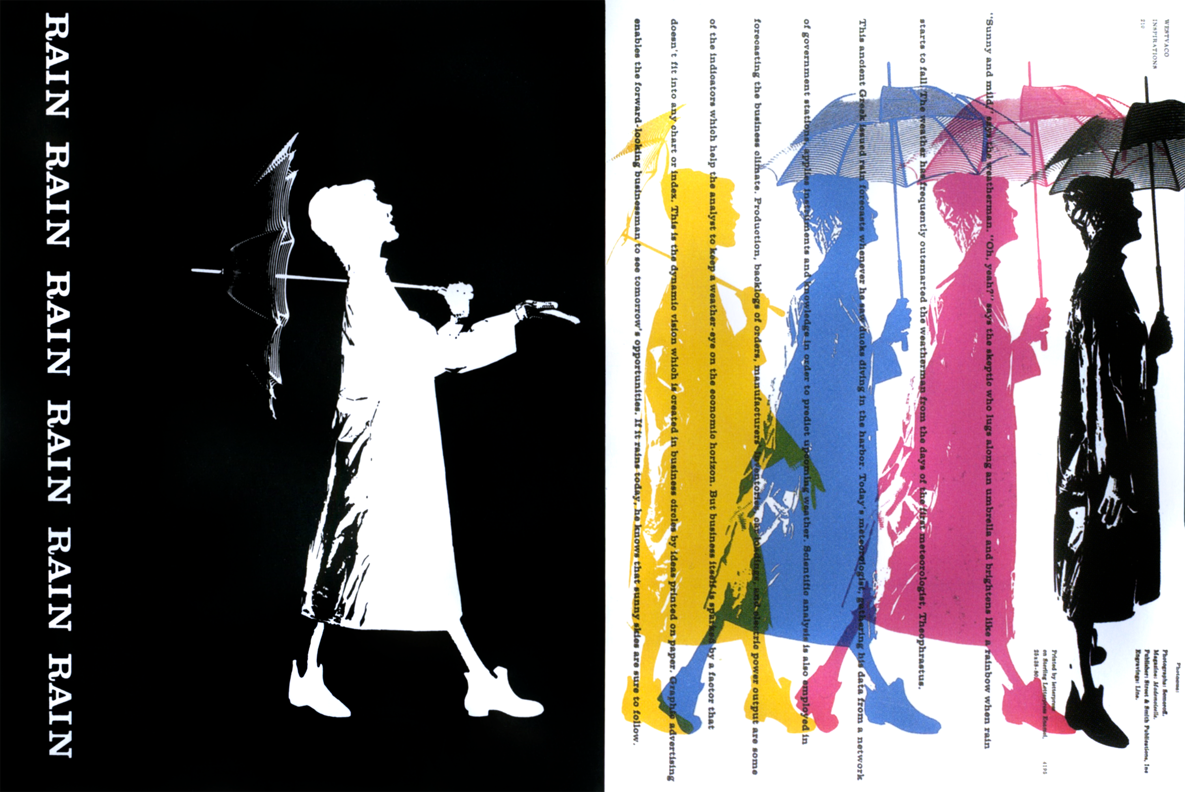
Typography, like architecture, blends beauty with functional utility. Thompson’s designs often paired unusual typographic arrangements with colorful shapes. For Rain, Rain, Rain, a 1958 Mademoiselle spread, he reproduced the same figure wearing a raincoat and carrying an umbrella as five colored silhouettes. In Futural, a 1962 Inspirations spread, he mirrored simplified shapes of airplanes across pages, using line-work on the verso and solid colors on the recto, and often overprinted his colorful shapes to add depth.
Separating Color for Screens
Thompson’s experience with printing technologies led to signature designs built from just four process colors. In offset printing, process colors are percentages of cyan, magenta, yellow, and key (black) inks, or CMYK. Four-color printing can produce a wide range of colors, but Thompson’s best-known designs often use these colors in their purest form, separated and printed in different areas of the composition.
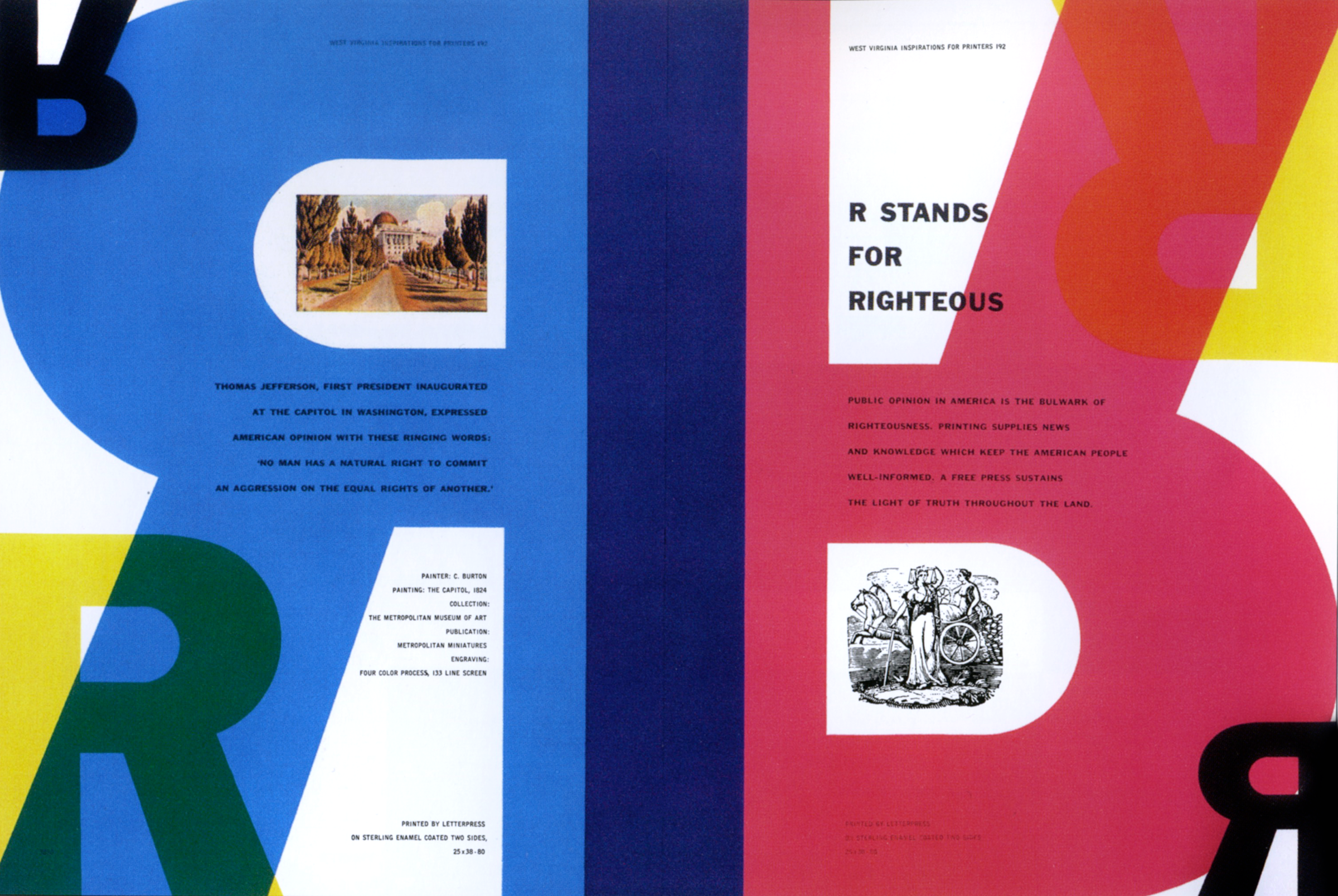
Web designers work with the RGB model, but separating red, green, and blue in the way Thompson separated CMYK components can produce equally inspiring screen designs.
A Lifelong Teaching Career
From 1956 until his death in Connecticut in 1995, Thompson taught graphic design at Yale University’s School of Art. His artistic autobiography, The Art of Graphic Design, was published in 1988. The New York Times Book Review praised it as a book in which “art and design are gloriously and daringly mixed,” a fitting description of his design approach as a whole. Original hardcover copies are now prohibitively expensive for collectors, but reprinted paperbacks are available at more realistic prices.
From Palette To Layout
Building this Thompson-inspired piece begins with content and choosing semantic HTML elements. Supporting only a handful of components — a header, article, aside, plus two figures — the design gets grounded with foundational styles: a deep blue background, white serif text, italic headlines, and sizing for headings and paragraphs. Captions inherit the green accent and italic treatment to echo the headline.
Working with CMYK-inspired process colors for the screen requires mapping to RGB. To approximate cyan, magenta, yellow, and black in RGB, set two of the red, green, and blue channels to their maximum values; adding black softens the result if it proves too vivid.
Space And Structure
Even on compact displays, reserving empty space lets the eye travel. Margins and padding typically supply the required breathing room, while capping the maximum width of certain graphics introduces whitespace and interest to small-screen layouts.
Medium-size viewports free enough room for the first layout styles. Splitting the running text into two columns keeps the measure consistent, and pairing the two figures side-by-side preserves their relation to the text. A five-column symmetrical grid on the body element governs the page, reinforced by a background image anchored to the right of the layout.
Both header and article get placed directly on the grid by toggling their display to contents, effectively stripping them from layout calculations. Using line numbers positions each content block:
- The Ford logo takes a single column, its maximum width removed since the column width now dictates its size.
- The banner — a Transit van profile — and main headline share the first four columns.
- Leaving the first column empty indents the main and aside from the left, while matching their widths to the banner creates a deliberate asymmetry.
Although the figures aren’t adjacent in the HTML, CSS Grid lets them pair into different columns on the same row with no markup changes. Indentation, rather than paragraph spacing, keeps the text as solid blocks — a technique that stands out even more in multi-column settings.
Caption Placement With Flexbox
Figure containers can hold one or more captions and images. Captions don’t have to sit below their pictures; with Flexbox, they can align above, to the left, or right, giving any design immediate magazine credibility. Reversing the flex-direction of the first figure brings its caption to the left. Vertical stacking is equally simple — setting the cross-axis alignment to flex-end lines captions up flush with the bottom edge of their images. A finishing touch orients the two captions in opposite directions for visual tension.
Asymmetric Design With A Compound Grid
Additional whitespace on larger screens pushes this layout into more distinctive asymmetry. A compound grid — the overlap of a four-column and a six-column scheme — generates a rhythmic 2|1|1|2 pattern, which transfers to fr units applied to the body columns. Four rows drawn from pixel, rem, and intrinsic sizing stitch together an exact structure, floored to fill the viewport height. Two data URI background images overlay, sized to remain contained on screen.
Structural placement follows line numbers, deliberately raising the headline above the banner image in the stacking order. Main content claims the last two columns, creating a distinct island on the right-hand side of the composition. The figures find their positions on the same grid: the first vertically oriented with its caption above the image, the second arranged horizontally with content resting on the baseline. Alignment fine-tuning leaves the piece fully resolved.
Complementary Header System
This layout’s complexity hides a simpler markup footprint — just header, main, and aside. Inside the header, nine separate Transit van images in complementary colors make up the visual centerpiece. They could be a single large file, but individual images support responsive arrangements: a scrolling panel on phones, a flexible grid on larger viewports. Both main and aside contain a headline, an exploded parts SVG, and divisions primed for column layout.
Styling starts with a dark grey body background and tailored headlines or paragraphs. Unlike simpler projects that flow naturally until larger screens, this one adopts layout styles from the outset. The header becomes a horizontal scrollable panel via flex and overflow properties:
header { display: flex; overflow-x: scroll; }Main content pieces — the image and text — respect a defined geometry: the first column in the arrangement holds the two-column layout for main, with the SVG limited to 100px in the right column. Grid lines don’t need numerical references when named lines communicate intent, grounding each child in the right slot. The aside mirrors that arrangement with its slim column on the left, a top border distinguishing it from main:
- Main structure — text flexibly fills in on the left with the image right-aligned.
- Aside structure — column flip makes the narrow graphics column lead at the left.
Grids Beyond Small Screens
Not every small layout requires a single column. The changing viewport opportunity for tablets introduces richer header behavior. A three-column symmetrical grid presents all nine van images cleanly. There’s no manual positioning needed — the auto-placement slots every image in sequence. Setting grid-auto-flow to column rather than the default row flips insertion to vertical travel before wrapping to the next column.
Once medium screens open up more page width, the content hierarchy re-aligns: the main element goes from two to four columns, content flush to the end so a solid central block emerges. grid-row numbers let the headline — first in the markup — sit below the text and visuals:
- The first content division hugs the left column.
- A second block stretches across two columns to the right.
- A final division holding the SVG slots into the second column.
Asymmetric placement carries into the the aside, with row numbering again repositioning its headline underneath running content.
A Two-Page Spread At Desktop Scale
Wide displays enable what would be a magazine’s full-page photographic spread. A two-column symmetrical body grid borrows bookbinding language, naming the left verso and the right recto — derived from the Latin for folded leaf pages folium versum and folium rectum. The header populates the left, effectively the spread’s image leaf. The main/aside chunks stack as content on the recto side.
A long measure harms readability on ultrawide monitors. Turning the text flow over into automatic multi-columns resolves that: declaring no count but column width, the browser builds 10em-wide columns across whatever space exists, keeping reading line lengths comfortable at any display scale.
Scalable Type Masked With SVG
SVG brings the same creative typographic possibilities to the web that Bradbury Thompson explored in print, with none of the accessibility or performance compromises. This design pairs SVG text with CSS masks and shapes, marked up with just one header and one main element.
<header>
  <div>
    <svg>…</svg>
  </div>
<header>

<main>
  <svg>…</svg>
</main>
Foundation styles first: a deep blue page background with white text establishes the contrast that makes this graphic pop.
body {
background-color: #1f455e;
font-family: 'sans-serif';
color: #fff; }
A scalable graphic in the header shapes repeating text with the outline of a Transit van. SVG offers its own clipping mechanism: a clipPath element holds a path defining the visible region. Giving the clip path a unique id lets us reference it later in the markup.
<svg>
  <clipPath id="transit">
    <path>…</path>
  </clipPath>
</svg>
Next come the coordinates forming the graphical text — brightly colored paths wrapped in a group with a class attribute we can bind to the clip path.
<svg>
  <clipPath id="transit">…</clipPath>
    <g class="transit">
      <path>…</path>
    </g>
</svg>
Whether the SVG sits in an img element or is embedded inline, the CSS clip-path property applies the graphical region defined by the clip path:
<style type="text/css"><![CDATA[
.transit {
-webkit-clip-path: url(#transit);
clip-path: url(#transit); }
]]></style>
clipPath shows only areas inside the clipping path; anything outside stays invisible. But masks offer a different route that works with any content, not just SVG. CSS masks hide portions of an element using a black-and-white mask image.
header div {
-webkit-mask-image: url("mask.svg");
mask-image: url("mask.svg"); }
Applying a mask keeps only the parts of the element falling under the mask's black areas. The rest disappears.
CSS mask-image shares much with CSS background: masks can be positioned, repeated, sized, and built from gradients. Since this mask doesn't need to repeat, its value is set to no-repeat, just as a background would.
header div {
-webkit-mask-repeat: no-repeat;
mask-repeat: no-repeat; }
The main element wears entirely different SVG content — brightly colored lines spelling out the Transit van's pedigree. Each line is wrapped in a tspan element with its own x and y coordinates, packing the text into a tight, solid block.
<svg>
<text>
<tspan x="0" y="86">BUILT AS A PASSENGER VAN, MINIBUS, </tspan>
<tspan x="0" y="156">CUTAWAY VAN CHASSIS, AND A PICKUP </tspan>
<tspan x="0" y="226">TRUCK. OVER 8,000,000 TRANSIT VANS </tspan>
<tspan x="0" y="296">HAVE BEEN SOLD, MAKING IT THE THIRD </tspan>
<tspan x="0" y="366">BEST-SELLING VAN OF ALL TIME.</tspan>
</text>
</svg>
SVG text elements style like HTML text. Emphasizing block solidity calls for a heavy condensed sans-serif, with tracking tightened by reducing letter spacing to -2px.
text {
font-family: 'sans-serif-condensed';
font-size: 83px;
font-weight: 700;
letter-spacing: -2px; }
Pseudo-class selectors work in SVG as effectively as in HTML. nth-of-type gives each line of tspan text its own color.
tspan:nth-of-type(1) {
fill: #c43d56; }

tspan:nth-of-type(2) {
fill: #f2c867; }

tspan:nth-of-type(3) {
fill: #377dab; }

tspan:nth-of-type(4) {
fill: #fff; }

tspan:nth-of-type(5) {
fill: #c43d56; }
The solid typographic block makes a strong standalone header, but adding a paragraph on the van's production history turns it into a fuller layout.
<header>
  <div>
    <svg>…</svg>
  </div>

  <p>…</p>
</header>
Foundation styles give the paragraph a font size and set it in uppercase to echo the SVG.
header p {
font-size: .91rem;
text-transform: uppercase; }
Text is justified for browsers supporting automatic hyphenation.
@supports (-webkit-hyphens: auto) or (hyphens: auto) {
header p {
-webkit-hyphens: auto;
hyphens: auto;
text-align: justify; }
}
On small and medium screens, the paragraph simply follows the SVG in the document flow. On larger viewports, the header graphic gets an explicit viewport-based width and a float so the text wraps around it with CSS Shapes. Reusing the mask image for the shape-outside URL keeps the wrap shape aligned with the visible graphic.
@media (min-width: 64em) {

header div {
float: left;
width: 65vw;
margin-bottom: 0;
shape-outside: url(mask.svg);
shape-margin: 20px; }
}
Broken Symmetry For The Close
The split symmetrical closing design needs just two structural elements. The header again carries the classic Ford logo, an SVG image, and a headline.
<header>
  <svg id="logo">…</svg>
  <img src="header.svg" alt="Ford Transit">
  <h1>…</h1>
</header>
The main element provides a scalable image and one paragraph of running text.
<main>
  <p>…</p>
  <img src="main.svg" alt="">
</main>
Small-screen base styles come first: light grey background, dark grey text, and a sans-serif typeface.
body {
background-color: #ededef;
font-family: 'sans-serif';
color: #262626; }

h1 {
text-align: center;
text-transform: uppercase; }
The header takes inverse treatment — dark grey background, lighter text — before the main content's background is set.
header {
margin-bottom: 2rem;
padding: 2rem;
background-color: #262626;
color: #ededef; }
The logo is centered and capped at half the viewport's width for small screens.
#logo {
margin: 0 auto 2rem;
max-width: 50vw; }
Extra room on medium screens turns the piece Thompson-esque. Grid properties and four symmetrical columns are assigned to both header and main elements.
@media (min-width: 48em) {

header, main {
display: grid;
grid-template-columns: repeat(4, 1fr); }
}
The header gets three explicit rows: the first and last at 100px, the middle row stretching to fill remaining space.
header {
grid-template-rows: 100px auto 100px; }
Placement proceeds by line numbers. The Ford logo occupies the two center columns, while the headline sits at the bottom spanning the full width. A higher z-index on both keeps them closest to the viewer.
#logo {
grid-column: 2 / 4;
grid-row: 1;
z-index: 2; }

h1 {
grid-column: 1 / -1;
grid-row: 3;
z-index: 2; }
The header image covers every column and row but with a lower z-index, receding to the bottom of the stacking order.
header img {
grid-column: 1 / -1;
grid-row: 1 / 4;
z-index: 1;
align-self: center; }
Identical styles apply to the main element's image via a shared selector.
header img, main img {
grid-column: 1 / -1;
grid-row: 1 / 4;
z-index: 1;
align-self: center; }
Vertical text can turn a short passage into a powerful visual pull. The paragraph's writing-mode switches to vertical-rl, with leading increased using viewport-based units.
main p {
line-height: 3vw;
white-space: pre-wrap;
writing-mode: vertical-rl; }
As a finishing stroke, color changes and a blending mode of difference boost legibility where the text crosses the graphic.
main p {
color: #f4eBd5;
mix-blend-mode: difference; }
The paragraph settles into the two center columns, aligned centrally with another high z-index.
main p {
grid-column: 2 / 4;
grid-row: 1 / 4;
align-self: center;
z-index: 2; }
Up until now the main content follows the header in normal flow. On larger screens, two symmetrical body grid columns reposition the elements side by side.
@media (min-width: 64em) {

body {
display: grid;
grid-template-columns: 1fr 1fr;
min-height: 100vh; }
}
Carrying Inspiration Forward
This series set out to show that inspiration from beyond the web matters. Studying how designers in other media tackled their challenges — and the solutions they found — equips us to make websites and products more distinctive and successful.
What's been covered here represents only a fraction of what's possible. Galleries, bookstores, museums, and record shops surround anyone looking for input and inspiration.
The technology is ready; the examples stand as proof. The past informs the future, and the web now has the tools — in SVG, CSS masks, shapes, and grids — to deliver designs as composed as anything Thompson placed on a printed page. The series ends here, but a follow-up book, Inspired Design for the Web, picks up where this one left off with more examples and deeper lessons for production web design.


