

Small Interface Fixes, Large Usability Gains
Some of the most impactful usability improvements are surprisingly straightforward. Problems in common software interfaces often stem from simple oversights — and the fixes can slash time spent on routine tasks, reduce user frustration, and make tools genuinely more accessible. Examining a few examples from everyday software reveals lessons that apply broadly to design and communication.
The Missing Scroll Bar in Font Menus
Open the Fonts drop-down menu in Microsoft Word (Mac version 16, or virtually any other version) and the list appears normal at first glance:
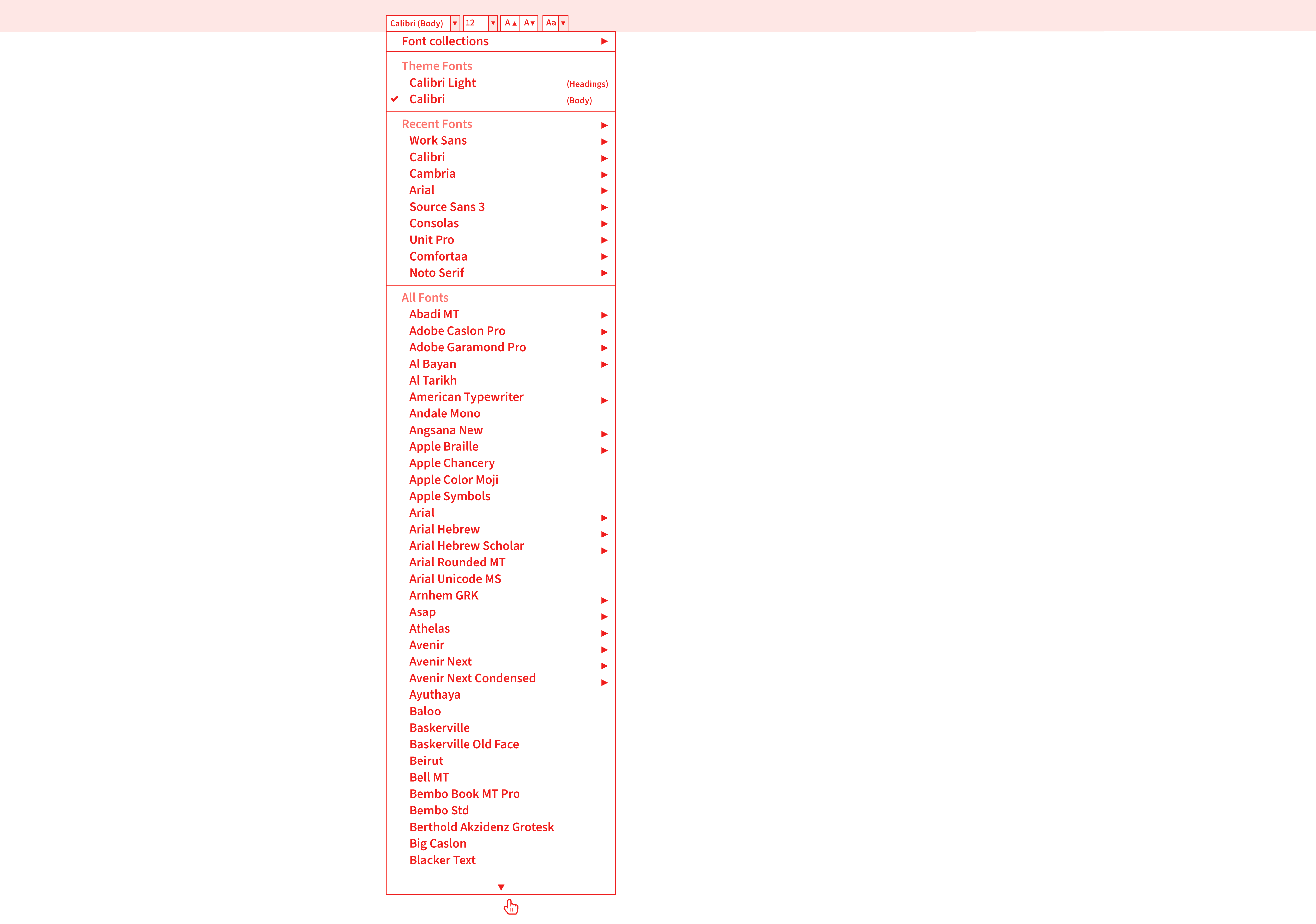
The menu shows all fonts installed on the machine, in alphabetical order. Try selecting a font near the end, such as Verdana. The mouse must travel to the bottom of the list, hover over the down arrow, and wait several seconds for the menu to scroll down near the letter V before the target is reachable. Typing the font name is an option, but users may not know exactly which font they want or what it is called.
Why It Hurts Usability
Any font below the letter B requires many seconds of waiting. The interaction is fragile too — moving the mouse off the menu or clicking elsewhere closes it entirely, forcing the user to start over. This is especially problematic for users who struggle with fine mouse control. The same flaw appears in website vertical navigation menus (sidenavs). When the browser window is shortened vertically, the side navigation often offers no visible scroll bar even though its content now exceeds the viewport. Users cannot tell that more content exists below the fold, and they have no obvious way to reach it.
The Fix
Adding a simple scroll bar to the right side of the font menu is a minimal engineering effort with outsized benefit. It allows users to navigate the list quickly, potentially cutting the time to locate and select a font in half. It is puzzling that such an inexpensive fix is not standard.
The deeper lesson: designers and developers should audit how users actually interact with their products. Without testing real tasks, it is impossible to know whether the design serves its purpose. Different users will approach the same interface with different goals and different methods:
- What people will want to do with your thing;
- Different people will want to use your design, information, and communication in different ways;
- Different people will want to achieve different things.
Dedicated Font Management Tools
Font Book on macOS and the Fonts Control Panel on Windows serve basic font installation. But their limitations are quickly apparent. Installing fonts manually by copying files into system folders is often faster than using these built-in tools. They are weak at displaying, comparing, and sharing details about fonts, and they lack features needed to manage fonts for a design team.
Specialized software fills the gap. Connect Fonts from Extensis is one example, offering significantly more capability than the built-in options:
- Better display of a font's glyphs;
- Shows the glyph name, Unicode value, and Glyph ID;
- Better grid display, plus QuickType, Waterfall, ABC 123, and punctuation views (many absent from Font Book);
- Generally more advanced technology overall.
Where it diverges further from the system tools:
- A font vault acting as a single, secure, managed repository;
- Sort options for all fonts (Name, Postscript Name, Type, Foundry, Class, Family, Version, Font Sense, Classification, Activation, Favourites, Date Added, Location);
- Google Fonts integration;
- Adobe Creative Cloud font management;
- Zoom controls;
- Glyph panels with search, plus glyph info (Name, Unicode, Glyph ID, Keystrokes);
- Glyph categorization (Entire Font, Alphabetic Presentation Forms, Basic Latin, Combining Diacritical Marks, Currency Symbols, Cyrillic, General Punctuation, Geometric Shapes, Greek and Coptic, Latin Extended Additional, Latin Extended-A, Latin Extended-B, Latin-1 Supplement, Letterlike Symbols, Mathematical Operators, Number Forms, Spacing Modifier Letters, Superscripts and Subscripts);
- Connected desktop and browser-based versions;
- Cloud libraries and font synchronization;
- Team libraries across desktop and online;
- File and document sharing;
- Font analytics and reports;
- Full admin account settings, valuable for controlling fonts and managing permissions at scale;
- Tagging support.
It also integrates with Adobe Creative Cloud, Sketch, and Affinity Designer/Photo/Publisher, with flexible font previews (Tile, QuickType, Waterfall and customized Waterfall, ABC 123, punctuation).
Adding a map to an annual review
An annual review is a printed publication that showcases a charity's achievements, news, and financial activities for the year. It gives shareholders and other interested parties information about the organization while promoting what it does. When designing one more than ten years ago, a key issue emerged: the text mentioned many different towns across the country that the charity supports and works with, yet there was no easy way for readers to know where those towns are or to envisage their location.
The solution was simple: a map on the inside back flap showing where the different towns are within the country. This is not rocket science — arguably just good old common sense. But what it does is dig out what people will want to do with the publication and make the communication better, more accessible, and more usable. The same problems would exist if the annual review were an electronic PDF or HTML; the medium does not change the principle. The question is whether a designer would have envisaged adding a map the client never even thought about or asked for. Sometimes, designers have to go the extra mile for their clients in need.
This issue of making information easier to understand and consciously helping people to understand and use it falls under the area of accessibility. It could easily be considered usability because it makes the information more usable, but it is more precisely about access structures, a concept highlighted in 1979 by information designer and educator Robert Waller, who runs the Simplification Centre and was Professor of Information Design between 2007–2011 at the Department of Typography & Graphic Communication at the University of Reading in the United Kingdom. The JS Party (Episode #36) podcast with Suz Hinton, Safia Abdalla and Kevin Ball also highlights that accessibility is about more than a disability a person may have and the devices they use to help them.
Access structures are not commonly talked about in the world of accessibility. Typically, we talk about people's physical issues (vision impairment, aging, dyslexia, physical disabilities) or supportive devices (magnifying glass, screenreader, vision impairment stick) or legal implications of bad accessibility. But we rarely talk about adding elements like access structures to aid content comprehension, processing and reading style strategies such as:
- Browse;
- Skim/preview;
- Search/scan;
- Intense study;
- Review.
A good example of sub-access structures in action is the audio hosting website SoundCloud. It has a standard search option that searches the whole website rather than requiring users to go through millions of web pages. When you search, it returns results in a vertical list, just like Google or Twitter. However, on the left of the search results webpage are very useful search refinement options:
- Everything
The search term searches through everything and all below options. - SoundCloud Go+ tracks
Only searches through this offline and ad-free listening service. Two further sub-search options: Added any time, Any length. - Tracks
Applies the search to just audio content. Three further sub-search options: Added any time, Any length, To listen to. - People
Applies the search to just user/profile account names. Nine further sub-search options relating to location, seeming to know the countries associated with the search. - Albums
Applies the search to albums, filtered by tag options: Electronic, Techno, Hip-Hop & Rap, Drum & Bass, House, Ambient, Electronica, Dance & EDM, Deep House. - Playlists
Applies the search to user-curated playlists, with the same filter by tag options as albums.
This may seem fairly standard, but the value is in the sub-access structures that allow users to further refine and edit their search term. Consider what would happen if you could only search and then had no refinement options — users would not be able to narrow down what they are trying to achieve. This combination of design, accessibility, usability, information and communication is what makes the feature genuinely useful.
Providing a digital business card increases the chance of being contacted
Running a graphic communication design and text editing business in the United Kingdom called User Design, Illustration, and Typesetting means contacting many art, design, and production managers at U.K. book publishers. About seven years ago, it became clear that these managers receive a lot of emails every day from people offering the same services. The challenge was increasing the chance that business details would be used and spread within their organizations, by whatever communication method they use, ultimately increasing the chance of them making contact.
The solution was simple: provide a link to a digital business card in PDF, PNG, RTF, and vCard formats on the homepage and contact us webpages. It is rarely done, but by making contact details more easily available and reusable in different electronic formats, it becomes quicker and easier to share details across different types of software — not everyone uses the same programs. This leads to more chance of people in organizations making contact.
The next important question is how to measure whether this is working and having an impact. In design and communication, it is important to know:
- What is working and what is not;
- What areas could be optimized and what areas could be better;
- What areas are not working well and are underperforming.
Basing design success measurements on what people think or feel is highly subjective, and soooooooooo last century.
The fastest internet speed in 2022 is still 4 kbps
Recent years have seen the awful impact of websites on users due to lazy loading images, infinite scroll, and content shifting on page load — techniques intended to save internet data bandwidth usage on both the user's end and server-side.
Lazy loading means an image or content is not loaded until it becomes available or requested by the user in the visible screen area. Because of this late loading, users frequently wait a few seconds for content to load, even with today's technology.
Infinite scroll works on the same principle, but the non-visible vertical content is not loaded until the user scrolls down. Lazy load can also be used with painful pagination features like the "go to page 1, 2, 3, 4, 5, 6, 7, 8, 9, 10" options seen on large e-commerce websites, as outlined by Vitaly Friedman in his article "Perfect Infinite Scroll UX."
Content shifting on page load refers to a mixture of lazy-loaded content (text, images, and layout) being delayed and loaded late, causing the content to shift the vertical and horizontal height of the page, moving elements and call-to-action buttons around, as highlighted by Michael Scharnagl on Smashing Magazine. This is especially problematic when trying to work quickly on a slowish machine or device, though even a fast machine does not seem to make a difference.
All three issues create bad user interactions, especially on longer-length web pages, even though they are promoted as good webpage performance techniques.
Give people the content when it should be there and when they need it, as fast as you can.
For very long webpages, some off-visible screen lazy loading and infinite scroll could be beneficial to save unnecessary loading. But for everything else, give users content as fast as possible. With today's technology, do not over-design and overthink. When using lazy loading or infinite scroll in 2022, we are still dialing up with 4 kbps modems like we did back in the year 2000. The delivery of information and images is still very slow, and we are still looking at blank or block-colored images waiting for them to load — 20 years of the internet later. Meanwhile, the average speed of computer and mobile internet in 2022 is 30.78 mbps, and we are still getting the same performance as in the year 2000. User experience is what matters, not technical wizardry.
Don’t Overload the First Visit
A common usability failure is piling too many demands on a user before they have even engaged with the page. The typical first visit to many sites now involves a rapid-fire sequence of interruptions:
- A cookie consent banner blocks the view.
- A newsletter sign-up pop-up appears.
- A notification prompt asks for permission to send updates.
- A location-access request appears.
- A promotional timer offers a discount if you order quickly.
- A chat widget opens and asks if you need help.
- A “save your password?” prompt appears in the browser.
None of these steps improve the user’s ability to read or buy. Instead, they create a hostile first impression. If someone’s first interaction with a product is a barrage of demands, many users will simply leave.
Keep the initial experience as frictionless as possible. For options that are legally required or genuinely useful, make them discoverable but not intrusive—for example, a universal settings or options link in the top corner of the page where users can customize their preferences. These choices should never block access to content.
The lesson is that over-demanding design costs you users. Each extra hurdle increases the chance that someone abandons the site before they have evaluated your product. Place the user’s intent first rather than your site’s need to collect data or push promotions. Think about how people want to use the design, make it easy and low-effort, and test it in real time.
Measurement Units in Clothing E-Commerce
Size guides are a frequent source of confusion in online shopping, particularly when measurements are expressed inconsistently. The issue is not the units themselves—centimeters (cm), millimeters (mm), and inches (in)—but how they are presented.
Consider a shopper who measures their chest circumference at 120 cm by measuring across the front and multiplying by two. They find a polo shirt on a French clothing site offering these sizes:
- 2 – XS
- 3 – S
- 4 – M
- 5 – L
- 6 – XL
- 7 – XXL
- 8 – 3XL
- 9 – 4XL
- 10 – 5XL
- 11 – 6XL
These labels are not immediately helpful, so the user clicks the size guide link. The slide-in panel provides bust circumference and waist measurements for each size, expressed in both centimeters and inches:
- 7 – XXL = bust circumference 121–125 cm / 48–49 in
Because the shopper’s measured 120 cm falls within this range, sizing is straightforward. The French site works well because it offers concrete measurements in multiple units. The precision helps users select the right product.
A British clothing company presents a different problem. With the same 120 cm measurement, the shopper finds a polo shirt offered only in these sizes:
- 36
- 38
- 40
- 42
- 44
- 46
The numbers alone provide no apparent information. Clicking the size guide reveals two options: “Top half (bust, chest)” and “Bottom half (waist).” Selecting the top-half table shows that size 46 corresponds to a 117 cm circumference—just short of the user’s actual measurement.
The Solution: Present Only Relevant Data
The issue here is not a missing table. The site provides two tables, but the second covers a broader range of products than the polo shirt selected. A user could easily read the XXL row (119–124 cm) in that general table and assume the item is available in that size, even though the selected product only goes up to 46 inches (117 cm). The information provided is not contextual.
A clearer presentation would label sizes with their equivalents directly, avoiding the need for a separate guide:
- 36 in (92 cm), 38 in (97 cm), 40 in (102 cm), 42 in (107 cm), 44 in (112 cm), 46 in (117 cm)
This removes guesswork for the shopper and reduces the chance of ordering the wrong size.
What We Can Learn
Clothing sites should give accurate, product-specific measurement information. Include only what applies to the item being shown—general tables covering unrelated products cause confusion. Any size chart should make your measurement range obvious and map labels to concrete units.
The cost of getting this wrong adds up. A wrong-size order leads to delivery, trying the item on, discovering a bad fit, repackaging, return paperwork, shipping it back, and waiting weeks for a refund. The user loses time; the merchant loses margin on processing returns, restocking, and handling another support request. In short, those few unclear numbers create friction that neither the user nor the business should have to absorb. Good sizing information is good design, and it benefits everyone involved.
What Accessible Design Actually Buys You
Getting these details right is not just a compliance exercise. It makes you a better designer, creates products that genuinely work for people, reduces stress and confusion, and cuts the time it takes users to complete their goals. It also tends to increase customer loyalty and the perceived quality of your brand — people stick with designs that don’t waste their effort.
Recap: Patterns That Mattered
- Microsoft Word font menu. The fix wasn’t just a nice-to-have. By understanding how people actually select fonts, a simple change made a frequently used action faster, reducing friction and improving workflow speed.
- Default software limitations. Out-of-the-box operating system software often lacks features that are essential for productive, accessible work.
- Map in an annual review. Adding a simple map to a long document dramatically improved content access and comprehension, making it more likely users would understand and act on the information.
- Electronic business cards. Offering different file formats for contact details increased the chance that people would reach out, by simplifying a single but crucial step.
- Performance technique extremes. Widely used patterns like lazy load and infinite scroll can render modern websites at speeds equal to a 2000-era 4 kbps connection, derailing users from their original task.
- First-interaction overload. Many sites confront visitors with as many as 13 options and settings before they can engage with their actual goal — a clear case of information pollution.
- Mundane information can still fail. Even seemingly standard information, like ordering a polo shirt online, creates massive problems when it isn’t communicated and structured logically for users.
Practical Prompts for Your Next Project
When looking at your own design, ask yourself a few diagnostic questions and then act on the answers. The goal is to genuinely reduce the work required, not just rearrange it.
How Can You Simplify the Work?
- Cut complexity and demands — don’t bombard users with options and notifications before they’ve even started their intended task.
- Reduce steps, stages, and unnecessary clicks.
- Strengthen the design, communication, and user interfaces by removing needless difficulty.
- Ask for feedback through high-quality questionnaires.
- Run real-time diagnostic user testing.
How Can You Make Content More Obvious and Easier to Scan?
- Add a search option that covers all of your content.
- Use a sitemap or index for quick discovery.
- Provide a navigation menu or contents page for a clear overview.
- Include a map, graph, or data visualization to make the content easier to envision.
- Offer content as audio, either online or transferable to a physical device.
- Use heading hierarchy (H1, H2, H3), bullet lists, boxes, or icons to chunk and highlight information.
- Deliver your communication in multiple formats — online, print, audio, video, braille, large print, or easy read — to suit different preferences.
- Follow lengthy content with a conclusion, summary, or recap to reinforce key points.
- Consider navigational aids like running heads, breadcrumbs, “go to top” links, scroll spy features, progress indicators, and thumbnail grids.
How Can You Better Understand Your Users?
- Find out, explore, ask, and watch people as they use your product.
- Discover what users actually want to do with your thing.
- Make it faster and easier for them to achieve those specific goals.
- Test with real tasks and observe where people struggle or whether they can finish in a reasonable time.
- Learn about different needs — from aging and dyslexia to vision, physical, or hearing issues.
- Study user personas to understand different user categories.
- Add better sectioning or navigation features within your content.
How Can You Offer Flexible Information Formats?
- Provide files where useful, such as HTML, SMS, RTF, PDF, VCARD, TXT, or XML.
- Let frequent users customize colors, typeface, or layout to reduce boredom and improve comfort.
- Consider delivering age-specific or otherwise more relevant content, both text and imagery.
- Give people control to adapt the interface to their most ideal presentation.
How can you simplify (I mean really reduce) the work, energy, and tasks for users to complete and get something done?
How would you make your design and information more obvious and easier to access, find, process and scan through for users?
How can you understand, envisage and get to know more about people and their requirements?
How can you provide the information people may want in different formats to allow better and easier use of your information?


