The Case Against Infinite Scroll — and Why It Can Still Win
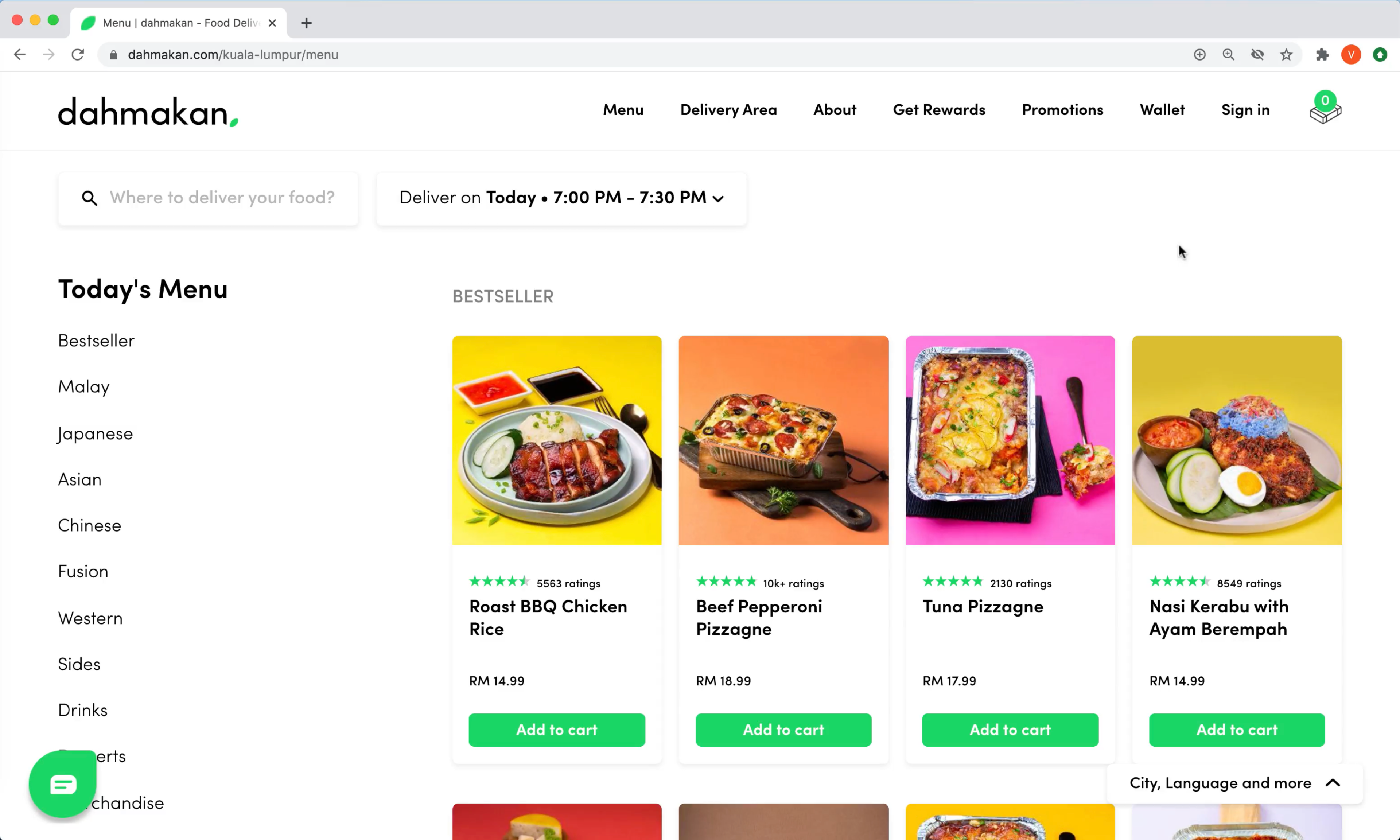
Infinite scroll has a reputation problem, and for good reason. Long lists of search results, products, or data entries can quickly become overwhelming when new items load endlessly. Once the number of displayed options exceeds a comfortable range, many users abandon the page entirely. Without clear breaks between batches, it’s hard to tell what has already been seen and what hasn’t, and the scrollbar becomes an unreliable gauge of page length as new content continuously loads.
URLs often fail to update as the user scrolls, making it impossible to bookmark a specific location in the list or share it with someone else. Reaching the footer becomes a game of cat and mouse — users race to scroll faster than the next batch of items loads, sometimes pressing Esc in a futile attempt to cancel the stream. Screen readers struggle to announce newly loaded items, and performance suffers on slow connections.
Pagination vs. Load More
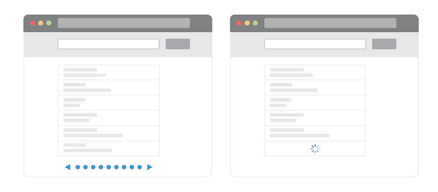
Pagination sidesteps these issues entirely. It gives users a clear beginning and end, a sense of completion when moving between pages, and a distinct URL for every page. The footer is always within reach, and users retain control over how many items appear per page. However, usability tests reveal a significant downside: pagination feels slower. Users tend to browse fewer items, spend more time on the first few pages, and show less engagement overall compared with infinite scroll.
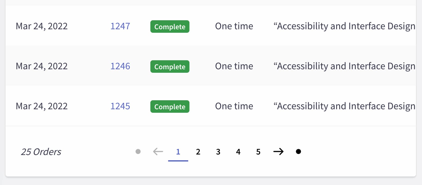
The “Load more” pattern offers a middle ground. Users scroll through an initial set of items, then choose to fetch more on tap or click. Some implementations load the first few batches automatically before switching to a button. A common approach is to display 10–30 products initially (10 on mobile, 30 on desktop), then auto-fetch the next batch only when the user reaches the end. Once the user has seen 30–70 items, the UI switches to a “Load more” button. Providing a "Back" button throughout keeps navigation predictable.
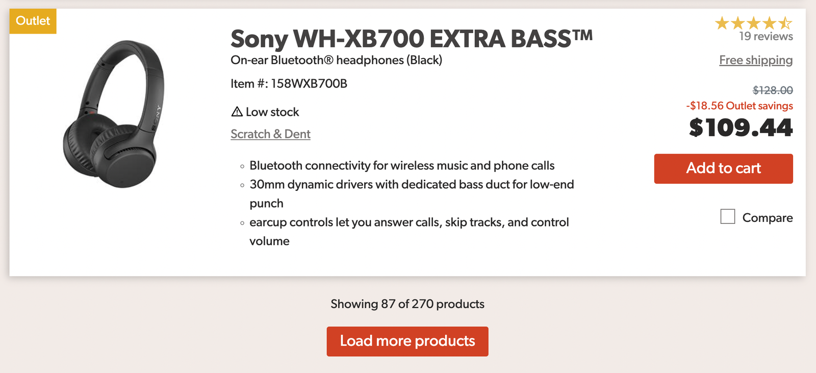
To let users continue browsing later, offer a way to save the current position in the list — for example, by entering an email address to receive a link that restores their exact place. This combines the speed of infinite scroll with the comfort and security of pagination, and research suggests users browse more and stay more engaged with this hybrid approach.
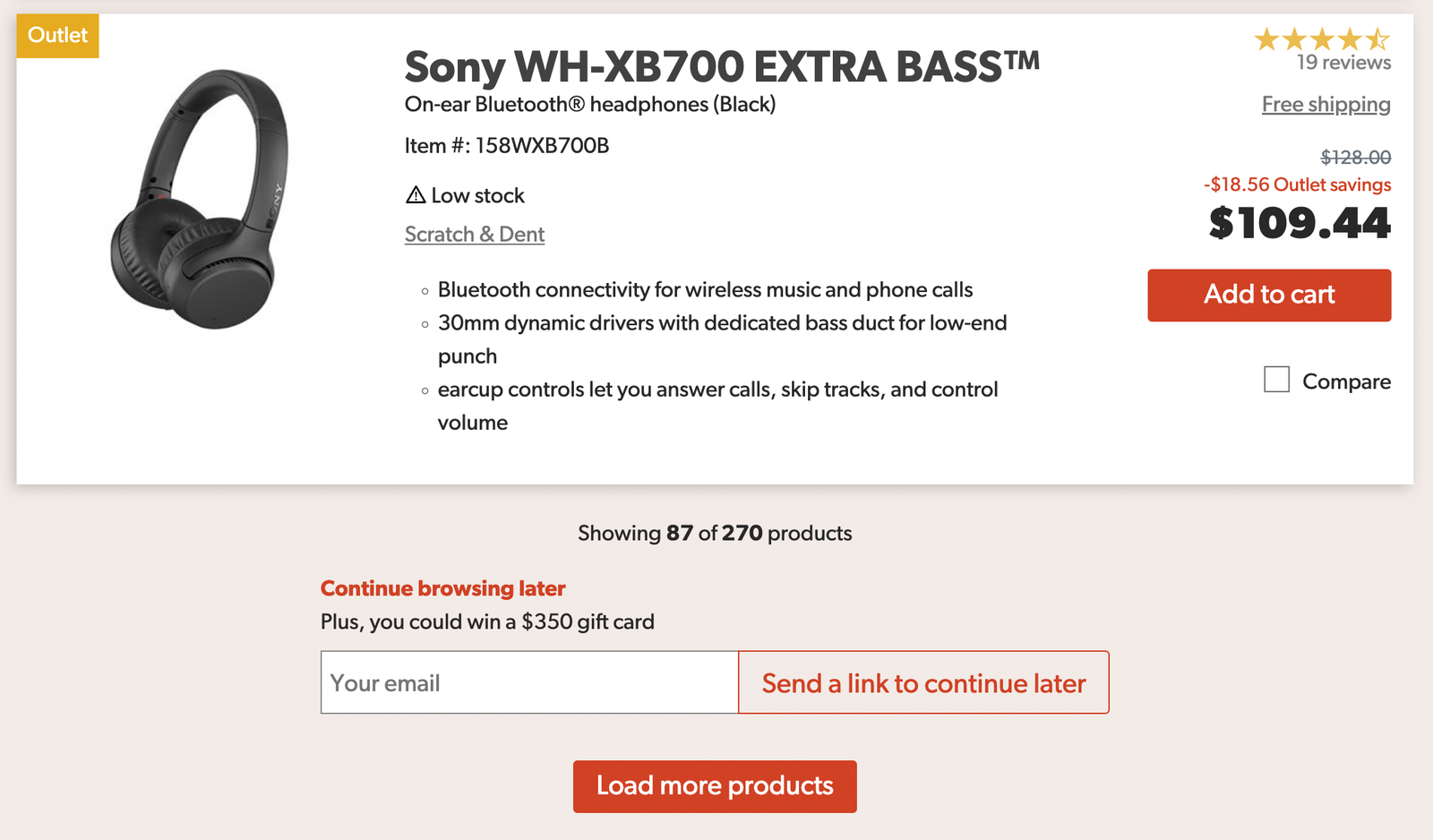
Marking Your Place in the Stream
For cases where infinite scroll is the right choice, the core problem is orientation. The easiest fix is to visually separate each new batch of items from the ones already seen. A user can then mark the position from which they want to continue later, with the option to view all previously seen products on a separate page.
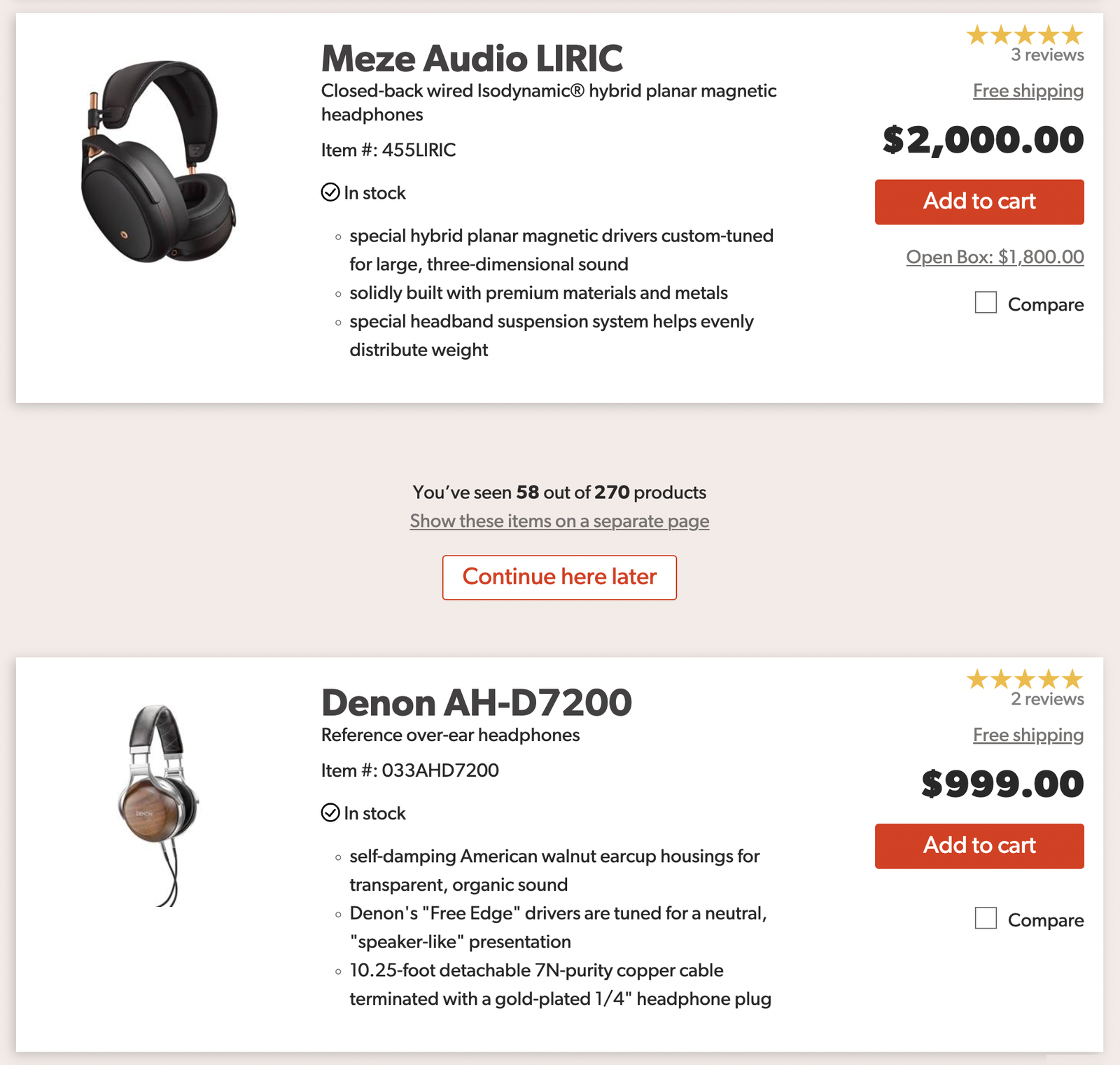
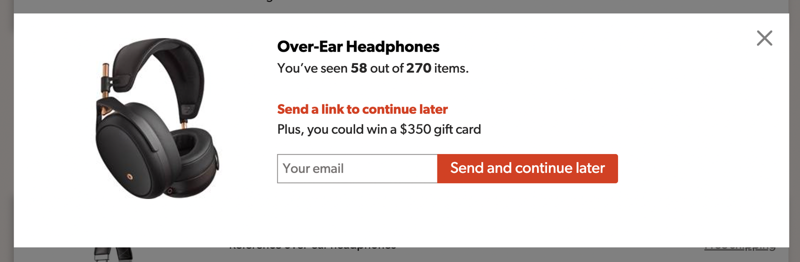
Clicking a "Continue here later" control can store the position in the browser, or trigger a modal requesting an email address. The email route doubles as a reminder channel — after collecting the address, you can notify users when new items appear.
An alternative is to display a newsletter box directly, letting users copy a link to the current position in the page.

Keeping the Footer in Reach
Even with position markers, auto-loading content still prevents users from reaching the footer. A footer reveal pattern solves this: a persistent helper at the bottom-right of the screen lets users open the footer on demand while the rest of the page scrolls infinitely. The footer must also be reachable via keyboard navigation, not just by tap or click.
Dynamic Pagination
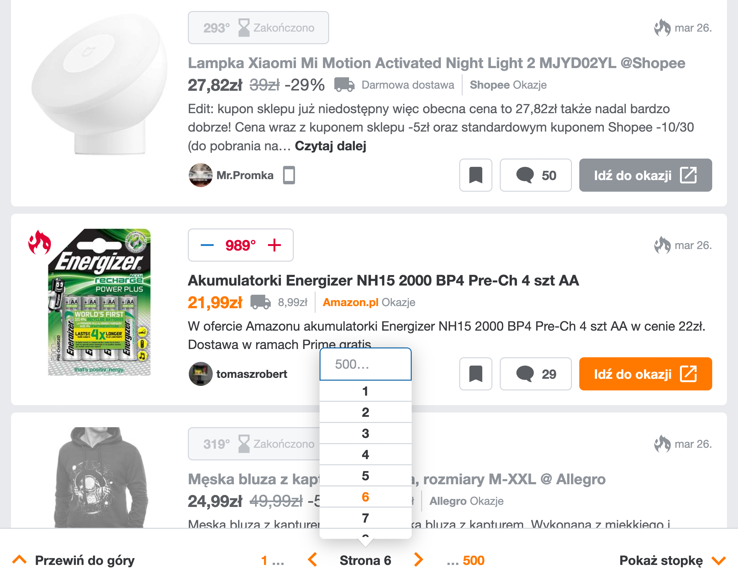
A more sophisticated approach is to present infinite scroll as dynamic pagination. As the user scrolls, the URL updates and the current page number appears in a sticky bottom bar. A drop-down allows direct jumps to any page, and an accordion opens the footer. This gives users a mental model of discrete pages even though content loads continuously.
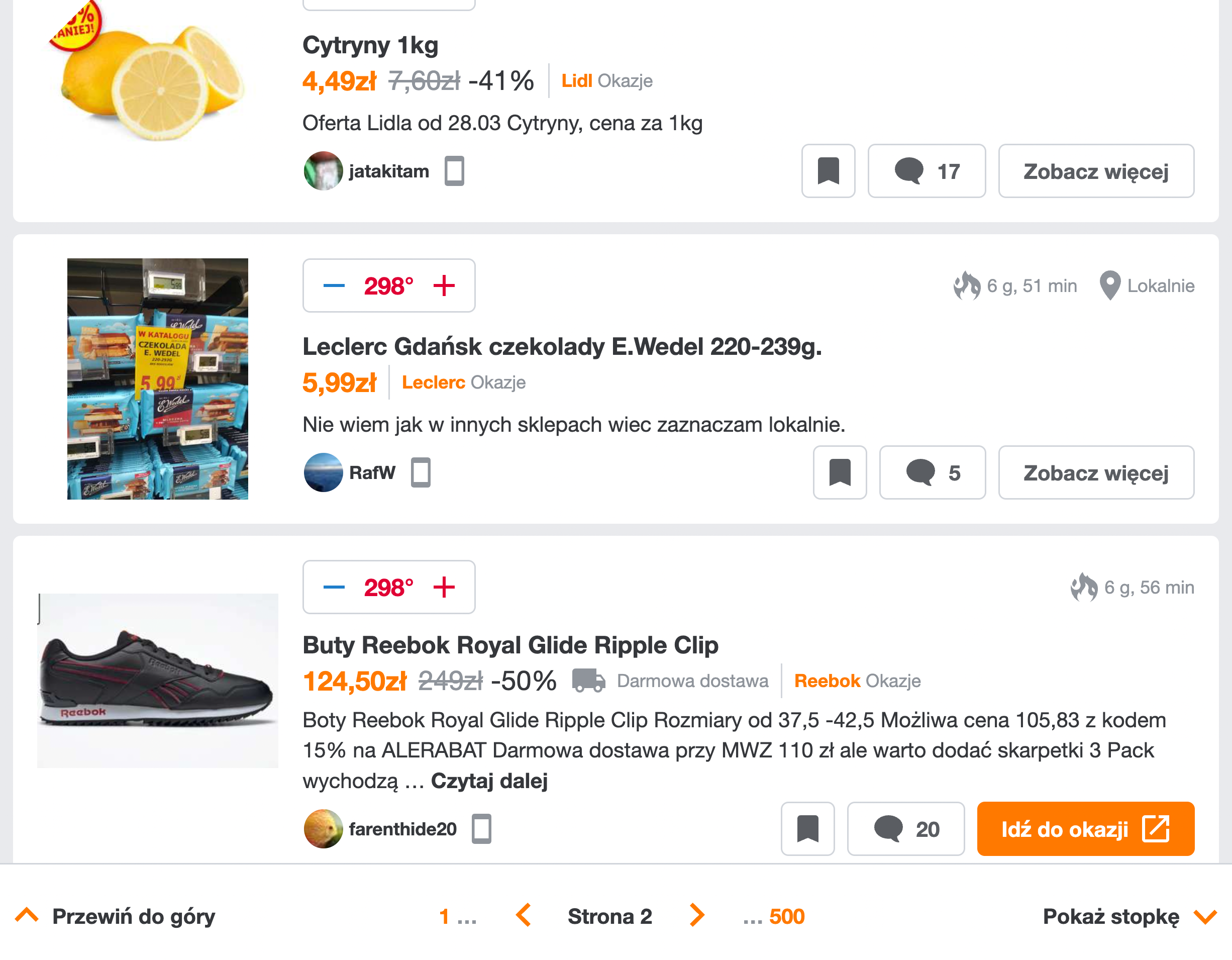
The "Back" button raises a question: after browsing pages 1 through 4, should Back return to page 3 or to the page visited before the list? Polluting browser history with every scroll position is undesirable, so a page-specific drop-down is the safer navigation tool. The Back button should return users to the page they came from before entering the list.
Helper Navigation: Scrollbar Labels and Mini-Maps
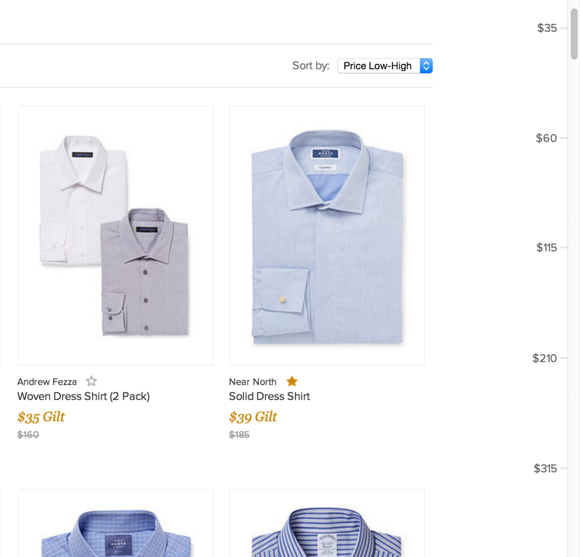
Baymard Institute suggests making scrollbars smarter with dynamic, vertically spaced labels. As users scroll, labels indicate their current position and allow jumping to ranges within the list. These labels would shift as the scrollbar grows and could reflect whatever sorting criterion the user has chosen.

For more ambitious interfaces, letting users pin sections of interest creates shortcuts back to favorite items. One such experiment, the Minimap prototype by Rauno Freiberg, demonstrates this concept — though it currently only works in Firefox.
When Is Infinite Scroll Worth It?
All of these safeguards come at a cost. The added URL tracking, segment markers, pagination fallbacks, and resume logic represent a significant implementation effort. Whether that effort pays off depends entirely on what your users are trying to do.
Infinite scroll is a poor fit for sites where people are comparing specific options, researching before a purchase, or hunting for a single, particular item. In those scenarios, an endless feed of undifferentiated content just makes the search harder, and users benefit more from traditional pagination that lets them work through results in discrete, trackable chunks.
The pattern earns its keep when the core activity is open-ended exploration — browsing a product catalog, shopping for multiple items in one session, or sifting through a large set of data entries. When users expect to scan a lot of content quickly and might act on many of the items they encounter, the speed of continuous browsing outweighs the navigational drawbacks. But that trade-off only works if the implementation treats accessibility and performance as requirements, not afterthoughts.
A Practical Checklist
If you must build infinite scroll, the following guidelines summarize the techniques discussed in this article. Treat them as a starting point for usability testing — some will hold up in your context, and some might not, but they are the most reliable patterns we have come across.
- When the use case is unclear, default to pagination — it remains the safest option.
- If you keep infinite scroll, always ship a footer reveal so users can reach the page footer without fighting the feed.
- Add a visual separator between “old” content (previously loaded) and “new” content (added after a refresh) to give users a sense of place.
- Let users save their position so they can stop browsing and pick up where they left off later.
- When appropriate, pair infinite scroll with a “load more” button instead of relying automatically triggered loading alone.
- Consider combining infinite scroll with paginated page numbers as an alternate navigation path.
- Update the URL as new content loads and make that URL copyable — it anchors the user’s current position.
- Give users a way to jump straight to any page via a pagination drop-down menu.
- Use the scrollbar to display range intervals, making it clear how much content exists and where the viewport sits within it.
- Allow users to pin or bookmark specific items or areas of interest within the feed.
- Treat accessibility and performance as core requirements in the build — keyboard support, screen reader announcements, and rendering efficiency cannot be bolted on later.
If in doubt, always favor pagination over infinite scroll. An endless list of options needs strong filtering, sorting, and search to be useful at all.