Home/Design & UX/Usability Pitfalls of Disabled Buttons, and How To Avoid Them — Smashi
Design & UX
Usability Pitfalls of Disabled Buttons, and How To Avoid Them — Smashing Magazine
How can we make disabled buttons more inclusive? When do they work well, and when do they fail on us? And finally, when do we actually need them, and how can we avoid them? In this article, Vitaly Friedman will take a look to common usability issues with disabled buttons, how to fix these issues and when disabling buttons actually makes sense. We’ll start from the beginning, looking into when disa
VF
Vitaly FriedmanSmashing Magazine
·August 5, 2021
The Problem With “Wait and See” Interfaces
Buttons that sit disabled by default are meant to protect users from making mistakes. The idea is straightforward: prevent the click until the input is known to be valid, and inline validation will guide the user toward a complete form. In practice, however, disabled buttons often leave users guessing about what went wrong, why they are blocked, and what they should do next.
A disabled control is a signal that something is wrong. But it does not say what. The missing piece could be a formatting error, an overlooked field, a system bug, or a permission issue. The user has no way to distinguish between these possibilities, so they are left to investigate on their own. Worse, when they finally realize the button is not responding, they often assume the problem is on their end and start retyping data or checking for typos — sometimes through the entire form.
When large portions of a page are disabled, users tend to assume the system is busy. Long-running processes feel risky to interrupt — the user does not know whether a booking went through or a payment was processed, and verifying that requires contacting support or logging into another system. So they wait. The patience threshold can be surprisingly high, especially when users have invested effort in filling in forms.
When the entire interface is blocked, customers can’t do much more than just sit and wait. (Image source: Walmart)
Eventually, the waiting stops. Users start moving the mouse, tabbing, scrolling, or tapping. If that does not work, the clicks become more stubborn. Some users take screenshots as evidence, open the same page in another tab, or switch browsers entirely. A common motivation behind this behavior is the fear of losing state: the user has typed in data, selected options, maybe found a working discount code, and does not want to do that work again. They would rather try to recover the page than risk refreshing and losing everything.
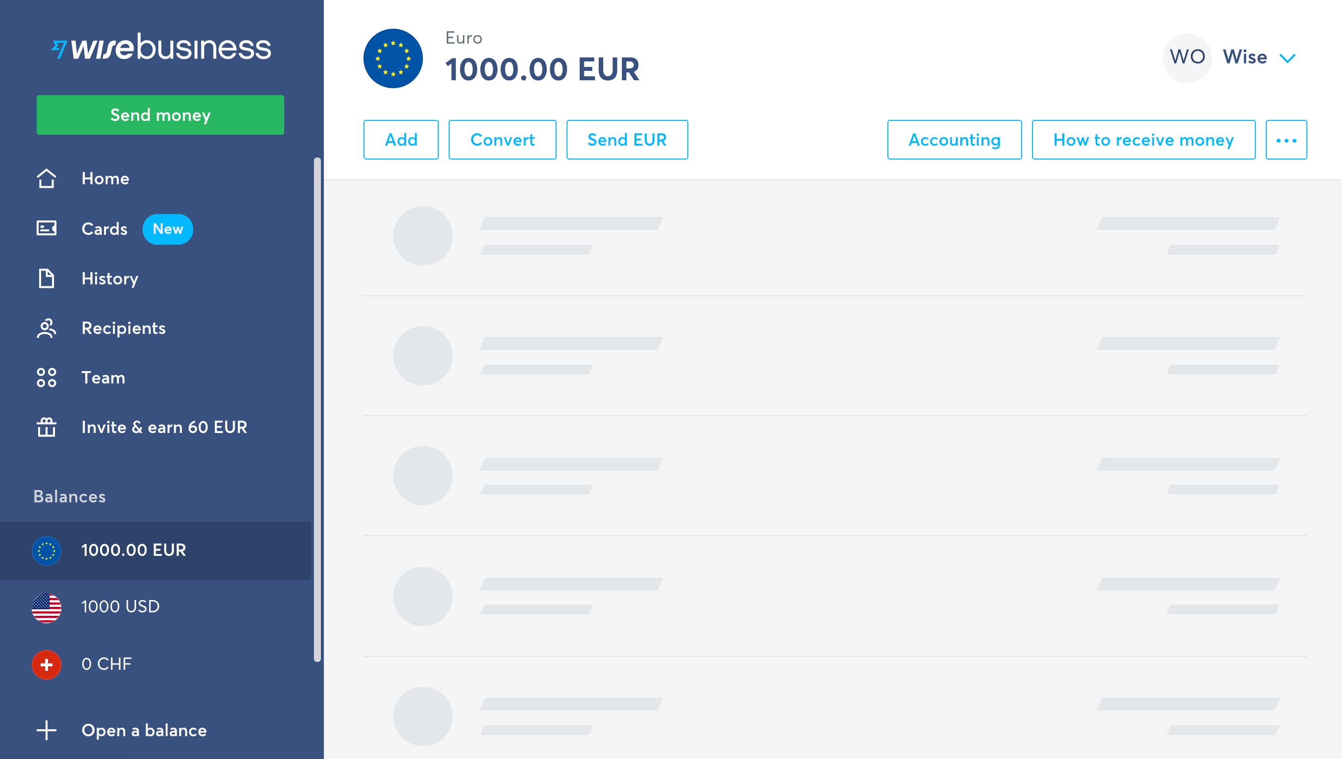
One of the many: a skeleton screen taking over the role of a disabled area by indicating that the items are being loaded. Example: Wise.com.
When a Single Button Blocks Progress
With only a single disabled button, the situation is different. Because the rest of the interface remains interactive, users are more likely to connect the issue to their own input. They rarely sit and wait. Instead they start experimenting.
When only a single button is disabled. In Postbank, a German bank, the “Weiter” button (“Continue”) is disabled by default, and an error is displayed if an input field is left empty?
A common reaction is to verify that the button is truly disabled by hovering, clicking, tapping, or tabbing to it repeatedly. Then comes the search for the usual suspects: wrong formatting, missing punctuation, or an accent character that broke validation. Users may retype phone numbers with and without +, with and without a leading zero, or with and without spaces. Some will go through the entire form field by field, even re-entering data that was added by the browser’s autofill, because they suspect the browser might have inserted something invalid.
This trial-and-error behavior is essentially guesswork. The user does not know what the application expects, because the disabled button gives no indication of what input will activate it. Inline validation helps only if it fires early enough to catch mistakes before the user tries to proceed. Often it does not.
Why Error Messages Are Better Than Silence
Disabled buttons lack one thing that error messages have: context. A disabled button cannot tell the user which field is invalid or what format is expected. An active button that validates on click can show a clear message that points to the exact problem and suggests a fix. Users know what to do next, and they can correct the issue without re-entering all their data by hand.
Keeping the button active also gives users a bit more control. They can submit incomplete data and get specific feedback, rather than having to guess what the interface is waiting for. To strengthen implementations, use inline validation that appears within one or two seconds, then delays the request slightly — the goal being to give the user some resilience before clicking on the button.
A wonderful interface of the Swedish public transportation website with a button that’s initially disabled, but becomes accessible once a selection is made.
When Inline Validation Fails, the Button Becomes the Jailer
Inline validation is supposed to prevent the nightmare of a disabled submit button. Errors appear field by field, the user corrects them, and the path forward stays clear. In theory. In practice, inline validation itself is a frequent source of dead ends, and its failures tend to be absolute: the user has zero chance of submitting the form because the button will never unlock.
Consider how often a perfectly valid input gets rejected:
A recently built address isn’t in the address validator’s database.
An email with a valid + tag (like [email protected]) trips a validator that assumes the character is spam.
A new business owner doesn’t have a company email yet, but the form refuses Gmail addresses.
Optional fields are highlighted as such, yet the system won’t accept an empty value.
A tax number (TIN/VAT) is valid but doesn’t conform to the validator’s country-specific rules.
Anti-spam protection is blocked by an aggressive ad-blocker.
Location detection breaks because the user blocks tracking.
A browser extension fills in a coupon code, but the system blocks it with no way to continue.
A user returns to a complex form days later to find “Continue” disabled because documents are still processing.
An input is fine, but just doesn’t match rules tailored to a specific group of frequent customers.
When inline validation has a bug or a false positive, it fails big time. Only a handful of users might be affected on a given day — or a few thousand. Tracking how many users land in this state is the first step toward understanding how severe the problem is for your business.
There is also a subtler cost. Inline validation is a hard boundary with strict requirements, but users often find themselves in complex situations the form designer never predicted. Most of the details are known and a deadline is looming, but a few documents are missing. The user has no way to proceed, so the abandonment doesn’t just cost a sale — it generates customer support calls, or worse, a cancelled account.
For the user, dealing with a disabled button is a gamble. They might get lucky: the erroneous fields are highlighted. Or not: the interface gives no clues at all, and they must hunt through the form to find and fix the issue before the button unlocks. This is frustrating on desktop; on mobile, where the button is often off-screen at the bottom of the page, it is worse.
As Matthew Standage put it, “when we disable a button on a form we are often disabling the call-to-action — that thing on the page we are trying to encourage users to click to proceed with their journey.” It is a fragile undertaking, because no matter how well-tested the code is, you can never be certain it is bulletproof.
Why Disabled Buttons Create Poor Experience
The underlying flaw is simple: a disabled button doesn’t explain what’s wrong. It signals that something is off, but not what needs fixing. Users are left guessing and, eventually, locked out entirely.
There are also accessibility concerns. As Adam Silver notes in “Form Design Patterns,” disabled buttons are typically not focusable, so keyboard users can’t reach them at all. They are often greyed out, which brings insufficient contrast against surrounding UI, making them hard to read. And because they rely on JavaScript and inline validation, a complex form on a narrow screen can make spotting and correcting errors genuinely difficult.
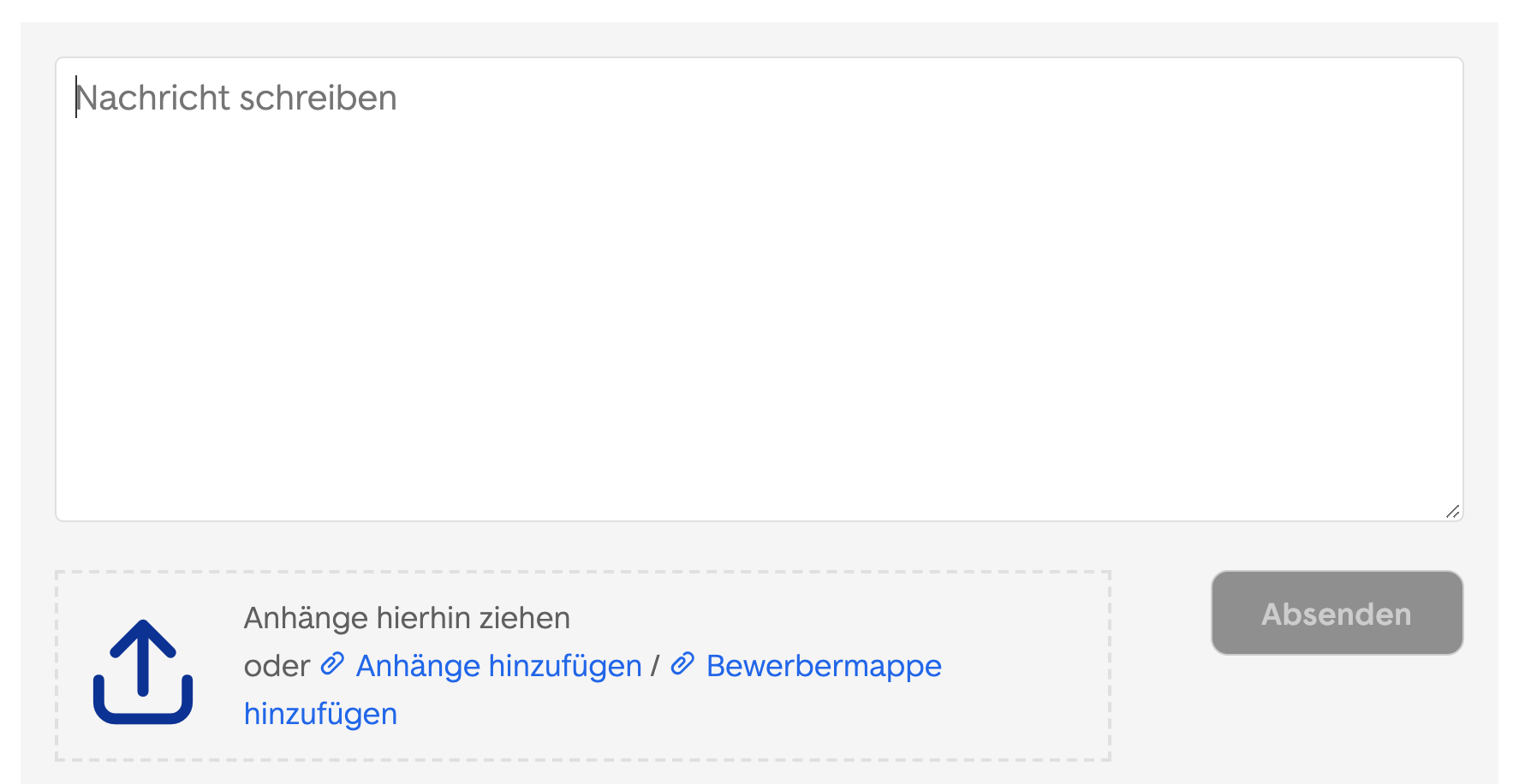
The “Absenden” (Submit) button at the bottom right corner is disabled by default. As most disabled buttons, it’s not focusable and greyed out. Example: ImmobilienScout24
Then there is the question of timing. Most implementations enable a button only when all required fields pass some validation — the latest possible moment to flip the switch. But what about situations where waiting that long makes no sense?
Imagine a customer opening a bank account. They need to verify a place of tax residency and upload supporting documents, but they don’t have all the papers at hand. The service allows a 14-day window to submit missing documents, but the form won’t proceed unless the user explicitly opts to “Submit later” for each missing item. If they don’t spot that option, they’re stuck.
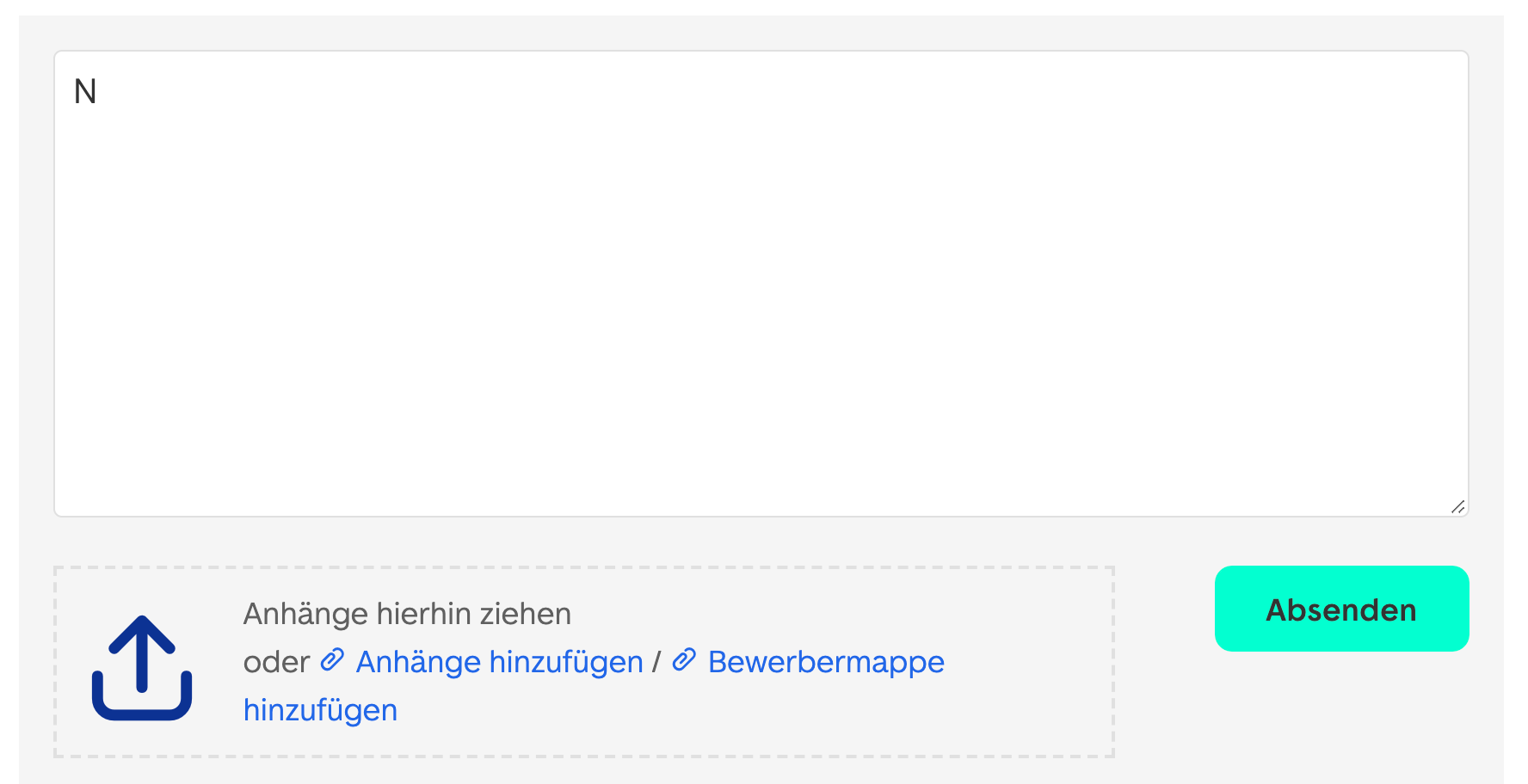
Typing a single character is enough to enable the button. What’s the right threshold? Example: ImmobilienScout24.
This raises a design choice: enable the button only when the user has opted to defer every missing document, or let them through anyway and remind them of the deadline afterward? The first option is more explicit but relies on the user noticing the “Submit later” links. The second may convert better, but risks confusion. The more conditional logic you build into user flows — common in enterprise and B2B forms — the more cautious you must be about when and how you enable the button.
None of this means disabled buttons are always wrong. They are appropriate for narrow, specific purposes where a disabled state is genuinely informative.
When a Disabled Button Is the Right Call
There are situations where a disabled button prevents a worse experience than the disability itself. Consider an e-commerce scenario: you see a pair of jeans on sale with only one item left. You click through quickly, add to cart, and only then find out the item is gone. A better approach is to disable the “add to cart” button outright when an option — a size or a variant — isn’t available, so the user never wastes the effort.
Or think about a large bank transfer. You’ve checked the IBAN, SWIFT, amount, and fees. You click the bright green confirmation button — and your finger slips, or another click registers. Without protection, you’ve just sent two transfer requests. The bank may then send two 2-factor authentication codes, leaving you to guess which one matches the actual payment.
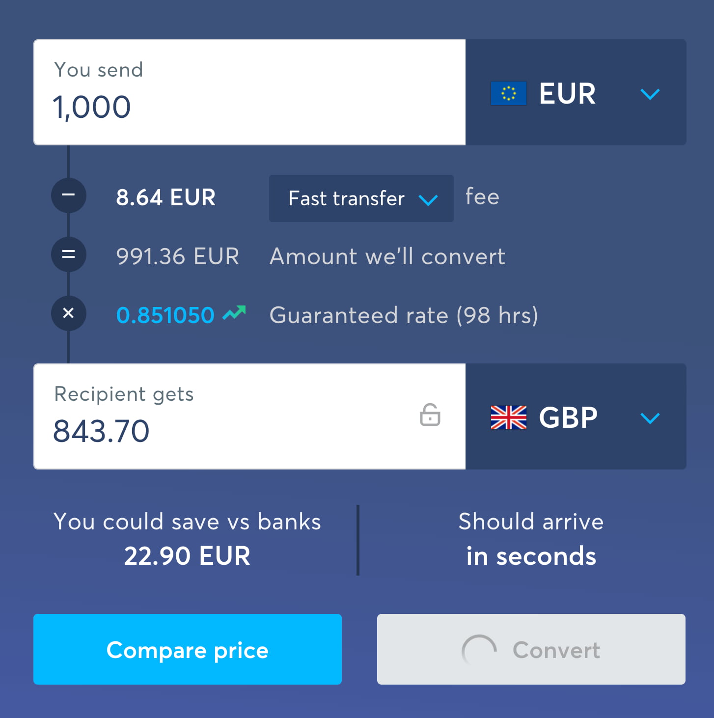
Upon click, Wise disables the “Convert” button without changing the text, but adds a loading indicator and changes a mouse pointer to indicate the change of state.
In this case, turning the button disabled after the first click is a clear signal that the state has changed, the operation is underway, and no further action is needed. The user simply waits for the interface to respond.
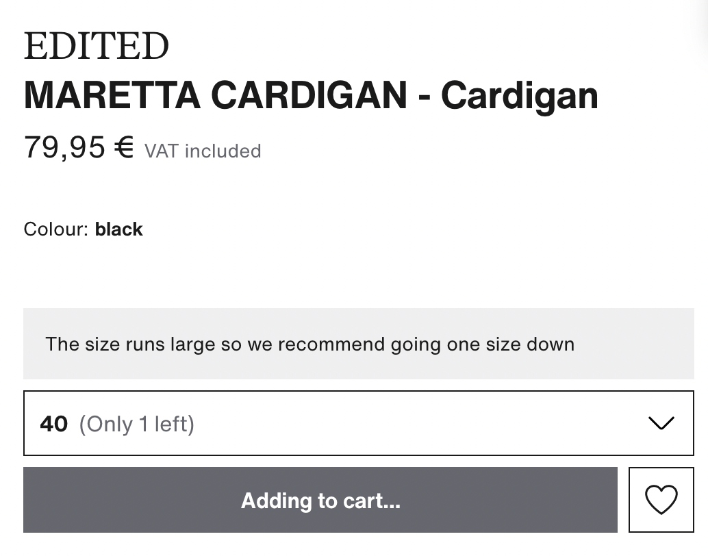
A button copy changing to “Adding to cart”, or a loading indicator. In this case it might make sense to disable the button briefly to avoid double purchases, and also stop listening to click/tap after the first click/tap.
When an option isn’t available or something is happening in the background, communicate it early and visibly. A simple state change can help, but adding context is better. For example, change the button label to “Adding to cart…” and include a looping loading indicator to show exactly what’s happening.
Where disabled buttons make sense:
Avoid wrong purchases: when the price depends on attributes, disable the button and update its label while recalculating the price.
Avoid double bookings: once clicked, disable the button and replace the CTA with a spinner or “Waiting…”. Provide a hint if the server takes long to respond. Stop listening for further clicks after the first; this doesn’t apply to steppers or Undo buttons, which warrant repeat taps.
Validate magic sign-in/SMS codes: keeping the button disabled until the input reaches a complete character count can be sensible — but only if testing doesn’t show that an active “Validate” button works just as well.
In these scenarios, a disabled state prevents error. But a greyed-out button with poor contrast is rarely the best way to communicate that. A more inclusive interpretation of the disabled state can help — one that remains informative, accessible, and clear about why a user is being held back.
When Disabled Buttons Are the Only Option
If your implementation relies on disabled buttons — whether by necessity or legacy constraints — there are well-tested techniques to make them far less hostile to users. Sandrina Pereira has collected several of these strategies in her work on making disabled buttons more inclusive. The core adjustments involve:
Using cursor: not-allowed so the pointer clearly signals the control is inert.
Providing a tooltip or hint that explains why the button is disabled. This should trigger on hover for mouse users, and also when the button receives keyboard focus via the Tab key — which requires the button to be focusable in the first place.
Preventing the click via JavaScript and using aria-disabled instead of the native disabled attribute. This avoids the temporary loss of keyboard focus that can occur while a form is submitting.
Letting aria-disabled keep the button focusable and announced by screen readers, so assistive tech users know the control exists but isn't yet enabled — mirroring the visual state.
Using ARIA live regions to announce dynamic content changes.
Avoiding pointer-events: none in CSS; it blocks mouse clicks but does nothing to stop keyboard focus or navigation.
Pereira's approach also includes a full, screen-reader-tested code snippet that announces how to make the button usable when the disabled control is focused. Beyond tooltips, another path is to guide users toward the source of the problem: link to an error summary at the top of the form, or provide jump-links to the specific input fields that contain errors. A simple hint beside the button explaining why it's disabled can also go a long way.
Give Users an Exit
Interfaces can rarely predict every circumstance a customer faces. When input is malformed, it's worth giving people the benefit of the doubt and providing a way to proceed even if their data doesn't perfectly meet your requirements. User testing has shown that a "way out" link placed beneath a disabled button is effective. The link invites users who can't proceed to contact customer support.
One pattern is a button that reads: "Can't proceed? Let us know and we'll get back to you." Clicking it lets users leave an email or phone number and request a callback. A further step is automatically sending the form's contents to customer support on the user's behalf, with an option for support to reply or call back.
Alternatively, let customers continue despite validation errors — for instance, when a postal address or phone number looks off. In that case you should still warn them, ask them to review the flagged fields, and request permission to reach out if problems surface. Re-surfacing errors one last time just before the final purchase action is also wise. These tweaks won't eliminate abandonment entirely, but they keep a channel open to resolve issues for the customer instead of leaving them stranded.
Rethinking Inline Validation
Inline validation raises a host of design questions: when to start validating, when to re-validate as users edit fields, and when to show inline errors versus success indicators. These deserve dedicated treatment, but broadly speaking, inline validation is compatible with providing a way out — it just doesn't need to be coupled with disabled buttons. In fact, inline validation becomes more useful without disabled buttons because users can get a clearer overview of valid and invalid fields when errors are highlighted after submit. That approach naturally requires the submit button to remain accessible at all times.
A Simpler Alternative
A far more straightforward strategy is to keep the "Continue" button enabled and use the click itself to explain what's wrong. A reliable pattern that avoids most usability pitfalls is:
Validate on submit, not before.
On submit, announce that errors exist and state how many there are, via a tooltip or error message.
If there's a single error, link directly to the offending input field.
If there are multiple errors, place an error summary at the top of the page and link to it from the submit action.
This approach is simple, accessible, and doesn't depend on scripting to resurrect a disabled control. For selections, frequently used default values can also remove the need for a disabled state. As seen with Blue Apron, a sensible default for recipe counts keeps the "Select" button always active because it always indicates the next step. In other contexts, you can make unavailability itself more informative: show which sizes are sold out rather than hiding them, or add a hint that an item is out of stock. Even better, let users sign up to be notified when it's back — a pattern Zalando uses. Every time you reach for a disabled button, ask whether there's a clearer way to communicate the available options or to hold onto the user despite an error — with defaults, hints, or a more actionable call to action.
Measuring the Damage
You can't fix what you don't track. If you already use disabled buttons, measure how often users actually get locked out and can't continue. That data will tell you how serious the problem is for your bottom line. If you must keep disabled buttons, invest in making them focusable and useful: more inclusive states, clear explanations, and an escape hatch to customer support that sends along the form contents. If you don't need them, validate on submit instead and route users directly to their errors with clear messages. Inline validation still has a place for showing progress through a form, but never let it stand between a user and the ability to proceed. These changes won't eliminate all friction, but they should cut down on frustration, speed up form completion, and reduce the number of customers who abandon entirely.
Running Through the Disabled Button Checklist
When you are designing or building an interface that includes disabled buttons, it helps to approach the work systematically. The questions below cover the most important decisions, from whether a disabled state is even necessary to how the control behaves for keyboard and assistive-technology users.
Is the button disabled by default because the item is genuinely unavailable?
If not, can the button stay enabled and validation happen on submit?
If not, can default values keep the button enabled from the start?
At what point should the button become disabled—for example, to prevent double bookings?
Should other parts of the interface be greyed out along with the button?
Is a skeleton screen animation appropriate while the button is disabled?
Would a loading spinner better communicate that the system is busy?
Should a progress indicator appear on the button itself?
Does the button label need to change when the control is disabled?
Does the disabled state meet sufficient color contrast requirements?
Should a note under the button explain why it is disabled?
Is the disabled button still focusable?
What should happen on hover or tap of the disabled button?
What happens when a user tries to focus or activate the disabled control?
Should the cursor change to not-allowed to signal the action is not permitted?
Is a tooltip the right way to explain the disabled reason?
Are clicks suppressed via JavaScript using aria-disabled?
Are ARIA live regions used to announce dynamic content changes?
Is pointer-events: none avoided, since it does not prevent focus or keyboard navigation?
Is the user guided toward the relevant errors when they tap, click, or tab to the disabled button?
When will the button become enabled again?
If the user is locked out, is there a link that sends their input to support?
If so, is the user asked for consent before being contacted?
Is inline validation used, whether positive or negative?
When and how are error messages displayed?
Is there an option to continue even when inline validation fails?
Does the button state update after every user input?
How will the button visually change while its state updates?
Does the label change while updating, such as “Updating…”?
Do the button colors change during the update process?
Is a loading spinner added while the button is updating?
Should click and tap listeners stop after the first activation?
Should listeners remain active for Undo buttons and steppers?
On narrow screens, can the disabled button be made sticky?
Is there tracking for how many users cannot proceed and abandon the flow?
Where applicable, is a design without disabled buttons tested as an alternative?
This article is part of the Design Patterns series exploring common interface components, including accordions, responsive configurators, date and time pickers, feature comparison tables, sliders, birthday pickers, mega-dropdown menus, and filters.
Vitaly Friedman loves beautiful content and doesn’t like to give in easily. When he is not writing, he’s most probably running front-end & UX … More about Vitaly ↬
Strong UX ideas do not secure investment on their own. Through a worked example, Alex Williams breaks down how to define business value, calculate costs, test causality, and build a credible case for the return on a design initiative. - UX - Design - Business