

How a Four-Day Form Design Workshop Unfolded
Adam Silver recently ran a four-day Form Design Masterclass for Smashing Magazine, joined by 81 attendees. The structure was deliberate: each day was split into two 45-minute segments with breaks, followed by a 30-minute Q&A. Every session tackled a single large problem, mirroring how such challenges arise in real projects, with the goal of analyzing options before settling on solutions. The content took roughly six months to prepare.
Day 1: Establishing a Clean Foundation
The first session focused on building a simple registration form from scratch. This approach was chosen to ground attendees in essentials: label positioning, form styling, and appropriate input types. By the end, the group had a functional form that kept things as simple as possible for users.
The day’s highlight was a “question protocol” exercise designed to shift focus from saving visual space to questioning why each field exists. Instead of relying on float labels, tooltips, or placeholder tricks, the group used a spreadsheet to understand the purpose of every question and how to elicit the best answer.
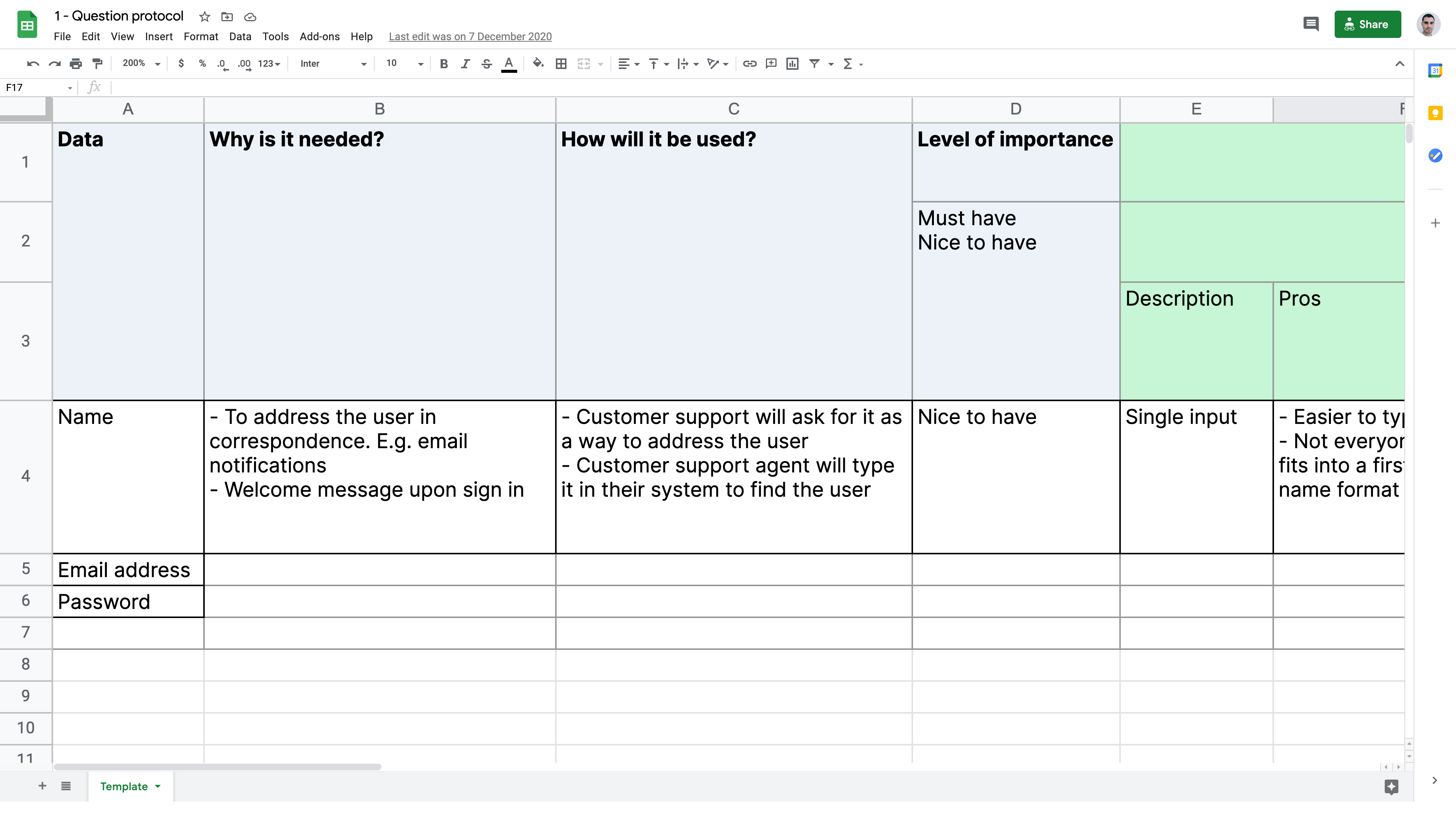
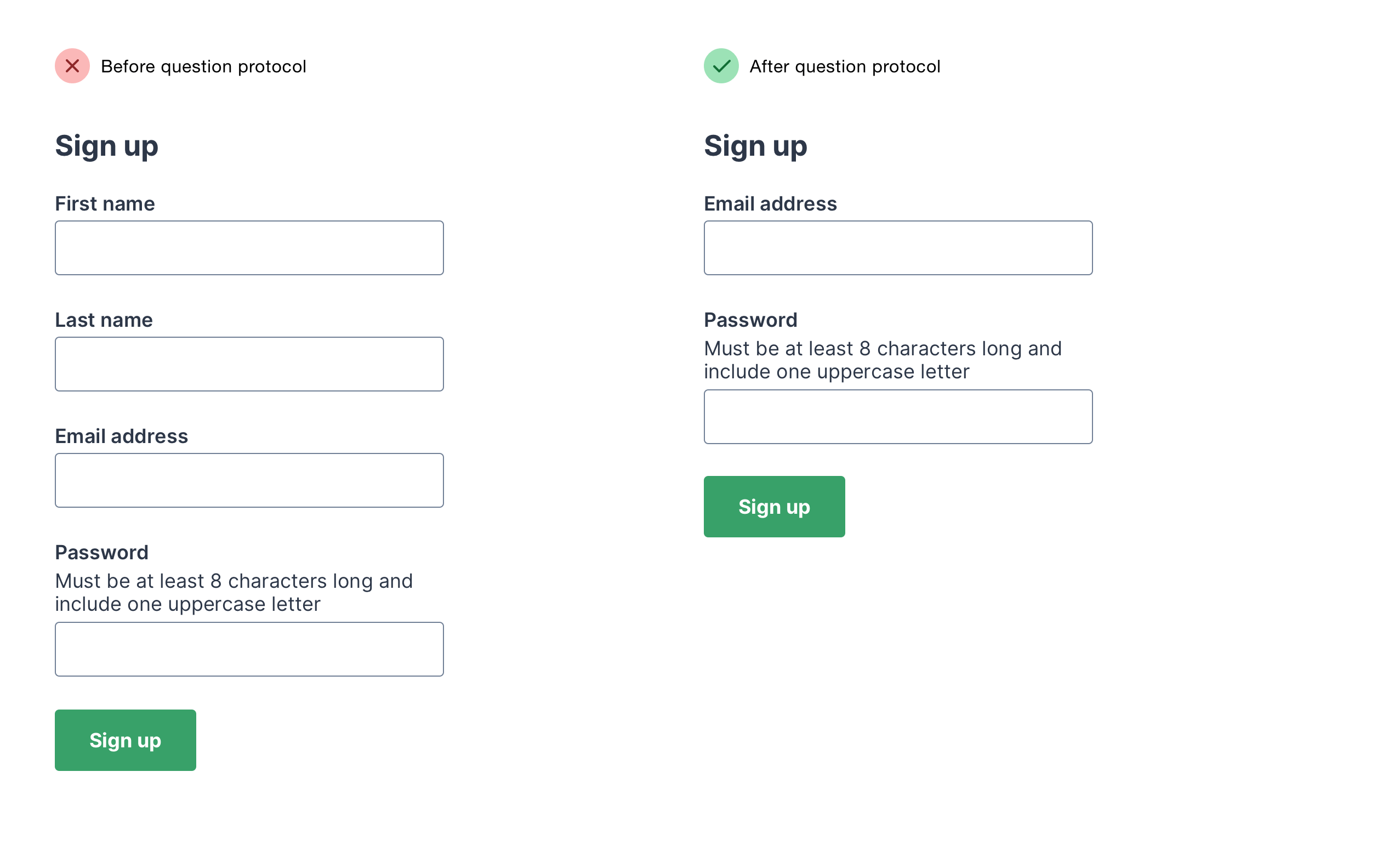
This exercise led to a deep review of the name, email, and password fields. The outcome was significant: the group cut the number of fields in half, leaving only those with clear justification.
Day 2: Handling Errors Gracefully
Day two revisited the registration form, this time concentrating on error recovery from two angles. First, the group determined when validation should occur and how error messages should be displayed. Second, they worked on crafting error copy that is clear, concise, consistent, and specific enough to get users back on track.
A central exercise was redesigning error messages for Smashing Magazine’s membership sign-up form. Attendee Sophy Colbert, a content designer, volunteered her proposed messages and explained the reasoning driving each choice.
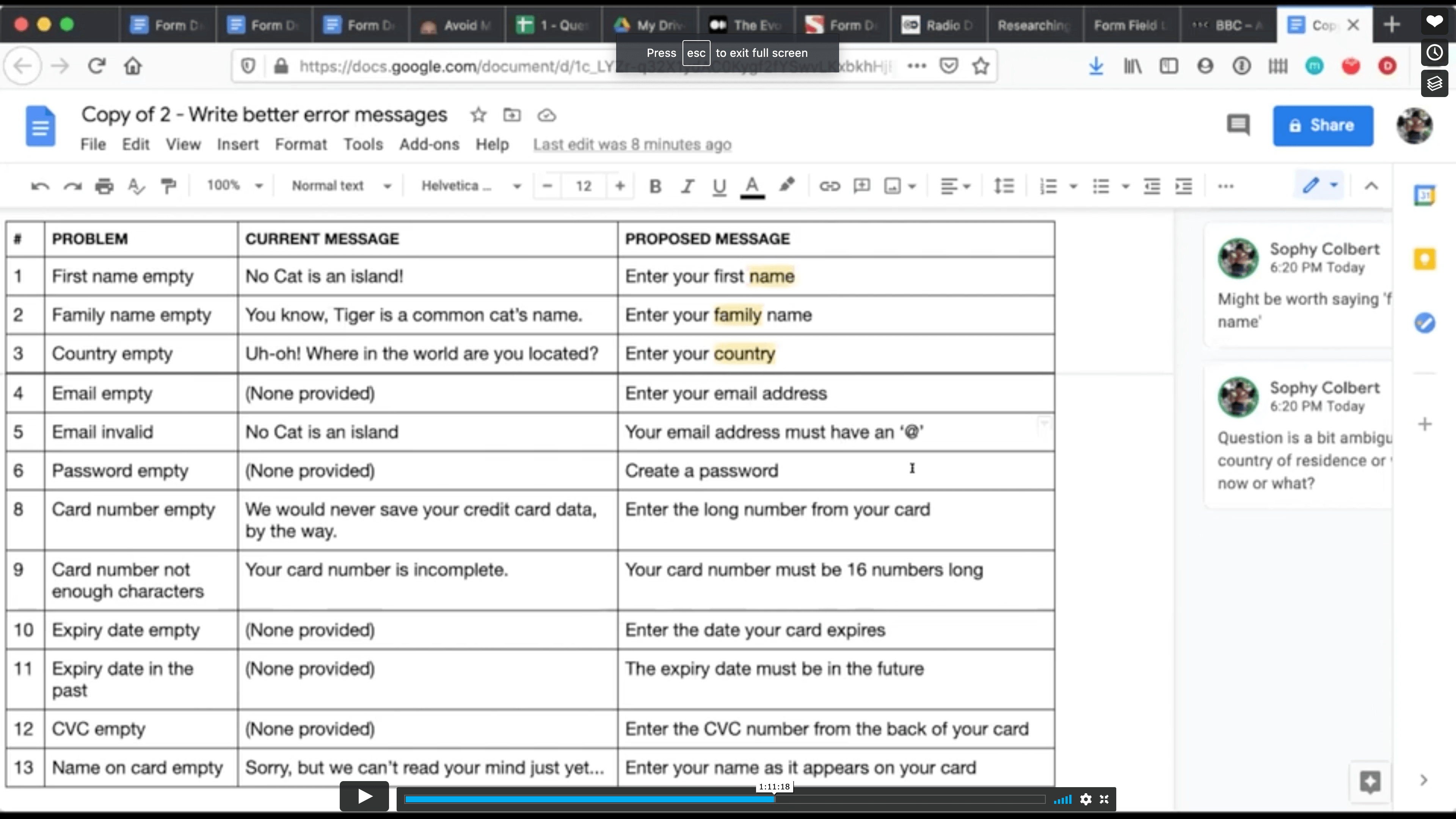
Her presentation offered rare insight into a content designer’s decision-making process, which the group appreciated.
Day 3: Confronting a Complex Checkout
The third day shifted to a complete redesign of the ASOS checkout flow, covering both guest checkout for first-time users and account-based checkout for returning customers. Discussion spanned UI patterns like tabs, accordions, and radio buttons, as well as comparative page structures for single-page and multi-page checkouts.
The standout moment came when redesigning interactions revealed hidden content and service design problems. The group converted tabs that asked users to declare whether they had an account:
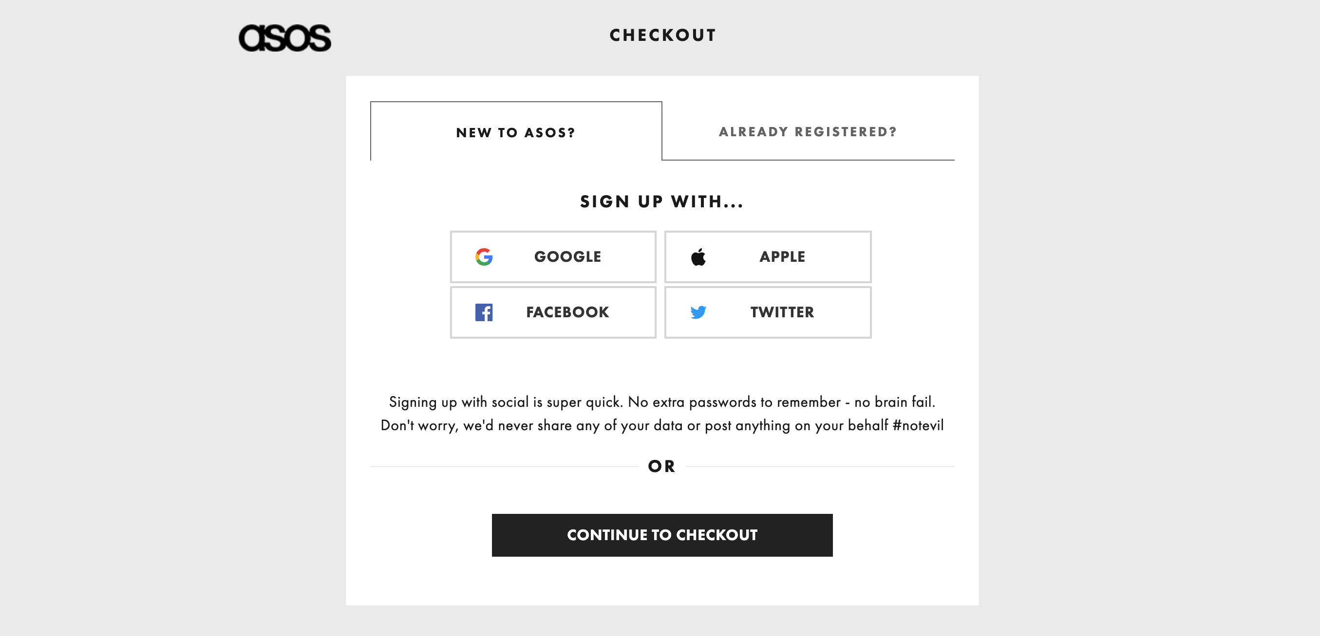
…and turned them into a radio button group:
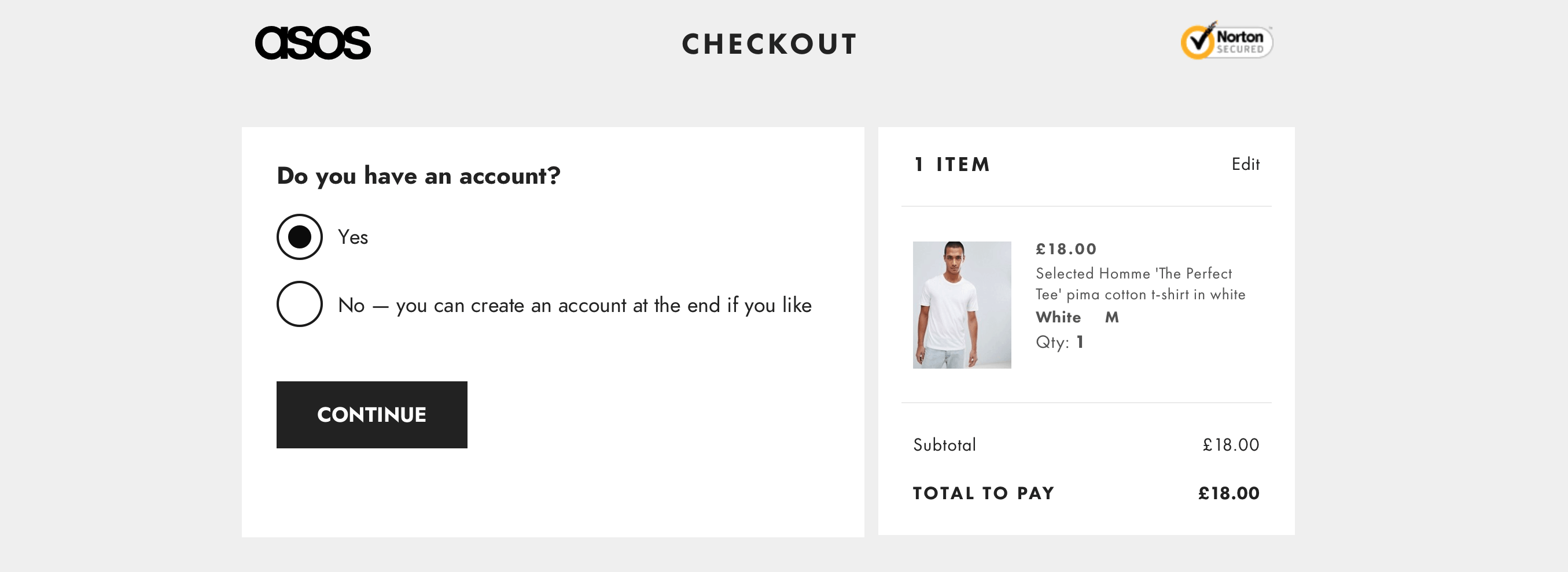
This exposed a fundamental flaw: real-world choices are rarely binary. When asked what option was missing, the group correctly suggested, “What if the user can’t remember?”
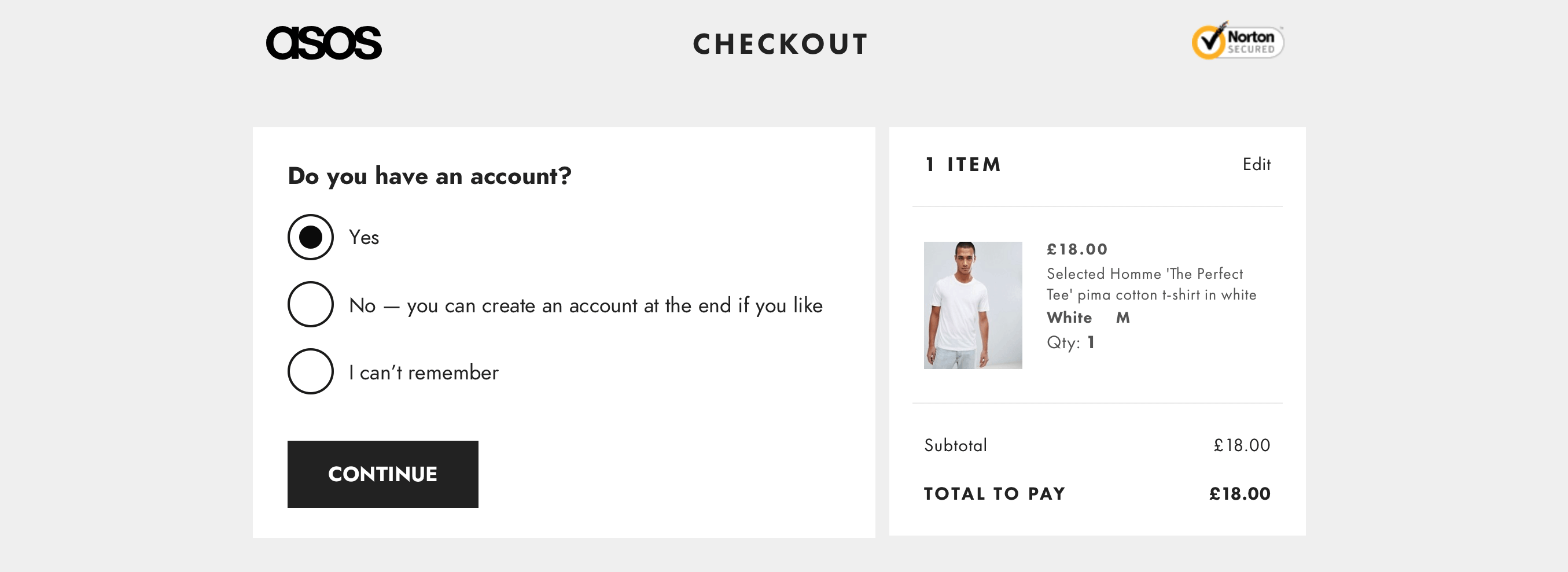
What began as an interaction design problem became a content and service design issue. This realization reinforced a key principle of form UX: “Make friends with other departments.” Designers must cooperate with stakeholders across the organization to keep forms simple, a process where the question protocol excels.
Day 4: Shorthand and Heavy Lifting
The final day was split into two parts, with the second covering patterns for long, complex forms that can take weeks to complete. These challenges were intentionally underexplored and offered new ground for design thinking.
The first part had a unique twist: Smashing Magazine’s founder, Vitaly, appeared as a business stakeholder. Attendees interrogated him about the registration form’s design choices, particularly why certain questions were asked at all.
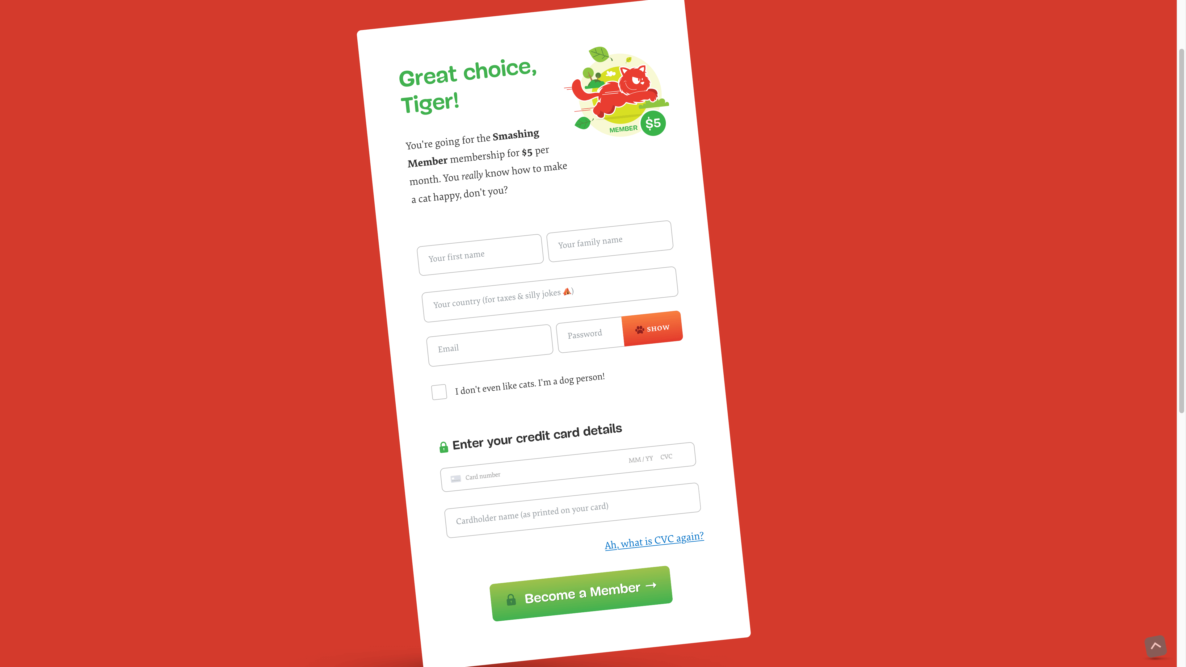
Several pointed exchanges emerged:
- Sophy O questioned why the country field was even present. Vitaly explained that needs depend on context — a book purchase requires shipping details and destination-based taxes. This challenge led to either removing the field until it was necessary, or making the hint text clearer about why the information was requested.
- Milos Lazarevic questioned a playful ‘Do you like cats?’ checkbox. While attendees like Dana Cottreau and Jaclyn Ziegler appreciated the fun, the discussion weighed that joy against the risk of alienating rushed or less digitally savvy users.
- Emma Stotz raised concerns about live validation, citing its known usability problems. In response, Vitaly showed interest in validating fields on submit instead.
Reflections on the Format
Silver felt the workshop ran well overall, moving past a couple of day-one technical glitches. The remote Zoom setup proved surprisingly effective. Screen sharing made it easy for attendees to illustrate questions, and breaking geographic barriers meant participants joined from around the world.
A key adjustment occurred between days. On day one, Silver read questions from a shared document, which created a barrier. For day two onward, he let people speak directly, producing more open dialogue where attendees started answering each other’s questions.
Planned Adjustments
Rethink the Basics
Silver noted that teaching fundamentals on day one likely covered ground attendees already knew. Next time, he’ll approach it as “how I teach” rather than “how to learn.” He also plans to ask the group about tricky points in convincing teammates, a problem he has faced himself.
Bigger Groups
Breakout exercises with pairs struggled because time zones meant some attendees were away for meals. Groups of four would help ensure no one is left out of the exercises.
More Collaborative Work
Despite the logistics, participants enjoyed the group tasks and requested more. Future sessions will include additional exercises.
A Lasting Takeaway
Throughout the workshop, the group covered more than 40 rules and principles of form design. After several attendees asked if these were available in a single reference, Silver created a poster summarizing all of them.
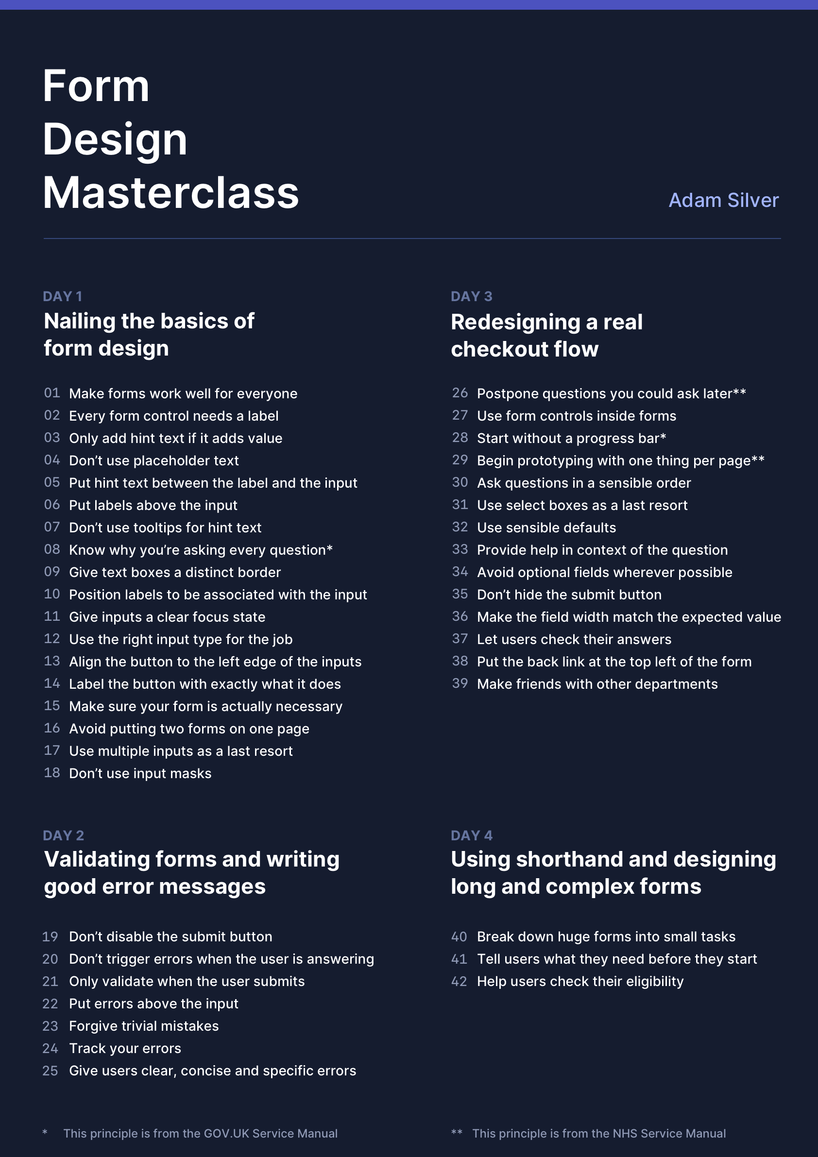
From the Workshop: A Practical Form Design Checklist
The Form Design Masterclass workshop wraps up with a takeaway poster that distills the core lessons into actionable principles. The poster is organized by day, with each day covering a different stage of form design work. Below is the full list of principles, which you can adapt for your own projects and share with your team.
Day 1: Getting the Fundamentals Right
The first day focuses on basic layout and control choices that improve usability for everyone.
- Make forms work well for everyone.
- Every form control needs a label.
- Only add hint text if it adds value.
- Don’t use placeholder text.
- Put hint text between the label and the input.
- Put labels above the input.
- Don’t use tooltips for hint text.
- Know why you’re asking every question.*
- Give text boxes a distinct border.
- Position labels to be associated with the input.
- Give inputs a clear focus state.
- Use the right input type for the job.
- Align the button to the left edge of the inputs.
- Label the button with exactly what it does.
- Make sure your form is actually necessary.
- Avoid putting two forms on one page.
- Use multiple inputs as a last resort.
- Don’t use input masks.
Day 2: Validation and Error Messages
Day two covers when to validate and how to communicate problems to users without adding friction.
- Don’t disable the submit button.
- Don’t trigger errors when the user is answering.
- Only validate when the user submits.
- Put errors above the input.
- Forgive trivial mistakes.
- Track your errors.
- Give users clear, concise and specific errors.
Day 3: Redesigning a Real Checkout Flow
The checkout redesign day emphasizes sensible sequencing and avoiding common conversion killers.
- Postpone questions you could ask later.**
- Use form controls inside forms.
- Start without a progress bar.*
- Begin prototyping with one thing per page.**
- Ask questions in a sensible order.
- Use select boxes as a last resort.
- Use sensible defaults.
- Provide help in context of the question.
- Avoid optional fields wherever possible.
- Don’t hide the submit button.
- Make the field width match the expected value.
- Let users check their answers.
- Put the back link at the top left of the form.
- Make friends with other departments.
Day 4: Shorthand and Long Forms
The final day tackles strategies for making complex, multi-step forms feel manageable.
- Break down huge forms into small tasks.
- Tell users what they need before they start.
- Help users check their eligibility.
* This principle is from the GOV.UK Service Manual.
** This principle is from the NHS Service Manual.

For more detail on the workshop itself, including how it’s structured and delivered, the full overview of Smashing’s online workshop format and its upcoming sessions on front-end and UX topics is worth a look. The related reading below covers adjacent subjects like useful newsletters for designers and the ongoing relevance of spreadsheets.


