
Multi-step forms make sense when a form is large and has many controls. Grouping fields screen by screen spares users from scrolling through an enormous form on a mobile device and generally improves the experience of completing long, complex forms. The tradeoff is coordination: there is much to manage, which is why many developers reach for a form library or widget. Building one by hand is still a useful exercise in the fundamentals. The walkthrough below covers a job application split across four sections, with a summary view at the end, built from baseline HTML, CSS, and JavaScript, plus error handling and accessibility.
Splitting the markup into steps
The application is divided into four sections in the HTML, each identified with an ID, with navigation at the bottom. The last section is a summary view that shows all answers before submission. A visual indicator communicates the current step and how many remain; the simplest version is dynamic text updated according to the active step, though a progress bar is an alternative. Create an index.html file with the baseline markup:
<form id="myForm">
  <section class="group-one" id="one">
    <div class="form-group">
      <div class="form-control">
        <label for="name">Name <span style="color: red;">*</span></label>
        <input type="text" id="name" name="name" placeholder="Enter your name">
      </div>

      <div class="form-control">
        <label for="idNum">ID number <span style="color: red;">*</span></label>
        <input type="number" id="idNum" name="idNum" placeholder="Enter your ID number">
      </div>
    </div>

    <div class="form-group">
      <div class="form-control">
        <label for="email">Email <span style="color: red;">*</span></label>
        <input type="email" id="email" name="email" placeholder="Enter your email">
      </div>

      <div class="form-control">
        <label for="birthdate">Date of Birth <span style="color: red;">*</span></label>
        <input type="date" id="birthdate" name="birthdate" max="2006-10-01" min="1924-01-01">
      </div>
    </div>
  </section>

  <section class="group-two" id="two">
    <div class="form-control">
      <label for="document">Upload CV <span style="color: red;">*</span></label>
      <input type="file" name="document" id="document">
    </div>

    <div class="form-control">
      <label for="department">Department <span style="color: red;">*</span></label>
      <select id="department" name="department">
        <option value="">Select a department</option>
        <option value="hr">Human Resources</option>
        <option value="it">Information Technology</option>
        <option value="finance">Finance</option>
      </select>
    </div>
  </section>

  <section class="group-three" id="three">
    <div class="form-control">
      <label for="skills">Skills (Optional)</label>
      <textarea id="skills" name="skills" rows="4" placeholder="Enter your skills"></textarea>
    </div>

    <div class="form-control">
      <input type="checkbox" name="terms" id="terms">
      <label for="terms">I agree to the terms and conditions <span style="color: red;">*</span></label>
    </div>

    <button id="btn" type="submit">Confirm and Submit</button>
  </section>

  <div class="arrows">
    <button type="button" id="navLeft">Previous</button>
    <span id="stepInfo"></span>
    <button type="button" id="navRight">Next</button>
  </div>
</form>

<script src="script.js"></script>
The first three sections contain form inputs and deliberately omit native form validation, giving the developer full control over how error messages are displayed. Native validation only fires when the submit button is clicked.
Styles and step logic
A styles.css file supplies the base styling:
:root {
  --primary-color: #8c852a;
  --secondary-color: #858034;
}

body {
  font-family: sans-serif;
  line-height: 1.4;
  margin: 0 auto;
  padding: 20px;
  background-color: #f4f4f4;
  max-width: 600px;
}

h1 {
  text-align: center;
}

form {
  background: #fff;
  padding: 40px;
  border-radius: 5px;
  box-shadow: 0 0 10px rgba(0, 0, 0, 0.1);
  display: flex;
  flex-direction: column;
}

.form-group {
  display: flex;
  gap: 7%;

}

.form-group > div {
  width: 100%;
}

input:not([type="checkbox"]),
select,
textarea {
  width: 100%;
  padding: 8px;
  border: 1px solid #ddd;
  border-radius: 4px;
}

.form-control {
  margin-bottom: 15px;
}

button {
  display: block;
  width: 100%;
  padding: 10px;
  color: white;
  background-color: var(--primary-color);
  border: none;
  border-radius: 4px;
  cursor: pointer;
  font-size: 16px;

}

button:hover {
  background-color: var(--secondary-color);
}

.group-two, .group-three {
  display: none;
}

.arrows {
  display: flex;
  justify-content: space-between
  align-items: center;
  margin-top: 10px;
}

#navLeft, #navRight {
  width: fit-content;
}

@media screen and (max-width: 600px) {
  .form-group {
    flex-direction: column;
  }
}
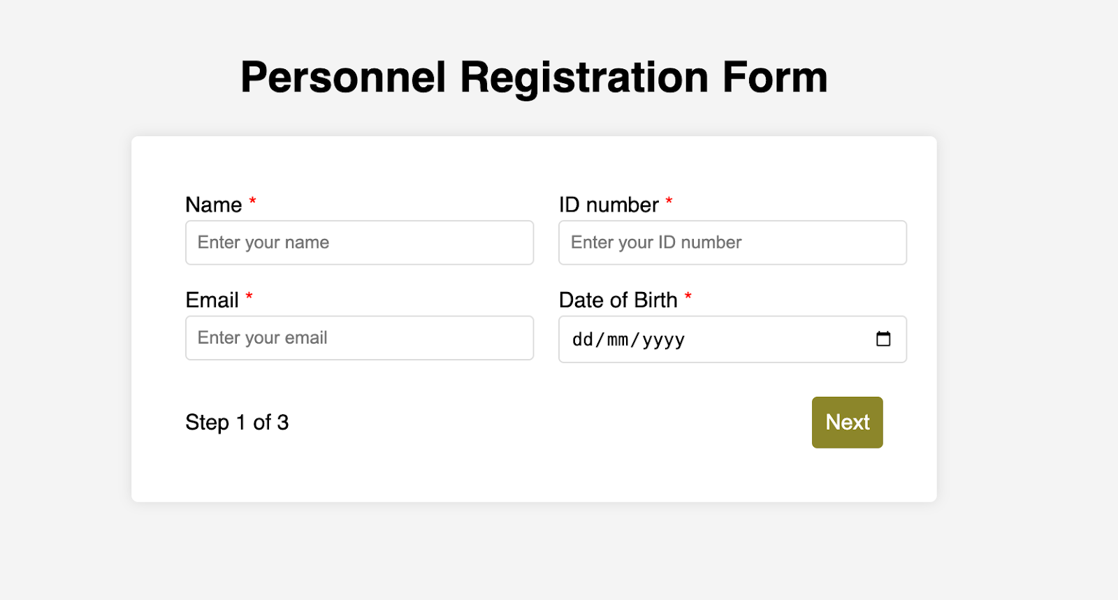
Opening the HTML file in a browser produces a two-column layout with a current-page indicator and navigation:
Functionality lives in a script.js file placed alongside the HTML and CSS:
const stepInfo = document.getElementById("stepInfo");
const navLeft = document.getElementById("navLeft");
const navRight = document.getElementById("navRight");
const form = document.getElementById("myForm");
const formSteps = ["one", "two", "three"];

let currentStep = 0;

function updateStepVisibility() {
  formSteps.forEach((step) => {
    document.getElementById(step).style.display = "none";
  });

  document.getElementById(formSteps[currentStep]).style.display = "block";
  stepInfo.textContent = `Step ${currentStep + 1} of ${formSteps.length}`;
  navLeft.style.display = currentStep === 0 ? "none" : "block";
  navRight.style.display =
  currentStep === formSteps.length - 1 ? "none" : "block";
}

document.addEventListener("DOMContentLoaded", () => {
  navLeft.style.display = "none";
  updateStepVisibility();
  navRight.addEventListener("click", () => {
    if (currentStep < formSteps.length - 1) {
      currentStep++;
      updateStepVisibility();
    }
  });

  navLeft.addEventListener("click", () => {
    if (currentStep > 0) {
      currentStep--;
      updateStepVisibility();
    }
  });
});
The script shows and hides sections according to the formStep values, which correspond to the IDs of the form sections. It also updates stepInfo with the current active section, serving as a progress indicator. Click events on the navigation buttons, registered after the page loads, let the user cycle through the sections.
Inside the navigation functions
The updateStepVisibility() function first hides every section to start from a clean slate:
formSteps.forEach((step) => {
  document.getElementById(step).style.display = "none";
});
It then displays the active section:
document.getElementById(formSteps[currentStep]).style.display = "block";`Next it updates the progress text:
stepInfo.textContent = `Step ${currentStep + 1} of ${formSteps.length}`;Finally it hides the Previous button on the first step and the Next button on the last section:
navLeft.style.display = currentStep === 0 ? "none" : "block";
navRight.style.display = currentStep === formSteps.length - 1 ? "none" : "block";
On page load, the Previous button is hidden because the form starts on the first section:
document.addEventListener("DOMContentLoaded", () => {
navLeft.style.display = "none";
updateStepVisibility();
The Next button gets a click handler that conditionally increments the step count and calls updateStepVisibility(), which shows the new section:
navRight.addEventListener("click", () => {
  if (currentStep < formSteps.length - 1) {
    currentStep++;
    updateStepVisibility();
  }
});
The Previous button gets the same treatment in reverse, conditionally decrementing the count before calling updateStepVisibility():
navLeft.addEventListener("click", () => {
  if (currentStep > 0) {
    currentStep--;
    updateStepVisibility();
  }
});
Validation and error handling
Errors should appear as soon as something is wrong, before the user ever reaches the Submit button, rather than surfacing vaguely after a long fill-out session. The approach here is to mark exactly which controls have errors, give meaningful messages, and clear those errors once the user corrects the input.
Grab the necessary input elements and add them to the existing constants:
const nameInput = document.getElementById("name");
const idNumInput = document.getElementById("idNum");
const emailInput = document.getElementById("email");
const birthdateInput = document.getElementById("birthdate")
const documentInput = document.getElementById("document");
const departmentInput = document.getElementById("department");
const termsCheckbox = document.getElementById("terms");
const skillsInput = document.getElementById("skills");
Then add a function to validate each step:
function validateStep(step) {
  let isValid = true;

  if (step === 0) {
    if (nameInput.value.trim() === "")
    showError(nameInput, "Name is required");
    isValid = false;
  }

  if (idNumInput.value.trim() === "") {
    showError(idNumInput, "ID number is required");
    isValid = false;
  }

  if (emailInput.value.trim() === "" || !emailInput.validity.valid) {
    showError(emailInput, "A valid email is required");
    isValid = false;
  }

  if (birthdateInput.value === "") {
    showError(birthdateInput, "Date of birth is required");
    isValid = false;
  }

  else if (step === 1) {

    if (!documentInput.files[0]) {
      showError(documentInput, "CV is required");
      isValid = false;
    }

    if (departmentInput.value === "") {
      showError(departmentInput, "Department selection is required");
      isValid = false;
    }
  } else if (step === 2) {

    if (!termsCheckbox.checked) {
      showError(termsCheckbox, "You must accept the terms and conditions");
      isValid = false;
    }
  }

  return isValid;
}
It checks that each required input has a value and that the email input is valid, setting the isValid boolean accordingly, and calls a showError() function defined above validateStep():
function showError(input, message) {
  const formControl = input.parentElement;
  const errorSpan = formControl.querySelector(".error-message");
  input.classList.add("error");
  errorSpan.textContent = message;
}
Supplementary styles for error states go in the stylesheet:
input:focus, select:focus, textarea:focus {
  outline: .5px solid var(--primary-color);
}

input.error, select.error, textarea.error {
  outline: .5px solid red;
}

.error-message {
  font-size: x-small;
  color: red;
  display: block;
  margin-top: 2px;
}

.arrows {
  color: var(--primary-color);
  font-size: 18px;
  font-weight: 900;

}

#navLeft, #navRight {
  display: flex;
  align-items: center;
  gap: 10px;
}

#stepInfo {
  color: var(--primary-color);
}
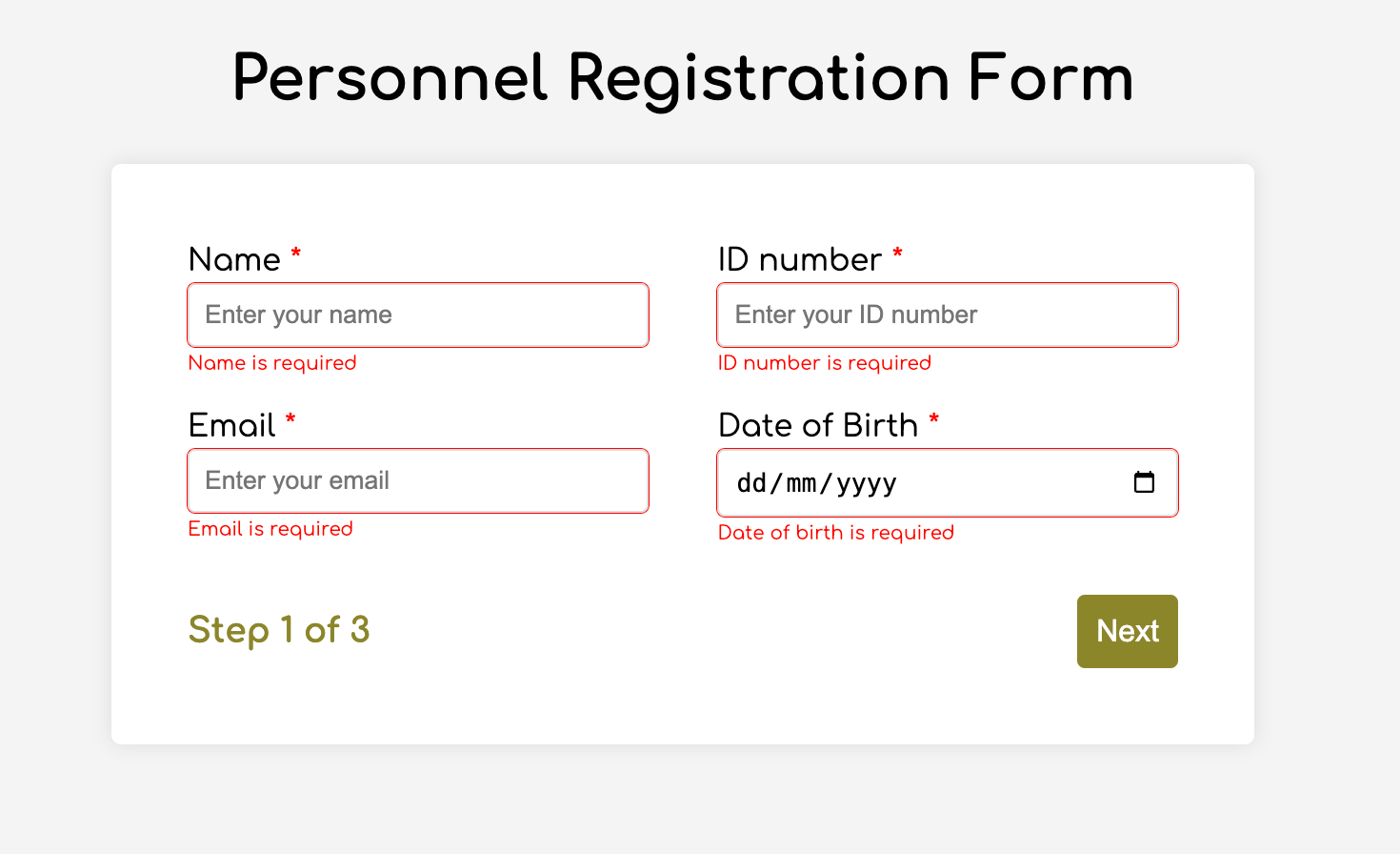
Buttons now refuse to advance until the inputs are valid:
Real-time handling clears errors as correct information is entered. Add this function below validateStep():
function setupRealtimeValidation() {
  nameInput.addEventListener("input", () => {
    if (nameInput.value.trim() !== "") clearError(nameInput);
  });

  idNumInput.addEventListener("input", () => {
    if (idNumInput.value.trim() !== "") clearError(idNumInput);
  });

  emailInput.addEventListener("input", () => {
    if (emailInput.validity.valid) clearError(emailInput);
  });

  birthdateInput.addEventListener("change", () => {
    if (birthdateInput.value !== "") clearError(birthdateInput);
  });

  documentInput.addEventListener("change", () => {
    if (documentInput.files[0]) clearError(documentInput);
  });

  departmentInput.addEventListener("change", () => {
    if (departmentInput.value !== "") clearError(departmentInput);
  });

  termsCheckbox.addEventListener("change", () => {
    if (termsCheckbox.checked) clearError(termsCheckbox);
  });
}
It listens for input and change events and clears the errors once the input is no longer invalid. The clearError() function goes below showError():
function clearError(input) {
  const formControl = input.parentElement;
  const errorSpan = formControl.querySelector(".error-message");
  input.classList.remove("error");
  errorSpan.textContent = "";
}
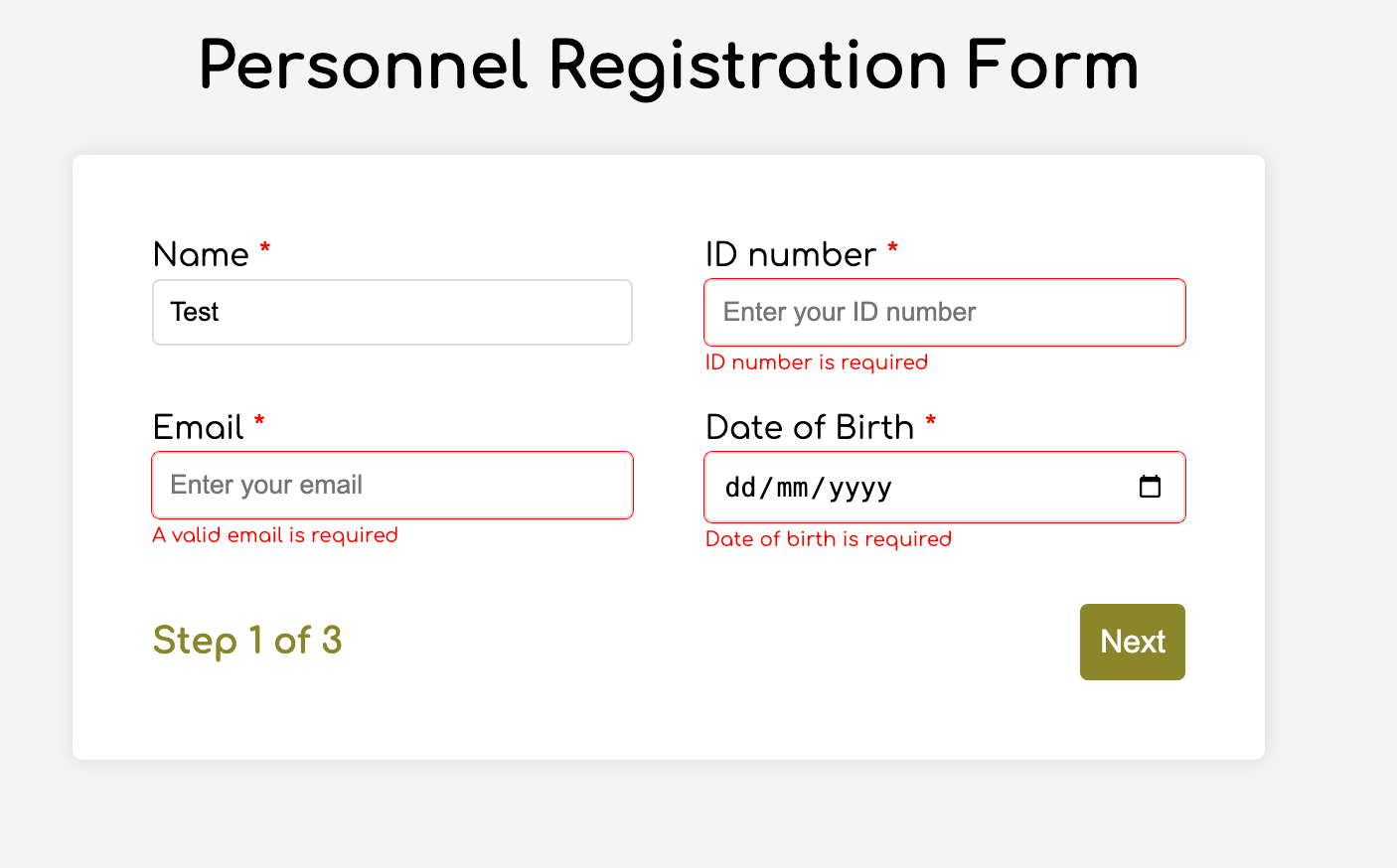
Errors now clear as soon as the user types the right value:
If errors are instead kept until the end of the form, at minimum jump the user back to the offending control and indicate how many errors need fixing.
The summary step before submission
Because users cannot see previous steps without navigating backward, a summary at the end gives assurance and a chance to edit. Add the fourth section to the markup to hold the summary view, moving the submit button into it:
<section class="group-four" id="four">
  <div class="summary-section">
    <p>Name: </p>
    <p id="name-val"></p>
    <button type="button" class="edit-btn" id="name-edit">
    <span>✎</span>
    <span>Edit</span>
    </button>
  </div>

  <div class="summary-section">
    <p>ID Number: </p>
    <p id="id-val"></p>
    <button type="button" class="edit-btn" id="id-edit">
    <span>✎</span>
    <span>Edit</span>
    </button>
  </div>

  <div class="summary-section">
    <p>Email: </p>
    <p id="email-val"></p>
    <button type="button" class="edit-btn" id="email-edit">
    <span>✎</span>
    <span>Edit</span>
    </button>
  </div>

  <div class="summary-section">
    <p>Date of Birth: </p>
    <p id="bd-val"></p>
    <button type="button" class="edit-btn" id="bd-edit">
    <span>✎</span>
    <span>Edit</span>
    </button>
  </div>

  <div class="summary-section">
    <p>CV/Resume: </p>
    <p id="cv-val"></p>
    <button type="button" class="edit-btn" id="cv-edit">
      <span>✎</span>
      <span>Edit</span>
    </button>
  </div>

  <div class="summary-section">
    <p>Department: </p>
    <p id="dept-val"></p>
    <button type="button" class="edit-btn" id="dept-edit">
      <span>✎</span>
      <span>Edit</span>
    </button>
  </div>

  <div class="summary-section">
    <p>Skills: </p>
    <p id="skills-val"></p>
    <button type="button" class="edit-btn" id="skills-edit">
      <span>✎</span>
      <span>Edit</span>
    </button>
  </div>

  <button id="btn" type="submit">Confirm and Submit</button>
</section>
Update formStep in the JavaScript to account for it:
const formSteps = ["one", "two", "three", "four"];Add the matching classes to styles.css:
.summary-section {
  display: flex;
  align-items: center;
  gap: 10px;
}

.summary-section p:first-child {
  width: 30%;
  flex-shrink: 0;
  border-right: 1px solid var(--secondary-color);
}

.summary-section p:nth-child(2) {
  width: 45%;
  flex-shrink: 0;
  padding-left: 10px;
}

.edit-btn {
  width: 25%;
  margin-left: auto;
  background-color: transparent;
  color: var(--primary-color);
  border: .7px solid var(--primary-color);
  border-radius: 5px;
  padding: 5px;
}

.edit-btn:hover {
  border: 2px solid var(--primary-color);
  font-weight: bolder;
  background-color: transparent;
}
Add these to the top of script.js alongside the other constants:
const nameVal = document.getElementById("name-val");
const idVal = document.getElementById("id-val");
const emailVal = document.getElementById("email-val");
const bdVal = document.getElementById("bd-val")
const cvVal = document.getElementById("cv-val");
const deptVal = document.getElementById("dept-val");
const skillsVal = document.getElementById("skills-val");
const editButtons =
  "name-edit": 0,
  "id-edit": 0,
  "email-edit": 0,
  "bd-edit": 0,
  "cv-edit": 1,
  "dept-edit": 1,
  "skills-edit": 2
};
Then add this function:
function updateSummaryValues() {
  nameVal.textContent = nameInput.value;
  idVal.textContent = idNumInput.value;
  emailVal.textContent = emailInput.value;
  bdVal.textContent = birthdateInput.value;

  const fileName = documentInput.files[0]?.name;
  if (fileName)
  const extension = fileName.split(".").pop();
  const baseName = fileName.split(".")[0];
  const truncatedName = baseName.length > 10 ? baseName.substring(0, 10) + "..." : baseName;
  cvVal.textContent = `${truncatedName}.${extension}`;
  } else {
    cvVal.textContent = "No file selected";
  }

  deptVal.textContent = departmentInput.value;
  skillsVal.textContent = skillsInput.value || "No skills submitted";
}
It inserts the input values into the summary section, truncates file names, and supplies fallback text for inputs that were not required. Update updateStepVisibility() to call it:
function updateStepVisibility() {
  formSteps.forEach((step) => {
    document.getElementById(step).style.display = "none";
  });

  document.getElementById(formSteps[currentStep]).style.display = "block";
  stepInfo.textContent = `Step ${currentStep + 1} of ${formSteps.length}`;
  if (currentStep === 3) {
    updateSummaryValues();
  }

  navLeft.style.display = currentStep === 0 ? "none" : "block";
  navRight.style.display = currentStep === formSteps.length - 1 ? "none" : "block";
}
And add the following to the DOMContentLoaded listener:
Object.keys(editButtons).forEach((buttonId) => {
  const button = document.getElementById(buttonId);
  button.addEventListener("click", (e) => {
    currentStep = editButtons[buttonId];
    updateStepVisibility();
  });
});
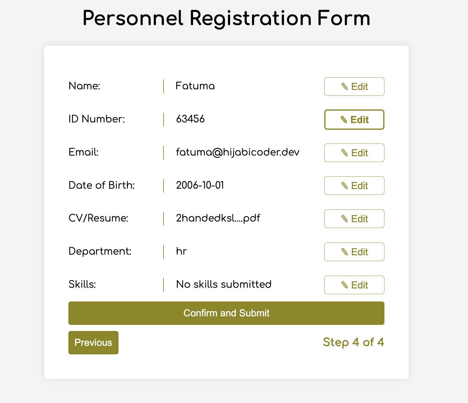
The summary now displays every entered value and lets the user edit any of them before submitting:
Submission follows from there:
form.addEventListener("submit", (e) => {
  e.preventDefault();

  if (validateStep(2)) {
    alert("Form submitted successfully!");
    form.reset();
    currentFormStep = 0;
    updateStepVisibility();
}
});
Accessibility adjustments
Accessibility begins with semantic HTML and appropriate form labels. Beyond that: give clickable elements enough room on small screens, describe navigation and progress indicators meaningfully, let users dismiss feedback themselves rather than auto-dismissing it, and watch contrast and font choice for readability. Three markup changes strengthen the technical side:
- Add
aria-required="true"to all inputs except the skills one, so screen readers know the fields are required without relying on native validation. - Add
role="alert"to the error spans, so screen readers treat them as important when an input is in an error state. - Add
role="status" aria-live="polite"to.stepInfo, telling screen readers the element tracks a state and that changes need not be announced immediately.
Replace showError() and clearError() in the script with versions that programmatically add and remove attributes tying each input to its error span and flagging the invalid state:
function showError(input, message) {
  const formControl = input.parentElement;
  const errorSpan = formControl.querySelector(".error-message");
  input.classList.add("error");
  input.setAttribute("aria-invalid", "true");
  input.setAttribute("aria-describedby", errorSpan.id);
  errorSpan.textContent = message;
  }

  function clearError(input) {
  const formControl = input.parentElement;
  const errorSpan = formControl.querySelector(".error-message");
  input.classList.remove("error");
  input.removeAttribute("aria-invalid");
  input.removeAttribute("aria-describedby");
  errorSpan.textContent = "";
}
Last, move focus to the first input of every section by appending this to updateStepVisibility():
const currentStepElement = document.getElementById(formSteps[currentStep]);
const firstInput = currentStepElement.querySelector(
  "input, select, textarea"
);

if (firstInput) {
  firstInput.focus();
}
The result is a four-part job application form with navigation, inline validation, a review step, and accessible behavior. A few references informed the work: MDN's "How to Structure a Web Form," the W3C's "Multi-page Forms" tutorial, and the A11y Project's "Create accessible forms."




