Why “readable to you” isn’t enough
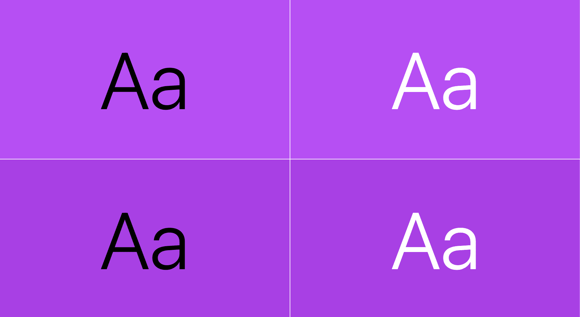
Text on a light background can look perfectly legible at first glance, but perception of contrast varies widely. A combination that works for one person may be unusable for someone with low vision, color blindness, or a monitor with different brightness characteristics. Accessible color contrast is the practice of ensuring text remains readable for everyone, and it’s a core requirement of the W3C’s Web Content Accessibility Guidelines (WCAG). The current stable version, WCAG 2.1, defines a minimum contrast requirement between text and its background.
How contrast is measured
WCAG measures the relationship between two colors as a contrast ratio, computed by comparing their relative luminance. Luminance describes how close a color is to black (0%) or white (100%). The W3C defines calculation algorithms that determine whether a given ratio meets accessibility thresholds.
It’s worth noting that the WCAG calculation has known issues and may eventually be replaced by a more reliable method. For now, however, WCAG is the standard the web works with.
The scoring rules
| AA | AAA | |
|---|---|---|
| Body text (< 24px) | 4.5 | 7 |
| Large text (> 24px) | 3 | 4.5 |
| UI (icons, graphs, etc.) | 3 | not defined |
Ratios are scored numerically: higher numbers indicate better contrast. You’ll see passing scores like 4.5 or 7 rather than a minimum of 3. To get familiar with the thresholds, Polypane’s Contrast Checker is a useful reference.
Putting Color Contrast to the Test
Knowing the contrast ratios to aim for is one thing; actually measuring them during a design or build is another. Three free tools can handle the job, each with a different balance of automation, scope, and control.
Pika (macOS Application)
Pika is a macOS system tool rather than a browser extension, which gives it access to every pixel on the screen. That makes it the go-to option when browser-based tools fall short—for example, when you need to compare colors outside the browser, or when gradients, blend modes, or semi-transparent colors make it hard for a browser to determine an element's effective background color.
Unlike DevTools or VisBug, which read colors from the browser’s DOM, Pika requires you to manually pick the exact two pixels you want to compare. That extra step buys you more control, and it opens up scenarios the other tools struggle with:
- Comparing any two on-screen colors, regardless of whether they're in a browser
- Testing colors with alpha transparency
- Checking text placed on top of gradients
- Reviewing colors that use blend modes like
mix-blend-modein CSS
To compare text against a background color, you select the text pixel and then a background pixel. The same approach works for vector graphics, where you can check stroke colors against fill colors. For a frosted glass effect, you can sample the lightest background gray as the comparison color to test the text against the most extreme case. With gradients or images, you can check contrast of text against specific spots in the image, such as comparing a label's letter against the light blue area of a photo behind it.
VisBug
VisBug is a cross-browser extension inspired by FireBug. It aims to lower the barrier to entry for design-minded developers by borrowing the UI patterns of common design tools. In addition to the Chrome Web Store, it's available for Firefox, Edge, Brave, and Safari.
Its Accessibility Inspect tool reports foreground/background color pairs and their contrast scores in a tooltip. You can trigger the info by hovering with the mouse or by keyboard-navigating to an element, and the tooltip responds to whatever is currently focused.
One differentiator is that VisBug can show multiple inspection tooltips simultaneously. If you click an element, its tooltip stays pinned. Holding Shift while clicking other elements pins each successive tooltip too. That's particularly handy for component-based design, where several adjacent color pairs within a single component must each pass, or during design reviews when you want to see a range of pairings all at once.
Chrome DevTools
If you work in Chrome, a suite of contrast-testing features is built in. Some examine one pair at a time, while others audit the whole page at once.
The Color Picker
In the Styles pane, color values display a small square swatch. Clicking that swatch opens the color picker, which reports a contrast ratio against the adjacent foreground or background when it can detect one. In an example with a custom property, the picker reports a ratio of 15.79 with two green check marks, showing it passes both AA and AAA under WCAG 2.1.
When a pairing fails, the color picker can be expanded to reveal the AA and AAA target scores. Next to each target is an eye dropper and a refresh icon; clicking the refresh finds the nearest passing color for you. That autocorrection is useful when you're less attached to a specific shade.
Inspection Tooltip
The element selection tool (the box-with-arrow icon at the top left of the panel, also activated by Control+Shift+C on Windows/Linux or Command+Shift+C on macOS) shows font, color, and accessibility info on hover. Point at any element to see its contrast score without hunting through the Styles pane—though, like the color picker, it displays only one score at a time.
Nudging Values Until They Pass
When a pairing is just short of the required ratio, an alternative to autocorrection is to manually adjust the CSS values live. To pull this off, the steps must happen in this order:
- Place keyboard focus inside the color value in the Styles panel.
- Activate the element inspection tool with the keyboard shortcut (
Control+Shift+CorCommand+Shift+Con macOS). - Hover over the target element.
- Use the up/down arrow keys to change the color channel numbers.
This works because focus stays in the CSS value while the mouse hovers elsewhere. Avoid clicking the target element—a click would shift focus away from the value and stop the nudging until you refocus.
CSS Overview Panel
For a page-wide view, the CSS Overview panel crawls the entire page and lists all inaccessible color pairings at once, showing each pair with its failing ratio.
Lighthouse
Lighthouse is a full-site auditing tool inside DevTools that also flags contrast problems. It displays small screenshots of every color pairing it finds—passing and failing alike—and failing combinations pull down your overall Lighthouse score.
Console Issues Reporting
For those who live in the console, an experimental feature in the Issues pane can report contrast accessibility problems as you work. Enable it in Settings → Experiments, then open the Issue pane to review any flagged color pairings.
Vision Deficiency Emulation
DevTools also includes a rendering emulation for different types of color blindness. It recalculates the page's colors to approximate how users with those conditions would see them. This is worth checking, since relying on color alone (e.g., red for errors, green for success) can fail for people who don't perceive those hues as intended.
System Contrast Preference Emulation
Operating systems allow users to request more or less contrast in their UI, and CSS responds via the same media query mechanism used for light/dark theme preferences. DevTools can emulate that system setting from the rendering tab, so you can test your design's response without changing the OS preference directly.
WCAG 3.0 APCA Preview
Finally, an experimental toggle in Settings → Experiments replaces the WCAG 2.1 contrast scoring with the proposed APCA algorithm. Once enabled, the point-inspect tooltip and color picker will report the APCA-based score so you can see how your pairings fare under the newer method while it's still being worked toward standardization.


