
Why contrast ratios matter more than you think
Color perception is not universal. Your environment — bright sunlight, a dim room — and your visual capabilities both affect how you see on-screen content. Millions of users have color blindness or low vision, so the way you experience a color scheme may not reflect how your users experience it.
To support these users, the WAI group defined a color contrast formula. Following these contrast ratios ensures people with moderately low vision can read text without needing contrast-enhancing assistive technology.
Take a moment to see how much the contrast ratio changes the readability of text in Figure 1.
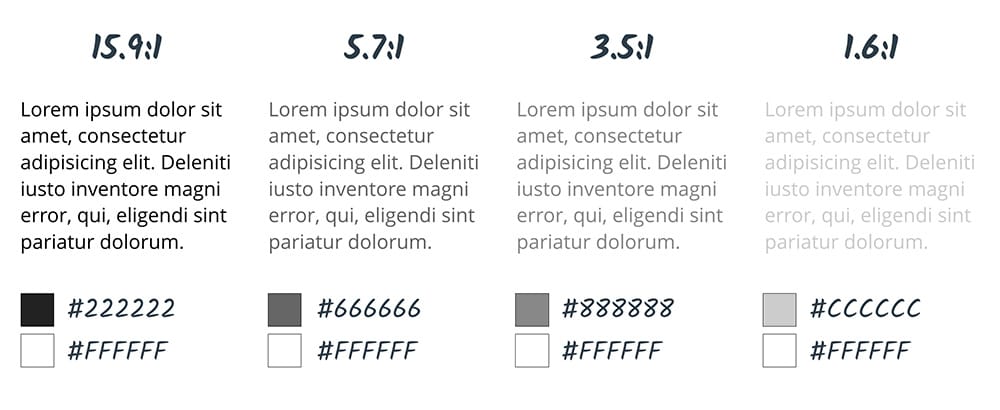
WCAG 2.0 sets 4.5:1 as the required minimum contrast ratio. That number compensates for contrast sensitivity loss comparable to 20/40 vision. Remember, 4.5:1 is just the floor. To support users with low vision or color blindness more fully, meet level AAA with a 7:1 contrast ratio.
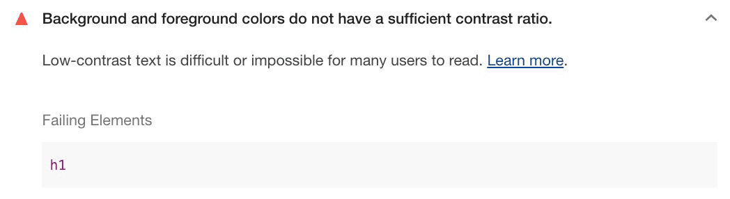
You can check your contrast ratios with the Lighthouse Accessibility Audit in DevTools.
Beyond WCAG: The Advanced Perceptual Contrast Algorithm
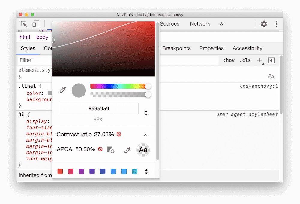
The Advanced Perceptual Contrast Algorithm (APCA) approaches contrast from a different angle: modern research on how humans actually perceive color.
Unlike WCAG's AA and AAA levels, APCA is context-dependent. It calculates contrast based on:
- Spatial properties — the font weight and text size
- Text color — the perceived lightness difference between text and background
- Context — ambient light, surroundings, and the text's intended purpose
Chrome has an experimental DevTools feature that replaces the AA/AAA contrast ratio guidelines with APCA.
Don't rely on color alone
Important information should always be conveyed through text or alt text — not just visual cues like color, patterns, images, font styling, or directional language.
Imagine a contact form that underlines invalid inputs in red. That color cue alone gives nothing to a screen reader or a user with color vision impairments. They cannot see why the form submission fails, and may give up altogether.
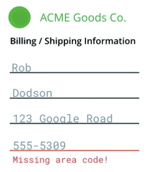
Instead, alert users in several ways. Add an error message that announces the specific field is invalid and why. Add help text describing what proper input looks like. You can still underline the invalid input in red — just ensure there are additional, non-visual cues.
If your interface leans heavily on color, you can find contrast issues in Chrome DevTools.
Testing high-contrast and inverted color modes
High-contrast modes help users with low vision navigate content more easily. Both macOS and Windows let users increase contrast across the whole operating system.
Users can also invert foreground and background colors (for example, on macOS), which is particularly useful for sites and apps without a dark mode.
You should manually verify your interface stays usable in these modes. For instance, a navigation bar may use a subtle background color to mark the active page. In high-contrast mode, that subtlety can vanish — and with it, the user's understanding of which page they are on.

Meeting level AA or higher contrast usually means your content works as expected with inverted colors or high contrast. But it is still worth testing manually to confirm the experience is what you intend.


