Throwback Cursors Bring Yesterday’s Web into Today’s Canvases
Figma is celebrating its annual April Fun Day with 404, a theme that looks back at some of digital design’s most distinctive eras—from DOS terminals to Y2K maximalism. As part of the festivities, users can temporarily swap their standard multiplayer cursors in Figma and FigJam for a set of retro-inspired alternatives, letting collaborators navigate their shared canvas with a bit of historical flair.
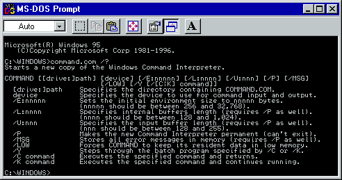
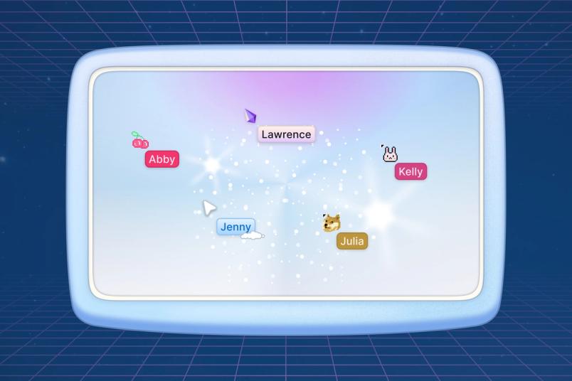
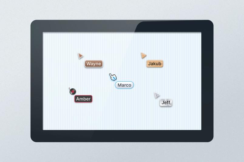
In collaborative tools like Figma, cursors are more than just pointers; they serve as a visual stand-in for teammates, enabling chat, emotes, and high-fives across a shared space. For this throwback event, the team introduced four distinct cursor aestheticsthey call 8-bit, Y2K, Skeuomorphic, and Aero. To use them, simply open any file and select the cursor icon in the top right corner.
8-bit: Pixel-Perfect Nostalgia
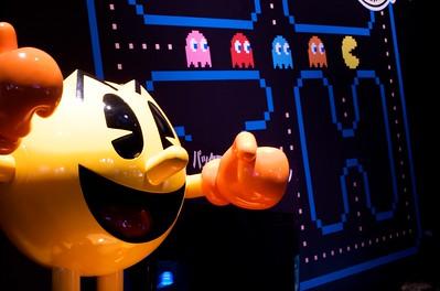
The 8-bit era covers a broad stretch of computing history, from text-based DOS terminals to the early days of Windows 2000. For Software Engineer Chris Brainerd, these designs evoke the foundational period when he first started working with computers. Product Designer Kelly Li grew up in China with a school system that ran on DOS without any graphical interface—just a blinking cursor on a black screen.
When Li finally encountered Windows 2000, she was taken with the tactile, three-dimensional quality of its interface elements, from the raised Start button to the way light seemed to play across the icons. “You could change the toolbar color at one point, and that blew my mind as a kid,” she recalls.
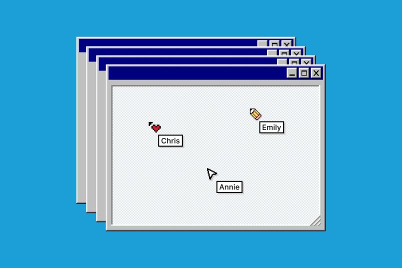
The design team’s mood board for this aesthetic drew on those early memories of arcade games like Pac-Man and Space Invaders, as well as the friendly, basic shapes of early GUI icons. To translate that look into cursors, they reduced the resolution and emphasized the pixel grid, leaning into the elementary charm of icons like a pointing hand or the classic No. 2 pencil. Product Designer Aosheng Ran described the process as “digging through the drawer of memory,” finding authentic visual anchors from the period.
Y2K: Expressive Excess
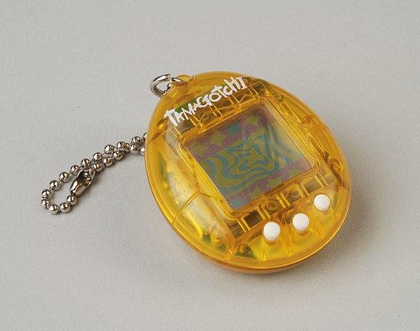
The Y2K aesthetic is having a moment, returning to fashion runways and digital design circles with its signature combination of holographic effects, neon colors, and maximalist embellishments. The team’s mood board for this set leans into that unapologetic energy, peppered with cultural touchstones from the year 2000—from Tamagotchis and the Backstreet Boys to the familiar static of a dial-up connection.
For Li, the era’s connection to self-expression is a personal one: her introduction to HTML came from a desire to decorate her MySpace profile with glittery GIFs, a lesson taught by her mother. “There’s a sense of customizability and self-expression that I miss about this era,” she says.
The cursor designs nod to pop iconography, with gem and cherry shapes, but the team aimed to refine the look rather than release the full rawness of early-aughts web design. “We tried to represent the ‘anything goes’ spirit of the time but bring the designs up in terms of sophistication and polish,” Li says. Even the inclusion of a doge meme—an important transplant from later internet culture—feels faithful because it captures the playful, pre-retina quality of the period. “It’s a bit blurry,” Ran notes.
We tried to represent the ‘anything goes’ spirit of the time but bring the designs up in terms of sophistication and polish.“We tried to represent the ‘anything goes’ spirit of the time but bring the designs up in terms of sophistication and polish.”
Aero: Glass and Gloss
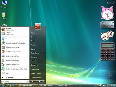
Microsoft’s Windows Aero design language, introduced with Windows Vista and refined in Windows 7, brought a glossy, translucent look to the personal computer. Referencing water, glass, and transparency, the interface felt futuristic and ultra-smooth. Around the same time, the widespread adoption of the Frutiger font family led the design community to coin the term “Frutiger Aero” to describe the style.
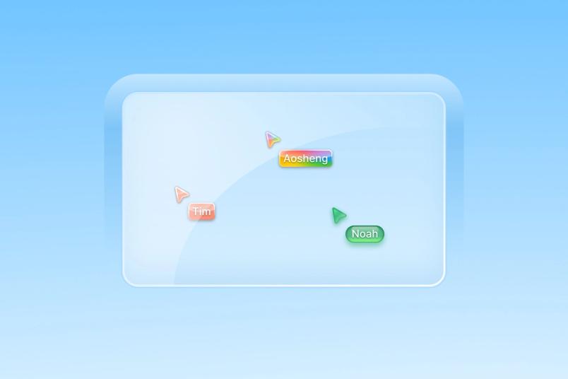
The aesthetic, defined by its high-gloss finishes and blue-and-green palette, made a strong impression. “I remember visiting my classmate’s house and seeing it. I was like, ‘What is this? It looks like it’s from outer space,’” Ran recalls. He also remembers installing theme packs for Windows XP to emulate the newer look without the risk of breaking his parents’ machine.
Creating the cursors required careful attention to rendering, particularly when it came to surfaces like a single translucent pill shape. “It took a lot of effort and attention to render a single pill,” says Li. “In our day to day, we do a lot of visual design and sweat the details, but it was fun to use that muscle in a different way.”
I remember visiting my classmate’s house and seeing [Windows 7]. I was like, ‘What is this? It looks like it’s from outer space.’“I remember visiting my classmate’s house and seeing [Windows 7]. I was like, ‘What is this? It looks like it’s from outer space.’”
Ready to relive the early web? Open a Figma or FigJam file to swap in these era-specific cursors and add a little history to your next collaborative session.
Bringing Back Digital Texture
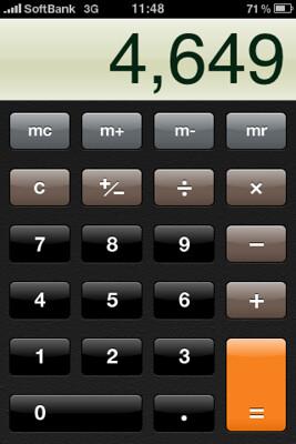
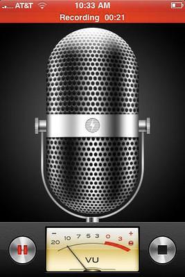
The 2007 iPhone launch revived skeuomorphism—design that mimics physical objects, like a file dropping into a trash icon. Apple’s own apps leaned in heavily: Notes looked like a yellow legal pad, Newsstand a wooden shelf, and the calculator app a faithful replica of a handheld device.
Those visual cues helped newcomers understand how to interact with unfamiliar technology. Aosheng, one of the designers behind the cursor project, remembers the era fondly: “This reminds me of when I got my first iPhone, and the excitement I felt at the time. The visual design felt so considered and handmade.”
The Texture of Touch
Kelly sees a resurgence of this aesthetic, but with a modern twist: “Less in the sense of physical metaphor, but more in the sense of reintroducing textures to our UIs. I think we’re so inundated with screens that people just want to ‘touch grass.’” The designers drew from that era’s emphasis on texture and three-dimensionality, pulling the metallic glow from classic iOS dials and switches, and referencing fine-grained leather patterns and the glassy look of old text bubbles. Colors like aqua help anchor the cursors in that specific time.
Translating that aesthetic into cursor form presented a unique technical challenge. Figma renders cursors and their name tags pixel-by-pixel, making them feel responsive but difficult to scale. To solve this, the team employed a 9-patch image technique for each name tag. This classic approach, borrowed from early CSS days, allows the tag’s length to expand or contract as needed while keeping the corner radii perfectly intact. As Kelly puts it, “The real generational divide is engineers who know how to do 9-patch, and those who don’t.”
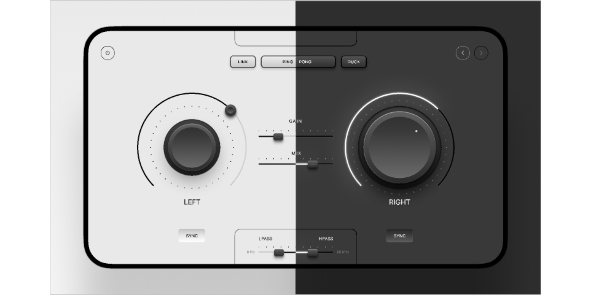
For engineers like Chris, the project brings welcome novelty: “The designers have been stretching their wings with this project, and as a result, the problems that Annie [Wang], Susan, and I are getting to solve are very fun. We don’t normally get to make cool radial gradients in CSS because nobody uses them anymore.”
More Than a Pointer
Each annual April Fun Day cursor is a time capsule, capturing the brash confidence of the Y2K years or the optimistic friendliness of skeuomorphism. But beyond the visual nostalgia, the handcrafted nature of these designs speaks to a deeper longing for the early internet’s ethos. “The internet somehow felt more accessible,” says Aosheng. “The sense of ownership that you had with MySpace, for example, gave you creative control over how it looked and reflected your identity.”
The project is a reminder of a more imaginative web, one built for self-expression. So pick a cursor that matches your attitude and log on.


