Designing for Accessibility, Improving Charts for Everyone
Google Cloud’s first dedicated data visualization team, founded in 2018, had a mission: make data accessible to everyone. Their work on Material Design’s data visualization guidelines was well known, but an internal realization soon emerged — their own visualizations were not as inclusive as they should be. Rather than treating accessibility as a final compliance check, the team made it the starting point." And that decision led to a surprising discovery: the most accessible chart was also the most effective one.
Why Data Visualization Has an Accessibility Problem
Charts are inherently visual, which makes them inaccessible by design to a large segment of the population. Nearly 7.6 million people in the US alone have a vision disability, and color blindness affects one in twelve men worldwide. Many of these people don't use screen readers — they simply encounter a chart that fails to convey its value. When a visualization can't deliver key insights to these users, it has failed in its primary purpose.
An Architectural Comparison for Inclusive Design
The principle behind the team's approach mirrors Frank Lloyd Wright's design for the Guggenheim Museum in New York City. Visitors traverse a wide, spiral ramp to view exhibits — the accessible path is the main path. Everyone uses it. No one has to search for a hidden elevator or a retrofitted entrance at the back. Accessibility itself is the core experience, not an afterthought.
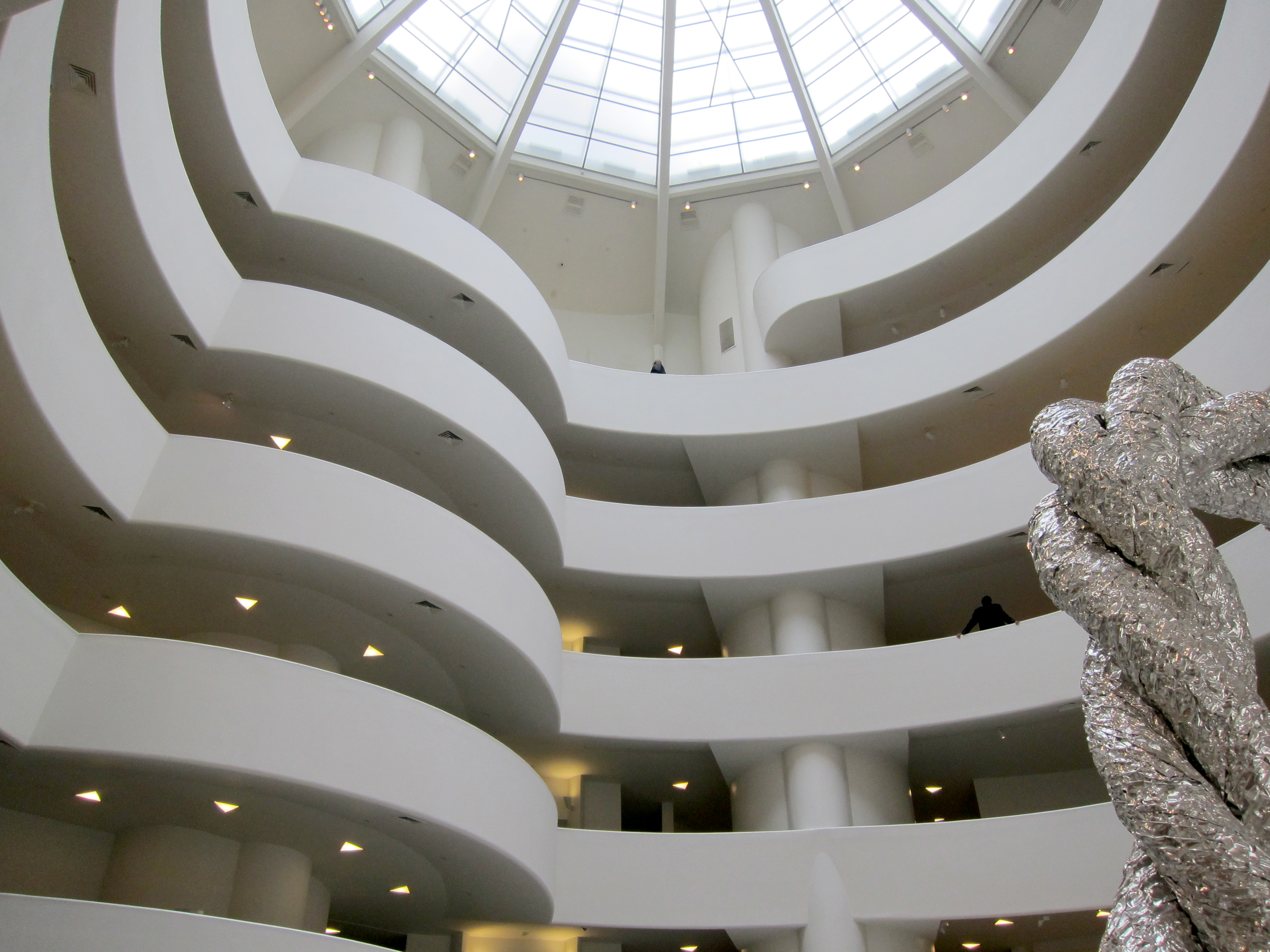
The same logic, the team reasoned, should apply to chart design. The accessible solution should be the chart itself, not an appended alternative or a simplified text description.
A Concrete Problem: Visualizing Code Performance
The team was asked to create a tool to help developers diagnose performance issues in their apps. The goal was to show the execution time of each function over many runs, allowing developers to identify which pieces of code were slow or unreliable. A chart needed to show a distribution of execution times for every function, and it needed to do so with at-a-glance clarity.
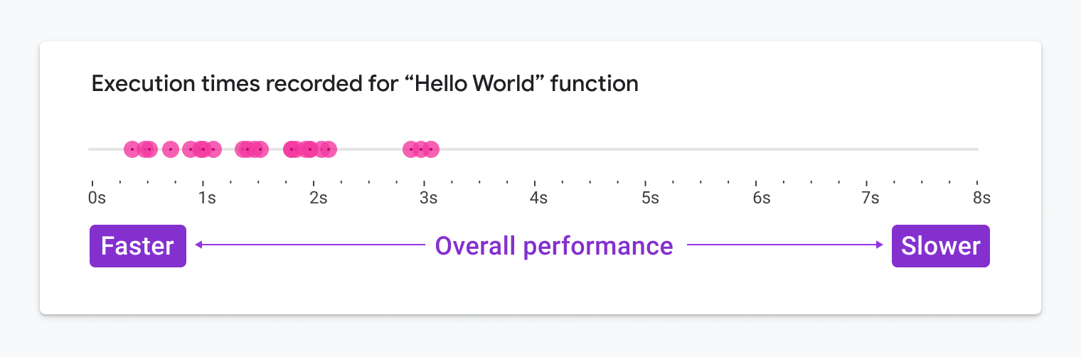
Initial explorations used dot plots and strip plots of individual execution times:
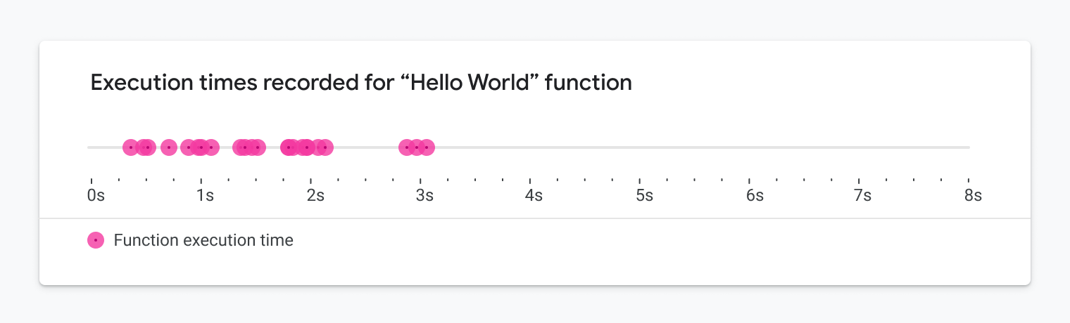
After enough runs, the shape of the data would clearly show how performant a function was:
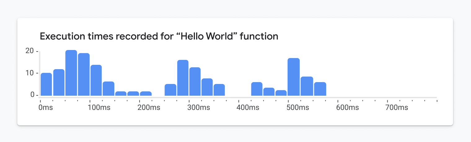
The first viable candidate was a histogram, which offers a more scalable solution for large volumes of data:
Applying the WCAG Constraints at the Start
With the Web Content Accessibility Guidelines (WCAG) in mind, the team evaluated the histogram against several specific constraints.
Zooming In for Low-Vision Users
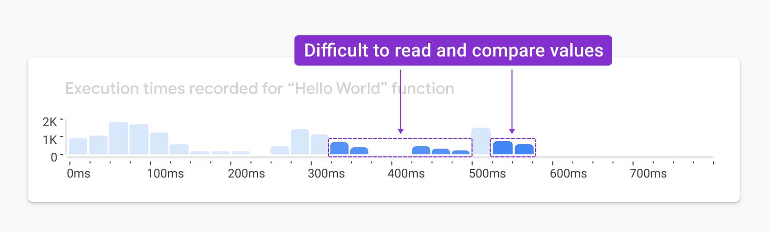
The visualization had to provide value at 200% zoom, which dramatically limits how much screen real estate it should occupy. When a histogram is scaled down for such a view, the height of each bar becomes nearly impossible to compare against the Y-axis, which stays compressed:
It gets even harder when you want to compare the performance of multiple functions with side-by-side histograms. The differences between bars become nearly impossible to read:
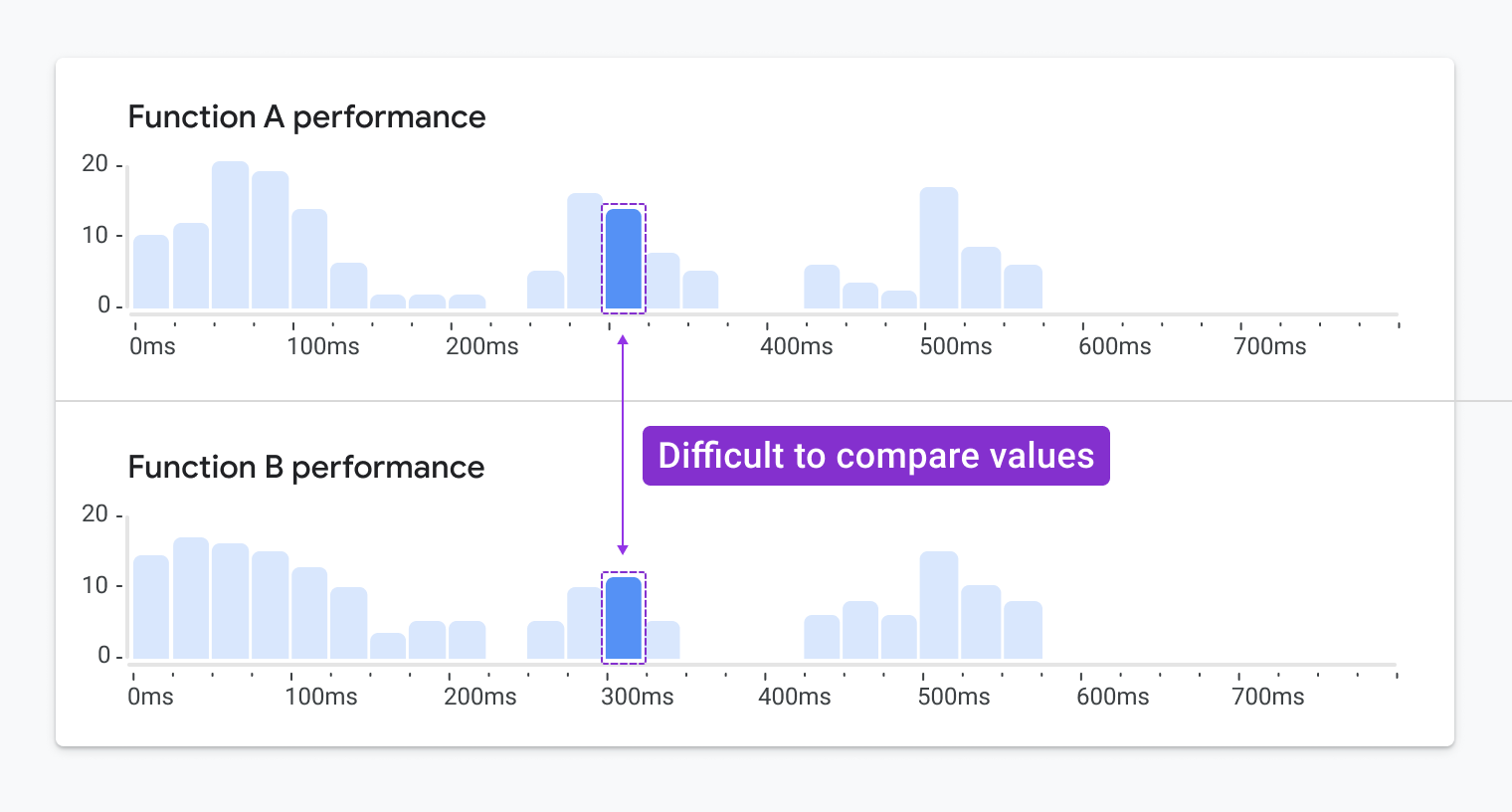
The histogram was quickly eliminated as a viable option.
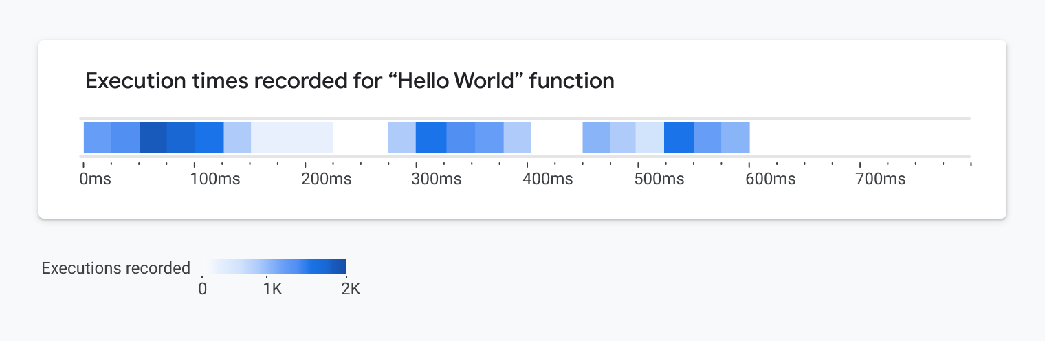
The next consideration was a heatmap, which could stack execution times as horizontal swimlanes. Each lane could represent repeated runs of a single function, with colors mapping to run times:
Color Contrast Without the Junk
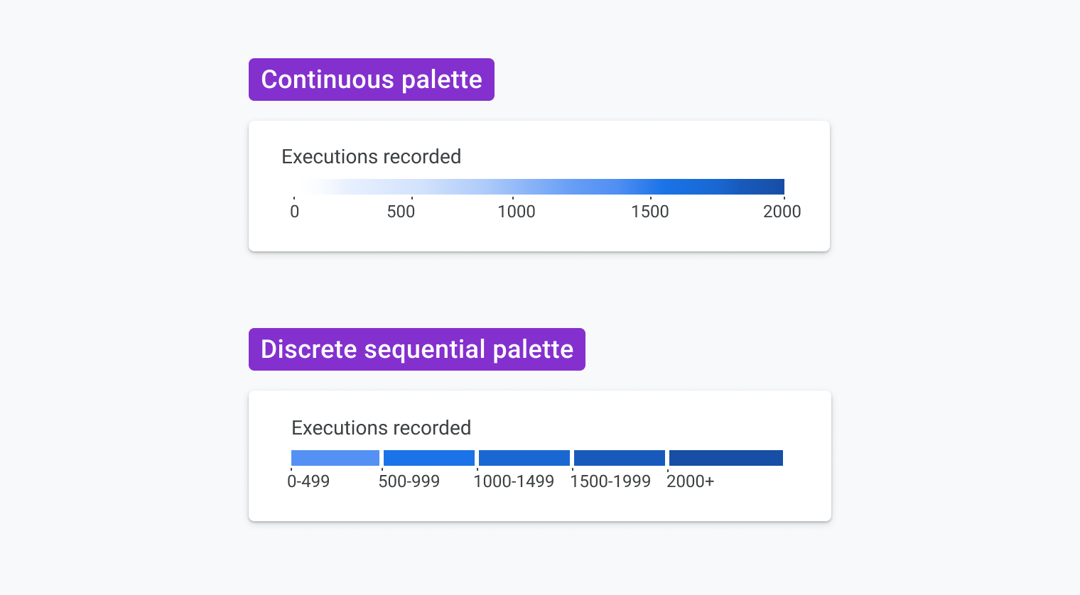
WCAG requires a minimum 3:1 contrast ratio against the background for graphics. On a white background, this drastically limits the available color palette. The team chose to group execution times into five discrete ranges, referred to as "bins," rather than trying to map an infinite range of times to a continuous color scale:
To comply with the 3:1 rule while still using these binned colors, the design added whitespace around each tile, preventing adjacent tiles from meeting the contrast threshold with *each other*:
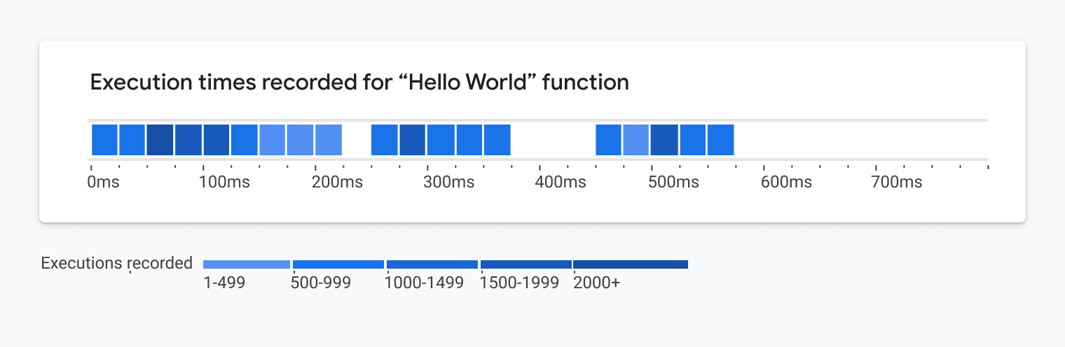
While compliant, this version was harder to read and visually demanding, drawing attention away from important alerts and warnings in the overall interface.
A Second Encoding for Colorblind Users
WCAG also mandates that color cannot be the only way to convey meaning. One option is to add icons or textures, but user testing across multiple studies revealed these additions are often misunderstood as indicating separate datasets or unique statuses. They added noise, not clarity. The team instead looked for a more effective secondary encoding. Using the discrete five-bin structure, they realized they could represent each bin with its own box height. Binning the value ranges gave absolute control over the height variations, making comparison between boxes straightforward:
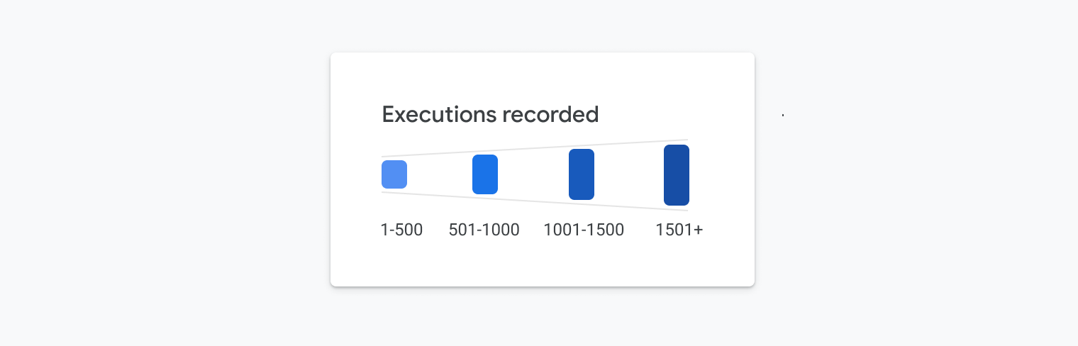
This added a second, non-color-based encoding to the chart which made it readable even without the color shades.
Circumventing the Contrast Constraint With End Caps
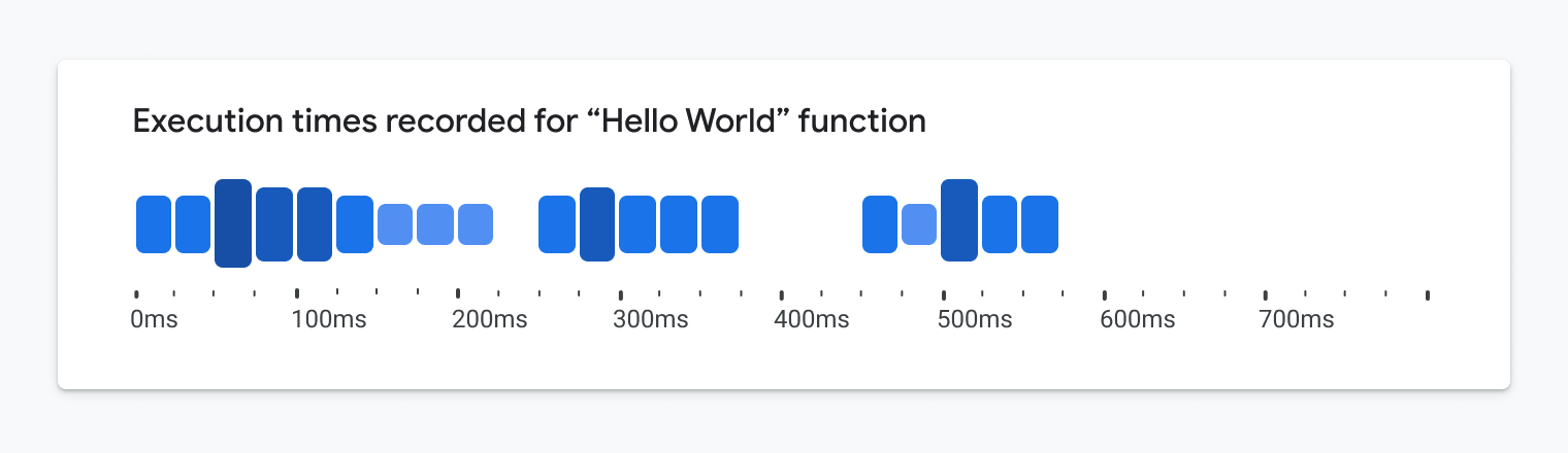
With the secondary encoding in place, the team returned to the question of color. They wanted a broader range of shades to make the chart more visually appealing, but each shade still had to meet the 3:1 contrast ratio against its white background — a strict limitation. The workaround was to add end caps to the top and bottom of each box. With a 3px thickness that achieves a 4.5:1 contrast ratio, these caps do the heavy lifting for accessibility. With darker accents anchoring the box edges, the chart complies with guidelines, but the interior fill could use lighter, more expressive shades that wouldn't meet the contrast requirement on their own:
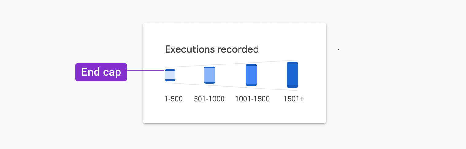
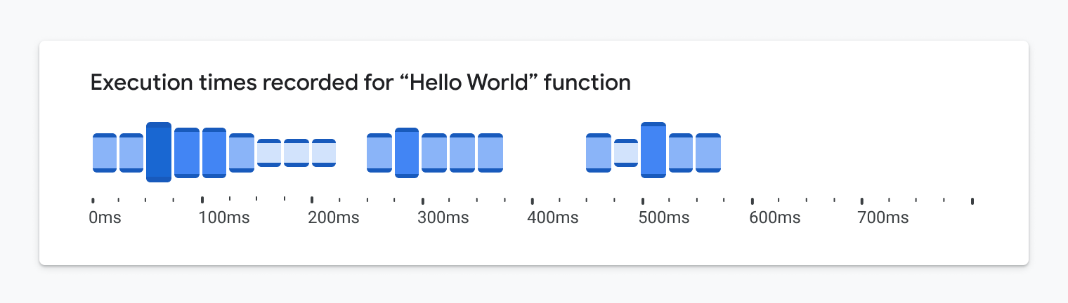
This approach simultaneously creates a more appealing visual and ensures the chart is readable for low-vision and colorblind users.
The Result: A New, Better Chart
The final result functions as a fusion of a histogram and heatmap, which the team calls a heat lane. It represents two dimensions: time and number of events — via binned ranges for both:
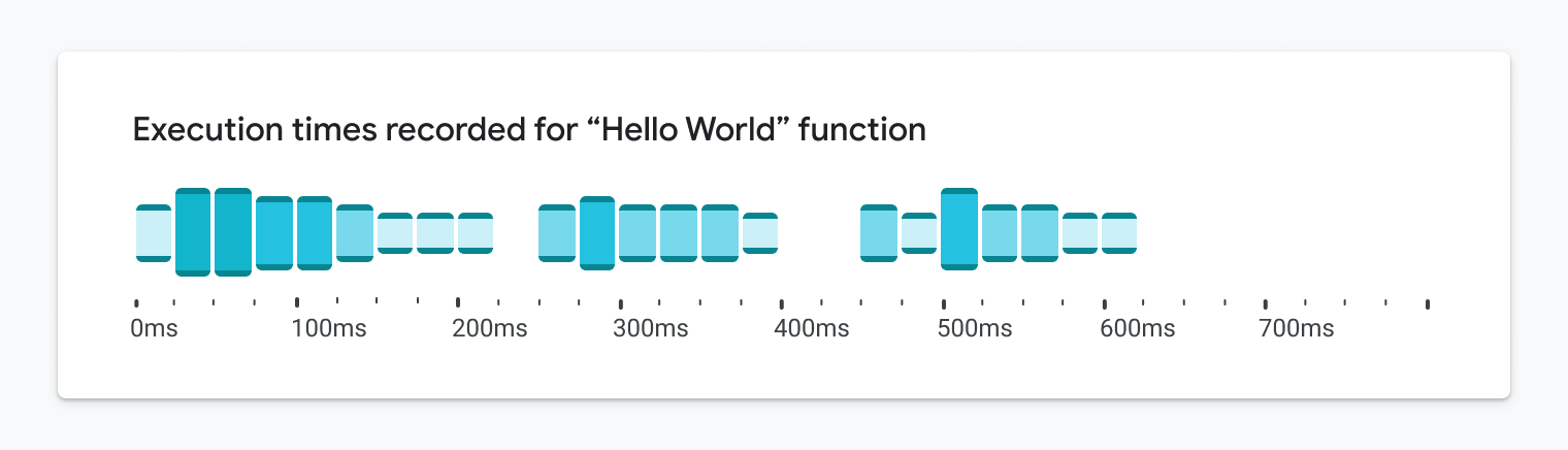
Why Is It Better for Full-Sighted Users?
The design also leverages a human cognitive trait known as pre-attentive processing. This is our evolutionary ability to spot something visually interesting in our environment almost instantly, such as spotting moldy produce in a basket:
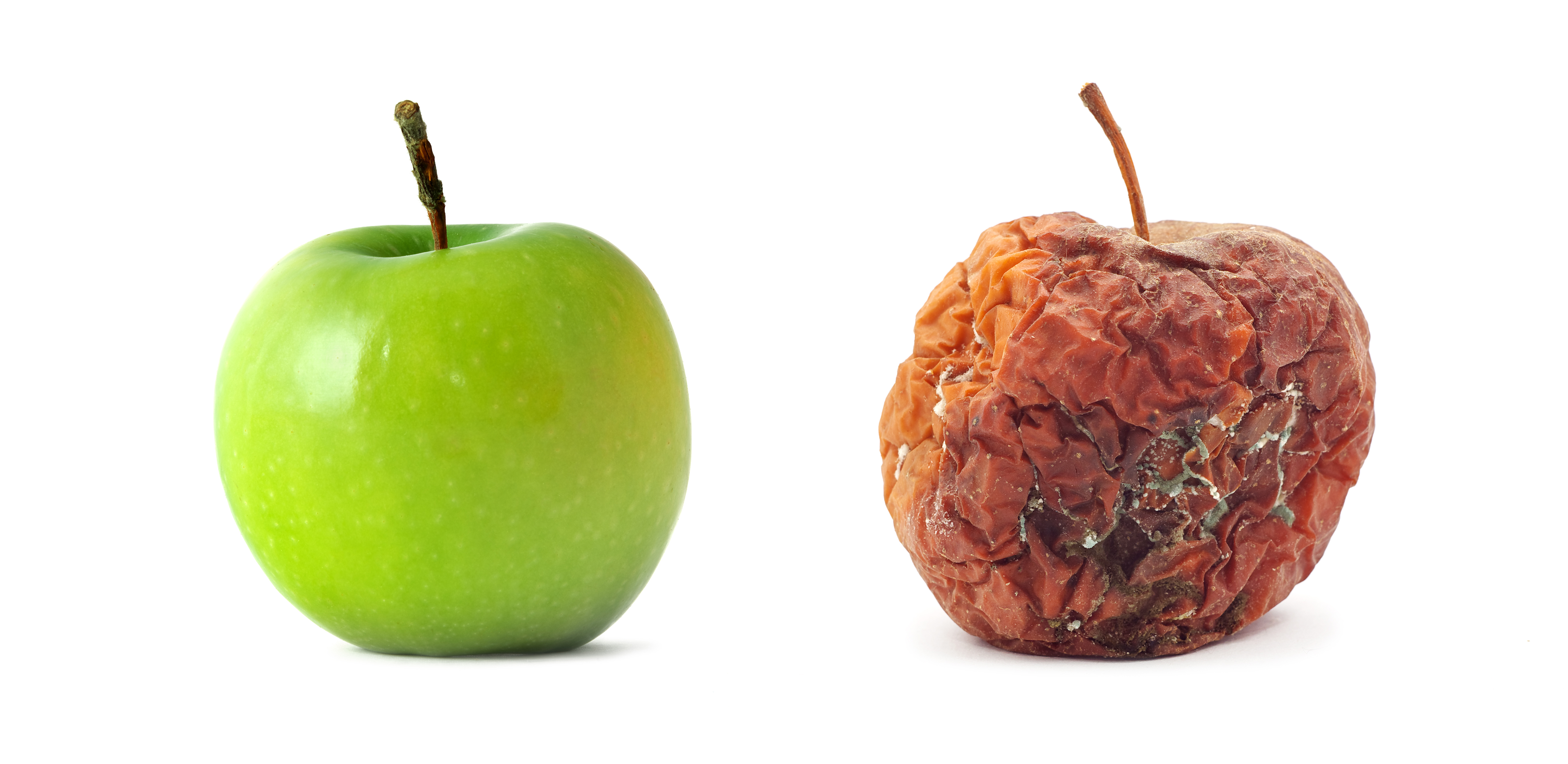
Heat lanes exploit this same power of pattern recognition. By looking at the chart, a developer can instantly spot what's a slow, concerning section without a detailed inspection of axis values. Even when the chart is blurred or squinted at — two common tests the team used — the most important trends and outliers remain visible. The accessible features did not create visual 'chartjunk' but instead became its essential visual design.
A Chart With Endless Options
The heat lane approach is flexible. Multiple lanes can be stacked on top of one another, making it immediately clear and easy to compare event times across different event types in the call stack:
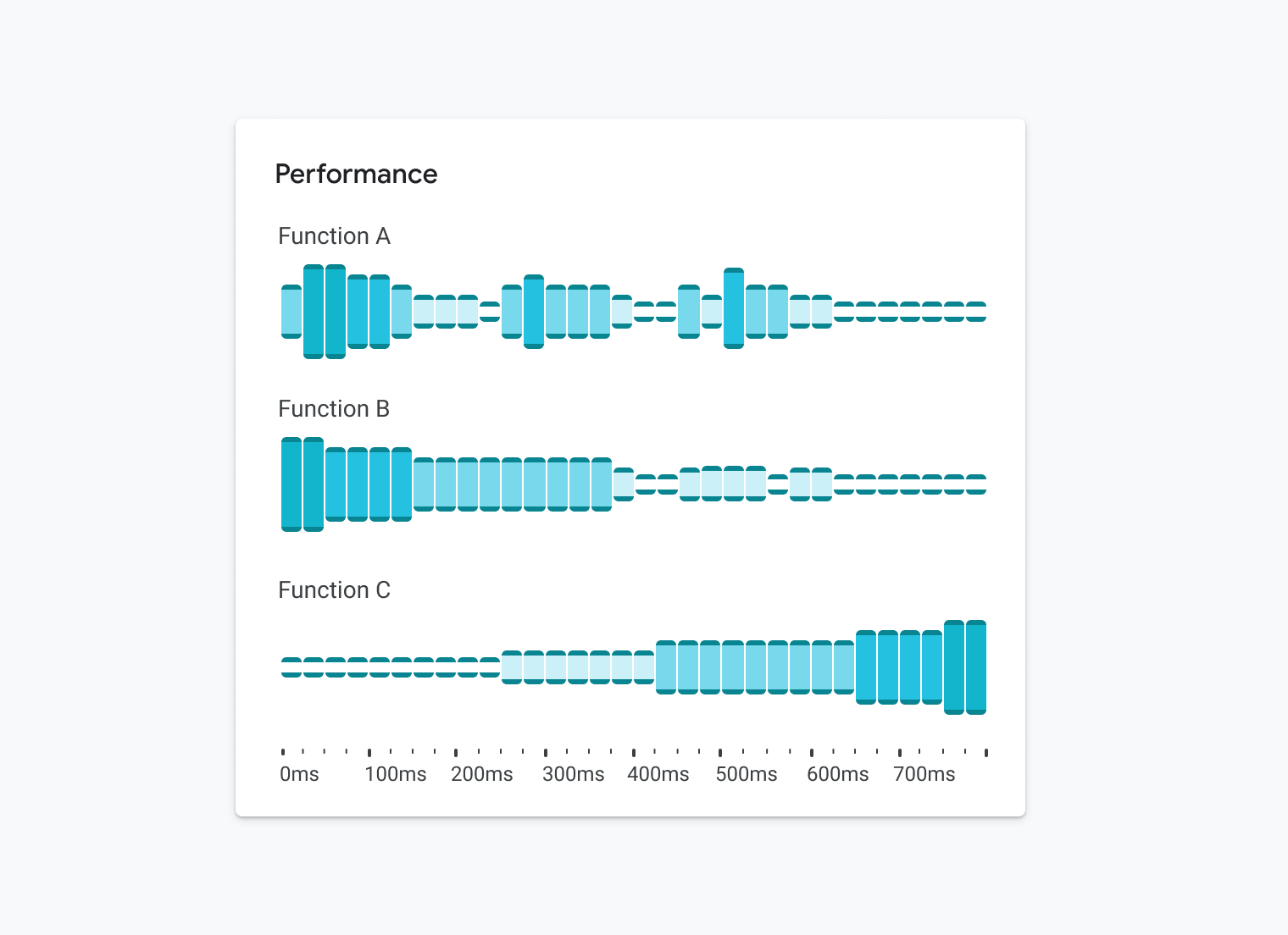
It’s also readable when reduced to the size of a sparkline:

The design scales effectively as a small multiple, making it possible to scan an entire matrix of functions at once:
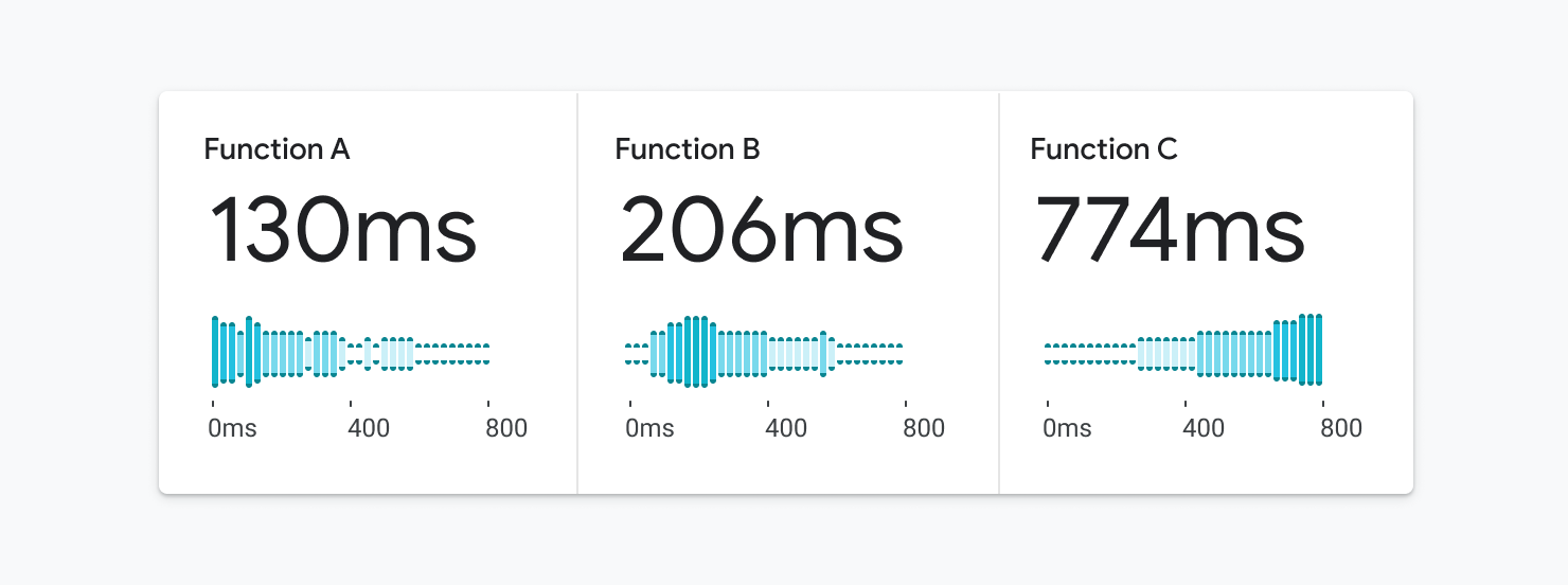
The heat lane handles sparse datasets of just a few data points and heavy data sets with millions of points with equal grace, making it a versatile option for detailed performance monitoring and an accessible visual style achieved by not compromising on its design.
Why Accessibility Up Front Pays Off
Had accessibility requirements been an afterthought, the team would likely have settled for a generic heatmap or histogram — and never considered merging the two. That combination is what makes the final visualization more scalable and glanceable for a broader audience. The lesson mirrors the mobile-first shift in product design: by constraining ourselves to accessible patterns first, we often arrive at genuinely better representations of data that surface more insight for everyone.
Beyond the Visuals
The visual layer is only one part of accessibility. The team has been rethinking data visualization end-to-end so that the information is reachable regardless of a person’s ability. Concretely, that means structuring charts so they can be navigated by keyboard for users with limited motor skills.
During chart construction, the team follows the Accessible Rich Internet Applications (ARIA) specification using the appropriate roles, landmarks, and attributes so a browser’s screen reader can interpret every chart element correctly. They are also exploring text-based approaches to call out trends, spikes, dips, and outliers. In select cases, sonification and audio summaries are being tested to reveal insights within the data without requiring sight.
Getting Started
For those beginning to factor accessibility into their data work, the following resources are useful launching points:
- Web Content Accessibility Guidelines
- Accessibility with Material 3
- “Google’s Six Principles for Designing Any Chart”, Manuel Lima
- Data Visualization in Material Design
The effort was a collective one: Sierra Seeborn, Jess Klos, Nicholas Cottrell, and Saurabh Kumar each contributed to the design, development, and deployment of this visualization.