

Accessibility Doesn’t Have to Be Overwhelming
Ask most teams about web accessibility and you’ll hear some variation of: “We’d like to do more, but we don’t have the time or know-how.” The importance of building products usable by a wide range of people is rarely disputed. Yet that’s usually where the conversation ends. Building an accessible product requires commitment from every role at every stage, and between time constraints, competing priorities and education gaps, it’s easy to push it aside.
Accessibility audits are expensive, and the costs only grow when you factor in design, development and QA time to fix findings. Add the steep learning curve on top, and many teams simply choose not to go there. There is so much technical nuance that it’s easy to get lost in the details.
Instead of diving into the weeds, step back and look at the bigger picture. Accessibility can be approached more naturally by framing it around four core principles: Perceivable, Operable, Understandable and Robust (POUR). This gives you a solid foundation without needing to memorize every specification upfront.
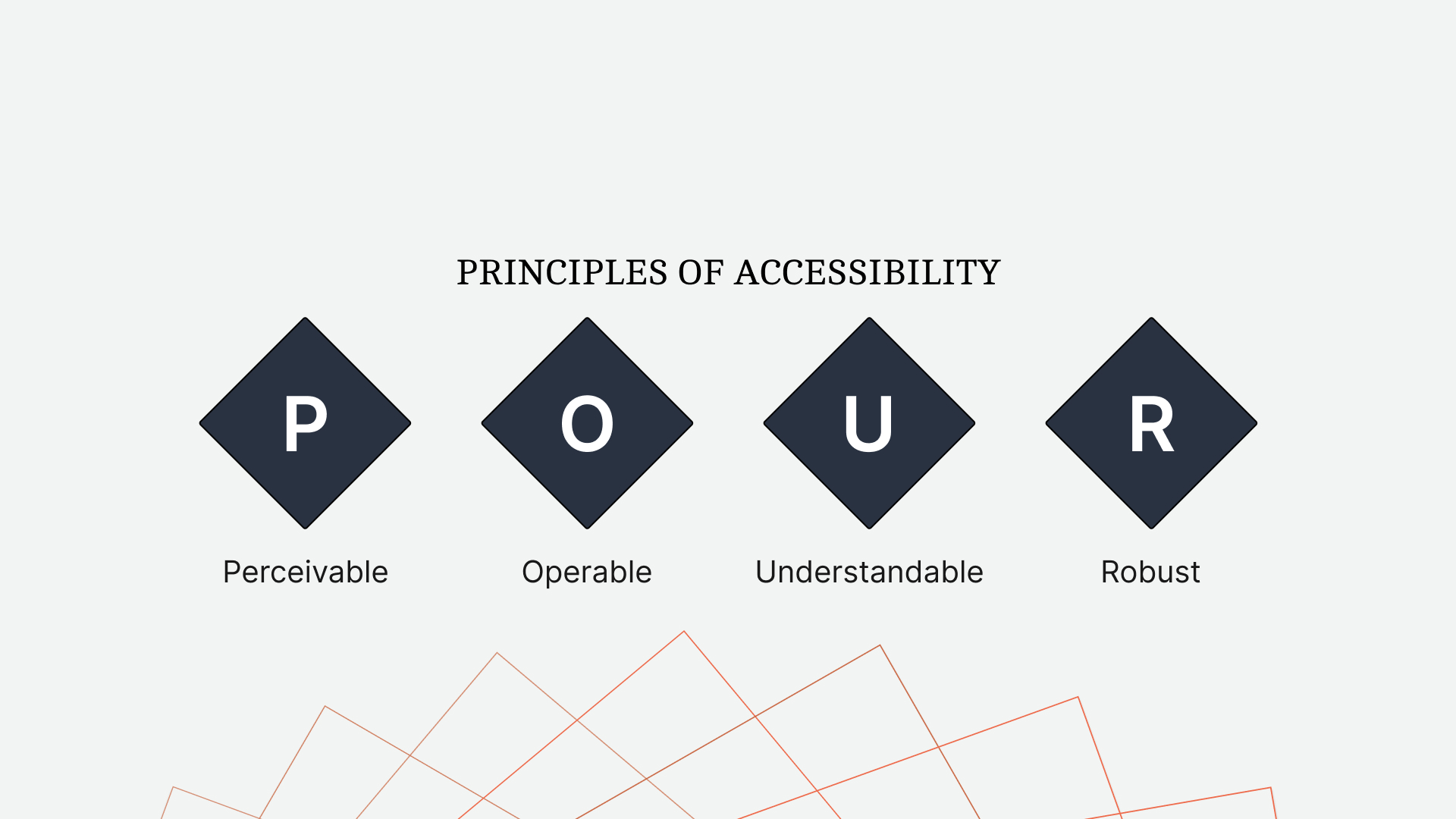
Perceivable
Perceivable content can be experienced through different senses. If you’re reading this article, it’s perceivable to sighted people. If someone is listening to it via a screen reader, the same content is perceivable audibly. The more ways people can engage with your content, the more perceivable it is.
Common examples include:
- Images with descriptive alternative text
- Video captions and subtitles
- Indicating state changes with more than just color
A real-world example is a crosswalk. When crossing isn’t safe, a red standing figure displays along with a slow, repeating beep. When it’s safe, the icon switches to a green walking figure and the beep quickens. The design communicates through icons, color and sound to create a safe, comprehensive experience for everyone.
Operable
Operable content determines whether people can actually use your product and navigate it. Developers often build for themselves — if they use a mouse to click around, that’s the primary experience they build, and sometimes the only one. But there are far more ways to operate a website than with a traditional mouse and keyboard.
Key requirements include:
- Every mouse-accessible function must also work via keyboard
- Visible and consistent keyboard focus on all interactive elements
- Clear page titles with descriptive, sequential headings
Understandable
What’s the point of content people can’t comprehend? Understandable content goes beyond defining acronyms. Your product needs to be consistent and empathetic in both design and content.
Ways to build an understandable experience:
- Declare the content language so assistive technologies interpret it correctly
- Keep repeated navigation elements in the same location across pages
- Provide descriptive, actionable error messages
As an example, Jenni Nadler’s article on error messaging describes how her team at Wix used clear language and an empathetic tone to create a standard in understandable error feedback.
Robust
Robust content should already feel familiar. If you’ve used a compiler like Babel to transpile JavaScript for broader support, you’ve practiced robustness. The same broad, reliable approach should apply to semantic HTML.
Ways to create robust markup:
- Validate rendered HTML to keep devices parsing it reliably
- Use markup to assign names and roles to non-native elements
The POUR principles provide a broad — if somewhat abstract — foundation. Even with that guidance, roadmaps and competing priorities can make it still feel like a heavy lift. The amount of detail and consideration is enough to deter some teams entirely.
Web accessibility is not all or nothing.
Even small changes can significantly improve a product’s accessibility. Just as software development has moved away from a strict waterfall model, accessibility can benefit from the same incremental mindset.
And sometimes, it’s easier to build on what you already know than to learn something entirely new. With slight adjustments to existing design and development practices, you can create a product that aligns with the POUR principles — but in a way that feels natural and intuitive rather than contrived.
The Accessibility Mindset Shift
Web accessibility can feel overwhelming because there is so much to learn. Realistically, you won't recall every WCAG criterion or every ARIA pattern from memory. Instead of trying to memorize every rule, you can make a bigger impact by adjusting how you approach a design from the very start. Two core shifts in mindset will help you identify where accessibility matters and understand what those areas need: treat markup as communication, and treat markup as function.
Markup Must Communicate As Clearly As The Design
When building from a design, we often build what we see. However, visual design is only part of creating content that is perceptible to everyone.

Consider a website’s navigation. When a person is on a specific page, we highlight the corresponding link with a different background color. Visually, this makes the link stand out as “the page you’re on right now.” But what if a person can’t see that color change? The content becomes more perceivable when its markup communicates as clearly as its design.
<a aria-current="page" href="https://www.smashingmagazine.com/products">Products</a>
By setting aria-current="page" on the current page’s anchor, you communicate the same information in HTML that the design communicates visually. This is critical for assistive technologies like screen readers.
See the Pen [Indicate The Current Page - Keys To An Accessibility Mindset [forked]](https://codepen.io/smashingmag/pen/XWPXmGQ) by Daniel Yuschick.
Note: As a bonus, instead of adding an .active class to style the navigation, make your CSS more resilient and reflective of the HTML state by using the [aria-current='page'] selector.
The active navigation page is only a minor example. The goal is less about specific markup patterns and more about how to think during development. When building a design, look for these common areas that likely need an extra layer of perceivable markup:
- When the design visually communicates the state,
Active navigation items, active tabs, loading indicators, disabled buttons. - When information is outside the flow of content,
Toast messages, dialogs, popover menus, error messages, tooltips. - When content is dynamic or live,
Notifications, chat windows, tabbed content, alerts that demand immediate attention. - When recreating a standard element,
Progress bars, accordions, custom select menus.
Take live notifications as a second example, like a friend-request bubble. If a notification is important enough to be seen visually, it should also be announced audibly.
See the Pen [Live Notifications - Keys To An Accessibility Mindset [forked]](https://codepen.io/smashingmag/pen/LYJGpwp) by Daniel Yuschick.
Some will see the bubble. Perceivable markup ensures the information reaches other senses, too. This is not about prioritizing one group; it is about providing a consistent experience for all. Perceivable markup helps those who need it, and it does not harm anyone who doesn’t.
Markup Is Functional, Not Visual
Design can make a task elegant, but appearance is not function. A key principle drives this home:
When writing the HTML markup for an element, it should be done relative to the element’s functionality, not its appearance.
HTML is a functional language; CSS is its visual counterpart. Marking up an element by its function rather than its looks sets a strong accessibility baseline from the start.
Take website navigation again. Navigation items often look like buttons, but they function as links. Marking them as anchors provides key expected behaviors for free: keyboard focus, a URL preview on hover or focus, and the ability to open in a new tab from the context menu. If you mark up a navigation item as a button based only on looks, you lose those link behaviors. When you break an element’s expected behavior, accessibility will suffer.
See the Pen [Links and Buttons - Keys To An Accessibility Mindset [forked]](https://codepen.io/smashingmag/pen/jOvWWOv) by Daniel Yuschick.
One of the most common mistakes is using a div where a button or link is needed. Do not style a div for interaction. Use the semantic element instead. What about when the required design goes beyond what a native element can do, like a custom progress bar or a styled select menu? Then you must shift back to the first key: make the alternative perceivable.
See the Pen [Progress Bars - Keys To An Accessibility Mindset [forked]](https://codepen.io/smashingmag/pen/KKxVVwG) by Daniel Yuschick.
Functional markup leads to a more accessible experience. Compare a generic div-based progress bar with the native progress element. Without perceivable markup, a screen reader can’t reach the bar; with it, the element provides both context and value. When you can’t use a functional element, you must build a perceivable one.
Communicate State With More Than Color
Designs themselves must also be perceivable. A common issue is removing focus rings or indicating state using only color.

Think of selecting imperial versus metric units on a flight display. It takes a moment to figure out which option is active because state is conveyed by color alone. Adding an underline and bolding the active option eliminates the guesswork.

Accessibility comes down to communicating in layers. When code has perceivable markup, that’s one layer. When a visual design can indicate state with color, an underline, and a font-weight change, that’s multiple layers. People take in information differently. Providing several routes helps a wider audience understand.
The Big Picture
This mindset won’t guarantee your work is fully accessible, but it makes a positive difference. Accessibility is a much broader commitment that extends beyond code. A commitment must exist at every step and in every role, from leadership down, as long as the product evolves.
Follow these overlapping rules: write markup that communicates naturally with assistive technology, and pick semantic elements based on function, not looks. When a native element’s styling is limiting, fall back on making the custom version perceivable. Each of these habits makes the product easier to use without excluding anyone else.
Consider the design of a crosswalk. Sighted, blind, and partially sighted people rely on its cues. So does the person looking down at their phone — the audible cue can catch their undivided attention. Parents might use those same light and sound signals to teach a child to cross safely. The crosswalk’s accessible design doesn’t prevent a person from crossing whenever they choose; it merely makes that experience possible for more people. In the same way, accessible design is good design, and it starts when you approach the work with the right mindset.
Resources
- CodePen collection: Keys to an Accessibility Mindset
- “When Life Gives You Lemons, Write Better Error Messages,” by Jenni Nadler



