

Accessibility Compliance Is Not the Same as Usability
Formally adopting web accessibility standards can make a product technically accessible to people with visual impairments, but it does not guarantee that the product will actually be usable for them. In user testing with visually impaired and blind participants on a guideline-compliant product, I observed concrete gaps: a large font that was unreadable because it was too thin, a restaurant reservation flow in which blind users could not understand the date navigation, and a checkout process that opened outside the visual field of low-vision users.
The W3C itself acknowledges this disconnect. Its documentation notes that when accessibility is treated as a checklist, technical compliance can come at the expense of the human interaction aspect, and accessibility is not truly achieved.
Understanding Visual Impairment
Visual impairment is a broad term covering people who have reduced visual acuity or a restricted visual field, making daily activities such as reading and navigating harder. Impairments range from mild vision loss to complete blindness:
- Central Scotoma: vision loss in the central visual field.
- Tunnel Vision: vision loss in the peripheral visual field.
- Hemianopia: vision loss in half of the visual field.
- Blindness: reserved for complete or near-complete vision loss.
The Warp and Weft of Inclusive Design
Producing a good user experience for people with visual impairments is like weaving fabric: the longitudinal warp and the transverse weft must be interlaced. In this analogy, accessibility and usability are the two threads that together create the final result.
Accessibility Standards
Web accessibility ensures that people with disabilities can perceive, understand, navigate, and interact with the web. Disabilities affecting web access include auditory, cognitive, neurological, physical, speech, and visual conditions.
As Tim Berners-Lee put it: “The power of the web is in its universality. Access by everyone regardless of disability is an essential aspect.”
Several standards exist to support that universality:
- Web Content Accessibility Guidelines (WCAG): defines how content such as text, images, and forms should be created to work with assistive technologies and alternative input methods.
- Authoring Tool Accessibility Guidelines (ATAG): defines how HTML editors, CMSs, and other authoring tools should support the creation of WCAG-compliant content.
- User Agent Accessibility Guidelines (UAAG): defines how browsers, extensions, and media players should be built to be accessible.
WCAG compliance is a technical discipline requiring specialized expertise. Yet, as the testing examples show, a guideline-compliant interface can still fail real users. Bruce Lawson’s introduction to Web Accessibility: Web Standards and Regulatory Compliance makes the point colorfully: a nourishing accessibility outcome is not guaranteed by following a recipe of code and guidelines, because people insist on having different needs and abilities.
Standards compliance is a necessary goal, and often a legal one, but it cannot stand alone.
The Usability Component
Usability measures how effectively a specified user can achieve defined goals in a particular environment. It is not exact science. Jacob Nielsen’s 1993 model, presented in Usability Engineering, breaks usability into five core attributes:
- Learnability: how easily users accomplish basic tasks on first encounter.
- Efficiency: how quickly users become productive after learning the design.
- Memorability: how easily returning users reestablish proficiency after a hiatus.
- Errors: how many errors users make, their severity, and the ease of recovery.
- Satisfaction: how subjectively pleasant the design is to use.
These five cornerstones need to be active throughout design and development. The technical adoption of accessibility guidelines must be paired with usability testing involving real users with visual impairments — otherwise, even compliant products will not truly serve the people they were designed to include.
Running A Usability Test With Blind And Visually Impaired Users
A usability test is a structured interview in which participants matching a target audience complete a series of tasks while verbally describing their reactions. This lets observers understand not just what participants do in the interface, but why they do it. When I ran my first such test with blind and visually impaired participants on a product that already met accessibility standards, I found little guidance for conducting these sessions. The following highlights from that process are grouped into three phases: preparation, execution, and follow-up.
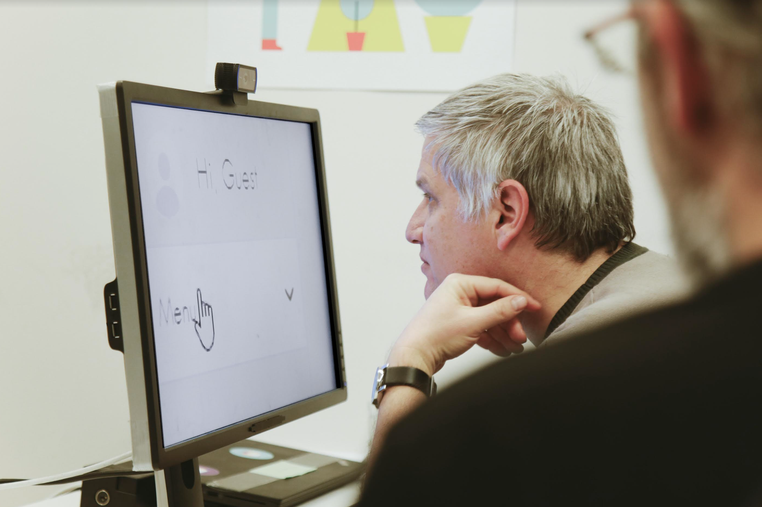
Preparing The Test
Defining the test goal is the starting point. The goal should be clear, specific, achievable, and relevant. We defined ours collaboratively with a multidisciplinary team of designers, product managers, developers, content writers, and QAs, since each role contributed a distinct perspective.
Because blind and visually impaired participants can take longer to complete tasks due to how they navigate a site, we prioritized tasks according to importance. This does not mean complex tasks need to be dropped.
Building the session schedule required accounting for physical limitations and product complexity. We had to reserve time for:
- Escorting each participant into and out of the lab, so we assigned a staff member to accompany them.
- Configuring assistive technology settings per participant, depending on their abilities and whether they brought their own equipment.
- Giving participants enough time to comfortably navigate the interface.
- Debriefing with staff after each session.
We scheduled one hour per session with 45 minutes between sessions, which turned out to be stressful and made us rush. An hour between sessions would have been better.
Recruiting participants whose backgrounds and abilities match the target audience is crucial. We were looking for blind and visually impaired people with experience buying products online. Useful recruiting sources include information and technology learning centers for people with visual impairments at hospitals, colleges, and universities.
In our case, my wife — an ophthalmologist — referred me to the operator of the Information Center for the Visually Impaired and Blind at her hospital. That person was happy to help and connected us with suitable candidates.
Preparing candidates involved discussing:
- The nature of the test, including that people would be watching and recording the session.
- Their online shopping habits: computer or mobile, preferred browser, assistive technologies used, and — when the interface is in English but the test runs in a non-English-speaking country — their language proficiency.
- The incentive, which itself needs to be accessible.
- Whether they could bring their own equipment.
Responsiveness was high, and most candidates were eager to attend.
Candidates interacted with the web differently. Some customized fonts, color contrast, or screen magnification; others used a screen reader; some combined several approaches. Most were not interested in bringing equipment, often because of difficulty carrying it or because they had desktops. We handled equipment ourselves, and once we found a staff member who knew how to configure the assistive technology, setup and adjustments between sessions were quick. We prepared browsers and tools including NVDA, JAWS, and ZoomText.
Camera and microphone positioning must also account for participants who need to sit close to the screen or view it from different angles. Before the session, verify that the lab itself is physically accessible: no stairs at the entrance, an accessible restroom, access to public transit, and space for a guide dog.
Consent forms like non-disclosure agreements can be sent online as accessible PDFs.
A week before the real sessions, we ran a dry run with a visually impaired participant to surface unexpected problems. For example, we discovered that our screen sharing tool conflicted with an assistive technology. The dry run also improved our schedule: the moderator’s introduction was too long, preventing us from covering planned tasks. We refined tasks that were unclear, too hard, or too easy. It also let the moderators practice with a real user and prepare mentally.
Running The Session
The moderator is central to keeping the session smooth. As Jared M. Spool wrote:
“The best usability test moderators have a lot in common with an orchestra conductor. They keep the participant comfortable and stress-free. The moderator tries to make the participant forget they are in a foreign environment with a bunch of strangers who intensely watch everything that he/she does. They keep the information flowing to the design team, especially the tough news. And they do all this with organized flair and patience, ensuring every aspect of the user’s experience is explored.”
— Moderating With Multiple Personalities: 3 Roles For Facilitating Usability Tests
With blind and visually impaired participants, the conductor must be even more sensitive. In sessions where a screen reader was running — which can distract observers — we asked participants to speak loudly and clearly so we could follow their reasoning and how they understood tasks.
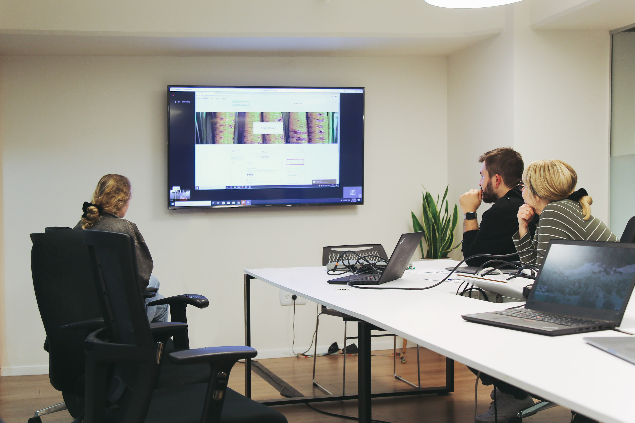
We invited observers from several departments so they could see participants directly. A written report cannot replace witnessing the experience firsthand. During the test, observers must pay close attention despite the distraction of the screen reader.
After The Session
Following the sessions, we compiled a report of insights. Some findings were bugs: blind participants did not always locate a particular button in NVDA’s Elements List dialog, and sometimes no confirmation was announced after clicking the “Like” button. Other issues were content-related: some blind participants did not realize they were filling the wrong form, or they wanted to scan a whole page quickly, but the aria-label strings were too long. Visual problems also appeared: participants using magnification software lost track when the next action appeared elsewhere on the screen, and some missed the modal “close” icon even when its color contrast was high.
In total we found 65 issues affecting multiple departments.
The report also captured positive moments. Some participants noted that an icon next to a link helped them skip reading the text. Others appreciated the placeholder text contrast, and a few said image zoom worked very well.
“Nothing About Us Without Us”
On July 26, 2020, the world marked the 30th anniversary of the Americans with Disabilities Act (ADA), legislation that opened doors long closed to people with disabilities — riding the bus, attending school, going to movies, visiting museums. Celebrations were canceled or moved online due to the coronavirus pandemic.
One online event was the Virtual Crip Camp, with speakers from the disability community. Its invitation featured a green bus with the slogan “Nothing About Us Without Us”:
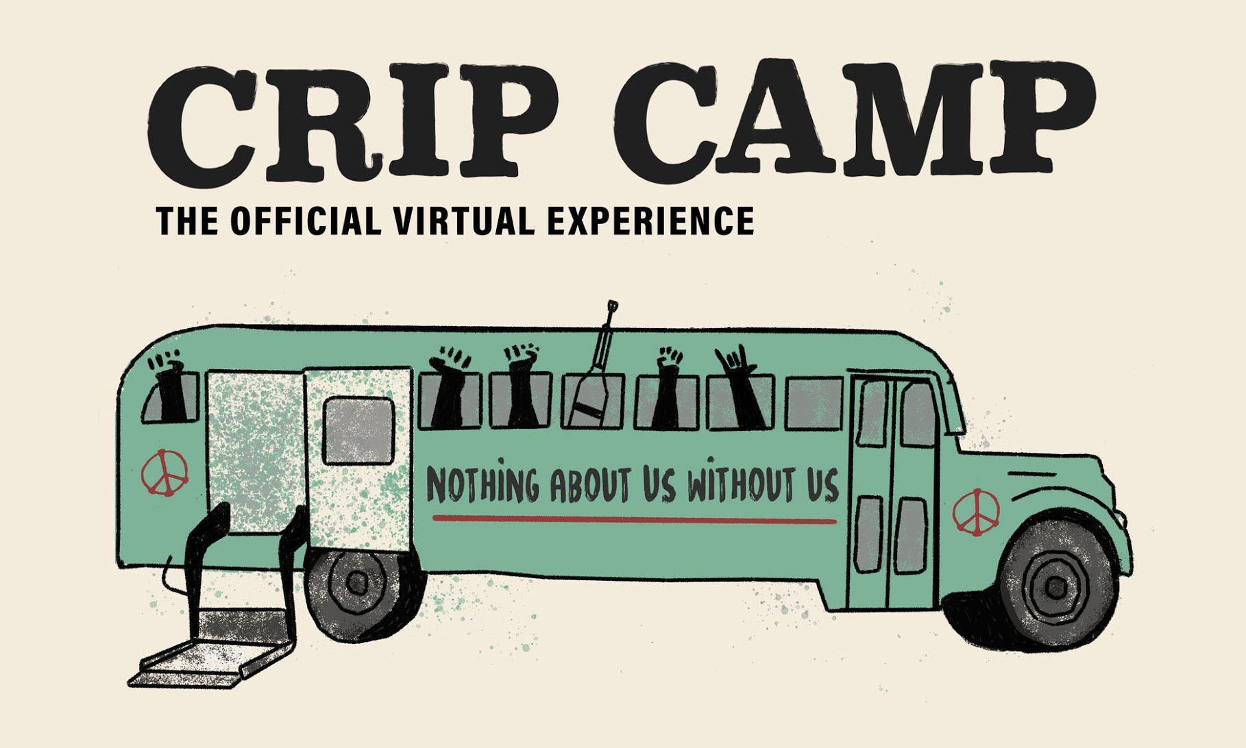
That slogan conveys that decisions should be made with direct participation from those most affected. Disability activists popularized it in the 1990s, and it became a rallying point across disability rights movements worldwide. Its wide use — including the hashtag #NothingAboutUsWithoutUs — reflects the desire of people with disabilities to shape decisions affecting their lives.
This philosophy echoes User-Centered Design, where the product should fit the user rather than forcing the user to adapt. Usability testing is one of the techniques that brings users into the development lifecycle.
The real value of usability testing is not the data in the report but the shift in perspective among team members who observe a participant in real time. Watching what they say, think, do, and feel builds empathy, which is essential when working with participants with disabilities. It motivates observers, drives change, and raises awareness of accessibility challenges.
Automated tools that check website accessibility can, at best, show how well the site meets WCAG guidelines. They do not reveal how usable the site actually is for people with disabilities. My colleague Neil Osman, an accessibility engineer at Wix who is visually impaired, describes the mechanistic approach this way:
"You can put lipstick on a pig, but it’s still a pig."
A usable product requires more than a checklist of accessibility standards. To create solutions for people with disabilities, you must be exposed to their experience directly.


