

Designing With Giovanni Pintori’s Visual Language
Giovanni Pintori helped define Olivetti’s identity for more than three decades. His bold colors, confident shapes, and thoughtful approach to publicity turned product advertising into something closer to art. For web designers, his work offers a lasting lesson: promotion doesn’t need to list features. It needs to tell a story that resonates.
Pintori was born in Sardinia in 1912. He studied at L’Istituto Superiore per le Industrie Artistiche (ISIA), where the curriculum covered ceramics, painting, metalwork, and woodwork. It was there he met Renato Zveteremich, then head of Olivetti’s advertising department. After graduating, Pintori joined Olivetti under Zveteremich and became art director in 1950.
“If artists are called upon to interpret, express, and defend the functional purity of a machine, it is truly a sign that the machine has entered the human spirit and that the problem of forms and relationships is still of an intuitive nature.”
— Renato Zveteremich
Olivetti was already known for meticulous product design. Industrial designer Marcello Nizzoli had ensured every detail — from the spacebar to the outer casing — was carefully considered. That same care extended beyond the machines themselves. The company’s creativity showed in its architecture, advertising, and graphic design.
Shapes That Suggest, Not Describe
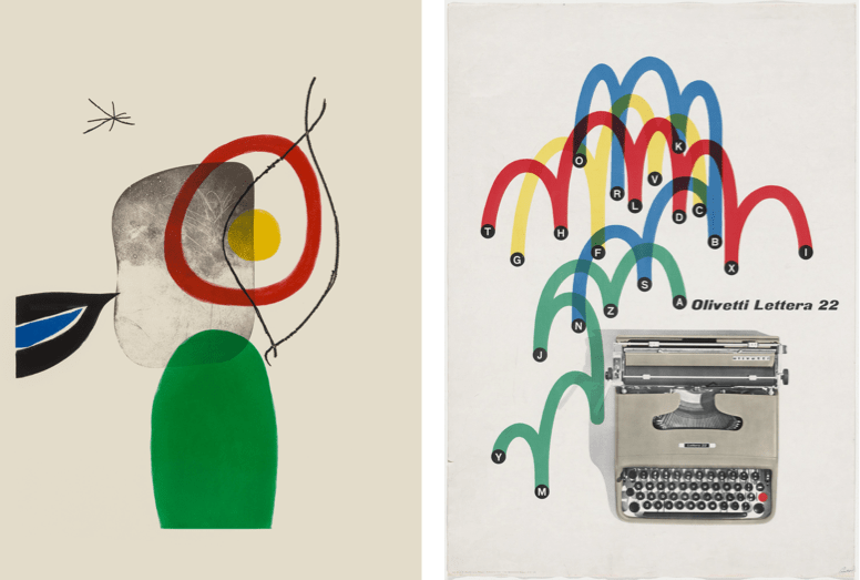
Pintori’s aesthetic was bold and confident. He drew from minimal palettes, combining bright color with shapes that filled his posters and brochures with energy. But his work was more than playful. His abstract shapes were purposeful: they suggested the benefits of a product rather than describing its features literally.
“I do not attempt to speak on behalf of the machines. Instead, I have tried to make them speak for themselves, through the graphic presentation of their elements, their operations and their use.”
That philosophy carried beyond his tenure at Olivetti, which ended in 1967. Pintori continued freelancing from his own studio in Milan before retiring to paint. He died in 1999, and his career is catalogued in Pintori by Marta Sironi, published by Moleskine.
Pintori defined this approach in an era before screens. But his ideas map naturally onto web design. The colors we choose, the objects we depict, and the way we structure a page all tell a story about a product or company — whether we intend them to or not.
Building a Color System
Color does more than decorate a site. It attracts attention, influences perception, and helps people understand what they can interact with. A good palette should guide navigation as clearly as the layout does.
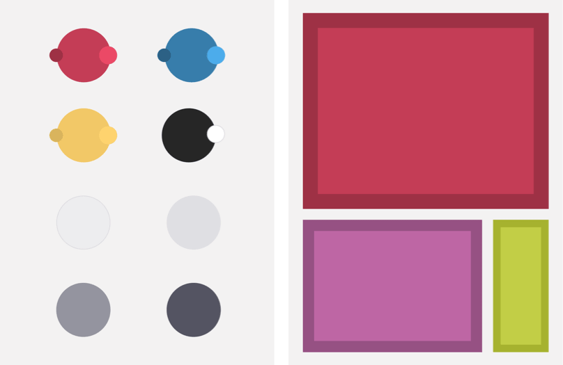
A practical approach is to keep palettes tight. Start with a dominant hue, add a secondary supporting hue, and use an accent color sparingly. To those, add neutral tones for backgrounds, borders, and text. Shades and tints of your core hues provide extra flexibility for depth: darken a color for a button border, lighten it for a highlight. With dark mode now widespread, consider slightly altering saturation and lightness so those colors stay vibrant against dark backgrounds.
From Pintori’s Posters to Layout Code
Applying Pintori’s visual language to the web can start with something as simple as the Morris Traveller — a quintessentially English car whose profile appears in the design below. The HTML for this first inspired design is minimal, needing only four structural elements: a header containing two SVGs, a main element for running text, an SVG of the Traveller’s front, and a footer with the company logo.
Flexbox for Narrow Screens
When you use inline SVG instead of external files, you reduce HTTP requests and gain a design advantage: the shapes can be recolored via CSS to suit light and dark themes.
A horizontal scrolling flex container is an effective way to maintain visual hierarchy on small screens. Set the header to display: flex and let it scroll horizontally. Use flex-grow: 1 on the images so they fill available space, and set flex-basis to a minimum of 640px so they remain large enough to matter. Finish with generous horizontal padding and center the logo in the footer.
Grid for Medium and Large Screens
On larger viewports, a horizontally scrolling row wastes the canvas. CSS Grid provides the precise placement and stacking that Flexbox lacks. For a medium-size header, create an intentional grid: three columns with fixed outer widths of 270px and a flexible middle column, plus rows similarly framed by fixed outer heights. This offsets the images and adds depth to the composition.
Once you have the structure in place, you might find that keeping type visible against a busy composition is the real challenge. Masking the background of text containers with mix-blend-mode or using overlay gradients gives you the freedom to keep the imagery bold without losing readability.
When it comes to an overall page layout, a six-column grid is a dependable pattern. Fill the header across all columns. For main content and footer, narrow their span and leave proportionally wider gaps — whitespace is a tool that leads the eye from element to element.
On large screens, take it further with a 6+4 compound grid. Use an eight-column body for the page skeleton, and include the same two-level structure inside that for content blocks. Doing so preserves proportions from one breakpoint to the next and makes the media queries feel consistent rather than arbitrary.
The headline benefit of such a layout: a solid central block of text and figures reads clearly. Bind main content close to its adjacent figure and align the text to the right for tight, obvious visual connection.
<header>
  <svg>…</svg>
  <svg>…</svg>
</header>

<main>
  <h1>…</h1>
  <p>…</p>
</main>

<figure>
  <svg>…</svg>
</figure>

<footer>
  <svg>…</svg>
</footer>
header {
display: flex;
flex-wrap: nowrap;
overflow-x: scroll; }
header svg {
flex-grow: 1;
flex-basis: 640px; }
header svg:not(:last-of-type) {
margin-right: 2rem; }
header {
display: grid;
grid-template-columns: 270px 1fr 270px;
grid-template-rows: 100px 1fr 100px; }
@media (min-width: 64em) {

body {
grid-template-columns: 2fr 1fr 1fr 2fr 2fr 1fr 1fr 2fr; }
}
header {
grid-column: 1 / 8; }

main {
grid-column: 2 / 5;
text-align: right; }

figure {
grid-column: 5 / 7; }

footer {
grid-column: 4;
padding: 0; }
The Power of Monochromatic Palettes
Working with color remains the hardest part of design for many. Monochromatic schemes are useful because visual cohesion requirements nearly vanish. These palettes rely on shades (adding black), tints (adding white), and tones (adding grey) from a single base hue.
Those variations can tone down colors that would otherwise dominate and are especially good for expanding a brand palette without adding new hues. One effective technique is a partially monochromatic approach: base everything on one hue, then add a single accent color as a counterpoint for depth and interest.
Long-term Relationships Beat Short Projects
Design education tends to emphasize new projects: learn a new industry, win a client, make an impact, move on. After years of working that way, longer relationships are proving to have their own creative dividends.
Design embedded inside an organization isn’t just about producing deliverables. It offers the chance to shape a brand’s long-term trajectory the way Pintori shaped Olivetti’s. The value becomes clear in the details: influencing marketing direction, directing color palettes across touchpoints, seeing what endures when the campaign is over.
Pintori’s career, spanning three decades with one manufacturer, also illustrates that genuine, thoughtful creative identity doesn’t expire after a launch push. Storytelling through color and shape was not only his professional mission, but also what kept his work vital over the long run.
Maximum Effect, Minimum Elements
One of Pintori’s trademarks was creating rich, layered compositions from deceptively simple components. The same principle can drive a modern web design built on CSS Grid, background gradients, and pseudo-elements. The entire layout requires only a headline, one paragraph, and seven empty division elements, each given its own identity so they can be styled independently.
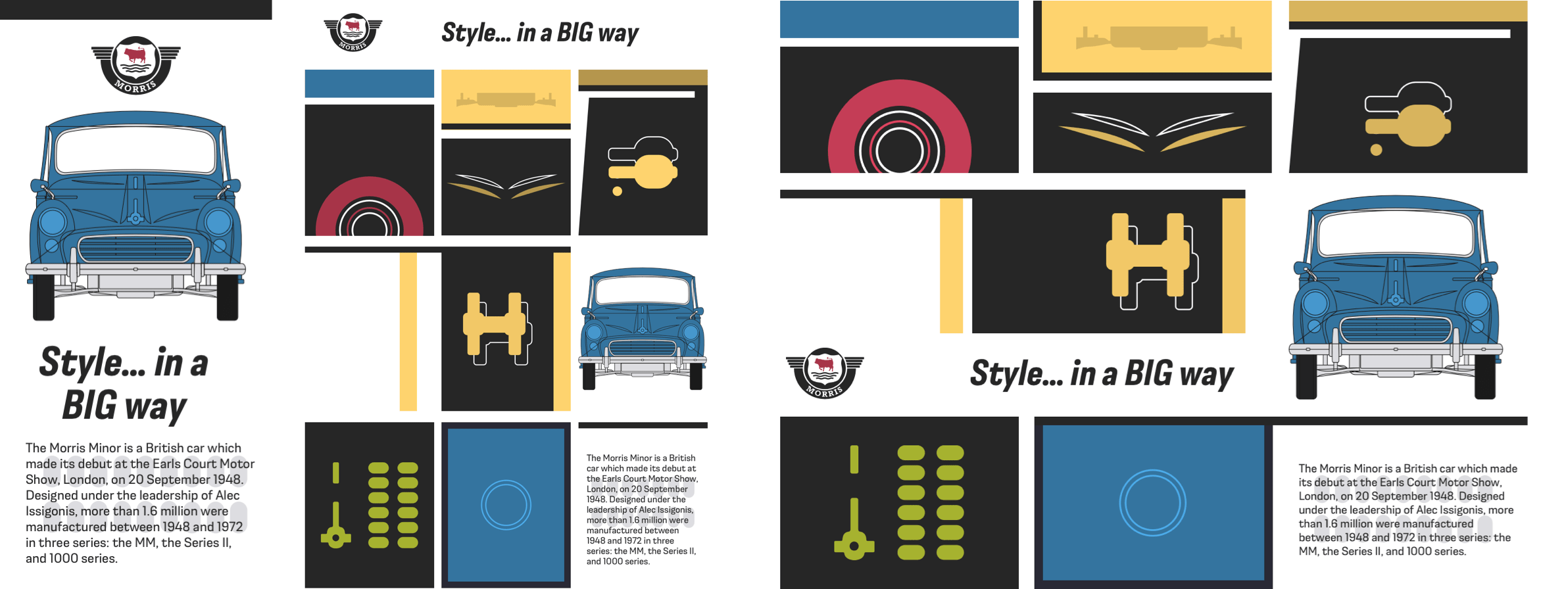
On small screens, this HTML would naturally display the headline and paragraph first. But by turning the body element into a grid with viewport-height-based gaps between its rows, the content can be reordered so the Morris logo and a picture of the Traveller’s front-end appear at the top. The panel containing the logo and image, plus the headline, are repositioned using explicit row line numbers.
<h1>…</h1>
<p>…</p>
<div id="panel-a"></div>
<div id="panel-b"></div>
<div id="panel-c"></div>
<div id="panel-d"></div>
<div id="panel-e"></div>
<div id="panel-f"></div>
<div id="panel-g"></div>
Since these panel divisions contain no other elements, their height collapses to zero, leaving only borders. A min-height on all panels ensures there is space for the generated backgrounds and content to display. The Morris logo itself is inserted into the first panel using a CSS generated content data URI — a file encoded as a string that the browser decodes and reconstructs into the original image. This technique works for PNGs and SVGs alike, and several online tools convert images into this format.
body {
display: grid;
row-gap: 2vh; }
For this first panel, the minimum height is matched to the logo’s height, then the logo is inserted. A similar approach places a background image behind the paragraph, with repeat, position, and size properties that keep the background flexible and always centered horizontally and vertically.
#panel-d { grid-row: 1; }
#panel-e { grid-row: 2; }
h1 { grid-row: 3; }
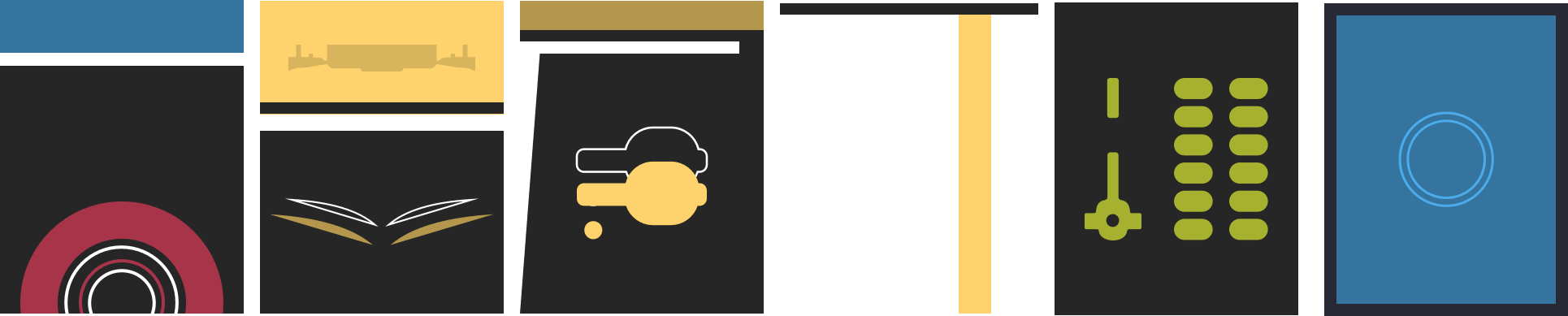
Each of the seven panels gets its own distinctive graphic design. Rather than dropping in image files — which would create at least seven additional HTTP requests — the panels combine multiple background images from data URIs and CSS gradients. The first panel shows the Morris hub cap over a striped blue, white, and black background. The hub cap arrives via a data URI, while the stripes come from a linear-gradient. Two comma-separated sets of repeat, position, and size values are supplied, kept in the same order as their respective background images.
[id*="panel"] {
min-height: 380px; }
<img src="data:image/png…">
<img src="data:image/svg+xml…">
A second panel combines two SVG images with more complex black, yellow, and white stripes. Placing color stops of different colors at the same gradient position creates hard lines between the colors, producing crisp stripes without any image file.
A Modular Grid for Larger Screens
Modular grids are rare in contemporary web design, but they suit this Pintori-inspired composition perfectly at larger screen sizes. The body becomes a three-column, three-row grid, with column widths set to fill all available space. Rows use Grid’s minmax value with a 300px minimum and a maximum of 1fr, guaranteeing enough height to show panel content.
div {
background-image: url("data:image/svg+xml…"); }
Because the elements in this layout don’t overlap, grid-template-areas offers the simplest placement method. Nine grid areas receive single-letter names from a through h; the letter d is assigned to two adjacent areas, so the item placed with that name occupies both. On this large-screen implementation, the minmax value controls row height, making the earlier min-height redundant. Panels are placed by area name, which means the layout can be rearranged without touching their position in the HTML.
#panel-d {
min-height: 90px;
text-align: center; }

#panel-d:before {
content: url("data:image/svg+xml…");
display: block;
width: 135px;
height: 90px;
margin: 0 auto; }
While most panels keep their design across screen sizes, one changes its content and background for large displays. This panel carries the familiar Morris logo and what reads as the main headline, “Style… in a BIG way.” Developing it starts with a deep solid border at the top and a data URI background image, followed by a gradient that creates the black panel and two vertical yellow stripes. The :before pseudo-element that earlier added the Morris logo is repositioned to the bottom-left of the panel for large screens.
p {
background-image: url("data:image/svg+xml…"); }

p {
background-repeat: no-repeat;
background-position: 50% 50%;
background-size: 50% 50%; }
The large headline itself is a direct child of the HTML body, not part of the panel, making precise positioning across fluid screen sizes tricky. To reproduce the design exactly without harming accessibility, an accessible method hides the headline visually for screen-reader users. The headline’s text is then restored with generated content via an :after pseudo-element, positioned at the bottom-right of the panel and styled in its bold, condensed, italic typeface.
Working With Complementary Colors
Complementary colors — those on opposite sides of the color wheel — have a clear mathematical relationship, but using them well is another matter. Adjacent complementary combinations can look harsh and unharmonious rather than balanced. Introducing shades, tints, or tones of those colors helps prevent clashing and expands the usable palette. Alternatively, a split complementary scheme uses two colors on either side of the complement instead of the direct opposite.
#panel-a {
background-image: url("data:image/svg+xml…"); }
The next Pintori-inspired design leans on complementary colors with several overlapping Morris Traveller blueprints. Its HTML is as minimal as the car’s depiction: a banner division holds an SVG of the Morris logo, and a main element carries the headline and running text. Flexibility across screen sizes comes from two picture elements, each containing three images; one sits in the header, another in the footer.
#panel-a {
background-image: url("data:image/svg+xml…"),
linear-gradient(
to bottom,
#34749F,
#34749F 65px,
#fff 65px,
#fff 80px,
#262626 80px); }
Foundation styles begin with an off-white background and almost black sans-serif text. The banner division is center-aligned, and the logo has a maximum width of 150px. The headline uses bold, condensed, italic Moderna Sans; a span inside it changes color to match other design elements, such as the bull emblem in the Morris Motors logo.
#panel-a {
background-repeat: no-repeat, repeat-x;
background-position: 50% 100%, 0 0;
background-size: 75% 75%, auto auto; }
On small screens, both header and footer each display a single Traveller image. When space allows two Travellers to sit side-by-side, the browser swaps in different images. At medium sizes, a four-column symmetrical grid makes use of the extra room. The banner division occupies the two center columns, with the logo centered and shifted vertically to sit between the bumpers of the two cars. Header and footer span the full grid, while the main content lies within the two center columns for a comfortable line length.
#panel-b {
background-image:
url("data:image/svg+xml…"),
url("data:image/svg+xml…"),
linear-gradient(
to bottom,
#B5964D,
#B5964D 125px,
#262626 125px,
#262626 140px,
#fff 140px,
#fff 155px,
#262626 155px); }

#panel-b {
background-repeat: no-repeat, no-repeat, repeat-x;
background-position: 50% 45px, 50% 190px, 0 0;
background-size: 90%, 90%, auto; }
Breaking the Grid at Larger Sizes
The most dramatic changes appear on large screens. Despite their names, header and footer elements don’t have to sit at the top and bottom of a layout — they can be positioned anywhere, including the left or right edges. For finer control, the four-column grid becomes eight columns with two rows. The first row is fixed at 160px, and the second row takes its height from content.
@media (min-width: 64em) {

body {
display: grid;
grid-template-columns: 1fr 1fr 1fr;
grid-template-rows: repeat(3, minmax(300px, 1fr));
gap: 1rem;
min-height: 100vh; }
}
The banner division is repositioned across three columns, with the main element matching below it. The footer moves into the first three columns and the header into the final four, building an asymmetrical composition from a symmetrical grid. Both header and footer stretch the full height of the grid, while the banner division stays in the first row and the main element fits beneath it.
body {
grid-template-areas:
"a b c"
"d d e"
"f g h"; }
Dark Mode Considerations
Dark and light themes are standard in modern product design since Apple introduced dark mode to iOS and macOS, and the user-preference media query is now widely supported. It accepts three values:
- no-preference: someone hasn’t expressed a preference
- light: someone has selected a light theme
- dark: someone has chosen a dark theme
Adding a dark version of this design requires little more than adjusting certain color values inside that media query, such as reversing background and foreground text colors and changing path fills in the SVG logo. But dark mode isn’t always simple inversion. Pure white text on fully black backgrounds is tiring to read over long passages, so an off-white is often the better choice. Even vibrant complementary colors can shift in appearance against dark backgrounds; CSS filters can boost brightness, saturation, or both without exporting alternate image files.
Building With Color Blocks
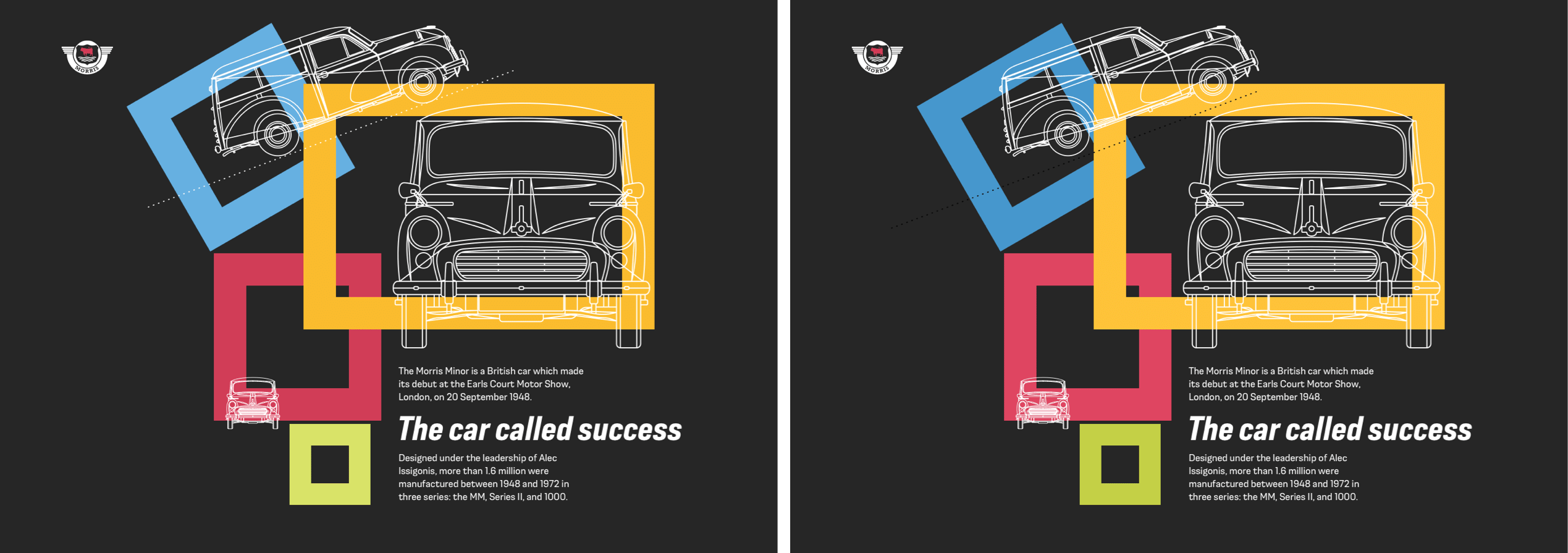
The closing design in this series moves into brighter territory: colorful rectangles hover over a dark grey canvas. Structurally, it stays lean — a header carrying the Morris Motors logo, a figure with three outline drawings of the Morris Traveller, and a main element for the running text.
<header>
  <svg>…</svg>
</header>

<figure>
  <img>
  <img>
  <img>
</figure>

<main>
  <h1>…</h1>
  <p>…</p>
  <p>…</p>
</main>
Four purely decorative SVG images support the visual effect. Because they carry no meaning for screen readers, each gets an ARIA hidden attribute:
<svg id="bg-1" aria-hidden="true">…</svg>
<svg id="bg-2" aria-hidden="true">…</svg>
<svg id="bg-3" aria-hidden="true">…</svg>
<svg id="bg-4" aria-hidden="true">…</svg>
Foundation styles set the background and foreground colors, then embed the same SVGs as data URIs in the background:
body {
background-color: #262626; }
background-image:
url("data:image/svg+xml…"),
url("data:image/svg+xml…"),
url("data:image/svg+xml…"),
url("data:image/svg+xml…");
color: #f3f2f2; }
Background repeat and position rules follow, centering each SVG and stacking them vertically. Sizes are set explicitly:
body {
background-repeat: no-repeat;
background-position:
50% 20px,
50% 240px,
50% 460px,
50% 680px;
background-size:
200px 200px,
300px 200px,
200px 200px,
100px 100px; }
The header logo aligns with the SVG behind it once its maximum width is constrained and horizontal margins center it:
header {
max-width: 200px;
margin: 0 auto; }
A horizontal scrolling panel again presents the three Traveller outlines. The figure uses flexbox, with horizontal overflow set to scroll:
figure {
display: flex;
flex-wrap: nowrap;
margin: 0;
padding: 0;
max-width: 100vw;
overflow-x: scroll; }
A flex-basis and matching height define the images' proportions:
figure img {
flex-grow: 1;
flex-basis: 320px;
height: 320px; }
Rather than add extra classes, attribute selectors that match a style's property and value precisely remove the background SVGs on small screens:
[aria-hidden="true"] {
display: none; }
A single media query breakpoint applies layout rules for medium and large displays. Eight equal-width columns and eight rows are set, and the small-screen background images are cleared:
@media (min-width: 48em) {

body {
display: grid;
grid-template-columns: repeat(8, 1fr);
grid-template-rows: repeat(8, auto);
background-image: none; }
The header and main content are then positioned between grid lines:
header {
grid-column: 1;
grid-row: 1; }
main {
grid-column: 5 / 8;
grid-row: 5 / 7; }
The figure itself is skipped for grid placement; instead, its images and division go onto the grid. Setting the figure's display to contents removes it from the styling flow:
figure {
display: contents; }
Each Traveller image lands in a distinct set of grid columns and rows, which changes both position and size:
figure img:nth-of-type(1) {
grid-column: 3 / 6;
grid-row: 2 / 4; }

figure img:nth-of-type(2) {
grid-column: 5 / 8;
grid-row: 2 / 5; }

figure img:nth-of-type(3) {
grid-column: 3 / 4;
grid-row: 5 / 6; }
CSS transforms fine-tune placement beyond grid constraints. Rotations, scaling, and translations adjust each image:
figure img:nth-of-type(1) {
transform: rotate(-20deg) translateX(-12rem); }
figure img:nth-of-type(2) { transform: scale(1.1); }
figure img:nth-of-type(3) { transform: scale(1.25); }
The colorful rectangles are finally revealed, pushed behind the content with a low z-index. Where they overlap, a mix-blend-mode deepens the palette:
[aria-hidden="true"] {
display: block;
z-index: 0;
mix-blend-mode: multiply; }
Those same shapes get grid positions and rotations, adding personality to the finished composition:
.bg-1 {
grid-column: 2 / 4;
grid-row: 2 / 4;
transform: rotate(-30deg);
transform-origin: 75% 50%; }

.bg-2 {
grid-column: 4 / 8;
grid-row: 2 / 5; }

.bg-3 {
grid-column: 3 / 5;
grid-row: 4 / 6; }

.bg-4 {
grid-column: 4 / 5;
grid-row: 6 / 7;
transform: rotate(5deg);
transform-origin: 0 0; }
Further Reading
- Inspired Design Decisions: Avaunt Magazine
- Inspired Design Decisions: Pressing Matters
- Inspired Design Decisions: Ernest Journal
- Inspired Design Decisions: Alexey Brodovitch
- Inspired Design Decisions: Bea Feitler
- Inspired Design Decisions: Neville Brody
- Inspired Design Decisions: Otto Storch
- Inspired Design Decisions: Herb Lubalin
- Inspired Design Decisions: Max Huber
- Inspired Design Decisions: Emmett McBain
- Inspired Design Decisions: Bradbury Thompson
NB: Smashing members have access to a beautifully designed PDF of Andy's Inspired Design Decisions magazine and full code examples from this article. You can buy this issue's PDF and examples as well as every other issue directly from Andy's website.
- How To Defend Your Design Process
- What Saul Bass Can Teach Us About Web Design
- It's Time To Talk About "CSS5"
- Setting And Persisting Color Scheme Preferences With CSS And A "Touch" Of JavaScript



