
Why Stories Belong in UX
Human brains are wired to find narrative even where none exists. Psychologist Daniel Kahneman demonstrates this in Thinking, Fast and Slow with a simple pair of words: “Bananas Vomit.” Readers automatically assume a temporal sequence and a causal connection between the two, forming a sketchy scenario even though no story was intended. This instinct to connect events linearly and causally is precisely why storytelling works in user experience design: UX is about aligning an experience with a person's mental model, and our mental models are built on narrative.
Stories also make abstract concepts concrete and simplify complex messages, as HubSpot’s storytelling guide notes. When a product tells a story, users care more and engage more deeply with the experience. The same principles that help an author craft a good narrative help a designer build a better product: they guide marketing material, ensure the product fits into the user journey, and reveal where descriptive content or emotional connection is needed.
To see how this works in practice, we can examine the five steps an author uses, applied to a real product: Sanofi’s Rheumatoid Arthritis Digital Companion, an app built in 2017 that is no longer available but remains a useful case study.
Step 1: Choose Your Genre
No one would call their favorite story a “murdery-mystery-romantic-comedy-sitcom.” Stories have genres because genre sets expectations and defines the space the story occupies. In UX, what an author calls a genre is closer to a niche or use case. It is not enough to say you are building “for healthcare” or “for finances” — the genre must be specific about the space in which the product exists and makes a difference for its audience.
One way to identify your product’s genre is to craft an elevator pitch focused on the problem, solution, and value proposition. Another is to fill in the blanks: “We want to be the _____ of __________.” The first field should be a known brand or archetype; the second should specifically describe what your organization does. Then explain what that means in a sentence or two. For example: “We want to be the Amazon of find-a-doctor apps, known for offering personalized recommendations.”
The team working on Sanofi’s Rheumatoid Arthritis Digital Companion used this approach to determine which features belonged in a “digital companion” for people with RA. They knew the audience needed simple tools to manage symptoms, track medication, and exercise joints, but they also needed to feel supported. So the internal genre became “the Mary Poppins of medication adherence apps”: anticipate what the patient needs, stay cheerful without being cheesy, and focus on what works rather than what is expected.
Step 2: Create Context
Context is everything that surrounds an experience. The same app is used differently when someone is sitting at home with full attention versus standing in a grocery store — the noise, visual stimuli, and reason for logging in all shape the interaction. Visual context is also part of UX design: headers and breadcrumbs tell users where they are in the broader structure of the product.
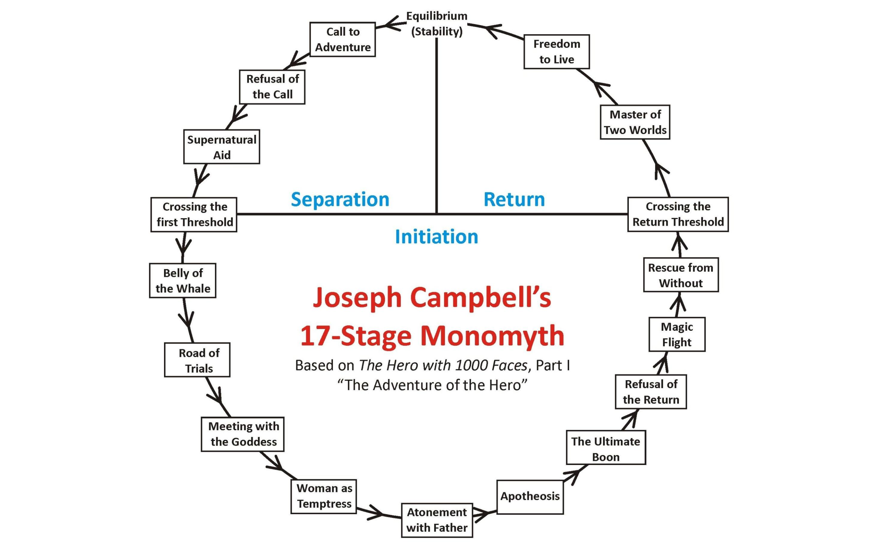
In Story Genius, Lisa Cron argues that many people mistake a list of events for a real story. A story needs context, not just a sequence of happenings. She illustrates this with common kindergarten writing prompts: What if Jane finds a message in a bottle? What if Freddy discovers a castle in his backyard? These “what ifs” lead nowhere because the reader has no idea why these events would matter to the characters. Adding a single line of context transforms them: What if Jane, who has waited years to hear from her long-lost father, finds a message in a bottle? Now the event has meaning. Joseph Campbell would call the pre-story state “equilibrium” or “stability” — the designer must show what stability looks like before the user receives their call to adventure.
For a product, context means going beyond the moment of use. It includes the problem the user has, what prompts them to seek a solution, and where they are when they use it. A new tool alone will not make someone feel connected to it. Instead of starting with features, ask these questions:
- Who is my audience?
- Where do they spend their time?
- What were they thinking, feeling, and doing before seeing my product?
For the RA Digital Companion, the team created a journey map to identify everything someone with RA experiences in their daily life. They sketched the journey on a storyboard and focused on moments of pain, frustration, or concern — these areas became the biggest opportunities for the app to have impact. The story began with Grace, their persona, waking up with hands that already hurt. They hypothesized she reaches for her phone first thing, perhaps to turn off her alarm, which became an opportunity to suggest a quick finger-exercise game at just the right moment. Without the journey map and storyboard, that connection to Grace’s real-life context would likely have been missed.
Shape Your Product’s Narrative Arc
A story that never ends is exhausting, not exciting. Good books and good products know when to wrap up. In The Hero with a Thousand Faces, Joseph Campbell identified 17 steps in the classic hero’s journey. UX teams don’t need to follow every beat, but the overall shape is a useful frame for mapping the user’s path from first contact to a graceful exit.
The key design question is: where does your product’s story climax? For TurboTax, that moment is when taxes get filed. But the story doesn’t end there — users still want to track their refunds. Even though that data lives outside the product, TurboTax sets expectations with infographics and offboarding content that keep users informed after they’re done. A deliberate offboarding process is as important as onboarding. Users don’t want to be nagged back into a tax app after the season ends; letting them leave and return on their own terms is what keeps them happy.
One concrete technique is to write out your user’s hero journey. Don’t be shy — cast your product’s user as a literal knight. Use the template to think through the emotional, mental, and physical state of the person at each step. A laundry detergent ad demonstrates the structure well:
The commercial can be broken down into a clear narrative:
| Step | Observation |
|---|---|
| Call to Adventure | Lily’s princess dress getting dirty. |
| Refusal of the Call | Lily’s procrastination: she doesn’t want to change out of her princess dress. |
| Road of Trials | The father collecting the dress and giving Lily her sheriff’s costume, plus her accompanying power trip (a true trial for every parent). |
| Apotheosis | When the wash is dry and can be worn again. |
| Refusal of the Return | The parent wanting to leave everything nice and clear in the basket. |
| Crossing the Return Threshold | When Lily gets her princess dress back. |
| Master of Two Worlds | Lily is wearing clean clothes that are not yet dirty and having to be washed. |
Notice where the product appears in the story and where the user steps away from the brand to continue living their life. For the Digital Companion, a companion app for rheumatoid arthritis patients, the team created vignettes for a persona named Grace. User research showed Grace was anxious and uncertain about taking her injections, sometimes skipping them entirely. Reframing her medication routine as a “Road of Trials” changed the product’s tone. The app copy encouraged her like a hero on a quest, praising her progress as she built a habit and transformed into a “Master of Two Worlds.”
Revise With User Data
“Good writing is good editing” applies to UX as much as prose. Authors work with editors and revise extensively; UX designers rely on usability testing, A/B tests, and prototype feedback. But digital products have an advantage over published books: they can be fixed after release. Healthcare.gov is the canonical example. Its launch crashed immediately, ballooning from a $93.7M budget to a final cost of $1.7B. Harvard Business School called it a major failure.
“The key issues discussed above resulted in the rollout of the healthcare.gov website ballooning the initial $93.7M budget to an ultimate cost of $1.7B. It is easy to observe that the launch of healthcare.gov was a major failure.”
Yet the product didn’t fail. The site still operates, and in 2021 alone more than 2.5 million people gained health coverage through it during the special enrollment period. A failed story stays failed; a failed product can iterate into success. The same pattern holds for hardware: Garmin releases multiple watch models every year, learning from the flops and refining successful styles over subsequent revisions.
The Digital Companion is no longer on app stores, but it shipped multiple releases after launch. The team was already running desirability tests on additional “finger stretching” game options and A/B testing video-based injection instructions before the first version even launched. Product visions don’t have to wait for release results — that’s the nature of UX work.
Plan The Sequel
Once a product ships, the sequel begins. Great sequels either complete a planned series (the Star Wars trilogies) or expand the existing world (the “a Star Wars story” one-offs). Bad sequels ignore established facts and character growth, which is why Game of Thrones fans reacted so strongly to its final episodes. Products can make the same mistake by discarding what made them successful to chase a tidy ending.
Sometimes the real world forces a product to rewrite its own mythology. After the 1964 Surgeon General’s report linked smoking to health risks, the tobacco industry tried an unusual pivot. Their fictional ad man Don Draper put it this way:
“If you don’t like what people are saying, change the conversation.”
They did exactly that — adding filters to cigarettes and marketing them as a protective measure against tar and nicotine, despite evidence to the contrary. The BMJ Journals described the outcome as a dramatic conversion from regular, unfiltered products to filtered and king-sized alternatives, keeping smoking rates steady. It was a successful, if ethically bankrupt, product sequel.
On the ethical side, the Digital Companion project seeded its own sequels: the lessons its designers, writers, and engineers carried into later roles, most recently at Verily. The original app told a story to end-users; the impact of that story rippled through health tech.
Find The Human Connection
Storytelling is how humans connect. Whether you draw from Lisa Cron’s Storygenius, Campbell’s hero’s journey, or Kahneman’s work on how the mind processes narrative, the same principle applies to product design.
“As human beings, we’re often drawn to the narrative; in part, because our complex psychological makeup wires us for the sharing of information through storytelling and in part due to our natural curiosity.”
A well-designed product takes narrative form. Its information architecture feels familiar, gives context, and provides flow. It slots naturally into the user’s own life story. To tell that story effectively, pick your genre and audience, build context, focus your scope where you can have the most impact, revise based on feedback, and consider what comes next. Storytelling is a powerful lens for any UX designer — it clarifies both what you build and who you build it for.



