
Why Design Concept Testing Is Worth Your Time
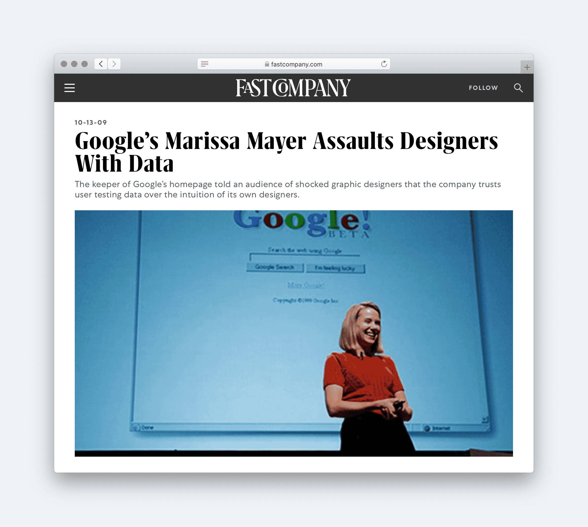
Designers are used to usability testing on live sites and prototypes, but testing a design concept — a static mockup — still raises eyebrows. The infamous “Forty Shades of Blue” episode at Google, where the company tested 40 slightly different link colors, has become shorthand for design testing run amok. That kind of obsessive testing is neither healthy for morale nor for most budgets.
But testing a concept doesn't mean running hundreds of micro-experiments. It means bringing structure to a process that is otherwise prone to endless revisions, subjective opinions and “Final-Version-21.sketch” moments. When used sensibly, testing makes design sign-off faster, more predictable and less contentious.
The Case For Testing Before The Build
Every designer has been through revision hell — tweaking colors and layout endlessly in hopes of final approval. That uncertainty makes project planning and budgeting difficult. Testing, far from being a luxury that slows a project down, can actually make it more predictable.
Most designs don't get rejected because they are bad; they get rejected because stakeholders don't like them. Testing creates a framework for evaluating a design that has nothing to do with personal preference. When a design performs well in tests, it can be approved without further iteration, or at worst needs only minor adjustments. Even when testing doesn't speed things up, it makes the outcome far more predictable.
Testing also shifts the basis on which a design is assessed. A design has two jobs: to connect with users emotionally and to let them use the site efficiently. Too often, it is judged solely on whether a client likes it — and that mismatch between purpose and evaluation causes friction. Testing refocuses stakeholders on what actually matters.
Because design is subjective, the more people who weigh in, the more disagreement there tends to be. The typical fix is compromise, which produces designs that please nobody. Testing is an alternative to design by committee; it reduces conflict and preserves the integrity of the design.
There is also the simple fact that designers are not infallible. We misjudge tone, miss a mental model, or overlook an image that undermines a call to action. Testing catches these issues early, while fixing them is just a matter of updating a mockup in Sketch or Figma rather than reworking a live site.
What To Test In A Static Mockup
Before testing anything, you need clarity on what you are testing. In the absence of interactivity, focus on two things:
- Brand and personality: whether the design connects emotionally and builds trust.
- Usability and visual hierarchy: whether users can navigate and find what they need.
Testing Brand And Personality
Users form impressions within a fraction of a second of viewing a page. In a study published in the Journal of Behaviour and Information Technology, researchers found that decisions are made in as little as one-twentieth of a second — and these first impressions are lasting. At that speed, users are judging on aesthetics alone, so the aesthetics must communicate the right things. Three methods are available.
Semantic Differential Surveys
This method starts before the design work: agree with stakeholders on a list of keywords the design should signal —trustworthy, fun, approachable. Once the design exists, show it to users and ask them to rate it against each keyword.
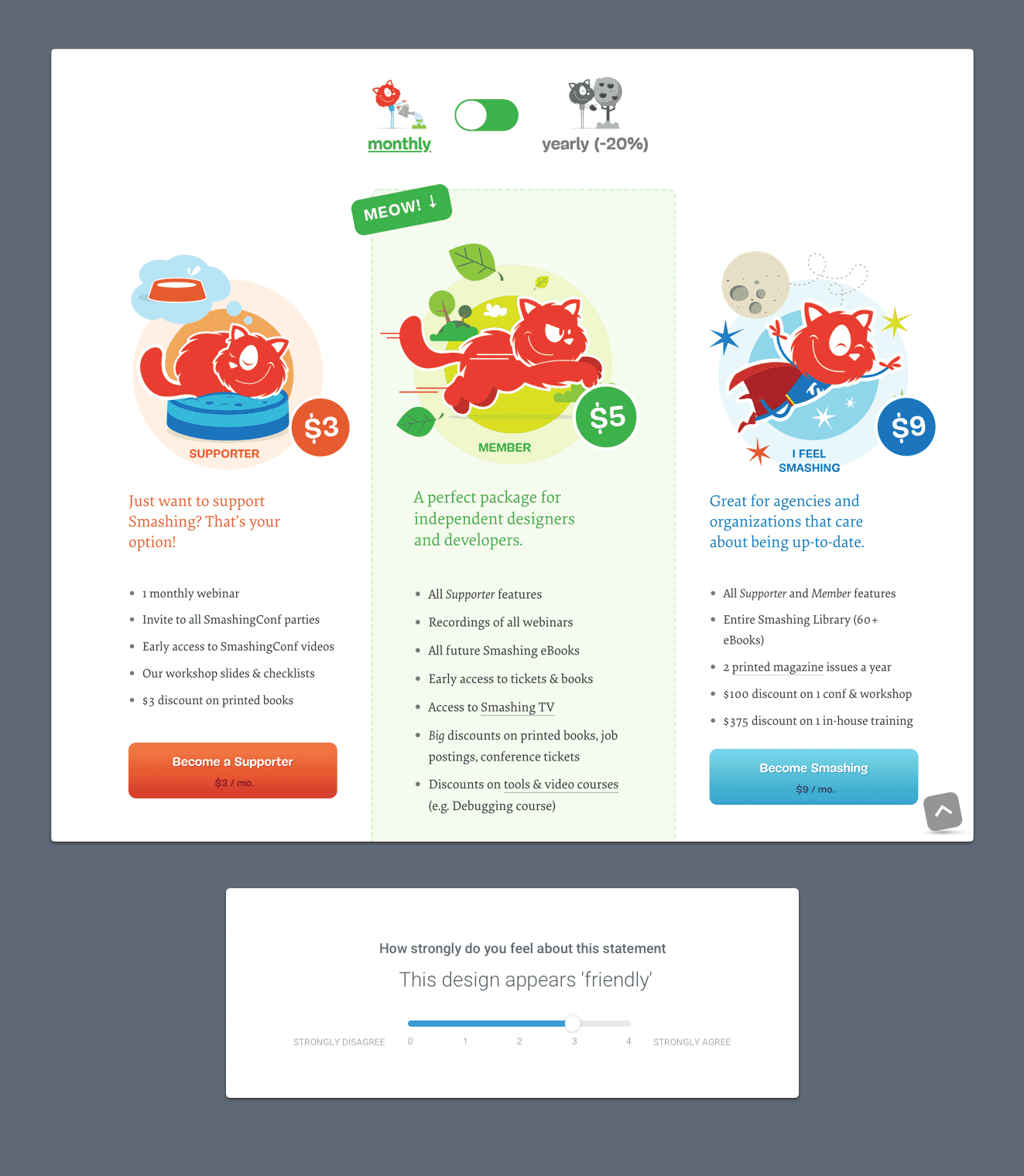
A semantic differential survey serves a dual purpose. If the design scores well on the agreed words, you know it is doing its job — and stakeholders find it hard to reject a design that tests well.
Preference Tests
With multiple concepts, a preference test is the simplest option. You show the options and ask users which one best conveys the agreed keywords — not which one they find prettiest. Asking for preferences based on the defined criteria keeps the evaluation objective.
The same logic can be extended to competition. Show users your concept alongside competitor websites and ask which better communicates the desired keywords.
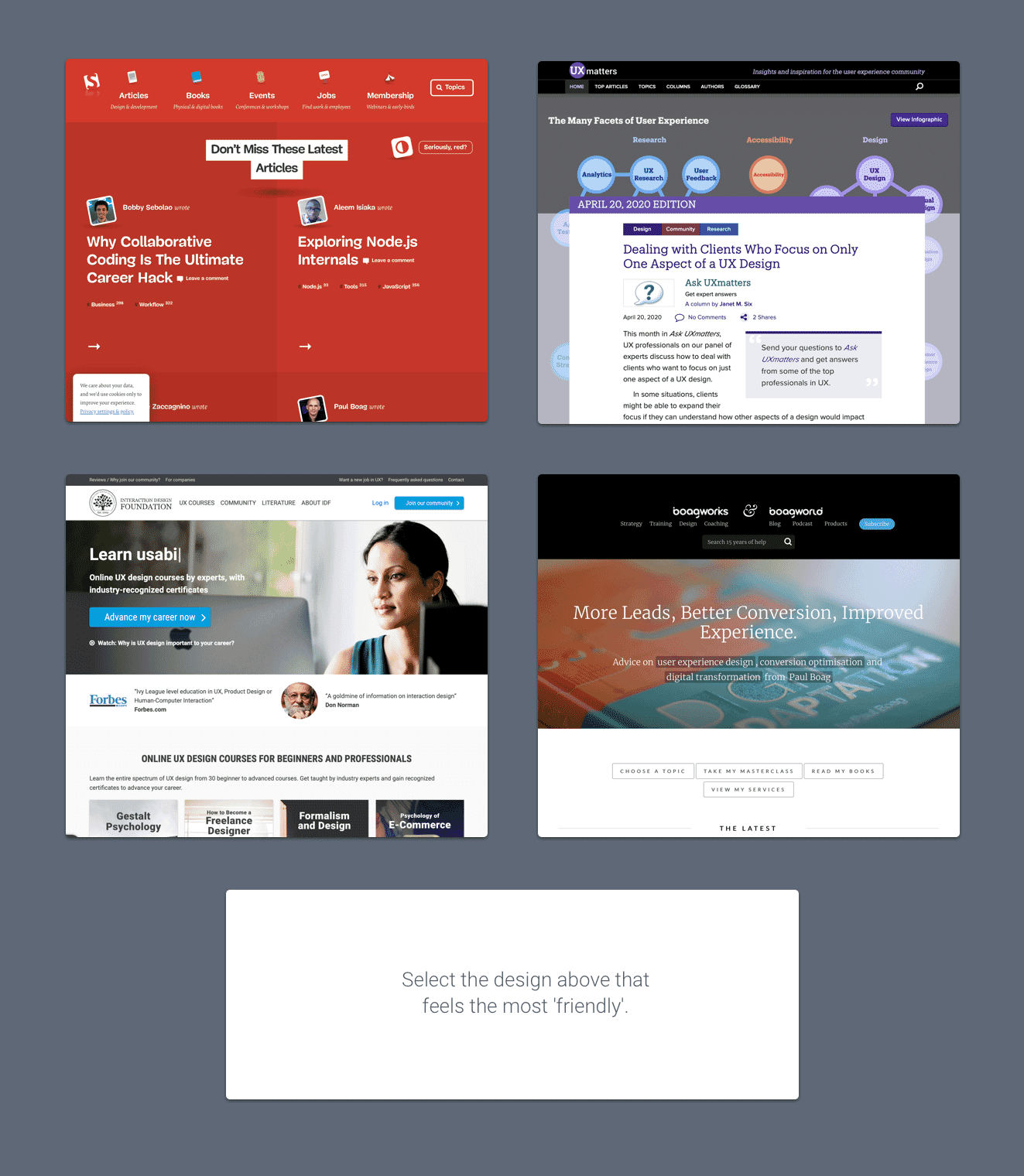
Preference testing has an additional advantage: it discourages picking and choosing individual design elements from different concepts or competitors. Users choose an entire design, which builds a case for keeping a concept intact rather than mashing aesthetic pieces together.
Testing Usability And Visual Hierarchy
Once a site or high-fidelity prototype exists, usability testing and A/B testing are straightforward. With only a static mockup, testing still works — and it is worth doing early, while changes are cheap to make. Two approaches matter most.
First-Click Tests
Bob Bailey and Cari Wolfson's research on usability showed how much depends on the first choice a user makes. Users who got a first click right had an 87% chance of completing the task correctly; users who got it wrong fell to a 46% success rate.
A first-click test is straightforward: present users with a task (“Where would you click to contact the website owners?”), show the mockup, and record where they click.
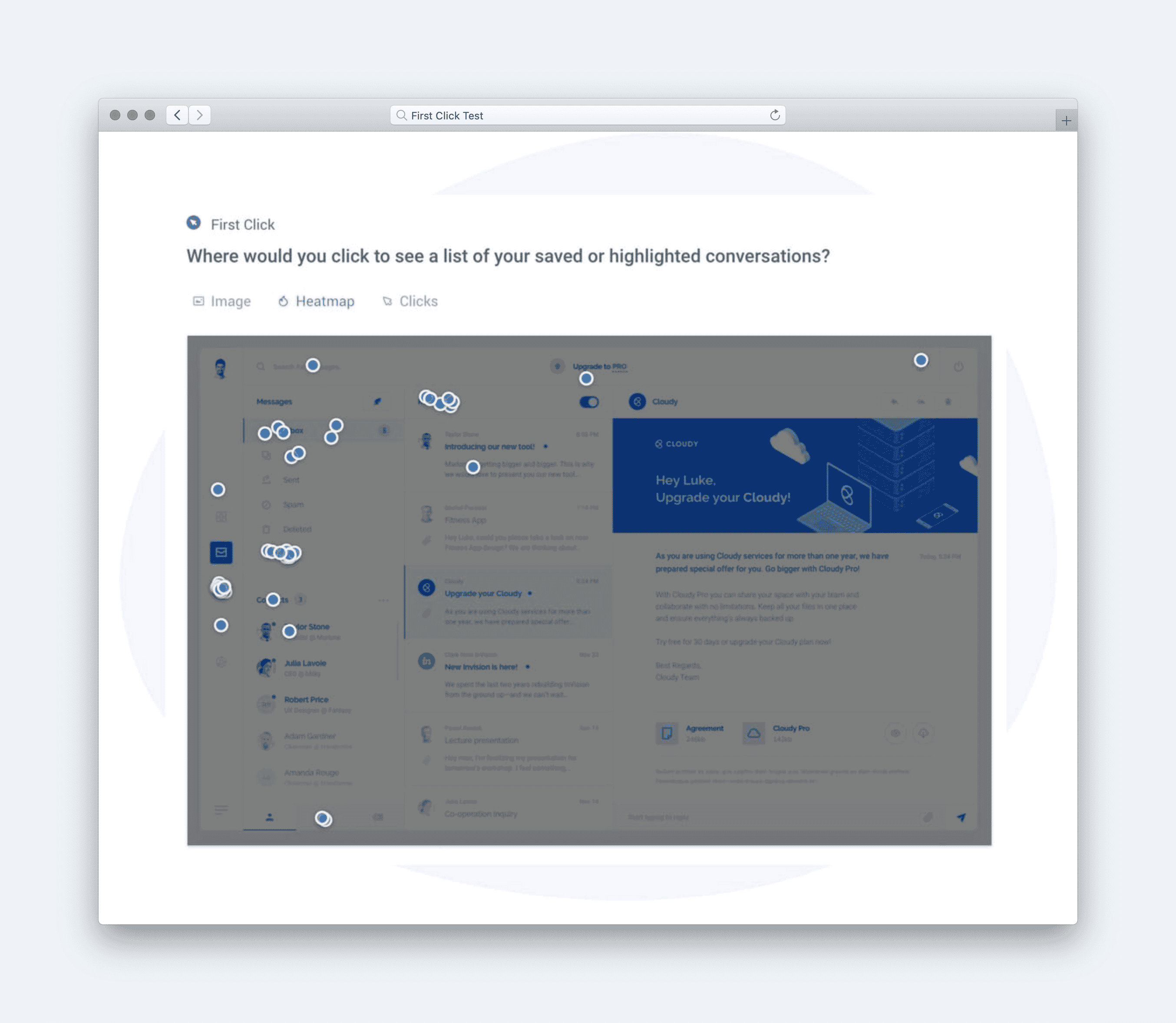
From a designer's point of view, this resolves disputes about information architecture by showing empirically whether labeling and structure make sense to users.
Five-Second Tests
Users decide quickly whether to stay — most will leave a site within 10 to 20 seconds. Your interface has to put the most important information front and center. A five-second test checks whether that works:
A five-second test is run by showing an image to a participant for just five seconds, after which the participant answers questions based on their memory and impression of the design.
Note not only whether users remember key elements, but how quickly they recall them. If users mention the secondary content before the primary call to action, the hierarchy may be off. A five-second test can also reassure clients worried about overlooked interface elements — which should quiet at least a few “make my logo bigger” requests.
Practical Concerns Are Manageable
Each of these tests is cheap to run and requires nothing more than a static mockup. When applied together — semantic differential surveys and preference tests for brand perception, first-click and five-second tests for usability — they produce a clear picture of whether a concept works both aesthetically and functionally.
Finding The Right Participants
Running the tests is straightforward with tools like Usability Hub, which supports all five methods covered above. You create a test, share the generated link, and wait for responses. The harder part is often sourcing participants.
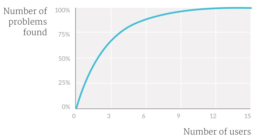
For usability testing, you don't need a large pool. The Nielsen Norman Group recommends testing with just five users, as the return on additional participants diminishes quickly after that point.
Recruiting those five can be as simple as reaching out to your existing customers or asking friends and family. If you need specific demographics, services like Usability Hub can source participants for roughly a dollar per person.
Testing Aesthetics: A Different Bar
Aesthetic testing demands a larger sample. Because design preference is inherently subjective, you need enough responses to smooth out statistical anomalies. Nielsen Norman Group suggests aiming for at least 20 participants when seeking statistically significant results.
For aesthetic evaluations, demographic accuracy matters more than for usability checks. Your testing platform should let you filter for the right audience. While this incurs a small cost, it pales in comparison to the person-hours typically spent debating design direction internally.
Time is rarely a barrier either. In practice, you can usually gather 20 responses within an hour — a timeline that likely beats your last stakeholder approval cycle.
Why It's Worth The Effort
Concept testing won't resolve every design challenge, but it consistently improves outcomes and can notably ease stakeholder management. Given the modest investment required, there is little reason not to try it on at least one project to see the difference.


