

Testing Ideas Before They Become Products
UX teams invest heavily in methods and processes to ensure their work is grounded in user needs rather than internal assumptions. Yet the urgency to move from problem to polished design often means ideas are validated only after significant resources have been spent. Concept testing closes that gap: it is a research method for gathering user feedback on a proposed solution while that solution still exists only as an idea, before detailed design work begins.
Consider a large bank that wants to simplify direct deposit enrollment. It might seem safe to assume an online, end-to-end enrollment flow is the obvious answer. But resource constraints raise questions that deserve user input before committing: Should the experience be mobile-friendly? Should it live in both a native app and the web? Should the bank provide in-person kiosks for customers? And do customers’ goals around enrollment even align with the business’s goals for promoting the feature? These aren't trivial decisions, even for a comparatively simple concept.
Concept testing is a hybrid of market and UX research: it probes whether an idea has an audience willing to adopt it and, if so, how that audience wants the experience delivered. Treating it as an essential part of the upfront UX process is good practice, not a departure from a user-centered philosophy. A product that is usable but unwanted serves no one.
The method also gives UX teams leverage when stakeholders arrive with a fully specified business idea and expect immediate design work. Declaring concept testing a standard part of how your team accepts work buys room to put the general concept in front of users, and the findings can be used to justify continued user engagement.
Timing matters. Testing too early — when the idea is too abstract or the use cases too undefined — wastes resources. Refine the concept enough that participants can react to a realistic scenario, or hold testing until you have multiple concepts that make the session worthwhile. Do not treat concept testing as a replacement for usability testing with refined wireframes or prototypes; it is validation of the idea, not of the interface.
Who Should Take Part
Involvement in concept testing should reach well beyond the core UX team. Researchers create the protocol and carry out sessions, but designers, information architects, and content strategists all contribute to the artifacts and benefit from hearing findings firsthand.
People outside the UX group are equally valuable in the room, including:
- Marketing team members
- Engineering and development team members
- Business analysts
- Key internal stakeholders from outside the product team

Inviting these colleagues to planning discussions or to observe a testing session builds buy-in, but observing a single session carries a caution: a stakeholder who watches one conversation may form a firm opinion from that limited view, making it harder to convey conflicting themes from other sessions later.
Internal stakeholders can also serve as test participants. This is most useful when they are also close to the intended user base — for example, supervisors at a service provider’s call center who understand the realities of the role. Having them respond to the concept, alongside actual call center representatives, turns stakeholders into advocates who understand the idea rather than merely sponsor it.
Still, external, representative end-users should have the largest voice in how a concept evolves. Their feedback might lead to tweaking parts of the idea that tested poorly, redefining who the target audience is, simplifying an idea that users found confusing, or accepting that the problem the product solves isn’t yet well understood and will require patience while users discover the need for it. None of these outcomes means abandoning the idea — but they are all reasons to listen before building.
Artifacts That Ground a Concept
Concept testing depends on an artifact that conveys the idea. Researchers often worry that showing anything concrete will lead participants. In practice, however, abstract questions — “What do you think of when I say ‘financial command center’?” — leave people guessing or frustrated. A simple sketch of charts that suggest personal financial monitoring generates a richer conversation with more honest insight into what users want from such a product.
The point of an artifact is to ground participants in the reality where a future concept would live, then let them expand on it. It is not to walk them to a predetermined conclusion that your idea is good. Keeping the artifact conceptual leaves room for users to reveal their own expectations and priorities. Useful artifacts are limited only by your creativity, but some proven options stand out:
- Sketches and drawings. Screens sketched out by hand, or a comic strip that lays out an interaction scenario, are enough to start the conversation. Concepts can be intentionally unfinished, and participants can be asked to complete the sketch or plot what happens in the next frame.
- Craft supplies. Tactile materials convey high-fidelity ideas at low cost. For a zoo exhibit concept, velcro and felt can stand in for a touchscreen kiosk. Another study constructed a cardboard ATM to let participants simulate using it. The low-fidelity artifact suits the exploratory stage where the concept is being shaped, not its final form.
- Sticky notes. When the concept involves a process, place each step on its own sticky note. Participants can reorder or add steps to design their ideal version of the flow that starts as your seed of an idea.

- Participant-created solutions. Beyond reacting to an artifact, participants can build their own version of a solution to your concept. Ask them to sketch or construct what they would create, and use that as the starting point for discussion about the features and use cases they imagine. This works well as a group activity, where a researcher facilitates while participants explain their creations. A warm-up exercise like the classic “how to make toast” can get people thinking visually before they try to solve the problem you are investigating. The logic behind participants’ ideal solutions gives designers raw material that can be translated into requirements for a digital experience.
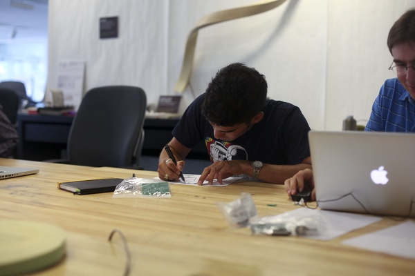
The list is far from exhaustive. The underlying principle is that participants take an artifact and turn a vague concept into something they can react to — and ultimately, into an experience they find useful. The artifact is scaffolding for discussion, not the final answer.
Concept Testing In Practice: Interviews, A/B Tests, And Alternatives
Interviews
Concept testing interviews pair the concept itself with one-on-one conversation, focused on a few core areas: hypothesis testing, current user behavior, competitive context, value proposition, and direct feedback on the artifact. Each serves a distinct purpose:
- Hypothesis testing: Explore whether the need your concept addresses actually exists. Do users struggle with a task or have an unmet need? Will your proposed solution fit how they work?
- Current solutions: Uncover how users meet the need today. Is the process manual? Happening outside your system? Are there steps you could remove with technology that users may not realize are extra?
- Competitive landscape: Identify which tools users already rely on and what experiences they expect from a solution like yours.
- Value proposition: Pay attention to how users talk about your concept. Their language — connected to the pain points they describe — can inform both product direction and future marketing.
- Artifact reactions: Collect direct, immediate responses to the sketch, storyboard, or prototype you bring to the session.
Remote interviews work well, but co-creation with tangible materials or crafts is harder at a distance. In that case, an online whiteboard or collaboration tool — such as Canvas Chrome, Google Jamboard, Miro, or Mural — can support the same hands-on activities.
A/B Testing With Artifacts
When you have more than one plausible direction for a concept, A/B testing with multiple artifacts lets you compare them directly. Use it when decisions like mobile versus desktop-first are on the table. Beyond the interview questions above, A/B testing helps determine:
- Which version communicates your idea more clearly?
- Which version delivers value more immediately?
- Which version is more realistic to build and meets user needs better?
A/B testing is resource-heavy — you need at least two fully developed test versions. It can run asynchronously, with participants logging in to view each version and answering questions as they go. Sessions can be purely static (view and respond) or interactive, using tools similar to how UserZoom or Usabilitytesting.com embed questions into a prototype walkthrough. Many such platforms also support audio responses or post-session feedback.
Because the session is unmoderated, asynchronous A/B concept testing scales to a larger participant pool without consuming your time per session. You can split participants so each sees only one version, or show both and ask for comparative feedback alongside the structured questions.
Other Approaches
Co-design gives users the raw materials to build on — or entirely re-create — the solution. To avoid biasing output, avoid introducing your own artifact at the start. Instead, work with designers to craft prompts and activities; participants then sketch, model with clay, or describe their ideal product in words. Compare what emerges with your intended direction to validate alignment.
Surveys trade depth for reach. Reliable and unbiased survey design really needs an experienced researcher, but when run at scale, survey results offer statistically generalizable evidence that a market exists. You can embed or link to the concept visuals and, as survey tools evolve, even include audio or video walkthroughs.
Working With Concept Testing Data
Ideally, a trained researcher runs concept testing. That expertise shows in non-leading questioning, sound study structure, and translating raw findings into design-relevant recommendations.
Each method yields a different kind of data. Qualitative feedback tells the product's story — how users envision it evolving. Quantitative results from A/B tests help you choose between competing design directions; similarly quantified survey responses capture market acceptance and feature priority when the study is large enough.
Once a concept is validated, detailed design can begin at a fidelity that supports usability testing. Beyond validating the MVP scope, concept testing findings help you identify and prioritize features, and build a user-focused product backlog that looks further ahead.
Where Concept Testing Can Go Wrong
Concept testing has limitations that you can sometimes manage upfront, and occasionally only discover through complementary research later.
- False future expectations. You may show users something that never ships, or ships with fewer features than presented. If you invite users to co-create from a given idea, be explicit that the final product may not match their sketches. If current technical constraints limit what can be real soon, don't showcase long-term possibilities that might not materialize, or clearly flag their status. Concept testing can build enthusiasm, but not at the cost of disappointment when reality lands.
- Over-explaining becomes leading. A genuinely new concept can be hard to convey without narrating exactly how it works. The more detailed that story, the more feedback reflects the specifics of your narrative rather than the concept's broader value — and the more you've anchored the participant in your version of events.
- Usability feedback doesn't surface. Concept fidelity isn't meant to support testing task completion or UI details. You may catch feedback on the sense of flow or rough layout, but you can't iterate on detailed design. That refinement comes later, in usability testing.
- Fidelity cuts both ways. High-fidelity artifacts look finished, pulling participant attention toward branding, iconography and look-and-feel, away from the core idea. Low-fidelity artifacts can be too abstract for participants to engage with meaningfully, which pushes you into explaining more — and the more you justify the concept, the more participants may bias responses based on your investment.
Two Real-World Tests: What Worked, What Didn’t
Concept testing isn't a purely theoretical exercise. Here are two examples from my own experience to show what it looks like in practice—and what happens when the setup isn't ideal.
Test #1: A Felt-Board Kiosk for Zoo Visitors
One of my most successful concept testing efforts came from a project for a major metropolitan US zoo and aquarium. The idea was to install interactive touch screen kiosks in an existing manatee exhibit. The goal was to increase visitor engagement beyond simple observation: visitors would use the kiosk to create pro-conservation messages and email them to friends and family, thereby encouraging the scientific processes of observation, recording, and sharing.
Rather than building a digital prototype, we went low-fi. Over a couple of weeks, we stationed ourselves on-site. Our “screen” was a felt board with velcro-backed laminated pictures (of manatees and their habitat) and words. Visitors could physically move these elements to compose their messages. This let us set up the board in several locations to test not just the core activity, but also how a permanent kiosk might disrupt or enhance the natural traffic flow of the exhibit.
We involved a cross-functional team: researchers, science educators, industrial and digital designers, developers, and zoologists. We gathered feedback through interviews on location, observing real visitors moving through the space to see where a physical obstruction might cause a problem.
The tactile prototype was a brilliant early proxy for the touch screen. It revealed a tension we hadn't anticipated. We assumed visitors would want total freedom to write any message they wanted. But our product owner had valid concerns about offensive content. The resulting design compromise was to include a more open-ended, pre-written sentence visitors could opt into: “Let’s keep the conversation going! Please reply to this email and I can share more with you when I get home.” (A nudge made more sense back when smartphones weren't ubiquitous.)
Critically, the testing informed design decisions before any fabrication began. We chose the kiosks' very sites based on visitor paths we observed; we learned the limits of user expectations; we even found that visitors wanted to email their own addresses, not just friend and family. The team’s philosophy embraced UX as more than a process, and the early feedback shaped the final product well before a single screen was coded or a material was selected.
Test #2: A Consolidated Financial Platform — When Stakeholders Outweigh Users
In another instance, an international financial advisory firm asked us to design a new product that would merge several existing tools while introducing new features for its advisors. As with any consolidation, we needed to explore the current user pain points and understand what would be lost (or gained) with the transition.
Our method was sound. We started with discovery interviews with stakeholders, isolated the most critical workflows, and mocked up a highly constrained story showcasing exactly those steps in a clickable prototype. Then, we ran remote interviews with screen sharing to get feedback.
The test audience, however, was where this effort went sideways. The client didn’t give us a pool of everyday end-users. They supplied a list of upper-level stakeholders. Our client’s implicit (and explicit) goal was to drum up support and buy-in at the top. However, those executives were far removed from the daily grinding realities of the current tools and clearly didn't use them for the exact purposes that underpin the concept's core value proposition.
They provided feedback not from on-the-ground experience, but from how they imagined a salesperson or a customer to think about the interface. Our feedback echoed that dynamic right back at them in our report out, recommending that we needed to get the prototype in front of *actual* end-users to measure genuine improvement.
Still, this misalignment wasn't a total wash in terms of insight. We learned some structural truths about the platform, completely apart from usability details. High-level stakeholders voiced loud concerns about the planned transition away from the legacy systems. They wondered about training and education on the new consolidated tool. That seemed inevitable when interacting with those who had successfully sold or invested in the previous products—their immediate survival depended on explaining the pending shift to clients.
The specific usability issues we wanted were less clear-cut, but we weren't stuck there for long. We uncovered just how critical data visualization is to the product's central value proposition, which was helping advisors make nimble financial decisions in time-sensitive markets. This insight pushed us to double down on exploring and innovating around how to communicate trustworthy, easy-to-digest real-time information before we settled on any detailed design.
Take the Pulse Early
Concept testing straddles both UX and market research. Treating market-acceptance questions as if they aren't part of your UX practice betrays the fact that usability often matters less when you're building for the wrong niche. A product can be technically perfect but completely useless if the target user can't even see why they'd pull out their wallet or change their behavior to adopt it.
When you put your ideas in front of end-users at the earliest, most humble stage of definition, you buy yourself an affordance cushion. Learning that visitors didn't want the constraint you were prepared for, or that executives have transition anxiety you weren't anticipating the crash properly for, will stop you from burning months of design and dev work on things no one wants to interact with. The ugliest, least-intuitive felt board in the world is still a powerful lens into how a person will experience your final, sculpted product—if you listen close enough.


