

Why Onboarding Determines Product Success
A great SaaS product can still fail if users never get far enough to see its value. High dropoff and inactivity rates are common problems, and the culprit is often the onboarding process. The first minutes after signup are when users decide whether your product is worth their time.
A well-designed onboarding flow bridges the gap between signup and activation. It shows users how the product works, why it matters, and how it fits into their workflow. Done right, an onboarding flow can deliver several measurable benefits:
- Higher conversion rates.
- Lower user abandonment.
- Increased activation and feature adoption.
- Better user satisfaction.
- Reduced churn.
Onboarding isn’t limited to a single signup form. For complex SaaS products, it can extend into tooltips and guided tours inside the app itself. Regardless of the format, the goal is the same: get users to their “aha” moment as quickly as possible. The process also lets you collect user preferences and personalize the experience, which reinforces the value of the product early on. In short, your onboarding sets the tone for the entire user relationship.
Building an Onboarding Flow in Feathery, Step by Step
The following walkthrough uses Feathery to construct an onboarding flow in the style of Duolingo’s well-known signup sequence. After creating a Feathery account, you can start from a template or a blank canvas; the steps below assume a fresh start.
Establish the Container Style First
Consistency across onboarding screens matters. Users should feel the same visual language throughout the flow, and the container design is the foundation of that.
Click the container on your first step and open the “Style” panel on the right.

The panel gives you control over layout, background color or imagery, corner radius, shadows, and transformations triggered by hover or click. If you intend to heavily customize the container, consider deleting extra template steps first: it is easier to duplicate a single styled container for subsequent steps than to rebuild the styling. Feathery also supports reusable styles and components via its themes feature.
Limit the Number of Steps
Working memory generally holds only five to seven items. To maximize completion rates, give users only the information and questions that are truly needed. Keep the flow at seven steps or fewer; five is preferable, and even more can work if each step is very short and simple.
Begin by choosing what kind of onboarding best serves your product: a setup walkthrough that personalizes the experience, a set of questions that identifies user type, a preview of core features, a welcome video or GIF, or compelling statistics about your product’s impact. Then assemble the steps.
Use the “Flow” tab on the left to manage steps. Click “+Step” at the bottom, or hover over an existing step button and use the plus sign that appears.

Double-click any step block to rename it. The three vertical dots on hover let you duplicate, rename, or delete the step.
Customize Each Screen’s Content
Strong onboarding keeps the design minimal: generous white space, concise language, and positive imagery and color. The “Elements” tab on the left sidebar holds all of the mix-and-match components you need.
Add a Progress Indicator
Every multi-step process should start with a “Progress” element at the top of the page so users always know where they are.

This progress indicator is fully adjustable: length, alignment, visibility, color, font, text placement, and text styling. Balance prominence against distraction; the bar should be findable, not dominant.
Draft the Text Before Images
Keep each screen to roughly 50 words or fewer. Text hierarchy matters: uniform sizing risks looking like a single wall of text. Use headings, bold and italics for emphasis, and place choice options into visual blocks.
An individual “Text” layer is added with the “Text” field.
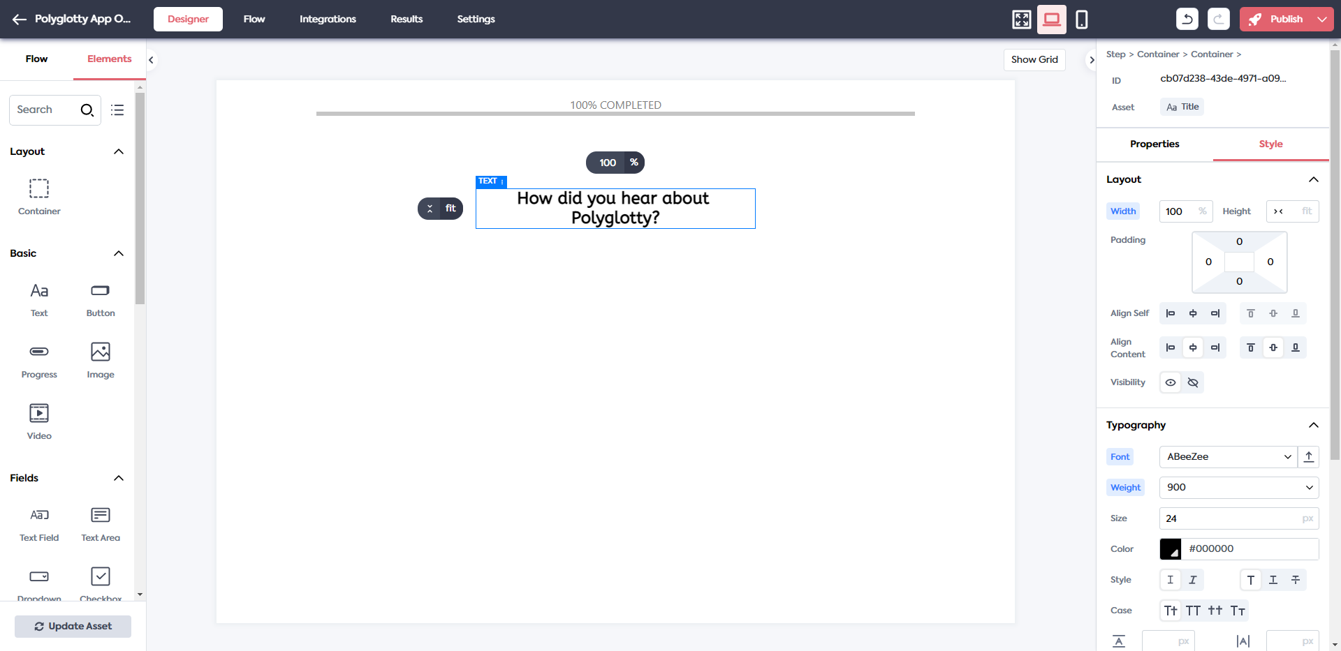
All typography is editable later from the “Style” panel.
Lay Down Imagery and Interactive Elements
Images must be uploaded from an external source; video requires a YouTube link. For more complex layouts, such as a set of text-and-image blocks, pick the element closest to your goal.
For a screen where users pick how they found the app, the “Button Group” element is suitable for nine clickable options:


The basic three-button structure becomes a colorful, custom-labeled grid. Because these are clickable choices, you can program hover effects so they respond to touch.
Other Elements to Consider
Feathery provides many additional building blocks that can be dropped into any step:
- Account setup or login forms
- File uploaders
- Slider selections
- Rating requests
- Payment forms
Choose whatever communicates or collects a piece of information in the simplest way.
Include Flexible Navigation
Letting users control their own journey is essential. A simple “Continue” button is common, but extra options can reduce drop-off.
For instance, if the current screen is not critical, offer both “Next” and “Skip.” The “Skip” link can be styled as plain text, while the primary “Next” action is more visually distinct.

Wire Up Interactivity and Validation
Every step will include at least a little interactivity. Configure these behaviors through the “Properties” toolbar on the right.
For “Button” elements, you have several options beyond simple step navigation: setting multiple actions, disabling a button until a form is submitted, creating custom validation rules, and using conditional logic to show or hide the button.

Other clickable elements share similar notions of validation and conditional appearance. A “Button Group,” for example, can allow multiple responses, or offer an optional answer so that you can let users skip it. Form fields might need limits on what is entered or uploaded.
Interactivity quality is critical, so spend time testing every button and condition. Any friction here is a leading indicator of trouble ahead.
Review the Flow Graph
Depending on how you created steps, the connections might be automated. Still, a visual check is wise.
Open the “Flow” tab, then click “Flow Editor.”

You’ll see the sequence and any pre-programmed button transitions. The editor also lets you create new steps, add or redefine connections between steps, set how each step connects to the next, and add conditional actions that route users differently. Return to the normal editor using the “Designer” button in the top-left.
Attach Any Needed Integrations
Integrations can improve the value of an onboarding flow without adding complexity to the user-facing screens. Tracking user behavior with Google Analytics, for example, reveals where users are dropping off. That kind of data shows your largest bottleneck.
The “Integrations” tab at the top lists what’s available.

- Firebase or Stytch for authenticated login
- Stripe for collecting one-off or recurring payments
- Plaid for pulling a new user’s financial information
- Slack to notify your team when onboarding completes
- HubSpot to add new users to your CRM and campaign automation
An onboarding form often replaces a follow-up from a representative; integrations extend that automation.
Publish and Embed the Code
When the flow looks right, press “Publish” in the top-right corner. The dropdown on the button opens a preview or the live form. Use the dropdown a second time to grab the JavaScript or React snippet.

The code is copied to your clipboard. Paste it into your CMS wherever you want the element to render, such as a startup pop-up.
Putting the Flow Into Practice
A user onboarding flow makes sense if your goal is conversion maximization or collecting essential user metadata. A usable flow is a matter of blending the right limitation on content, careful step design, streamlined navigation, and dependency-free integrations.
A well-built onboarding experience, whether started from a template or an empty layout, can take very little time to feel complete and polished. A few design decisions and Feathery’s configuration options are all it takes to build it out.


