Reactions to the liquid glass aesthetic Apple introduced at WWDC 2025 run the full spectrum: enthusiasm for how content reflects against backgrounds, frustration with weak foreground-background contrast, and a rush to rebuild the effect in CSS. Those positions can all hold at once. My own stance is neutral — intrigued by the material, wary about legibility, especially given how much trouble I already have with Apple's existing design system in places like Control Center — and genuinely interested in the experiments developers have produced.
What Apple Says It Is
Apple's own WWDC material is the place to start. Liquid glass is the first design system applied universally across all Apple platforms, unlike the previous major overhaul in iOS 7, which was confined to a single platform. It is built to refract light and react to interaction, with UI elements morphing into others as context changes — additional controls appearing, for instance — in a manner reminiscent of the Dynamic Island's shape-shifting animations. Removing hard rectangular edges frees up space, letting interface elements join the content and respond to their surroundings.
A longer Apple video aimed at designers and developers frames liquid glass as an evolution of several earlier ideas: the aqua interface from macOS 10, the real-time effects of iOS 7, the fluidity of iOS 10, the flexibility of the Dynamic Island, and the immersive interface of visionOS. Apple calls it a "digital meta-material" that bends and shapes light while moving like water, and at least partly a response to hardware with deeper rounded corners. Instead of scattering light as earlier designs did, it lenses the background, warping and bending it for a gel-like feel.
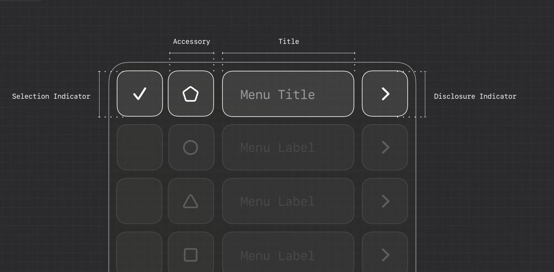
Translucence has a functional purpose: seeing what lies under a control, such as a progress indicator you can scrub more precisely, helps reveal it. Controls persist between views to establish a relationship between the control and its states — an idea that echoes the View Transition API. Elements adapt automatically to light and dark modes. The material is layered from highlight (light casting and movement), shadow (depth separating foreground from background), and illumination (the material's flexible properties). It is not meant to be used everywhere; it works best at the navigation layer, and glass on glass should be avoided. Two variants exist — regular, the more versatile, and clear, which lacks the adaptive behaviors that keep content visible below the surface — and glass can be tinted different colors.
Developer References
Apple has published implementation resources to accompany the announcement:
- Introduction to Liquid Glass
- Adopting Liquid Glass
- Landmarks: Building an app with Liquid Glass
- Applying Liquid Glass to custom views
The Legibility Dispute
The pushback centers on reading content against a glass surface, even though the aesthetic, purpose and principles are broadly applauded. Solid or opaque color has traditionally established foreground-background contrast; with refracted light, color matters less, and brightening or dimming a light source may not yield enough contrast, particularly for low-vision users. WCAG 2.2 addresses contrast through color and font size rather than something as amorphous as liquid glass, where the bending of content below the surface is what creates contrast in the first place.
In "Apple's 'Liquid Glass' and What It Means for Accessibility," the concern is variable contrast: translucent elements that let background colors bleed through create ratios that hold up over one background and fail over a bright photo of a sunset. The same piece notes Apple's influence — Android devices without notches copied the Dynamic Island look — and argues that a purely aesthetic decision here carries accessibility implications. Dyslexic users already struggle with busy backgrounds and low-contrast text; now visual noise is baked into the design language, and attention disorders may be aggravated by multiple translucent layers. The verdict: "It's like having a grand entrance and a side door marked 'accessible.' Technically compliant. But missing the point." The legal layer matters too, since thousands of ADA-related digital accessibility lawsuits are filed yearly in the U.S.; Apple can absorb the cost, but its influence sets precedents.
"Liquid Glass: Apple vs accessibility" points out that even Apple's press release screenshots show key interface components that are at best very difficult to read — and those images were chosen to show the design at its best. Apple, it argues, remains reactive rather than proactive on vision accessibility, with major problems still unfixed in earlier OS versions a year on (the vestibular trigger from tap-holding the Focus button in Control Centre, for example). The advice: acknowledge Apple's leadership in accessibility, but stop assuming that working for you, with Apple's controls to mitigate the worst effects, means everything is fine. Because it isn't.
Hardik Pandya's "Liquid Glass" raises a separate objection: the effect inserts a layer of visual processing between the user and their memories, making what was immediate feel mediated and filtered. UI controls, he argues, are not meant to be seen but operated — one manipulates a button, slider or switch rather than observing it, yet the design leaves buttons as amorphous shapes, sliders without mechanical clarity and toggles without physical affordances, floating abstractly behind glass. The most forward-thinking interface work today aims for invisibility, while liquid glass makes the interface more visible and demanding of attention.
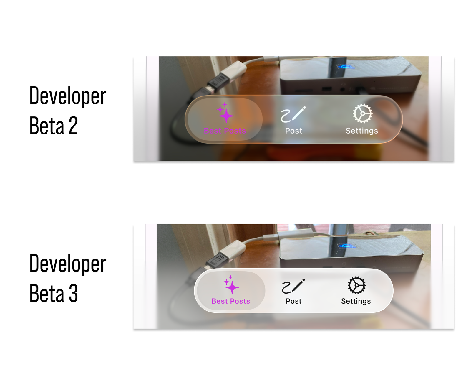
Not all responses are critical. "Liquid glass, now with frosted tips" cautions against judging the introductory beta too harshly, noting that Apple is actively developing it ahead of release and that opacity between glass and content increased in several key areas between Beta 2 and Beta 3.
Rebuilding It on the Web
Roughly a month after the WWDC introduction, tutorials, generators and even UI frameworks are already plentiful. A sampling: Kevin Powell's CSS blurry glass tutorial and Nordcraft's CSS liquid glass walkthrough on the video side; LogRocket's "Adopting Apple's Liquid Glass: Examples and best practices" in written form; a Liquid Glass Figma file, DesignFast's CSS effects, a Liquid Glass UI framework, and a CSS generator.
Glass-based interfaces are not new and CodePen is full of prior work, but the recent experiments cluster around SVG filters and background blurs, alongside many programmatic demos. A CSS-only example pairs an SVG filter with backdrop-filter and nested containers that roughly mimic Apple's three layers of highlight, shadow and illumination; a tintable theme toggle applies the same approach to show color tinting; another demo compares a plain CSS blur against an SVG backdrop, and others show the effect on a slider component and, in one case, WebGL.
iOS 27 Refines Rather Than Replaces the Aesthetic
Rather than abandoning Liquid Glass, Apple appears to be committing to it — refining the material in iOS 27 with a set of targeted adjustments. The anticipated changes:
- A new glass transparency slider, which adds or subtracts translucence — adjusting how clearly the glass reads against the background.
- Sidebars stop being floating objects, becoming more grounded and connected to a window's main content via an edge-to-edge design.
- Icons keep their "squircle" shape, but become sharper by letting developers add more layers of glass to the design. The mechanics of this are not obvious.
- Window corner radius becomes less dramatic and more consistent.
The refinements are expected alongside macOS Golden Gate.
Further Reading
A running set of coverage and reactions worth working through:
- "Apple's Liquid Glass is exactly as ambitious as Apple" (Fast Company)
- "Apple unveils iOS 26 with Liquid Glass" (9to5Mac)
- "Apple Announces All-New 'Liquid Glass' Software Redesign Across iOS 26 and More" (MacRumors)
- "Apple just added more frost to its Liquid Glass design" (The Verge)
- "Apple tones down Liquid Glass effect in iOS 26 beta 3" (The Apple Post)
- "More assorted notes on Liquid Glass" (Riccardo Mori)
- A range of CodePen Collections, useful for seeing the effect built directly in CSS