

Why “accessible components” don’t guarantee accessible designs
Organizations tend to sit at very different points on the accessibility spectrum. Some have invested heavily in making their design systems barrier-free; others are just starting. A common assumption — particularly among teams with mature systems — is that if the underlying components are accessible, the designs built from them will be too. That assumption breaks down in practice.
Accessibility annotations exist to close that gap. These are notes embedded in design files that surface intent not visible in the static mockup: how focus should move, what alt text an image needs, or which virtual keyboard should appear for a mobile input. Annotations answer questions like:
- How is assistive technology meant to navigate from one element to another?
- What’s the alternative text for informative images and unlabeled buttons?
- How does content shift with viewport size, orientation, or zoom?
- Which virtual keyboard should a mobile form input summon?
- Where should focus land in complex interactions?
Getting these answers wrong — or skipping them entirely — can undermine the experience for people with disabilities. Public annotation kits are a common starting point. They’re well suited for teams building new components, teams without a design system, or teams lacking deep accessibility expertise. They typically cover controls, structural landmarks, decorative images, form semantics, and keyboard focus order.
Start with a toolkit that doesn’t require a specialist
At GitHub, we wanted every designer to use annotations out of the box — not just accessibility specialists. That meant rebuilding an existing annotation library from the ground up to reduce overhead and add inline documentation. The result is the GitHub Annotation Toolkit, now open source. It builds on the work of the former Inclusive Design team at CVS Health, whose open source kits remain widely used in the Figma community.
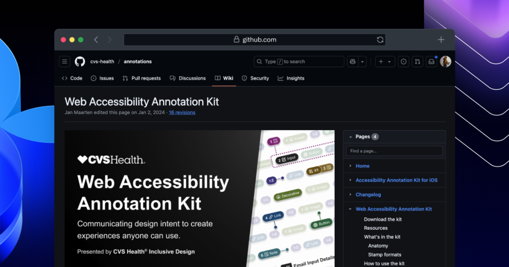
The toolkit removes a bottleneck: when only specialists can interpret designs for developers, hand-off slows down. By folding technical knowledge into every component, less specialist attention is needed per feature. But that raises a question: if components carry all the necessary annotations, and teams follow usage guidance consistently, shouldn’t accessibility be solved?
Where the system approach falls short
Not quite. Three issues get in the way.
Accessibility is not a binary state
Design systems evolve, and no component is either “fully accessible” or not. Some have severe issues — keyboard inoperability, missing alternative text. Others are merely generic — ambiguous control labels. Claiming a system is “fully accessible” is almost always inaccurate. WCAG Success Criteria are a necessary foundation, but they aren’t tailored to your specific product, audience, or context. Your users’ needs differ from every user’s needs. Real insight comes from testing with actual users — including people who rely on assistive technology daily. That direct feedback, not just conformance checking, is what kept Primer’s components genuinely accessible.
Components don’t enforce good composition
Stitching together accessible parts does not automatically produce a sensible heading hierarchy. As components land in layouts the guidance never anticipated, subtle failures appear: text overflows at certain zoom levels, context disappears on rotation, or an image that was decorative in one place is informative in another.
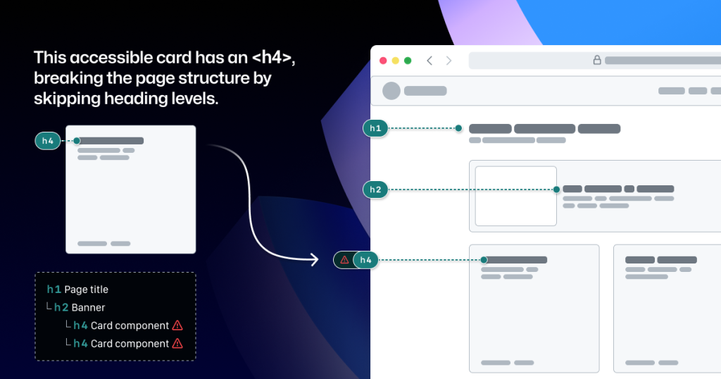
Forms built from the same inputs will still need different validation messaging. Even with a well-audited system, page-level design decisions — the ones that happen during composition — remain a source of accessibility regressions. Adopting a component library doesn’t eliminate audit findings.
Figment components hide implementation details
Annotation kits are usually design-system agnostic, because nearly every organization uses its own. When teams adopt a kit, they typically label their system’s components to tell developers “this already exists, don’t rebuild it.” That labeling also catches components that get accidentally “detached” in Figma. But there are details the component properties alone won’t reveal. Take a Primer Button from the Web Figma library:
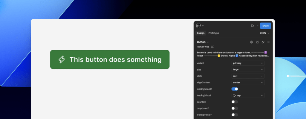
- Functional intent: Does the visual button actually act as a link? If so, a developer must use the
<LinkButton>React component instead of<Button>. - Accessible labeling: Does the icon need alternative text? In some cases, buttons need visually-hidden text to differentiate them from adjacent controls. The Figma component provides no slot for that information.
- Data submission behavior: When a design shows no visible form, how do we convey that the button must submit data with specific attributes?
Leaving those questions unanswered, hoping someone notices and guesses right, is a risk no design system should absorb.
A slot for annotations, not a replacement for them
The pragmatic fix is to embed annotation presets directly into design system components. When you create a new component, detailed annotations help define its accessibility contract. Once the component is built and instances become part of a design, those baked-in annotations cover the standard usage. Annotating them again is redundant.
But some properties vary by instance. Reusing the CVS Health kit alone would capture those variations — but it would still require annotation for the static, built-in semantics. So as we developed our own toolkit, we pre-set annotations for each Primer component to capture both the fixed and the variable details at once.
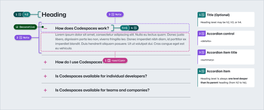
An accordion provides a good example. The annotation set built into the component spells out heading levels, the semantics for the <detail> and <summary> elements, landmark roles, and decorative icons. Engineers can build it correctly on the first pass without re-annotating anything standard. Two things, however, remain design-time decisions:
- Whether the optional title at the top is used.
- The actual heading level of each item inside the accordion.
Skip annotating those, and you risk a broken page structure or confusing navigation. The risk is small for a lone button but grows quickly with pattern complexity, nested components, interaction states, and repeated instances.
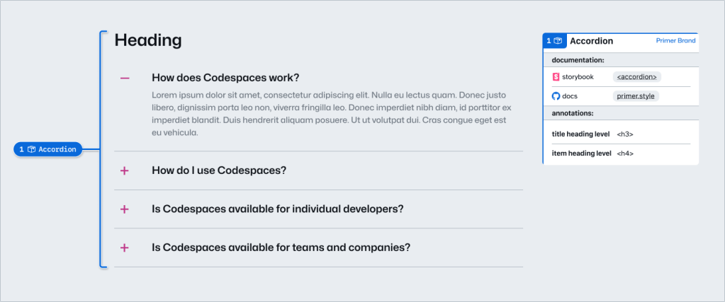
Rather than re-annotating the component’s fixed semantics — or leaving the variable pieces to chance — you add two quick notes. One annotation points to the component; the second fills in the heading levels.
Because these annotations carry pre-set prompts for specific component details, we call them Preset annotations. The prompts are tailored to each Primer component, so designers answer only what’s genuinely instance-dependent. Everything else ships already specified.
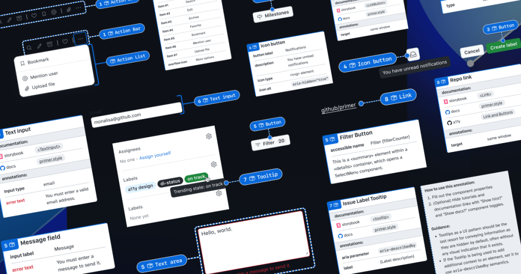
Preset annotations: accessibility details, documented at the source
To put this approach into practice, we took ten frequently used Primer components and built a new set of Preset annotations called Primer A11y Presets. These Presets capture the accessibility details that are most often missed when implementing components—leading to audit issues around missing labels, absent error validation messages, or overlooked HTML and ARIA attributes.
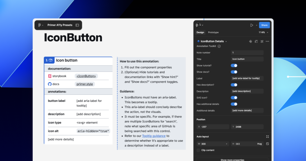
Each Preset annotation is linked to the relevant component documentation and Storybook demos. That way developers can jump straight to the technical reference they need, without designers having to source and attach links manually. The annotations also include guidance on how to fill out each Preset and how to use the component accessibly, so designers get inline support without leaving their Figma canvas.
Building your own Presets
Preset annotations are tied to specific components, so they only work if you’re using the design system they were created for. A Button in Google’s Material Design is not the same as a Button in Shopify’s Polaris, IBM’s Carbon, or Primer.
In part 2 of this series, we walk through how to create your own set of Preset annotations for your design system, along with different ways to document accessibility details before development begins.
For a visual walkthrough, Alexis Lucio explores Preset annotations during GitHub’s Dev Community Event at Figma’s Config 2024. You can also get the guide to GitHub’s Annotation Toolkit.


