

Why Emotion for a React Component Library
A component library is only useful if it can apply styles consistently no matter where its components end up. Emotion, a CSS-in-JavaScript library, helps with that by letting you collocate a component with its styles, keeping those styles scoped so they can’t leak into surrounding code.
Emotion offers two React APIs:
@emotion/core@emotion/styled
Both APIs accept styles written as template strings or as objects. They also both handle vendor prefixing, nested selectors, media queries, and other CSS features you’d otherwise manage by hand.
The Core API
The core API works like React’s style property, but with more power. With objects, styling a component looks like this:
import { jsx } from '@emotion/core'

let Box = props => {
  return (
    <div
      css={{
        backgroundColor: 'grey'
      }}
      {...props}
    />
  )
}
The same component can be styled with a template string using the css tag function:
import { jsx, css } from '@emotion/core'

let Box = props => {
  return (
    <div
      css={css`
        background-color: grey
      `}
      {...props}
    />
  )
}
The Styled API
The styled API builds on the core API but changes the calling convention. You invoke it with an HTML element or React component, then pass it styles as an object or template string. Here’s the object style:
import styled from '@emotion/styled'

const Box = styled.div({
        backgroundColor: 'grey'
});
Here’s the template string version of the same thing:
import styled from '@emotion/styled'

const Box = styled.div`
        background-color: grey
`
Both flavors render the same result. For a component library, the styled API has practical advantages:
- It takes fewer keystrokes to define a component.
- It accepts an
asprop, so callers can change the underlying HTML element for semantic reasons at the call site.
Project Setup and Design Tokens
The companion repository contains a starter layout with Rollup already configured for building the library. The structure places shared configuration in a utils folder:
helpers.js— small functions used across components.units.js— spacing and font-size values.theme.js— palette, shadows, typography, and shape definitions.
Each component lives in its own folder with three files: the component implementation, an index.js re-export, and a Storybook story file for previewing states.
The spacing scale in units.js uses multiples of four, while font sizes follow a major second (1.125) type scale:
export const spacing = {
  none: 0,
  xxsmall: '4px',
  xsmall: '8px',
  small: '12px',
  medium: '20px',
  gutter: '24px',
  large: '32px',
  xlarge: '48px',
  xxlarge: '96px',
};

export const fontSizes = {
  xsmall: '0.79rem',
  small: '0.889rem',
  medium: '1rem',
  large: '1.125rem',
  xlarge: '1.266rem',
  xxlarge: '1.424rem',
};
The theme file defines the design tokens. Its structure borrows ideas from Material-UI:
import { spacing } from './units';

const white = '#fff';
const black = '#111';

const palette = {
  common: {
    black,
    white,
  },
  primary: {
    main: '#0070F3',
    light: '#146DD6',
    contrastText: white,
  },
  error: {
    main: '#A51C30',
    light: '#A7333F',
    contrastText: white,
  },
  grey: {
    100: '#EAEAEA',
    200: '#C9C5C5',
    300: '#888',
    400: '#666',
  },
};

const shadows = {
  0: 'none',
  1: '0px 5px 10px rgba(0, 0, 0, 0.12)',
  2: '0px 8px 30px rgba(0, 0, 0, 0.24)',
};

const typography = {
  fontFamily:
    "Inter, -apple-system, BlinkMacSystemFont, 'Segoe UI', Roboto, Ubuntu, 'Helvetica Neue', sans-serif",
};

const shape = {
  borderRadius: spacing['xxsmall'],
};

export const theme = {
  palette,
  shadows,
  typography,
  shape,
};
Meanwhile, helpers.js exposes a utility for checking whether an object has no keys:
export const isObjectEmpty = (obj) => {
  return Object.keys(obj).length === 0;
};
Building the Button
Like most libraries, we’ll start with a button. Buttons appear everywhere in forms and interfaces, so the component needs to handle variations without sprawl.
The button component accepts a set of props: variant (solid or outline), size (small, medium, large), enableElevation, and color. A configuration object controls which props reach the DOM, since some props like color would otherwise appear on the rendered element:
import styled from '@emotion/styled';
import isPropValid from '@emotion/is-prop-valid';

const StyledButton = () => {};

const IGNORED_PROPS = ['color'];

const buttonConfig = {
  shouldForwardProp: (prop) =>
    isPropValid(prop) && !IGNORED_PROPS.includes(prop),
};

export const Button = styled('button', buttonConfig)(StyledButton);
Sizes are mapped to font-size and padding combinations:
const buttonSizeProps = {
  small: {
    fontSize: fontSizes['xsmall'],
    padding: `${spacing['xsmall']} ${spacing['small']}`,
  },
  medium: {
    fontSize: fontSizes['small'],
    padding: `${spacing['small']} ${spacing['medium']}`,
  },
  large: {
    fontSize: fontSizes['medium'],
    padding: `${spacing['medium']} ${spacing['large']}`,
  },
};
Variant handling starts with a function that maps the requested variant to the correct CSS properties, using palette colors when available and falling back to defaults from the theme’s common and grey objects:
const getPropsByVariant = ({ variant, color, theme }) => {

  const colorInPalette = theme.palette[color];

  const variants = {
    outline: colorInPalette
      ? outlineVariantPropsByPalette
      : defaultOutlineVariantProps,
    solid: colorInPalette
      ? solidVariantPropsByPalette
      : defaultSolidVariantProps,
  };

  return variants[variant] || variants.solid;
};
The actual style values for each variant come from a set of predefined property maps:
const defaultSolidVariantProps = {
  main: {
    border: `1px solid ${theme.palette.grey[100]}`,
    backgroundColor: theme.palette.grey[100],
    color: theme.palette.common.black,
  },
  hover: {
    border: `1px solid ${theme.palette.grey[200]}`,
    backgroundColor: theme.palette.grey[200],
  },
};

const defaultOutlineVariantProps = {
  main: {
    border: `1px solid ${theme.palette.common.black}`,
    backgroundColor: theme.palette.common.white,
    color: theme.palette.common.black,
  },
  hover: {
    border: `1px solid ${theme.palette.common.black}`,
    backgroundColor: theme.palette.common.white,
    color: theme.palette.common.black,
  },
};

const solidVariantPropsByPalette = colorInPalette && {
  main: {
    border: `1px solid ${colorInPalette.main}`,
    backgroundColor: colorInPalette.main,
    color: colorInPalette.contrastText,
  },
  hover: {
    border: `1px solid ${colorInPalette.light}`,
    backgroundColor: colorInPalette.light,
  },
};

const outlineVariantPropsByPalette = colorInPalette && {
  main: {
    border: `1px solid ${colorInPalette.main}`,
    backgroundColor: theme.palette.common.white,
    color: colorInPalette.main,
  },
  hover: {
    border: `1px solid ${colorInPalette.light}`,
    backgroundColor: theme.palette.common.white,
    color: colorInPalette.light,
  },
};
Finally, a styled component assembles all of these pieces. It also makes the theme optional: if none is provided, a default theme is used, so consumers don’t have to wrap the library in Emotion’s ThemeProvider:
const StyledButton = ({
  color,
  size,
  variant,
  enableElevation,
  disabled,
  theme,
}) => {
  if (isObjectEmpty(theme)) {
    theme = defaultTheme;
  }

  const fontSizeBySize = buttonSizeProps[size]?.fontSize;
  const paddingBySize = buttonSizeProps[size]?.padding;
  const propsByVariant = getPropsByVariant({ variant, theme, color });

  return {
    fontWeight: 500,
    cursor: 'pointer',
    opacity: disabled && 0.7,
    transition: 'all 0.3s linear',
    padding: buttonSizeProps.medium.padding,
    fontSize: buttonSizeProps.medium.fontSize,
    borderRadius: theme.shape.borderRadius,
    fontFamily: theme.typography.fontFamily,
    boxShadow: enableElevation && theme.shadows[1],
    ...(propsByVariant && propsByVariant.main),
    ...(paddingBySize && { padding: paddingBySize }),
    ...(fontSizeBySize && { fontSize: fontSizeBySize }),
    '&:hover': !disabled && {
      boxShadow: enableElevation && theme.shadows[2],
      ...(propsByVariant && propsByVariant.hover),
    },
  };
};
Using the Button
With the component complete, usage looks like this:
<Button
    variant="solid"
    color="primary"
    size="small"
    enableElevation
    disabled
>
    Small Outline Elevated Button
</Button>
Each prop is optional:
variantdefaults tosolidif omitted; passoutlineto change it.colorsupports named palette colors such asprimaryanderror. When no color is given, the button falls back to its default color state.sizeacceptssmall,medium(the default), orlarge.enableElevationapplies abox-shadowwhen set.disabledworks as usual, with an added opacity reduction on the disabled state.
Calling the button with no props at all results in a solid, medium-sized default—useful when you need a generic action button.
The Box Foundation
The Box component serves as a generic container that can wrap any component or HTML element. It accepts common layout properties such as padding, margin, display, and width, and it will act as the base for several other components discussed here.
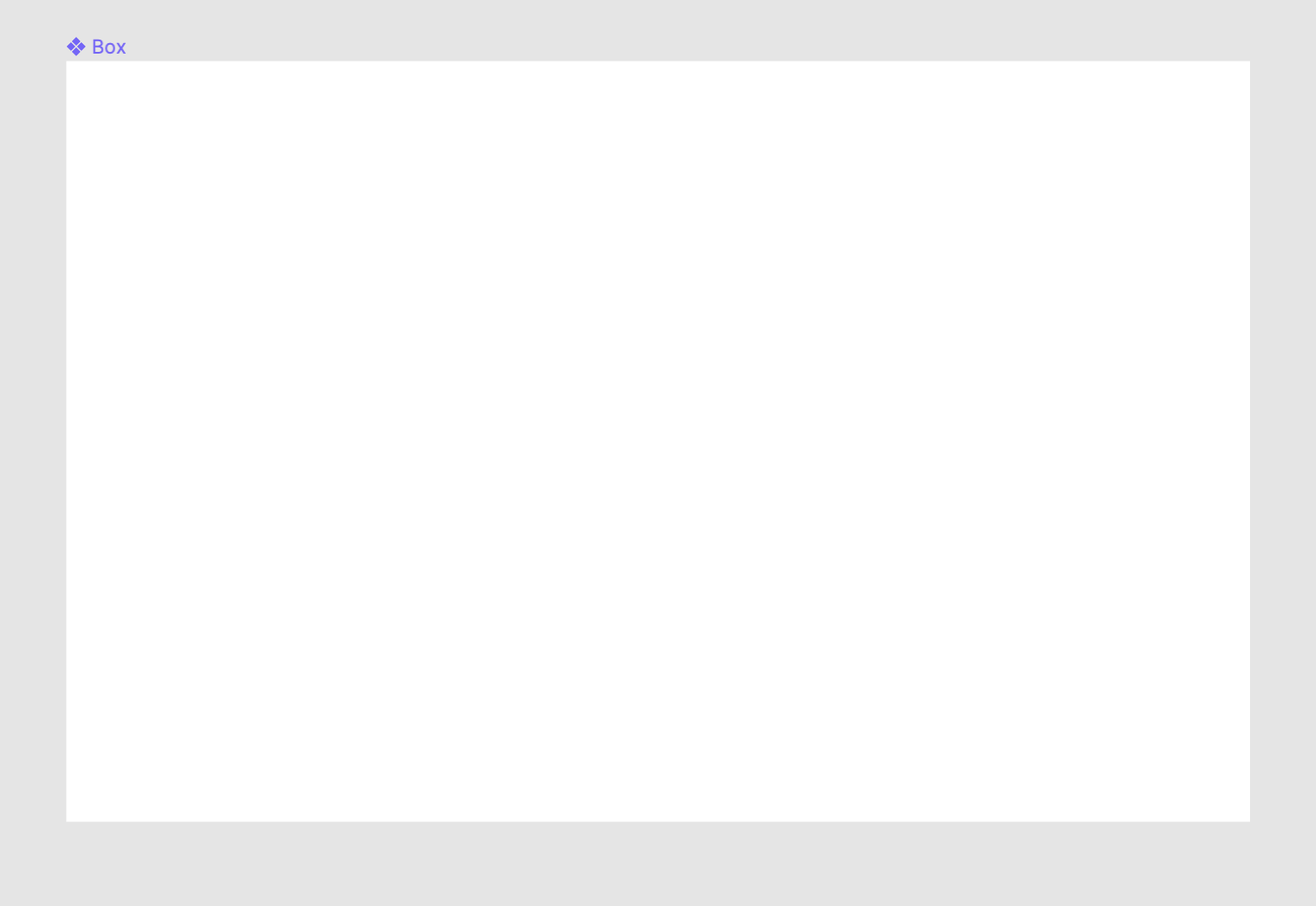
After creating a dedicated folder, we define the component:
import styled from '@emotion/styled';
import isPropValid from '@emotion/is-prop-valid';
import { spacing, theme as defaultTheme } from '../../utils';

const StyledBox = ({
  paddingX,
  paddingY,
  marginX,
  marginY,
  width,
  display,
  theme,
  ...props
}) => {

  if (isObjectEmpty(theme)) {
    theme = defaultTheme;
  }

  const padding = spacing[props.padding];
  let paddingTop = spacing[props.paddingTop];
  let paddingRight = spacing[props.paddingRight];
  let paddingBottom = spacing[props.paddingBottom];
  let paddingLeft = spacing[props.paddingLeft];
  if (paddingX) {
    paddingLeft = spacing[paddingX];
    paddingRight = spacing[paddingX];
  }
  if (paddingY) {
    paddingTop = spacing[paddingY];
    paddingBottom = spacing[paddingY];
  }
  let margin = spacing[props.margin];
  let marginTop = spacing[props.marginTop];
  let marginRight = spacing[props.marginRight];
  let marginBottom = spacing[props.marginBottom];
  let marginLeft = spacing[props.marginLeft];
  if (marginX) {
    marginLeft = spacing[marginX];
    marginRight = spacing[marginX];
  }
  if (marginY) {
    marginTop = spacing[marginY];
    marginBottom = spacing[marginY];
  }
  return {
    padding,
    paddingTop,
    paddingRight,
    paddingBottom,
    paddingLeft,
    margin,
    marginTop,
    marginRight,
    marginBottom,
    marginLeft,
    width,
    display,
    fontFamily: theme.typography.fontFamily,
  };
};

const IGNORED_PROPS = ['display', 'width'];

const boxConfig = {
  shouldForwardProp: (prop) =>
    isPropValid(prop) && !IGNORED_PROPS.includes(prop),
};

export const Box = styled('div', boxConfig)(StyledBox);
The spacing rule we defined earlier supplies the actual values for both padding and margin. The component receives contextual values like small or medium for these properties and resolves them against the spacing object.
The component also supports axis-specific props: paddingX and paddingY for horizontal and vertical padding, and marginX and marginY for their margin counterparts. To prevent display and width from being forwarded to the DOM, they are added to the list of ignored props in the config.
A typical usage looks like this:
<Box
  padding="small"
  paddingTop="medium"
  paddingBottom="medium"
>
  Simple Box Component
</Box>
A live example is available on CodeSandbox.
In the example, padding is set to small, and paddingTop and paddingBottom are set to medium. This results in padding-left and padding-right of 12px, with padding-top and padding-bottom of 20px. Using paddingY instead of the individual top and bottom props would produce the same layout.
The Columns Layout
The Columns component is a Box variant with a display of flex, distributing its children evenly along the x-axis.
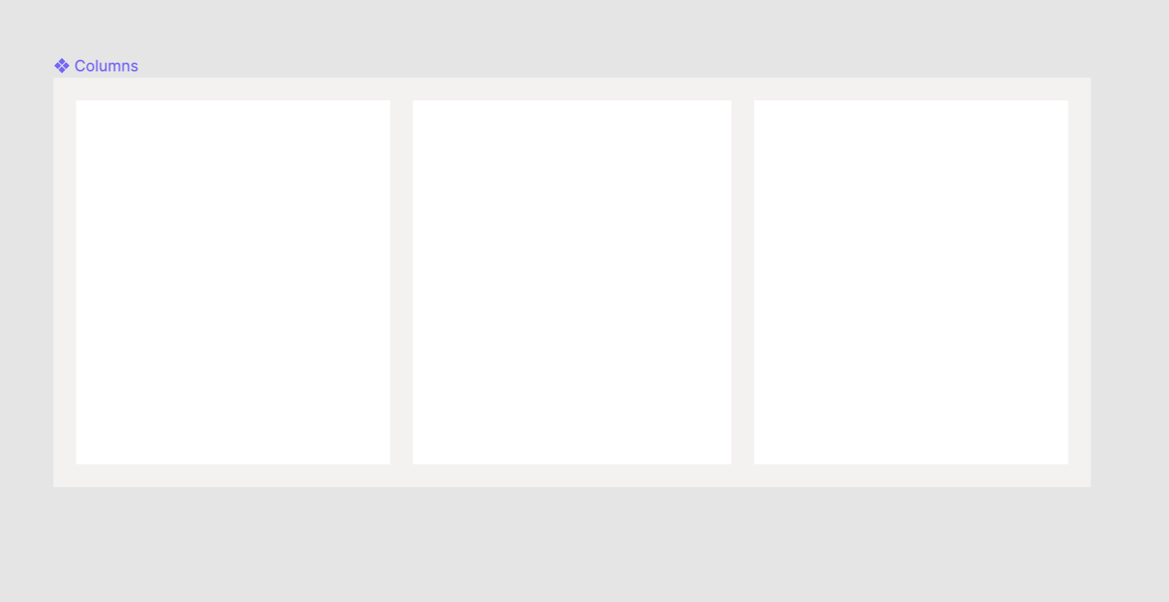
Here is the implementation:
import React from 'react';
import { Box } from '../Box';

export const Columns = ({ children, space, ...props }) => {
  return (
    <Box display="flex" {...props}>
      {React.Children.map(children, (child, index) => {
        if (child.type !== Box) {
          console.warn(
            'Each child in a Columns component should be a Box component'
          );
        }

        if (index > 0) {
          return React.cloneElement(child, {
            marginLeft: space,
            width: '100%',
          });
        }

        return React.cloneElement(child, { width: '100%' });
      })}
    </Box>
  );
};
The component uses React.Children to iterate over its children. Each child after the first receives a marginLeft and a width property; the first child is the leftmost element and therefore skips the margin. The children are expected to be Box elements so the relevant styles apply correctly.
Example usage:
<Columns space="small">
  <Box> Item 1</Box>
  <Box> Item 2</Box>
  <Box> Item 3</Box>
</Columns>
A live example is on CodeSandbox.
With the small spacing value, the children are separated by 12 pixels along the x-axis. Because Columns is effectively a Box, it inherits all Box properties and remains fully customizable.
The Stack Layout
The Stack component is also a Box variation. It spans the full width of its parent and spaces its children evenly along the y-axis.
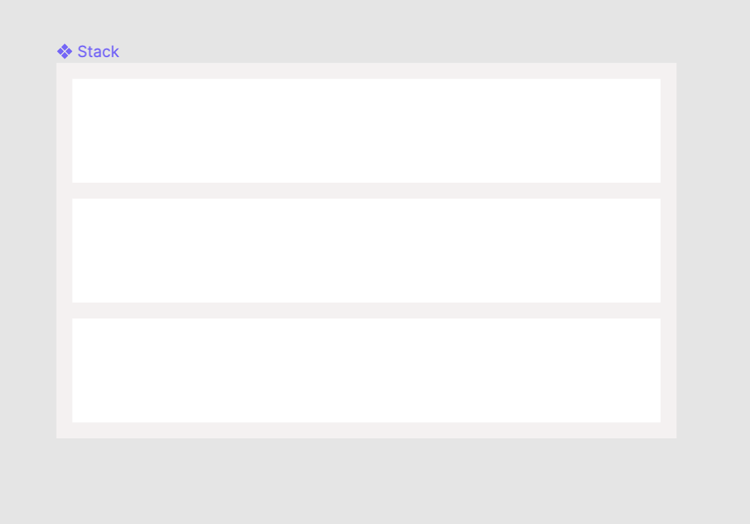
Here is the code:
import React from 'react';
import { Box } from '../Box';
import { Columns } from '../Columns';

const StackChildrenTypes = [Box, Columns];
const UnsupportedChildTypeWarning =
  'Each child in a Stack component should be one of the types: Box, Columns';

export const Stack = ({ children, space, ...props }) => {
  return (
    <Box {...props}>
      {React.Children.map(children, (child, index) => {
        if (!StackChildrenTypes.includes(child.type)) {
          console.warn(UnsupportedChildTypeWarning);
        }

        if (index > 0) {
          return React.cloneElement(child, { marginTop: space });
        }

        return child;
      })}
    </Box>
  );
};
It maps over its children with React.Children, adding a paddingTop equal to the provided space value to every child except the first, which keeps its original position. As with Columns, each child is expected to be a Box to receive the necessary props.
Example usage:
<Stack space="small">
  <Box marginTop="medium"> Item 1</Box>
  <Box> Item 2</Box>
  <Box> Item 3</Box>
</Stack>
A live example is on CodeSandbox.
In this case, the Box children are spaced by the small unit, while the first Box uses its own marginTop, demonstrating how individual components can be customized independently.
Wrapping Up
These examples show how Emotion's APIs can be used to build React components. This approach works well for an internal component library. If you plan to release your library publicly, anticipate requests for theming and additional flexibility, so design the library with some leeway from the start.
The repository for this article is on GitHub, and the button designs we have used are on Figma.
References
- “On Building Component Libraries”, Mark Perkins, Clearleft
- “Exploring Responsive Type Scales”, Joseph Mueller
- “Design Systems With React and Storybook”, Emma Bostian, Frontend Masters
- Emotion official documentation


