What a design system actually is
A design system is a set of building blocks and standards that keep the look and feel of products consistent. It acts as a blueprint, giving teams a unified language and structured framework for creating digital products. The goal is to cut down the time spent recreating elements and patterns when designing and building at scale.
Design systems often go unnoticed by end users, and that's a sign they're working. Colors and icons convey meaning, buttons keep a consistent size and shape, and language stays clear. They encode the principles and elements that define a user's experience across mobile apps, websites, television interfaces, and car dashboards.
How design systems are organized
The hierarchy within a design system can be understood in three levels:
1. Design system
This is the top-level container: an evolving collection of resources and processes for the entire product ecosystem. It holds technical specs, design tokens, documentation, best practices, and core principles that guide UX decisions and product development.
2. Component and pattern libraries
These are reusable visual elements and interaction patterns that define a product's common interface and behaviors. They include templates, layouts, interaction patterns, code snippets, and components, backed by detailed documentation. This is where design and development meet: technical specs and code transform design intent into implementation reality.
3. Foundational elements
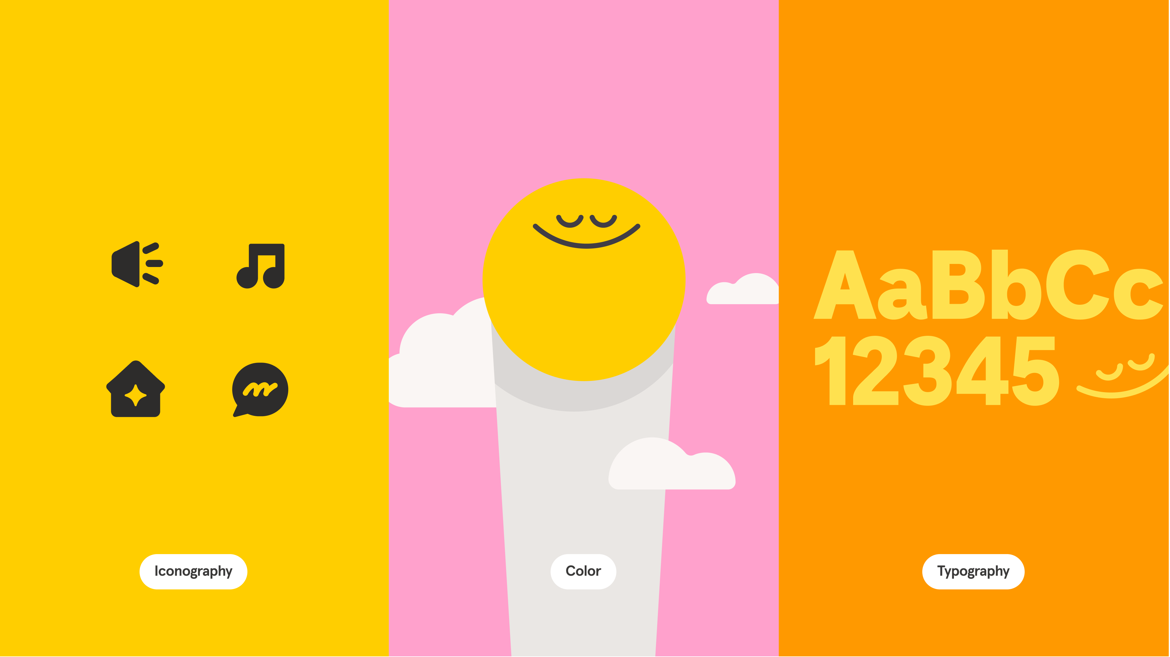
These set the visual language: color, typography, icons, logos, illustrations, and the product's voice and tone. Accessibility and brand guidelines usually live here too.
Two common distinctions matter. Component libraries focus on UI elements like buttons and input fields, while pattern libraries address broader solutions like navigation flows or data display. Likewise, a design system is more holistic than a style guide, which is a subset covering primarily visual elements like colors, typography, and imagery.
Design systems are not a creativity killer
A common misconception is that design systems stifle aesthetics and force blanket homogeneity. In practice, they free designers from repeatable patterns so they can tackle other challenges. Because components are shared and maintained centrally, designers can reuse consistent elements, set up variants for different modes and screen sizes, and propagate updates across the system from one place — no more copy-pasting the same designs. That leaves room to focus on the next problem and build more intuitive, accessible experiences.
Why teams adopt design systems
The real impact of a design system is its ability to streamline workflows, ensure consistency across a product, and support collaboration between cross-functional teams. A well-run system functions as a single source of truth: designers spend less time remaking components and instead pull from a library of brand-approved, development-friendly options. When components are built with code, tokens, and animation presets, developers can turn them into functional, accessible code much faster.
For new designers, the system doubles as an onboarding tool, teaching them about the product and its principles so they can contribute sooner. As the system matures, it gives teams a shared vision and language, leading to more consistent products and, over time, greater trust from users.
A brief history of design systems
The concept of systematic design predates digital products. Its roots reach back to the NATO Software Engineering Conference in the late 1960s, where Christopher Alexander discussed interconnected patterns in architecture — an approach later detailed in the book A Pattern Language. Earlier still, graphic design and print media relied on style guides and typographic standards that introduced the idea of systematic design.
As branding grew important to mid-20th-century businesses, comprehensive brand guidelines followed. The digital revolution translated those principles from paper to pixels, and as the web and app market expanded, systems grew in complexity. Apple in 1987, then Google, IBM, and Microsoft, established design languages that set the direction for countless interfaces, driven by practicality as much as aesthetics: clear documentation and reusable patterns accelerated development.
Broad interest in pattern languages surged in 2006 when Yahoo! released its Design Pattern Library and User Interface Library (YUI). Google's Material Design was the first to call itself a "design language" in 2014. Brad Frost's atomic design methodology in 2013 redefined system structure, organizing UI components into a clear hierarchy from atoms to molecules to organisms and providing shared vocabulary for design and development teams alike.
That same era saw frameworks like Twitter Bootstrap and Zurb Foundation influence how teams approached standardization. Inspired by graphic standards manuals and those frameworks, many practitioners began building their own sets of standards, reusable assets, and documentation — what would become their first design systems. Today these resources are comprehensive, guiding everything from visual coherence to usability across devices and platforms, marking the field's evolution from rudimentary guidelines to sophisticated frameworks.
Signs It’s Time for a Design System
There is no universal trigger point for adopting a design system. The decision is strategic, driven by the specific pain points and operational realities of your team. Several common indicators can help you determine if the investment is justified.
Inconsistent user interfaces. If your product’s look and feel varies noticeably across platforms or experiences, diluting brand identity, it’s a strong signal. Standardized patterns provide the predictability needed to maintain a coherent user experience.
Support for multiple themes and platforms. Managing seamless shifts between light and dark modes, varying brands, or a range of device types becomes significantly more complex without a central source of truth. A design system helps handle this complexity.
Repetitive design and development work. When teams spend time reimplementing similar components or debating UI details rather than solving novel technical problems, it’s inefficient. Standardized components give developers consistent patterns, reducing back-and-forth and accelerating development cycles.
Communication breakdowns. A shared design language with clear technical specifications creates a common vocabulary for both designers and developers, minimizing misunderstandings during collaboration.
Slow onboarding and lifecycle bottlenecks. New team members can contribute faster with a robust system in place. Similarly, when everyone works from one source of truth, design, prototyping, and updates become more predictable, reducing quality-assurance issues across the product’s lifecycle.
Preparing for Implementation Roadblocks
Adopting a design system is not a one-time project. Teams often underestimate the commitment involved, and several predictable challenges can stall progress if not addressed.
Ongoing maintenance. Like any successful product, a design system is never "done." It requires a dedicated stream of resources and continuous attention to remain relevant and useful, making it a long-term organizational commitment.
Deferred value. The benefits of a design system accrue over time, not overnight. This delayed impact can complicate buy-in from leadership, especially when resources are diverted from more immediate project goals. The initial time and potential team investment can be significant before tangible results appear.
Resource competition. Effective systems require ongoing input from designers, developers, and product managers. This may necessitate reprioritizing existing work or expanding headcount to prevent the system from stagnating.
Cultural change. The most subtle challenge is often the most difficult. A design system requires more than new tools; it demands a shift in how teams communicate, collaborate, and approach their work. The effort needs internal champions to advocate for its value and to foster a community that contributes to the system, allowing it to evolve as a living resource shaped by its users.
Broad adoption. Convincing stakeholders across different departments of the long-term value involves education, clear demonstrations of impact, and a coherent strategy. Nurturing a cross-functional community is often essential for broad acceptance.
Acknowledging these hurdles early allows you to strategize around them, setting the stage for a system that is not only effective but genuinely embraced by the organization.
Where to Start
Building a design system is as much about establishing a culture of consistency and collaboration as it is about creating standards. There is no single right way to proceed. Starting with smaller updates is a valid path if a full-scale rollout is not yet feasible.
For further guidance, consider resources like Figma’s Introduction to design systems course, its library of articles on the topic, and open design systems available in the Figma Community.