
A system rebuild driven by UI3
Preparing the UI3 overhaul for Config 2024 exposed an uncomfortable truth inside Figma: the company that builds the industry’s design-system tool was running its own product on a fragmented, aging system. Years of fast growth had left detached instances and subtly inconsistent components scattered across teams. Before Figma could ship a new interface, it needed a foundation that teams across the organization could actually build on.
The Product Foundations team, led by product designer Wayne Sun and Engineering Manager Tom Williams, assembled five designers and engineers to start over. From the start, the group borrowed a practice from software engineering. “It was like paired programming, except between engineering and design,” says engineer Josh Ferrell. The close collaboration was deliberate: a design system only works if design intent and technical implementation stay in lockstep. The result was a new internal system called Figma Pattern Library (FPL).

Retiring the spreadsheet
FPL’s first job was cleaning up years of accumulated technical debt. The original design system predated Figma’s variables feature, so designers relied on styles while engineers tracked color tokens in a separate Google Sheet. That spreadsheet routinely lagged behind product changes, and the design files and shipped code drifted apart.
Variables plus Figma’s REST API gave the team a way to keep the two sides aligned automatically. They built typography variables that alias through existing typography styles and migrated from color styles to color variables as the single source of truth. CSS definitions were added directly to those color variables, so developers inspecting in Dev Mode see the correct variable names without leaving the tool.
The team organized the color work into two collections:
- Primitive variables built on color ramps, grouped by hue from 100 to 1000.
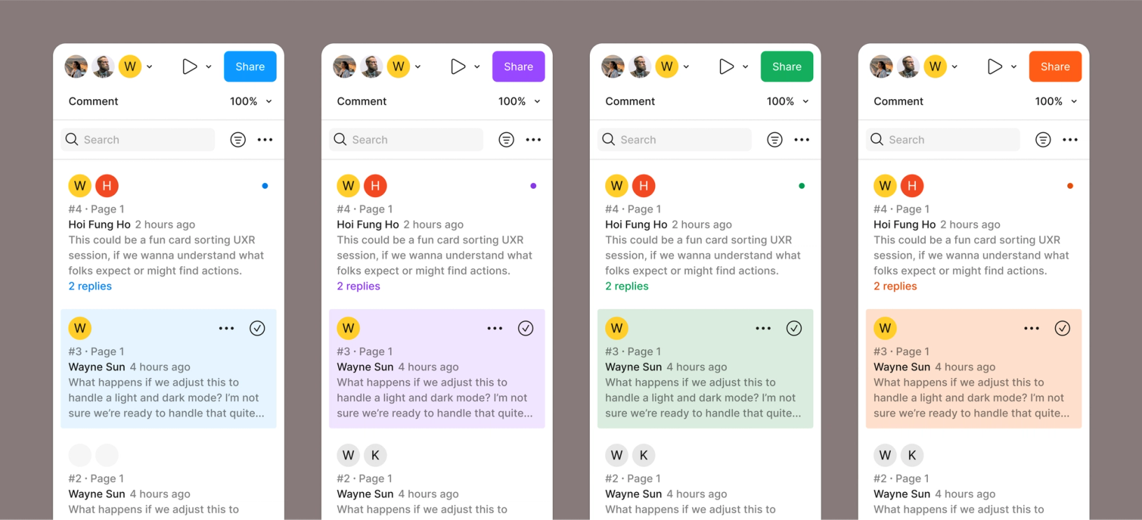
- Semantic variables following the schema already established for dark mode, with separate modes for themes (light/dark) and products (Figma Design, FigJam, Slides, Dev Mode).
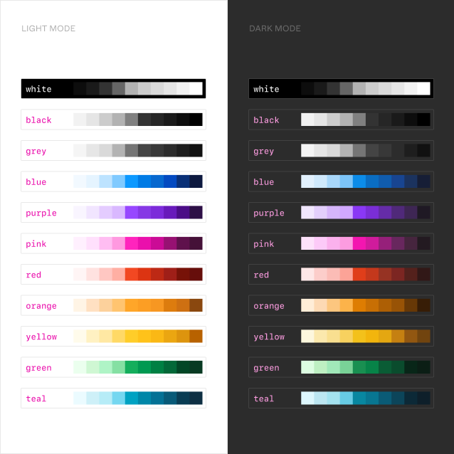
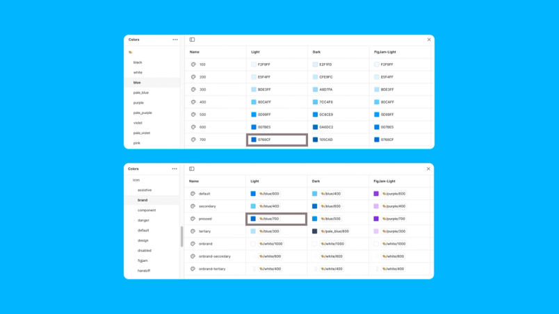
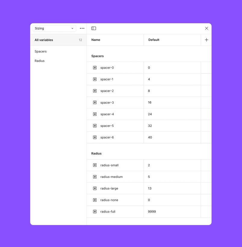
The structure lets shared components adapt across themes and products without splitting into one-off variants. Radius and spacing variables were set up the same way to keep the look and feel consistent.
Synchronization through automation
Rather than rely on anyone remembering to update tokens by hand, the team wired design variables to code through Figma’s REST API. A GitHub Action triggers whenever variable changes are published, opening a pull request for review and merge. The payoff came quickly: “We were able to add all of the new brand colors for slides with almost no engineer time,” says Josh. Designers define the colors, developers use the correct tokens—easy to verify in Dev Mode—and the rest follows.
Prioritizing the component rebuild
With the token foundation in place, the team ran a five-month sprint to rebuild components on the new variable system. They ranked work by impact: components that appeared frequently in the app and carried accessibility considerations got the most attention. Checkboxes went first as a straightforward starting point that built momentum, followed by harder elements like buttons and tabs with their multiple states and interaction patterns.
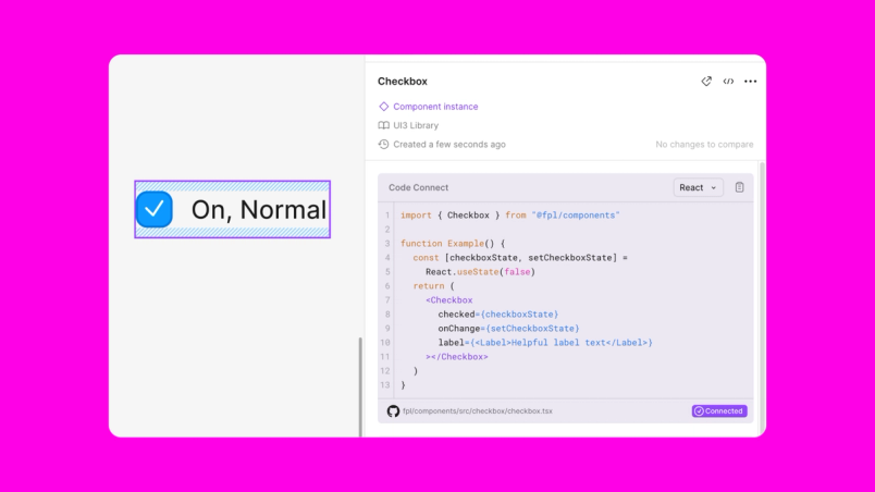
The team learned early that a perfect one-to-one match between Figma components and coded components was neither realistic nor necessary. They worked closely with the team building Code Connect, Figma’s tool for boosting design-system adoption by surfacing code in Dev Mode. The FPL team were the first beta testers, meeting weekly with Code Connect’s developers to shape features and validate the product as they used it.
That collaboration produced a hard rule: no FPL component is considered complete without Code Connect support. The requirement improves adoption in both directions. Engineers see in Dev Mode whether an FPL component exists for the design they are inspecting. And because Code Connect translates between design and code, the design components can stay intuitive even when they don’t mirror engineering structures exactly. As Tom Lowry puts it, “The translation between design and code components lives in Code Connect.”
What five months produced
The rebuild yielded concrete deliverables:
- 680+ tokens for color, typography, sizing, spacing, and radius
- 22 component sets with more than 670 variants
- Full design documentation in the main Figma library
- A new documentation site for engineers with use cases, APIs, and UI2-to-UI3 migration guides
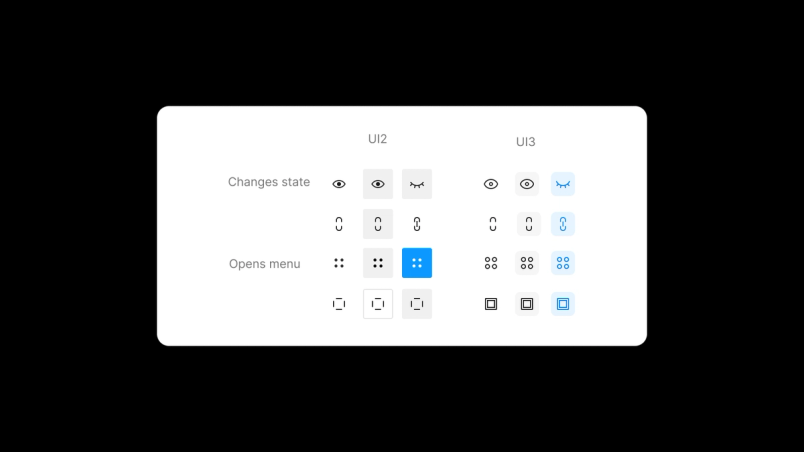
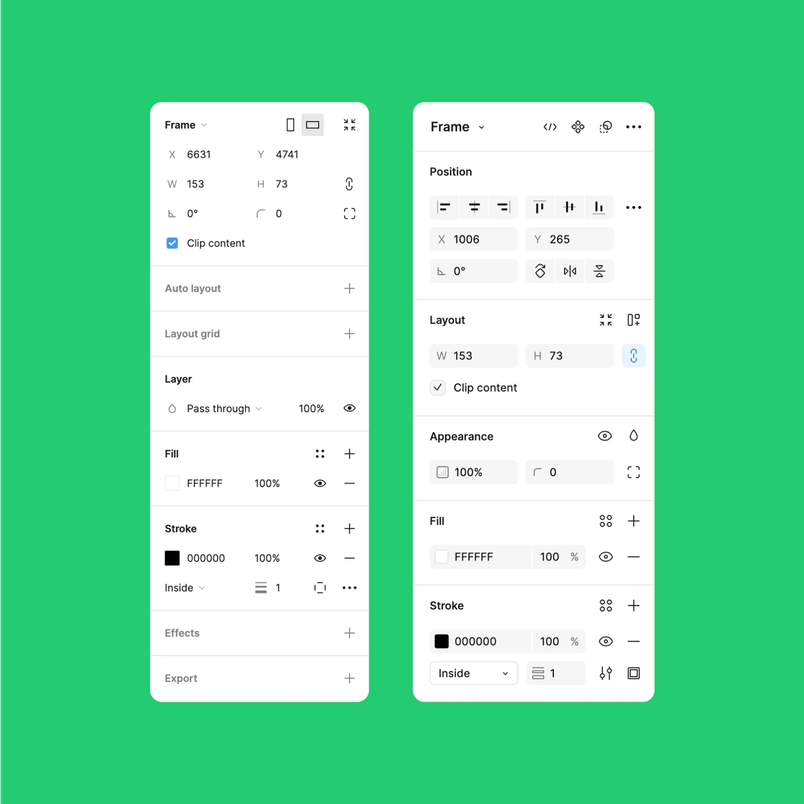
Teams report better component discoverability and a more direct path to accessible features, according to Tom. The icon button is a visible example: four different buttons with inconsistent visual treatments and behaviors were consolidated into one cohesive component set. In the design panel, input fields were reworked and a new combo input component added for more consistent layout and extra interactions.
A foundation that keeps moving
FPL is not frozen. Designers can propose changes through branches in the library file, and an internal advocacy program is in the works to tighten collaboration between the FPL team and the wider design organization. Engineers get unstyled primitives that allow experimentation without breaking consistency.
“It’s about finding the right balance between consistency and flexibility,” says Josh, “allowing teams to experiment and push boundaries while still maintaining a coherent user experience.”
Wayne’s advice for other teams taking on the same kind of project: “Have an abundance mentality. Give your time. Give your attention. Give your ability.” For Figma, the real payoff of FPL is less about the component count and more about how the system brought designers and engineers together to build on shared ground. The foundation is already changing how Figma teams work—and proving that a strong system is one that keeps evolving.


