
One file, one conference: inside Config 2024’s brand system
Figma’s annual user conference, Config, is held at San Francisco’s Moscone Center—a venue large enough that the Brand Studio’s visual language had to work across building wraps, hallways, screens, and swag bags, all while serving more than ten thousand in-person attendees plus a virtual audience. For Config 2024, the team anchored that identity in the most basic elements of the product itself.


This year’s inspiration came directly from the redesigned Figma interface and the introduction of Figma Slides. The team focused on the idea of moving fluidly between modes of creation—designing, presenting, collaborating—and translated that into a shape-based language built from primitives plucked from the Figma toolbar: rectangle, circle, and polygon.
These modest forms became the foundation of a modular system of “supergraphics.” Each primitive could expand, rotate, and combine into larger configurations, all managed through a component library in Figma. With three variants per supergraphic, every shape could be shown from a different angle, letting the team vary compositions without starting from scratch.
That library was designed to solve a practical UX problem, not just an aesthetic one. Attendees needed to navigate registration, find sessions, and orient themselves in a sprawling venue. The visual system doubled as a wayfinding tool, using bold, distinguishable graphics to guide people through both physical and digital spaces.

Bringing flat graphics into physical space
The team took cues from artists like Sol LeWitt and Barbara Stauffacher Solomon, whose large-scale environmental works informed the move from screen to venue. At Moscone, the primitives appeared as vinyl wraps on the building exterior and covered entire hallways. To add dimension, material, and contrast, the graphics were translated into physical structures in the central Makers’ Space, where attendees used them as seating, photo backdrops, and meeting points.
Above the event floor, a hanging installation of 14 multi-color box kites—some as large as 17 feet—greeted attendees as they entered. Built in partnership with One Hat One Hand, the kites took the flat supergraphics into three dimensions. Each level of the venue offered a different vantage point, and the rotation of the kites echoed the animation moves where shapes twist into unexpected profiles.
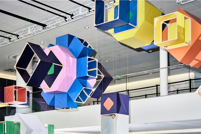
The same library made its way onto the big screen, serving as backdrops for conversations and intermissions, and even as a protective pattern for podcast and virtual recording booths.
Motion with interchangeable parts
Alongside the graphic language, the team developed motion principles mapped to four core ideas:
- Shift: Rotating positions and perspective shifts, representing diverse points of view converging.
- Transform: Morphing shapes that convey ongoing change and reinvention.
- Amplify: Cascading patterns that show how tools scale a vision.
- Activate: Neighboring shapes sparking and transforming each other, symbolizing collaboration.
A fully custom animation for every surface would have been impractical, so the team built a motion library of interchangeable parts. This allowed them to create varied compositions across different color palettes quickly, and to share the toolkit with external partners. Relay, which produced the keynote opening film, received the library as a starting point, then expanded on it with new motifs. Every video also received custom sound from Sounds Like These, adding another layer of cohesion.
Even the Config website received the motion treatment. Hovering over the Config logo makes each letterform morph into a primitive shape—a small detail that reinforces the theme of transformation.
Palette management through variables
The color system was built for maximum flexibility. Six distinct palettes, each with a different background color, allowed for varied combinations across assets. Keeping that complexity manageable required Figma’s variables feature. By defining palettes as variables, the team could store reusable color values, alternate between palettes quickly, and ensure consistency across every team and vendor working on the event.
From expressive to functional on the web
The Config website was the first surface to combine all these elements in one place. The design balanced large-scale, color-blocked visuals against functional information architecture. Aperçu Mono, a small monospace font, was used to contrast against the animating supergraphics and calls-to-action. Color-coded theming helped users distinguish talk tracks and find their way through the virtual experience.
The site launched in three phases—an announcement microsite, the agenda launch, and the day-of broadcast—each revealing more of the brand system. Throughout the process, the team sketched everything in Figma, from physical supergraphics to 3D kites and wayfinding, to keep work fast and visibility high across all collaborators.
Scaling the system beyond the pixel
Like any product feature, the success of Config's visual identity came down to how well it served real needs. The Brand Studio had to understand who the audience was and what the event needed from its materials before any system could take shape. The result was a design language with enough discipline to stay consistent and enough room to flex at every scale: from website headers to keynote stages, from functional wayfinding to purely expressive moments.
The team anchored this flexible system to its four core pieces — graphic primitives, oversized supergraphics, color, and motion. Once those first principles were locked in, the foundation could more easily adapt to what different contexts demanded of it. Instead of stretching a one-size-fits-art template too thin, the team adapted this core kit toward each artifact's strengths, producing everything from lean UI components to physical stage details — all without breaking the overall identity guardrails.
Collaboration in a single workspace
Just as with the company's products, the cross-functional work between web, event, and brand teams stayed in sync by keeping all the design work in a single Figma file throughout the project. That way, clear visibility and alignment worked on the conference the way Config itself was meant to operate — a collaborative exercise from first concept to final shipped reality.
Editor's note: We’ve updated the post to note that there were 10 thousand in-person attendees.


