
Why the Spinner Fails Agentic AI
For three decades, interface designers have had one default answer for latency: the spinner. The spinning wheel, the throbber, the progress bar — these all communicate a specific technical reality. The system is retrieving data, and the delay comes from bandwidth or file size.
Agentic AI introduces a fundamentally different kind of wait. When an agent pauses for twenty seconds, it is not downloading; it is thinking. It is evaluating options, sequencing steps, and generating output. A generic looping animation cannot convey that distinction. Users watching a spinner cannot tell whether the system is handling a complex task or has silently failed. That ambiguity breeds anxiety.
To earn trust, the wait itself must become a reassurance moment. Instead of a passive "something is happening," the interface should communicate an active "here is exactly how I am working on your problem."
Microcopy as the Transparency Layer
Transparency is often treated as a visual design problem, but the words carry most of the load. Generic placeholders like Loading or Working are relics of static software. What users need are status updates that state what the system is actually doing.
Consider a scheduling agent that arranges recurring meetings on a user's behalf. A message like "Checking availability" leaves too much unspecified. Users cannot tell whose calendar is being checked, what other steps remain, or whether the AI retained the participants and purpose of the request. That uncertainty makes the wait feel tense.
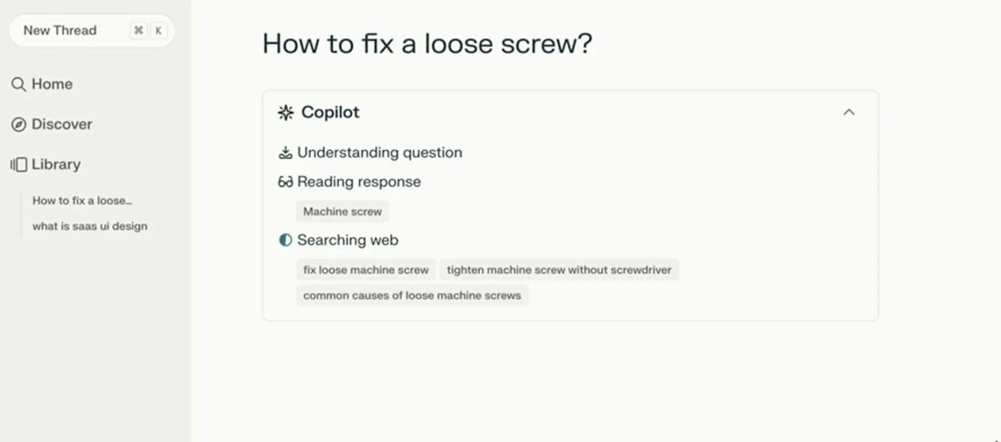
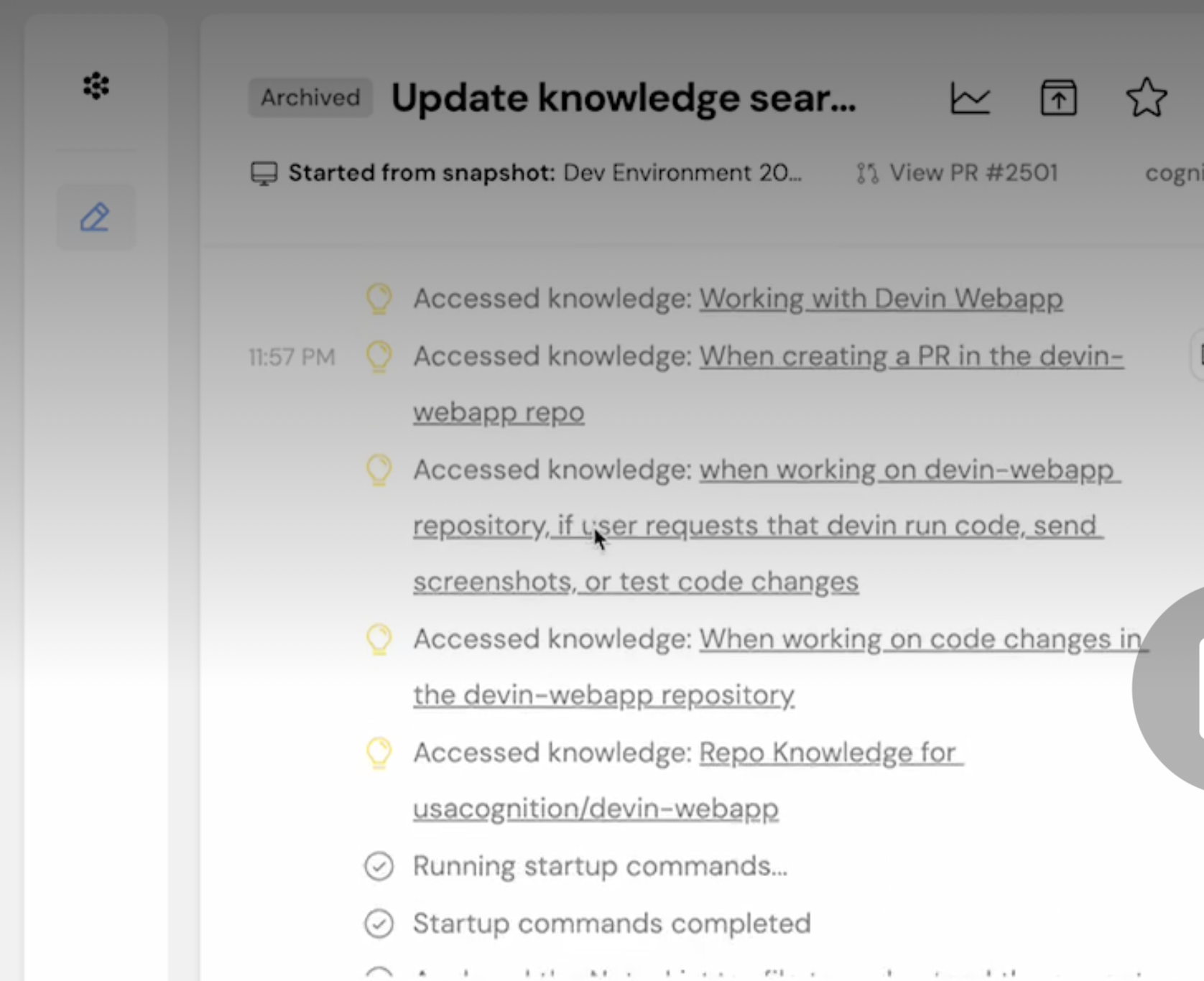
Perplexity AI demonstrates the alternative. When a query is submitted, the interface lists the concrete actions being taken in real time, updating as each completes. The user never has to guess what the system is doing.
The Agentic Update Formula
Useful status text connects what the system is doing with why it is doing it. For the scheduling agent, the waiting period breaks down into distinct, visible stages:
- Checking your calendar to find open times for a recurring Thursday call with [Name(s)]
- Cross-checking availability with [Name(s)] calendars
- Syncing [Name(s)] schedules to secure your meeting time on [Date and Time]
- Finally, a completion message prompting the user to confirm the invite in their email.
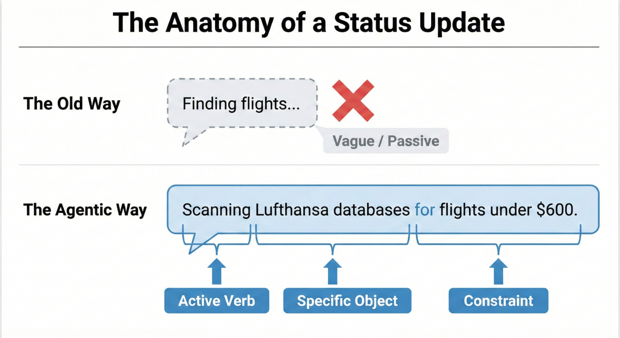
Each update grounds the technical process in the user's actual context. This structure reduces to three components: a strong Action Word, the Specific Item being worked on, and any Limits or constraints the agent must respect.
A weak update for a flight-booking agent would simply say Searching for flights… A stronger version applies the formula explicitly:
- Action Word: Scanning
- Specific Item: the prices on Lufthansa and United
- Limits/Rules: to find anything under $600
This phrasing proves the AI understood the request and is operating within its boundaries.
Voice and Tone Follow the Risk Level
Whether an AI should sound human or mechanical depends on the stakes of the task, as mapped in the Impact/Risk Matrix from the Decision Node Audit. Low-risk operations, like a calendar check, suit a friendly, conversational tone. High-stakes operations — a large financial transfer or a database migration — demand mechanical precision. A screen reading "I am thinking hard about your money" would alarm users; "Verifying account routing numbers" reassures them.
Still, the risk matrix is only a starting point. No rule set can predict the exact phrasing and register that builds trust across every audience and scenario. Rigorous user research is the final authority. That means:
- Running A/B tests on alternative phrasings and tone.
- Conducting usability studies to observe emotional responses to system messages.
- Performing interviews to learn what users expect from the AI in terms of candor.
This research keeps the AI's personality comfortable and appropriate for the people actually using it in context.
The microcopy formula — action words, specific items, and limits — supplies the content of an honest status update. But words alone do not make an interface transparent. A well-written sentence buried in a poor layout is still a failure.
The remaining challenge is designing the delivery system for those messages. The update formula is the engine; the interface pattern is the chassis. A capable engine still needs a frame that can carry it.
A Pattern Library for Agent Transparency
Choosing the right words is only half the battle. The container matters just as much. A trivial background task, like an agent tidying up files, calls for a quiet status signal. A high-stakes operation, such as transferring money, demands a UI that cannot be ignored. The goal is to build a library of patterns where the weight of the message matches the prominence of the interface, replacing the anxiety of waiting with informed confidence.
Low-Key Progress: The Living Breadcrumb
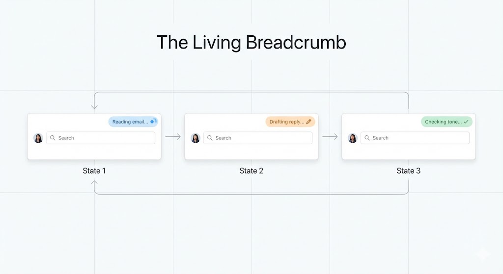
For low-importance work happening behind the scenes, constant pop-ups are a nuisance. A more elegant solution is what we call the living breadcrumb: a subtle status indicator that lives in the application’s chrome, such as a menu bar or border.
Consider an email client where the AI is composing a reply. Instead of a modal dialog, a small indicator pulses softly, cycling through text updates like Reading email, then Drafting reply, and finally Checking tone. It gives the user the option to check progress without demanding immediate attention, offering quiet assurance without disrupting flow.
High-Stakes Clarity: Dynamic Checklists
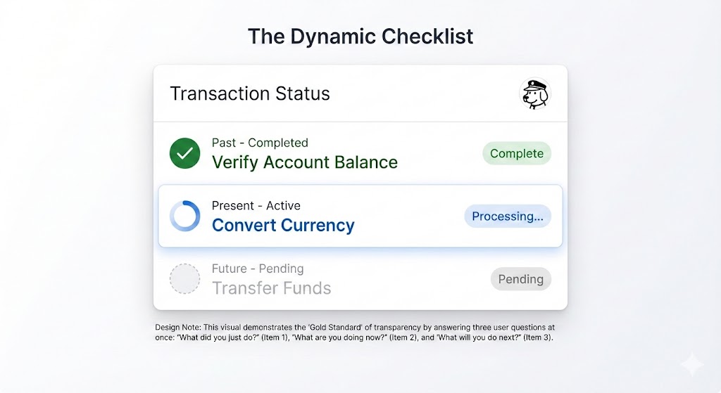
For critical, multi-step processes like processing a complex financial transaction, a simple progress bar is insufficient. The Dynamic Checklist offers a stronger anchor of context. It enumerates every planned step for the user, highlighting the stage currently in progress while marking completed ones and listing what comes next.
- Step 1: Verify Account Balance [Complete].
- Step 2: Convert Currency [Processing].
- Step 3: Transfer Funds [Pending].
This pattern gracefully absorbs unpredictable timing. If currency conversion takes ten seconds longer than expected, the user can see that the delay is part of the Converting Currency step. Because they know the action is complex, their patience and trust hold up better than they would with an indeterminate spinner.
However, building a checklist is not just a UI task. It requires deep integration across the stack. The front end needs a robust state management system that listens for completion events, which usually arrive via back-end webhooks, so the interface stays in sync with the agent’s workflow.
Deep Transparency: The Thinking Toggle
Some users want more than a friendly summary — they want to see the machinery at work. The Thinking Toggle is a progressive disclosure control, like a “View Logs” chevron, that expands a status update into a terminal-style view of sanitized logic logs.
- Querying API endpoint /v2/search;
- Response received: 200 OK;
- Filtering results by relevance score > 0.8.
Most users will never open it. Yet its mere presence can signal that the system has nothing to hide, which builds trust with users who need deep assurance.
This openness is not without risk. Those logs must be meticulously sanitized and abstracted before they ever reach the screen. Exposing internal data structure names, proprietary logic, or security tokens would be a critical vulnerability. Honesty should never come at the cost of security.
Handling Partial Success
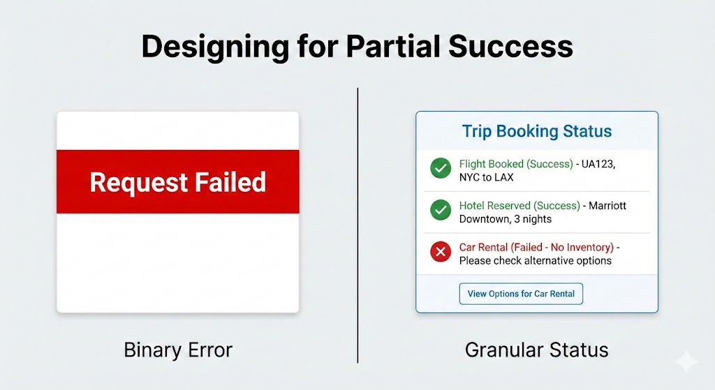
AI agents rarely deliver perfect, all-or-nothing results. In a world of greys, binary error messaging is a trust-killer. When an agent books a flight and a hotel but fails to secure a car rental, showing a large red “Request Failed” banner is not just misleading — it is harmful.
Instead, present a clear summary of the outcome:
- Flight booked: UA 492 [Success].
- Hotel reserved: Marriott Downtown [Success].
- Car rental: Hertz [Failed — No inventory].
This lets the user intervene only where needed, keeping the successful work and allowing them to fix the single failed component themselves.
When the Tool Fails, Not the Agent
It is important to distinguish between the AI’s abilities and the reliability of external services it depends on. When a virtual assistant cannot check your calendar because the Google Calendar API is down, that is not the assistant’s fault.
- Less helpful: “I could not check your calendar.” (Suggests the assistant is incompetent.)
- More helpful and honest: “The Google Calendar connection is not responding. I will automatically try again in 30 seconds.”
The message should not frame the AI as the failure point. Blaming the AI for an outage it cannot control makes users lose faith in it. Blaming the tool, accurately, preserves the user’s trust in the agent and sets a reasonable expectation for recovery.
The Audit Trail: Persisting Trust
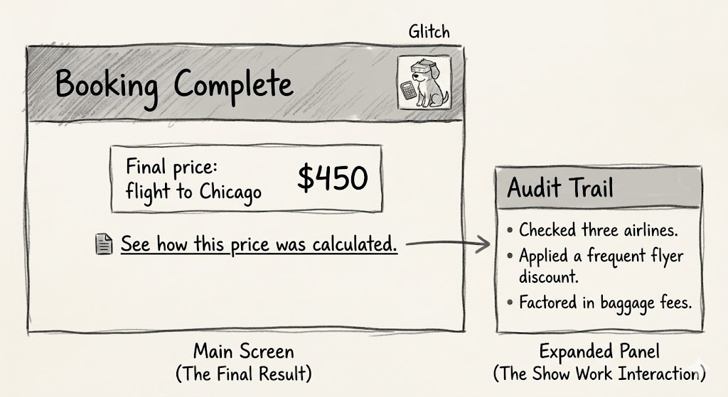
Real-time indicators only help if the user is looking at them. For a professional who walks away after initiating a task, the checklist disappears with the progress screen. If the result is unexpected, their only option is to start from scratch. This is why every agentic interface needs an audit trail. Design a Show Work interaction — a link or history log on the final results page that lets the user replay the decision process.
- See how this price was calculated;
- View search sources.
This receipt is the ultimate safety net for spot-checking the output. Even when unopened, its presence communicates that the system is willing to stand behind its work.
The cost of missing this trait is visible in ChatGPT’s memory feature. In April 2025, as developer Simon Willison notes, the system’s memory was automatically used as context in every new conversation. But it offered no way to review what it had stored or when it was applied — there was no log, no timeline, and no plain-language list of “here’s what the AI has decided about you.” The only way to see it was to know a prompt trick asking the model to quote its hidden instructions.
Most users never discovered this. They just noticed, as Willison did, that ChatGPT had placed a “Half Moon Bay” sign in the background of a generated image (Figure 8) because it cross-referenced their location from old sessions without announcing it. That is not personalization; that is a transparency failure. The audit trail is the necessary remedy.

Together, the patterns create a library of options for AI transparency:
| Pattern | Best Use Case | The User’s Anxiety | The Trust Signal |
|---|---|---|---|
| The Living Breadcrumb | Low-stakes, background tasks (e.g., drafting emails, sorting files). | Did the system stall or freeze? | I am active, but I won't disturb you. |
| The Dynamic Checklist | High-stakes workflows with variable time (e.g., financial transfers, booking travel). | Is it stuck? What step is taking so long? | I have a plan, and I am currently executing Step 2. |
| The Thinking Toggle | Expert tools or complex data analysis (e.g., code generation, market research). | Is this hallucinating or using real data? | I have nothing to hide; here are my raw logs. |
| The Audit Trail | Post-task review for any outcome (e.g., final reports, completed bookings). | How do I know this result is accurate? | Here is the receipt of my work for you to verify. |
Table 1: Four design patterns enhancing transparency.
Ignored Interfaces: The Expert Workflow
No matter how good the design, many experts will still ignore the interface. An insurance underwriter creating fifty quotes a day will not watch a progress bar. They click “Generate,” switch to another tab to answer emails, and return only when they expect the work to be done.
Such professionals judge the system purely on the result. If the tool quotes $550 for a premium they expected to fall between $500 and $600, they accept it without question. Trust is established quickly. Over time, as accurate outputs continue, the tool becomes an accelerator for a mundane but necessary task.
But if the system returns $900 — far outside the expected range — the user stops and switches back immediately. In that interruption, they missed the transient explanation about the high-risk surcharge. And because the explanation vanished with the progress bar, the user cannot piece together why the price deviated without re-running the task.
Instead, they will revert to manual quoting. In their eyes, a $900 result against a $500-$600 expectation is garbage, regardless of the logic. They will not watch an animation to understand it; they will simply validate the output against their own trusted process. This false start erodes trust and renders the AI useless to that user. Hitting a rejection of this kind in a business tool wastes ten minutes of user time and takes away any chance you had to earn their continued use.
Transparency as the Product
An AI interface should not be treated as a magic trick, which relies on hidden mechanics. It should be treated as a colleague — someone who keeps you informed of status, snags, and progress. That honesty is what lets you rely on them.
Applying specific updates, dynamic checklists, partial-success states, and audit trails changes the dynamic. It stops treating AI as a black box with a nice coat of paint and starts treating it as a dependable team member whose work can be reviewed and managed.
Real transparency here does not mean exposing neural networks. It means giving the user access to three things: the AI’s current status, its known limits, and an easy-to-follow history of its decisions. When people can see why they got a result, how to guide the system, and when to step in, the product starts building trust instead of inciting anxiety.
References
- “The Essential Guide to A/B Testing”, Ali E. Noghli
- “Usability testing: the complete guide”, Andrew Tipp
- “How to Conduct User Interviews”, IxDF