
The terminal’s accessibility gap
Terminal applications sit in an awkward spot when it comes to accessibility. Unlike a web page, where the DOM gives screen readers structured content to work with, a CLI’s output is mostly raw text. The terminal emulator renders characters as directed, and assistive technology has to infer meaning from that layout. Standards such as WCAG provide little concrete guidance for this space—the W3C’s WCAG2ICT document offers high-level advice but stops short of prescribing specific techniques for text-based software.
GitHub’s recent work on the GitHub CLI targets three groups: screen reader users, those who need high contrast between text and background, and users who need customizable color options. The features are available now in v2.72.0 under the gh a11y command.
Rethinking interactive prompts
The GitHub CLI’s interactive prompt screens, which redraw the display to show selection states and progress, pose problems for speech-synthesis screen readers. Visual cues and constant redraws do not translate well to spoken output. To address this, GitHub is introducing a new prompter built with Charm’s charmbracelet/huh library:
A similar issue appears in progress indicators. The previous “spinner” implementation redrew the screen with different braille characters to show that a command was running. That animation is unintelligible to screen readers. It has been replaced with a static text progress indicator that shows a contextual message where possible, falling back to a generic “Working…” message.
Color and contrast
A terminal’s background color is set by the user’s terminal emulator, not by the application running inside it. That makes it tricky for a CLI to guarantee sufficient contrast—the application has no fixed background to design against. GitHub’s legacy color palette for Markdown rendering failed to account for this, producing low-contrast output in some environments.
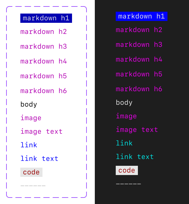
What the CLI can do is align its color choices to the ANSI 4-bit color set, which is the palette most terminals allow users to customize, and it has done so based on Primer’s accessibility foundations.
Beyond the public preview
The preview includes work on screen reader-friendly prompts, static progress reporting, and color alignment. Looking forward, GitHub plans to make the accessibility improvements available to extension authors so third-party commands can match the core CLI’s behavior, and to explore ways to make table output easier for screen readers to parse. The design work was done in collaboration with Charm and the GitHub Accessibility team.
How to get involved
GitHub is inviting users to test the new features and share feedback:
- Update to GitHub CLI v2.72.0 and run
gh a11yto see how to enable the accessible features. - Join the GitHub CLI accessibility discussion to offer comments or suggestions.
- Reach out to the accessibility team through the discussion panel if you have lived experience relevant to these personas.