

The uneven playing field of mobile
Mobile now accounts for more than half of all web traffic, which means the first impression many customers get of a brand happens on a phone. The exact share varies by product, but every site has some mobile audience — and that audience expects an experience that is responsive, accessible and fast. This goes well beyond basic optimisations such as contrast ratios and Time to First Byte. In the fragmented mobile landscape, experiences must adapt to low data mode, limited memory and CPU, reduced motion, dark and light mode, and a host of other conditions.
Ignore those conditions and you risk losing prospective customers entirely. The pressure to ship quickly makes thorough testing across devices and scenarios feel like a luxury, yet it remains the only reliable way to confirm quality.
Who your mobile customers actually are
Most designers and developers carry a relatively recent phone. Their customers do not. Analytics rarely show visitors on mid-range handsets with flaky 3G connections — but that is precisely because those visitors never make it into the logs. A site that struggles on their hardware will not get a second visit, so the data set quietly filters out the people who need the most consideration.
The scale of mobile usage is hard to overstate. Comscore’s Global State of Mobile 2020 report found mobile accounted for 79% of digital minutes in the US and 81% in the UK, with a 65% jump in video consumption on mobile during 2020. Much of that time is spent inside a handful of apps, but social platforms increasingly serve as a gateway to the web — particularly for education.
Older devices do not vanish when new ones ship. They get handed down and remain “good enough” for everyday tasks for years. The average phone replacement cycle in the US now stretches to 33 months, and globally the typical bestselling handset costs just under $200. Android accounted for 84.8% of all phones shipped in 2020, according to IDC. A representative target device, then, is an Android phone at least 24 months old, costing $200 or less, on a slow connection with roughly 400ms RTT and 400kbps transfer — if anything, a pessimistic estimate.
Mobile is a spectrum, and a widening one. Ericsson’s Mobility Visualizer projects a 15× increase in 5G subscribers between 2020 and 2026, from 212 million to 3.3 billion, which will only stretch the gap between high-end and low-end experiences further. Testing on a flagship device tells you little about how the majority will fare.
Why business buy-in should follow
Mobile testing is easy to justify on engineering grounds but harder to sell to leadership. The available case studies help close that gap. WPO Stats collects hundreds of documented examples of performance work moving business metrics.
Flipkart, India’s largest e-commerce site, is a well-known case. After struggling to keep its mobile website as engaging as its native app, the company briefly went app-only before unifying web and app into a mobile-optimised progressive web app. The result was a 70% increase in conversion, three times more time spent on the mobile site, and a 40% lift in re-engagement.
Search visibility is another lever. Search engines have factored mobile-friendliness into rankings for years, and Google’s page experience update, effective from 31 May 2021, applies a positive ranking signal for Core Web Vitals in mobile search only. The signal applies to groups of similar URLs that meet all three thresholds, and its impact is expected to be modest — comparable to the earlier HTTPS boost. The direction is clear regardless: better mobile optimisation, including accessibility, correlates with better rankings.
Accessibility is part of the mobile test
Accessible design starts with obvious items like touch targets, contrast and legible type, but quickly leads into more difficult territory: keyboard navigation, correct landmark assignment, screen reader announcements, focus traps and avoiding inaccessible third-party scripts. Each component needs to stay accessible as it evolves. Failing that, customers with permanent, temporary or situational disabilities simply cannot use the product. The earlier accessibility testing begins, the less it costs in consultancy, third-party services or legal exposure later.
What a thorough mobile test covers
Testing tools are plentiful, but most testing focuses on consistency and functionality. A complete mobile test goes a layer deeper into the specifics of the platform.
Screen size and density churn
New devices bring new screen dimensions and pixel densities every year. That constant churn makes debugging layout issues more difficult and more time-consuming, so tests need to cover a representative spread rather than a single popular size.
OS version spread
iOS adoption of the latest release tends to be high — around 57% for iOS 14 — but Android versions in active use stretch back to Ice Cream Sandwich. Both platforms and the long tail between them need to be part of test planning.
Browser diversity
Chrome holds roughly 62.63% of global mobile browser usage and Safari 24.55%, which makes it tempting to test only those two. Regional markets often rely on lesser-known browsers or proxy browsers such as Opera Mini. Their individual percentages look small but can still represent hundreds of thousands of users globally, and they behave very differently from the mainstream engines.
Options For Practical Mobile Web Testing
A local device lab is one route for mobile web testing, and it is especially valuable for remote teams. Building one does not require a large budget, and personally experiencing load performance on real hardware is informative. Yet a device lab alone rarely covers the full picture: for consistent cross-device checks or automated test runs, you need more.
A solid free starting point is Responsively. This open-source tool offers mirrored interactions, customizable layouts, more than 30 built-in device profiles, hot reloading, and screenshot utilities.
Several other tools extend this idea with different feature sets:
- LT Browser — a free desktop app for building responsive sites, with 50+ preset resolutions for mobile, tablet, and desktop. It shows a mobile view of your site side by side, and interactions and touch are mirrored across panels.
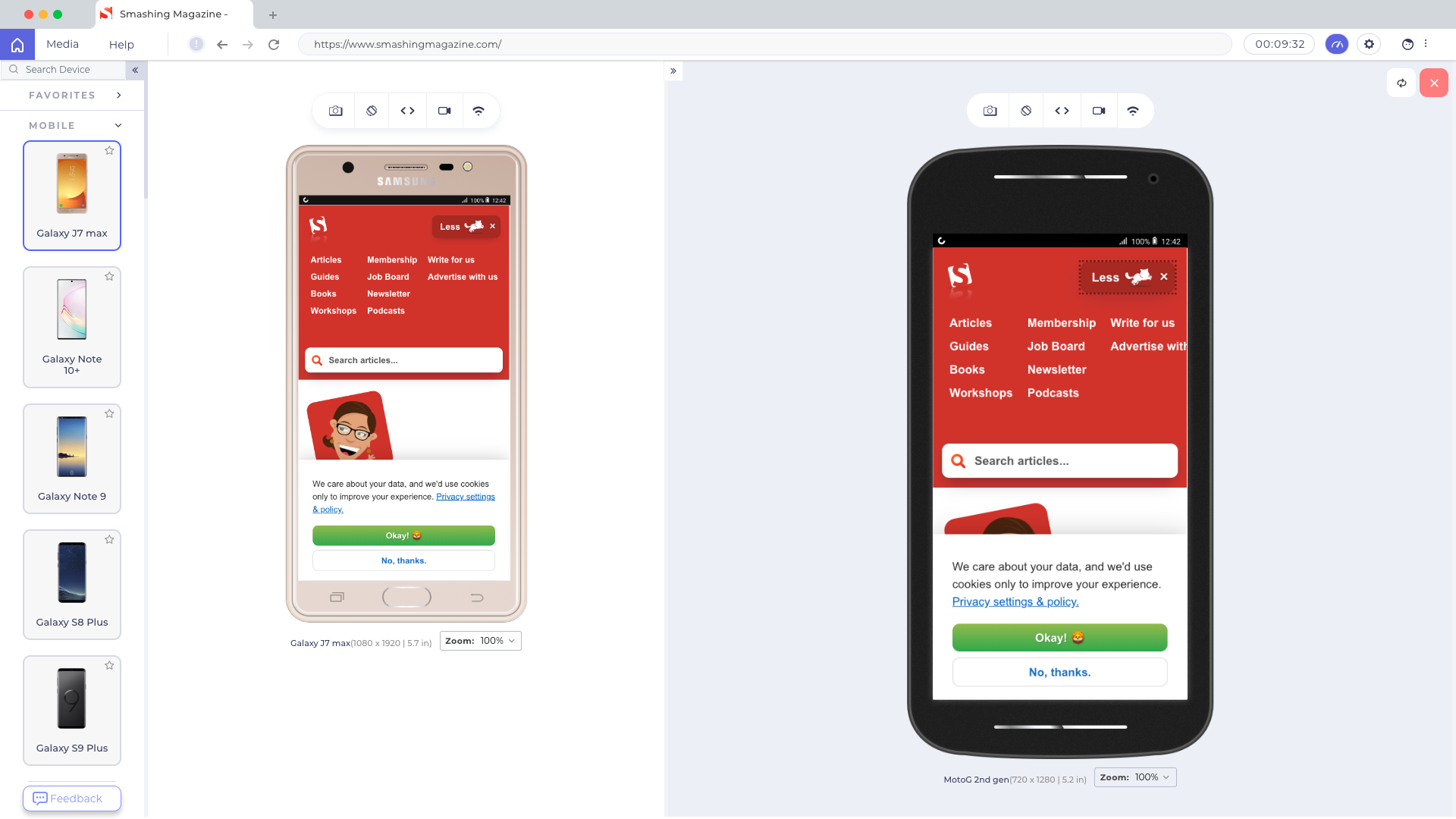
After download and registration, LT Browser supports building, testing, and debugging, plus capturing screenshots and videos of bugs, assigning issues to specific devices, performance profiling, and side-by-side viewing of multiple devices. The free tier allots 30 minutes per day.
For more advanced needs, LambdaTest runs cross-browser tests on 2000+ devices across operating systems, supporting both automated browser testing and manual checks. LambdaTest is a sponsor of the original report.
- Sizzy — syncs scrolling, clicks, and navigation across devices, captures screenshots of all devices at once with or without device frames, and has a Universal Inspect Element for simultaneous inspection.
- Blisk — ships with over 50 device profiles and synchronized scrolling, supports testing touch and previewing devices side by side, edits code across all open devices, and offers hot-reloading, video recording, and screenshots.
- Polypane — previews a site across 27 devices with synced scrolling, clicks, touch, keyboard input, and hovers. It has broad media-query support, including
prefers-reduced-data, and debugging tools for accessibility, CSS layouts, and links. - BrowserStack — automates testing and additionally simulates low battery, abrupt power-off, and interruptions such as calls or SMS.
- In-house Selenium Grid — for those who want to keep testing on their own device lab, open-source platforms like Zalenium and Aerokube support automated Selenium runs.
Why The Mobile Testing Picture Matters
Mobile devices are the primary way most people reach the web, but that usage brings distinct challenges for performance measurement and bug reproduction. The testing landscape has matured to address this, with tools that range from free device-preview apps to full service-based testing platforms. The right choice depends on scope: quickly inspecting a layout, running scripted cross-browser suites, or replicating real-world device conditions locally.
Because your site represents your business, and mobile access will only grow, these checks are not optional. Users expect the same accessible and responsive experience on their phones as they get on the desktop, and that experience drives how your brand is received. Making mobile performance a first-class testing concern is what keeps those expectations satisfied. For deeper reading on adjacent topics, see the articles below.



