
What Can We Actually Measure In A Typeface?
For anyone evaluating typefaces for extended reading, pinning down measurable aspects beyond personal preference is a challenge. The categories below break down which typographic features can be assessed objectively through quantitative measures, and which remain firmly in the territory of expert, subjective judgment.
X-Height Relative To Ascenders And Descenders
- Validation: A larger x-height paired with medium-length ascenders and descenders appears to be the most effective combination, though this carries some assumptions.
- Description: Typefaces with the most efficient ratio of x-height to cap height include Wayfinding Sans Pro and Johnston Underground, sitting between 67% and 69%. This is detailed in Ralf Hermann's paper “Does A Large X-Height Make Fonts More Legible?.”
- Measurement: Millimeters.
- Quality type: Strong (objective).
Comparing Aesthetic Quality Against Peers
- Validation: A typeface will usually have related designs, so how does it hold up against those closest to it?
- Description: Expert review or opinion.
- Measurement: Rated as not good, okay, or very good.
- Quality type: Weak (subjective).
Quality As A Historical Revival
- Validation: When a typeface is a revival, how well does it perform against other established or well-executed historical revivals?
- Description: Expert review or opinion.
- Measurement: Rated as not good, okay, or very good.
- Quality type: Weak (subjective).
Character, Symbol, And Language Coverage
- Validation: Determines the typeface's range for varied text needs.
- Description: Support for mathematical symbols, extended languages, and other special information types is essential.
- Measurement: A numerical score or tick list against required languages and features.
- Quality type: Strong (objective).
Kerning Quality
- Validation: Good kerning improves typographic quality and legibility.
- Description: A kerning test based on the example from Veronika Burian and José Scaglione’s article “Quality type: How to spot fonts worth your money.”
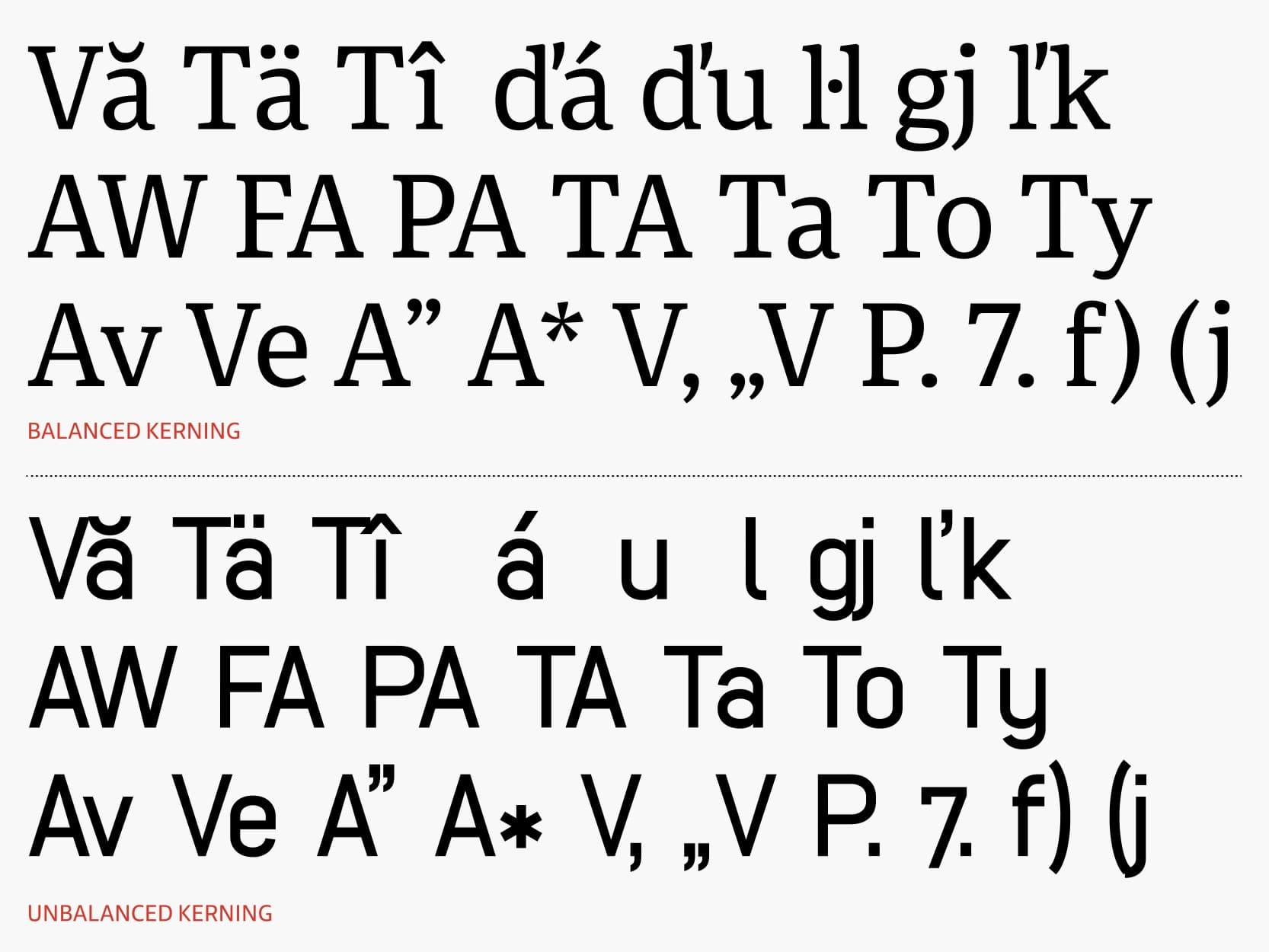
- Measurement: Rated as not good, okay, or very good. Potentially a percentage or a precise numerical score based on a standard test.
- Quality type: Strong (objective).
Accessibility For Children’s Reading
- Validation: Specialized characters and symbols enable clearer, more legible text for younger readers.
- Description: Use of infant characters, as noted in the paper “Letter and symbol misrecognition in highly legible typefaces for general, children, dyslexic, visually impaired and aging readers — 2019 fourth edition.”

- Measurement: A numerical score for characters and symbols, alongside a research and design effort rating of not good, okay, or very good.
- Quality type: Strong (objective).
Accessibility For Dyslexic Readers
- Validation: Dyslexic characters, as covered in the paper “Letter and symbol misrecognition in highly legible typefaces for general, children, dyslexic, visually impaired and aging readers — 2019 fourth edition” and Robert Hillier’s PhD “A typeface for the adult dyslexic reader.”
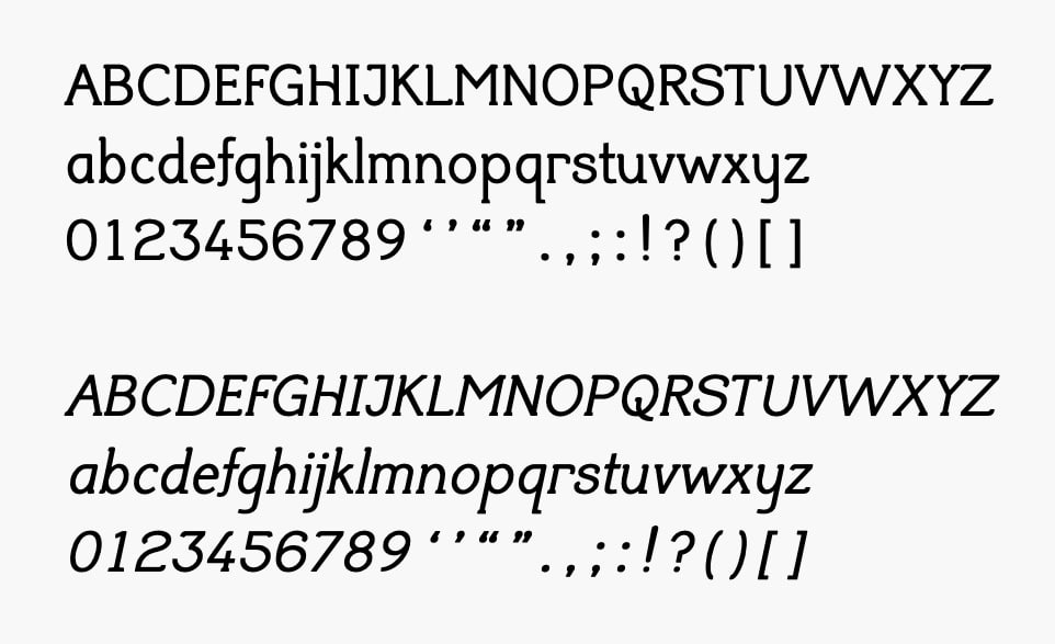
- Description: A numerical score based on the number of characters and symbols.
- Measurement: Research and design effort rated as not good, okay, or very good.
- Quality type: Strong (objective).
Accessibility For Visually Impaired Readers
- Validation: Visually impaired characters, as detailed in the paper “Letter and symbol misrecognition in highly legible typefaces for general, children, dyslexic, visually impaired and aging readers — 2019 fourth edition.”

- Measurement: A numerical score based on the number of characters and symbols.
- Description: Research and design effort rated as not good, okay, or very good.
- Quality type: Strong (objective).
Reader-Focused Performance Metrics for Extended Reading Typefaces
Subjective Measures: What Readers Say and Feel
Comprehension testing is among the most complex reader-based measurements. The challenge is that recall in a test environment rarely reflects true knowledge: an inability to retrieve or articulate something on paper does not mean the reader never understood or absorbed it. Legibility expert Sofie Beier notes that faster reading speed does not automatically mean better comprehension, and that superior comprehension is frequently associated with slower reading. A common test format is a passage or several pages of text followed by questions or information-based tasks. Due to the inherent subjectivity of memory and expression, this is considered a weak measurement type.
Questionnaires capture people’s opinions, preferences, thoughts, concerns, likes, and dislikes through questions, interviews, and real-time observation. Data is collected as notes and recordings. This is also assessed as a weak (subjective) measurement type.
Appeal testing can be split into two related but distinct approaches. One evaluates how well a typeface fits its subject matter — for instance, whether a more organic, chiseled, or wavy face better communicates gardening content. This is scored on a simple scale of not good, okay, or very good, and is treated as a strong (objective) measurement. The other approach gathers user feedback in relation to typefaces the reader already knows and uses, asking what they like or dislike about a face compared to those references. While this can yield interesting observations, it remains highly subjective, relying on notes and recordings as a weak measurement type.
Read-Aloud and Think-Aloud protocols both surface obvious difficulties between typefaces, classifications, or weights (such as thin, extra bold, italic, or condensed). In the read-aloud method, the reader vocalizes the text and immediately expresses any thoughts about the document. In the think-aloud variant, participants perform specific tasks while vocalizing their thinking process. Both methods produce notes and recordings categorized as not good, okay, or very good, with notes on specific problems; both are weak (subjective) measures.
Facial muscle activation provides a physiological check on emotional response. Facial electromyography (EMG) reveals that corrugator muscle activity — the muscle that lowers the eyebrow and produces frowns — varies inversely with the emotional valence of presented stimuli. The zygomatic muscle, which controls smiling, is positively associated with positive emotional stimuli and mood state. By placing tiny sensors over these muscles, researchers measure minute electrical changes reflecting muscle tension, producing frequency readings. Work in this area appears in John Cacioppo, Lauren Bush, and Louis Tassinary’s “Microexpressive facial actions as a function of affective stimuli: Replication and extension” and Ulf Dimberg’s “Facial electromyography and emotional reactions.” This method is rated as weak (subjective) and possibly strong (objective).
Objective Measures: Accuracy and Timing
Read speed is a difficult area to quantify despite its seeming simplicity. A person might scan a page quickly — theoretically “reading” everything in a few seconds — while absorbing little of the content. Still, clear performance differences emerge; comparing a script face such as Snell Roundhand with a highly legible face like the Unit typeface shows a decisive advantage for the more legible design. Speed is measured through eye-tracking (time, speed, and behavior). The measure is rated strong (objective).
Character, symbol, or word-finding tests gauge how quickly readers locate information. Participants are asked to find a specific character or phrase within a text, with the target shown at the bottom of the sheet for easy referral, while response times are recorded. This approach is documented in Brian Sze-Hang Kwok’s paper “Legibility of medicine labels.” Results are numerical scores of correct and incorrect responses, a strong (objective) measure.
Similar in design, phrase-searching tests ask participants to locate a phrase within a medicine label’s context, again with the phrase displayed for reference and timing recorded. This yields a numerical score of correct and incorrect responses and is, likewise, a strong (objective) measure.
At-a-glance testing determines whether readers can correctly identify a word, letter, or symbol without misreading — under fast-response conditions. Typefaces are individually set to a height of 4 mm using the letter “H” as a reference object; participants sit roughly 70 cm from the monitor, measured with a tape measure at the session start. Each trial follows a fixed sequence: a fixation rectangle (400 ms), a non-letter masking stimulus (200 ms), the target stimulus (timed by staircase rules), a second mask (200 ms), and a response prompt lasting up to 5000 ms. This method is described in “The great typography bake-off: comparing legibility at-a-glance” by Ben Sawyer, Jonathan Dobres, Nadine Chahine, and Bryan Reimer. It provides numerical scores of characters or symbols plus time measurements, a strong (objective) measure.
Fixation duration measures the time a gaze rests relatively still while taking in information. Saccadic amplitude captures the quick simultaneous movement of both eyes during line reading. Both methods are presented in the paper “Legibility of light and ultra-light fonts: eyetracking study” by Ivan Burmistrov, Tatiana Zlokazova, Iuliia Ishmuratova, and Maria Semenova. Fixation duration is recorded in milliseconds; saccadic amplitude is recorded in degrees. Each is considered weak (subjective) and potentially strong (objective).
Legibility Extremes and Specialized Instruments
The Radner reading chart is a standardized multilingual reading test system developed through collaboration around validated sentence structures. The chart is built of sentence optotypes: short sentences comparable in word count (14 words), word length, word position, lexical difficulty, and syntactic complexity, with language-specific characteristics taken into account. This system is discussed by Sofie Beier and Kevin Larson in “How does typeface familiarity affect reading performance and reader preference?”
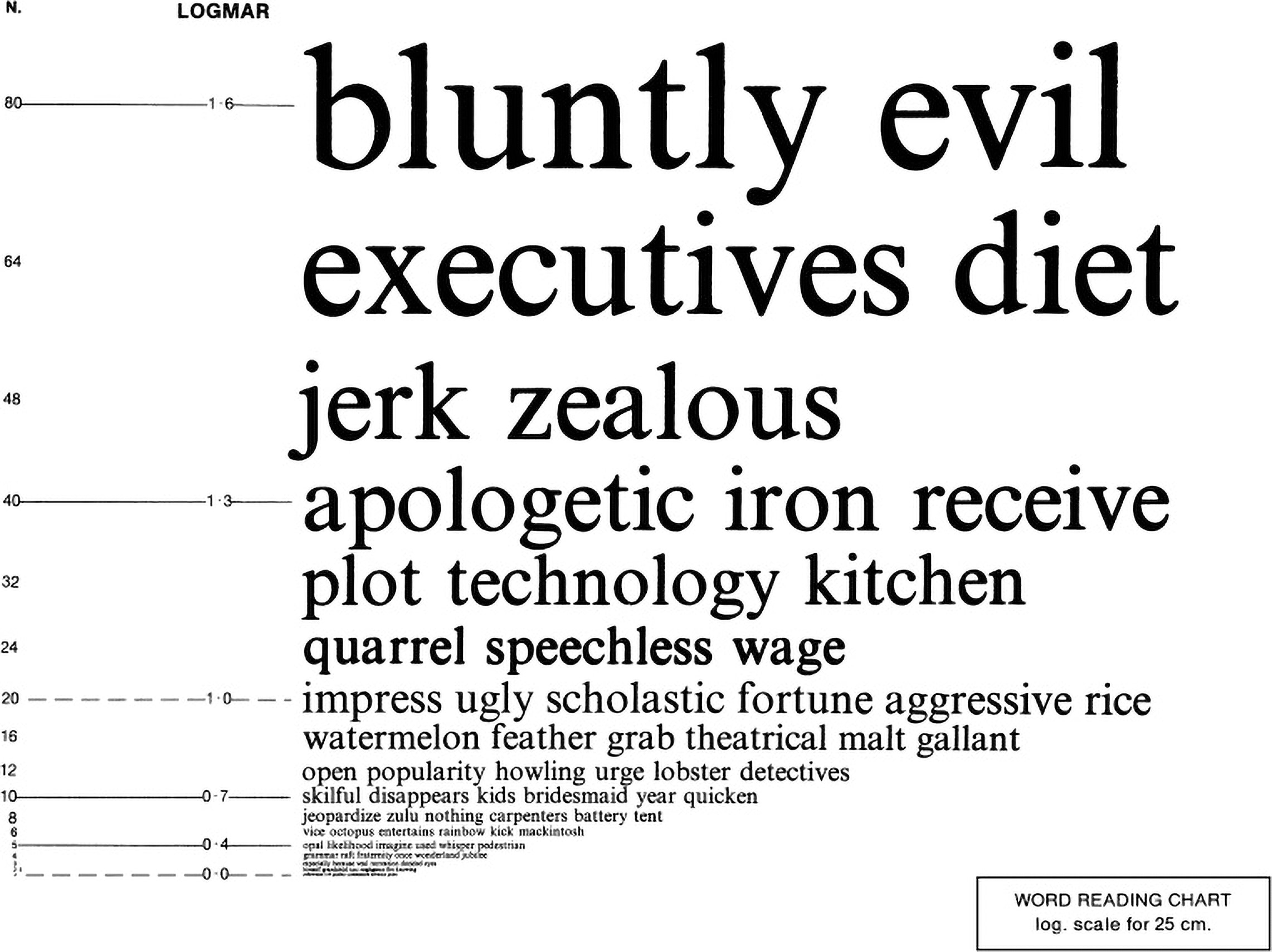
The test scores responses as correct or incorrect, recording the point of failure. This is a strong (objective) measure.
Legibility (misrecognition) tests whether readers correctly identify a letter, number, word, or symbol without confusing it with another. This method is described in “Letter and symbol misrecognition in highly legible typefaces for general, children, dyslexic, visually impaired and aging readers — 2019 fourth edition.” Scoring is binary with time measurement, a strong (objective) measure. The distance-based variant checks how far away a letter, symbol, or word remains readable. As documented in Robert Waller’s “Comparing typefaces for airport signs,” a participant stands far from a screen, sign, or printed sheet and gradually approaches until identification is possible; alternatively, with a screen, the target can be enlarged. In one application (from Beier and Larson’s “Design improvements for frequently misrecognised letters”), the first character shown was “d” — among the most easily recognizable letters, per Miles Tinker’s Legibility of print — to establish individual vision thresholds. Starting at 10 meters, participants approached until the letter was just identifiable; test distances varied from 4.5 to 9 meters, averaging about 6 meters. Measurements are in mm, cm, or m, a strong (objective) metric.
Small-size legibility pushes eyesight close to its limits at sizes below 8 pt. Measuring the x-height rather than point size is preferable. Ratings of difficulty, such as easy, reasonable, and hard, may accompany time readings. This is a strong (objective) measure. Rotated information testing applies similar pressures at extreme angles: specifically -45 degrees and +45 degrees horizontally and vertically. These angles are common in virtual reality (VR) software and products.
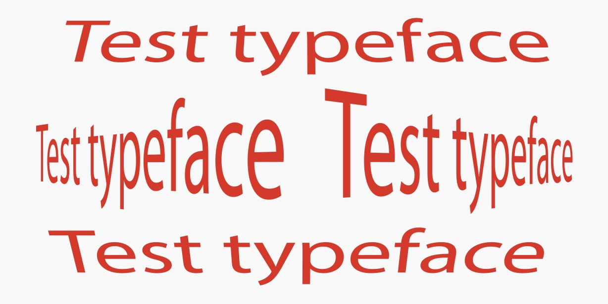
This is scored through character, symbol, or word tests as a strong (objective) measure. Degrading, distortion, and blurring tests as in Ralf Hermann’s “Designing the ultimate wayfinding typeface” likewise assess identification at progressively harder optical thresholds.
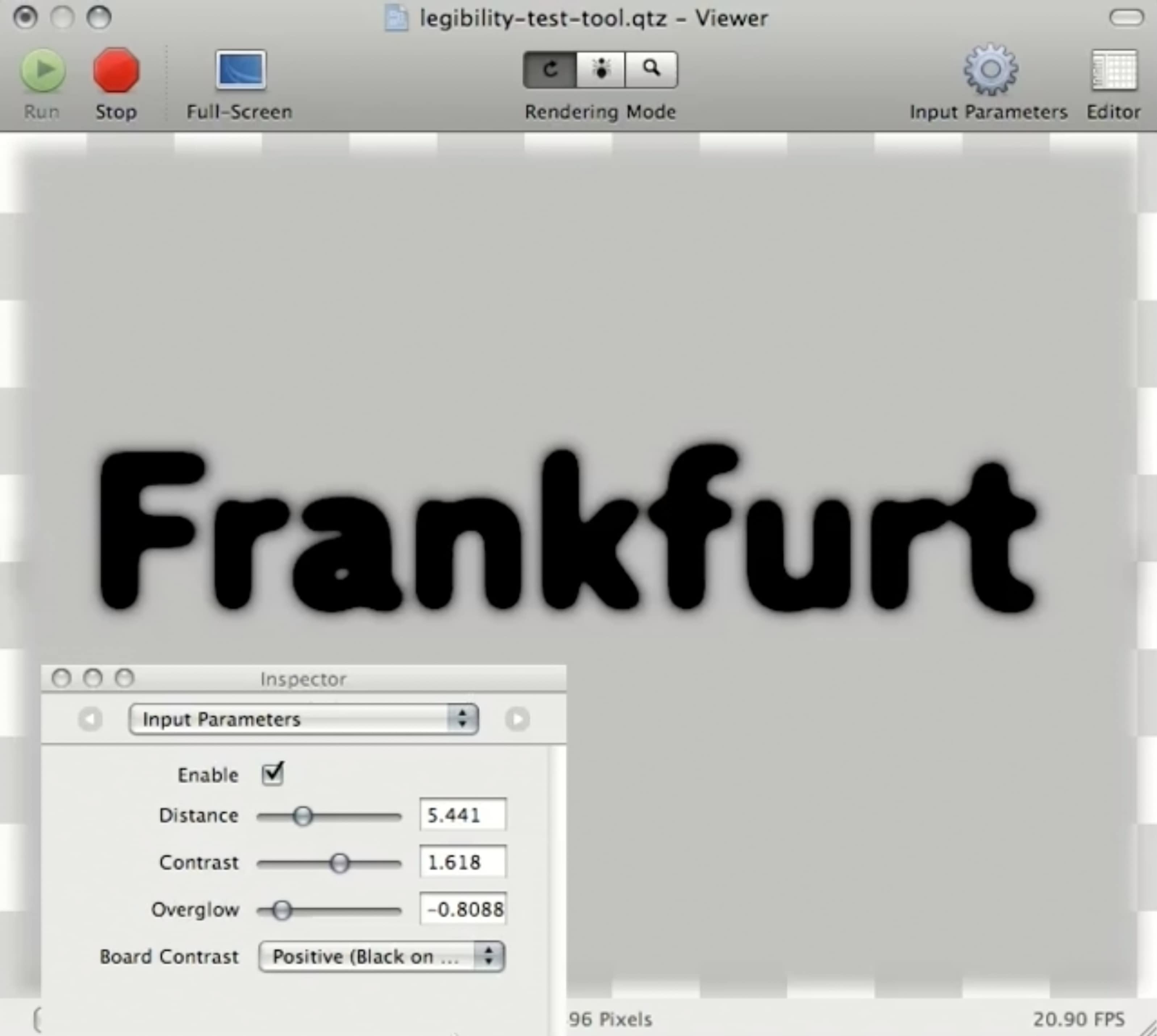
Scores for correct or incorrect identification are recorded alongside time measures — another strong (objective) approach.
Matching Typefaces to Real-World Contexts
Reading rarely happens in a pristine, controlled environment. Typography must survive traffic noise, fatigue, screen glare, and split-second glances. Measuring how a typeface behaves in degraded conditions matters as much as testing it in ideal ones.
Light
- Validation: To observe how a typeface performs under different lighting and how people respond in those conditions.
- Description: Test in both low-light and good-light scenarios, measuring how the information is affected.
- Measurement: Correct or incorrect identification score, with timing also tracked. Light strength is measured in lumens (lm).
- Measure quality type: Strong (objective).
Stress and Time Pressure
- Validation: To determine how typefaces hold up in high-pressure situations with quick, stressed eye movements.
- Description: Create realistic stressful scenarios: booking a ticket while navigating an airport, completing tasks after a six-hour work day, or working late at night when users are tired. For time-pressure specifically, set tasks like finding information within a deadline, booking a taxi quickly, or looking up a number in a telephone directory.
- Measurement: Accuracy and efficiency of user actions; possibly blood pressure or heart rate monitoring. Time is measured directly.
- Measure quality type: Weak (subjective).
Distant Reading
- Validation: To push a person's vision and agility, seeing how typefaces respond at the extremes.
- Description: Test the limits of vision, as with reading road signs from a moving car where distance and orientation are factors. Consider how weather affects information and communication.
- Measurement: In meters, centimeters, or millimeters.
- Measure quality type: Strong (objective).
OpenType Variable Fonts
A single non-variable font is static, but variable fonts can be instructed to adapt to their technological environment. They can modify themselves in real time in response to screen size, media queries, user customisation, and environments, utilising axes such as weight, width, italic, slant, optical size, and grade to perform better in changing situations.
- Measurement: Assessment of legibility, readability, comprehension, and user preference relative to changing circumstances. Many measurement types apply; most overlap with other areas in this assessment framework.
- Measure quality type: Weak (subjective) and possibly strong (objective).
Typography for Extended Reading: Technical Constraints
For long-form text, technology imposes its own performance criteria. A typeface intended for extended reading should be assessed against practical, quantifiable criteria.
Range of Weights
- Validation: A typeface with a range of weights is more useful and appreciated.
- Description: The number of weights on offer.
- Measurement: Numerical score based on the count of weights.
- Measure quality type: Strong (objective).
On-Screen Rendering and Hinting
- Validation: Poor hinting and screen rendering results in hard-to-read type and illegibility.
- Description: Take a screenshot and zoom in, or use a magnifying device, to analyse the hinting.
- Measurement: A score of not good, okay, or very good across three screen types: low-resolution, HD, and 4k+.
- Measure quality type: Strong (objective).
Font File Size
- Validation: Heavier fonts consume more bandwidth across large sites and slow initial content paint.
- Description: Check the file size of the font.
- Measurement: File size in kb. This metric is of limited use, however—a typeface with extensive symbol and language support cannot genuinely be made much smaller regardless of optimisation effort.
- Measure quality type: Strong (objective).
OpenType Features
- Validation: Desirable features—small caps, diverse number styles, ligatures—improve typographic quality and usability.
- Description: A typeface is better when it includes the features required by users and the content.
- Measurement: Numerical score or checklist of available features.
- Measure quality type: Strong (objective).
Controlled Variables in the Design Itself
Beyond environment and technology, the internal typographic variables influence communication. Tracking, leading, kerning, weight, line length, word spacing, condensed weights, size, colour, and OpenType features all affect how type performs. These must be measured with precision, as Ralf Hermann, director of Typography.Guru, notes in his paper "What makes letters legible?"
- Measure quality type: Weak (subjective) and hard to measure accurately.
Where Results Might Land
There is an open question of how to present performance findings, whether through data tables, infographics, or other forms of graph.
The Scientist and Designer Communication Gap
Sofie Beier, a legibility expert, addresses the historical disconnect between disciplines in her paper "Letterform research: An academic orphan":
"To produce findings that are relevant for the practicing designer, scientists benefit from consulting designers in the development of the experiments. While designers can contribute with design skills, they cannot always contribute with scientific rigor. Hence, researchers will profit from adopting a methodological approach that ensures both control of critical typographical variables and scientific validation. An interdisciplinary collaboration where scientists provide valid test methods and analysis and designers identify relevant research questions and develop test materials, will enable a project to reach more informed findings than what the two fields would be able to produce in isolation."
— Sofie Beier in "Letterform Research: An Academic Orphan"
The legacy of these divisions remains. Designers have tended to share findings without scientific rigour. Scientists have produced technically dense material with equations, hard for practitioners to apply. Both perspectives have gaps in expertise.
This is not intended to make the typeface design practice harder. A typeface typically demands a year of committed work, or more; Martin Majoor has said he designed his Questa typeface at irregular intervals across seven years. The craft demands serious respect—enough that taking on the task of designing a typeface is, by itself, something to decline lightly.
Paths Toward a Better Evidence Base
Several practical actions could move the field forward:
- Research legibility and letter characteristics thoroughly, in libraries and online. The academic journal Visible Language offers all archives free on its website, including work produced over five decades ago.
- Engage with other typeface designers and those who use type.
- Avoid designing and releasing typefaces in isolation—solo work tends to lack diverse testing and feedback.
- Run regular comparisons, testing your typeface against another to identify strengths and weaknesses across contexts, environments, and populations.
- Release findings, design intentions, and technical fixes openly—in the distribution package, in a publication, or on a central public repository like GitHub.
- Consider refining or extending an existing typeface over creating a new one. New is not automatically better, and incremental improvement to proven designs can be the smarter path.
Why Typeface Performance Measurement Matters More Than Ever
With thousands of typefaces available and centuries of type design behind us, it is reasonable to ask whether we can — and should — measure how well a typeface performs. For highly legible typefaces in particular, even a basic set of performance metrics would be a meaningful step forward. If every newly released typeface came with one or two such measures, it would at least establish a foundation.
What we need is a set of cross-measurable tests so that results can be compared across typefaces. Currently, if one designer tests a typeface against Arial and another tests against Helvetica, the findings are not interchangeable. Typographic choices and typesetting values also differ between testers, which further undermines comparability. Standardizing these variables would make the data more reliable and far more useful.
The Limits of Measurement
It is important to acknowledge that a poor score in a test does not make a typeface inherently bad — it only suggests that, under the same conditions, another typeface might perform better. A typeface that fails in one context could still work well in practice elsewhere. This is a genuinely difficult area.
Even established best practices can be questioned. Research by Kevin Larson, Richard Hazlett, Barbara Chaparro, and Rosalind Picard in their paper “Measuring the aesthetics of reading” found that when a typeface was rendered with no OpenType features — no ligatures, small caps, old-style figures, fractions, or true superscripts and subscripts — in a standard body paragraph, readers read faster and comprehended more. This does not mean designers should abandon typographic refinement, but it does show that few assumptions in graphic communication are completely safe.
Further Reading
- “Micro-Typography: How To Space And Kern Punctuation Marks And Other Symbols,” Thomas Bohm
- “A Reference Guide For Typography In Mobile Web Design,” Suzanne Scacca
- “7 Gorgeous Free And Open-Source Typefaces And When To Use Them,” Noemi Stauffer
- “Exo 2.0, A Contemporary Geometric Sans Serif Font (Freebie),” Vitaly Friedman




