

What “Performance” Means For A Typeface
Typefaces are compiled systems of letters and symbols — representations of sounds and information — that have been in use for centuries. The first movable type machine was created by Bi Sheng in China (circa 970–1051 AD), over four centuries before Johannes Gutenberg’s contribution of metal-block movable type for mass printing. Phototypesetting systems appeared in the early 1960s using glass disks that spun in front of a light source, and digital type arrived in the 1980s. Today, type travels through cables, wirelessly on smartphones, and even in 3D within virtual reality glasses.
Dozens of classifications exist — sans serif, serif, slab serif, script, handwritten, display, ornamental, stencil, and monospace — and technology has created new ones, including mixed typefaces like Luc(as) de Groot’s TheMix, which combines serif and sans serif elements. That diversity is exactly what makes defining and testing typefaces so difficult.
The question at hand: how well do typefaces designed for extended reading actually work? How does one serif or sans serif fare against a comparable face? And what concrete, measurable data can tell us whether a new typeface outperforms a similar one from years past?
The Case For Measurement — And The Obstacles
Technology has made typeface design easier than ever, but easier design does not mean better outcomes. Rather than reinventing wheels, objective measures would let the community learn from what does and does not work — and build better ones. That is straightforward. The long answer is that measuring a typeface’s effectiveness is difficult. Many new typefaces ship with no objective testing data at all, leaving users to guess where they succeed or fail.
The context and environment matter as much as the face itself. Consider an elderly person reading road signs while driving home at night, an accountant performing numerical calculations under a tight deadline, a child learning to read in the back of a bumpy car, or a person with dyslexia completing an evening class assignment. Different information, situations, environments, and people confound any simple measurement. Even more fundamentally, we cannot accurately observe what happens inside people’s minds when they read.
Robert Waller, information designer at the Simplification Centre, notes that legibility research goes back to the 1870s but that factors interact in complex ways. As he points out:
“Indeed, in recent times a consensus has grown that the interaction of variables in type design is so complex that few generalizable findings can be found”
Ralf Hermann, director of Typography.Guru, goes further. Scientific tests that modify one parameter while keeping others unchanged are nearly impossible with typefaces, because a typeface consists of dozens of relevant parameters — x-height, weight, contrast, width, to name a few. He is blunt about one common flaw:
“So if you come across a scientific legibility study that compares typefaces set at the same point size, don’t even bother to read on!”
Variables Must Be Controlled
Accurate comparison requires keeping typographic design parameters the same, which is harder than it sounds. X-heights differ greatly between typefaces; two faces set at the same point size in software will not look the same size because point size is, as Robert Waller puts it, “a notoriously imprecise measure.” A more effective and accurate approach is to set the typefaces being compared to a consistent x-height measurement rather than a matched point size.
When two typefaces are set to 26 pt in Adobe InDesign, slight differences appear at the tops of letters — the typeface may be rendered essentially larger even while the point size is identical. Setting both to an x-height of 5.5 mm fixes the visual size but produces different point sizes for each typeface, which is exactly why measuring x-height rather than point size matters for testing.
Beyond the face itself, the typographic design and layout probably matter more than the typeface choice. Line length, size, color, spacing, and leading all interact. Even the world’s most legible typeface would be nearly rendered useless set with negative leading of −7 points and a line length of 100 characters. No single factor determines performance; the entire design system must work in concert.
Needed: A Standard Baseline
Test results become incomparable when researchers pick different reference faces. If one person tests two serifs against one set of controls and another person tests two different serifs against different baselines, the results cannot be cross-compared. Testing faces from different classifications — a serif against a sans serif — may produce differences, but those results are also entangled with classification-specific differences.
The community might settle on a set of standard reference typefaces. Times New Roman is commonly used in academic journals as a serif baseline; Arial serves a similar role for sans serif, and Courier is a candidate for monospace. Even then, two researchers could use the same reference faces but completely different typographic settings, introducing yet another layer of inconsistency. To genuinely standardize measurement, a default typographic design and typesetting would need to accompany the baseline typefaces.
The overarching conclusion: typeface measurement is not a matter of a single metric but of multiple interacting factors within a broader system. Those variables all have to work well together to achieve an ideal, effective final presentation.
When Two Typefaces Are Nearly The Same
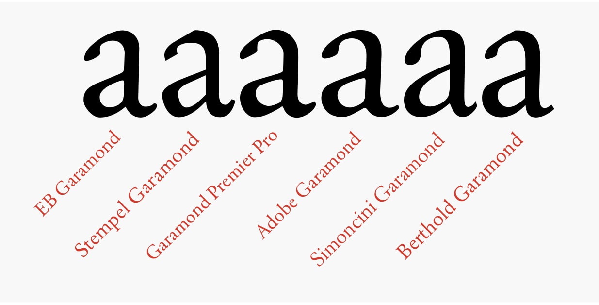
Some of the most popular typefaces in use today are not entirely original designs. Neue Haas Grotesk (1956), Helvetica (1957), Arial (1982), Bau (2002), Akkurat (2004), Aktiv Grotesk (2010), Acumin (2015), and Real (2015) all share a similar visual approach. The same is true of groups like Frutiger (1976), Myriad (1992), Monotype SST (2017), Squad (2018), and Silta (2018), or text faces such as Collis (1993), Novel (2008), Elena (2010), Permian (2011), and Lava (2013). If we look at a face like Garamond, there are numerous versions available, each claiming to be the most accurate rendition.

Foundries naturally argue their interpretation is the best, but these faces were designed for different contexts and technological eras, so there may not be a single winner. The differences also extend to robust faces like Minion Pro versus Monotype Baskerville: the latter has more stroke variance and a more pronounced personality. Questions of which performs better in which setting remain open, even with the body of research that has accumulated over the last decade.
Searching For The Neutral Face
Kai Bernau’s Neutral typeface is one attempt to answer those questions through design. Starting as a graduation project at KABK (the Academy of Art, The Hague), Bernau measured and averaged the letterforms of popular 20th-century sans-serifs, including Helvetica, Univers, Frutiger, Meta, and TheSans. The goal was to produce a font whose skeleton represents the merged characteristics of these faces, resulting in a typeface with no particular voice or style — an anonymous, grey-like presence that could serve as an ideal of neutrality.
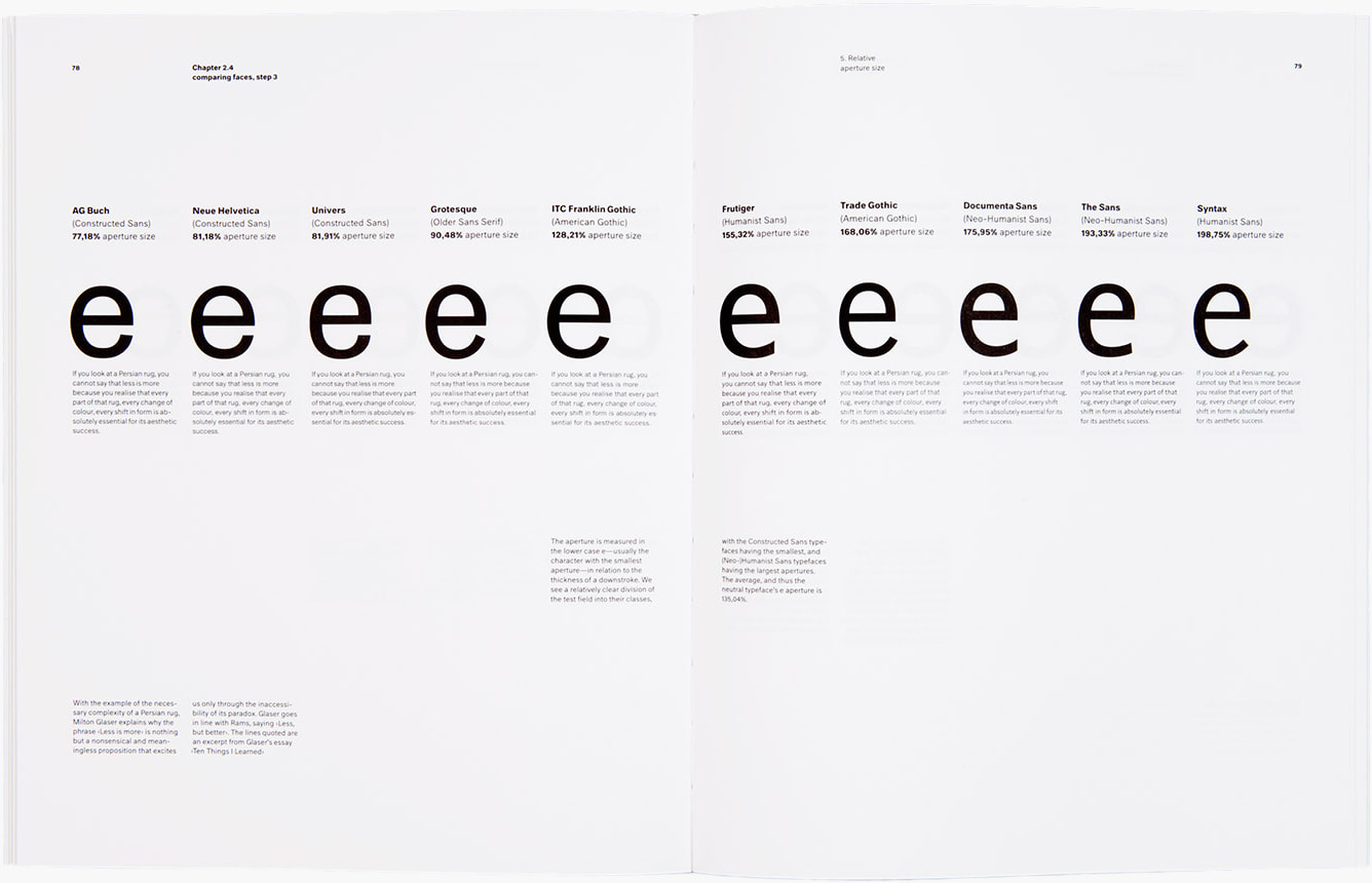
The underlying question is whether a utopian, optimally legible typeface can even exist. Sofie Beier, a legibility researcher, is skeptical:
"In the history of design, there are many examples of designers proposing an 'ideal typeface'. The fact is that there is no optimal typeface style. A thorough literature review shows that typeface legibility varies significantly depending on the reading situation."
A more practical approach might be to develop a shared reference list of legibility research and findings, so designers can make better-informed choices instead of repeating the same aesthetic formulas.
Measuring Before Redesigning
There is another important reason to measure typeface performance, and David Sless of the Communication Research Institute in Australia frames it well. Most design work is redesign, not invention from scratch. If a change is claimed to be an improvement, there must be before-and-after measurements to back that claim. As Sless puts it:
"Benchmarking is that part of the design process where you ask how an existing system is performing against agreed performance requirements set at the scoping stage of the design process... we need to know what we are changing from. Unless we look carefully at what we are doing now before making a change, we might throw out some good bits."
Without this data, new typefaces simply land in the same place as old ones. Designers invest heavily in aesthetic appeal but often miss the functional aspect that should be driving the work.
Is A Typeface A Tool?
Kris Sowersby of Klim Type Foundry argues that a typeface is not a tool:
"In theory, designers could perform all of their typesetting jobs with the same one or two typefaces. But they don't. I can almost guarantee this comes down to aesthetics. They choose a typeface for its emotive, visceral and visual qualities — how it looks and feels. Designers don't use typefaces like a builder uses a hammer. The function of a typeface is to communicate visually and culturally."
There is a counterargument, however. Typefaces are chosen to produce precise responses and behaviors from users. Selecting a face for its legibility with readers who have poor eyesight is a deliberate functional decision, quite similar to choosing a hammer suited to a specific job. Similarly, typefaces render with varying quality across different screen resolutions, which makes their technical performance a legitimate consideration beyond pure aesthetics.
Subjective Versus Objective Test Data
When evaluating type performance, the kind of data collected matters. Subjective measures ask users what they prefer or what feels readable. Objective measures determine whether a user correctly identified a letter and how long it took.
- A subjective measure: The user simply states they can "read this typeface better." That statement reflects a personal feeling, so it cannot be precisely quantified or compared across people.
- An objective measure: The user performs a task — such as identifying a letter — and the result is verifiably correct or incorrect, with a measurable completion time.
Kevin Larson of Microsoft's Advanced Reading Technologies team acknowledges the value of both, noting, "while I generally agree with you on the importance of objective data, and most of my work has collected reading speed measures of one kind or another, I think there can be interesting subjective data."
Sless takes a firmer position on the dangers of poor testing methods. Many designers ask the wrong questions — what do people think of the design, which one do they prefer — which leads to inadequate answers. He suggests a far more useful starting point: "what do I want people to be able to do with this artifact?" Attitude surveys, preference tests, and expert opinions are highly subjective. The more reliable route is setting measurable performance tasks and using diagnostic testing to observe success or failure.
Both types of data have some value, but only objective measurements give designers the accurate, repeatable feedback needed to understand how a typeface truly performs.
Defining Success For Legible Typefaces
Before designing or evaluating a typeface for extended reading, it is worth stepping back to ask what the typography should actually accomplish. As David Sless puts it:
“A far more useful question to ask before you design a new information artifact or redesign an existing one is: what do I want people to be able to do with this artifact?”
Applying that question to highly legible typefaces for long-form reading, the goals span recognition, comprehension, and user well-being. A practical list of desired outcomes includes:
- Enabling fast and accurate recognition of each letter, word, and symbol.
- Having the typeface’s character match and reinforce the content, so the design supports rather than fights the message.
- Maximizing how much information readers can understand, absorb, and retain.
- Maintaining reader motivation and engagement over long sessions.
- Building a sense of trust in the material, making the text feel high quality and respectful of the reader.
- Minimizing visual fatigue, so readers can continue without undue strain.
- Optimizing every typographic detail — leading, tracking, kerning, size, color, line length, hyphenation, capitalization, and word spacing — for efficiency.
- Serving varied audiences, including those with low vision, dyslexia, aphasia, or specific learning needs such as children, by offering letterforms and OpenType or stylistic options that can be adapted for accessibility or language support.
These points frame what “performance” means in practice: not just whether a letter is readable, but whether the entire reading experience helps people do what they came to do.
What To Expect Next
The issues raised here are intentionally complex, and they demand a deeper look at methodology. The second part of this exploration will examine how to test typefaces properly, covering how to design meaningful experiments, gather useful data, and make the most of every stage in the process. That includes practical guidance on choosing test tasks, measuring outcomes, and interpreting results.
Related Reading
- “Micro-Typography: How To Space And Kern Punctuation Marks And Other Symbols” — Thomas Bohm
- “A Reference Guide For Typography In Mobile Web Design” — Suzanne Scacca
- “7 Gorgeous Free And Open-Source Typefaces And When To Use Them” — Noemi Stauffer
- “Exo 2.0, A Contemporary Geometric Sans Serif Font (Freebie)” — Vitaly Friedman



