

Why a Performance-Aware Site Still Fails Core Web Vitals
Smashing Magazine has long been vocal about web performance, with its own yearly performance checklists and regular articles on the subject. So when the team started seeing persistently amber Core Web Vitals scores in Google Search Console, it was both frustrating and puzzling. The team knew the theory; the problem was in the practice.
The issue centered on mobile Largest Contentful Paint (LCP). Under Google's Page Experience Update, LCP is one of three metrics that determine whether a page gets the full search ranking boost. LCP measures when the largest contentful element in the initial viewport is painted—usually a hero image or headline. It deliberately ignores non-contentful elements like background colors. And once the user scrolls or interacts, the LCP element is fixed; the timer measures from page load start to that element's paint.
Search Console is the authority here, at least from an SEO perspective. It doesn't matter what lab tools say; GSC reflects what Google Search sees from real user experience data via the Chrome User Experience Report. Smashing Magazine's GSC data showed mobile LCP failing across most pages.
Finding the Culprit
Running a typical article page through WebPageTest quickly identified the LCP element: the author's photo. That seemed like an obvious starting point. The image itself was already well optimized in format and file size. It was served from a separate assets domain, which can hurt performance, but Smashing had already added a preconnect hint to mitigate that. They had recently overhauled their performance, so the obvious fixes—compression, caching, hints—were already in place. Still, the metric failed.
Suggestions like delaying service worker registration or tweaking HTTP/2 priorities didn't move the needle enough. With lab tools showing the image loading efficiently, the team had to consider a more aggressive approach.
Inlining as a Deliberate Trade-Off
When a resource is critical to initial render, inlining it in the HTML eliminates an extra network request. Smashing already inlined critical CSS. But inlining images is usually discouraged: it bloats the HTML and prevents caching benefits for repeat visits to the same image. However, this context justified the exception. The author photo was small, critical to LCP, and unlikely to be reused often—readers typically browse articles from many different authors.
Vitaly Friedman, Smashing Magazine's co-founder, explored inlining the image in AVIF format. AVIF was already supported in Chrome and Firefox and offered strong compression over traditional JPEGs. Encoding the author image as AVIF and base64-embedding it added only about 3 KB to the HTML—a negligible cost for the LCP gain.
There was a slight philosophical discomfort in optimizing for Chrome because of a Google-mandated metric, especially since AVIF wasn't yet supported in Safari at the time. But AVIF is a standards-based format, and the approach acted as progressive enhancement: Safari users still got the same content, just not as fast. Lab results improved dramatically. Problem seemingly solved.
It wasn't.
Questioning the LCP Element Itself
After the usual 28-day window for CrUX data to refresh, Search Console scores flitted between green and amber. Improvement had been made, but the issue wasn't fully resolved. Taking another look with fresh eyes led to a more fundamental question: was the author photo the right thing to be optimizing at all?
Readers come for the article, not the author's portrait. The real content is the headline and the text. Optimizing the headline as the LCP element would not only make the metric easier to satisfy—text paints faster than images—but would also better reflect what users actually came to see.
The fix was simple: place the headline above the author image and increase its font size on mobile. Further tweaks removed the author image entirely on small screens, where space is precious. The resulting mobile view shows the title, key article metadata, and the start of the summary—a more useful experience that also draws much faster than any image could.
This wasn't a cynical SEO hack. It was a case where aligning the metric with genuine user value also happened to satisfy the metric's technical requirements. That alignment is exactly what Core Web Vitals is designed to reward: improving the metric required improving the experience itself.
Why the Whole Graph Moved at Once
The Search Console graph was swinging in near-unison across the whole site, with one stubborn group of roughly 1,000 pages staying green throughout. The reason lies in how Google measures Core Web Vitals.
Search Console doesn't score every URL individually. Instead, it assigns pages to page groupings — clusters based on URL patterns and technologies that Google infers, but never shows you directly. If a group has enough traffic, the group's metrics apply to all pages within it, even ones that might have their own passing scores. For a site like Smashing Magazine, that means all ~3,000 articles live in one bucket. When that bucket flips between passing and failing, the entire graph moves dramatically.
Checking the CrUX API at the origin level told a similar, more precise story. The percentage of "Good" pages hovered dangerously close to the 75% pass threshold, and the p75 LCP value never moved far enough above the 2500ms line. A few bad days of traffic was enough to tip the whole grouping into the "needs improvement" category. The site needed headroom, not just marginal gains.
Tempting But Wrong: Optimizing Further
At this point, the obvious move was to shave more time off the LCP element — the article title — perhaps by tackling the font loading. But stepping back, something didn't add up. Smashing Magazine was already doing everything right: static site generation, inlined critical resources, CDN hosting on Netlify. Performance tools like Lighthouse and WebPageTest confirmed it was fast, even on throttled connections.
If a site with this setup couldn't pass Core Web Vitals comfortably, the problem wasn't a missing optimization. It was time to look at the data from a different angle.
Diving Into the CrUX Data
Without a real user monitoring (RUM) solution in place, the next step was to mine the Chrome User Experience Report more thoroughly. A sitewide pull of CrUX data via a Google Sheets script showed mixed results across individual pages — some passed, while older pages tended to fail. The CrUX dashboard confirmed the LCP was borderline and trending in the wrong direction. Other metrics like TTFB and First Paint offered no clues.
One pattern did stand out: a noticeable rise in mobile usage. Was that a broader trend in how readers access the site, and could it explain the sliding mobile LCP despite the improvements? Still no definitive answer.
The India Connection
Google Analytics revealed a substantial share of traffic from India, much of it hitting older articles. Country-level CrUX data isn't in the dashboard, but it is available in the BigQuery CrUX dataset. Querying the www.smashingmagazine.com origin showed a wide disparity in LCP scores across the top 10 countries by traffic.
India alone accounted for 16% of all visits, and its origin-level LCP was missing the target. The Philippines and Pakistan also had poor scores, though with much less traffic. To verify the hypothesis, Smashing Magazine installed the web-vitals library and fed real user data back into Google Analytics for a few days. Analyzing it with the Web Vitals Report confirmed the suspicion: every top country had solid LCP scores except India, despite Netlify's presence in Mumbai.
But the picture got clearer when filtering for mobile Chrome users — the only traffic that counts for CrUX and thus Core Web Vitals. India jumped to the number one spot, nearly tripling the next country, the USA. The Philippines, Nigeria, and Pakistan — all with poor connectivity scores — also rose into the top ten. The overall poor mobile LCP suddenly made complete sense.
Why Chrome Users Skew the Results
Mobile is not a uniform global experience. In many Western countries, desktop usage during work hours still balances the mix, and iPhones dilute Chrome's share of mobile traffic. In India and similar markets, mobile is the primary — often only — way online, and Chrome dominates it. Because CrUX only measures Chrome, countries with more iPhones (like the USA) have a much smaller slice of their mobile users represented in the data. The effect of slower, Chrome-heavy regions is amplified well beyond their actual share of site visits.
Core Web Vitals Are Global
Core Web Vitals thresholds are the same for every country. Google has confirmed that good scores in one region don't offset bad ones elsewhere — all Chrome users across the globe go into the same melting pot. If a page grouping doesn't clear the threshold overall, the ranking signal for all of its users suffers, regardless of how fast the experience is in the United States or Europe.
The data shows a clear performance divide between richer and poorer nations. Technology costs money, and many countries prioritize getting populations online over upgrading infrastructure to the latest standards. For sites with globally distributed audiences, this is not an edge case — it's an existential reality of Core Web Vitals measurement. The blind spot of ignoring non-Chrome browsers turns out to matter far more than merely underrepresenting Firefox users. It systematically skews the results toward regions with the worst connectivity.
The Country Question: Should Core Web Vitals Be Regional?
There’s a fair argument that judging a global site like Smashing Magazine by the same performance yardstick in every country is inherently unfair. If a French-focused site is fast for users in France but struggles for French Canadians because it lacks a global CDN, should it be penalized in Canadian search results? The connection of Core Web Vitals to SEO ranking introduces a financial dimension that complicates this further.
One proposed solution is to keep the thresholds identical but measure them per country. A site could rank well in France where it passes Core Web Vitals, while ranking lower in Canada where it doesn’t. Similarly, Smashing Magazine might rank well in regions where it passes, while being compared only against other sites in India that face similar infrastructure constraints.
However, this approach carries significant risks. It could lead to ignoring users in countries deemed less profitable, undermining the entire initiative. Additionally, adding nearly 200 country-level dimensions would make an already complex metric nearly unmanageable.
The SaveData Solution
After identifying that the bottleneck was largely location-based, the team revisited an earlier idea: further optimization of web fonts. The question wasn’t whether to stop delivering fonts entirely—that would be too blunt—but whether there was a clean signal to trigger a more aggressive, font-free experience for users who would benefit.
That signal exists in the SaveData header and its accompanying JavaScript API. Users can explicitly enable this setting in supported browsers to indicate a preference for reduced data usage. This is useful for those on limited data plans, expensive roaming, or slower infrastructure. Acting on this user request is fundamentally different from arbitrarily deciding to serve a stripped-down site to an entire country.
There are three ways to access this information:
- The
SaveDataheader is sent on each HTTP request, allowing dynamic backends to alter the returned HTML. - The
NetworkInformation.saveDataJavaScript API enables front-end scripts to adapt. - The upcoming
prefers-reduced-datamedia query allows CSS to respond, though it remains behind a flag in Chrome pending standardization.
The team measured how many of their mobile Indian users actually had this setting enabled. The results were promising: about two-thirds did. The Effective Connection Type (ECT) data was less useful, as most users were classified as "4g." They also confirmed that the majority of Indian users were on an up-to-date Chrome browser, meaning they'd benefit from the media query once fully available.
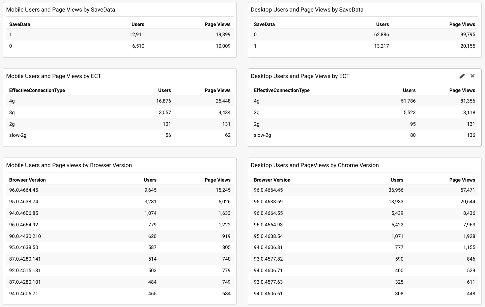
Based on this data, the team applied the JavaScript API version to their font-loader script, preventing additional fonts from loading for these users. They also implemented the prefers-reduced-data media query in their CSS to use fallback fonts instead of custom web fonts for the initial render, though this won't affect most users until the feature leaves the experimental stage.
Positive Results and Cautious Optimism
The changes yielded measurable improvements shortly after implementation in mid-November. Google Search Console charts showed a notable shift towards the "good" category, alongside a steady decline in the original level LCP score.
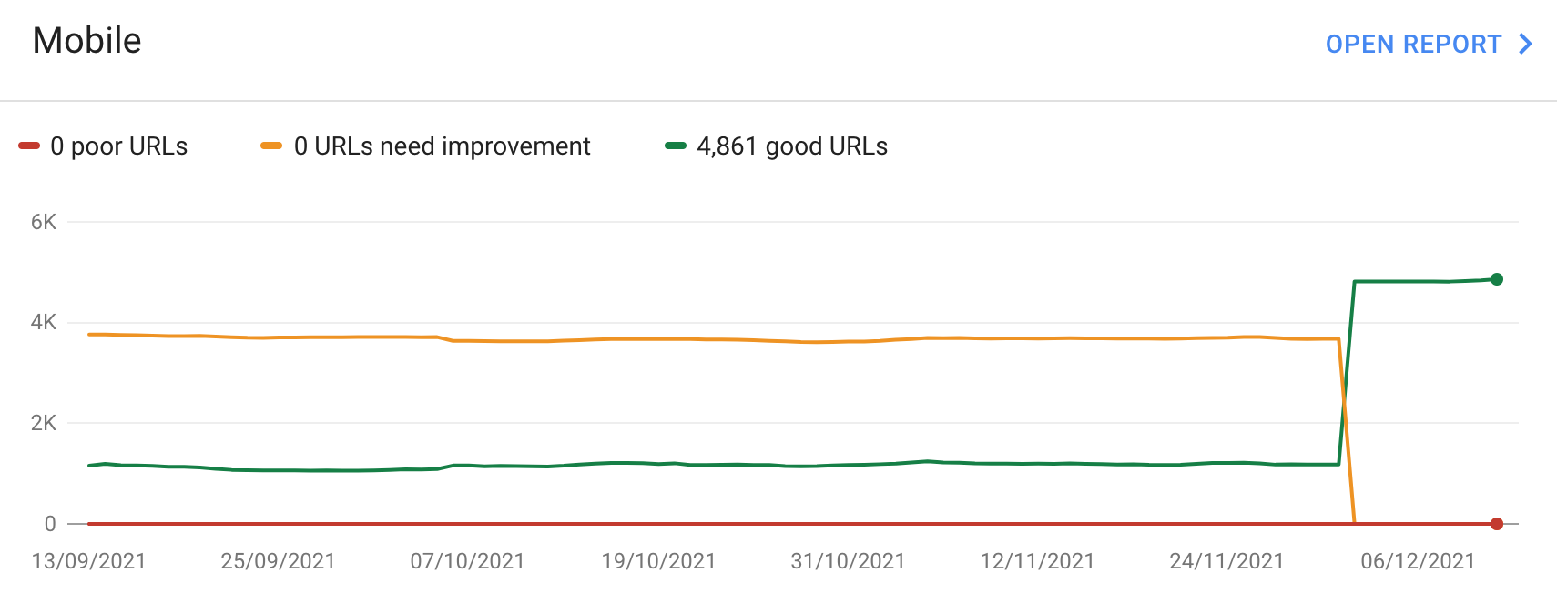
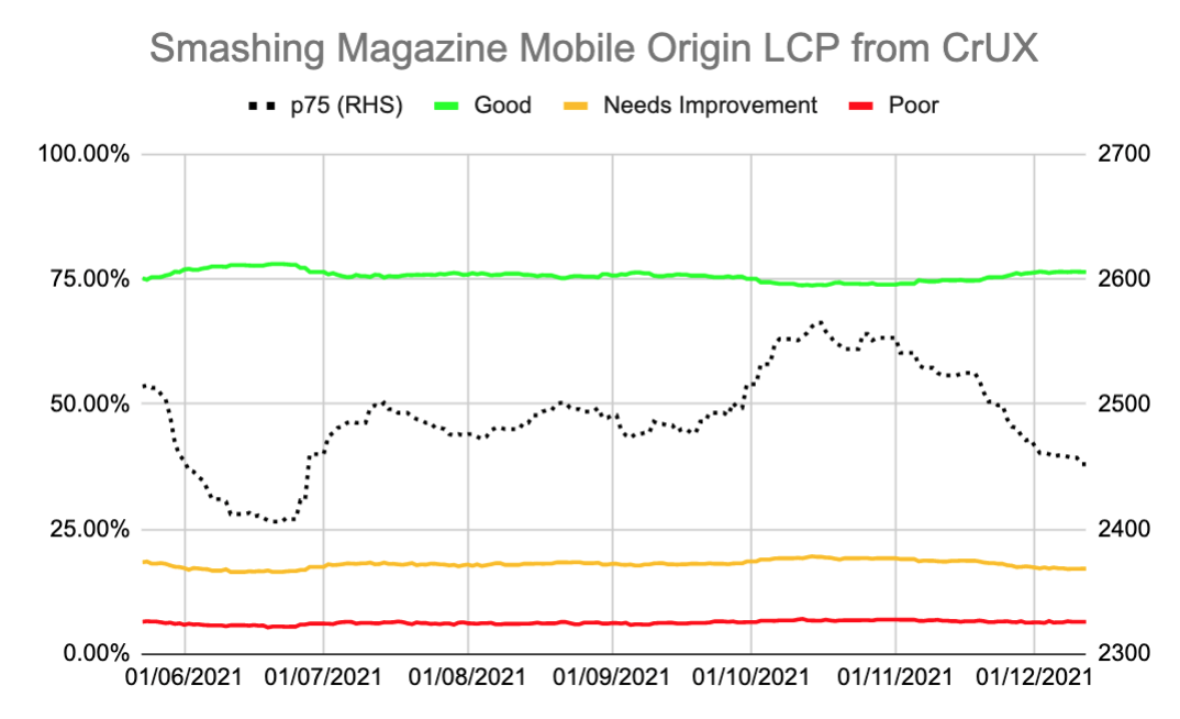
While the current headroom isn't as large as the team would like, there's hope that the full release of prefers-reduced-data will provide additional room. A sudden surge in mobile traffic from users with poor connectivity could still tip the site back into the amber zone, so the team is keeping a close watch on these metrics. Nonetheless, the effort represents a best-efforts basis to improve user experience for those who need it most.
Regarding the actual impact on search rankings, the team noted a large but temporary uptick in search impressions the same week the site flipped to green. This was likely an unrelated blip, but it was an interesting correlation nonetheless.
Key Takeaways
This case study yields several important lessons for any team wrestling with Core Web Vitals:
- When RUM data—including CrUX or Google Search Console—flags a problem, it's usually real. The temptation to blame the metric rather than investigate the underlying user experience should be resisted.
- Building your own RUM solution provides far richer, more granular data than CrUX's high-level summaries, enabling precise drilling down into issues and offering insight into the devices your audience actually uses.
- Core Web Vitals are global by nature, which creates unique challenges for internationally-focused sites. Without a RUM layer, deciphering why CrUX numbers look the way they do can be extremely difficult.
- Chrome usage patterns differ significantly by region, with mobile usage in some countries skewing away from high-end devices like iPhones.
- Core Web Vitals are a better measure of user experience, but they don't mandate a single, uniform experience for all users. In fact, respecting a user's explicit preference for reduced data is a superior way to serve them.
The success of this strategy shows that understanding the “why” behind the metrics, rather than blindly chasing an aggregate score for a global audience, can lead to smarter, more user-respecting optimizations.



