
Why Mobile Performance Falls Short
Today's mobile web still trips over itself: refreshes that spin too long, page transitions that stutter, and taps that feel delayed. Developers chase native-like smoothness but often get lost in resets and heavyweight frameworks. The core problem is that many of these frameworks hide the underlying mechanics of rendering, compositing, and hardware acceleration, leaving developers blind to what the browser is actually doing.
Throwing GPU acceleration at every element is a common but dangerous reflex. Three issues lurk behind this shortcut:
- Memory and CPU burden: Compositing every DOM element for the sake of acceleration shifts heavy lifting to the GPU, and the next developer who inherits the code will feel the pain.
- Power drain: When the GPU works, the battery pays. Mobile developers must balance visual fidelity against the wide range of device hardware constraints.
- Conflicts: Applying acceleration to elements already composited can cause visual glitches. Understanding overlapping acceleration is essential.
For interaction to feel native, the CPU should only set up the initial animation, and the GPU should handle the compositing during motion. CSS transforms such as translate3d, scale3d, and translateZ are the key to this arrangement, because they create dedicated layers for elements, allowing the GPU to render everything in harmony.
The Building Blocks of Page Transitions
The three most common mobile interaction patterns — sliding, flipping, and rotating — can be implemented with surprisingly little code. Each transition requires only a handful of CSS rules and JavaScript functions.
Sliding Between Views
Slide transitions closely mimic the native feel of iOS and Android apps. The basic idea is to stage a new content area to the left or right of the viewport, then animate it into the center. The slide itself is triggered by swapping CSS classes on the page's div elements.
.page {
  position: absolute;
  width: 100%;
  height: 100%;
  /*activate the GPU for compositing each page */
  -webkit-transform: translate3d(0, 0, 0);
}
The foundation of this is the translate3d(0,0,0) property, which forces the browser to hand off animation duties to the GPU. When a user taps a navigation element, plain JavaScript executes the class swap — no frameworks required.
function getElement(id) {
  return document.getElementById(id);
}

function slideTo(id) {
  //1.) the page we are bringing into focus dictates how
  // the current page will exit. So let's see what classes
  // our incoming page is using. We know it will have stage[right|left|etc...]
  var classes = getElement(id).className.split(' ');

  //2.) decide if the incoming page is assigned to right or left
  // (-1 if no match)
  var stageType = classes.indexOf('stage-left');

  //3.) on initial page load focusPage is null, so we need
  // to set the default page which we're currently seeing.
  if (FOCUS_PAGE == null) {
    // use home page
    FOCUS_PAGE = getElement('home-page');
  }

  //4.) decide how this focused page should exit.
  if (stageType > 0) {
    FOCUS_PAGE.className = 'page transition stage-right';
  } else {
    FOCUS_PAGE.className = 'page transition stage-left';
  }

  //5. refresh/set the global variable
  FOCUS_PAGE = getElement(id);

  //6. Bring in the new page.
  FOCUS_PAGE.className = 'page transition stage-center';
}
In practice, the stage-left or stage-right class becomes stage-center, and CSS3 handles the motion. Similarly, media queries down the CSS allow developers to target specific devices, orientations, and resolutions. This is also the right place to disable acceleration for desktop WebKit browsers that already accelerate all transforms. One caveat: under Android Froyo 2.2 and older, these acceleration tricks produce no gains because compositing is done entirely in software.
/* iOS/android phone landscape screen width*/
@media screen and (max-device-width: 480px) and (orientation:landscape) {
  .stage-left {
    left: -480px;
  }

  .stage-right {
    left: 480px;
  }

  .page {
    width: 480px;
  }
}
Flipping with Touch Events
Swipe-based flipping is a common pattern on iOS and Android WebKit browsers. Capturing the gesture properly requires tracking the element's current position, which cannot be retrieved with the usual element.offsetLeft because the page transition relies on a CSS3 ease-out transition. The correct approach is to use the WebKitCSSMatrix interface to read the current transform matrix.
if (pagePosition >= 0) {
 //moving current page to the right
 //so means we're flipping backwards
   if ((pagePosition > pageFlipThreshold) || (swipeTime < swipeThreshold)) {
     //user wants to go backward
     slideDirection = 'right';
   } else {
     slideDirection = null;
   }
} else {
  //current page is sliding to the left
  if ((swipeTime < swipeThreshold) || (pagePosition < pageFlipThreshold)) {
    //user wants to go forward
    slideDirection = 'left';
  } else {
    slideDirection = null;
  }
}
The gesture logic needs to determine the swipe direction and establish a time threshold (swipeTime, measured in milliseconds) so that a quick swipe fires a navigation event, just as a deliberate flip would. While the finger is still on the screen, CSS3 transitions apply to keep the page following the touch naturally. A cubic-bezier easing function can fine-tune the feel, but in practice an ease-out curve is sufficient.
function positionPage(end) {
  page.style.webkitTransform = 'translate3d('+ currentPos + 'px, 0, 0)';
  if (end) {
    page.style.WebkitTransition = 'all .4s ease-out';
    //page.style.WebkitTransition = 'all .4s cubic-bezier(0,.58,.58,1)'
  } else {
    page.style.WebkitTransition = 'all .2s ease-out';
  }
  page.style.WebkitUserSelect = 'none';
}
Once the touch gesture is recognized, the code hands off to the same slideTo() methods used in the slide demo, completing the navigation.
track.ontouchend = function(event) {
  pageMove(event);
  if (slideDirection == 'left') {
    slideTo('products-page');
  } else if (slideDirection == 'right') {
    slideTo('home-page');
  }
}
Rotating 180 Degrees
A 180-degree rotation exposes the reverse side of the current view. The syntax is short — toggling a class via an onclick handler does the job — but support is hit-or-miss. Most versions of Android lack true 3D CSS transform support, and instead of a flip, the page will "cartwheel" away. Use this transition sparingly or not at all on those platforms.
The markup uses front-and-back panels as siblings.
<div id="front" class="normal">
...
</div>
<div id="back" class="flipped">
    <div id="contact-page" class="page">
        <h1>Contact Page</h1>
    </div>
</div>
The JavaScript assigns the transition class to trigger the animation.
function flip(id) {
  // get a handle on the flippable region
  var front = getElement('front');
  var back = getElement('back');

  // again, just a simple way to see what the state is
  var classes = front.className.split(' ');
  var flipped = classes.indexOf('flipped');

  if (flipped >= 0) {
    // already flipped, so return to original
    front.className = 'normal';
    back.className = 'flipped';
    FLIPPED = false;
  } else {
    // do the flip
    front.className = 'flipped';
    back.className = 'normal';
    FLIPPED = true;
  }
}
The CSS then defines the rotation transformation.
/*----------------------------flip transition */
#back,
#front {
  position: absolute;
  width: 100%;
  height: 100%;
  -webkit-backface-visibility: hidden;
  -webkit-transition-duration: .5s;
  -webkit-transform-style: preserve-3d;
}

.normal {
  -webkit-transform: rotateY(0deg);
}

.flipped {
  -webkit-user-select: element;
  -webkit-transform: rotateY(180deg);
}
Seeing What the GPU Truly Renders
With transitions covered, the next question is how to verify that acceleration is happening as intended. The macOS debugging environment provides several powerful tools.
Launching Safari from the terminal with two environment variables turns on a rich debugging session:
CA_COLOR_OPAQUE=1— tints every accelerated element red.CA_LOG_MEMORY_USAGE=1— reports the memory footprint sent to the Core Animation backing store.
With these flags active, a red hue instantly reveals which elements are composited vs. which are not. The visible tint is also a direct indicator of system strain, showing whether an animation is leaking memory or running indefinitely when it should be idle.

Chrome offers a complementary view through the about:flags page. Enabling the FPS Counter displays frames per second in the top-left corner of the browser window, giving immediate feedback on animation fluidity. A similar setting, "Composited render layer borders," draws boundaries around composited layers — useful when combined with the WebKit falling leaves demo for testing purposes.

Finally, measuring actual GPU memory usage requires looking at the Core Animation buffer output. In a case where 1.38 MB of drawing instructions is being pushed to the buffers, resizing the window immediately reflects new memory demands in the console readout. To test for an iPhone, shrink the browser down to 480×320 pixels; the values will then mirror what a mobile device would experience.
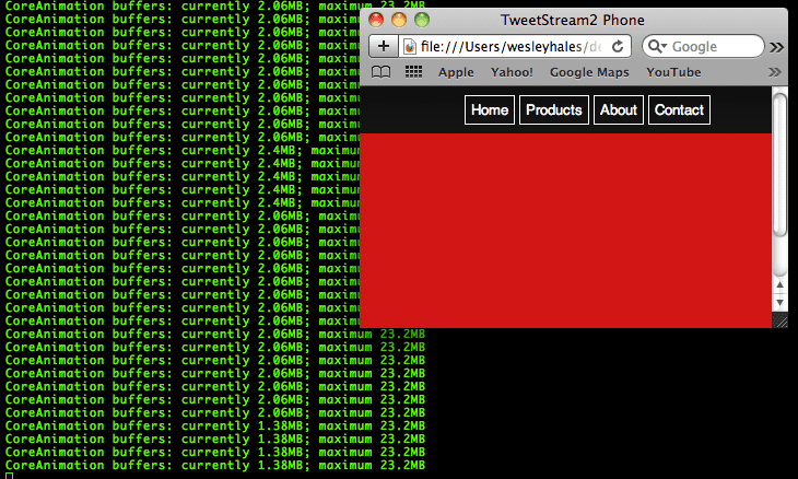
This method of inspection is the difference between reading about acceleration and viewing it in action, revealing both the mechanics and the true costs underlying every transition.
Prefetching Pages and Handling Responses
Moving beyond basic application cache, we can prefetch and cache individual pages using concurrent AJAX requests, similar to the techniques used by jQuery Mobile and similar frameworks. This approach solves several core mobile web problems:
- Fetching: Prefetching pages enables offline use and eliminates the wait between navigation actions. This feature should be used sparingly to avoid choking the device's bandwidth when the connection returns.
- Caching: Need an asynchronous approach for storing fetched pages.
localStorageis well supported across devices but is synchronous by nature. - AJAX parsing: Using
innerHTML()to insert the AJAX response into the DOM is dangerous and unreliable. A more reliable mechanism handles concurrent calls and leverages new HTML5 features for parsingxhr.responseText.
Building on the code from the Slide, Flip, and Rotate demo, we start by adding secondary pages and linking to them. We then parse the links and create transitions on the fly.
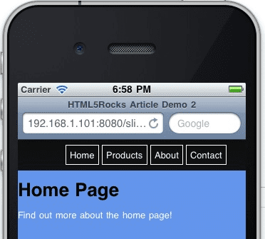
View the Fetch and Cache demo here.
This code leverages semantic markup. A link to another page points to a child page that follows the same node and class structure as its parent. This could be extended further by using the data-* attribute for "page" nodes, and so on. Here is the detail page located in a separate HTML file, which will be loaded, cached, and set up for transition on app load:
<div id="home-page" class="page">
  <h1>Home Page</h1>
  <a href="demo2/home-detail.html" class="fetch">Find out more about the home page!</a>
</div>
The JavaScript is stripped down for simplicity, removing any helper or optimization logic. The goal is to loop through a specified array of DOM nodes to dig out links to fetch and cache.
var fetchAndCache = function() {
// iterate through all nodes in this DOM to find all mobile pages we care about
var pages = document.getElementsByClassName('page');
for (var i = 0; i < pages.length; i++) {
// find all links
var pageLinks = pages[i].getElementsByTagName('a');
for (var j = 0; j < pageLinks.length; j++) {
var link = pageLinks[j];
if (link.hasAttribute('href') &&
//'#' in the href tells us that this page is already loaded in the DOM - and
// that it links to a mobile transition/page
!(/[\#]/g).test(link.href) &&
//check for an explicit class name setting to fetch this link
(link.className.indexOf('fetch') >= 0)) {
//fetch each url concurrently
var ai = new ajax(link,function(text,url){
//insert the new mobile page into the DOM
insertPages(text,url);
});
ai.doGet();
}
}
}
};
In this demo, the fetchAndCache() method is called on page load. A more sophisticated version, which detects the network connection before calling it, is covered in the next section.
Caching Responses and Parsing with iframe
An "AJAX" object ensures proper asynchronous post-processing. A more advanced explanation of using localStorage within an AJAX call is available in Working Off the Grid with HTML5 Offline. The code caches on each request and falls back to the cached copy when the server doesn't return a 200 response.
function processRequest () {
  if (req.readyState == 4) {
    if (req.status == 200) {
      if (supports_local_storage()) {
        localStorage[url] = req.responseText;
      }
      if (callback) callback(req.responseText,url);
    } else {
      // There is an error of some kind, use our cached copy (if available).
      if (!!localStorage[url]) {
        // We have some data cached, return that to the callback.
        callback(localStorage[url],url);
        return;
      }
    }
  }
}
One important constraint is that localStorage uses UTF-16 for character encoding, meaning every single byte is stored as 2 bytes. This reduces the effective storage limit from 5MB to around 2.6MB total. This limitation is a key reason for fetching and caching page markup outside the application cache scope, as addressed next.
Recent HTML5 changes to the iframe element offer a straightforward way to parse the responseText from an AJAX call. While there are numerous JavaScript parsers and regular expressions that strip script tags and perform related tasks, letting the browser handle it is more reliable. The example writes the responseText into a temporary hidden iframe, using the HTML5 sandbox attribute.
According to the spec, the sandbox attribute enables a set of extra restrictions on any content hosted by the iframe. Its value must be an unordered set of unique space-separated tokens that are ASCII case-insensitive. The allowed values are allow-forms, allow-same-origin, allow-scripts, and allow-top-navigation. With the attribute set, content is treated as being from a unique origin; forms, scripts, and plugins are disabled, and links are prevented from targeting other browsing contexts.
var insertPages = function(text, originalLink) {
  var frame = getFrame();
  //write the ajax response text to the frame and let
  //the browser do the work
  frame.write(text);

  //now we have a DOM to work with
  var incomingPages = frame.getElementsByClassName('page');

  var pageCount = incomingPages.length;
  for (var i = 0; i < pageCount; i++) {
    //the new page will always be at index 0 because
    //the last one just got popped off the stack with appendChild (below)
    var newPage = incomingPages[0];

    //stage the new pages to the left by default
    newPage.className = 'page stage-left';

    //find out where to insert
    var location = newPage.parentNode.id == 'back' ? 'back' : 'front';

    try {
      // mobile safari will not allow nodes to be transferred from one DOM to another so
      // we must use adoptNode()
      document.getElementById(location).appendChild(document.adoptNode(newPage));
    } catch(e) {
      // todo graceful degradation?
    }
  }
};
Safari correctly refuses to implicitly move a node from one document to another, raising an error if the new child node was created in a different document. To avoid this, the code uses adoptNode.
Why not use innerHTML? Even though it is now part of the HTML5 spec, inserting a server response into an unchecked area of the DOM is dangerous. Although jQuery and jQuery Mobile use innerHTML at their core, there are reports of it "stopping working randomly" on certain mobile platforms. The iframe approach is a more robust alternative.
Detecting Network Type and Connection State
With the ability to buffer, or predictively cache, the web app comes the need for proper connection detection to make the app smarter. Mobile app development is highly sensitive to online and offline modes and connection speed. The Network Information API makes this possible, offering a way to build an extremely smart mobile web app.
To illustrate, consider the common scenario of being on a high-speed train. The network may drop out intermittently, and different geographic areas might have very different transmission speeds—HSPA or 3G could be available in urban areas while remote locations are limited to slower 2G. The following code handles numerous connection scenarios, providing:
- Offline access through
applicationCache. - Detection of the bookmarked-and-offline state.
- Detection of switches between online and offline modes.
- Detection of slow connections to adjust content fetching based on network type.
The code is surprisingly minimal. First, the relevant events and loading scenarios are detected:
window.addEventListener('load', function(e) {
 if (navigator.onLine) {
  // new page load
  processOnline();
 } else {
   // the app is probably already cached and (maybe) bookmarked...
   processOffline();
 }
}, false);

window.addEventListener("offline", function(e) {
  // we just lost our connection and entered offline mode, disable eternal link
  processOffline(e.type);
}, false);

window.addEventListener("online", function(e) {
  // just came back online, enable links
  processOnline(e.type);
}, false);
The event listeners must distinguish between an event call and a page request or refresh. This matters because the body onload event won't fire when switching between the online and offline modes.
Next, a simple check for an ononline or onload event handles re-enabling disabled links when shifting from offline to online. In a more sophisticated app, this is where you'd resume background fetching or manage the UX for intermittent connections.
function processOnline(eventType) {

  setupApp();
  checkAppCache();

  // reset our once disabled offline links
  if (eventType) {
    for (var i = 0; i < disabledLinks.length; i++) {
      disabledLinks[i].onclick = null;
    }
  }
}
The processOffline() function takes the opposite approach. Here, an app can be manipulated for offline mode while trying to recover background transactions. The example digs out all external links and disables them, trapping users in the offline app.
function processOffline() {
  setupApp();

  // disable external links until we come back - setting the bounds of app
  disabledLinks = getUnconvertedLinks(document);

  // helper for onlcick below
  var onclickHelper = function(e) {
    return function(f) {
      alert('This app is currently offline and cannot access the hotness');return false;
    }
  };

  for (var i = 0; i < disabledLinks.length; i++) {
    if (disabledLinks[i].onclick == null) {
      //alert user we're not online
      disabledLinks[i].onclick = onclickHelper(disabledLinks[i].href);

    }
  }
}
Once the app knows its connected state, it can also inspect the type of connection when online and adjust its behavior. The following code includes comments with typical download speeds and latencies for North American providers:
function setupApp(){
  // create a custom object if navigator.connection isn't available
  var connection = navigator.connection || {'type':'0'};
  if (connection.type == 2 || connection.type == 1) {
      //wifi/ethernet
      //Coffee Wifi latency: ~75ms-200ms
      //Home Wifi latency: ~25-35ms
      //Coffee Wifi DL speed: ~550kbps-650kbps
      //Home Wifi DL speed: ~1000kbps-2000kbps
      fetchAndCache(true);
  } else if (connection.type == 3) {
  //edge
      //ATT Edge latency: ~400-600ms
      //ATT Edge DL speed: ~2-10kbps
      fetchAndCache(false);
  } else if (connection.type == 2) {
      //3g
      //ATT 3G latency: ~400ms
      //Verizon 3G latency: ~150-250ms
      //ATT 3G DL speed: ~60-100kbps
      //Verizon 3G DL speed: ~20-70kbps
      fetchAndCache(false);
  } else {
  //unknown
      fetchAndCache(true);
  }
}
On an Edge connection, resources are fetched synchronously, serializing all requests:

In contrast, on WiFi, fetching is done asynchronously, allowing parallel request timelines:

The numerous adjustments possible for the fetchAndCache process go beyond this example, which demonstrates changing the sync/async flag per connection type. Even this basic approach allows for some user experience adjustment based on slow or fast connections. On slow connections, another consideration is showing a loading modal when a link is clicked, while the app is still fetching that page in the background. The underlying goal is to minimize latency while fully leveraging both the connection and HTML5's capabilities. View the network detection demo for a full working example.
While building mobile HTML5 apps remains a field in active development, these examples illustrate the basic underpinnings of a mobile framework built entirely on HTML5 and its supporting technologies. Addressing these features at the core, without hiding them behind a wrapper, allows developers to tune the experience to the actual capabilities of the connection.



