Tracking Feature Success Beyond Conversion
Shipping a new feature raises an immediate question: is it actually working? Teams often reach for conversion rate as the default answer, but it is a poor instrument for judging individual design decisions. A more practical approach is a lightweight metric framework called TARS, which combines four simple measurements to evaluate how a feature performs for the people it was built for.
Target Audience Share
The first step is estimating what percentage of your product's users actually have the problem the feature solves. This is not the same as feature usage. If only 5% of users hit an export button, that doesn't mean the target audience is 5% — many more users may need to export data but simply cannot find the feature.
Question to ask: "What percentage of all our product's users have that specific problem that a new feature aims to solve?"
Adoption and Retention
Adoption measures how many users meaningfully engage with the feature over a given period. The key is focusing on successful, valuable engagement — not clicks or time spent. Signals like sharing an exported URL, downloading files, or using filters count; mere page views do not.
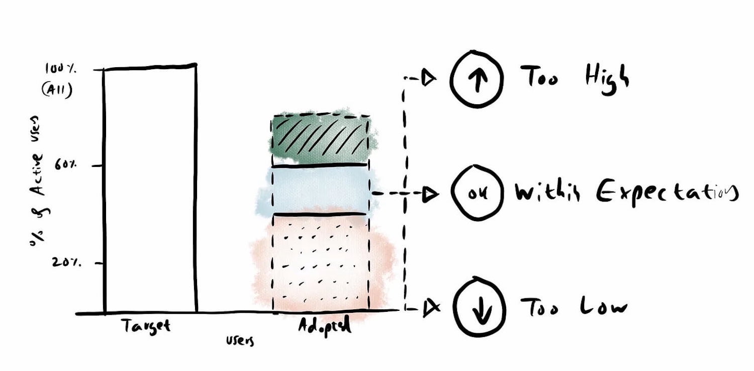
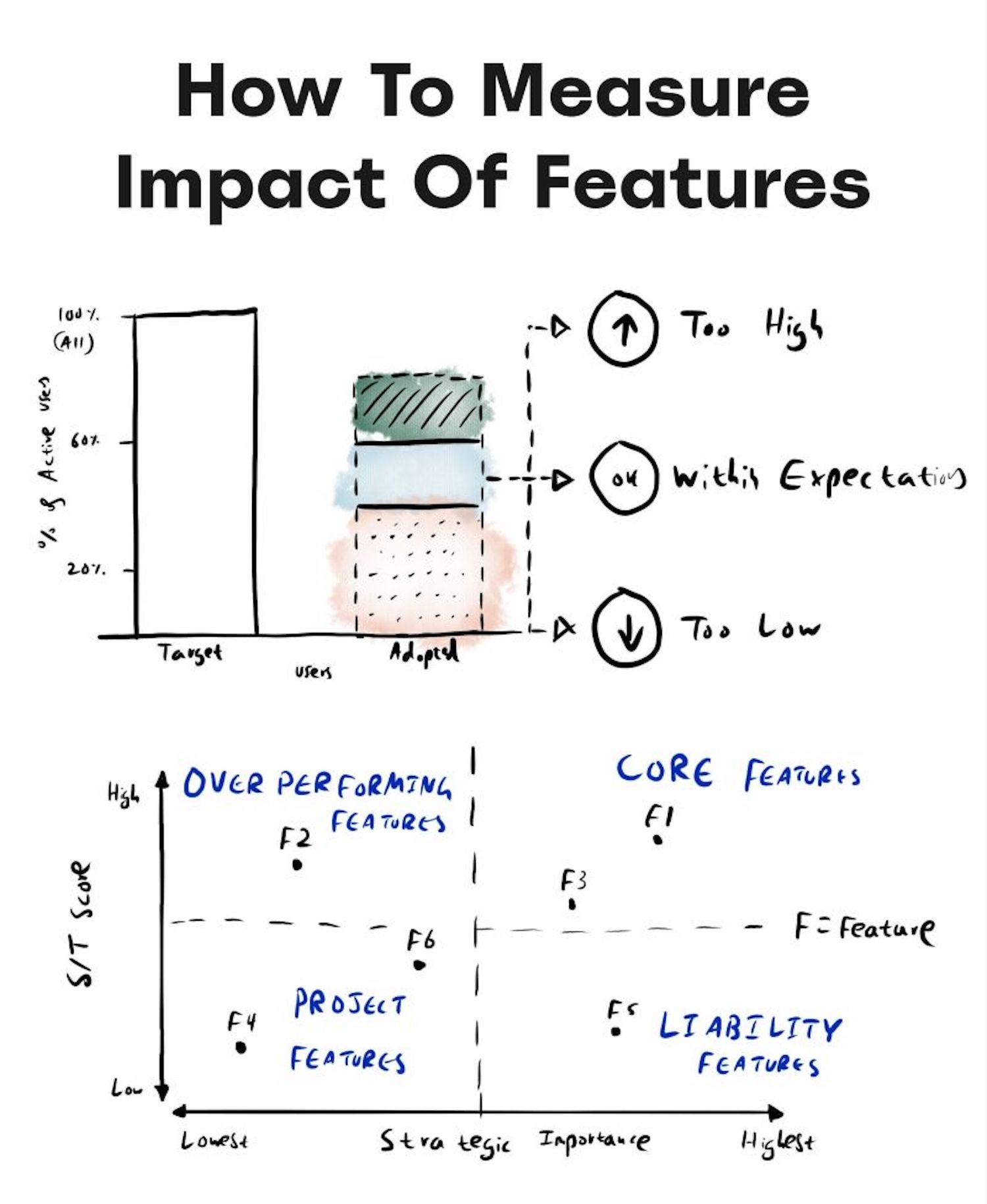
High adoption (over 60%) suggests the problem was significant. Low adoption (under 20%) may mean users already have workarounds, or that the feature's placement in the UI makes it undiscoverable. Low adoption is not automatically failure — if a problem affects only 10% of users, reaching 50–75% adoption within that group is a clear win.
Question to ask: "What percentage of active target users actually use the feature to solve that problem?"
Retention looks at whether users come back. Measuring how many adopted users return to the feature over time provides a strong signal of strategic importance. Retention above 50% indicates high strategic value, 25–35% medium, and 10–20% low.
Question to ask: "Of all the users who meaningfully adopted a feature, how many came back to use it again?"
Satisfaction Among Retained Users
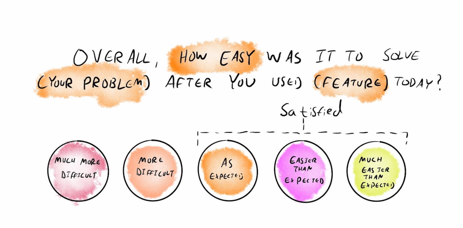
Asking all users for feedback is noisy and unhelpful. TARS targets only retained users — those who have used the feature repeatedly — and asks how easy it was to solve their problem compared to expectations. This surfaces issues that retention numbers alone cannot reveal.
Plotting Features on a Matrix
Once you have TARS data for every feature, you can calculate an S÷T score: the percentage of satisfied users divided by target users. Mapping all features on a 2×2 matrix by satisfaction and retention reveals useful categories:

- Overperforming features: low retention but high satisfaction — users don't need them often, but when they do, the feature works exceptionally well.
- Liability features: high retention but low satisfaction — these deserve improvement work.
- Core features: high on both dimensions — these anchor the product.
- Project features: low on both — candidates for deprioritization.
Why Conversion Rate Is Not a UX Metric
Conversion is frequently treated as the ultimate measure of product success, yet linking a specific design change to a conversion uplift is nearly impossible. Everyone on the team — sales, marketing, engineering, design — contributes to conversion, and external factors like seasonality muddy the picture further.
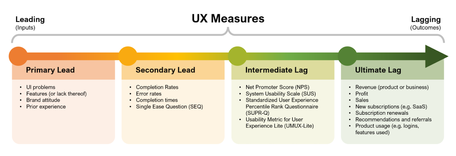
High conversion can happen despite poor UX when strong brand pull, aggressive urgency tactics, attractive pricing, brilliant marketing, customer loyalty, or a lack of alternatives drive users through the funnel. Conversely, low conversion can occur with excellent UX when offers don't match the audience, users distrust the brand, the business model is weak, marketing misses its target, or external conditions intervene.

Improved conversion is a positive outcome of good UX work, but it is not a diagnostic UX instrument. UX metrics measure task completion, time on task, error rates, and decision quality. Those are what reveal whether a feature genuinely helps people — and where the next design effort should go.
Complementing Product Metrics
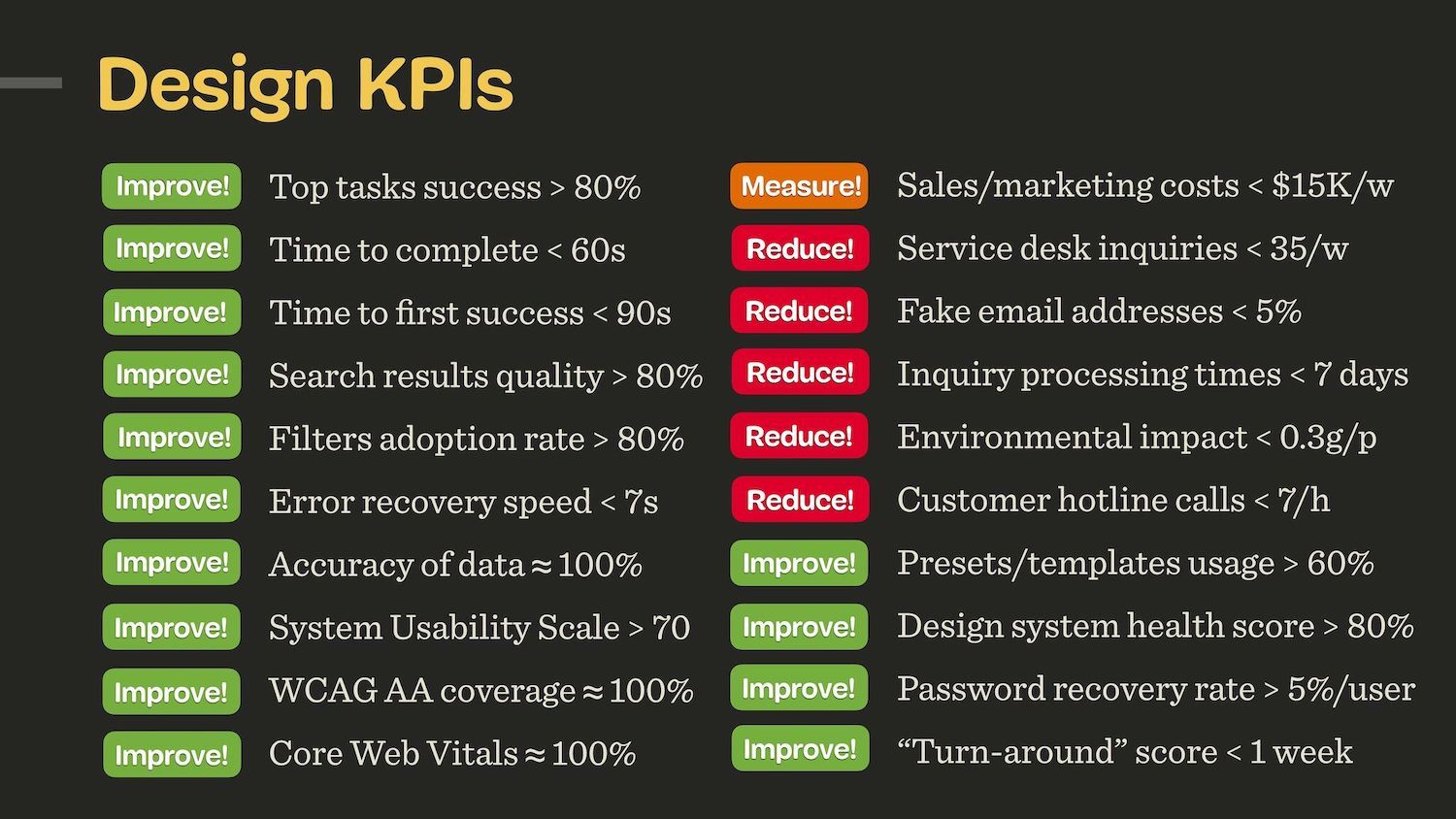
Product metrics alone give an incomplete picture. Strong sales can coexist with frustrated, inefficient users who remain only because they have no alternative tool. TARS ties customer usage patterns to customer experience in a repeatable way, giving teams a defensible basis for discussing priorities across design, product, and engineering. Depending on the project, extending TARS with additional UX-focused KPIs can fill in the remaining gaps.