

Setting the Stage for a Faster Web
Performance work has to start somewhere, and that somewhere is not with a bundler config or a new image format. Before any optimization, you need to define the environment you’re optimizing for. That means understanding the devices, networks, and browsers your users actually rely on — not the ones you test on in the office.
This is the foundation of any credible performance strategy. Without it, you’re guessing. With it, you can prioritize effectively and measure what matters.
Know Your Users’ Hardware and Connections
The most powerful machine on your desk tells you nothing about the median experience. A performance budget is only useful if it’s anchored to real-world constraints. The conversation starts with two blunt questions: What devices are your users on, and what kind of network are they using?
It’s tempting to assume a fast 4G or 5G connection for everyone. The reality is that mobile users are often on slower, metered connections, or they’re on public Wi-Fi that’s congested. Even on “fast” connections, latency and packet loss can make a mockery of raw bandwidth figures. Similarly, the hardware gap is enormous. A top-tier phone from two years ago can still outperform a budget Android device released this year when it comes to JavaScript execution and rendering.
Build a Baseline Profile
A practical approach is to construct a reference profile of the low-to-mid-range device you want to support. This isn’t about excluding high-end users; it’s about setting a floor. Think of it as a test device that runs on a mid-range CPU, with throttled network conditions simulating a 3G or slow 4G connection. This becomes your baseline for every audit.
Key elements of that baseline include:
- Device class: Define a slow-but-realistic CPU (e.g., a low-end mobile SoC) to target for all lab testing.
- Network throttling: Simulate a connection that reflects a poor mobile experience to expose payload and dependency issues.
- Browser behavior: Track how your site behaves on the least capable browser you intend to support.
Why Lab Data Isn’t Enough
Lab audits are essential for catching regressions, but they’re a controlled simulation. They can’t tell you about real-world variance caused by things like aggressive browser extensions, running background apps, or the user’s actual distance from a cell tower. That’s what Field Data (or Real User Monitoring, RUM) is for.
Field data captures the delays and pain points encountered by actual visitors on their actual devices. It’s the only way to know what your performance work is truly worth in production.
Map Metrics to User Experience
The old days of a single metric — like page load time — are gone. Performance is a multi-faceted problem that requires a nuanced view. Different metrics speak to different parts of the experience, from the initial response to interaction readiness. A solid measurement plan will combine laboratory settings for reproducible debugging with field data for real-world validity.
Diagnose, Then Optimize
Even with a perfect environment defined, performance work requires a clear process. A structured workflow based on repeatable diagnostics prevents aimless tweaking.
- Measure: Establish the current state through lab and field tools.
- Identify the bottleneck: Is the problem is JavaScript execution, network latency, or rendering cost?
- Optimize: Apply the technique that directly targets the diagnosed area (e.g., code-splitting, image optimization, or CSS containment).
- Re-test: Verify the impact using the same baseline and compare apples to apples.
This loop is only as good as the context you’ve defined at the start. Without a clear picture of the environment and the metrics for success, you aren’t optimizing for users — you’re just optimizing for a lighthouse score, which is a very different thing.
Building Blocks: Tools, Baselines, and Architecture Decisions
Choosing Your Build Tooling
Stick with what works for your team when it comes to build tools—whether that's Grunt, Gulp, Webpack, Parcel, or a combination. As long as the process is maintainable and meets your needs, there's no requirement to chase trends. While Rollup and Snowpack are gaining popularity, Webpack remains the most established option with hundreds of plugins for optimizing build sizes. Worth watching is the Webpack Roadmap 2021.
One promising recent strategy is granular chunking with Webpack in Next.js and Gatsby. By default, modules not shared across entry points can be requested for routes that don't need them, creating unnecessary overhead. Granular chunking uses a server-side build manifest file to determine which chunks are used by specific entry points, preventing duplicated code.
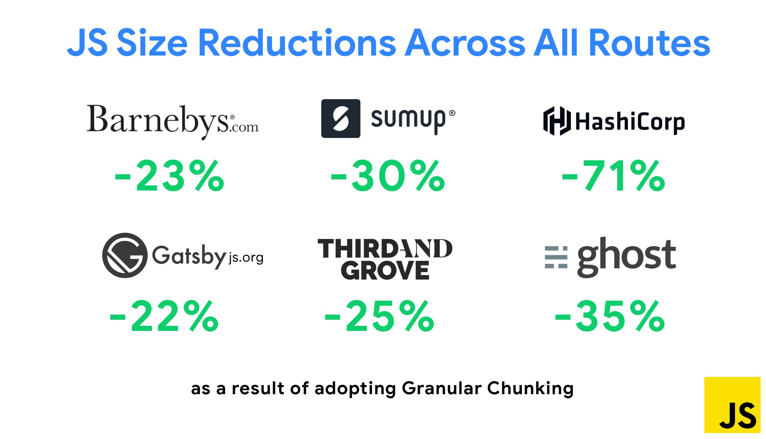
The SplitChunksPlugin creates multiple split chunks based on predefined conditions, improving page load time and caching during navigations. This shipped in Next.js 9.2 and Gatsby v2.20.7.
Webpack has a steep learning curve, but resources abound: the official documentation, Webpack — The Confusing Bits, and An Annotated Webpack Config, plus free courses such as Sean Larkin's Webpack: The Core Concepts and Webpack for Everyone. For practical examples, the Webpack examples repo offers hundreds of ready-to-use configurations, and awesome-webpack aggregates useful libraries and tools. Etsy's case study covers their migration from RequireJS to Webpack, managing over 13,200 assets in 4 minutes on average. For performance-focused tips, check Ivan Akulov's Twitter thread and the awesome-webpack-perf repo.
Baselines, Frameworks, and Cumulative Costs
Progressive enhancement remains a solid guiding principle: build the core experience first, then layer advanced features for capable browsers. This creates resilient experiences—if a site performs well on slow hardware and poor networks, it will only improve on better conditions. Adaptive module serving takes this further, delivering "lite" core experiences to low-end devices.
With many unknowns affecting loading—network conditions, thermal throttling, cache eviction, third-party scripts, disk I/O, and more—JavaScript carries the heaviest cost after web fonts and images. Performance bottlenecks have shifted from server to client, meaning developers must scrutinize network transfer, parse/compile time, and runtime costs. A 170KB budget that includes critical-path HTML/CSS/JavaScript, router, state management, utilities, framework, and application logic leaves no room for waste.
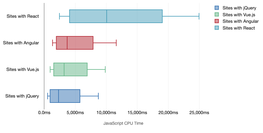
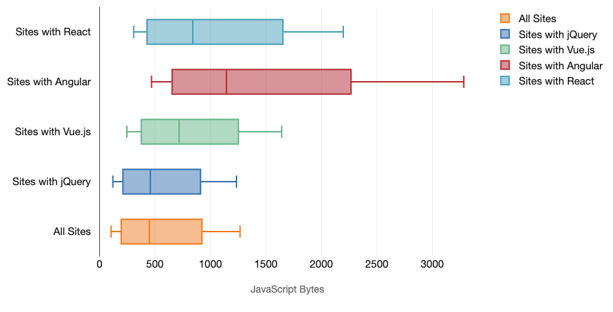
Tim Kadlec's research on the cost of JavaScript frameworks highlights the reality of multiple frameworks in use—an older jQuery module being migrated alongside legacy Angular applications. The cumulative cost of JavaScript bytes and CPU execution can render experiences barely usable even on high-end devices. Modern frameworks aren't prioritizing less powerful devices, so phone and desktop experiences differ dramatically. Sites with React or Angular typically spend more time on the CPU, and even in the best case, "using a framework means making a trade-off in terms of initial performance."
Not every project needs a framework, and not every page of an SPA needs one loaded. Netflix's case study is instructive: removing React and associated libraries from the client-side cut JavaScript by over 200KB, achieving a 50%+ reduction in Time-to-Interactivity for their logged-out homepage. They then prefetched React during the user's time on the landing page.
If you remove a framework from critical pages entirely, Gatsby users can try gatsby-plugin-no-javascript to strip all JavaScript from generated static HTML. On Vercel, disabling runtime JavaScript in production for specific pages is possible experimentally.
Framework costs are significant by default: 58.6% of React pages ship over 1 MB of JavaScript, and only 36% of Vue.js page loads achieve a First Contentful Paint under 1.5 seconds. According to a study by Ankur Sethi, React applications will never load faster than about 1.1 seconds on an average phone in India, Angular takes at least 2.7 seconds to boot up, and Vue users wait at least 1 second before interaction. SPAs can be made fast, but not out of the box—the time and effort to optimize (and stay optimized) must be budgeted. Lightweight options like Preact, Inferno, Vue, Svelte, Alpine and Polymer can handle many use cases.
When evaluating options, Seb Markbåge suggests measuring startup with a first render, deletion, and second render to see how framework code scales with reuse. Sacha Greif's 12-point scoring system covers features, accessibility, stability, performance, package ecosystem, community, learning curve, and more.
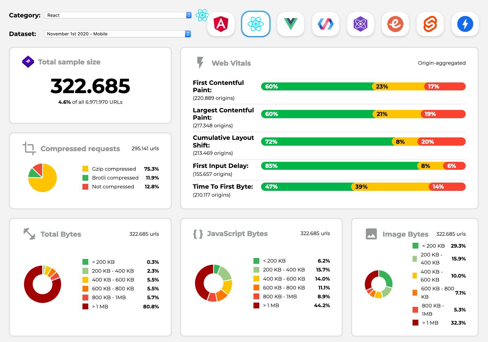
Long-term data is available through Perf Track, which tracks Core Web Vitals across Angular, React, Vue, Polymer, Preact, Ember, Svelte, and AMP, including comparisons for Gatsby, Next.js, Create React App, Nuxt.js, and Sapper sites. Default stacks like Gatsby, Next.js, Vuepress, Preact CLI, and PWA Starter Kit provide solid baselines for average mobile hardware, with web.dev framework-specific guidance for React and Angular.
An alternative to SPA architecture altogether: Turbolinks, a 15KB library that uses HTML instead of JSON, fetching pages on link follow, swapping the body and merging head without a full page load. See the Hotwire stack documentation for details.
Rendering: The Architecture Decision
The client-side versus server-side debate resolves to using both. Progressive booting aims for a quick First Contentful Paint via SSR, while keeping time-to-interactive close behind. Late-discovered JavaScript locks the main thread; avoid this by breaking functions into async tasks, using requestIdleCallback, and lazy-loading UI with dynamic import().
Time to Interactive (TTI) measures the first five-second window after initial render with no JavaScript task longer than 50ms (Long Tasks). A task over the threshold resets the search, causing the browser to flip between Interactive and Frozen states. After reaching Interactive, non-essential parts can boot on demand or as resources allow. Frameworks typically lack a simple priority concept for developers, making progressive booting difficult to implement.
Houssein Djirdeh and Jason Miller's work on Rendering on the Web and Modern Front-End Architectures outlines the available strategies:
- Full Server-Side Rendering (SSR): Classic approach where all requests render on the server, returning finished HTML. The FCP-to-TTI gap is small, avoiding round-trips, and HTML can stream to the browser—but server think time increases, hurting Time To First Byte.
- Static Rendering: Prerender all pages to static HTML with minimal JavaScript at build time. This requires generating HTML for every possible URL up front, but produces consistently fast TTFB. Netflix's approach demonstrates how this can cut loading and TTI by 50%.
- SSR With (Re)Hydration (Universal Rendering): Returns server-rendered HTML with a script loading a full client application. In theory ideal; in practice, the page looks ready but can't respond to input, causing rage clicks. The gap between FCP and TTI widens, and rehydration is expensive. React uses
ReactDOMServer'srenderToString; Vue hasvue-server-renderer; Angular offers@nguniversal; Next.js and Nuxt.js provide solutions out of the box. - Streaming SSR With Progressive Hydration: Renders multiple requests concurrently, sending content in chunks to improve TTFB (
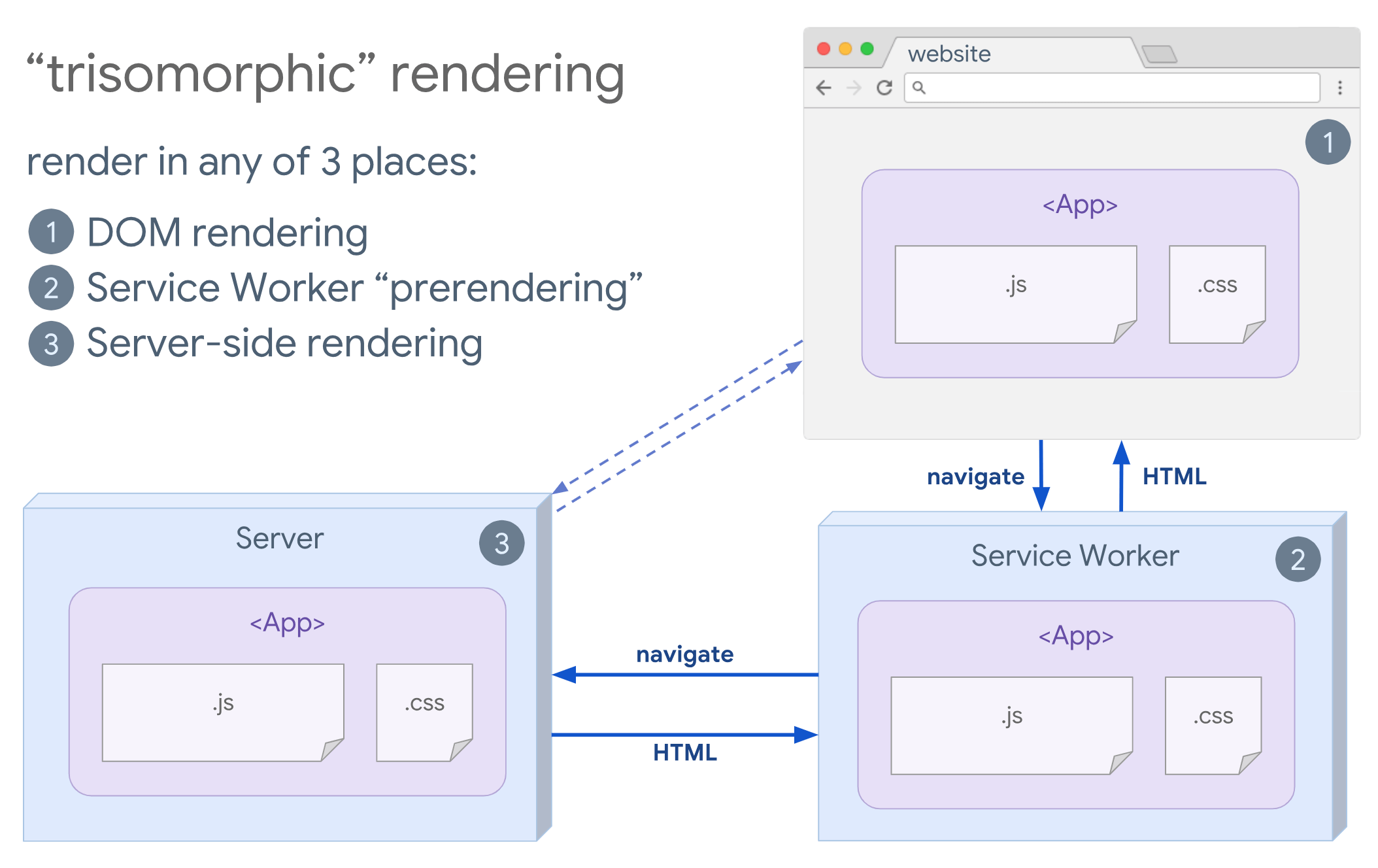
renderToNodeStream()in React,renderToStream()in Vue). Client-side, components are code-split and hydrated gradually by priority—critical parts first, others deferred until they're visible, needed for interaction, or the browser is idle. Vue developers have vue-lazy-hydration; partial hydration works with Preact and Next.js. - Trisomorphic Rendering: With service workers, streaming server rendering handles initial navigations, then the service worker takes over HTML rendering after installation, enabling SPA-style navigations within a session.
- CSR With Prerendering: Renders the application to static HTML at build time, capturing the initial state. Unlike SSR, the client must still boot the app for interactivity. Gatsby uses
renderToStaticMarkupinstead ofrenderToString; Vuepress and prerender-loader offer the same for their respective ecosystems. This improves TTFB and FCP but requires all URLs known ahead of time. - Full Client-Side Rendering (CSR): Everything happens on the client, creating a huge gap between FCP and TTI. Apps often feel sluggish, and aggressive code-splitting becomes critical. If interaction is minimal, SSR is generally a better choice; otherwise, the App Shell Model can help.
The best approach: limit full client-side frameworks to pages that require them, and don't rely on SSR alone for complex applications. Both done poorly are disasters. Render important pixels promptly, minimize the gap to TTI, prerender static content, stream HTML, and hydrate progressively, on visibility, or during idle time.
One clear opportunity: serving content statically from a CDN. Even with thousands of products and personalization, critical landing pages can be static HTML, decoupled from your framework. Static-site generators often produce very fast pages. Markus Oberlehner's guide shows how to combine Eleventy and Preact for partially hydrated, progressively enhanced sites.
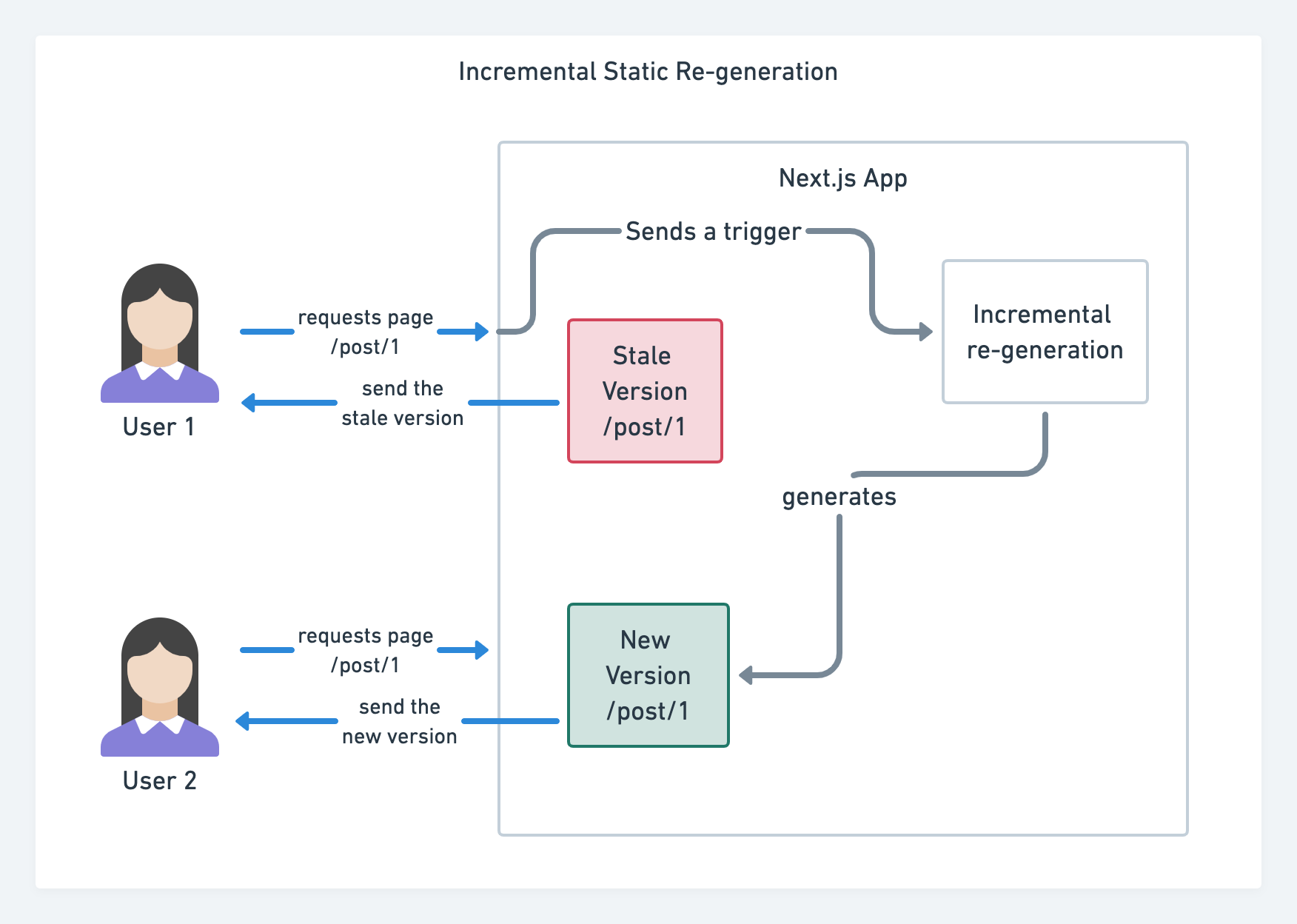
Large-scale JAMStack sites introduce build time concerns. Gatsby's incremental builds improve build times by 60 times with integrations into WordPress, Contentful, Drupal, and Netlify CMS. Next.js also offers incremental static regeneration: pages can be added at runtime and existing ones re-rendered in the background as traffic arrives.
Building applications, not just pages, benefits from the PRPL pattern and app shell architecture: push minimal code to render the initial route, cache resources with a service worker, and lazy-load routes asynchronously.
APIs and Content Delivery
API delays propagate directly to users. With REST, components drawing from multiple resources may require several round-trips, and responses often over- or under-fetch data. GraphQL addresses this: queries retrieve all needed data in a single request with an exact response, organized by its schema. The structure can eliminate JavaScript state management code. Getting started: designing a performant GraphQL server and understanding GraphQL performance.
Platform-specific formats—AMP, Facebook's Instant Articles, Apple News—offer guaranteed performance and built-in CDNs. But as Tim Kadlec notes, AMP documents tend to be faster than counterparts yet don't necessarily mean a page is performant. With AMP no longer required for Top Stories, adoption patterns are shifting. The downsides persist: maintaining separate versions and, for Instant Articles and Apple News, without actual URLs.
CDNs don't need to be limited to static content. Evaluate compression, image optimization at the edge, A/B testing support, edge-side includes, service worker support, and HTTP over QUIC (HTTP/3). Katie Hempenius's guide to CDNs covers selection and tuning—use Brotli, TLS 1.3, HTTP/2, and HTTP/3. Note that HTTP/2 prioritization is effectively broken on many CDNs, per research by Patrick Meenan and Andy Davies.
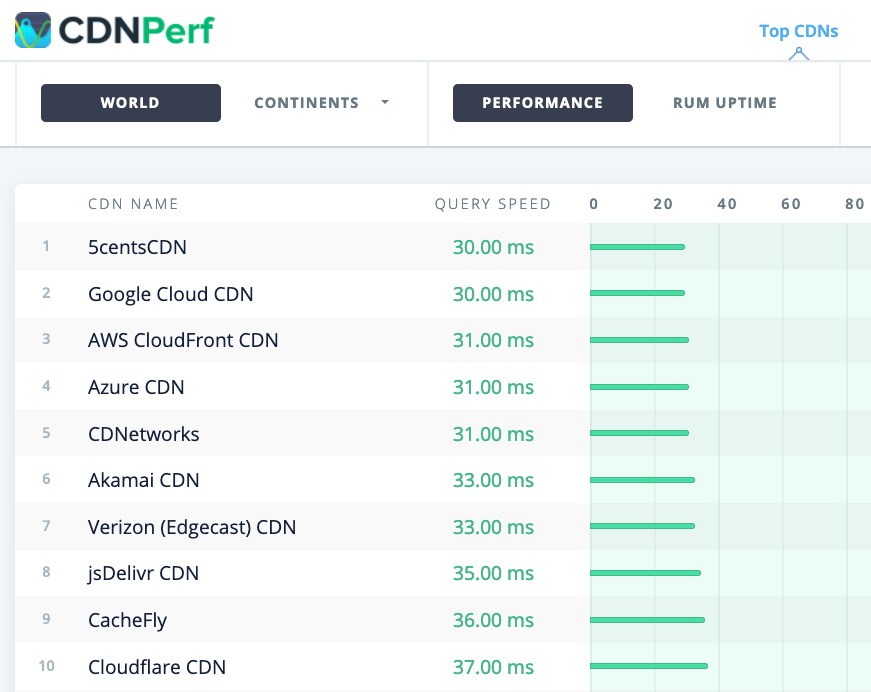
CDN comparison resources include CDN Comparison, CDN Perf (300 million daily tests based on real user monitoring), CDN Planet Guides, and the Web Almanac's CDN chapter.
The Baseline: Device Hardware, Network, And User Environment
Before you can optimize anything, you need to know exactly what conditions your site must perform under. This means defining the real-world environment of your users — not the idealized setup of your development machine or office connection. If your baseline assumptions are wrong, every subsequent decision about budgets, thresholds, and delivery strategies will be misguided.
Hardware Realities
Device performance is the first variable to pin down. You cannot assume your users are on the latest flagship phone or a high-end laptop. The hardware baseline you choose directly impacts what counts as a "fast" page load.
- Analyze your actual analytics data for device type, screen resolution, and available memory, not just the most common device name.
- Use a range of reference devices — from a low-end Android phone to a mid-range laptop — for all performance testing. A site that feels snappy on an iPhone 12 may be sluggish on a budget device from 2019.
- Test across both Wi-Fi and cellular connections. A connection type breakdown in your analytics will show you the real mix.
Low-end devices are not just slower at rendering; they also have less available memory and smaller disk caches. This affects how aggressively you can use caching strategies, and it makes JavaScript execution costs more significant. A heavy framework that takes 300ms to parse on a desktop may take over 1.5 seconds on a mid-range phone.
Network Conditions And Latency
Network speeds reported in analytics are often misleading. The "4G" label in Chrome DevTools represents a theoretical throughput that does not reflect real-world throttle, loss, or jitter. What matters for perceived performance is not raw bandwidth but round-trip time (RTT) and the number of requests in flight.
You should define not one but at least three reference network profiles:
- A fast profile: The best case you want to be excellent on, typically a modern 4G or 5G connection.
- A moderate profile: Your primary tuning target, representing a real mid-range connection with higher latency and some packet loss.
- A slow profile: A patience-testing fallback, like a 2G or severely degraded 3G connection, to verify your resilience strategies.
When you measure, always throttle both download and upload speeds, and set a realistic RTT. Throughput alone fails to capture the effect of request chain depth, where each round trip adds hundreds of milliseconds to the critical path.
The RTT: Performance Is Relative
The single most important measure in your network baseline is the unthrottled round-trip time between a test client and your server. Content delivery networks exist primarily to shrink this number by moving the server closer to the user. Your performance budget for network requests should be defined in terms of RTT, not in milliseconds of abstract load time.
For example, consider a user on a mid-range device over a real network. If your page requires three sequential round-trips for the critical resources (DNS, TCP/TLS, then the document plus CSS), the minimum possible time is three times the RTT, before even a single byte of render-blocking CSS is parsed. Reducing this chain is often more impactful than compressing payload sizes.
Establishing The Performance Budget
Once you have documented the hardware and network baselines, translate them into a concrete performance budget. The budget should specify hard limits on metrics you can measure consistently across your reference set:
- Maximum JavaScript bundle size on the critical path, in kilobytes.
- Maximum number of requests needed before first paint.
- Target Time to Interactive and Largest Contentful Paint for the moderate device profile.
- Maximum total page weight for initial load on the slow network profile.
These budgets give your team a guardrail. They make trade-offs explicit — for instance, deciding that a library that adds 50KB is only acceptable if the measured LCP under the moderate profile stays under budget. Without this environment definition, optimization discussions tend to focus on micro-benchmarks of the lab rather than on what users actually experience.
Continuous Monitoring Against The Baseline
The environment you define today will not be the environment your users have in six months. Continually re-validate the baseline assumptions. Track when average trending device types shift, when mobile data plans start allowing more requests at higher speeds, and when your Core Web Vitals field data starts deviating from lab results.
Use lab testing with the fixed reference profiles for debugging and regression testing, but treat field data from the Crux report or similar sources as the ground truth for whether the defined baseline matches reality. If field data says your typical user is on a slower cell connection than you assumed, reevaluate your budgets. A baseline is a living document, not a comma-separated value file you set up once and forget.



