Shipping Less, Faster: The Asset-Size Battle
Improving front-end performance in 2021 still starts with a simple, brutal question: how much code are you actually sending? Every kilobyte of JavaScript, CSS, and images has a cost that compounds across slow networks and low-end devices. The most effective optimization is often the most unglamorous one — reducing the size of what you ship.
Budgeting for Bytes
Setting a hard performance budget is the only way to prevent regressions from creeping in over time. A budget forces you to define what “fast” means for your project before you ship, rather than after users complain.
- Baseline budgets: Establish a maximum page weight for JavaScript, CSS, and total page weight. Use tools that fail your CI build when the budget is exceeded.
- Metered delivery: Treat your bundle size like a utility bill. Know what you are paying per page load and flag spikes immediately.
- Team awareness: Make the budget visible in pull requests. If a new dependency costs 50 KB, that trade-off should be a conscious decision, not an accident.
The Weight of JavaScript
JavaScript remains the most expensive resource on the web. It is not just the download time; the browser must parse, compile, and execute it, and that processing often happens on the main thread, blocking interactivity.
Common strategies for reducing JS payloads:
- Code-splitting: Break your bundle into smaller chunks that load on demand via dynamic
import(). - Tree-shaking: Remove unused exports from your dependencies, letting bundlers like webpack or Rollup eliminate dead code.
- Module/nomodule pattern: Ship modern, smaller ES2015+ code to modern browsers and a transpiled fallback only to legacy ones. This often cuts ~20% off the JS weight.
Evaluating Dependencies
Every library you add is a maintenance and performance cost. Before installing a package, check its size and its dependency tree. Tools like bundlephobia.com show you the minified and gzipped size of any npm package, and webpack-bundle-analyzer gives you a visual breakdown of what is inside your final bundles.
Be honest about what you truly need. A utility that is used in three places might be better implemented in a few lines of vanilla JavaScript than pulling in a full library.
“The fastest request is the one that never happens — and the fastest code is the code that is never parsed.”
CSS: Keep It Lean
CSS is render-blocking by default, so every byte of CSS delays the first render. While CSS is generally cheaper to process than JavaScript, it still competes for bandwidth and parsing time.
- Critical CSS: Inline the styles needed for above-the-fold content and load the rest asynchronously. This removes the render-blocking penalty for the initial view.
- Unused CSS removal: Tools such as
PurgeCSSorUnCSSscan your templates and strip out selectors that never appear in your markup. A CSS framework’s reset alone often ships far more rules than the page actually uses. - Media query splitting: Loading a large desktop stylesheet on mobile wastes bytes. Serve a base stylesheet and load breakpoint-specific files where supported.
Image Optimization
Images often account for the majority of a page's weight. They are also the resource users are most likely to notice — nobody wants to wait for a blurry placeholder to resolve.
The optimization workflow remains constant:
- Compress aggressively: Run all images through tools like
imageminorSquooshat the highest compression that does not show visual artifacts. - Choose modern formats: Use
WebP(andAVIF, where supported) instead of JPEG or PNG. They offer significantly better compression at similar quality. - Right-size dimensions: Never send a 4000px image to a 300px viewport. Generate multiple sizes and let the browser pick via
srcsetandsizes. - Lazy-load below the fold: The native
loading="lazy"attribute on<img>elements defers offscreen images until the user scrolls near them, saving bandwidth and memory.
Decoding Overhead
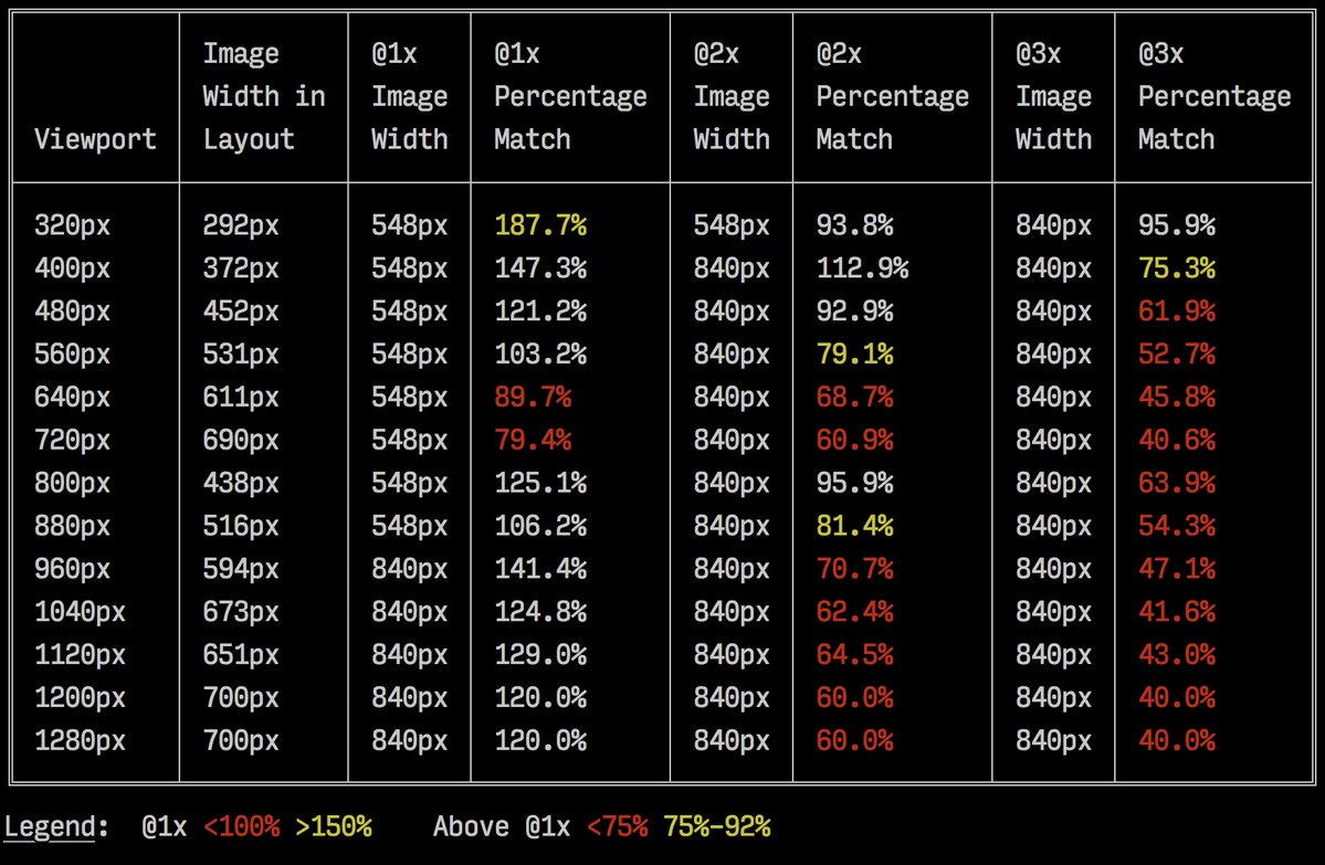
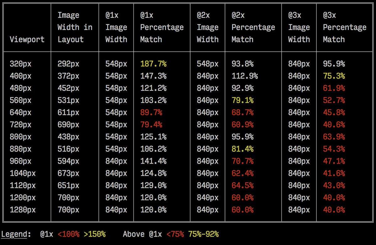
Image size is not the only cost. Large images can consume a disproportionate amount of memory during decoding, especially on mobile devices. When you serve a highly compressed 2000-pixel-wide hero image, the browser still decodes it at its full rendered size and holds it in memory. Be aware of the interplay between image dimensions and device memory. Keep in mind the rendered layout size; you do not benefit from sending more pixels than the browser will display.
The Future of Image Delivery
CDNs and image services have made the optimization process less manual. Rather than pre-generating every transformation, services like imgix or Cloudinary allow you to request resizing and format conversion via URL parameters. This lets you serve adaptive, format-negotiated images with minimal build-time configuration, freeing your team to focus on the design and content rather than the asset pipeline.

Compression and Image Delivery: Getting the Easy Wins
Brotli for Text Compression
Brotli, the open-source lossless data format introduced by Google in 2015, is now supported in all modern browsers. It provides better compression ratios than Gzip for plain text payloads when properly configured. While higher compression levels in the encoder demand more CPU in exchange for lower file sizes, Brotli decompresses quickly regardless of the chosen level.
If your site already uses Gzip, expect improvement in size reduction and First Contentful Paint timings by shifting to Brotli — studies show results ranging from single-digit to double-digit percentage gains. Many CDNs support Brotli, including Akamai, Netlify Edge, AWS, KeyCDN, Fastly, Cloudflare, and CDN77.
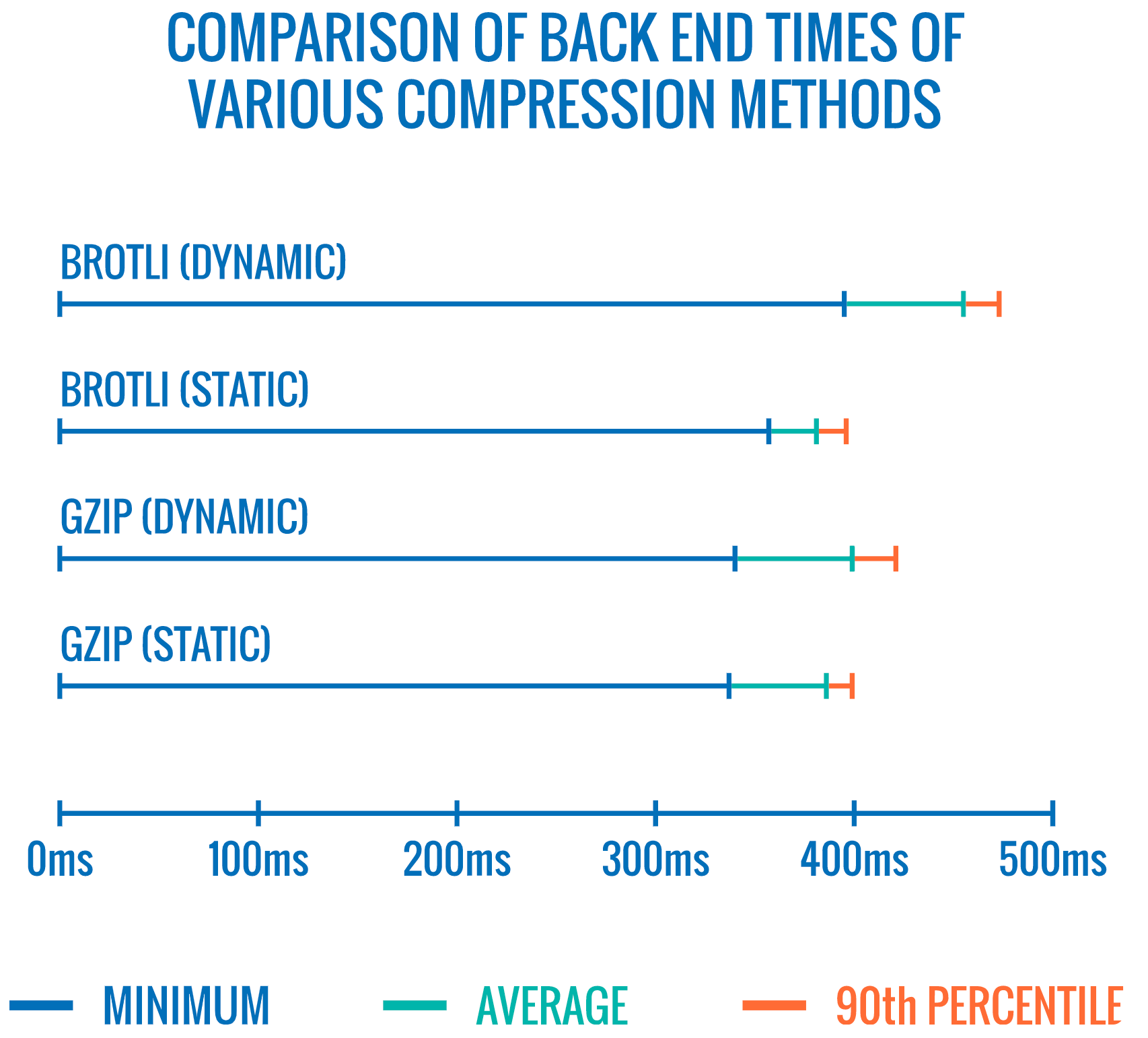
However, dynamically compressing all assets at high compression levels is expensive, and the cost can nullify the benefits. At the highest level, the time required for the server to begin responding while waiting to compress the asset could undo any payload savings.
The Brotli file format features a built-in static dictionary that supports multiple transformations. Felix Hanau's research at Cloudflare shows it's possible to improve compression at levels 5 through 9 by leveraging a "more specialized subset of the dictionary than the default," using the Content-Type header to apply an appropriate dictionary for HTML, JavaScript, or CSS. This yields "negligible performance impact (1% to 3% more CPU compared to 12% normally) when compressing web content at high compression levels, using a limited dictionary use approach."

Elena Kirilenko's research similarly demonstrates fast, efficient Brotli recompression using previous compression artifacts. When dynamic content resembles known-in-advance templates — such as JavaScript bundle subsets, dynamic HTML from templates, or dynamically subsetted WOFF2 fonts — removing 10% of content yields a 5.3% compression improvement and 39% faster compression speed. Even with 50% content removal, compression rates improve 3.2% and speed improves 26%.
For a practical strategy: pre-compress static assets with Brotli and Gzip at the highest level during build time, and compress dynamic HTML on-the-fly with Brotli at levels 4–6. Ensure your server handles content negotiation properly between Brotli and Gzip.
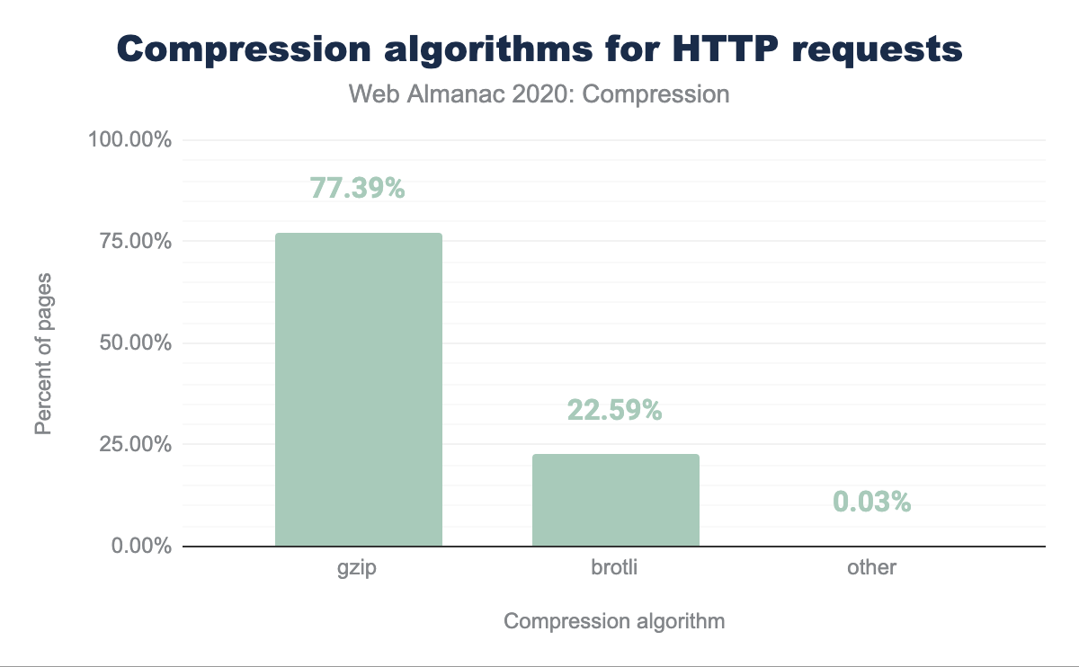
Despite these gains, as of early 2021 approximately 60% of HTTP responses still arrive with no text compression at all, while only 9.1% use Brotli. For many sites, simply enabling compression remains one of the easiest wins.
Choosing Image Workflows: From Client Hints to AVIF
Responsive images with srcset, sizes, and the picture element remain essential, but Client Hints extend this picture. Client hints are HTTP request header fields — including DPR, Viewport-Width, Width, Save-Data, and Accept — that server the server about the browser, screen, and connection, allowing the server to deliver appropriately sized images in correct formats. As Ilya Grigorik explains, client hints aren't an alternative to responsive images: "The picture element provides the necessary art-direction control in the HTML markup. Client hints provide annotations on resulting image requests that enable resource selection automation."
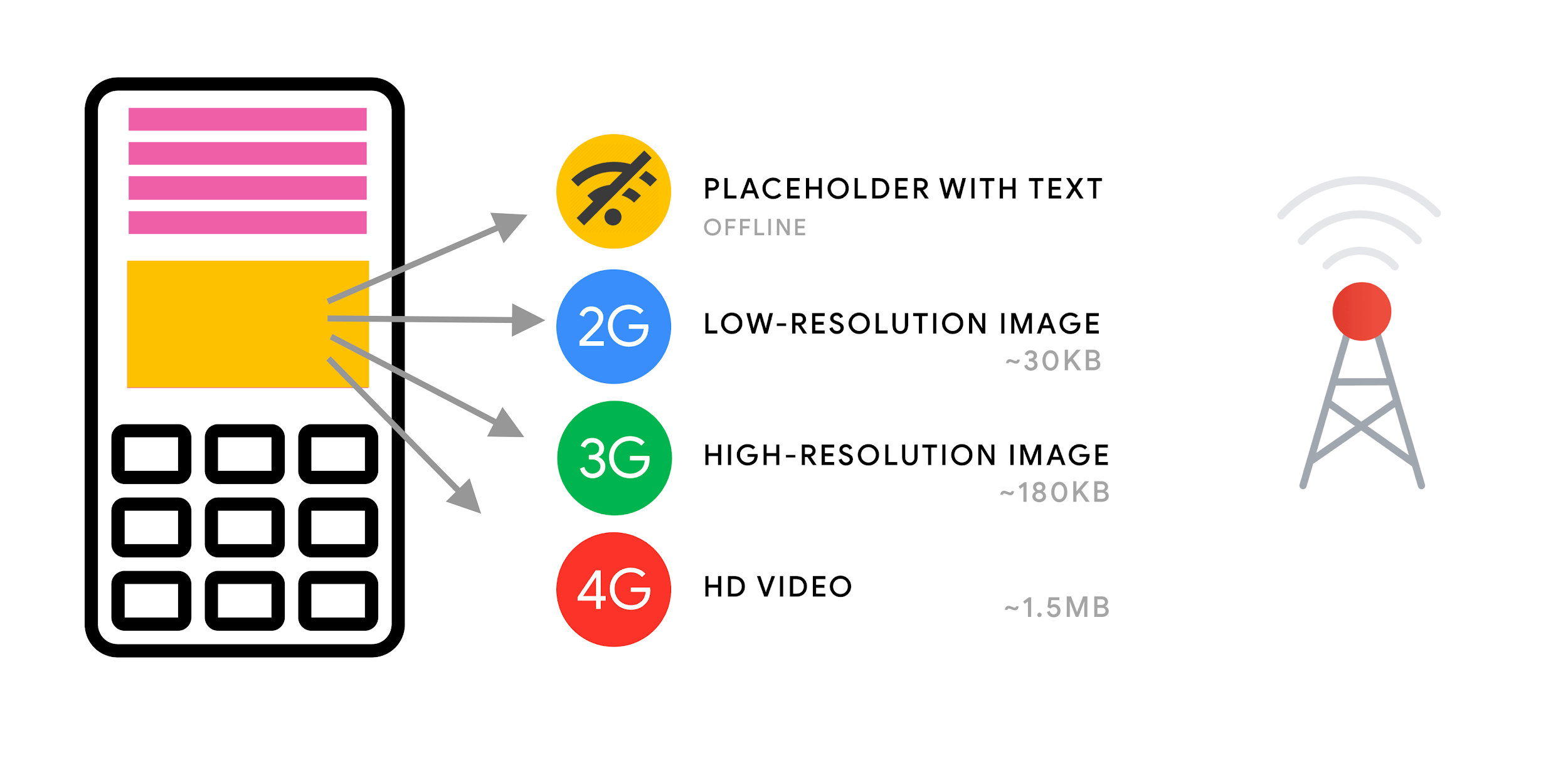
For supporting browsers, measurements indicate potential byte savings on images of 42%, with 1MB+ fewer bytes for the 70th percentile of users. Smashing Magazine itself saw 19–32% improvement. Client hints are supported in Chromium-based browsers but remain under consideration in Firefox.
For background images, use image-set, now supported in Safari 14 and most modern browsers except Firefox, to conditionally serve low-resolution and high-resolution images via 1x and 2x descriptors:
background-image: url("fallback.jpg");
background-image:
  image-set( "photo-small.jpg" 1x,
    "photo-large.jpg" 2x,
    "photo-print.jpg" 600dpi);
With WebP now supported in all modern browsers following Apple's addition in Safari 14, it's time to adopt the format while keeping a JPEG fallback. However, WebP does not support progressive rendering like JPEG — users may actually see a finished JPEG image faster over the network, even if the WebP payload is smaller.
AVIF meanwhile, derived from AV1 video keyframes, "very consistently outperforms JPEG in a very significant way. This is different from WebP which doesn't always produce smaller images than JPEG," notes Malte Ubl. Compared to WebP and JPEG, AVIF yields median file size savings up to 50% at the same structural similarity. One of the first image formats to support HDR color, AVIF currently lacks progressive image decoding and slow encoding (though decoding is fast). It's now supported in Chrome, Firefox, and Opera.
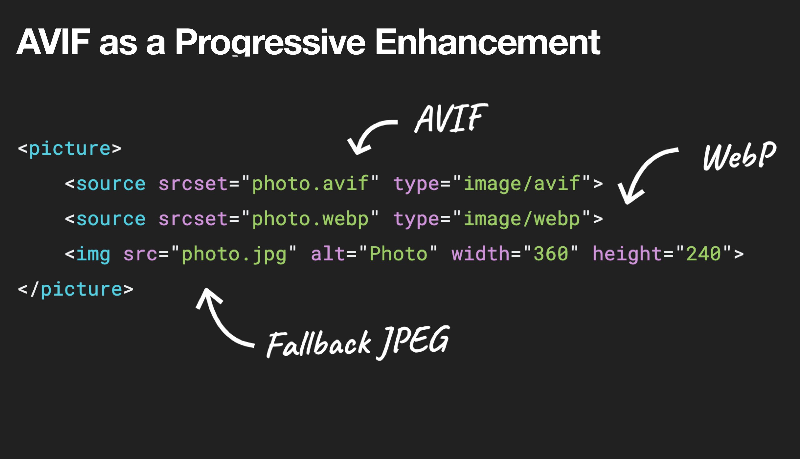
A sensible serving strategy uses the picture element with content negotiation, falling back from AVIF to WebP and then to JPEG where needed:
<picture>
  <source type="image/avif">
  <source type="image/webp">
  <img src="image.jpg" alt="Photo" width="450" height="350">
</picture>
<picture>
<source


  type="image/avif"
/>
<source


  type="image/webp"
/>
<source


  type="image/jpeg"
/>
  <img src="fallback-image.jpg" alt="Photo" width="450" height="350">
</picture>
To respect user preferences, swap animated images with static ones when visitors have opted into reduced motion:
<picture>
  <source media="(prefers-reduced-motion: reduce)" type="image/avif"></source>
  <source media="(prefers-reduced-motion: reduce)" type="image/jpeg"></source>
  <source type="image/avif"></source>
  <img src="motion.jpg" alt="Animated AVIF">
</picture>
AVIF is gaining a supporting ecosystem: Squoosh, AVIF.io, and libavif handle encoding and conversion; Jake Archibald's Preact component decodes files in a worker; PostCSS plugins and Cloudflare Workers enable progressive delivery. For animations, testing shows performance order of formats is roughly AVC1 (h264), HVC1, WebP, AVIF, and GIF — MP4 still outperforms AVIF for animation.

Fine-Tuning JPEG, PNG, SVG and the Assets Around Them
For critical hero images, ensure JPEGs are progressive and compressed with mozJPEG (which improves start rendering time) or Google's Guetzli encoder — though be prepared for slow processing times, potentially a minute of CPU per megapixel. Use Pingo for PNG, and SVGO or SVGOMG for SVG. Keep vector assets tidy: clean up unused assets, remove unnecessary metadata, and reduce path points.
Several tools help automate this work:
- Squoosh compresses, resizes, and manipulates images at optimal levels.
- Guetzli.it handles JPEG compression where image context suits it.
- Responsive Image Breakpoints Generator or services like Cloudinary and Imgix automate responsive workflows;
srcsetandsizesalone also provide large gains. - imaging-heap measures responsive markup efficiency across viewports and device pixel ratios.
- GitHub Actions for image compression prevents uncompressed images from reaching production.
- BlurHash provides short strings representing image placeholders for early display.
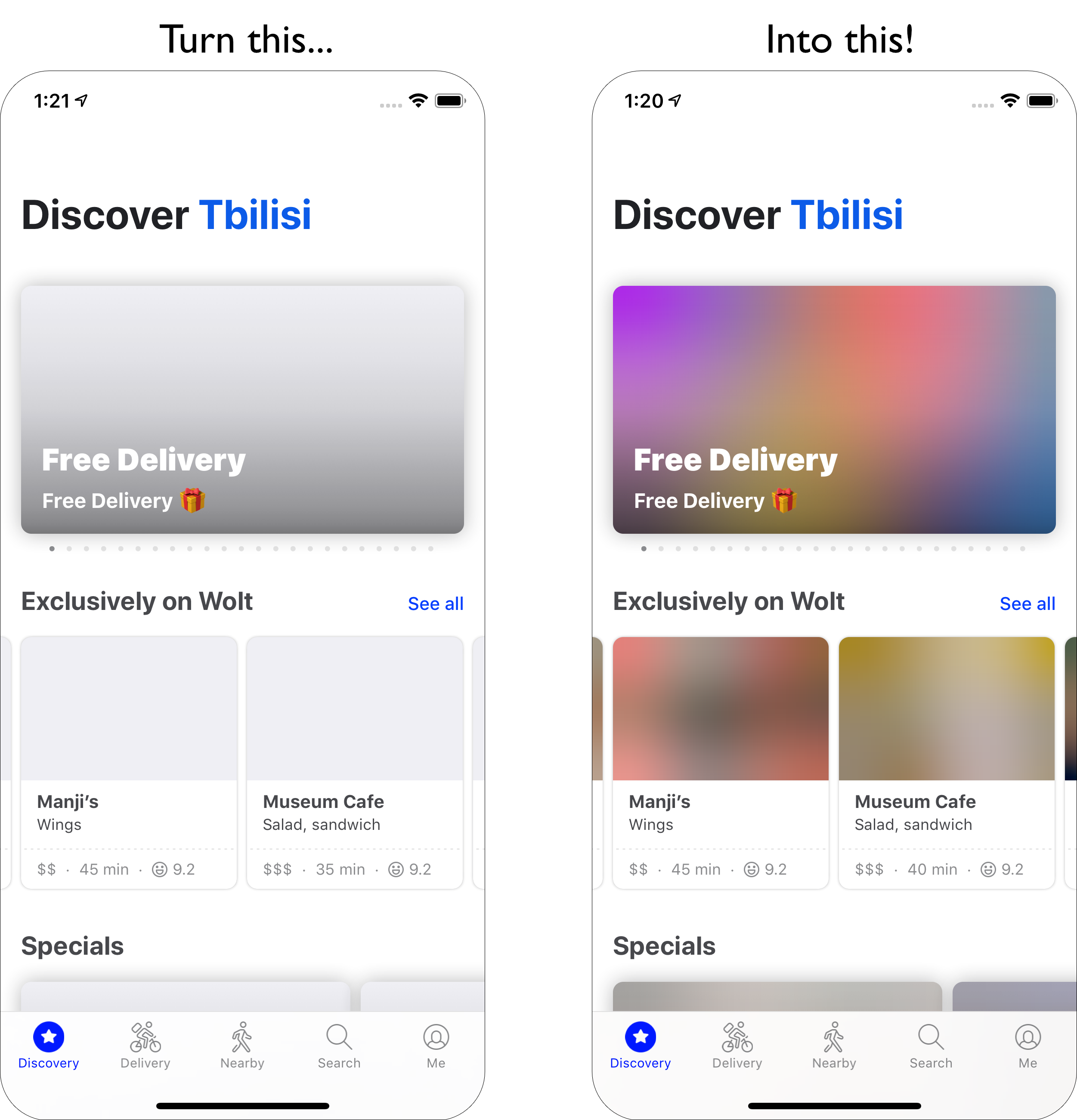
Optimizing image files alone may not suffice. To improve the time before critical images start rendering, lazy-load less important images and defer scripts until after critical images have rendered. Use the hybrid approach: native lazy-loading combined with a library detecting visibility changes via IntersectionObserver. Attribute-conscious practices matter too: set width and height to prevent layout shifts, watch for CSS aspect-ratio, and carefully manage what triggers downloads — carousels, accordions, and galleries often fetch images that never display.
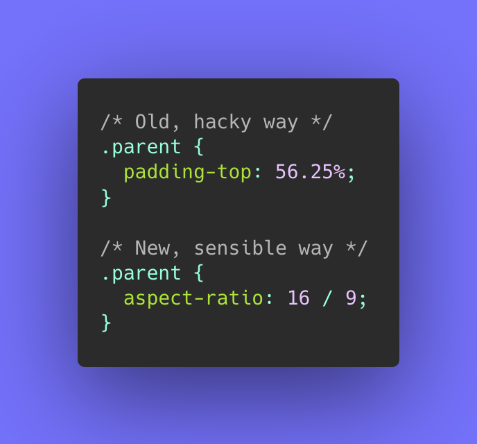
For aggressive techniques, Edge workers on a CDN can chop and rearrange HTTP/2 streams to control image delivery in real time. Perceived performance also improves via multiple background image techniques, applying blur, adjusting contrast, or stripping colors to reduce file size. For enlarging smaller photos without quality loss, tools such as Letsenhance.io exist.
Beyond Images: Video and Fonts
Video Delivery and Format Choices
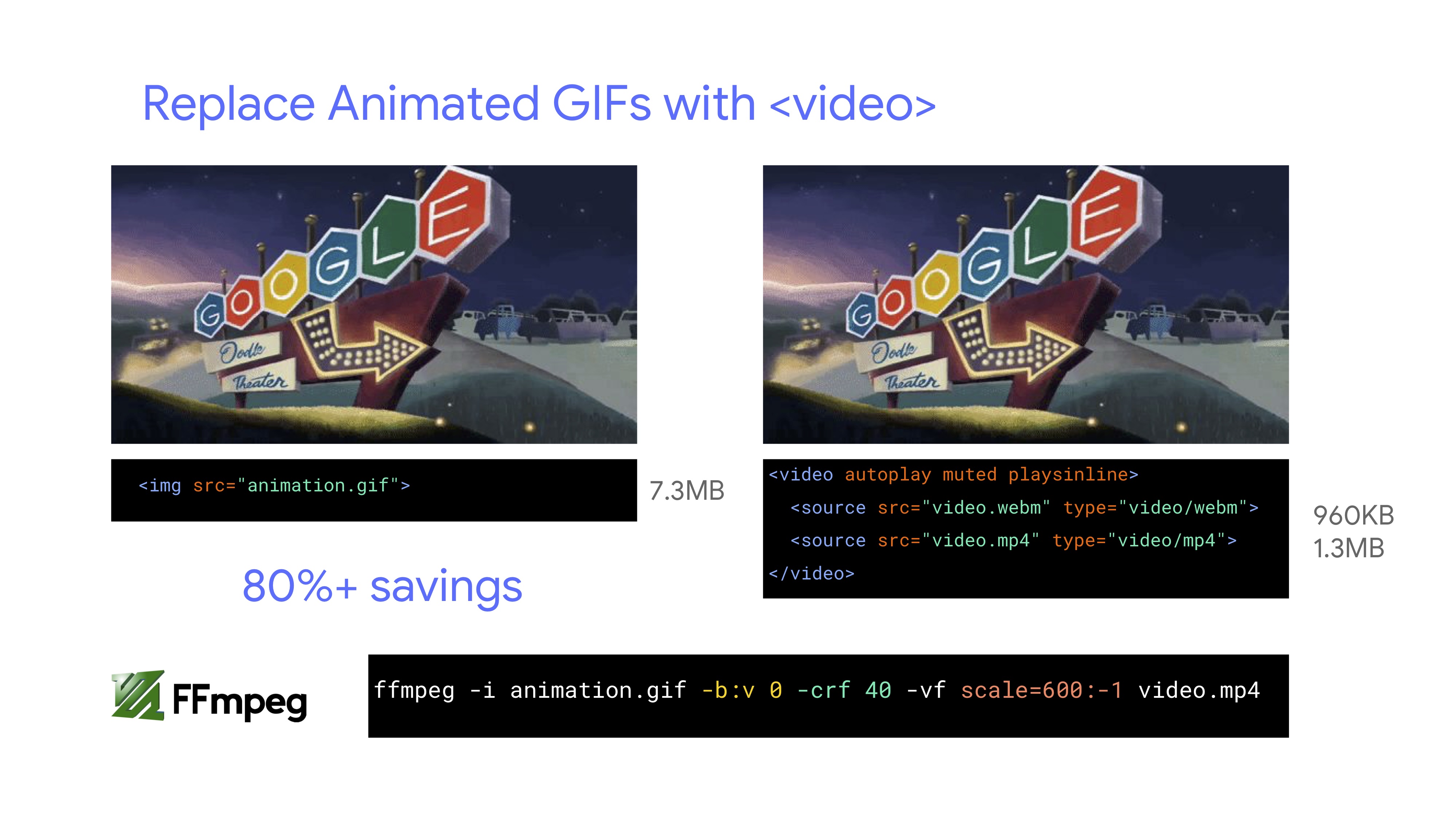
It is time to abandon GIFs in production. Switch to animated WebP (with GIF fallback) or looping HTML5 videos, which browsers don't preload but are dramatically lighter. Testing from Colin Bendell shows inline img-tag videos in Safari Technology Preview display at least 20× faster and decode 7× faster than GIF equivalents.
<!-- By Houssein Djirdeh. https://web.dev/replace-gifs-with-videos/ -->
<!-- A common scenartio: MP4 with a WEBM fallback. -->
<video autoplay loop muted playsinline>
  <source src="my-animation.webm" type="video/webm">
  <source src="my-animation.mp4" type="video/mp4">
</video>
Video encoding has moved forward significantly. AV1, released by the Alliance of Open Media, offers compression comparable to H.265 but without licensing fees, achieving roughly twice the compression of WebM. AV1 is gaining browser support and its use within the video element is reasonable.

For maximum compatibility, MP4s served with H.264 remain the standard. Ensure MP4s use multipass encoding, move the moov atom metadata to the file header, enable byte serving, and consider providing a WebM alternative. For large background videos, display the first frame as a poster image or a looping, heavily optimized segment before playing the full video once buffered. Responsive poster support can be layered on with JavaScript libraries where custom posters per screen size are needed.
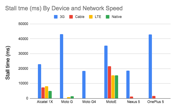
Video performance directly affects user retention, with abandonment increasing roughly 5.8% for each additional second of startup delay beyond a 2-second threshold. Since small screen devices don't need 720p or 1080p streams, either serve smaller video versions tailored by JavaScript detection or use HLS streaming for adaptive bitrate negotiation.
<!-- Based on Doug Sillars's post. https://dougsillars.com/2020/01/06/hiding-videos-on-the-mbile-web/ -->
<video id="hero-video"
          preload="none"
          playsinline
          muted
          loop
          width="1920"
          height="1080"
          poster="poster.jpg">
<source src="video.webm" type="video/webm">
<source src="video.mp4" type="video/mp4">
</video>
To conserve bandwidth, add the preload="none" attribute so browsers download no video until needed, and insert autoplay only for displays over a certain size threshold:
<!-- Based on Doug Sillars's post. https://dougsillars.com/2020/01/06/hiding-videos-on-the-mbile-web/ -->
<video id="hero-video"
          preload="none"
          playsinline
          muted
          loop
          width="1920"
          height="1080"
          poster="poster.jpg">
<source src="video.av1.mp4" type="video/mp4; codecs=av01.0.05M.08">
<source src="video.hevc.mp4" type="video/mp4; codecs=hevc">
<source src="video.webm" type="video/webm">
<source src="video.mp4" type="video/mp4">
</video>
/* By Doug Sillars. https://dougsillars.com/2020/01/06/hiding-videos-on-the-mbile-web/ */
<script>
    window.onload = addAutoplay();
    var videoLocation  = document.getElementById("hero-video");
    function addAutoplay() {
        if(window.innerWidth > 1000){
            videoLocation.setAttribute("autoplay","");
      };
    }
</script>
Web Font Loading, Done Deliberately
First, question the necessity of web fonts at all — system-ui stacks meet many product needs. If web fonts are required, they should be subsetted. Use Glyphhanger, Fontsquirrel, or command-line automation via subfont, which analyzes the page and injects only the optimal font subsets.
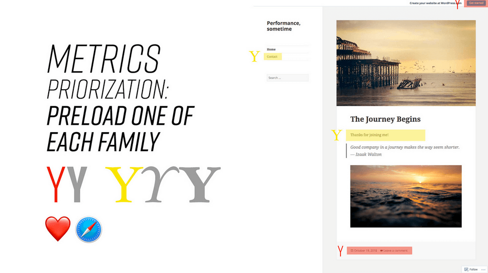
WOFF2 support is excellent, making it the primary delivery format alongside WOFF for legacy fallbacks. Among the many loading strategies, Zach Leatherman's "Critical FOFT with preload" and "The Compromise" provide a two-stage render: load a small supersubset for fast initial rendering, then load the rest of the family asynchronously. Reserve preload usage carefully — injected hints placed just before blocking scripts delay discovery without compromising first render time — and limit preloading to one or two fonts per family.
Avoid relying on the local() value in @font-face declarations. A locally installed font with the same name frequently differs from its web counterpart in rendering, missing OpenType features, or altered line heights, notes Bram Stein. Mixing locally installed fonts with web fonts is therefore discouraged — Google Fonts has accordingly disabled local() in returned CSS for all users except Android requests for Roboto.
Whatever the loading method, choose a font-display strategy: optional offers text readability immediately, while swap introduces a 3-second timeout before fallback text appears. For minimizing reflow entirely, group repaints via the Font Loading API — create FontFace objects, fetch all fonts, then apply them together exactly once:
/* Warning! Not a good idea! */
@font-face {
  font-family: Open Sans;
  src: local('Open Sans Regular'),
       local('OpenSans-Regular'),
       url('opensans.woff2') format ('woff2'),
       url('opensans.woff') format('woff');
}
/* Load two web fonts using JavaScript */
/* Zach Leatherman: https://noti.st/zachleat/KNaZEg/the-five-whys-of-web-font-loading-performance#sWkN4u4 */

// Remove existing @font-face blocks
// Create two
let font = new FontFace("Noto Serif", /* ... */);
let fontBold = new FontFace("Noto Serif, /* ... */);

// Load two fonts
let fonts = await Promise.all([
font.load(),
fontBold.load()
])

// Group repaints and render both fonts at the same time!
fonts.forEach(font => documents.fonts.add(font));
To begin fetching early without blocking, hide a non-breaking space inside the body with visually-hidden classes while CSS fonts toggle between loading states under Font Loading API control:
<body class="no-js">
  <!-- ... Website content ... -->
  <div aria-visibility="hidden" class="hidden" style="font-family: '[web-font-name]'">
      <!-- There is a non-breaking space here -->
  </div>
  <script>
    document.getElementsByTagName("body")[0].classList.remove("no-js");
  </script>
</body>
body:not(.wf-merriweather--loaded):not(.no-js) {
  font-family: [fallback-system-font];
  /* Fallback font styles */
}

.wf-merriweather--loaded,
.no-js {
  font-family: "[web-font-name]";
  /* Webfont styles */
}

/* Accessible hiding */
.hidden {
  position: absolute;
  overflow: hidden;
  clip: rect(0 0 0 0);
  height: 1px;
  width: 1px;
  margin: -1px;
  padding: 0;
  border: 0;
}
Self-hosting static assets remains a best practice; google-webfonts-helper makes this easy. Otherwise, understand the HTTP cache partitioning introduced in Chrome v86 — cross-site resources like fonts can no longer share a CDN cache. Harry Roberts' "fastest Google Fonts" snippet offers workarounds:
<!-- By Harry Roberts.
https://csswizardry.com/2020/05/the-fastest-google-fonts/

- 1. Preemptively warm up the fonts’ origin.
- 2. Initiate a high-priority, asynchronous fetch for the CSS file. Works in
-    most modern browsers.
- 3. Initiate a low-priority, asynchronous fetch that gets applied to the page
-    only after it’s arrived. Works in all browsers with JavaScript enabled.
- 4. In the unlikely event that a visitor has intentionally disabled
-    JavaScript, fall back to the original method. The good news is that,
-    although this is a render-blocking request, it can still make use of the
-    preconnect which makes it marginally faster than the default.
-->

<!-- [1] -->
<link rel="preconnect"
      href="https://fonts.gstatic.com"
      crossorigin />

<!-- [2] -->
<link rel="preload"
      as="style"
      href="$CSS&display=swap" />

<!-- [3] -->
<link rel="stylesheet"
      href="$CSS&display=swap"
      media="print" onload="this.media='all'" />

<!-- [4] -->
<noscript>
  <link rel="stylesheet"
        href="$CSS&display=swap" />
</noscript>
Complement font choices with modern capabilities: unicode-range to slice fonts into language-specific sets, style matching tools to avoid jarring layout shifts, and @font-face descriptors for overriding font metrics (available in Chrome 87). For data-sensitive or motion-sensitive users, conditionally skip web font downloads via the Save-Data header, Network Information API, prefers-reduced-data, or prefers-reduced-motion. Measure outcomes with metrics like "All Text Visible" and "Web Font Reflow Count," and account for how variable fonts can reduce total font payload while concentrating all weight onto a single request. With progressive font enrichment on the horizon, browsers will eventually fetch only glyph subsets needed on a page, patching in additional sets dynamically for subsequent requests.
GZIP & Brotli
Text-based assets should always be compressed before they are sent over the wire. GZIP is the default, but Brotli (br) offers significantly better compression ratios and is supported in all modern browsers. When enabled, Brotli can reduce transfer sizes by roughly 20% compared to GZIP, so it is worth the extra configuration effort.
- Enable Brotli at the server level for
text/html,text/css,application/javascript, and SVG files. - Ensure that pre-compressed static assets are served with the correct
Content-Encodingheader to avoid double compression. - Configure servers to negotiate between
brandgzipvia theAccept-Encodingrequest header, falling back to GZIP when Brotli is unsupported.
GZIP remains a solid fallback, but for larger JavaScript bundles, Brotli at its highest quality level beats GZIP in virtually every test.
Image Optimization
Images still account for the largest share of page weight on most websites. The most effective strategy is to load fewer images and make each one as small as possible. This involves both choosing the right modern format and applying the appropriate compression settings.
- AVIF and WebP: Both formats now have broad browser support. AVIF typically offers a 50% savings over JPEG at equivalent quality, while WebP provides a more consistent middle ground. Serve AVIF first, falling back to WebP, then to JPEG or PNG.
- Quality level: Lower quality settings are often indistinguishable to users, especially on photos. Aim for a quality level of 30-45 for AVIF and 70-80 for WebP rather than defaulting to 90+.
- Lossless vs. lossy: Use lossy compression for photographic content and reserve lossless only for images that need pixel-perfect accuracy, such as screenshots with text.
Automated image pipelines can do the heavy lifting during the build process. Tools like sharp, ImageMagick, or dedicated image CDNs can generate the required variants on the fly.
CSS and Fonts
CSS is render-blocking by default, so its weight directly impacts the time to first paint. The fastest CSS is the CSS you do not send. Removing unused rules and combining critical inlining with lazy loading of non-critical styles prevents unnecessary bytes from blocking the rendering path.
In 2021, the CSS containment property (contain) provides a way to limit the style and layout scope of individual components. It is now well supported and can yield noticeable parsing improvements for complex, visually rich pages.
Web fonts are another frequent culprit. Keep the number of font files low and limit the character set to only what is needed. Subsetting fonts to the Latin glyph set (unicode-range) prevents browsers from downloading unused glyphs. Remember that font-display: swap avoids invisible text while a font loads.
JavaScript Budgets
JavaScript parsing and execution time competes directly with rendering on the main thread. Even with excellent compression, long script execution blocks interaction. A practical approach is to set explicit budgets per page type.
- Total script budget: Keep the uncompressed size of JavaScript per page under 300 KB for mobile, measured after minification but before GZIP.
- Time to Interactive: The total download and parse time of scripts for the critical path should not push the time to interactive past roughly 5 seconds on a mid-range Android device.
- Framework weight: Third-party libraries often make up more code than the application itself. Reconsider dependencies that provide marginal benefit, and prefer tree-shakable modules.
Auditor tools like Lighthouse show how much a page's JavaScript contributes to blocking time. Loading scripts asynchronously or with defer does not reduce execution cost, it only shifts when it occurs. For above-the-fold experiences, split code and defer all non-critical logic until after user interaction.