

Why Components Stop Working
When a component fails, it usually isn’t because the underlying functionality broke. More often, the component was built too rigidly to support a new design requirement — an icon appears before text instead of after, or a modal that always had a header now needs a version without one. These small variations accumulate until the component no longer fits the product.
This cycle feels inevitable: build for a narrow case, extend for one-off variations, then abandon the component when it becomes unmanageable. The result is growing technical debt, a steeper learning curve for new developers, and a codebase that gets harder to maintain with each iteration.
The root cause is often that components are built to be too considerate — of each other and especially of their own content. Components need to be selfish. They should only define their own behavior and appearance, and leave content-related decisions to the content itself.
The code examples in this article use React and TypeScript, but the patterns are framework agnostic.
The Cost of a Considerate Button
Tracking a simple Button component through several design iterations shows how considerate design creates problems.
A Promising Start
A basic design calls for a button with two color themes.
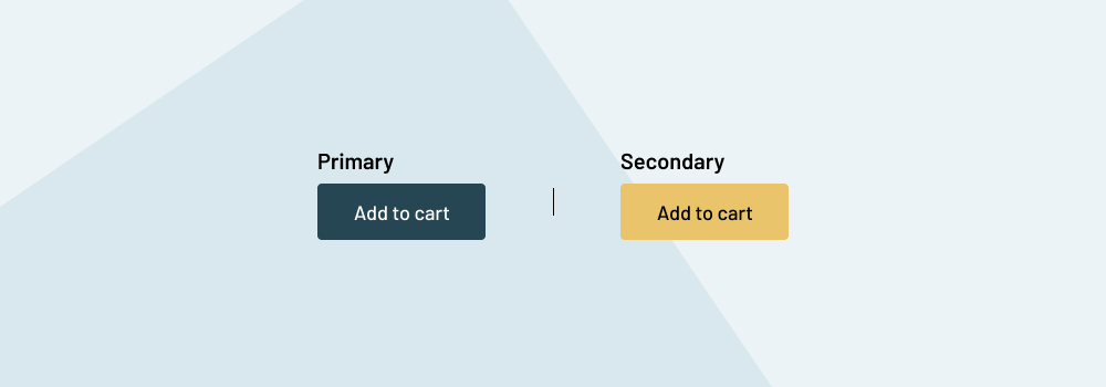
The initial component implementation is straightforward:
// First, extend native HTML button attributes like onClick and disabled from React.
type ButtonProps = React.ComponentPropsWithoutRef<"button"> & {
  text: string;
  theme: 'primary' | 'secondary';
}
<Button
  onClick={someFunction}
  text="Add to cart"
  theme="primary"
/>
The component defines theme and text props to meet the design. It works, and it satisfies the current needs of the product — but those needs never stay static.
The Icon Arrives
The product team decides the Add to cart button should include an icon, but not every button will have one.

The component props are extended with an optional icon prop that conditionally renders an icon.
type ButtonProps = {
  theme: 'primary' | 'secondary';
  text: string;
  icon?: 'cart' | '...all-other-potential-icon-names';
}
<Button
  theme="primary"
  onClick={someFunction}
  text="Add to cart"
  icon="cart"
/>
This works for a while, but the design soon requires icons on the start of the text, not just the end.

Instead of a single icon prop, the component now introduces iconAtStart and iconAtEnd.
type ButtonProps = {
  theme: 'primary' | 'secondary' | 'tertiary';
  text: string;
  iconAtStart?: 'cart' | '...all-other-potential-icon-names';
  iconAtEnd?: 'cart' | '...all-other-potential-icon-names';
}
Refactoring the existing usages keeps things working. The component is now hardcoded with conditional logic, but it still functions.
Escalating Complexity
A new confirmation UI requires the icon to be a different color from the text.
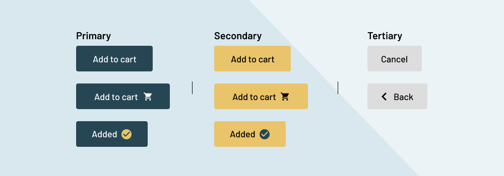
Rather than a more flexible solution, a quick fix is applied: an iconColor prop.
type ButtonProps = {
  theme: 'primary' | 'secondary' | 'tertiary';
  text: string;
  iconAtStart?: 'cart' | '...all-other-potential-icon-names';
  iconAtEnd?: 'cart' | '...all-other-potential-icon-names';
  iconColor?: 'green' | '...other-theme-color-names';
}
Now the component needs to handle yet another variation — an icon-only button.

The text prop becomes optional, and the original icon prop is reintroduced for the icon-only variant.
type ButtonProps = {
  theme: 'primary' | 'secondary' | 'tertiary';
  iconAtStart?: 'cart' | '...all-other-potential-icon-names';
  iconAtEnd?: 'cart' | '...all-other-potential-icon-names';
  iconColor?: 'green' | '...other-theme-color-names';
  icon?: 'cart' | '...all-other-potential-icon-names';
  text?: string;
}
The API is now confusing. There is nothing stopping someone from passing both icon and text, or combining icon with iconAtStart. Each new combination either breaks the UI or requires more conditionals inside the component.
The Breaking Point
The final design iteration requires the button label to include a quantity count with a different font weight and underline.

The Button only accepts a plain text string — no other child elements. It no longer works. At this point, the team faces one of several bad options:
- Perform a major refactor to move from a
textprop to acceptingchildrenor arbitrary markup. - Split the
Buttoninto a separateAddToCartcomponent with a rigid API specific to one use case, duplicating logic or extracting it into a shared file. - Deprecate
Buttonentirely and create a new component, fragmenting the codebase and adding technical debt.
None of these outcomes are good. The question is: where did the component go wrong?
Content Responsibility Is Not the Component’s Job
Consider the native HTML button element. Its responsibilities are minimal:
- Display content without opinion about what that content is.
- Handle native behavior and attributes like
onClickanddisabled.
Browser default styles are typically stripped with CSS resets, leaving the button as essentially a functional container for triggering events. Formatting the content inside it is the content’s own responsibility — not the button’s.
The core problem with considerate component design is that component props define the content rather than defining the component itself.
The original Button component introduced a text prop from the start, placing a limitation on what content could be passed. This immediately deviated from the native button pattern. The later icon props made the component responsible for styling and positioning content, which expanded the API with every new design requirement.
When a component takes on responsibility for the content it displays, it needs an API that supports every possible variation of that content. That API will eventually break down because content requirements are always changing.
Selfish Components, Selfless Maintenance
Component APIs that try to please everyone often end up serving no one well. The original Button was a team player, sharing responsibility for its content until it became so burdened that it reached deprecation. The fix isn’t more props — it’s fewer responsibilities. A selfish component focuses on its own core duties and lets content manage itself.
When the component is responsible for the content it displays, it will break down because the content will forever and always change.
How would a selfish approach have changed the Button from the start? By honoring the two core responsibilities of the native HTML button element, the structure would have looked different immediately.
// First, extend native HTML button attributes like onClick and disabled from React.
type ButtonProps = React.ComponentPropsWithoutRef<"button"> & {
  theme: 'primary' | 'secondary' | 'tertiary';
}
<Button
  onClick={someFunction}
  theme="primary"
>
  <span>Add to cart</span>
</Button>
Dropping the text prop in favor of children aligns the component with its native counterpart: it becomes little more than a container for triggering events. With child content supported natively, icon-related props become unnecessary — an icon can render anywhere within the button, at any size or color. Those icon props could be extracted into their own selfish Icon component.
<Button
  onClick={someFunction}
  theme="primary"
>
  <Icon name="cart" />
  <span>Add to cart</span>
</Button>
With content-specific props removed, the Button can focus on itself.
// First, extend native HTML button attributes like onClick and disabled from React.
type ButtonProps = React.ComponentPropsWithoutRef<"button"> & {
  size: 'sm' | 'md' | 'lg';
  theme: 'primary' | 'secondary' | 'tertiary';
  variant: 'ghost' | 'solid' | 'outline' | 'link'
}
The resulting API is specific to the component and independent of its content. Self-interest props keep the learning curve minimal while retaining flexibility for varied use cases. Icons can sit at either end of the content.
<Button
  onClick={someFunction}
  size="md"
  theme="primary"
  variant="solid"
>
  <Box display="flex" gap="2" alignItems="center">
    <span>Add to cart</span>
    <Icon name="cart" />
  </Box>
</Button>
Or the Button can contain only an icon.
<Button
  onClick={someFunction}
  size="sm"
  theme="secondary"
  variant="solid"
>
  <Icon name="cart" />
</Button>
Products evolve, and selfish component design improves the ability to evolve with them. Beyond buttons, a few principles drive this approach.
Principles Of Selfish Design
Let HTML Drive The Component
Components are often direct abstractions of native HTML elements like button or img. When they are, the native element should drive the component’s design. If the native element accepts children, the abstraction should too. Every deviation from native behavior is something users must learn anew.
The original Button deviated by rejecting child content. That made it rigid and forced a mental model shift just to use it. HTML elements have had years of thought put into their structure — the wheel doesn’t need reinventing.
Children Fend For Themselves
The more a component styles its content, the more rigid it becomes. Many elements are semantic containers; we don’t expect a section to style what’s inside it. A button is just a specific type of semantic container, and its abstraction should follow suit.
Components Are Singularly Focused
Think of props as a conversation focused entirely on the component and its immediate responsibilities:
- How do I look?
Props feed the component’s ego. The refactoredButtondoes this withsize,theme, andvariant. - What am I doing?
A component cares only about what it alone does. TheButtonexpresses this throughonClick. If another click event exists within its content, that’s the content’s problem — theButtondoes not care. - When and where am I going next?
For components like modals, drawers, and tooltips, knowing when and where they appear matters. They aren’t always in the DOM, so beyond appearance and behavior, they need placement expressed through props likeisShownandposition.
Composition Over Configuration
Modal and drawer layouts vary widely: some show a header bar, others don’t; some drawers have a footer call-to-action, others have none. Rather than encoding each variation into a single component with conditional props like hasHeader or showFooter, split the component into composable children.
<Modal>
  <Modal.CloseButton />
  <Modal.Header> ... </Modal.Header>
  <Modal.Main> ... <Modal.Main>
</Modal>
<Drawer>
  <Drawer.Main> ... </Drawer.Main>
  <Drawer.Footer> ... </Drawer.Footer>
</Drawer>
Composition lets each piece be selfish and used only where needed. The root component’s API stays clean, and many props move to the specific child that needs them.
A Selfish Modal
The pattern that saved the Button also works for another notoriously fractured component: the modal.

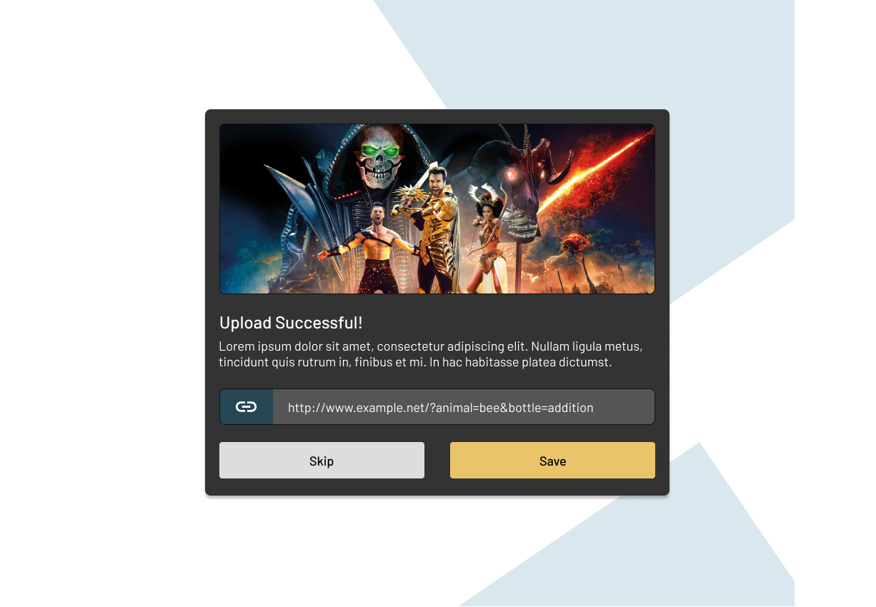
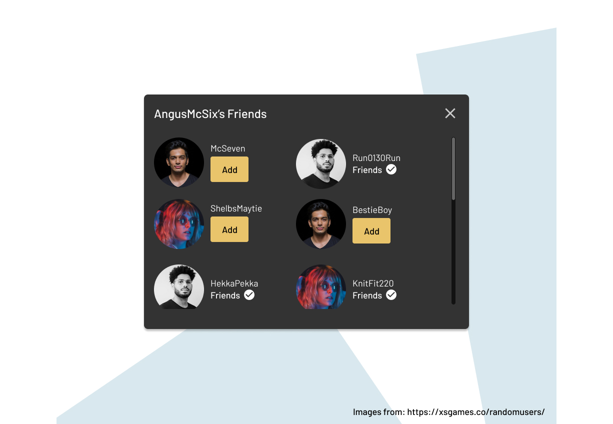
With three distinct layouts in mind, the modal’s design can be steered by selfish principles from the outset.
Breaking down each design:
- Edit Profile: defined header, main, and footer sections, plus a close button.
- Upload Successful: a modified header with no close button, a hero image, and stretched footer buttons.
- Friends: close button returns, content area scrolls, but no footer exists.
The takeaway: header, main, and footer sections are interchangeable — they may or may not appear in any given view. The close button functions independently of any section. This signals a composable child-component approach, allowing pieces to be plugged into the Modal as needed.
The root Modal then has a narrow mandate: conditionally render with any combination of content layouts. As long as it is just a conditionally-rendered container, it never needs to own its content. With that core defined, each composable piece can be scoped to a single role.
| Component | Role |
|---|---|
| ` | This is the entry point of the entire Modal component. This container is responsible for when and where to render, how the modal looks, and what it does, like handle accessibility considerations. |
| ` | An interchangeable Modal child component that can be included only when needed. This component will work similarly to our refactored Button component. It will be responsible for how it looks, where it’s shown, and what it does. |
| ` | The header section will be an abstraction of the native HTML header element. It will be little more than a semantic container for any content, like headings or images, to be shown. |
| ` | The main section will be an abstraction of the native HTML main element. It will be little more than a semantic container for any content. |
| ` | The footer section will be an abstraction of the native HTML footer element. It will be little more than a semantic container for any content. |
The Composables
Modal
The Modal handles conditional rendering through an isShown prop. When true, the Modal and its content render.
type ModalProps = {
  isShown: boolean;
}
<Modal isShown={showModal}>
  ...
</Modal>
Styling and positioning belong in the component’s CSS — no props needed for them.
Modal.CloseButton
The CloseButton follows the same pattern as the refactored Button, and can even be built from it.
import { Button, ButtonProps } from 'components/Button';

export function CloseButton({ onClick, ...props }: ButtonProps) {
  return (
    <Button {...props} onClick={onClick} variant="ghost" theme="primary" />
  )
}
<Modal>
  <Modal.CloseButton onClick={closeModal} />
</Modal>
Modal.Header, Modal.Main, Modal.Footer
Each layout section takes direction from its HTML equivalent (header, main, footer). These elements accept any child content variation, so the components do too. No special props — they are semantic containers.
<Modal>
  <Modal.CloseButton onClick={closeModal} />
  <Modal.Header> ... </Modal.Header>
  <Modal.Main> ... </Modal.Main>
  <Modal.Footer> ... </Modal.Footer>
</Modal>
Three Layouts, One API
The full markup is intentionally omitted to keep focus on the structural takeaways.
Edit Profile. This modal uses each Modal child only as a self-styling, self-positioning container — no className prop required. Content styling belongs to the content itself.
<Modal>
  <Modal.CloseButton onClick={closeModal} />

  <Modal.Header>
    <h1>Edit Profile</h1>
  </Modal.Header>

  <Modal.Main>
    <div className="modal-avatar-selection-wrapper"> ... </div>
    <form className="modal-profile-form"> ... </form>
  </Modal.Main>

  <Modal.Footer>
    <div className="modal-button-wrapper">
      <Button onClick={closeModal} theme="tertiary">Cancel</Button>
      <Button onClick={saveProfile} theme="secondary">Save</Button>
    </div>
  </Modal.Footer>
</Modal>
Upload Successful. Again, components are opinionless containers. Content handles its own styling, whether that means a modal-button-wrapper class or a isFullWidth prop added to the Button for a wider size.
<Modal>
  <Modal.Header>
    <img src="..." alt="..." />
    <h1>Upload Successful</h1>
  </Modal.Header>

  <Modal.Main>
    <p> ... </p>
    <div className="modal-copy-upload-link-wrapper"> ... </div>
  </Modal.Main>

  <Modal.Footer>
    <div className="modal-button-wrapper">
      <Button onClick={closeModal} theme="tertiary">Skip</Button>
      <Button onClick={saveProfile} theme="secondary">Save</Button>
    </div>
  </Modal.Footer>
</Modal>
Friends. This layout drops Modal.Footer. It’s tempting to put overflow styles on Modal.Main, but that extends the container’s responsibility to its content. Better to handle scrolling in a modal-friends-wrapper class.
<Modal>
  <Modal.CloseButton onClick={closeModal} />

  <Modal.Header>
    <h1>AngusMcSix's Friends</h1>
  </Modal.Header>

  <Modal.Main>
      <div className="modal-friends-wrapper">
        <div className="modal-friends-friend-wrapper"> ... </div>
        <div className="modal-friends-friend-wrapper"> ... </div>
        <div className="modal-friends-friend-wrapper"> ... </div>
      </div>
  </Modal.Main>
</Modal>
The selfish Modal handles evolving designs with flexible, tightly scoped pieces.
What Comes Next
With these principles in mind, two design variations worth considering:
- A fullscreen modal variation — how would the
Modalneed to adjust? - A two-step registration flow — how could the
Modalsupport that structure?


The Takeaway
Components carry an outsized share of the weight in modern frontend development, and the demand for dependable component libraries — whether bundled into a design system or used standalone — keeps growing. As the pace of the web accelerates, the ability to ship components that are accessible, stable, and resilient is no longer optional.
Too often, though, components are expected to do far more than they should. They absorb the responsibilities of the content they wrap and the layout that surrounds them. Every "small improvement" that expands a component's awareness of its context makes the pattern more fragile. Eventually, the component stops working as intended, and the fallout is familiar: codebase forks, growing technical debt, and a UI that drifts toward inconsistency.
The fix is to strip a component back to its own core duties. Build a prop API that expresses only those duties. If a component never worries about what sits inside it or what wraps around it, it can survive change far longer. This selfish design philosophy treats components as semantic containers and nothing more. Their only obligation is to themselves.
When components stay indifferent to their content, content gains the freedom to evolve — or move between containers — without breaking anything. By refusing to be considerate of its surroundings, a component becomes the most reliable thing in the system. That reliability benefits everyone: the content that never stops shifting, the consistency of the design and UI, the users who interact with that ever-changing content, and the developers who compose components day in and day out.
Ultimately, good component design is a practice of restraint. Selfishness is the principle; being a considerate team player is the developer's job — applied where it belongs, in the implementation, not in the component's public interface.


