

The author of AgnosticUI set out to build a dialog component for the library, initially intending to avoid dependencies and use the native <dialog> element as the foundation. After research, that plan changed: the library instead wraps Kitty Giraudel's a11y-dialog, the same package behind her existing React adapter. Adapters were written for Vue 3, Svelte, and Angular, and AgnosticUI wraps all four implementations.
Where the native element falls short
The native <dialog> is under active development and will likely be the way forward, but current gaps ruled it out for a component library supporting multiple frameworks:
- Clicking the backdrop does not close the dialog by default.
- The
alertdialogrole—for dialogs that require a response and must not be dismissed via backdrop click orESC—does not work with the native element. - The
::backdroppseudo-element is only available when the dialog is opened programmatically withdialog.showModal(). - Default styles are left to the browser and JavaScript is required regardless, so the implementation isn't fully HTML anyway.
Some of these can be worked around, and Adam Argyle's web.dev post on building a dialog with the native element is a useful resource if you stay on that path.
The requirements list
The target behavior for an accessible dialog was:
- Close on backdrop click or
ESC. - Trap focus so keyboard users cannot tab out of the component.
- Support
TABandSHIFT+TABwithin the dialog. - Return focus to the previously focused element on close.
- Apply
aria-*attributes and toggles correctly. - Provide portals when used inside a JavaScript framework.
- Support the
alertdialogrole. - Prevent the underlying body from scrolling when needed.
- Avoid the native element's common pitfalls.
- Allow custom styling while respecting
prefers-reduced-motion.
That list is why the native element was dropped despite the work going into it. Scott O'Hara's writing on dialogs and Kitty's Smashing Magazine guide to building an accessible dialog from scratch cover the topic in more depth.
Auditing the chosen implementation
Because the requirements lean heavily on accessibility, a11y-dialog itself needed an audit. That covered manual verification of the functionality across browsers, tooling such as Lighthouse, IBM Equal Access Accessibility Checker, Deque's AXE, and WAVE, testing with JAWS, NVDA, and VoiceOver, and testing with real people. Automation alone is insufficient: a Deque Systems study found automated tooling catches only about 57% of accessibility issues. No screen reader testing is a substitute for people, though in this case no participants were found; had they been, a similar scripted set of steps would have been used while observing and taking notes.
Testing happened on a skeleton page run locally rather than in Storybook, CodePen, or CodeSandbox, to avoid having to validate the validators—a Storybook-specific a11y add-on adds a layer of complexity when auditing an external component. A local server is needed; npx serve <DIRECTORY> is one option. The page used combined HTML, CSS, and JavaScript in one file and imported a11y-dialog from a CDN, so it requires a network connection.
| Feature | Result |
|---|---|
It should close when clicking outside the dialog (on the backdrop) or when pressing the ESC key. | ✅ |
| It ought to trap focus to prevent tabbing out of the component with a keyboard. | ✅ |
It should allow forwarding tabbing with TAB and backward tabbing with SHIFT+TAB. | ✅ |
| It should return focus back to the previously focused element when closed. | ✅ |
It should correctly apply aria-* attributes and toggles. | ✅ I verified this one “by eye” after inspecting the elements in the DevTools Elements panel. |
| It should provide Portals. | Not applicable. This is only useful when implementing the element with React, Svelte, Vue, etc. We’ve statically placed it on the page with aria-hidden for this test. |
It should support for the alertdialog ARIA role for alert situations. | ✅ You’ll need to do two things: First, remove data-a11y-dialog-hide from the overlay in the HTML so that it is <div class="dialog-overlay"></div>. Replace the dialog role with alertdialog so that it becomes:<div class="dialog-container" id="my-dialog" aria-hidden="true" aria-labelledby="my-dialog-title" aria-describedby="my-dialog-description" role="alertdialog">Now, clicking on the overlay outside of the dialog box does not close the dialog, as expected. |
| It should prevent the underlying body from scrolling, if needed. | ✅ I didn’t manually test but this, but it is clearly available per the documentation. |
It should avoid the common pitfalls that come with the native <dialog> element. | ✅ This component does not rely on the native <dialog> which means we’re good here. |
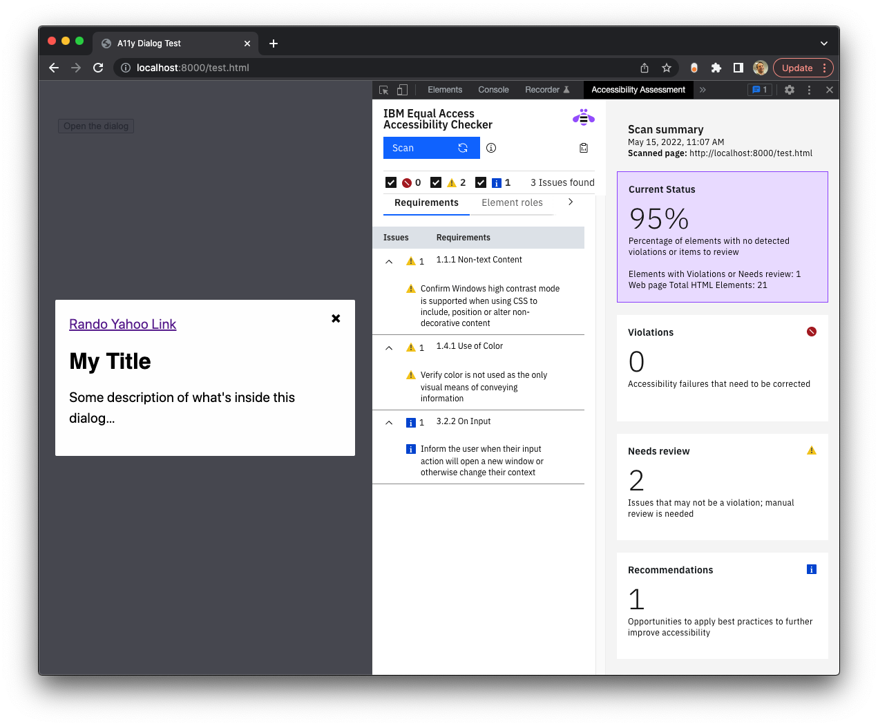
Lighthouse ran on both desktop and mobile, with the dialog open by default and closed by default, because tooling sometimes misses dynamically shown or hidden DOM elements. IBM Equal Access produced no red violations, only a couple of items flagged for manual review. VoiceOver walked through the scripted checks mapped out for the audit.
| Step | Result |
|---|---|
| The dialog component’s trigger button is announced. | “Entering A11y Dialog Test, web content.” |
The dialog should open when pressing CTRL+ALT +Space should show the dialog. | “Dialog. Some description of what’s inside this dialog. You are currently on a dialog, inside of web content.” |
The dialog should TAB to and put focus on the component’s Close button. | “Close this dialog button. You are currently on a button, inside of web content.” |
| Tab to the link element and confirm it is announced. | “Link, Rando Yahoo Link” |
Pressing the SPACE key while focused on the Close button should close the dialog component and return to the last item in focus. | ✅ |
Existing options by framework
These were gathered during research and not personally tested:
- Angular: A 2020 Deque article auditing Angular component libraries found Material (and its CDK) and ngx-bootstrap appear to offer decent dialog accessibility.
- React: Reakit's dialog claims compliance with the WAI-ARIA dialog guidelines, chakra-ui appears attentive to accessibility, and Material is available here too. Reach's dialog and Adobe's
@react-aria/dialogalso come recommended. - Vue: Vuetensils, Austin Gil's headless component library, has a dialog; Vuetify implements Material with a dialog of its own. PrimeVue's dialog, notably, failed to return focus to the original element.
- Svelte: svelte-headlessui is worth a look, as is the Material port svelterial. Many SvelteKit users build their own component sets because its packaging idiom makes that simple;
svelte-a11y-dialogis a convenient base for custom dialogs, drawers, and bottom sheets. - Bootstrap: Offers a modal component that requires following documented steps to make it accessible.
Rolling your own, or reusing one
Building a design-system dialog from scratch is doable but extremely error-prone, and the audit above shows how much has to be tested for a single component. Scott O'Hara, co-editor of the ARIA in HTML and HTML AAM specs, makes the trade-off plainly:
You could put in the effort to add in those extensions, or you could use a robust plugin like a11y-dialog and ensure that your dialogs will have a pretty consistent experience across all browsers.
For AgnosticUI, a11y-dialog already had Vue and React ports, but the Vue port had not yet been updated for Vue 3. The time that would have gone into a likely buggy hand-rolled dialog went instead into helping update that port, plus new Svelte and Angular ports—both very new and considered experimental beta software at time of writing.
The same show/hide mechanism extends beyond dialogs: adding a few classes to the audit's CSS turns a11y-dialog into a working drawer (off-canvas) component. The classes extend the base dialog additively, the same approach used for the drawer being added to AgnosticUI.




