
Design Lessons From Mid-Century Cartoon Titles
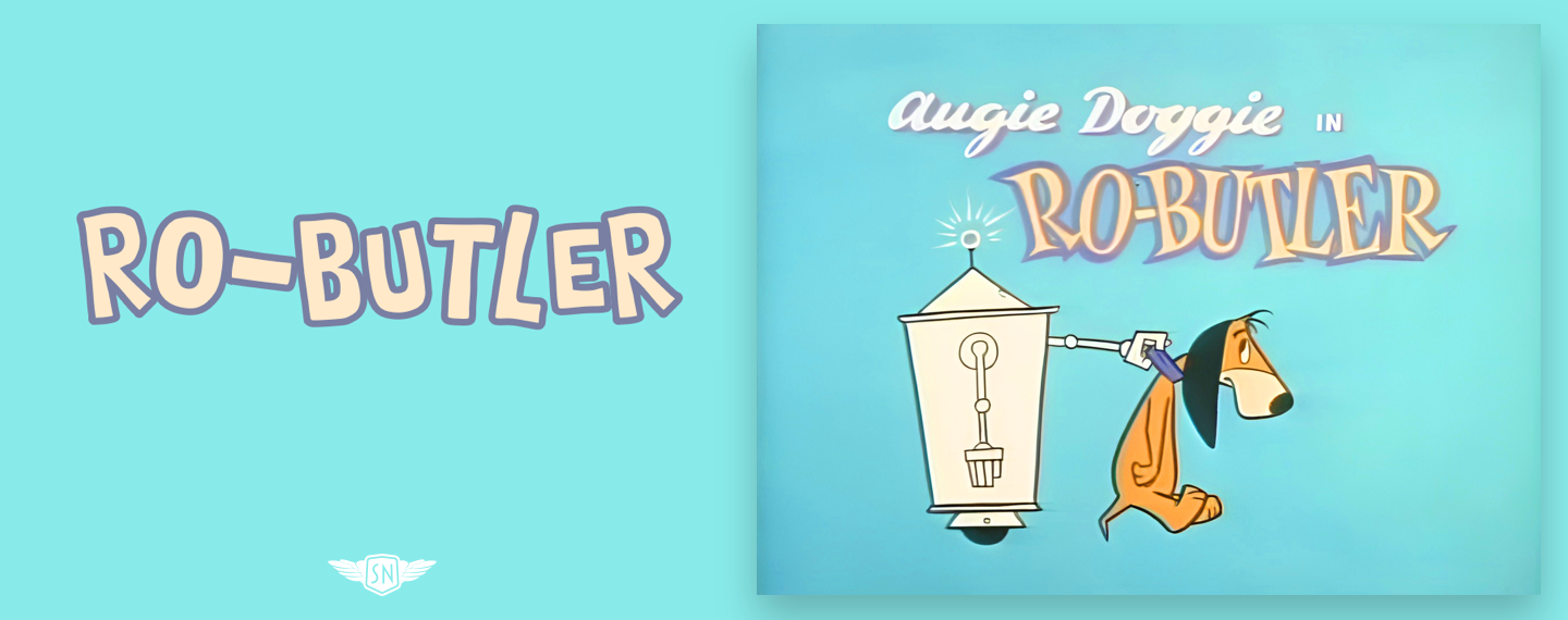
Before television, cartoon title cards were often painterly and detailed. But when budgets tightened in the 1950s, artists like Lawrence "Art" Goble — best known for his work at Hanna-Barbera on shows like The Flintstones, Quick Draw McGraw, and Yogi Bear — developed a more graphic, stylized approach. His single frames relied on flat color, bold shapes, and integrated typography to communicate a story and set a mood without motion.
That approach translates well to modern web design. Headers, landing-page heroes, and splash screens all benefit from the same principles: a clear central idea, strong visual hierarchy, and typography that reinforces the message. Using CSS properties like text-shadow, text-stroke, and transform, you can recreate that mid-century energy.
Recreating Toon Typography With CSS Shadows and Strokes
Toon title lettering typically depends on a few key techniques. Hard offset shadows, for example, lift text off the background:
color: #f7f76d;
text-shadow: 5px 5px 0 #1e1904;
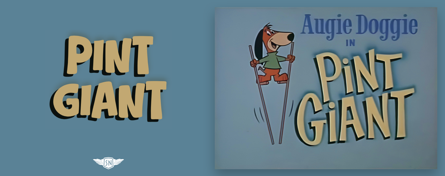
Semi-soft shadows with negative offsets give a different, gentler feel:
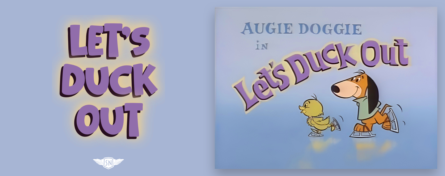
Layering multiple shadows — starting with a solid offset and adding progressively softer blurs — creates depth and a halo effect:
color: #6F4D80;
text-shadow:
  -5px 5px 0 #260e1e, /* Shadow 1 */
  0 0 15px #e9ce96,   /* Shadow 2 */
  0 0 30px #e9ce96,   /* Shadow 3 */
  0 0 30px #e9ce96;   /* Shadow 4 */
Strokes are equally important. The text-stroke shorthand sets both text-stroke-width and text-stroke-color, drawing a contour around each glyph. Though it required a -webkit- prefix for a long time, it's now supported across modern browsers. Combining a stroke with a subtle shadow can make flat text look three-dimensional:
color: #eff0cd;
-webkit-text-stroke: 4px #7890b5;
text-stroke: 4px #7890b5;
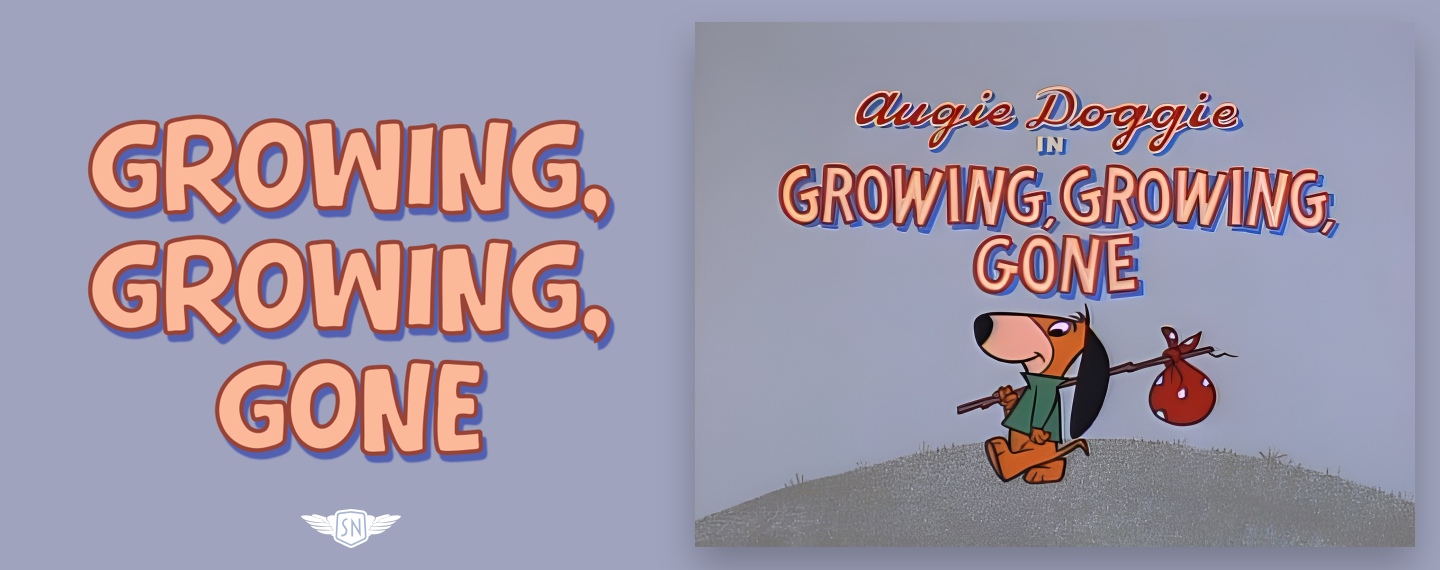
color: #fbb999;
text-shadow: 3px 5px 1px #5160b1;
-webkit-text-stroke: 3px #984336;
text-stroke: 3px #984336;
Paint Order and Layering
By default, browsers draw the stroke over the fill, which can look wrong with thin letterforms and thick outlines. The paint-order property changes that. Setting paint-order: stroke paints the outline first, letting the fill sit on top for cleaner edges and better readability:
color: #fbb999;
paint-order: fill;
text-shadow: 3px 5px 1px #5160b1;
text-stroke-color:#984336;
text-stroke-width: 3px;
Clipping Backgrounds Into Letterforms
For title text that contains gradients or textures, use background-clip: text together with text-fill-color: transparent. Start with a background painted behind the text, then clip it to the glyphs:
background: linear-gradient(0deg, #667b6a, #1d271a);
-webkit-background-clip: text;
-webkit-text-fill-color: transparent;
This technique works well alongside strokes and shadows — the clipped background adds color and texture inside the letters, while the stroke keeps edges crisp and a shadow provides separation. Be sure to test browser rendering, as quirks can affect shadows and clipped text.
Per-Character Control and Accessibility
To nudge or animate individual letters, each character must be wrapped in its own span element. Doing this manually is fragile, so a text-splitting library is the practical choice. The author's own solution, splinter.js (currently in beta), activates by adding a data- attribute to the target element.
Accessibility is a key caveat with character splitting. Screen readers generally read text nodes in order. If a word is split into individual letters, some readers will concatenate them correctly, but others may pause between glyphs — potentially reading "Hum Sweet Hum" as disconnected letters. For that reason, splinter.js preserves the original text via an ARIA attribute:
<span class="toon-char" aria-hidden="true">H</span>
<span class="toon-char" aria-hidden="true">u</span>
<span class="toon-char" aria-hidden="true">m</span>
<h2 aria-label="Hum Sweet Hum">
  <span class="toon-char" aria-hidden="true">H</span>
  <span class="toon-char" aria-hidden="true">u</span>
  <span class="toon-char" aria-hidden="true">m</span>
</h2>
Once characters are split, you can style them freely. For instance, applying different translate values via :nth-child selectors recreates the uneven baseline of hand-drawn lettering:
/* 4th, 8th, 12th... */
.toon-char:nth-child(4n) { translate: 0 -8px; }
/* 1st, 5th, 9th... */
.toon-char:nth-child(4n+1) { translate: 0 -4px; }
/* 2nd, 6th, 10th... */
.toon-char:nth-child(4n+2) { translate: 0 4px; }
/* 3rd, 7th, 11th... */
.toon-char:nth-child(4n+3) { translate: 0 8px; }
Rotation adds even more chaos:
/* 4th, 8th, 12th... */
.toon-line .toon-char:nth-child(4n) {
rotate: -4deg; }

/* 1st, 5th, 9th... */
.toon-char:nth-child(4n+1) {
rotate: -8deg; }

/* 2nd, 6th, 10th... */
.toon-char:nth-child(4n+2) {
rotate: 4deg; }

/* 3rd, 7th, 11th... */
.toon-char:nth-child(4n+3) {
rotate: 8deg; }
And keyframe animations bring the characters to life. Define a rotation animation, apply it to the generated span elements, then set per-character rotation amounts and delays:
@keyframes jiggle {
0%, 100% { transform: rotate(var(--base-rotate, 0deg)); }
25% { transform: rotate(calc(var(--base-rotate, 0deg) + 3deg)); }
50% { transform: rotate(calc(var(--base-rotate, 0deg) - 2deg)); }
75% { transform: rotate(calc(var(--base-rotate, 0deg) + 1deg)); }
}
.toon-char {
animation: jiggle 3s infinite ease-in-out;
transform-origin: center bottom; }
.toon-char:nth-child(4n) { --base-rotate: -2deg; }
.toon-char:nth-child(4n+1) { --base-rotate: -4deg; }
.toon-char:nth-child(4n+2) { --base-rotate: 2deg; }
.toon-char:nth-child(4n+3) { --base-rotate: 4deg; }

.toon-char:nth-child(4n) { animation-delay: 0.1s; }
.toon-char:nth-child(4n+1) { animation-delay: 0.3s; }
.toon-char:nth-child(4n+2) { animation-delay: 0.5s; }
.toon-char:nth-child(4n+3) { animation-delay: 0.7s; }

Making an Impression With Intentional Typography
A well-designed header or hero area needs clarity, character, and confidence — not simply a faded full-width background image. The techniques that made cartoon title cards effective — deliberate shadows, bold strokes, clipped colors, and restrained motion — are equally powerful on the web. Typography was a core part of that mid-century design language, and with modern CSS, it can be again.


