Web components are often assumed to require JavaScript and the Shadow DOM. A second pattern, the HTML Web Component, starts from markup instead: an existing fragment is wrapped in a custom element, and JavaScript layers behavior on top only when it is available. Jeremy Keith's description captures the appeal — what you build is technically achievable with DOM traversal and event handling, but the component is less fragile, portable, and obeys the single responsibility principle.
Three examples from the Web UI Boilerplate component library (built with Storybook) show the pattern's two key payoffs: style encapsulation and progressive enhancement.
A disclosure that works without JavaScript
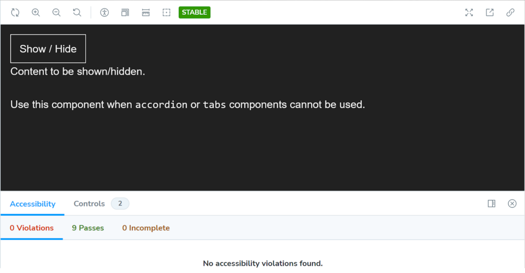
A <webui-disclosure> element holds a <button> that shows and hides a <div> of text. Because the button carries the hidden attribute, it is hidden by default when JavaScript is disabled or fails to execute, and the content inside the div is simply displayed. Visitors can read the content either way.
<webui-disclosure
  data-bind-escape-key
  data-bind-click-outside
>
  <button
    type="button"
    class="button button--text"
    data-trigger
    hidden
  >
    Show / Hide
  </button>

  <div data-content>
    <p>Content to be shown/hidden.</p>
  </div>
</webui-disclosure>
The demo extends Chris Ferdinandi's disclosure example with two [data-attribute]s on the tag that let the element close on the ESC key or on a click outside it. Browsers must be told what to do with a made-up tag name by defining the custom element:
customElements.define('webui-disclosure', WebUIDisclosure);Custom elements need a dashed-ident such as <my-pizza>, though as Jim Neilsen notes (via Scott Jehl), the dash does not have to fall between two words. The ES Module for the component is structured roughly as follows in plain JavaScript:
default class WebUIDisclosure extends HTMLElement {
  constructor() {
    super();
    this.trigger = this.querySelector('[data-trigger]');
    this.content = this.querySelector('[data-content]');
    this.bindEscapeKey = this.hasAttribute('data-bind-escape-key');
    this.bindClickOutside = this.hasAttribute('data-bind-click-outside');

    if (!this.trigger || !this.content) return;

    this.setupA11y();
    this.trigger?.addEventListener('click', this);
  }

  setupA11y() {
    // Add ARIA props/state to button.
  }

  // Handle constructor() event listeners.
  handleEvent(e) {
    // 1. Toggle visibility of content.
    // 2. Toggle ARIA expanded state on button.
  }

  // Handle event listeners which are not part of this Web Component.
  connectedCallback() {
    document.addEventListener('keyup', (e) => {
      // Handle ESC key.
    });

    document.addEventListener('click', (e) => {
      // Handle clicking outside.
    });
  }

  disconnectedCallback() {
    // Remove event listeners.
  }
}
One event listener lives in constructor(); the rest sit in connectedCallback(), a split Hawk Ticehurst explains in more detail. None of this script is required for the component to work, but it adds the show/hide behavior plus accessibility: JavaScript injects aria-expanded and aria-controls so screen reader users understand the button's purpose. No additional CSS is written for this component — the styling comes from inherited global or component styles.
Tabs and scoped styles
The second example, a tabbed interface, demonstrates style encapsulation: CSS scoped to a web component does not leak out and cannot conflict with styles elsewhere on the page.
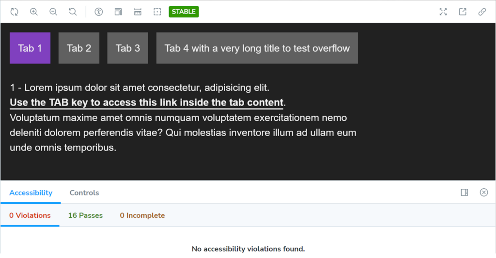
The markup uses three links styled as tabs, each pointing at an anchor matching a panel ID such as #tab1 or #tab2:
<webui-tabs>
  <div data-tablist>
    <a href="#tab1" data-tab>Tab 1</a>
    <a href="#tab2" data-tab>Tab 2</a>
    <a href="#tab3" data-tab>Tab 3</a>
  </div>

  <div id="tab1" data-tabpanel>
    <p>1 - Lorem ipsum dolor sit amet consectetur.</p>
  </div>

  <div id="tab2" data-tabpanel>
    <p>2 - Lorem ipsum dolor sit amet consectetur.</p>
  </div>

  <div id="tab3" data-tabpanel>
    <p>3 - Lorem ipsum dolor sit amet consectetur.</p>
  </div>
</webui-tabs>
The CSS is split into a default layer and a JavaScript-dependent layer.
webui-tabs {
  [data-tablist] {
    /* Default styles without JavaScript */
  }

  [data-tab] {
    /* Default styles without JavaScript */
  }

  [role='tablist'] {
    /* Style role added by JavaScript */
  }

  [role='tab'] {
    /* Style role added by JavaScript */
  }

  [role='tabpanel'] {
    /* Style role added by JavaScript */
  }
}
Two rules — [data-tablist] and [data-tab] — hold the component's default styles and apply whether or not JavaScript loads. The other three selectors are injected only once JavaScript places the role attribute on those elements. Styles therefore apply only when the script is actually needed, which is progressive enhancement in itself. All of it is fully scoped to <webui-tabs>, with no bleed into other components or global styles, and simple descendant selectors can replace classnames, complex selectors and methodologies like BEM.
Light DOM versus Shadow DOM
For most projects the authors bundle web component CSS into a single file so default styles are available globally even when JavaScript does not run. Alternatively a stylesheet can be imported via JavaScript so that only this component consumes it:
import styles from './styles.css';

class WebUITabs extends HTMLElement {
  constructor() {
    super();
    this.adoptedStyleSheets = [styles];
  }
}

customElements.define('webui-tabs', WebUITabs);
Or a <style> tag can be injected instead:
class WebUITabs extends HTMLElement {
  connectedCallback() {
    this.attachShadow({ mode: 'open' }); // Required for JavaScript access
    this.shadowRoot.innerHTML = `
      <style> <!-- styles go here --> </style>
      // etc.
    `;
  }
}

customElements.define('webui-tabs', WebUITabs);
Either way, styles stay scoped to the component, preventing leakage out while allowing global styles to be inherited. Consider a component whose opening and closing tags contain markup —everything between them is "Light" DOM:
<my-web-component>
  <!-- This is Light DOM -->
  <div>
    <p>Some content... styles are inherited from the global scope</p>
  </div>

  ----------- Shadow DOM Boundary -------------
  | <!-- Anything injected by JavaScript -->  |
  ---------------------------------------------
</my-web-component>
As Dave Rupert's write-up shows, external styles can pierce the Shadow DOM and select Light DOM elements: a <button> written between the tags picks up the global button selector's styles, while a <button> injected by JavaScript is untouched. Styling the Shadow DOM button requires internal styles such as an imported stylesheet or inline <style> block. Not every property is blocked, though — 37 properties, mostly text, list and table formatting, are documented as inherited by web components.
Enhancing the tabs with JavaScript
The full script is lengthy, so the structure is abbreviated:
default class WebUITabs extends HTMLElement {
  constructor() {
    super();
    this.tablist = this.querySelector('[data-tablist]');
    this.tabpanels = this.querySelectorAll('[data-tabpanel]');
    this.tabTriggers = this.querySelectorAll('[data-tab]');

    if (
      !this.tablist ||
      this.tabpanels.length === 0 ||
      this.tabTriggers.length === 0
    ) return;

    this.createTabs();
    this.tabTriggers.forEach((tabTrigger, index) => {
      tabTrigger.addEventListener('click', (e) => {
        this.bindClickEvent(e);
      });
      tabTrigger.addEventListener('keydown', (e) => {
        this.bindKeyboardEvent(e, index);
      });
    });
  }

  createTabs() {
    // 1. Hide all tabpanels initially.
    // 2. Add ARIA props/state to tabs & tabpanels.
  }

  bindClickEvent(e) {
    e.preventDefault();
    // Show clicked tab and update ARIA props/state.
  }
  bindKeyboardEvent(e, index) {
    e.preventDefault();
    // Handle keyboard ARROW/HOME/END keys.
  }
}

customElements.define('webui-tabs', WebUITabs);
The script adds ARIA roles, states and properties for screen reader users and keyboard bindings: TAB moves focus into the active tab and any focusable content in the active tabpanel, while the ARROW keys traverse tabs. Without JavaScript, the tabs still anchor to their panels and the panels stack vertically — an accessible default. With JavaScript, the experience is enhanced and accessibility is updated.
A Shadow DOM loader, generated entirely by script
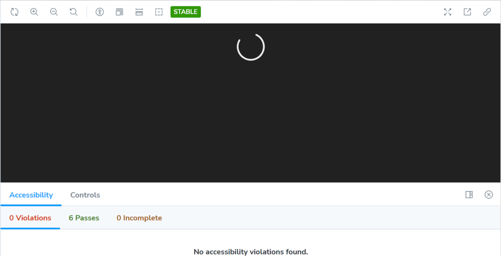
The third example differs from the first two: <webui-ajax-loader> is generated entirely by JavaScript and uses the Shadow DOM, since it only indicates a loading state for Ajax requests and is needed only when JavaScript runs. The markup is just the component's opening and closing tags:
<webui-ajax-loader></webui-ajax-loader>The simplified JavaScript structure:
default class WebUIAjaxLoader extends HTMLElement {
  constructor() {
    super();
    const shadow = this.attachShadow({ mode: 'open' });
    shadow.innerHTML = `
      <svg role="img" part="svg">
        <title>loading</title>
        <circle cx="50" cy="50" r="47" />
      </svg>
    `;
  }
}

customElements.define('webui-ajax-loader',WebUIAjaxLoader);
Everything between the tags is injected by script and lives in the Shadow DOM, encapsulated from other scripts and styles. The <svg> element carries a part attribute — the zoom-in point:
<svg role="img" part="svg">
  <!-- etc. -->
</svg>
Named parts offer another way to style a custom element: the ::part pseudo-selector styles the SVG from outside the template literal:
webui-ajax-loader::part(svg) {
  // Shadow DOM styles for the SVG...
}
That selector can also consume CSS custom properties, scoped globally or locally to the element:
webui-ajax-loader {
  --fill: orangered;
}

webui-ajax-loader::part(svg) {
  fill: var(--fill);
}
As for progressive enhancement, JavaScript supplies all of the HTML, so the loader renders only when JavaScript is enabled and supported — and when it does, the SVG arrives with an accessible title.
HTML-first, JavaScript as needed
The point is that HTML Web Components are an HTML-first feature. JavaScript plays a role only as large as required: more encapsulation, or extra UX when a visitor's browser supports it. The components lean on vanilla web languages without depending too heavily on any one of them.




