
Why Resilience Matters
Resilience is baked into the web's foundation. Browsers ignore invalid HTML and unsupported CSS, processing what they can and skipping the rest. JavaScript offers no such courtesy. When a script fails, we must catch the error and decide what happens next. That decision directly shapes the user experience.
A degraded experience doesn't have to be a dead end. A failed API request might make a section unusable, but the rest of the page can still deliver value. This principle—graceful degradation—is what separates a resilient UI from a brittle one. And it matters beyond technical polish. A feature that fails without explanation frustrates users and reflects poorly on the product. Reliability is a signal of quality, and users associate a smooth experience with a trustworthy brand.
Writing off failures as corner cases is tempting, but the web has many corners: different browsers, hardware, network conditions, and user preferences. The longer a system runs, the more likely something will go wrong.
Not All Errors Are Equal
Failures have a hierarchy, just like content. A broken total balance on a banking dashboard is more critical than a failed notification prompt. Categorizing errors by impact—borrowing from methods like MoSCoW prioritization—helps decide what the UI must surface.
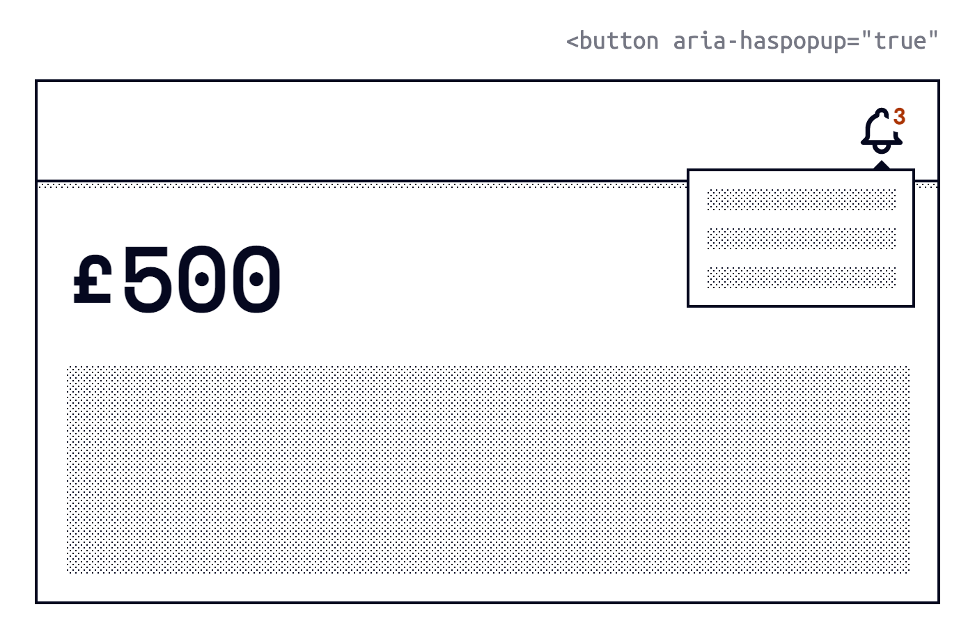
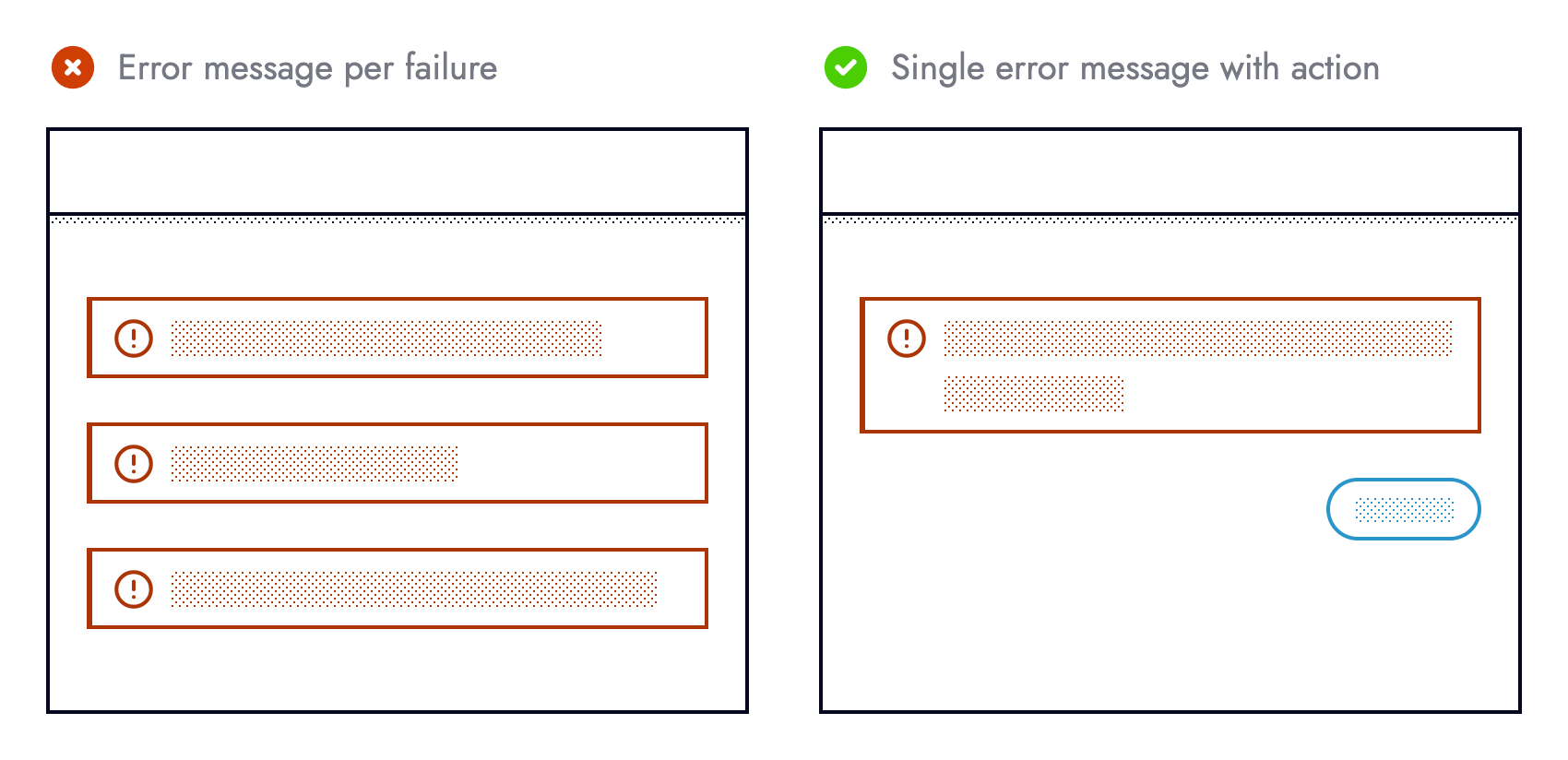
Primary information failures demand transparency: let the user know something went wrong. For secondary failures, gracefully hide the degraded component and preserve the core experience. Bombarding users with every error message simply clutters the interface. Instead, let content hierarchy guide which failures surface and which are handled quietly behind the scenes.
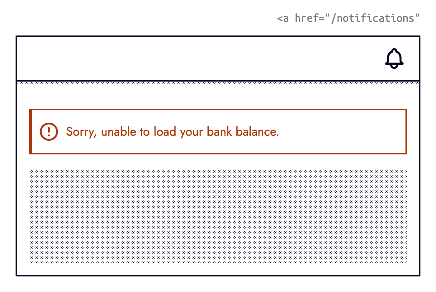
a href='/notifications' to the notification center. (Large preview)A straightforward decision tree can determine whether to show an error message:

Defensive Coding First
Preventing errors beats recovering from them. The best error is one that never happens. While we cannot control third-party outages or user behaviour, we can stop assumptions creeping into our code.
Consider fetching data about debit cards. An optimistic approach assumes the endpoint returns an array of objects, each with a lastFourDigits field:
const debitCards = useDebitCards();

return (
  <ul>
    {debitCards.map(card => {
      <li>{card.lastFourDigits}</li>
    })}
  </ul>
);
Users end up testing our assumptions when the response deviates. A defensive rewrite verifies those assumptions inline:
const debitCards = useDebitCards();

if (Array.isArray(debitCards) && debitCards.length) {
  return (
    <ul>
      {debitCards.map(card => {
        if (card.lastFourDigits) {
          return <li>{card.lastFourDigits}</li>
        }
      })}
    </ul>
  );
}

return "Something else";
The same logic applies to third-party libraries. Calling stripe.handleCardPayment without checking it exists is optimistic:
stripe.handleCardPayment(/* ... */);
Verifying the method is present before using it is safer:
if (
  typeof stripe === 'object' &&
  typeof stripe.handleCardPayment === 'function'
) {
  stripe.handleCardPayment(/* ... */);
}
This is feature detection in its purest form. Checking the Clipboard API before offering copy or paste allows the UI to adapt ahead of time by hiding unsupported features:
if (navigator.clipboard) {
  /* ... */
}
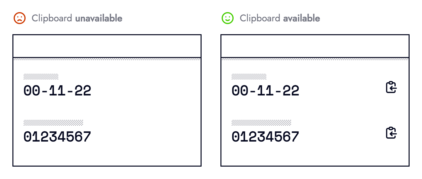
User behaviour also deserves guardrails. Double-clicking a submit button should not duplicate a non-idempotent request. Preventing resubmission during form submission mitigates the fallout of multiple requests:
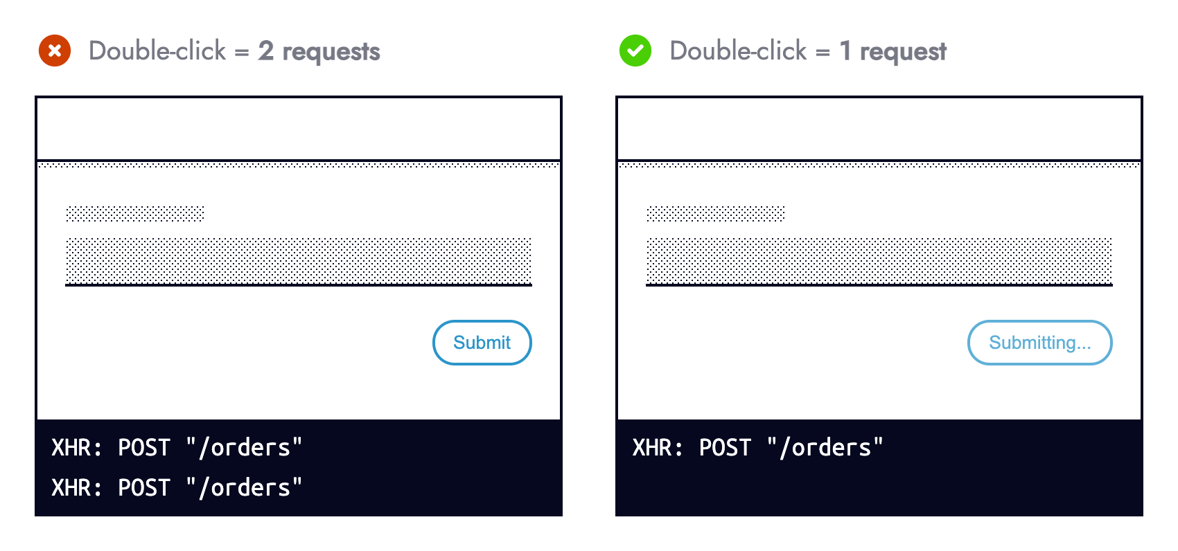
For accessibility, prefer managing state in JavaScript over using the disabled attribute; exposing aria-disabled="true" keeps the button focusable while still preventing duplicate actions.
Recover, Fallback, or Acknowledge
Not every error is preventable. When one occurs, a decision tree helps determine the response:
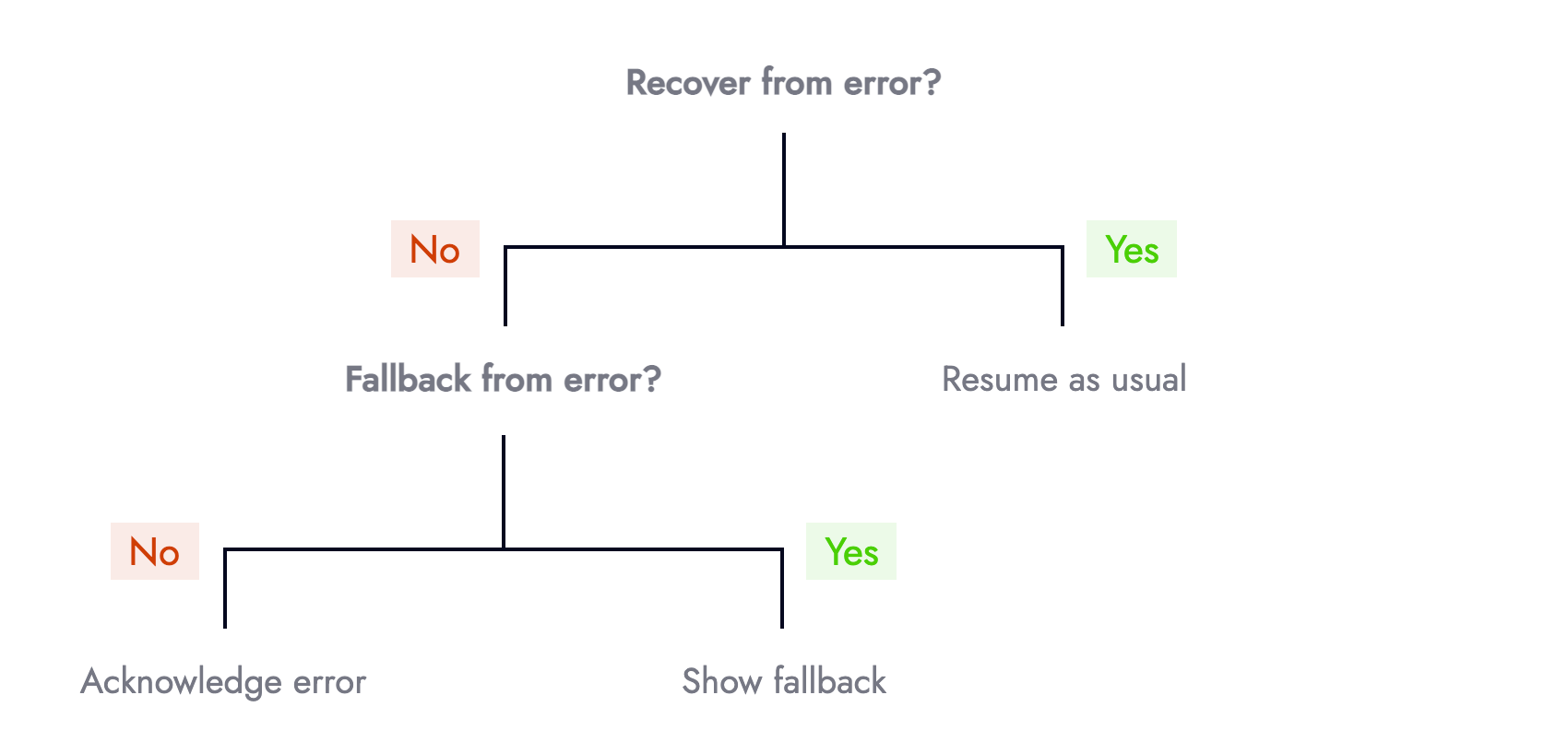
First, ask whether recovery is possible. Retrying a failed GET request often succeeds due to intermittent network issues. Libraries like SWR include this out of the box. At Nutmeg, retries are limited to reads; writes like POST or DELETE are never retried, since duplicates risk unwanted mutations.
Second, if recovery fails, is there a fallback? A failed card payment could offer PayPal or Open Banking as alternatives:
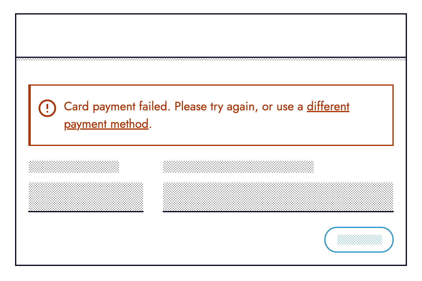
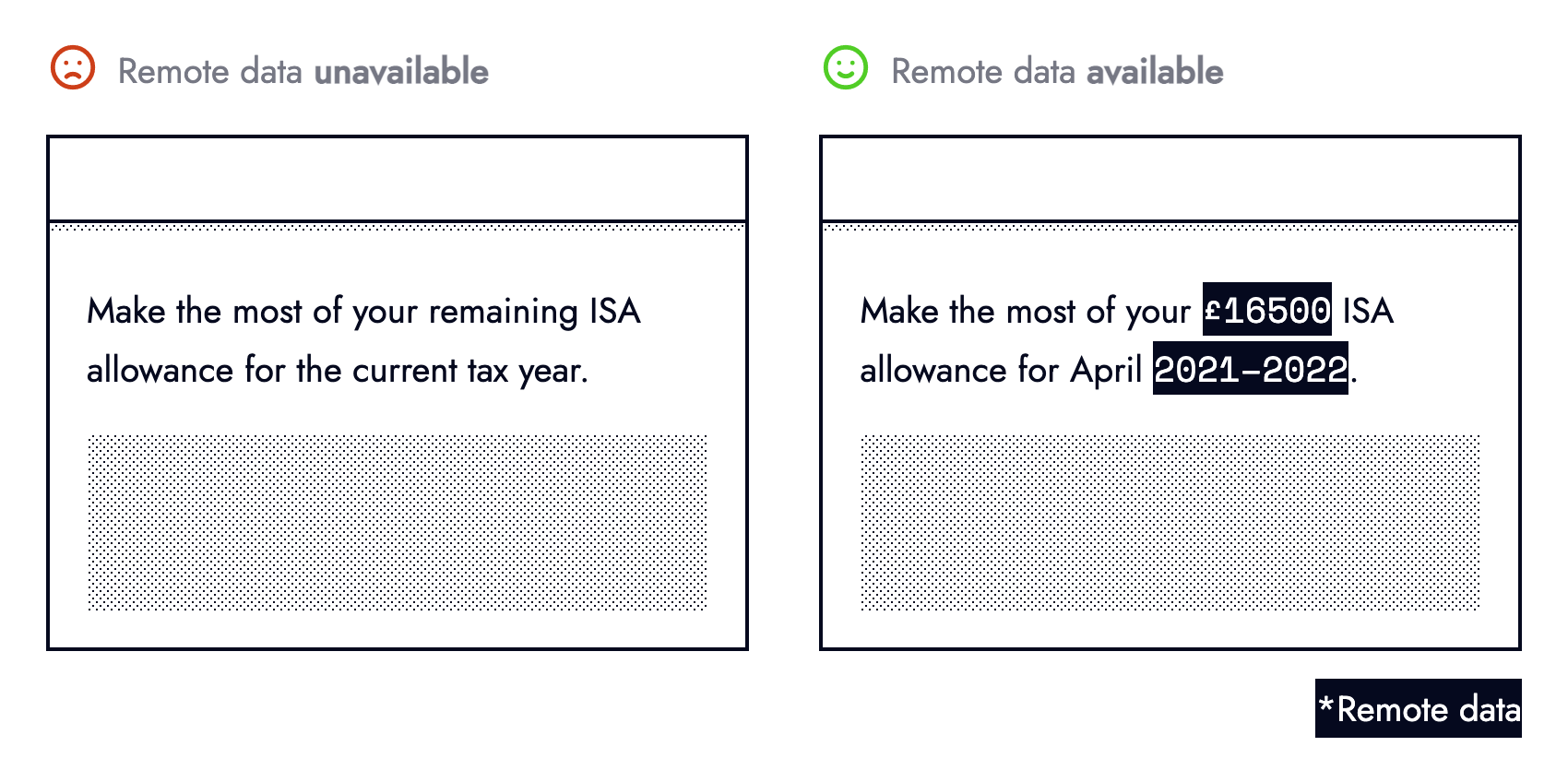
Fallbacks need not be elaborate. Text depending on remote data can fall back to a simpler, static message when the request fails:
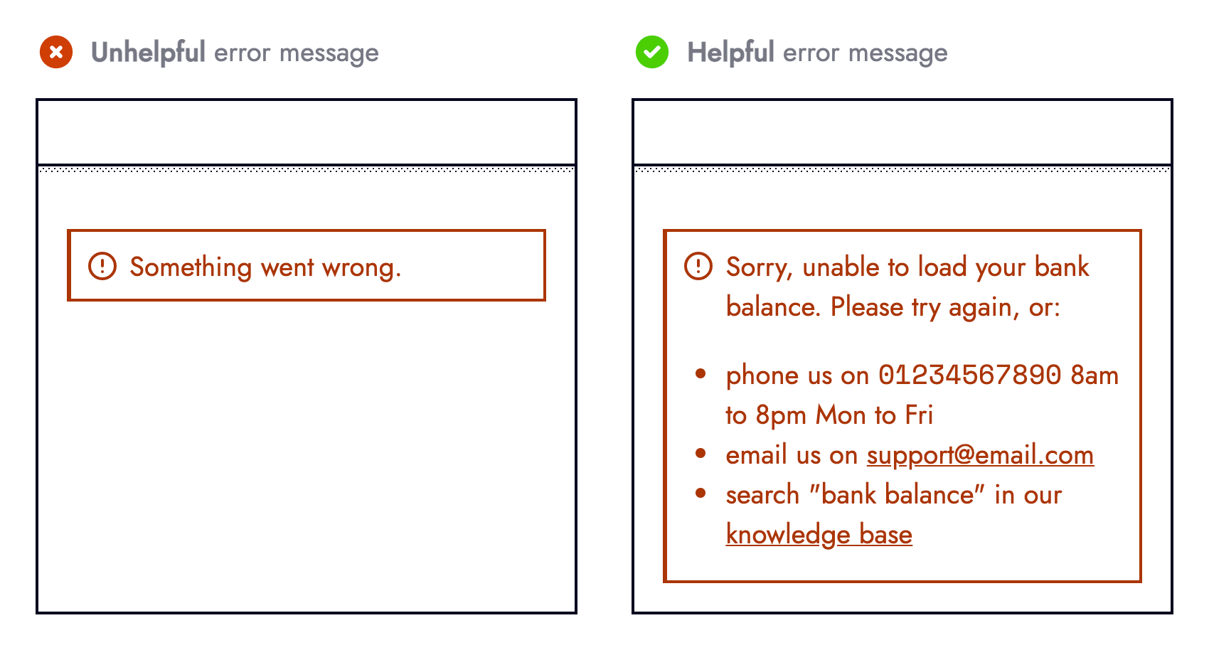
Finally, if neither recovery nor fallback is possible, acknowledge the error. Use the content hierarchy to judge importance, then inform the user with actionable guidance, like contacting support:
Visibility Through Observability
A degraded experience is only half the story. Engineers need to know why the experience degraded, and that includes errors the user never sees.
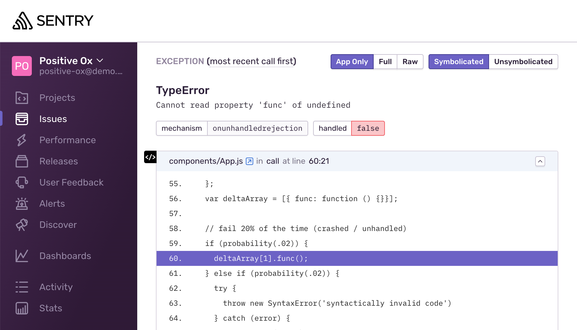
Tools like Sentry and Rollbar automatically capture unhandled exceptions:
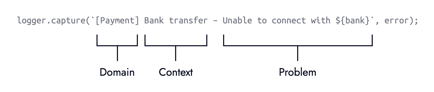
Setting these up costs little effort and pays off in faster mean time to acknowledge. The real value, though, comes from explicitly logging errors. Adding context and meaning makes troubleshooting far easier. Aim for non-technical teams to understand the message:
The Stripe example benefits from an explicit else branch for logging failed preconditions:
if (
  typeof stripe === "object" &&
  typeof stripe.handleCardPayment === "function"
) {
  stripe.handleCardPayment(/* ... */);
} else {
  logger.capture(
    "[Payment] Card charge — Unable to fulfill card payment because stripe.handleCardPayment was unavailable"
  );
}
This defensive check can run when a component mounts—before the error—giving the UI more time to react.
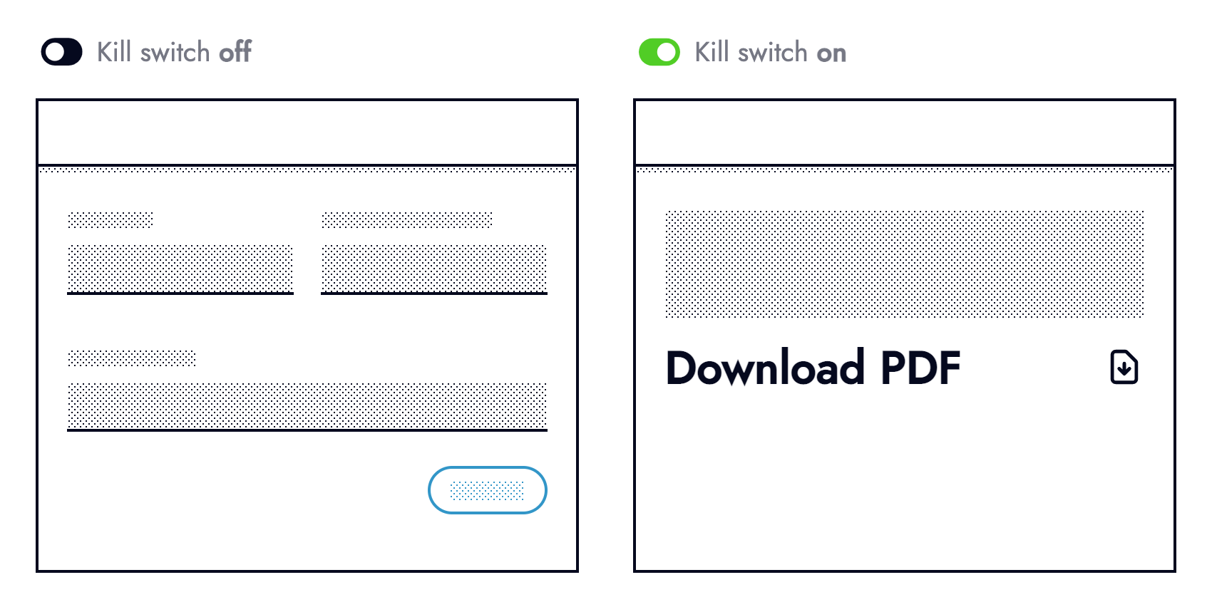
Observability exposes weaknesses. Once located, harden the code or wrap risky third-party integrations in operational feature flags. When an outage is discovered—hopefully by monitoring rather than users—communicate clearly about the issue. Forewarning tempers frustration, and transparency helps users plan around the problem:

Learning From Incidents
Errors are uncomfortable, but they are learning tools. Success in complex systems comes from confronting mistakes and creating an environment where failure is safe to discuss. Document incidents as they happen, much like aviation's black boxes capture every flight detail.
At minimum, prior documentation shortens the mean time to repair should the same issue recur. Write root cause analysis reports that are honest and discoverable. Cover what went wrong, the impact, relevant technical details, and follow-up actions. Those reports become a trail that helps current and future engineers avoid repeating history.
Building With Failure in Mind
Resilient UI development starts with acknowledging that the web is inherently unreliable. Networks drop, APIs change, and devices run out of memory. Teams that plan for these failures from the design stage treat reliability as a feature, not a patch. Proactive preparation beats reactive debugging from every angle: business metrics, customer trust, and the developer experience itself, which suffers when engineers are stuck hunting regression instead of shipping.
- Interfaces should degrade gracefully, offering meaningful value even when full functionality is unavailable.
- Challenge every assumption about state, connectivity, or input; ask “what can break here?” before writing code.
- Rank errors by impact and severity; a cosmetic glitch is not a data-integrity incident and deserves a different response.
- Prevention beats reaction. Validate inputs, guard against null, and write assertions before wiring up error handlers.
- On any failure, first ask whether a graceful recovery path or a safe fallback exists, then build it.
- User-facing messages must clearly explain what happened and suggest an actionable next step, not dump stack traces.
- Engineers need their own visibility: wire errors into monitoring and alerting from day one.
- Internal error logs and reports should carry meaningful context — the component, the action, the attempted payload — so a colleague can act without a long investigation.
- Treat every incident as data. Document lessons and share them so the whole team builds on what was learned.



