
Why attempt logic in CSS at all
Treating CSS as a puzzle-solving medium is good mental training, and unlike building a calculator in Minecraft, the skill has market value: many generalist developers avoid CSS, so depth here stands out. The side benefit is that once you have bent the language into something it was never meant to do, ordinary layout work starts to feel trivial.
The debate over whether CSS is Turing complete, or whether CSS and HTML count as programming languages, is unresolved by this experiment. What is clear is that newer features added for common UI patterns increasingly span the boundary between styling and behavior, and fiddling with custom properties and logical functions is a practical way to spend time with them.
Sudoku's constraint-based rules looked plausibly compatible with CSS's declarative nature, so the earlier claims of a CSS sudoku solver seemed worth checking. That prior work turned out to validate puzzles rather than solve them, and it relied on a small amount of JavaScript for its text inputs. Days spent attempting a full solver and generator in pure CSS produced lessons: Sass functions and mixins can be unit tested (worth doing, since heavy reuse makes them as risky to change as any other code); Chrome DevTools responds to roughly 50MB of Sass-generated CSS with an endless spinner; and translating something like a Python solver into pure CSS may or may not be possible. What is achievable, at least, is a working solver and generator for 16-square Sudoku.
The radial value picker
An experiment like this comes with an obligation to include something visually interesting, though Sudoku players generally want a UI that stays out of the way. Standard number pickers in Sudoku apps are not especially intuitive, so the radial menu pattern was borrowed from early black-and-white Macintosh interfaces and modern games. Existing pure CSS radial menu libraries exist, including React Planet, but that was the model worth imitating: selecting an item with the ring around it while the available actions are displayed attractively.
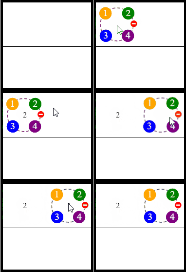
Numbers were built as labels using the old border-radius: 50% trick, on top of dashed circle code adapted from an existing Pen, and absolutely positioned so they stay on the correct spot of the dashed circle while the animation changes its size.
.context .number.top {
  background: green;
  margin-left: auto;
  margin-right: auto;
  left: 0;
  right: 0;
  top: -12.5px;
}

.context .number.left {
  background: orange;
  margin-top: auto;
  margin-bottom: auto;
  top: 0;
  bottom: 0;
  left: -12.5px;
}
The animation raises z-index so the picker is clickable, and animates the top and left margins from 50% to zero so the circle expands out of the center.
@keyframes bounce-out {
  0% {
    z-index: -1;
    width: 35%;
    height: 35%;
    margin-left: 50%;
    margin-top: 50%;
    opacity: 0;
  }
  100% {
    z-index: 2;
    opacity: 1;
    width: var(--circle-radius);
    height: var(--circle-radius);
  }
}
A cubic-bezier() on the animation approximates React Planet's bouncy physics.
.context {
  animation: bounce-out cubic-bezier(.68,-0.6,.32, 2.5) .5s forwards;
}
Radio button hacks handle both value selection and the opening behavior of the picker for the selected square, since they provide mutual exclusivity and remembered state. The central mechanism is that CSS variables are set at the level of the Sudoku grid based on checkbox state, which means a given value produces identical results whether a user clicked it or the generator placed it there. Because square/value combinations are numerous, these are generated with Sass, including separate bit values per combination and another custom property tracking whether a square remains unsolved.
@for $i from 1 through 16 {
  @for $j from 1 through 4 {
    #select-#{$j}-value-square-#{$i}:checked ~ .sudoku  {
       --square-#{$i}-unsolved: 0;
       --square-#{$i}-equals-#{$j}: 1;
    }
  }
}
Validation via a precomputed solution list
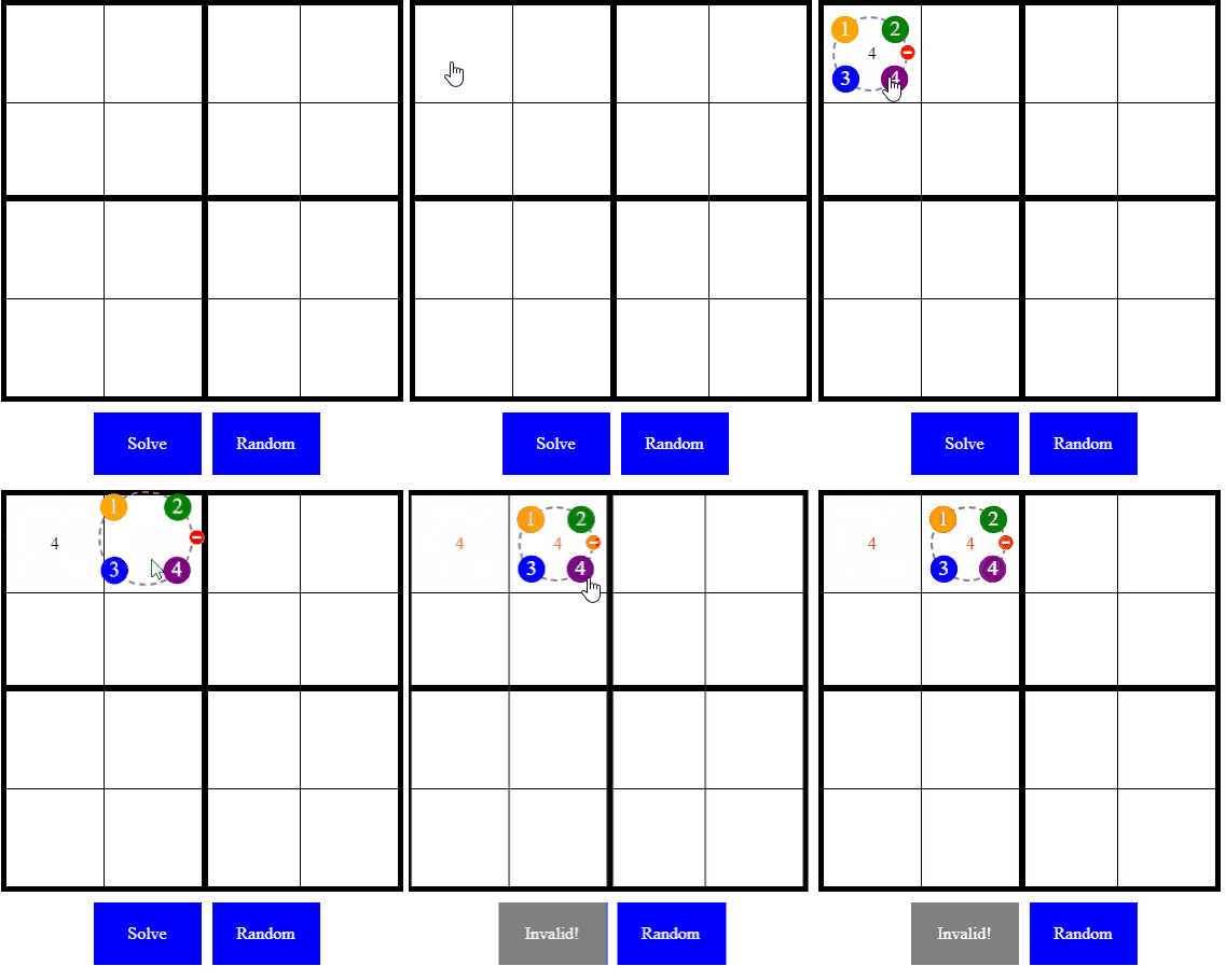
Sixteen squares with four possible values each yields on the order of four billion combinations, but only 288 of them are valid 4×4 Sudoku solutions. That small set is where Sass pays off: whatever one thinks about CSS's Turing completeness, Sass is Turing complete and offers real data structures such as lists, so a list of the valid puzzles can be massaged with a bit of regex into a two-dimensional Sass list.
$solutions: ((1,2,3,4,3,4,1,2,2,1,4,3,4,3,2,1),(3,1,2,4,2,4,1,3,1,3,4,2,4,2,3,1),(1,2,3,4,3,4,1,2,2,3,4,1,4,1,2,3),/*...many lines later...*/(2,4,3,1,3,1,4,2,4,2,1,3,1,3,2,4),(4,3,2,1,2,1,4,3,3,4,1,2,1,2,3,4));
This list serves as the database of the application. A nine-square-by-nine validator would need to check rows, columns and blocks, but knowing the answer set in advance allows a different question: could the entered numbers still belong to a valid puzzle? In pseudocode:
foreach (s in squares)
{
  if (solutionsContains(s.value, s.index) or s.isUnsolved())
  {
    showValidationError();
  }
}
That leans on the intermediate variables compiled onto each square whenever a value is chosen.
--square-#{$i}-unsolved: 0;
--square-#{$i}-equals-#{$j}: 1;
The difficulty is expressing or. The calc()-based operator simulations documented on CSS-Tricks were an inspiration, but such formulas grow unwieldy once nested conditions with more than two operands are needed, which is exactly the case here:
if ((squareOneEqualsOne and squareTwoEqualsTwo /*...*/ and squareSixteenEqualsOne) or (squareOneEqualsOne and squareTwoEqualsThree /*...*/ and squareSixteenEqualsOne))
  {
    sudokuIsValid();
  }
}
By now min() and max() are well supported alongside calc(), and clamp() is just convenience sugar over the first two. Most write-ups apply them to fluid typography, but they accept numbers anywhere a number is allowed. The trick is bit flags: passing them to min() is and, passing them to max() is or, as the truth tables show.
| A | B | A AND B | min(A, B) |
|---|---|---|---|
| 0 | 0 | 0 | 0 |
| 1 | 0 | 0 | 0 |
| 0 | 1 | 0 | 0 |
| 1 | 1 | 1 | 1 |
| A | B | A OR B | max(A, B) |
|---|---|---|---|
| 0 | 0 | 0 | 0 |
| 1 | 0 | 1 | 1 |
| 0 | 1 | 1 | 1 |
| 1 | 1 | 1 | 1 |
Since anything legal inside calc() is legal inside min() and max(), the validation condition becomes expressible without a preprocessor providing convenience only until Sass generates it.
.sudoku {
  --square-1-matches-puzzle-1: max(var(--square-1-unsolved), var(--square-1-equals-1, 0));
  --square-2-matches-puzzle-1: max(var(--square-2-unsolved), var(--square-2-equals-2, 0));
  /*...*/
  --square-16-matches-puzzle-1: max(var(--square-16-unsolved), var(--square-16-equals-1, 0));
  --puzzle-1-found: min(var(--square-1-matches-puzzle-1),
  /*...*/
  var(--square-16-matches-puzzle-1));
  --solution-found: max(var(--puzzle-1-found), /*...*/ var(--puzzle-288-found));
}
Each square is checked to be either unsolved or matching a precomputed solution at the same position, which yields a variable stating whether the current grid is a valid puzzle. Any behavior that can be driven by a number can then be driven by --solution-found; both z-index and opacity are especially versatile for this. For instance, to turn the grid red when it is invalid, each square gets something like:
.square {
  color: rgb(calc(255 * (1 - var(--solution-found))), 0, 0);
}
More awkward: shaking the grid every time it becomes invalid. The documentation for animation-duration resolves it.
A value of
0s, which is the default value, indicates that no animation should occur.
So the shake animation's duration can be keyed to --solution-found, with the :active pseudo-class removing the animation while a number is clicked so it replays on every subsequent invalid state.
#select-#{$j}-value-square-#{$i}:active  {
  animation: none;
}

 #select-#{$j}-value-square-#{$i}:checked ~ .sudoku {
  animation: shake cubic-bezier(.36,.07,.19,.97) calc((clamp(0, 1 - var(--solution-found), 1)) * 1s) forwards;
}
None of this would work without custom properties, whose behavior exceeds their modest appearance: they are reevaluated and update the UI when dependencies change, like a reduced form of the reactivity a JavaScript framework such as Vue provides. Reactivity, in other words, is native to the browser through CSS variables — and once the stylesheet knows every solution, a solver is within reach.
Solving: stacked cards and z-index
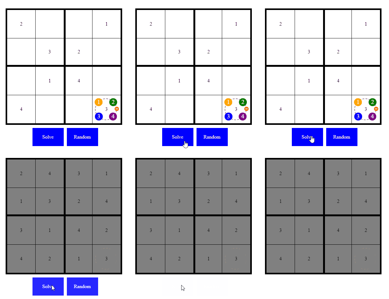
The intermediate variables introduced for validation were designed to do double duty.
.sudoku {
  --puzzle-1-found: min(var(--square-1-matches-puzzle-1),
  /*...*/
  var(--square-16-matches-puzzle-1));
}
Beyond readability, knowing which of the 288 puzzles are matched is what makes solving possible.
#no-solution {
  z-index: 1;
  color: red;
}
@for $solution-index from 1 through 288 {
label[for=solution-#{$solution-index}] {
  cursor: pointer;
  z-index: calc(var(--puzzle-#{$solution-index}-found) * #{$solution-index});
}

#solution-#{$solution-index}:checked ~ .sudoku  {
  @for $square from 1 through 16 {
    --square-#{$square}-solution:"#{nth(nth($solutions, $solution-index), $square)}";
    --square-#{$square}-color: grey;
    --auto-#{$square}: 1;
  }
The plural matters: few filled squares can mean multiple valid solutions, which solvers like this JavaScript one handle by answering even when a human could not solve without guessing. The CSS solver's single-looking "solve" button is 288 stacked labels, all visually identical: cards with the same back and different faces. Whatever solution should win floats to the top because the z-index is the match flag multiplied by $solution-index, so the later-listed correct answer wins ties. With no match, every solve button has z-index of zero and the disabled "invalid puzzle" button, at z-index of one, sits on top; when puzzle one is the solution, its button still shows because the invalid button precedes it in the HTML. Stacking context has its surprises, so this is also a demonstration of a less-than-obvious stacking rule.
Generating puzzles and pseudo-randomness
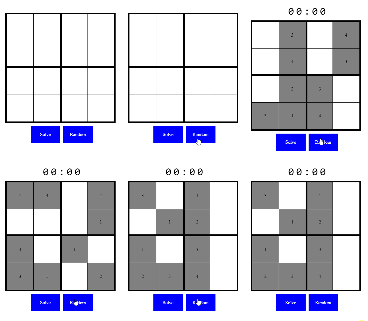
The generator is the solver with extra requirements: some squares stay unsolved when the button is pressed, the combination must differ on each press, solve must reveal a complete solution, and manual solving should be rewarded with a victory screen reporting time.
CSS has no random() function, though Sass does, so varying output from the same button needs another mechanism — and the solver's stack of cards already provides the pattern. The approach of animating stacking order with radio hacks, credited to Alvaro Montoro's CSS-Tricks article on generating seemingly random values in CSS, was chosen after attempts to avoid extra markup; it is as if the deck of puzzle cards keeps shuffling invisibly so each draw shows a different face. Combining that pseudo-randomness with Sass's genuine random() adds replay value.
@for $j from 0 through 287 {
label[for=generate#{$j}] {
animation-delay: #{$j * .35s};
}
label[for=generate#{$j}]:active:after {
z-index: 300;
width: 100%;
}
#generate#{$j}:checked ~ .sudoku {
$blockCounts: (1: 2, 2: 2, 3: 3, 4: 2);
$shuffleSquares: (1, 2, 3, 4, 5, 6, 7, 8, 9, 10, 11, 12, 13, 14, 15, 16);
@for $square from 1 through 16 {
$index1: random(16);
$index2: random(16);
$temp: nth($shuffleSquares, $index1);
$shuffleSquares: set-nth($shuffleSquares, $index1, nth($shuffleSquares, $index2));
$shuffleSquares: set-nth($shuffleSquares, $index2, $temp);
}
@each $square in $shuffleSquares {
$row: ceil($square/4);
$column: 1 + ($square - 1) % 4;
$block: if($row < 3, 1, 3) + if($column < 3, 0, 1);
$count: map-get($blockCounts, $block);
$val: nth(nth($solutions, $j + 1), $square);
--square-#{$square}-solution-#{$val}: 1;
@if ($count > 0) {
$blockCounts: map-merge($blockCounts, ($block: $count - 1));
--square-#{$square}-unsolved: 0;
--square-#{$square}-equals-#{$val}: 1;
@for $other-value from 1 through 4 {
@if ($other-value != $val) {
--square-#{$square}-equals-#{$other-value}: 0;
}
}
--square-#{$square}-color: grey;
--auto-#{$square}: 1;
}
}
}
}In each 4×4 block, Sass randomly picks two of four squares to solve, with one "gimme" block where only a single square is unsolved. Because validation and solving read the variables rather than the checked state of the value selector, generated values behave exactly like values the user clicked.
The solve timer
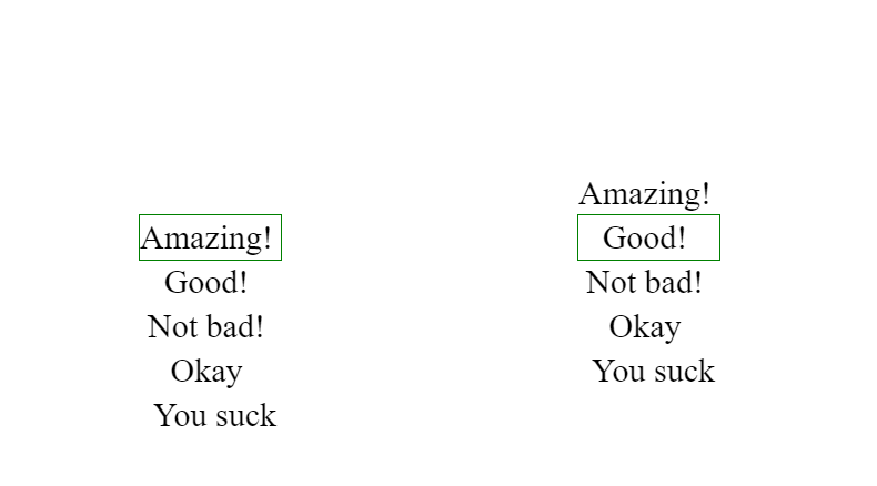
The seconds counter can be examined first without overflow: hidden on the digits, bordered in green to mark the visible region at each animation step.
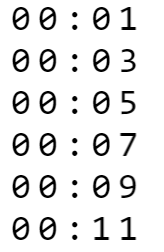

An infinitely repeating keyframes animation shifts a list of possible digits one character left at a fixed interval; a monospaced font guarantees every character is the same width. The seconds digit runs zero through nine while the next digit advances once per ten seconds, then only up to five, before both reset.
The technique is the familiar spritesheet animation, substituting a pseudo-element of digits for a shifted background image. Animated counters can be built in several ways, and some cross-browser-compatible options really need a preprocessor; this variant stays short, leaves timing to CSS, and asks only that the markup supply a placeholder per digit.
<div class="stopwatch">
  <div class="symbol"></div>
  <div class="symbol">:</div>
  <div class="symbol"></div>
  <div class="symbol"></div>
</div>
.stopwatch {
text-align: center;
font-family: monospace;
margin-bottom: 10px;
}
.symbol {
width: 1ch;
overflow: hidden;
display: inline-flex;
font-size: 5ch;
}
.symbol:nth-child(1)::after {
animation: tens 3600s steps(6, end) infinite;
content: '012345';
}
.symbol:nth-child(2)::after {
animation: units 600s steps(10, end) infinite;
content: '0123456789';
}
.symbol:nth-child(4)::after {
animation: tens 60s steps(6, end) infinite;
content: '012345';
}
.symbol:nth-child(5)::after {
animation: units 10s steps(10, end) infinite;
content: '0123456789';
}
@keyframes units {
to {
transform: translateX(-10ch);
}
}
@keyframes tens {
to {
transform: translateX(-6ch);
}
}Iteration counts of infinite mean the counter restarts after an hour. Resetting between games uses the same trick as the picker: each press of the generate button removes the animation from the digits via the :active pseudo-class so they return to zero, and the animation restarts once the radio is inactive — one line of CSS.
input[name=generate]:active ~ .stopwatch .symbol::after {
  animation: none;
}
The circular gauge
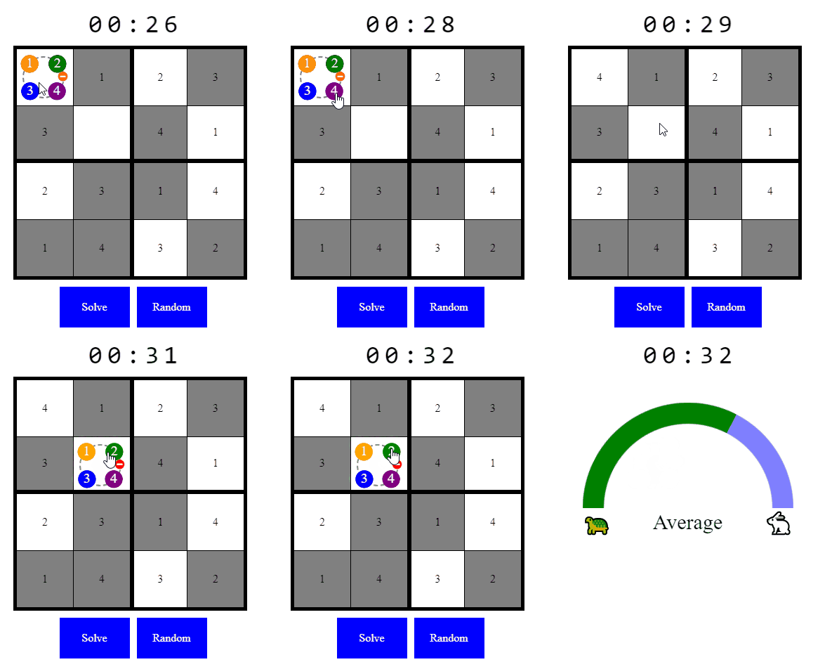
Performance feedback when a puzzle is solved pressures players to improve, and the gauge built for it is reusable as a standalone, minimalist component. In that standalone Pen the rating is set by radio hacks; in the game an animation moves it toward a lower rating as time passes, and the gauge itself sits at zero opacity, displayed and paused only when a manual solve is detected.
The semicircle is an illusion: it is a full circle whose lower half is clipped by overflow: hidden.
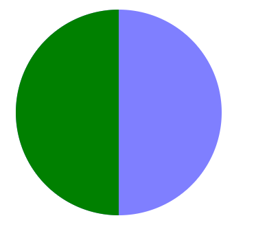
A pseudo-element filling half of the <div> supplies the two colors.

A second circle in the game's background color, centered with flexbox, punches out the middle to make a donut.
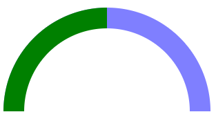
Clipping the container to half the circle's height yields the semicircle — and rotating the donut by negative or positive degrees makes the green appear to fill or drain. Flexbox handles the labels: if the rating <div> matches the circle's diameter, emoji labels land at each end and the description sits in the center.
#rating {
  font-size: 30px;
  display: flex;
  width: 300px;
  justify-content: space-between;
}
The markup:
<div id="rating">
  <div id="turtle">🐢</div>
  <div id="feedback"></div>
  <div id="rabbit">🐇</div>
</div>
The description text is switched like the timer digits but rotated to a vertical shift, since feedback strings vary in length while sharing a height.
Reactivity, limits, and what is worth keeping
Whether the logic implemented here counts as programming is hard to deny, even though it is decidedly unusual CSS; as in most of tech, the honest answer is "it depends," and the exercise shows programming is as much mindset as technology. The standard caveat still applies: this much logic in stylesheets should generally stay out of production, for maintainability, accessibility, and other concerns ending in "ility." Yet some pieces are genuinely convenient — the built-in reactivity of CSS variables can require gymnastics, and possibly a framework, in JavaScript — and the circular gauge is one component that could plausibly ship, especially against a heavy JavaScript widget that does more than needed.
A reset button remains missing: starting a new game requires a page refresh, a limitation inherent to radio button hacks, which is what separates CSS hacking from conventional programming. Animations that set CSS variables would solve it, but that is CSS Houdini territory, currently Chromium-only; if it arrives everywhere, expect a flood of new hacks. And the question of a full 81-square solver in CSS is still open, should anyone care to find out.