
Negotiating a base size with the user
Before you make type scale with the viewport, you need a starting point that respects what the user asked for. Browsers let people set a default font-size that applies across sites, and zooming adjusts size on a per-site basis. If you hard-code a size in pixels or viewport units, you override both of those controls. The safer foundation is 1em, which resolves to the user's preference when you haven't set anything else.
Not every design wants the browser default, though. An article reading experience may benefit from larger text, while a data-dense interface might want something more compact. You can suggest a default that fits the design without fully taking control away from the user.
Starting with multiplication
A common approach is to express your preferred size as a multiple of the user's default. This assumes the browser default is 16px and that most visitors won't change it. If you want 20px body text, you'd write:
html {
  /* 20px preferred, 16px expected: 20/16 = 1.25 */
  font-size: 1.25em;
}
Or show the conversion explicitly with calc():
html {
  font-size: calc(20 / 16 * 1em);
}
This preserves some user influence: someone who prefers a 24px default gets text at 1.25 times that. But the math can produce a strange result when both you and the user effectively request 20px — their 20px default gets multiplied by 1.25 again, yielding 25px that neither of you asked for.
Letting comparison functions mediate
CSS comparison functions avoid that problem entirely. Instead of converting pixels to em with assumptions about defaults, treat 1em as the user's preference and use it directly. A font-size of max(1em, 20px) always picks the larger of your design target (20px) and the user's requested size. The user can go larger but not smaller.
With clamp() you allow scaling in both directions:
html {
  font-size: clamp(1em, 16px + 0.25vw, 1.25em);
}
This defaults to 20px while the user's preference is smaller, but caps the result at 1.25em when they ask for more. When the user's requested size falls outside that range, their preference wins. No assumptions about the actual pixel value of 1em, no doubled multipliers. Apply this to the root html element and you can reference the negotiated size anywhere on the site as 1rem.
Making the base responsive
Once the base size is negotiated, you can make it respond to available space. One route is breakpoints — adjust the clamped value at specific media or container query thresholds. Another is to add viewport or container units directly into the static value, so the size changes continuously instead of in jumps.
html {
  font-size: clamp(1em, var(--base-font-size, 16px), 1.25em);
  @media (width > 30em) { --base-font-size: 18px; }
  @media (width > 45em) { --base-font-size: 20px; }
}
The vw and vi units each represent 1% of the viewport's width. The container equivalents, cqw and cqi, refer to 1% of an inline-size container. This fluid approach means you only set a starting point and a rate of change. With 0.25vw, for example, font-size grows by 0.25px for every 100px of viewport width — the browser handles the interpolation at every intermediate size.
Don't overvalue the smoothness itself. Most users won't notice the difference between a media query jump and a continuously interpolated value; they only see the result after resizing or changing zoom. The real advantage of fluid sizing is that you never have to predict or hard-code breakpoints. When the viewport is 1000px wide, a base of 16px plus 0.25vw evaluates to 18.5px automatically.
That said, explicit media queries are clearer if you prefer to think in terms of a desired size at a given viewport, since the intent is more directly readable in the code. Calculating viewport units from intended breakpoints often leads to copy-and-pasted magic numbers from third-party tools that are hard to maintain. As with most CSS decisions, pick the formulation that most plainly expresses your design intent.
Zoom, Resize, and the Illusion of Two Different Events
Media queries and vi units derive from the same viewport measurement, but that measurement means different things to different users. A viewport width of 600px yields the same CSS results whether the user is viewing the page on a narrow phone screen or has zoomed in on a desktop browser. In the first case, the pixel is a fixed size and the window is small. In the second, the window size is unchanged but each pixel is rendered larger. Both operations reduce the number of pixels across the browser's width, making resizing and zooming indistinguishable to CSS.
This distinction matters because the user intent behind each action is different. Resizing manages screen space; zooming adjusts content size for readability. A font-size that relies exclusively on a viewport-relative value like 1vw or 100vw will respond only to the former. Zooming produces no change at all, breaking a core accessibility expectation.
Restoring Zoom With calc()
The fix is to treat the viewport-relative unit as an adjustment to a base value, not as the sole value. Using calc(16px + 1vw) keeps some responsiveness to the viewport while the fixed px component remains scalable under zoom. When a user zooms to 200%, that base value doubles, even though the vw contribution remains unchanged.
The proportional mix still matters. On a 1000px viewport, calc(16px + 1vw) yields 26px. At 200% zoom, that becomes 42px—an increase of just over 160%, not the full 200%. As the viewport-relative portion of the calculation grows on larger screens, the effectiveness of zoom decreases further. There is a point at which even 500% zoom—the maximum in most browsers—cannot double the rendered font size, which fails WCAG SC 1.4.4.
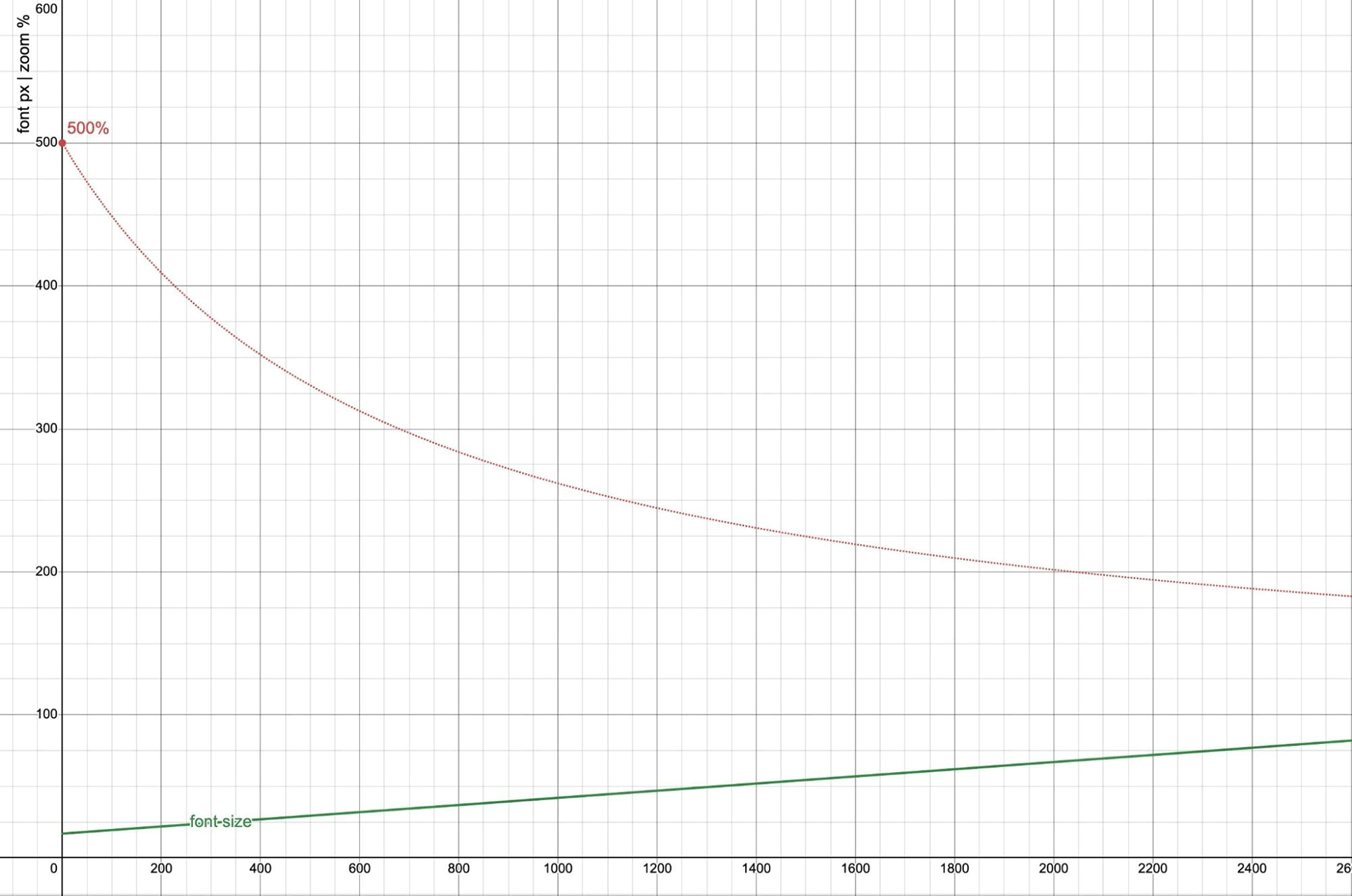
0 to 2600px wide. The vertical axis for font-size is also in pixels, showing the result of calc(17px + 2.5vw). The 500% zoom line uses the same viewport-width horizontal axis, but treats the vertical axis as a percentage.
The graph shows this degradation clearly. At a zero-width viewport, 500% zoom is fully effective, but that effectiveness drops quickly as the viewport grows. Once the browser window reaches roughly 2040px wide, the maximum zoom is barely enough to hit a 200% font-size increase. Beyond that, the requirement is impossible to meet.
Setting a minimum and maximum with clamp() enforces boundaries that protect accessibility. As noted by Maxwell Barvian:
If the maximum font size is less than or equal to 2.5 times the minimum font size, then the text will always pass WCAG SC 1.4.4, at least on all modern browsers.
Accounting for User Defaults
The pixel base in calc(16px + 1vw) responds to zoom but ignores the user's default font-size preference. Replacing the pixel values with em or rem units makes the calculation responsive to both. A complete fluid type rule therefore uses an em-based minimum and maximum, with a small vw contribution in the middle:
html {
  font-size: clamp(1em, 17px + 0.24vw, 1.125em);
}
This pattern keeps the minimum at 1em (the user default), caps the maximum at 1.125em so that the 200% requirement remains satisfiable at any viewport, and limits the vw weight so that zoom retains most of its power.
Generating Type Scales With pow()
Responsive typography rarely involves only one size. CSS has a built-in type scale based on the medium keyword, which maps to the user's font-size preference (16px by default). The scale steps are:
xx-small: 3/5 (0.6)x-small: 3/4 (0.75)small: 8/9 (0.89)medium: 1large: 6/5 (1.2)x-large: 3/2 (1.5)xx-large: 2/1 (2)xxx-large: 3/1 (3)
These build on the user default rather than the site's root font-size, so the scale loses meaning once you set a custom :root size. Most authors build their own scale anyway, frequently borrowing ratios from music theory via third-party generators:
html {
  /* musical ratios */
  --minor-second: calc(16/15);
  --major-second: calc(9/8);
  --minor-third: calc(6/5);
  --major-third: calc(5/4);
  --perfect-fourth: calc(4/3);
  --augmented-fourth: sqrt(2);
  --perfect-fifth: calc(3/2);
  --major-sixth: calc(5/3);

  /* the golden ratio*/
  --golden-ratio: calc((1 + sqrt(5)) / 2);
}
The pow() function makes custom scale generation unnecessary. You can define a consistent step directly in CSS with 1rem as the base:
html {
  /* choose a ratio */
  --scale: 1.2;

  /* generate the scale using pow() */
  --xx-small: calc(1rem * pow(var(--scale), -0.5));
  --x-small: calc(1rem * pow(var(--scale), -0.25));
  --small: calc(1rem * pow(var(--scale), -0.125));
  --medium: 1rem;
  --large: calc(1rem * pow(var(--scale), 1));
  --x-large: calc(1rem * pow(var(--scale), 2));
  --xx-large: calc(1rem * pow(var(--scale), 3));
  --xxx-large: calc(1rem * pow(var(--scale), 4));

  /* change the ratio for different viewport sizes */
  @media (width > 50em) {
    --scale: var(--perfect-fourth);
  }
}
Whole-number steps are not mandatory—the 12pt typography convention uses fractional exponents for smaller sizes to scale more gradually than the large type sizes, which use whole steps. The emerging CSS mixins and progress() functions will eventually streamline this further, but they are not covered here.
Applying Containers and Making an Informed Trade-Off
Container queries can reuse the same logic by swapping vw for cqi. Keeping the user's font-size on the html element allows every nested type-setting container to call back to that preference as 1rem. In the demo, the scale is defined on the body and then recalculated per element carrying a type-set attribute.
Type that flows with its container is more consistent with its environment, but it comes at the cost of page-wide uniformity. More importantly, fluid typography itself is at odds with user control: both approaches cannot be fully honored at once. The simpler option remains perfectly viable: using the user default and the built-in keyword scale and nothing else. If you do opt for fluid sizes, verify the outcome at several viewport widths against 200% and 500% zoom.


