
What CSS Data Types Are
Every CSS value lives in a unit space called a data-type, and properties and functions only accept the types they expect. opacity and scale take a unitless <number>; box metrics such as width and height take a <length> (px, rem, cm); rotate() and conic-gradient() take an <angle> (deg, rad, turn); and animation and transition take a <time> in s or ms. Specs and MDN mark these types with angle brackets: <data-type>. Other calculable types like <percentage>, <frequency> and <resolution> follow the same math, but <color>, <string> and <image> do not: an expression like "foo" * red is meaningless.
Browser support for typed arithmetic is experimental and very limited at the time of writing; check MDN or Can I Use for the current status.
The Rules of Typed Arithmetic
Addition and subtraction
Operands must share a data type. calc(3em + 45deg) and calc(6s - 3px) produce no logical result, but different units within one type are fine: calc(4em + 20px) and calc(300deg - 1rad).
Multiplication
A typed value can only be multiplied by a plain <number>: calc(3px * 7), calc(10deg * 6), calc(40ms * 4). The result adopts the type and unit of the first value. calc(10px * 10px) is invalid because regular math would yield 100px², and CSS has no squared units.
Division and the new unitless result
Dividing by a number works as it does for multiplication. Dividing a type by the same type is the feature that changes everything: where calc(70px / 10px) was previously invalid, it now returns a valid number — 7 here — starting with Safari 18.2 and Chrome 140.
That single change lets one data type be converted into another, and lets values of one type be conditioned mathematically on another. The angles and distances in the swirl demo below rest entirely on this.
A Spiral Built From One Ratio
A container <div> holds 36 <i> elements arranged in a spiral. Each element is positioned with rotate(var(--angle)) and translateX(var(--distance)); the angle comes from sibling-index() multiplied by 10deg, so element 1 rotates 10 degrees, element 2 by 20, and so on.

i { --angle: calc(sibling-index() * 10deg); }The distance is derived from the angle to keep the two proportional. Dividing the angle by 360deg yields its value as a unitless number, which is then multiplied by a <length> such as 180px:
i {
  --angle: calc(sibling-index() * 10deg);
  --distance: calc(var(--angle) / 360deg * 180px);
}
Because the ratio between angle and distance never changes, redefining any element's angle keeps it on the same spiral.
The Divisor's Unit Is the Meaning
The unitless output is relative to the unit you divided by. Dividing by 360deg produces a number expressed in degrees; dividing by 1turn — the same quantity — produces a number expressed in turns, with a completely different value.
With <length> values the effect is easier to see. On a 1080px wide screen, dividing 100vw by 1px gives the number of pixels across the screen, 1080:
calc(100vw / 1px) /* 1080 */Dividing the same width by 1em (assuming a 16px font size) instead gives the number of em units across the screen:
calc(100vw / 1em) /* 67.5 */Conversions in Practice
Width to angle, without media queries
The conversion need not run from angle to length. Here the screen width (100vw) drives an element's angle in a single line of CSS with no media queries. Taking clamp(300px, 100vw, 700px) defines a 400px range from 300px to 700px; subtracting 700px shifts it to -400px–0px. Dividing by 400px normalizes that to a unitless number between -1 and 0, and multiplying by -90deg turns it into an angle:
p {
  rotate: calc(((clamp(300px, 100vw, 700px) - 700px) / 400px) * -90deg);
}
Size to opacity
A unitless result can also feed any property that accepts <number>, including opacity — for example, making smaller text more opaque. Here each <p> gets a --font-size custom property; subtracting 0.8rem from a variable ranging over 0.8rem–2rem produces a range of 0–1.2rem:
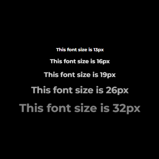
Dividing by 1.2rem would normalize to 0–1, but dividing by 2.4rem instead caps the result at 0–0.5, which is then subtracted from a maximum opacity of 1:
p {
  font-size: var(--font-size, 1rem);
  opacity: calc(1 - (var(--font-size, 1rem) - 0.8rem) / 2.4rem);
}
The px readout in the same demo comes from the same trick: dividing a rem font size by 1px returns its size in pixels as a unitless value, injected into the paragraph's ::after content:
p::after {
  counter-reset: px calc(var(--font-size, 1rem) / 1px);
  content: counter(px) 'px';
}
Width to color
All of this runs at runtime, natively. In this demo the element's background is colored proportionally to its rendered width; drag the bottom-right corner to watch the color change live. Since the default width is 50% of the screen, the initial color can differ across devices. There are no media queries and no JavaScript.
p {
  --hue: calc(100cqi / 1px);
  background-color: hsl(var(--hue, 0) 75% 25%);
}
A length → number → angle → number → length chain
A deliberately extreme example: an animated line's width (100cqi) is divided by 300px to get a unitless 0–1 value, multiplied by 180deg, and passed into sin(). That returns another unitless 0–1 value, this time distributed along a parabola, which is multiplied by -200px to yield the ball's vertical position relative to the line. Because that position is derived from the line's width, it stays on the same arc however the width is defined.
.ball {
  --translateY: calc(sin(calc(100cqi / 300px) * 180deg) * -200px) ;
  translate: -50% var(--translateY, 0);
}
What Dividing by a Type Changes
Division between typed values moves CSS past isolated data types toward a system where they interoperate. Styles stop being purely declarative and start defining mathematical relationships between properties: a width can drive a color, an angle can dictate a distance, a font size can determine its own visibility. Many such behaviors previously required JavaScript. It remains to be seen how these techniques combine with scroll-driven animations and view transitions.




