

The Real Difference Between <article> and <section>
The <article> vs. <section> question is a perennial one for HTML authors. The simplest mental model: think of an <article> as a discrete, self-contained unit that could be lifted out of its current context and reused elsewhere — syndicated, republished, or displayed standalone. The HTML spec defines it as "a complete, or self-contained, composition" that is "independently distributable or reusable, e.g. in syndication."
That covers a lot more than blog posts: forum posts, user-submitted comments, interactive widgets, product listings, or videos on a YouTube-style page all qualify. A homepage consisting of a list of blog posts would wrap each post in its own <article>, all contained within a <main> element. The same pattern applies to any collection of standalone items.
There's a practical payoff to this markup beyond abstract semantics. Apple's watchOS Reader feature explicitly relies on <article> to identify the primary content of a page for its optimized reading view. Apple's developer documentation notes that wrapping content in an <article> tag signals which parts of a page matter most, and combining it with HTML5 microdata (like itemprop attributes for author, publication date, and title) lets Reader style and surface those elements prominently on small watch screens.
"We've brought Reader to watchOS 5 where it automatically activates when following links to text-heavy web pages. It's important to ensure that Reader draws out the key parts of your web page by using semantic markup to reinforce the meaning and purpose of elements in the document."
What <section> Was Supposed To Do
So where does that leave <section>? The element was originally invented as a generic wrapper to support the HTML5 document outlining algorithm — a scheme that would let authors use only <h1> tags and have browsers automatically infer their logical heading level based on nesting depth within sectioning elements like <article> and <section>.
<h1>My Fabulous article</h1>

<p>Lorem Ipsum Trondant Fnord</p>
On a standalone article page, that approach seems to work fine visually. But consider a homepage listing multiple article excerpts:
<h1>My latest posts</h1>

<article>

  <h1>My fabulous article</h1>

 <p>Lorem Ipsum Trondant Fnord</p>

</article>

<article>

  <h1>Another magnum opus</h1>

  <p>Magnum solero paddle pop</p>

</article>
Per the spec, the <h1>s nested inside the <article> elements should conceptually "become" logical <h2>s, since <article> is a sectioning element. The idea dates back to 1991, when Tim Berners-Lee himself proposed a nestable <SECTION> element with a generic <H> tag that would produce the required heading level at any depth.
It never worked out. No browser has ever implemented the HTML5 document outline algorithm. JAWS attempted it in Internet Explorer at one point, but the implementation was buggy and was not extended to Firefox. Browser developers have shown little interest in the feature.
Why Nested <h1>s Are a Trap
What you will notice in modern browsers is a visual effect: an <h1> nested inside multiple <section> elements is rendered at progressively smaller font sizes, matching the default styling of <h2>, <h3>, and so on. That's true across Firefox, Chrome, Chromium-based Edge, and Safari.
But that appearance is purely cosmetic. If you inspect the same markup in a browser's accessibility inspector — Firefox's devtools, for example — you'll see the problem. A nested <h1> that looks like an <h2> still reports aria-level="1" in the accessibility tree. A genuine <h2>, by contrast, reports aria-level="2". The visual styling has not changed what assistive technologies perceive.
Mozilla did experiment with communicating the computed heading level to the accessibility tree, but reverted the change. As one Mozilla engineer explained, the experiment "had to revert it because people in our a11y team complained about too many regressions (accidentally lowering <h1> levels and such)."
This matters because heading structure is one of the primary navigation tools for screen reader users. WebAIM's screen reader user survey found that 86.1% of respondents consider heading levels very or somewhat useful for navigation. The conclusion for authors is simple: keep using <h1> through <h6> explicitly, and don't rely on <section> nesting to imply hierarchy.
When <section> Still Earns Its Keep
All of that said, there's a legitimate accessibility use case for <section>. On this very site, Smashing Magazine wraps its "quick summary" box in a <section> element — a change suggested by screen reader user Léonie Watson.
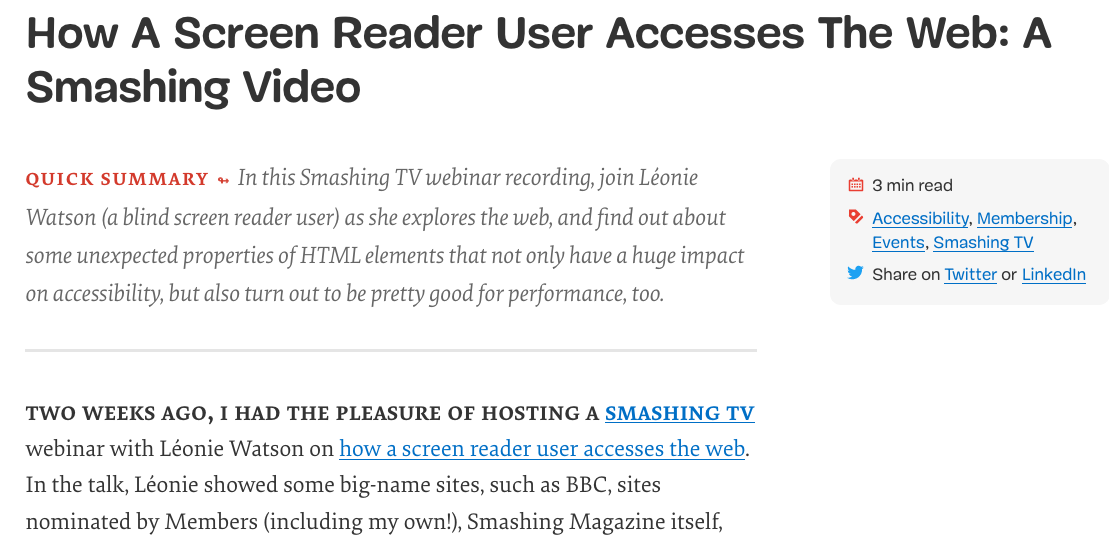
Articles on Smashing are preceded by a summary, followed by a decorative horizontal rule. The problem: since the separator is purely visual, screen reader users couldn't tell where the summary ended and the article began. The fix was to wrap the summary in a <section> with an accessible name:
<section aria-label="quick summary">

    Summary text

</section>
In most screen readers, a <section> without an accessible name is not announced. But with an aria-label, it becomes a labeled region — Watson's screen reader now announces "Quick summary region" at the start and "Quick summary region end" at the close, and users can skip the summary entirely if they wish.
The same effect could be achieved with a <div role="region">, but as Marco Zehe notes, if you label an element via aria-label or aria-labelledby, it should have a proper role. Since <section> has a built-in role of region, it's the cleaner choice: built-in beats bolt-on.
What Practically Matters
When all the specification talk is set aside, a few concrete rules will serve you and your users far better than chasing an outline algorithm that no browser actually implements.
- Keep a single
<h1>per page as the main heading. Then step down through<h2>,<h3>,<h4>, and so on, without skipping levels. This gives assistive technology a reliable document structure. - Reserve
<section>for cases where you pair it with anaria-labelso a screen reader user knows where a sub-part of an article begins and ends. Outside that pattern, either skip it entirely or pick a more meaningful element such as<aside aria-label="quick summary">or<div role="region" aria-label="quick summary">. - Use
<main>,<header>,<footer>, and<nav>freely. They offer clear landmarks for screen reader users and are invisible to everyone else. - Treat
<article>as the container for any self-contained piece of content — not just blog posts. It can also help WatchOS present your content properly when users browse from their wrist.
Digging Deeper
If you want the full backstory on why the sectioning model fell short, these references cover the spec history and the practical guidance that replaced it:
- “Headings And Sections,” HTML 5.2 W3C Recommendation (14 Dec. ’17) — Includes a telling warning: “There are currently no known native implementations of the outline algorithm … Therefore the outline algorithm cannot be relied upon to convey document structure to users. Authors should use heading rank (h1-h6) to convey document structure.”
- “There Is No Document Outline Algorithm,” Adrian Roselli — A detailed account of how the sectioning algorithm specification has changed over time.
- “ARIA in HTML,” W3C Editor’s Draft (19 Dec. ’19) — Governance for when you do add ARIA roles and attributes to your HTML.
- “The Practical Value of Semantic HTML,” Bruce Lawson — Real-world impact of semantic markup, including how WatchOS consumes HTML5 and microdata.
The author gratefully acknowledges Léonie Watson’s help writing the original piece. Any errors are totally her fault.


