Why Text Breaks: A Field Guide to Font Fallback
Font fallback is one of those subjects that sounds simple until you actually have to deal with it. When a requested font doesn't contain a glyph for a character you're rendering, the system has to decide what to substitute — and that decision process is full of edge cases, hidden assumptions, and surprising behavior. It's a problem every rendering engine faces, and the details matter more than you'd think.
The Basic Problem
Every font covers a specific set of characters. When your text includes a character outside that set — say, an accented letter, a Chinese character, or an emoji — the rendering system can't just draw it with the same font. It has to find another font that does have the glyph, and then decide how to mix that substituted glyph into your text.
That process is called font fallback, and it's not as straightforward as picking the next font in a list. The system needs to consider:
- Which fonts are actually available on the system, not just which ones you specified
- Which of those fonts contain the specific glyph you need
- What language the text is in (which can change the shape of the glyph)
- How to handle fonts that match partially — covering some chars in a run but not others
Modern text rendering also has to deal with variable fonts, color fonts, and fonts that don't share the same metrics. Each of these adds another layer of complexity to what was already a messy system.
How Fallback Actually Works
When a rendering engine hits a character that's missing from the active font, it doesn't just grab any font that has the glyph. The process goes something like this:
- Determine the set of characters you're trying to render (not just the one failing)
- Look at the system's font registry to find candidates that cover those characters
- Filter candidates by language, style, and other available metadata
- Score or order the remaining candidates based on how well they fit the requested font
- Pick the best one and render the character with it
The catch is that every rendering engine implements these steps differently, with different heuristics and priorities. What looks fine in one browser or operating system might look completely off in another — or simply render with a glyph from an entirely different font family that you never asked for.
Figuring Out What Went Wrong
Font issues can be hard to debug. If a rendered character looks wrong — too thin, the wrong width, a mismatched baseline — you might assume the font itself is broken. But more often than not, the problem is that the character was never in that font at all. The fallback system simply found something that visually approximated it, and you're now looking at two different fonts sharing one line of text.
A few telltale signs that fallback has happened:
- Inconsistent glyph shape or thickness within a single word
- Sudden differences in x-height or the alignment of ascenders and descenders
- Characters render with the right shape but the wrong width, breaking text layout
- Whitespace that doesn't match char width either
Sometimes the fallback font is actually a decent visual match for the primary font, and you might not notice. Other times, the gap is obvious. Either way, the substitution happens behind the scenes without your consent.
The Language Trap
An especially subtle problem crops up when the language of the text changes the character shape itself. Certain characters — particularly in scripts like Arabic or some Southeast Asian writing systems — render differently depending on the specific language they're used in, even if they're written identically.
The available fallback candidates might be narrowed based on language metadata, and an incorrect language tag can steer the renderer toward a font with the wrong variant shape. You can end up with visually correct text that no native speaker would actually recognize, because the glyph looks like a different letter or a different character form altogether.
The Placeholder Approach
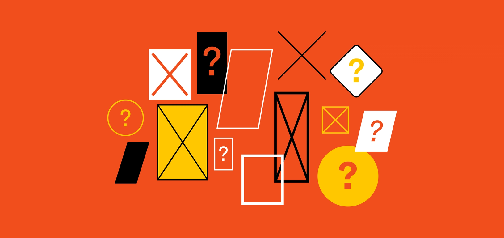
When no font contains the missing glyph, the fallback system gives up and renders a placeholder. The classic example is the small rectangle, often called a "tofu" box. That's the failure state of font fallback — the last resort when every other option has been exhausted.
Tofu is usually a sign that a font is genuinely missing from the system, not that fallback doesn't exist. Text on old systems was much more likely to produce tofu because system font lists were limited. Modern systems bundle broader font sets, so tofu appears less often now. But it still happens — especially for obscure or newly standardized characters that no installed font covers yet.

When the Fonts Fail You
The real lesson is that font fallback is a blend of deliberate engineering and pragmatic compromise. There arerules at play, but those rules were written by many different parties at many different times. Getting it right — and knowing when the system is working against you — requires paying attention to the details.
When every character needs a safety net
Most people have seen the symptoms: a text message full of empty boxes, an emoji that looks fine when sent but arrives as loose parts, or a line of text that suddenly jumps downward when an emoji is added. These look like random bugs, but they all trace back to the same mechanism: font fallback.
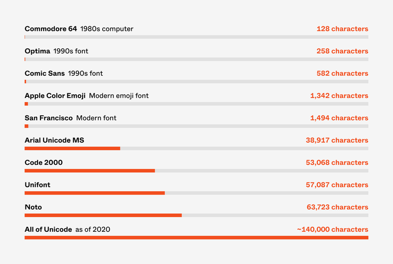
Fonts are not infinite. A typical western font ships with a couple hundred glyphs; a Chinese or Japanese font needs thousands. No font covers everything in Unicode, which today holds over 140,000 characters across about 150 scripts. And so every font carries a last-resort glyph called .notdef—often drawn as a rectangle—to answer requests for characters it doesn't have.
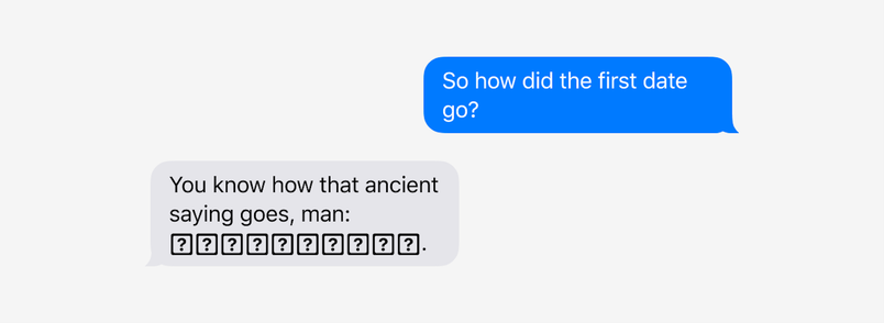
.notdef made sense when fonts and text were physically bound together. But computers decouple the two: a machine can render text written in a font unknown to its author, or in a font that didn't even exist when the text was created. So fonts need a way to say, "I don't know what this character should look like." The .notdef glyph is that answer. It isn't a Unicode character itself; it's just a placeholder that stands in for whichever character is missing.
A character-by-character negotiation
The font fallback that most developers know comes from CSS:
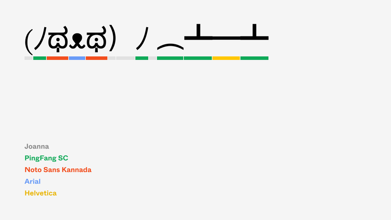
font-family: Joanna, Helvetica Now, Helvetica, Arial, sans-serif;
The browser walks the list, using the first font it has. The list is a compromise ladder: the first font is the intended design, and each further entry is an increasingly generic surrender.
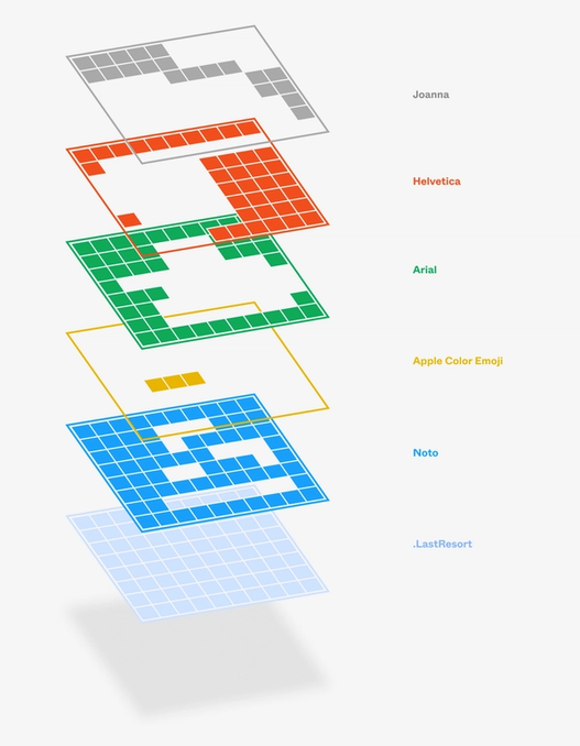
But font fallback doesn't work at the font level—it works per character. The browser revisits the entire chain for each letter. If the first font lacks one glyph, the next font is tried for that character alone. So a single sentence can end up typeset in several fonts, even if your CSS named a tidy stack.
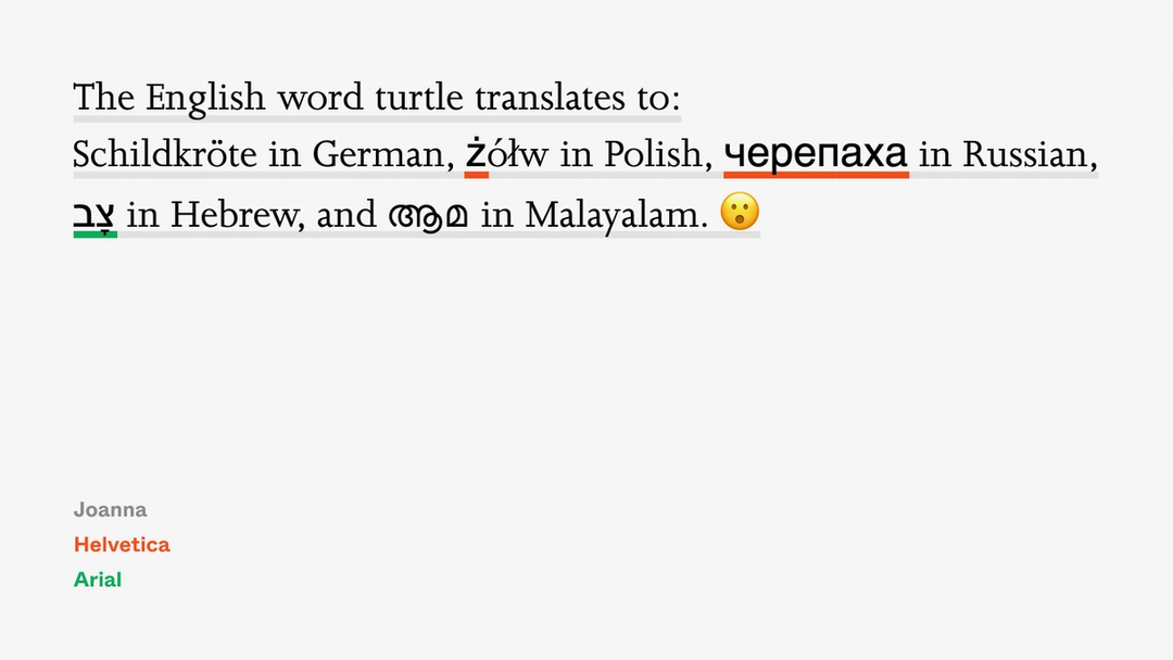
That mixed look is often acceptable, because at least it's readable. The alternative—tofu boxes everywhere—would make most text unusable, since no font comes close to covering all of Unicode. The reason we rarely see tofu is that your OS and browser quietly append dozens of fonts to the chain you declared. macOS extends a four-font stack to more than thirty fonts; Windows does something similar.
font-family: Joanna, Helvetica Now, Helvetica, Arial, Menlo, Monaco, .AppleSymbolsFB, LucidaGrande, CourierNewPSMT, GeezaPro, NotoNastaliqUrdu, Ayuthaya, Kailasa, PingFangSC, PingFangTC, HiraginoSans-W3, HiraginoSansGB-W3, PingFangHK, AppleSDGothicNeo, KohinoorBangla, KohinoorDevanagari, KohinoorGujarati, MuktaMahee, NotoSansKannada, KhmerSangamMN, LaoSangamMN, MalayalamSangamMN, NotoSansMyanmar, NotoSansZawgyi, NotoSansOriya, SinhalaSangamMN, TamilSangamMN, KohinoorTelugu, NotoSansArmenian, EuphemiaUCAS, STIXGeneral, Galvji, Kefa, .NotoSansUniversal, AppleColorEmoji, .LastResort;
These silent additions include emoji fonts like AppleColorEmoji or Segoe UI Emoji, script-specific fonts like NotoSansMyanmar, and enormous catch-all families such as Arial Unicode, Unifont, Code2000, or Noto—the anti-tofu fonts designed to catch whatever falls through everything else.
The system-level fallback also explains why emoji can push a line downward. Emoji usually come from a fallback font, and that font's vertical metrics may be larger than the main text font. The browser expands the line to fit the tallest glyph, even if the emoji is the only character from that font on the line.
Unicode's accidental font shop
One side effect of a 140,000-character Unicode is visual overlap: characters from different scripts look identical or nearly so. These are homoglyphs. Latin O, Greek Ο, and Cyrillic О are distinct characters that most readers can't tell apart. Unicode also includes mathematically styled Latin alphabets—bold, fraktur, double-struck, and more—which effectively puts fonts inside the character set itself.
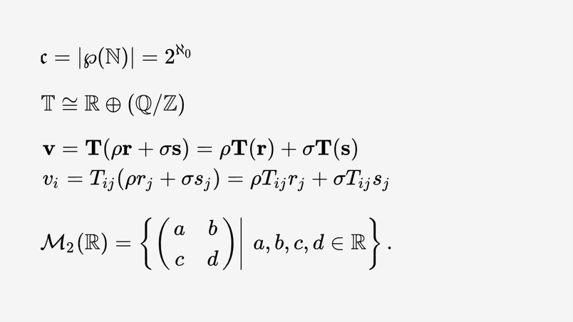
Websites like Unicode Text Converter exploit this to let users write "𝕄𝕒𝕣𝕔𝕚𝕟" or "ᴹᵃʳᶜⁱⁿ" without any font support. Because letters are just coded characters, there's no rule against repurposing math alphabets for style.
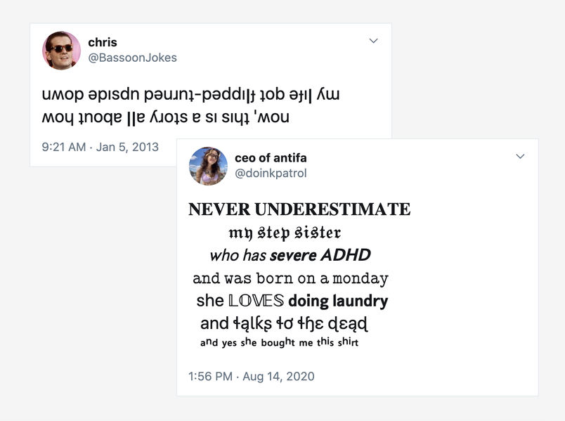
But this trick has costs. Fallback handles each stylized letter by looking for a font that contains it; since different platforms fall back to different fonts, the same stylized text can look different from one device to another. On older systems, an unsupported character eventually hits the bottom of the chain and renders as tofu. Screen readers may announce each character as "mathematical letter M" rather than plain "M," and search engines may not match the stylized text at all.
Still, there is something remarkable in how many fonts cooperate to show even a simple kaomoji. Box-drawing characters, letters from multiple scripts, and punctuation can each come from a different font file, all invisible to the reader.
When everything else fails
Platforms handle the "character no font claims" case differently. Some draw nothing. Firefox on desktop draws a rectangle with the hex code inside. macOS adds a font named .LastResort at the very end of its fallback chain; it draws a uniformly styled rounded rectangle with a question mark, no matter which character reaches it.

You can build your own fallback safety net, too. Standalone fallback fonts exist for people who want to control what happens at the end of the chain: Adobe NotDef draws consistent tofu, Adobe Blank draws nothing at all, and an older version of Unicode's Last Resort font shows which Unicode block the missing character belongs to.
Font engineers also distinguish .notdef from a different glyph altogether: the Replacement Character (�). It has its own Unicode code point and appears when the data itself is corrupt—when the underlying bytes don't parse as valid text. Although unrelated to font fallback, � follows the same rules as any other character, and some fonts even include a design for it.
The special case of emoji
Emoji are both simpler and stranger than ordinary glyphs. They're all served from one font per platform, but the Unicode standard adds around a hundred new emoji each year. Your OS's emoji font is usually the most current one in the fallback chain, but lag is still common—a new emoji may arrive on a phone before the desktop system catches up, rendering as tofu in the meantime.
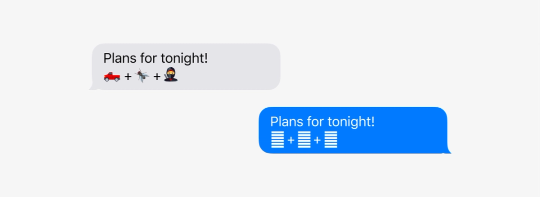
Many modern emoji are also composite: a black cat is a cat character joined to a black square with an invisible zero-width joiner. A woman in a tuxedo is a tuxedo person plus a female sign. These constructs fall apart on older systems, which can't assemble the parts—the recipient sees the separate components instead of the intended single glyph. This is more useful than tofu, since the parts hint at the meaning, but it is still an inconsistency in a system that otherwise hides its internal mechanics well.

Lost symbols and found characters
The typographical world has its own stories of obsolescence. The "per" symbol (⅌) once competed with @ as a commercial shorthand—"10 cents ⅌ apple"—but it never made it onto enough typewriters and mostly disappeared by the end of the 19th century. Some writers kept drawing it in by hand, a personal form of font fallback.
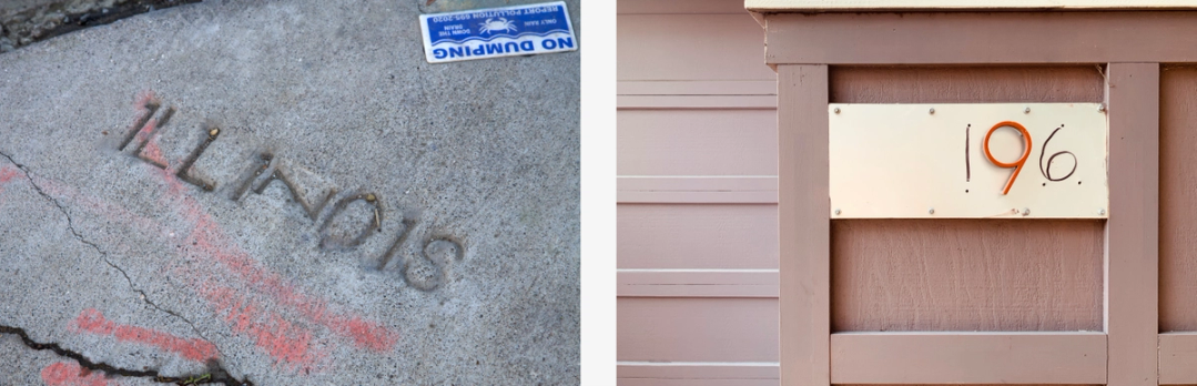
Falling fonts are not a failure of the system but its deliberate design. The price we pay is the occasional row of boxes, the oddly inflated line height, and the composed emoji that waft apart. In return we get text that interoperates across the entire history of writing—on computers that do the heavy lifting invisibly, character by character.
When fallback fonts are the better choice
A web font failing to load is not always a bug. Sometimes it is a deliberate engineering decision. A well-chosen fallback stack — system fonts, generic families and font-display values working together — can deliver a faster first paint than any webfont, especially on lower-end devices and flaky connections.
Respect the user's prefers-reduced-data setting when you can. Combined with the font-display: optional descriptor, it is a practical way to skip decorative fonts entirely for users who have opted out of heavy payloads. The text still renders correctly, just in a font the user will recognize instantly.
The same reasoning applies inside Figma and other design tools. A prototype that references a font the reviewer does not have installed will fall back silently, and the reviewer cannot tell whether they are seeing the real design or a substitute. For collaboration to be reliable, either embed the font in the file, share it alongside the file, or use a platform that hosts it. Assume nothing about the reviewer's machine.
When you detect a failed load in your own code — via document.fonts.check() or the loadingdone/loadingerror events — do not just log it and move on. Consider what the fallback actually looks like in context. Metrics like line-height, letter-spacing and container height often need adjustment for the fallback. A one-line CSS tweak scoped to a .fonts-failed class on <html> is often enough to keep the layout honest.
Test the failure, not just the success
Every serious font strategy should be tested under failure conditions. Use DevTools to block the font file, throttle the network, or load the page with JavaScript disabled to see what happens when the @font-face never resolves. Verify that the fallback order you defined actually triggers in the sequence you expect and that no content becomes invisible or overlapping.
Check the Performance panel for the font request itself — its size, its font-display period, and its swap timing. Check the Network panel for the font/woff2 response headers. And check the Accessibility tree: a fallback font with different metrics can break heading semantics for screen reader users if it causes a reflow that moves focus targets.
The goal is not to make failures impossible — failures are part of the web. The goal is to make failures quiet, fast and aesthetically acceptable. A fallback font that reads well is not a consolation prize; it is a legitimate part of the design system, and it deserves the same care as the primary typeface.


