
Whimsical's marketing pages for its flowchart, wireframe and mind map tools let visitors use the product directly on the site — an approach that makes the advertisement and the product the same thing. The Mind Maps page in particular renders an interactive demo through the <canvas> element.
Canvas versus SVG
Canvas is one valid route to this kind of embedded demo, though SVG could get you there too; the line between choosing one and the other is never entirely clear-cut. What matters editorially is the decision to skip the usual sign-up funnel. Most products require registration and onboarding before a visitor can see any value. Here the demo is the value, presented before any form stands in the way.
Per-feature theming and instant examples
Each product feature on the site carries its own visual theme, which makes the individual demos stand out as you move through the pages and encourages further exploration. Equally effective is the ability to jump straight into a working wireframe example. There is no marketing copy about revolutionising mind mapping; the product gets out of the way of itself and leads.
The unlabelled icon problem
The navigation icons have no text labels. The design is attractive, but the meaning of each icon is not self-evident, and the debate over labelling icons in software design has run for decades. Jef Raskin, one of the designers of the original Macintosh in the 1980s, argued in The Humane Interface that icons should never go unlabelled. That position may be too strict, but product-specific icons and mind map imagery are not everyday sights, so labels would not hurt here.
Typography as a supporting act
The site sets text in DIN Next, a typeface built to recede while display faces take the foreground, which seems at odds with such a visually loud design at first glance — the squiggly lines, floating circles and moon shapes scattered throughout the UI.
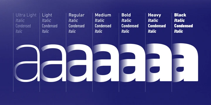
The tension mostly resolves in the font's favour: the flamboyant visuals carry the identity, and a quiet typeface keeps the interface from shouting over itself, arguably the right call when the surrounding UI is this expressive.
Color contrast is the thing to watch
Loud interfaces need contrast discipline, and lots of white text over bright, colorful backgrounds is exactly where that gets missed. Stacie Arellano's earlier write-up on color contrast guidelines explains why it matters:
You can mathematically know if two colors have enough contrast between them.
The W3C has a document called Web Content Accessibility Guidelines (WCAG) 2.1 that covers successful contrast guidelines. Before we get to the math, we need to know what contrast ratio scores we are aiming to meet or exceed. To get a passing grade (AA), the contrast ratio is 4.5:1 for most body text and 3:1 for larger text.
Whimsical's numbers were not checked for this piece, but it is the right thing to audit in a design like this. Illegible UI text is a serious failure, and it is an easy one to make by accident.



