
Animated type specimen as <video> and CSS
Mass-Driver's specimen page for its type family MD Nichrome leans on motion graphics to explain the font's features; those animations are styled <video> elements rather than scripted canvas work.
Headings that trail off
The fading letter treatment below combines a few small CSS rules:
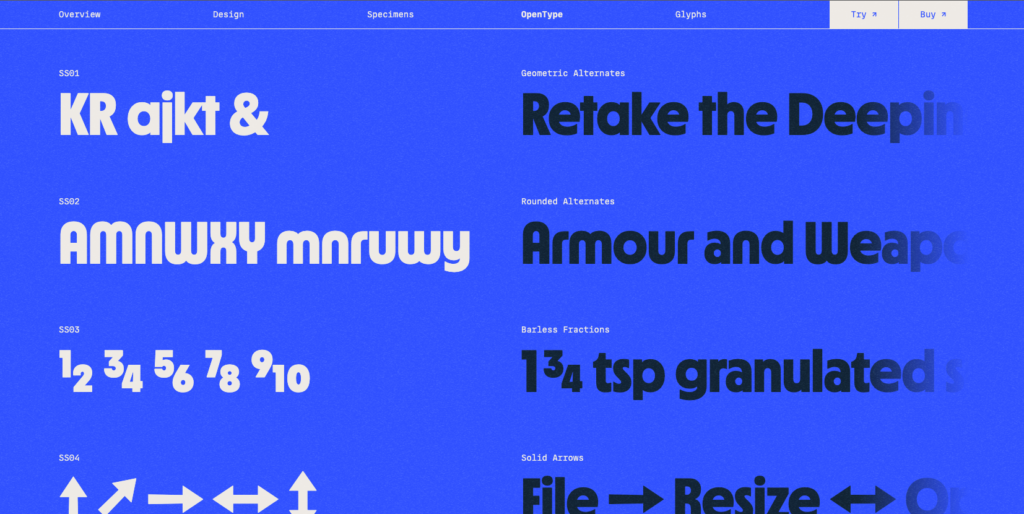
Each <h1> is held to one line with white-space, and hidden overflow lets the heading run off the edge. The fade itself comes from a linear gradient containing transparency — applied here as a mask-image, which is a reminder that browser-generated gradients are images.
OpenType feature previews on hover
Alongside the typography, the page advertises the font's OpenType features, such as fractions and alternate letters. Each section shows the feature by default and switches on hover:
.element {
  font-feature-setting: unset;
}
unset is an unusual choice, but a fitting one here: the feature shows first, and hovering reveals the default.
Building the background
The background stacks two layers: a shimmering, paper-like animation underneath a gradient. Inspecting it in DevTools shows the shimmer is a PNG whose background-position is shifted slightly, animating it like a GIF.
h1 {
  white-space: nowrap;
  overflow: hidden;
  -webkit-mask-image: linear-gradient(to right, black 75%, transparent);
}
The result is a soft grain that gives the page texture — the kind of treatment common around 2008, when buttons were styled to look analog. A comparable animated grain technique has been documented in depth elsewhere.
Bézier gradients
Smoothness in the gradient layer comes from a technique designer Rutherford Craze explained in a thread and packaged as a gradients tool:
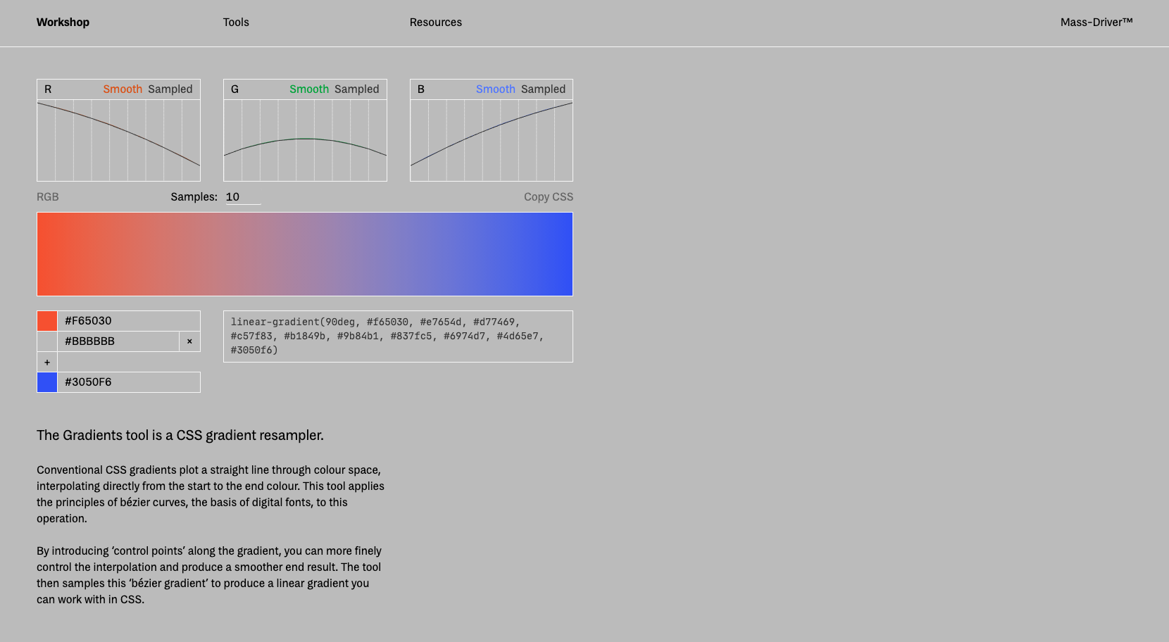
Conventional CSS gradients plot a straight line through colour space, interpolating directly from the start to the end colour. This tool applies the principles of bézier curves, the basis of digital fonts, to this operation.
By introducing 'control points' along the gradient, you can more finely control the interpolation and produce a smoother end result. The tool then samples this 'bézier gradient' to produce a linear gradient you can work with in CSS.
This addresses what is known as the "Gray Dead Zone" of gradients, the dull color that tends to appear mid-way through a linear interpolation.
Sticky placement
On load the page shows only the logo; scrolling brings the navigation in, where it locks into place. The same sticky positioning is reused further down to demonstrate the font's glyphs. The CSS is minimal — declare position: sticky on the element, then offset it if it should begin sticking at a particular point.
.sticky-thing {
  position: sticky;
  top: 75px;
}
Keeping the navigation to one side and out of sight until needed keeps attention on the letterforms first and the surrounding UI second — a quiet layout worth noting given how crowded most pages are.



