

Card backgrounds where conic gradients meet along the diagonal
A recent layout problem required a grid of cards where each card has a CSS aspect-ratio set by a user-controlled --ratio variable. On top of that, each card needed two conic gradients running from opposite corners and meeting exactly along the diagonal.
Making a color stop align with the diagonal is trivial for a linear-gradient(): specify a direction like to top left and the transition runs along the diagonal regardless of the box's proportions. A conic-gradient(), however, requires a fixed angle or percentage around the circle, which doesn't adapt to a changing aspect ratio on its own.
Why an angle calculation isn't viable (yet)
The CSS spec for trigonometric functions would give a clean method here. The diagonal's angle relative to the vertical is atan(var(--ratio)), derived from the right triangle formed by the card's width, height, and diagonal. That gives a directly usable angle value:
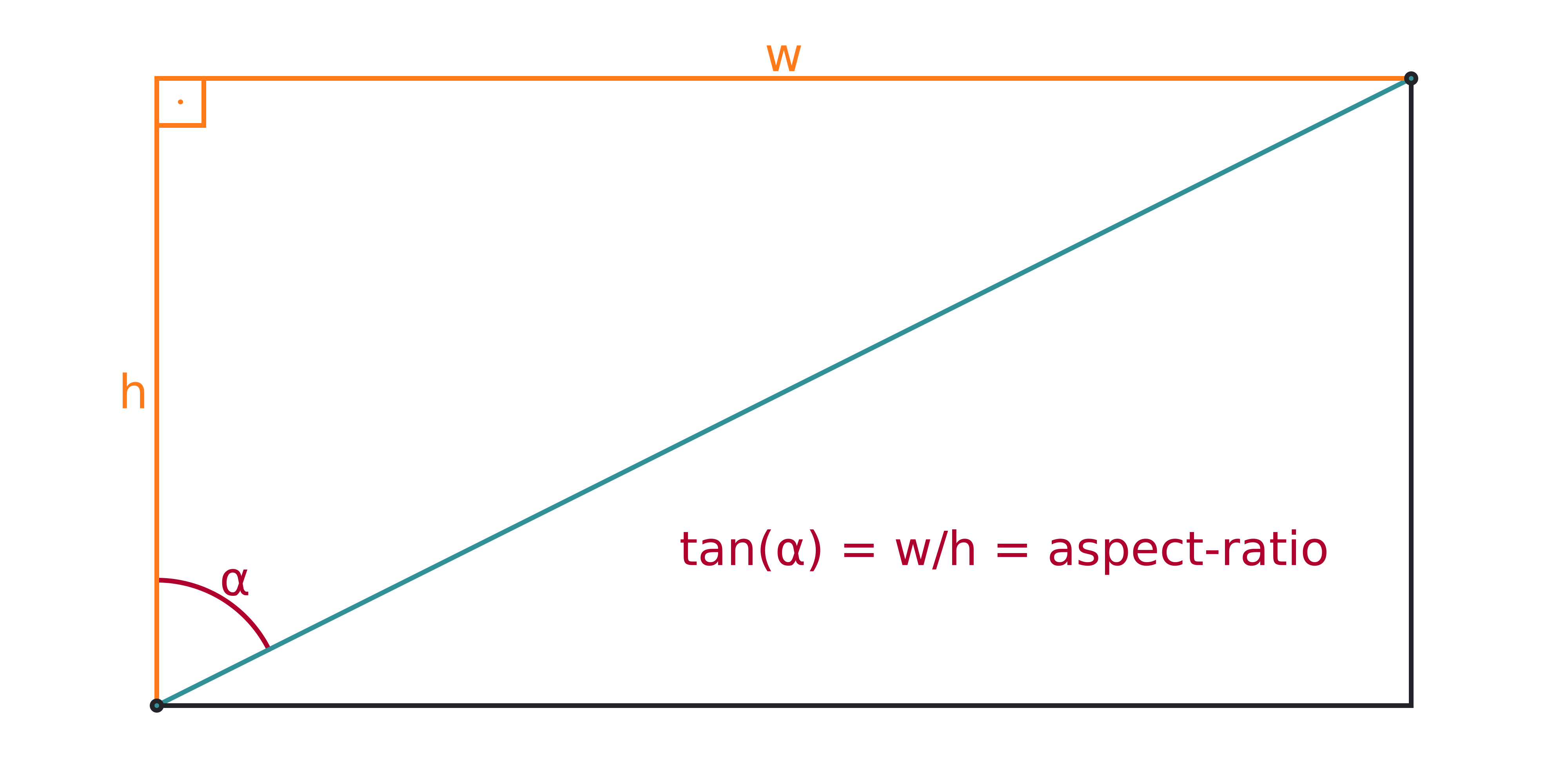
Applied to the gradient, the code is straightforward:
--ratio: 3/ 2;
aspect-ratio: var(--ratio);
--angle: atan(var(--ratio));
background:
  /* below the diagonal */
  conic-gradient(from var(--angle) at 0 100%,
      #319197, #ff7a18, #af002d  calc(90deg - var(--angle)), transparent 0%),
  /* above the diagonal */
  conic-gradient(from calc(.5turn + var(--angle)) at 100% 0,
      #ff7a18, #af002d, #319197 calc(90deg - var(--angle)));
The problem: no current browser ships trig functions. That's a future solution only.
If JavaScript is permitted in the project, the equivalent is to read --ratio and compute --angle manually:
let angle = Math.atan(1/ratio.split('/').map(c => +c.trim()).reduce((a, c) => c/a, 1));
document.body.style.setProperty('--angle', `${+(180*angle/Math.PI).toFixed(2)}deg`)
When the requirement is strictly CSS—no script allowed—there's a hackier but workable path.
The SVG-derived trick: draw square, then scale
The useful quirk comes from SVG gradient behavior. An SVG linear gradient drawn on a square box at 45deg puts its sharp transition exactly on the diagonal. If that same 45deg gradient is applied to a non-square rectangle, the side bars still land on the diagonal, which is not at 45deg for a rectangle. The reason: SVG's default gradientUnits="objectBoundingBox" stretches the 1×1 gradient space to fit the target's bounding box.
SVG has no conic gradients, but the same principle can reproduce the effect with CSS. Put the conic gradients on a square element, make the color transition sit at 45deg, then distort that square with a scale transform:
aspect-ratio: 1/ 1;
width: 19em;
background:
  /* below the diagonal */
  conic-gradient(from 45deg at 0 100%,
      #319197, #ff7a18, #af002d 45deg, transparent 0%),
  /* above the diagonal */
  conic-gradient(from calc(.5turn + 45deg) at 100% 0,
      #ff7a18, #af002d, #319197 45deg);
The ratio is neither in the element's own aspect ratio nor in a dedicated property—it goes straight into a calc(), where the slash separates values fine for aspect-ratio but acts as a division operator inside calc(). That lets one variable drive geometry:
--ratio: 3/ 2;
transform: scaley(calc(1/(var(--ratio))));
The visual checks out: change --ratio and the split between the two gradients tracks the diagonal.
Scaling a real card breaks layout
Applying that directional scale to the actual card is rarely a good strategy. On a CSS grid, the grid cell remains square—scaling the .card inside squishes content visibly. Text gets distorted too.
Instead, keep the card at its natural size and aspect ratio, and put the gradient effect on an absolutely positioned ::before pseudo-element sitting behind the content with z-index: -1. That pseudo-element starts square, sized to the card's width, then gets the directional scale. Because it is top aligned with the card, the transform origin's y component must stay at 0:
body {
  --ratio: 3/ 2;
  /* other layout and prettifying styles */
}

.card {
  position: relative;
  aspect-ratio: var(--ratio);

  &::before {
    position: absolute;
    z-index: -1; /* place it behind text content */

    aspect-ratio: 1/ 1; /* make card square */
    width: 100%;

    /* make it scale relative to the top edge it's aligned to */
    transform-origin: 0 0;
    /* give it desired aspect ratio with transforms */
    transform: scaley(calc(1/(var(--ratio))));
    /* set background */
    background:
      /* below the diagonal */
      conic-gradient(from 45deg at 0 100%,
      #319197, #af002d, #ff7a18 45deg, transparent 0%),
      /* above the diagonal */
      conic-gradient(from calc(.5turn + 45deg) at 100% 0,
      #ff7a18, #af002d, #319197 45deg);
    content: '';
  }
}
In this code the styles are written as SCSS (as opposed to the plain CSS used for the simpler versions).
Padding, box-sizing, and a Chromium bug
An obvious improvement is to add padding so the text doesn't go edge-to-edge. Doing so reveals an important detail: the default box-sizing: content-box means the aspect ratio applies to the content area only. Adding uniform padding changes the rendered box proportions, but the ::before element's scaling ratio stays fixed, so the background no longer matches the actual card dimensions.
Example math for aspect-ratio: 4/1 on a 16rem-wide content box: the content height is 4rem. Adding 1rem padding on all sides expands the padding box to 18rem × 6rem, which is a 3:1 ratio, not 4:1. The ::before still maps to a 4:1 visual height (4.5rem), leaving a visible discrepancy between background and card.
Setting box-sizing: border-box fixes that mismatch in Firefox. But Chromium does not yet apply the aspect ratio to the content box in all cases, producing a cell that picks up the same 3/1 ratio and overflows. With place-content: center set on the card's grid, the visual result in Chromium is short of expectations.
This is a known Chromium issue, reported and expected to be corrected in upcoming releases. A compatible workaround for the moment: take box-sizing, padding and place-content off the card itself, and instead put the text inside a child element that is itself a grid that centers and pads its content. If the text is a single line, a pseudo-element can serve the size alone at no extra markup cost, though the child stays selectable with ::after.
.card {
  /* same as before,
     minus the box-sizing, place-content and padding declarations
     the last two of which which we move on the child element */

  &__content {
    place-content: center;
    padding: 1em
  }
}
Rounding the corners
With the background on its own scaled pseudo-element, a border-radius on the card body alone would be distorted by the same directional transform. Setting the radius directly on the ::before and reversing the y-axis scale on the radius offsets the distortion. Alternatively, set rounding on the card and hide overflowing parts with overflow: hidden, with the caveat that descendants wanting to draw outside the card would be clipped.
$r: .5rem;

.card {
  /* same as before */

  &::before {
    border-radius: #{$r}/ calc(#{$r}*var(--ratio));
    transform: scaley(calc(1/(var(--ratio))));
    /* same as before */
  }
}
The complete pattern—ratio variable, square-then-scale pseudo background, padding on an inner text wrapper, and radius compensation—yields card backgrounds whose conic gradients split along the diagonal across any aspect ratio, without invoking unsupported math functions.


